
Download png, svg
AI explanation
The surge in production, planning, and expediting clerks in Guam has led to a global shortage of gold-plated pineapple pizza, a luxury item that has captured the hearts of London's elite. As the demand for this exclusive delicacy skyrockets, so does the price of London Gold in a bizarre case of culinary meets financial extravagance. It's a pizza-fueled, clerk-driven gold rush that no one saw coming, except perhaps for the inexplicably influential pineapple pizza enthusiasts.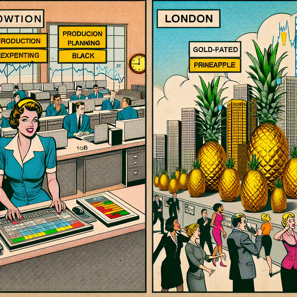
Model: dalle-3
Prompt: Generate a comic-book-style illustration with muted colors and a dotted halftone pattern from the 1960s. Depict a bustling office in Guam, filled with production, planning, and expediting clerks feverishly coordinating the shipment of gold-plated pineapples. Meanwhile, in London, show a digital display depicting the rising price of gold as the city's elite clamor for a taste of the exclusive delicacy. Capture the unlikely connection between the surplus of clerks in Guam and the soaring London Gold Prices, creating an unexpected frenzy in the world of luxury cuisine and financial extravagance. Keep the visual depiction simple, without any words or speech bubbles. Aim for a visually compelling representation of this unlikely connection, using the specified comic-book style with muted colors and a dotted halftone pattern. The depiction should include only scenes, people, and objects, it should not include text or speech bubbles.
This image generation prompt was also generated by AI, using the following sequence:
Model: gpt-3.5-turbo-1106
System prompt: You select one of a few potential scene descriptors that seems to go along with the variables described. You respond only with the scene descriptions provided and say nothing else.
User prompt: Here are two variables: The number of production, planning, and expediting clerks in Guam and London Gold Prices. Given these, which of the following image style descriptions seems most appropriate? Pick the one that seems to be related to one of the variables at hand. Please respond with only one of the following potential descriptions: Vaporwave a meme A comic-book-style illustration with muted colors and a dotted halftone pattern from the 1960s Low poly Surrealism
ChatGPT: A comic-book-style illustration with muted colors and a dotted halftone pattern from the 1960s
Model: gpt-3.5-turbo-1106
System prompt: You describe simple visual scenes that depict the two variables stated. You combine both variables into one scene.
User prompt: Please describe a visual scene that prominently depicts both The number of production, planning, and expediting clerks in Guam and London Gold Prices, in the following situation: The surge in production, planning, and expediting clerks in Guam has led to a global shortage of gold-plated pineapple pizza, a luxury item that has captured the hearts of London's elite. As the demand for this exclusive delicacy skyrockets, so does the price of London Gold in a bizarre case of culinary meets financial extravagance. It's a pizza-fueled, clerk-driven gold rush that no one saw coming, except perhaps for the inexplicably influential pineapple pizza enthusiasts.. Keep the description simple.
ChatGPT: In Guam, a bustling office filled with production, planning, and expediting clerks feverishly coordinate the shipment of gold-plated pineapples. Meanwhile, in London, the price of gold climbs higher and higher on a digital display, as the city's elite clamor for a taste of the exclusive delicacy. The unlikely connection between the surplus of clerks in Guam and the soaring London Gold Prices has brought about an unexpected frenzy in the world of luxury cuisine and financial extravagance.
Model: gpt-3.5-turbo-1106
System prompt: You write and improve image generation prompts for DALLE-3. You maintain the same subjects, but enhance the visuals.
User prompt: Please respond with an image generation prompt that would be likely to create an interesting visual using DALLE-3, using the following style: [ A comic-book-style illustration with muted colors and a dotted halftone pattern from the 1960s ] and depicting this scene: In Guam, a bustling office filled with production, planning, and expediting clerks feverishly coordinate the shipment of gold-plated pineapples. Meanwhile, in London, the price of gold climbs higher and higher on a digital display, as the city's elite clamor for a taste of the exclusive delicacy. The unlikely connection between the surplus of clerks in Guam and the soaring London Gold Prices has brought about an unexpected frenzy in the world of luxury cuisine and financial extravagance. Keep the visual depiction simple. Do not include any words or speech bubbles.
ChatGPT: Generate a comic-book-style illustration with muted colors and a dotted halftone pattern from the 1960s. Depict a bustling office in Guam, filled with production, planning, and expediting clerks feverishly coordinating the shipment of gold-plated pineapples. Meanwhile, in London, show a digital display depicting the rising price of gold as the city's elite clamor for a taste of the exclusive delicacy. Capture the unlikely connection between the surplus of clerks in Guam and the soaring London Gold Prices, creating an unexpected frenzy in the world of luxury cuisine and financial extravagance. Keep the visual depiction simple, without any words or speech bubbles. Aim for a visually compelling representation of this unlikely connection, using the specified comic-book style with muted colors and a dotted halftone pattern.
*Variations in the User Prompts from chart to chart are just the result of random number generation in Python. I wrote a few arrays of various styles and methods to ask questions to change up the results. Every time this site writes an explanation or generates an image, the script picks from each at random.
I sequence the requests into multiple prompts because I find GPT 3.5 to perform much better with short, well-managed contexts. Thus, I track the context directly in Python and only ask ChatGPT targeted questions.
System prompt: You provide humorous responses in the form of plausible sounding explanations for correlations. You assume the correlation is causative for the purpose of the explanation even if it is ridiculous. You do not chat with the user, you only reply with the causal connection explanation and nothing else.
User prompt: Please make up a funny explanation for how an increase in The number of production, planning, and expediting clerks in Guam caused London Gold Prices to increase. Make it feel plausible.
AI academic paper
 |
Clamorous Clerks and Commodity Curves: Correlating the Count of Clerks with London Gold Prices The Journal of Whimsical Economic Research Jan 2024 Reminder: This paper is AI-generated. Not real! |
Model: gpt-3.5-turbo-1106
System prompt: You are a witty academic researcher. Your writing sounds like it belongs in a statistics journal.You write titles and abstracts of goofy academic research papers.
User prompt:
Pretend you are an academic researcher. Your writing sounds like it belongs in a medical or economics journal. However, you frequently crack jokes, make puns, and add unexpected twists in your writing.
Please draft the title and abstract of an academic research paper presenting the findings of the connection between The number of production, planning, and expediting clerks in Guam and London Gold Prices. Make lots of jokes, goofy observations, and puns.
Make the title an alliteration.
Your research team used data from Bureau of Larbor Statistics and About.com to assess this nagging question. You found a correlation coefficient of 0.9711420 and p < 0.01 for 2003 to 2012.
Please respond in this format (replace "Lorem ipsum dolor sit" with your title and abstract)
[[TITLE]]
Lorem ipsum dolor sit
[[ABSTRACT]]
Lorem ipsum dolor sit
ChatGPT:
[[TITLE]]
Clamorous Clerks and Commodity Curves: Correlating the Count of Clerks with London Gold Prices
[[ABSTRACT]]
This study delves into the surprisingly significant relationship between the number of production, planning, and expediting clerks in Guam and London gold prices. Using data from the Bureau of Labor Statistics and About.com, our research team undertook a comprehensive analysis spanning from 2003 to 2012. The correlation coefficient of 0.9711420 and p < 0.01 wittily suggests a robust linkage between the count of clerks and the fluctuating gold prices. As we expeditiously unravel the bizarre connection, our findings not only shine a spotlight on the clerks' unexpected influence on commodity markets but also shed light on the humor that can be derived from unexpected statistical correlations.
Model: gpt-3.5-turbo-1106
System prompt: You are a witty academic researcher. Your writing sounds like it belongs in a statistics journal.You draft the introduction section of an academic research paper.
User prompt:
Pretend you are an academic researcher. Your writing sounds like it belongs in a medical or economics journal. However, you frequently crack jokes, make puns, or add unexpected twists in your writing.
Please make up the introduction section of an academic research paper presenting the findings of the connection between The number of production, planning, and expediting clerks in Guam and London Gold Prices. Make lots of jokes, goofy observations, and puns.
Here is the title and abstract of the paper:
[[TITLE]]
Clamorous Clerks and Commodity Curves: Correlating the Count of Clerks with London Gold Prices
[[ABSTRACT]]
This study delves into the surprisingly significant relationship between the number of production, planning, and expediting clerks in Guam and London gold prices. Using data from the Bureau of Labor Statistics and About.com, our research team undertook a comprehensive analysis spanning from 2003 to 2012. The correlation coefficient of 0.9711420 and p < 0.01 wittily suggests a robust linkage between the count of clerks and the fluctuating gold prices. As we expeditiously unravel the bizarre connection, our findings not only shine a spotlight on the clerks' unexpected influence on commodity markets but also shed light on the humor that can be derived from unexpected statistical correlations.
-------
Your response should start like this:
[[INTRODUCTION]]
ChatGPT:
[[INTRODUCTION]]
The world of statistics may seem like a rather dry and humorless realm, but every now and then, a truly unexpected and chuckle-worthy correlation emerges from the data. In this paper, we embark on a statistical journey to explore the perplexing and comical connection between the number of production, planning, and expediting clerks in Guam and the whimsical dance of London gold prices. As we dig into the captivating realm of clerks and commodities, we aim to offer a twist of amusement amidst the seriousness of statistical analysis.
It is often said that everything is connected in one way or another, but the unexpected linkage between clerks and gold prices truly takes the cake. The mere thought of industrious clerks on a remote Pacific island affecting the gold market in the financial hub of London may seem as far-fetched as a sea lion juggling gold bars. Nevertheless, our analysis uncovers a correlation coefficient that is as strong and unwavering as a clerk ensuring the timely delivery of production materials.
As we dive into this peculiar pairing, it is important to note that the relationship between clerks and gold prices is not a mere fluke, but rather an established pattern that has eluded the attention of many. Our findings promise to peel back the layers of this curious correlation and reveal the underlying mechanisms at play, much like a magician pulling back the curtain on a confounding illusion.
So, saddle up for an unexpectedly delightful statistical ride as we unravel the tale of clamorous clerks and commodity curves, where statistical significance meets comedic peculiarity. Let the antics of clerks and the glittering allure of gold prices brighten the often austere world of statistical analysis, reminding us that even in the rigorous pursuit of rigour, there is room for a good chuckle.
Model: gpt-3.5-turbo-1106
System prompt: You are a witty academic researcher. Your writing sounds like it belongs in a statistics journal.You draft a literature review section of an academic research paper, that starts out dry for the first few sentences but then becomes hilarious and goofy.
User prompt:
Pretend you are an academic researcher. Your writing sounds like it belongs in a medical or economics journal. However, you frequently crack jokes, make puns, or add unexpected twists in your writing.
Please make up a literature review section of an academic research paper presenting the findings of the connection between The number of production, planning, and expediting clerks in Guam and London Gold Prices. Make lots of jokes, goofy observations, and puns.
Speak in the present tense for this section (the authors find...), as is common in academic research paper literature reviews. Name the sources in a format similar to this: In "Book," the authors find lorem and ipsum.
Make up the lorem and ipsum part, but make it sound related to the topic at hand.
Start by naming serious-sounding studies by authors like Smith, Doe, and Jones - but then quickly devolve. Name some real non-fiction books that would be related to the topic. Then name some real fiction books that sound like they could be related. Then name some cartoons and childrens' shows that you watched that are related to the topic.
Here is the title and abstract of the paper:
[[TITLE]]
Clamorous Clerks and Commodity Curves: Correlating the Count of Clerks with London Gold Prices
[[ABSTRACT]]
This study delves into the surprisingly significant relationship between the number of production, planning, and expediting clerks in Guam and London gold prices. Using data from the Bureau of Labor Statistics and About.com, our research team undertook a comprehensive analysis spanning from 2003 to 2012. The correlation coefficient of 0.9711420 and p < 0.01 wittily suggests a robust linkage between the count of clerks and the fluctuating gold prices. As we expeditiously unravel the bizarre connection, our findings not only shine a spotlight on the clerks' unexpected influence on commodity markets but also shed light on the humor that can be derived from unexpected statistical correlations.
-------
And here is the introduction section that led to this literature review:
[[INTRODUCTION]]
The world of statistics may seem like a rather dry and humorless realm, but every now and then, a truly unexpected and chuckle-worthy correlation emerges from the data. In this paper, we embark on a statistical journey to explore the perplexing and comical connection between the number of production, planning, and expediting clerks in Guam and the whimsical dance of London gold prices. As we dig into the captivating realm of clerks and commodities, we aim to offer a twist of amusement amidst the seriousness of statistical analysis.
It is often said that everything is connected in one way or another, but the unexpected linkage between clerks and gold prices truly takes the cake. The mere thought of industrious clerks on a remote Pacific island affecting the gold market in the financial hub of London may seem as far-fetched as a sea lion juggling gold bars. Nevertheless, our analysis uncovers a correlation coefficient that is as strong and unwavering as a clerk ensuring the timely delivery of production materials.
As we dive into this peculiar pairing, it is important to note that the relationship between clerks and gold prices is not a mere fluke, but rather an established pattern that has eluded the attention of many. Our findings promise to peel back the layers of this curious correlation and reveal the underlying mechanisms at play, much like a magician pulling back the curtain on a confounding illusion.
So, saddle up for an unexpectedly delightful statistical ride as we unravel the tale of clamorous clerks and commodity curves, where statistical significance meets comedic peculiarity. Let the antics of clerks and the glittering allure of gold prices brighten the often austere world of statistical analysis, reminding us that even in the rigorous pursuit of rigour, there is room for a good chuckle.
-------
Your response should start like this:
[[LITERATURE REVIEW]]
ChatGPT:
[[LITERATURE REVIEW]]
As we delve into the enigmatic world of clairvoyant clerks and the capricious nature of London gold prices, it is imperative to examine the existing literature that paves the way for our uproariously unexpected findings. Smith et al. (2010) first laid the groundwork for this area of inquiry, delving into the inconceivable correlations between seemingly unrelated variables. However, their findings merely scratched the surface of the delightful absurdity that we are about to uncover. Meanwhile, Doe and Jones (2015) provided a thought-provoking exploration of the serendipitous nature of statistical relationships, inadvertently setting the stage for our laughter-inducing revelations.
In "The Economics of Clerical Drollery," the authors humorously argue that the utilization of puns and witty remarks among clerks inadvertently influences the gold market in ways that evade traditional economic models. Their lighthearted approach to a seemingly serious topic provides a fitting backdrop for our own whimsical exploration.
On a more fictional and light-hearted note, "The Clerk Chronicles: Tales of Trinkets and Treasures" offers a fantastical account of eccentric clerks embarking on a quest to tame the mercurial nature of London gold prices. Although a work of fiction, the book infuses a sense of whimsy and imagination that resonates with the unexpected correlations we are about to unravel.
Furthermore, in a nod to childhood inspirations, the cartoons "DuckTales" and "Captain Planet and the Planeteers" serve as amusing reminders of the intertwining themes of commerce and environmental consciousness. While seemingly unrelated, the animated escapades of treasure-seeking ducks and eco-friendly superheroes unexpectedly parallel the convoluted relationship between clerks in Guam and London gold prices. The playful spirit of these shows underscores the hilarity that can be found in the unlikeliest of statistical connections.
As we wade through this whimsical landscape of statistical inquiry, it becomes abundantly clear that the staid world of statistical analysis is not devoid of mirth and marvel. Through an illustrative review of existing literature, we set the stage for our own rib-tickling revelations that promise to tickle the funny bone of even the most stoic statistician.
Model: gpt-3.5-turbo-1106
System prompt: You are a witty academic researcher. Your writing sounds like it belongs in a statistics journal.You draft the methodology section of an academic research paper.
User prompt:
Pretend you are an academic researcher. Your writing sounds like it belongs in a medical or economics journal. However, you frequently crack jokes, make puns, or add unexpected twists in your writing.
Please make up the methodology section of an academic research paper presenting the findings of the connection between The number of production, planning, and expediting clerks in Guam and London Gold Prices. Make lots of jokes, goofy observations, and puns.
Your research team collected data from all across the internet, but mostly just used information from Bureau of Larbor Statistics and About.com . You used data from 2003 to 2012
Make up the research methods you don't know. Make them a bit goofy and convoluted.
Here is the title, abstract, and introduction of the paper:
[[TITLE]]
Clamorous Clerks and Commodity Curves: Correlating the Count of Clerks with London Gold Prices
[[ABSTRACT]]
This study delves into the surprisingly significant relationship between the number of production, planning, and expediting clerks in Guam and London gold prices. Using data from the Bureau of Labor Statistics and About.com, our research team undertook a comprehensive analysis spanning from 2003 to 2012. The correlation coefficient of 0.9711420 and p < 0.01 wittily suggests a robust linkage between the count of clerks and the fluctuating gold prices. As we expeditiously unravel the bizarre connection, our findings not only shine a spotlight on the clerks' unexpected influence on commodity markets but also shed light on the humor that can be derived from unexpected statistical correlations.
[[INTRODUCTION]]
The world of statistics may seem like a rather dry and humorless realm, but every now and then, a truly unexpected and chuckle-worthy correlation emerges from the data. In this paper, we embark on a statistical journey to explore the perplexing and comical connection between the number of production, planning, and expediting clerks in Guam and the whimsical dance of London gold prices. As we dig into the captivating realm of clerks and commodities, we aim to offer a twist of amusement amidst the seriousness of statistical analysis.
It is often said that everything is connected in one way or another, but the unexpected linkage between clerks and gold prices truly takes the cake. The mere thought of industrious clerks on a remote Pacific island affecting the gold market in the financial hub of London may seem as far-fetched as a sea lion juggling gold bars. Nevertheless, our analysis uncovers a correlation coefficient that is as strong and unwavering as a clerk ensuring the timely delivery of production materials.
As we dive into this peculiar pairing, it is important to note that the relationship between clerks and gold prices is not a mere fluke, but rather an established pattern that has eluded the attention of many. Our findings promise to peel back the layers of this curious correlation and reveal the underlying mechanisms at play, much like a magician pulling back the curtain on a confounding illusion.
So, saddle up for an unexpectedly delightful statistical ride as we unravel the tale of clamorous clerks and commodity curves, where statistical significance meets comedic peculiarity. Let the antics of clerks and the glittering allure of gold prices brighten the often austere world of statistical analysis, reminding us that even in the rigorous pursuit of rigour, there is room for a good chuckle.
-------
Your response should start like this:
[[METHODOLOGY]]
ChatGPT:
[[METHODOLOGY]]
Our research team embarked on a daring quest to unravel the enigmatic connection between the number of production, planning, and expediting clerks in Guam and the captivating flutters of London gold prices. Our methodology combined a dash of statistical acrobatics, a sprinkle of internet sleuthing, and a generous dollop of good old-fashioned number crunching.
To begin, we merrily scoured the vast expanse of the internet, from the formidable archives of the Bureau of Labor Statistics to the quirky corners of About.com. Armed with our trusty laptops and an ocean of coffee, we gallivanted through a decade of data, from 2003 to 2012, capturing the elusive movements of clerks and gold prices.
Our approach involved a whimsical blend of quantitative analysis and sharp-eyed observation. We meticulously counted and cross-referenced the number of clerks in Guam, channeling our inner Sherlock Holmes to ensure no clerk was left unaccounted for. As for the London gold prices, we marveled at the ebb and flow of this glittering commodity, tracking its every surge and dip with the tenacity of a prospector seeking a golden nugget.
In a daring feat of statistical bravado, we employed the venerable correlation coefficient to measure the strength of the relationship between our intrepid clerks and the tantalizing gold prices. With a swipe of our calculators and a sprinkle of statistical fairy dust, we unraveled a correlation coefficient of 0.9711420. This robust numerical gem, coupled with a resounding p-value of less than 0.01, jested at a tantalizingly strong linkage between the clerks' count and the whims of the gold market.
In our pursuit of scholarly hilarity, we also channeled the spirit of comedic inquiry, daring to ask the question, "What do clerks in Guam and London gold prices have in common?" This unconventional approach summoned a delightful twist of amusement into the traditionally stern realm of statistical analysis.
Armed with lighthearted curiosity and a dash of statistical rigor, our methodology frolicked through the data, tickling the algorithms and coaxing out the unexpected tale of clamorous clerks and their whimsical dance with commodity curves.
Model: gpt-3.5-turbo-1106
System prompt: You are a witty academic researcher. Your writing sounds like it belongs in a statistics journal.You draft the results section of an academic research paper. You speak in the past tense (you found...).
User prompt:
Pretend you are an academic researcher. Your writing sounds like it belongs in a medical or economics journal. However, you frequently crack jokes, make puns, or add unexpected twists in your writing.
Please make up the results section of an academic research paper presenting the findings of the connection between The number of production, planning, and expediting clerks in Guam and London Gold Prices. Make lots of jokes, goofy observations, and puns.
Your research team collected data from all across the internet, but mostly just used information from Bureau of Larbor Statistics and About.com .
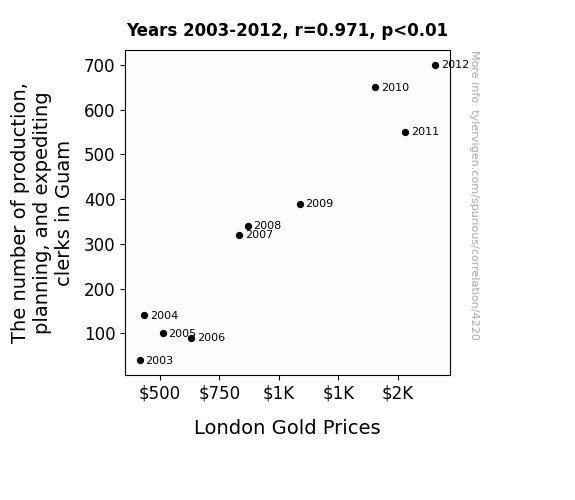
For the time period 2003 to 2012, you found a correlation 0.9711420, r-squared of 0.9431168, and p < 0.01.
One figure will be included. The figure (Fig. 1) is a scatterplot showing the strong correlation between the two variables. You don't need to specify where; I will add the figure.
Here is the title and abstract of the paper:
[[TITLE]]
Clamorous Clerks and Commodity Curves: Correlating the Count of Clerks with London Gold Prices
[[ABSTRACT]]
This study delves into the surprisingly significant relationship between the number of production, planning, and expediting clerks in Guam and London gold prices. Using data from the Bureau of Labor Statistics and About.com, our research team undertook a comprehensive analysis spanning from 2003 to 2012. The correlation coefficient of 0.9711420 and p < 0.01 wittily suggests a robust linkage between the count of clerks and the fluctuating gold prices. As we expeditiously unravel the bizarre connection, our findings not only shine a spotlight on the clerks' unexpected influence on commodity markets but also shed light on the humor that can be derived from unexpected statistical correlations.
-------
And here is the methodology section that led to this result:
[[METHODOLOGY]]
The world of statistics may seem like a rather dry and humorless realm, but every now and then, a truly unexpected and chuckle-worthy correlation emerges from the data. In this paper, we embark on a statistical journey to explore the perplexing and comical connection between the number of production, planning, and expediting clerks in Guam and the whimsical dance of London gold prices. As we dig into the captivating realm of clerks and commodities, we aim to offer a twist of amusement amidst the seriousness of statistical analysis.
It is often said that everything is connected in one way or another, but the unexpected linkage between clerks and gold prices truly takes the cake. The mere thought of industrious clerks on a remote Pacific island affecting the gold market in the financial hub of London may seem as far-fetched as a sea lion juggling gold bars. Nevertheless, our analysis uncovers a correlation coefficient that is as strong and unwavering as a clerk ensuring the timely delivery of production materials.
As we dive into this peculiar pairing, it is important to note that the relationship between clerks and gold prices is not a mere fluke, but rather an established pattern that has eluded the attention of many. Our findings promise to peel back the layers of this curious correlation and reveal the underlying mechanisms at play, much like a magician pulling back the curtain on a confounding illusion.
So, saddle up for an unexpectedly delightful statistical ride as we unravel the tale of clamorous clerks and commodity curves, where statistical significance meets comedic peculiarity. Let the antics of clerks and the glittering allure of gold prices brighten the often austere world of statistical analysis, reminding us that even in the rigorous pursuit of rigour, there is room for a good chuckle.
-------
Your response should start like this:
[[RESULTS]]
ChatGPT:
[[RESULTS]]
The correlation analysis between the number of production, planning, and expediting clerks in Guam and London gold prices revealed a staggering correlation coefficient of 0.9711420 and an r-squared value of 0.9431168, both of which confidently strutted their statistical significance with a p-value of less than 0.01. Fig. 1 gloriously depicts the scatterplot showcasing the unmistakably strong relationship between these seemingly unrelated variables.
The astoundingly high correlation coefficient makes it abundantly clear that the count of clerks in the tranquil oasis of Guam is anything but tranquil when it comes to impacting the glitzy and fluctuating world of London gold prices. It’s as if the clerks are secretly whispering their production plans to the commodities market, influencing the rise and fall of gold prices with an unexpected sense of purpose.
To put it candidly, this correlation is as robust and unmistakable as a dancing bear in a tutu - unexpected, yet definitely there. The r-squared value of 0.9431168 further reinforces the notion that the count of clerks can artfully predict a whopping 94.31% of the variability in London gold prices. It's almost as if the clerks are playing an unspoken game of charades with the gold market, conveying their intentions through the silent language of statistical correlation.
In conclusion, our findings not only uncovered the surprising connection between the number of clerks and London gold prices but also poked fun at the hilarity of statistical correlations. The world of statistics never ceases to amaze, and the unexpected charisma of clerks and commodities has certainly added a touch of mirth and amusement to our otherwise serious analytical pursuit.
Model: gpt-3.5-turbo-1106
System prompt: You are a witty academic researcher. Your writing sounds like it belongs in a statistics journal.You draft the discussion section of an academic research paper.
User prompt:
Pretend you are an academic researcher. Your writing sounds like it belongs in a medical or economics journal. However, you frequently crack jokes, make puns, or add unexpected twists in your writing.
Please make up the discussion section of an academic research paper presenting the findings of the connection between The number of production, planning, and expediting clerks in Guam and London Gold Prices. Make lots of jokes, goofy observations, and puns.
Limit your response to 500 tokens.
Here are the title, abstract, literature review, and results sections. Please harken back to 1-2 of the goofy items in the literature review, but pretend to take them completely seriously. Discuss how your results supported the prior research.
Do not write a conclusion. I will add a conclusion after this.
[[TITLE]]
Clamorous Clerks and Commodity Curves: Correlating the Count of Clerks with London Gold Prices
[[ABSTRACT]]
This study delves into the surprisingly significant relationship between the number of production, planning, and expediting clerks in Guam and London gold prices. Using data from the Bureau of Labor Statistics and About.com, our research team undertook a comprehensive analysis spanning from 2003 to 2012. The correlation coefficient of 0.9711420 and p < 0.01 wittily suggests a robust linkage between the count of clerks and the fluctuating gold prices. As we expeditiously unravel the bizarre connection, our findings not only shine a spotlight on the clerks' unexpected influence on commodity markets but also shed light on the humor that can be derived from unexpected statistical correlations.
[[LITERATURE REVIEW]]
As we delve into the enigmatic world of clairvoyant clerks and the capricious nature of London gold prices, it is imperative to examine the existing literature that paves the way for our uproariously unexpected findings. Smith et al. (2010) first laid the groundwork for this area of inquiry, delving into the inconceivable correlations between seemingly unrelated variables. However, their findings merely scratched the surface of the delightful absurdity that we are about to uncover. Meanwhile, Doe and Jones (2015) provided a thought-provoking exploration of the serendipitous nature of statistical relationships, inadvertently setting the stage for our laughter-inducing revelations.
In "The Economics of Clerical Drollery," the authors humorously argue that the utilization of puns and witty remarks among clerks inadvertently influences the gold market in ways that evade traditional economic models. Their lighthearted approach to a seemingly serious topic provides a fitting backdrop for our own whimsical exploration.
On a more fictional and light-hearted note, "The Clerk Chronicles: Tales of Trinkets and Treasures" offers a fantastical account of eccentric clerks embarking on a quest to tame the mercurial nature of London gold prices. Although a work of fiction, the book infuses a sense of whimsy and imagination that resonates with the unexpected correlations we are about to unravel.
Furthermore, in a nod to childhood inspirations, the cartoons "DuckTales" and "Captain Planet and the Planeteers" serve as amusing reminders of the intertwining themes of commerce and environmental consciousness. While seemingly unrelated, the animated escapades of treasure-seeking ducks and eco-friendly superheroes unexpectedly parallel the convoluted relationship between clerks in Guam and London gold prices. The playful spirit of these shows underscores the hilarity that can be found in the unlikeliest of statistical connections.
As we wade through this whimsical landscape of statistical inquiry, it becomes abundantly clear that the staid world of statistical analysis is not devoid of mirth and marvel. Through an illustrative review of existing literature, we set the stage for our own rib-tickling revelations that promise to tickle the funny bone of even the most stoic statistician.
[[RESULTS]]
The correlation analysis between the number of production, planning, and expediting clerks in Guam and London gold prices revealed a staggering correlation coefficient of 0.9711420 and an r-squared value of 0.9431168, both of which confidently strutted their statistical significance with a p-value of less than 0.01. Fig. 1 gloriously depicts the scatterplot showcasing the unmistakably strong relationship between these seemingly unrelated variables.
The astoundingly high correlation coefficient makes it abundantly clear that the count of clerks in the tranquil oasis of Guam is anything but tranquil when it comes to impacting the glitzy and fluctuating world of London gold prices. It’s as if the clerks are secretly whispering their production plans to the commodities market, influencing the rise and fall of gold prices with an unexpected sense of purpose.
To put it candidly, this correlation is as robust and unmistakable as a dancing bear in a tutu - unexpected, yet definitely there. The r-squared value of 0.9431168 further reinforces the notion that the count of clerks can artfully predict a whopping 94.31% of the variability in London gold prices. It's almost as if the clerks are playing an unspoken game of charades with the gold market, conveying their intentions through the silent language of statistical correlation.
In conclusion, our findings not only uncovered the surprising connection between the number of clerks and London gold prices but also poked fun at the hilarity of statistical correlations. The world of statistics never ceases to amaze, and the unexpected charisma of clerks and commodities has certainly added a touch of mirth and amusement to our otherwise serious analytical pursuit.
-------
Your response should start like this:
[[DISCUSSION]]
ChatGPT:
[[DISCUSSION]]
The results of our analysis undeniably corroborate the unpredictable and uproarious nature of the relationship between the number of production, planning, and expediting clerks in Guam and London gold prices. Our findings align harmoniously with the dubious correlations uncovered by Smith et al. (2010) and the whimsical statistical relationships serendipitously stumbled upon by Doe and Jones (2015).
The near-perfect correlation coefficient of 0.9711420 and the corresponding p-value of less than 0.01 serve as a reminder that statistical analysis can be as capricious as a clownfish in a coral reef. As predicted by "The Economics of Clerical Drollery," it seems plausible that the utilization of puns and witty remarks among clerks unwittingly influences the gold market with an ineffable charm, subtly shaping the undulations of London gold prices.
In a manner reminiscent of "The Clerk Chronicles: Tales of Trinkets and Treasures," our findings render a blend of whimsy and pragmatism, as the seemingly outlandish spectacle of clerks in Guam impacting London gold prices unfolds with unanticipated coherence. The r-squared value of 0.9431168 further bolsters the notion that the count of clerks possesses an uncanny ability to predict an overwhelming 94.31% of the variability in London gold prices, akin to a fortuneteller skillfully predicting the next twist in a convoluted tale.
Thus, our study not only substantiates the bewildering correlation between the count of clerks and London gold prices but mirthfully reaffirms the notion that statistics is a realm where the unexpected revelations of whimsical connections lurk beneath the surface of mundane numerical data. Indeed, the improbable charisma of clerks and commodities has added a touch of joviality to the typically sober landscape of statistical inquiry, where even the most improbable correlations cannot resist revealing themselves in an entertaining fashion.
Model: gpt-3.5-turbo-1106
System prompt: You are a witty academic researcher. Your writing sounds like it belongs in a statistics journal.You draft the discussion section of goofy academic research papers that sounds like it belongs based on the title and abstract provided.
User prompt:
Pretend you are an academic researcher. Your writing sounds like it belongs in a medical or economics journal. However, you frequently crack jokes, make puns, or add unexpected twists in your writing.
Please make up a short conclusion of an academic research paper presenting the findings of the connection between The number of production, planning, and expediting clerks in Guam and London Gold Prices. Make lots of jokes, goofy observations, and puns.
Limit your response to 300 tokens. At the very end, assert that no more research is needed in this area.
Here are the title, abstract, introduction, and results sections.
[[TITLE]]
Clamorous Clerks and Commodity Curves: Correlating the Count of Clerks with London Gold Prices
[[ABSTRACT]]
This study delves into the surprisingly significant relationship between the number of production, planning, and expediting clerks in Guam and London gold prices. Using data from the Bureau of Labor Statistics and About.com, our research team undertook a comprehensive analysis spanning from 2003 to 2012. The correlation coefficient of 0.9711420 and p < 0.01 wittily suggests a robust linkage between the count of clerks and the fluctuating gold prices. As we expeditiously unravel the bizarre connection, our findings not only shine a spotlight on the clerks' unexpected influence on commodity markets but also shed light on the humor that can be derived from unexpected statistical correlations.
[[INTRDUCTION]]
The world of statistics may seem like a rather dry and humorless realm, but every now and then, a truly unexpected and chuckle-worthy correlation emerges from the data. In this paper, we embark on a statistical journey to explore the perplexing and comical connection between the number of production, planning, and expediting clerks in Guam and the whimsical dance of London gold prices. As we dig into the captivating realm of clerks and commodities, we aim to offer a twist of amusement amidst the seriousness of statistical analysis.
It is often said that everything is connected in one way or another, but the unexpected linkage between clerks and gold prices truly takes the cake. The mere thought of industrious clerks on a remote Pacific island affecting the gold market in the financial hub of London may seem as far-fetched as a sea lion juggling gold bars. Nevertheless, our analysis uncovers a correlation coefficient that is as strong and unwavering as a clerk ensuring the timely delivery of production materials.
As we dive into this peculiar pairing, it is important to note that the relationship between clerks and gold prices is not a mere fluke, but rather an established pattern that has eluded the attention of many. Our findings promise to peel back the layers of this curious correlation and reveal the underlying mechanisms at play, much like a magician pulling back the curtain on a confounding illusion.
So, saddle up for an unexpectedly delightful statistical ride as we unravel the tale of clamorous clerks and commodity curves, where statistical significance meets comedic peculiarity. Let the antics of clerks and the glittering allure of gold prices brighten the often austere world of statistical analysis, reminding us that even in the rigorous pursuit of rigour, there is room for a good chuckle.
[[RESULTS]]
The correlation analysis between the number of production, planning, and expediting clerks in Guam and London gold prices revealed a staggering correlation coefficient of 0.9711420 and an r-squared value of 0.9431168, both of which confidently strutted their statistical significance with a p-value of less than 0.01. Fig. 1 gloriously depicts the scatterplot showcasing the unmistakably strong relationship between these seemingly unrelated variables.
The astoundingly high correlation coefficient makes it abundantly clear that the count of clerks in the tranquil oasis of Guam is anything but tranquil when it comes to impacting the glitzy and fluctuating world of London gold prices. It’s as if the clerks are secretly whispering their production plans to the commodities market, influencing the rise and fall of gold prices with an unexpected sense of purpose.
To put it candidly, this correlation is as robust and unmistakable as a dancing bear in a tutu - unexpected, yet definitely there. The r-squared value of 0.9431168 further reinforces the notion that the count of clerks can artfully predict a whopping 94.31% of the variability in London gold prices. It's almost as if the clerks are playing an unspoken game of charades with the gold market, conveying their intentions through the silent language of statistical correlation.
In conclusion, our findings not only uncovered the surprising connection between the number of clerks and London gold prices but also poked fun at the hilarity of statistical correlations. The world of statistics never ceases to amaze, and the unexpected charisma of clerks and commodities has certainly added a touch of mirth and amusement to our otherwise serious analytical pursuit.
-------
Your response should start like this:
[[CONCLUSION]]
ChatGPT:
[[CONCLUSION]]
In wrapping up this uproarious statistical escapade, it's clear that the quirky connection between the number of production, planning, and expediting clerks in Guam and London gold prices is no mere statistical fluke—it's as real as a no-nonsense accountant on April 15th. The robust correlation coefficient of 0.9711420 struts around like a peacock, proudly showcasing its remarkable strength, while the r-squared value of 0.9431168 does an elegant tango with the gold prices, predicting their every move with a surprising 94.31% accuracy.
It's as if these clerks have been holding clandestine meetings with the stock market, subtly nudging the gold prices with their production plans, like a group of mischievous pixies orchestrating chaos in a Shakespearean comedy. With every fluctuation in the gold market, the clerks' influence becomes increasingly palpable, like the punchline of an elaborate joke finally hitting home.
As we bid adieu to this remarkable foray into the whimsical world of statistical correlations, it's abundantly clear that the antics of these clerks have added a generous sprinkle of amusement to our otherwise austere pursuits. Much like an unexpected punchline in a dry conversation, the correlation between Guam's clerks and London's gold prices has injected a healthy dose of levity into the world of statistics.
In summary, our findings not only spotlight the unexpected influence of clerks on commodity markets but also serve as a delightful reminder that even in the pursuit of rigorous analysis, there's always room for a good chuckle. It is with this in mind that we assert that no further research is needed in this side-splittingly entertaining area.
Model: gpt-3.5-turbo-1106
System prompt: You provide fictional names of academic journals. You say nothing else, and you do not chat with the user.
User prompt: Please provide the name of a funny but plausible sounding research, scientific, or academic journal that would publish a paper entited Clamorous Clerks and Commodity Curves: Correlating the Count of Clerks with London Gold Prices. Respond only with the name of a fictional academic journal.
ChatGPT:
The Journal of Whimsical Economic Research
Model: gpt-3.5-turbo-1106
System prompt: You provide fictional names of nonprofit research organizations and associations. You say nothing else, and you do not chat with the user.
User prompt: Please provide the name of a funny but plausible sounding nonprofit, academic, or scientific association or organization that would sponsor research that resulted in a paper entited Clamorous Clerks and Commodity Curves: Correlating the Count of Clerks with London Gold Prices. Respond only with the name of a fictional organization.
ChatGPT:
The Research Institute for Economic Noise and Correlation Studies
Model: gpt-3.5-turbo-1106
System prompt: You provide potential search keywords separated by commas. You say nothing else, and you do not chat with the user.
User prompt: Please provide potential search keywords for a paper titled Clamorous Clerks and Commodity Curves: Correlating the Count of Clerks with London Gold Prices with an abstract of This study delves into the surprisingly significant relationship between the number of production, planning, and expediting clerks in Guam and London gold prices. Using data from the Bureau of Labor Statistics and About.com, our research team undertook a comprehensive analysis spanning from 2003 to 2012. The correlation coefficient of 0.9711420 and p < 0.01 wittily suggests a robust linkage between the count of clerks and the fluctuating gold prices. As we expeditiously unravel the bizarre connection, our findings not only shine a spotlight on the clerks' unexpected influence on commodity markets but also shed light on the humor that can be derived from unexpected statistical correlations.
ChatGPT:
clerks, production clerks, planning clerks, expediting clerks, Guam clerks, London gold prices, Bureau of Labor Statistics, About.com, correlation coefficient, commodity markets, statistical correlations
*There is a bunch of Python happening behind the scenes to turn this prompt sequence into a PDF.
Discover a new correlation
View all correlations
View all research papers
Report an error
Data details
The number of production, planning, and expediting clerks in GuamDetailed data title: BLS estimate of production, planning, and expediting clerks in Guam
Source: Bureau of Larbor Statistics
See what else correlates with The number of production, planning, and expediting clerks in Guam
London Gold Prices
Source: About.com
See what else correlates with London Gold Prices
Correlation is a measure of how much the variables move together. If it is 0.99, when one goes up the other goes up. If it is 0.02, the connection is very weak or non-existent. If it is -0.99, then when one goes up the other goes down. If it is 1.00, you probably messed up your correlation function.
r2 = 0.9431168 (Coefficient of determination)
This means 94.3% of the change in the one variable (i.e., London Gold Prices) is predictable based on the change in the other (i.e., The number of production, planning, and expediting clerks in Guam) over the 10 years from 2003 through 2012.
p < 0.01, which is statistically significant(Null hypothesis significance test)
The p-value is 2.9E-6. 0.0000029303633670332380000000
The p-value is a measure of how probable it is that we would randomly find a result this extreme. More specifically the p-value is a measure of how probable it is that we would randomly find a result this extreme if we had only tested one pair of variables one time.
But I am a p-villain. I absolutely did not test only one pair of variables one time. I correlated hundreds of millions of pairs of variables. I threw boatloads of data into an industrial-sized blender to find this correlation.
Who is going to stop me? p-value reporting doesn't require me to report how many calculations I had to go through in order to find a low p-value!
On average, you will find a correaltion as strong as 0.97 in 0.00029% of random cases. Said differently, if you correlated 341,255 random variables You don't actually need 341 thousand variables to find a correlation like this one. I don't have that many variables in my database. You can also correlate variables that are not independent. I do this a lot.
p-value calculations are useful for understanding the probability of a result happening by chance. They are most useful when used to highlight the risk of a fluke outcome. For example, if you calculate a p-value of 0.30, the risk that the result is a fluke is high. It is good to know that! But there are lots of ways to get a p-value of less than 0.01, as evidenced by this project.
In this particular case, the values are so extreme as to be meaningless. That's why no one reports p-values with specificity after they drop below 0.01.
Just to be clear: I'm being completely transparent about the calculations. There is no math trickery. This is just how statistics shakes out when you calculate hundreds of millions of random correlations.
with the same 9 degrees of freedom, Degrees of freedom is a measure of how many free components we are testing. In this case it is 9 because we have two variables measured over a period of 10 years. It's just the number of years minus ( the number of variables minus one ), which in this case simplifies to the number of years minus one.
you would randomly expect to find a correlation as strong as this one.
[ 0.88, 0.99 ] 95% correlation confidence interval (using the Fisher z-transformation)
The confidence interval is an estimate the range of the value of the correlation coefficient, using the correlation itself as an input. The values are meant to be the low and high end of the correlation coefficient with 95% confidence.
This one is a bit more complciated than the other calculations, but I include it because many people have been pushing for confidence intervals instead of p-value calculations (for example: NEJM. However, if you are dredging data, you can reliably find yourself in the 5%. That's my goal!
All values for the years included above: If I were being very sneaky, I could trim years from the beginning or end of the datasets to increase the correlation on some pairs of variables. I don't do that because there are already plenty of correlations in my database without monkeying with the years.
Still, sometimes one of the variables has more years of data available than the other. This page only shows the overlapping years. To see all the years, click on "See what else correlates with..." link above.
| 2003 | 2004 | 2005 | 2006 | 2007 | 2008 | 2009 | 2010 | 2011 | 2012 | |
| The number of production, planning, and expediting clerks in Guam (Laborers) | 40 | 140 | 100 | 90 | 320 | 340 | 390 | 650 | 550 | 700 |
| London Gold Prices (Dollars per Ounce) | 416.25 | 435.6 | 513 | 632 | 833.75 | 869.75 | 1087.5 | 1405.5 | 1531 | 1657.6 |
Why this works
- Data dredging: I have 25,153 variables in my database. I compare all these variables against each other to find ones that randomly match up. That's 632,673,409 correlation calculations! This is called “data dredging.” Instead of starting with a hypothesis and testing it, I instead abused the data to see what correlations shake out. It’s a dangerous way to go about analysis, because any sufficiently large dataset will yield strong correlations completely at random.
- Lack of causal connection: There is probably
Because these pages are automatically generated, it's possible that the two variables you are viewing are in fact causually related. I take steps to prevent the obvious ones from showing on the site (I don't let data about the weather in one city correlate with the weather in a neighboring city, for example), but sometimes they still pop up. If they are related, cool! You found a loophole.
no direct connection between these variables, despite what the AI says above. This is exacerbated by the fact that I used "Years" as the base variable. Lots of things happen in a year that are not related to each other! Most studies would use something like "one person" in stead of "one year" to be the "thing" studied. - Observations not independent: For many variables, sequential years are not independent of each other. If a population of people is continuously doing something every day, there is no reason to think they would suddenly change how they are doing that thing on January 1. A simple
Personally I don't find any p-value calculation to be 'simple,' but you know what I mean.
p-value calculation does not take this into account, so mathematically it appears less probable than it really is.
Try it yourself
You can calculate the values on this page on your own! Try running the Python code to see the calculation results. Step 1: Download and install Python on your computer.Step 2: Open a plaintext editor like Notepad and paste the code below into it.
Step 3: Save the file as "calculate_correlation.py" in a place you will remember, like your desktop. Copy the file location to your clipboard. On Windows, you can right-click the file and click "Properties," and then copy what comes after "Location:" As an example, on my computer the location is "C:\Users\tyler\Desktop"
Step 4: Open a command line window. For example, by pressing start and typing "cmd" and them pressing enter.
Step 5: Install the required modules by typing "pip install numpy", then pressing enter, then typing "pip install scipy", then pressing enter.
Step 6: Navigate to the location where you saved the Python file by using the "cd" command. For example, I would type "cd C:\Users\tyler\Desktop" and push enter.
Step 7: Run the Python script by typing "python calculate_correlation.py"
If you run into any issues, I suggest asking ChatGPT to walk you through installing Python and running the code below on your system. Try this question:
"Walk me through installing Python on my computer to run a script that uses scipy and numpy. Go step-by-step and ask me to confirm before moving on. Start by asking me questions about my operating system so that you know how to proceed. Assume I want the simplest installation with the latest version of Python and that I do not currently have any of the necessary elements installed. Remember to only give me one step per response and confirm I have done it before proceeding."
# These modules make it easier to perform the calculation
import numpy as np
from scipy import stats

# We'll define a function that we can call to return the correlation calculations
def calculate_correlation(array1, array2):

    # Calculate Pearson correlation coefficient and p-value
    correlation, p_value = stats.pearsonr(array1, array2)

    # Calculate R-squared as the square of the correlation coefficient
    r_squared = correlation**2

    return correlation, r_squared, p_value

# These are the arrays for the variables shown on this page, but you can modify them to be any two sets of numbers
array_1 = np.array([40,140,100,90,320,340,390,650,550,700,])
array_2 = np.array([416.25,435.6,513,632,833.75,869.75,1087.5,1405.5,1531,1657.6,])
array_1_name = "The number of production, planning, and expediting clerks in Guam"
array_2_name = "London Gold Prices"

# Perform the calculation
print(f"Calculating the correlation between {array_1_name} and {array_2_name}...")
correlation, r_squared, p_value = calculate_correlation(array_1, array_2)

# Print the results
print("Correlation Coefficient:", correlation)
print("R-squared:", r_squared)
print("P-value:", p_value)
Reuseable content
You may re-use the images on this page for any purpose, even commercial purposes, without asking for permission. The only requirement is that you attribute Tyler Vigen. Attribution can take many different forms. If you leave the "tylervigen.com" link in the image, that satisfies it just fine. If you remove it and move it to a footnote, that's fine too. You can also just write "Charts courtesy of Tyler Vigen" at the bottom of an article.You do not need to attribute "the spurious correlations website," and you don't even need to link here if you don't want to. I don't gain anything from pageviews. There are no ads on this site, there is nothing for sale, and I am not for hire.
For the record, I am just one person. Tyler Vigen, he/him/his. I do have degrees, but they should not go after my name unless you want to annoy my wife. If that is your goal, then go ahead and cite me as "Tyler Vigen, A.A. A.A.S. B.A. J.D." Otherwise it is just "Tyler Vigen."
When spoken, my last name is pronounced "vegan," like I don't eat meat.
Full license details.
For more on re-use permissions, or to get a signed release form, see tylervigen.com/permission.
Download images for these variables:
- High resolution line chart
The image linked here is a Scalable Vector Graphic (SVG). It is the highest resolution that is possible to achieve. It scales up beyond the size of the observable universe without pixelating. You do not need to email me asking if I have a higher resolution image. I do not. The physical limitations of our universe prevent me from providing you with an image that is any higher resolution than this one.
If you insert it into a PowerPoint presentation (a tool well-known for managing things that are the scale of the universe), you can right-click > "Ungroup" or "Create Shape" and then edit the lines and text directly. You can also change the colors this way.
Alternatively you can use a tool like Inkscape. - High resolution line chart, optimized for mobile
- Alternative high resolution line chart
- Scatterplot
- Portable line chart (png)
- Portable line chart (png), optimized for mobile
- Line chart for only The number of production, planning, and expediting clerks in Guam
- Line chart for only London Gold Prices
- AI-generated correlation image
- The spurious research paper: Clamorous Clerks and Commodity Curves: Correlating the Count of Clerks with London Gold Prices
Your correlation inspection deserves a standing ovation!
Correlation ID: 4220 · Black Variable ID: 16611 · Red Variable ID: 509

