

AI explanation
As the cartographers in New York mapped out their city in detail, they inadvertently uncovered hidden pockets of solar energy potential. This not only led to an increase in solar power usage locally, but their passion for mapping also spread globally, inspiring the people of Gabon to chart their own course towards solar power dominance. You could say the cartographers truly put the 'sun' in surveying, illuminating a path to renewable energy!
Model: dalle-3
Prompt: Generate an image of a bustling New York street scene, with cartographers spread out on benches and tables, poring over maps. Show a group of them huddled around a map, sketching new solar panel layouts for the city streets. Contrast this with a view of sunny Gabon, where workers are busy installing solar panels on rooftops, powered by bright sunlight. Capture the dynamic contrast of bustling city activity and serene rooftop installation, creating a sense of progress and innovation in renewable energy. The depiction should include only scenes, people, and objects, it should not include text or speech bubbles.
This image generation prompt was also generated by AI, using the following sequence:
Model: gpt-3.5-turbo-1106
System prompt: You select one of a few potential scene descriptors that seems to go along with the variables described. You respond only with the scene descriptions provided and say nothing else.
User prompt: Here are two variables: The number of cartographers in New York and Solar power generated in Gabon. Given these, which of the following image style descriptions seems most appropriate? Pick the one that seems to be related to one of the variables at hand. Please respond with only one of the following potential descriptions: Minimalism Magic realism A TIME magazine cover image Scalar art Symbolism
ChatGPT: A TIME magazine cover image
Model: gpt-3.5-turbo-1106
System prompt: You describe simple visual scenes that depict the two variables stated. You combine both variables into one scene.
User prompt: Please describe a visual scene that prominently depicts both The number of cartographers in New York and Solar power generated in Gabon, in the following situation: Because as more cartographers flooded New York, they accidentally drew new solar panel layouts on their maps, inspiring Gabon to adopt the designs and boost solar power generation.. Keep the description simple.
ChatGPT: In New York, the streets were bustling with a growing number of cartographers, their maps spread out on benches and tables as they worked. Amongst them, a few cartographers were huddled around a map, sketching out new solar panel layouts on the city streets. Meanwhile, in Gabon, workers were busy installing solar panels on rooftops, following the designs inspired by the maps from New York. The sun shone brightly, powering the newly installed solar panels as they generated an increasing amount of clean, renewable energy for the country.
Model: gpt-3.5-turbo-1106
System prompt: You write and improve image generation prompts for DALLE-3. You maintain the same subjects, but enhance the visuals.
User prompt: Please respond with an image generation prompt that would be likely to create an interesting visual using DALLE-3, using the following style: [ A TIME magazine cover image ] and depicting this scene: In New York, the streets were bustling with a growing number of cartographers, their maps spread out on benches and tables as they worked. Amongst them, a few cartographers were huddled around a map, sketching out new solar panel layouts on the city streets. Meanwhile, in Gabon, workers were busy installing solar panels on rooftops, following the designs inspired by the maps from New York. The sun shone brightly, powering the newly installed solar panels as they generated an increasing amount of clean, renewable energy for the country. Keep the visual depiction simple. Do not include any words or speech bubbles.
ChatGPT: Generate an image of a bustling New York street scene, with cartographers spread out on benches and tables, poring over maps. Show a group of them huddled around a map, sketching new solar panel layouts for the city streets. Contrast this with a view of sunny Gabon, where workers are busy installing solar panels on rooftops, powered by bright sunlight. Capture the dynamic contrast of bustling city activity and serene rooftop installation, creating a sense of progress and innovation in renewable energy.
*Variations in the User Prompts from chart to chart are just the result of random number generation in Python. I wrote a few arrays of various styles and methods to ask questions to change up the results. Every time this site writes an explanation or generates an image, the script picks from each at random.
I sequence the requests into multiple prompts because I find GPT 3.5 to perform much better with short, well-managed contexts. Thus, I track the context directly in Python and only ask ChatGPT targeted questions.
System prompt: You provide humorous responses in the form of plausible sounding explanations for correlations. You assume the correlation is causative for the purpose of the explanation even if it is ridiculous. You do not chat with the user, you only reply with the causal connection explanation and nothing else.
User prompt: Please make up a funny explanation for how an increase in The number of cartographers in New York caused Solar power generated in Gabon to increase. Include one good pun.
AI academic paper
 |
Mapping the Solar Cartography: Exploring the Correlation between Cartographers in New York and Solar Power in Gabon Journal of Eclectic Cartography and Renewable Energy Jan 2024 |
Model: gpt-3.5-turbo-1106
System prompt: You are a researcher writing an academic paper.You write titles and abstracts of goofy academic research papers.
User prompt:
Pretend you are an academic researcher. Your writing sounds like it belongs in a medical or economics journal. However, you frequently crack jokes, make puns, and add unexpected twists in your writing.
Please draft the title and abstract of an academic research paper presenting the findings of the connection between The number of cartographers in New York and Solar power generated in Gabon. Make lots of jokes, goofy observations, and puns.
Include a pun in the title.
Your research team used data from Bureau of Larbor Statistics and Energy Information Administration to assess this nagging question. You found a correlation coefficient of 0.9721141 and p < 0.01 for 2012 to 2021.
Please respond in this format (replace "Lorem ipsum dolor sit" with your title and abstract)
[[TITLE]]
Lorem ipsum dolor sit
[[ABSTRACT]]
Lorem ipsum dolor sit
ChatGPT:
[[TITLE]]
Mapping the Solar Cartography: Exploring the Correlation between Cartographers in New York and Solar Power in Gabon
[[ABSTRACT]]
As scholars we often find ourselves venturing into uncharted territories, but this time we take a whimsical route to investigate the relationship between the number of cartographers in New York and the solar power generated in Gabon. By leveraging data from the Bureau of Labor Statistics and the Energy Information Administration, we embarked on a journey where maps met megawatts. Our analysis revealed a surprising correlation coefficient of 0.9721141 and p < 0.01 for the years 2012 to 2021. Join us as we navigate through the realms of map-making and solar energy in this illuminating study that sheds light on the unexpected connections between seemingly unrelated phenomena.
Model: gpt-3.5-turbo-1106
System prompt: You are a researcher writing an academic paper.You draft the introduction section of an academic research paper.
User prompt:
Pretend you are an academic researcher. Your writing sounds like it belongs in a medical or economics journal. However, you frequently crack jokes, make puns, or add unexpected twists in your writing.
Please make up the introduction section of an academic research paper presenting the findings of the connection between The number of cartographers in New York and Solar power generated in Gabon. Make lots of jokes, goofy observations, and puns. Stay serious and dry most of the time, but then occasionally let your wit shine through.
Here is the title and abstract of the paper:
[[TITLE]]
Mapping the Solar Cartography: Exploring the Correlation between Cartographers in New York and Solar Power in Gabon
[[ABSTRACT]]
As scholars we often find ourselves venturing into uncharted territories, but this time we take a whimsical route to investigate the relationship between the number of cartographers in New York and the solar power generated in Gabon. By leveraging data from the Bureau of Labor Statistics and the Energy Information Administration, we embarked on a journey where maps met megawatts. Our analysis revealed a surprising correlation coefficient of 0.9721141 and p < 0.01 for the years 2012 to 2021. Join us as we navigate through the realms of map-making and solar energy in this illuminating study that sheds light on the unexpected connections between seemingly unrelated phenomena.
-------
Your response should start like this:
[[INTRODUCTION]]
ChatGPT:
[[INTRODUCTION]]
As we enter the fascinating realm of correlation research, we are often drawn to the unconventional and the unexpected. In this study, we set out to unravel the enigmatic relationship between the number of cartographers in New York and the solar power generated in Gabon. While at first glance, one might be inclined to dismiss this as a whimsical pursuit akin to chasing unicorns, we were determined to map out the unexplored territories of this peculiar connection.
In a world where data reigns supreme, we turned our attention to the Bureau of Labor Statistics and the Energy Information Administration to embark on our unconventional journey. The allure of connecting the precision of cartography with the vibrancy of solar power kept our spirits high, even in the midst of data cleaning and statistical analysis.
Our findings, which we present in this paper, left us feeling like modern-day explorers uncovering a hidden treasure: a surprising correlation coefficient of 0.9721141 and p < 0.01 for the years 2012 to 2021. Yes, you read that right. It seems that there is more to cartography than meets the eye, and the rays of solar power in Gabon are not immune to its influence.
As we delve deeper into this study, it becomes clear that the intersection of cartography and solar energy is not just a mere coincidence, but rather a quirky dance of variables that have long eluded our understanding. Join us as we traverse the intricate landscapes of map-making and solar energy, where the sun meets the lines on the map, and where a well-drawn boundary might just hold the key to unlocking the potential of solar power.
So, grab your compass and solar-powered flashlight, dear reader, as we venture forth into the uncharted territories of correlation between the number of cartographers in New York and the solar power generated in Gabon. It's going to be one heck of a journey—a journey where we might just find that "X" marks the spot for solar energy amidst the cartographic labyrinth.
Model: gpt-3.5-turbo-1106
System prompt: You are a researcher writing an academic paper.You draft a literature review section of an academic research paper, that starts out dry for the first few sentences but then becomes hilarious and goofy.
User prompt:
Pretend you are an academic researcher. Your writing sounds like it belongs in a medical or economics journal. However, you frequently crack jokes, make puns, or add unexpected twists in your writing.
Please make up a literature review section of an academic research paper presenting the findings of the connection between The number of cartographers in New York and Solar power generated in Gabon. Make lots of jokes, goofy observations, and puns.
Speak in the present tense for this section (the authors find...), as is common in academic research paper literature reviews. Name the sources in a format similar to this: In "Book," the authors find lorem and ipsum.
Make up the lorem and ipsum part, but make it sound related to the topic at hand.
Start by naming serious-sounding studies by authors like Smith, Doe, and Jones - but then quickly devolve. Name some real non-fiction books that would be related to the topic. Then name some real fiction books that sound like they could be related. Then name some movies that you watched that are tangentially related to the topic.
Here is the title and abstract of the paper:
[[TITLE]]
Mapping the Solar Cartography: Exploring the Correlation between Cartographers in New York and Solar Power in Gabon
[[ABSTRACT]]
As scholars we often find ourselves venturing into uncharted territories, but this time we take a whimsical route to investigate the relationship between the number of cartographers in New York and the solar power generated in Gabon. By leveraging data from the Bureau of Labor Statistics and the Energy Information Administration, we embarked on a journey where maps met megawatts. Our analysis revealed a surprising correlation coefficient of 0.9721141 and p < 0.01 for the years 2012 to 2021. Join us as we navigate through the realms of map-making and solar energy in this illuminating study that sheds light on the unexpected connections between seemingly unrelated phenomena.
-------
And here is the introduction section that led to this literature review:
[[INTRODUCTION]]
As we enter the fascinating realm of correlation research, we are often drawn to the unconventional and the unexpected. In this study, we set out to unravel the enigmatic relationship between the number of cartographers in New York and the solar power generated in Gabon. While at first glance, one might be inclined to dismiss this as a whimsical pursuit akin to chasing unicorns, we were determined to map out the unexplored territories of this peculiar connection.
In a world where data reigns supreme, we turned our attention to the Bureau of Labor Statistics and the Energy Information Administration to embark on our unconventional journey. The allure of connecting the precision of cartography with the vibrancy of solar power kept our spirits high, even in the midst of data cleaning and statistical analysis.
Our findings, which we present in this paper, left us feeling like modern-day explorers uncovering a hidden treasure: a surprising correlation coefficient of 0.9721141 and p < 0.01 for the years 2012 to 2021. Yes, you read that right. It seems that there is more to cartography than meets the eye, and the rays of solar power in Gabon are not immune to its influence.
As we delve deeper into this study, it becomes clear that the intersection of cartography and solar energy is not just a mere coincidence, but rather a quirky dance of variables that have long eluded our understanding. Join us as we traverse the intricate landscapes of map-making and solar energy, where the sun meets the lines on the map, and where a well-drawn boundary might just hold the key to unlocking the potential of solar power.
So, grab your compass and solar-powered flashlight, dear reader, as we venture forth into the uncharted territories of correlation between the number of cartographers in New York and the solar power generated in Gabon. It's going to be one heck of a journey—a journey where we might just find that "X" marks the spot for solar energy amidst the cartographic labyrinth.
-------
Your response should start like this:
[[LITERATURE REVIEW]]
ChatGPT:
[[LITERATURE REVIEW]]
In "The Cartographer's Handbook," Smith and Doe examine the pivotal role of cartography in shaping our understanding of the world around us. They delve into the intricate art of map-making, highlighting how cartographers meticulously trace every contour and boundary, much like maestros conducting an orchestra of lines and symbols. It seems that in the symphony of solar power and cartography, each map holds the potential for a sun-drenched harmony.
Conversely, Jones' study "Solar Power: A Bright Future" articulates the escalating significance of solar energy in a world thirsting for sustainable power sources. Jones meticulously unravels the intricate dance of photovoltaic cells, sunlight, and renewable energy policies. As we pondered over the pages of Jones' work, it dawned upon us that perhaps the undulating lines and vibrant hues of cartography might cast a shadow that influences the solar energy landscape in ways we are yet to fathom.
But let's not confine ourselves to just the weighty tomes of scholarly discourse. In "The Map of the Invisible World" and "Solaris," we encounter fictional renditions of map-making and solar phenomena that strike a chord with our exploration. In these tales, the obscure reaches of maps unfurl alongside enigmatic solar forces, hinting at a realm where cartographers and solar energy are intertwined in ways we had never imagined. The narratives of these literary works propelled our musings toward uncharted territories, where the unlikeliest of connections await discovery.
As we fostered our quest for insight, we indulged in cinematic encounters with tangentially related themes. "The Map of Tiny Perfect Things" and "Sunshine" led us through cinematic odysseys that traversed both the realms of map-making and solar realms. Although these movies may not be emblematic representations of our scholarly pursuits, their thematic undercurrents provoked whimsical contemplations on the interconnectedness of cartography and solar power.
Brace yourselves, dear readers, for what lies ahead is a journey that unravels the tapestry of solar cartography. Let's embark upon this expedition with heartened spirits and a pinch of levity, for who knows what delightful surprises await us at the intersection of maps and sunshine?
Model: gpt-3.5-turbo-1106
System prompt: You are a researcher writing an academic paper.You draft the methodology section of an academic research paper.
User prompt:
Pretend you are an academic researcher. Your writing sounds like it belongs in a medical or economics journal. However, you frequently crack jokes, make puns, or add unexpected twists in your writing.
Please make up the methodology section of an academic research paper presenting the findings of the connection between The number of cartographers in New York and Solar power generated in Gabon. Make lots of jokes, goofy observations, and puns. Stay serious and dry most of the time, but then occasionally let your wit shine through.
Your research team collected data from all across the internet, but mostly just used information from Bureau of Larbor Statistics and Energy Information Administration . You used data from 2012 to 2021
Make up the research methods you don't know. Make them a bit goofy and convoluted.
Here is the title, abstract, and introduction of the paper:
[[TITLE]]
Mapping the Solar Cartography: Exploring the Correlation between Cartographers in New York and Solar Power in Gabon
[[ABSTRACT]]
As scholars we often find ourselves venturing into uncharted territories, but this time we take a whimsical route to investigate the relationship between the number of cartographers in New York and the solar power generated in Gabon. By leveraging data from the Bureau of Labor Statistics and the Energy Information Administration, we embarked on a journey where maps met megawatts. Our analysis revealed a surprising correlation coefficient of 0.9721141 and p < 0.01 for the years 2012 to 2021. Join us as we navigate through the realms of map-making and solar energy in this illuminating study that sheds light on the unexpected connections between seemingly unrelated phenomena.
[[INTRODUCTION]]
As we enter the fascinating realm of correlation research, we are often drawn to the unconventional and the unexpected. In this study, we set out to unravel the enigmatic relationship between the number of cartographers in New York and the solar power generated in Gabon. While at first glance, one might be inclined to dismiss this as a whimsical pursuit akin to chasing unicorns, we were determined to map out the unexplored territories of this peculiar connection.
In a world where data reigns supreme, we turned our attention to the Bureau of Labor Statistics and the Energy Information Administration to embark on our unconventional journey. The allure of connecting the precision of cartography with the vibrancy of solar power kept our spirits high, even in the midst of data cleaning and statistical analysis.
Our findings, which we present in this paper, left us feeling like modern-day explorers uncovering a hidden treasure: a surprising correlation coefficient of 0.9721141 and p < 0.01 for the years 2012 to 2021. Yes, you read that right. It seems that there is more to cartography than meets the eye, and the rays of solar power in Gabon are not immune to its influence.
As we delve deeper into this study, it becomes clear that the intersection of cartography and solar energy is not just a mere coincidence, but rather a quirky dance of variables that have long eluded our understanding. Join us as we traverse the intricate landscapes of map-making and solar energy, where the sun meets the lines on the map, and where a well-drawn boundary might just hold the key to unlocking the potential of solar power.
So, grab your compass and solar-powered flashlight, dear reader, as we venture forth into the uncharted territories of correlation between the number of cartographers in New York and the solar power generated in Gabon. It's going to be one heck of a journey—a journey where we might just find that "X" marks the spot for solar energy amidst the cartographic labyrinth.
-------
Your response should start like this:
[[METHODOLOGY]]
ChatGPT:
[[METHODOLOGY]]
To navigate the uncharted waters of correlating cartography in New York with solar power in Gabon, our research team employed a blend of traditional statistical analysis and a touch of whimsy. We gathered data from the Bureau of Labor Statistics and the Energy Information Administration, utilizing information spanning the years 2012 to 2021. Our methodical approach to data collection involved scouring various obscure corners of the internet, donning our metaphorical cartographer hats, and delving deep into the archives of labor and energy statistics.
We began our expedition by meticulously extracting the number of employed cartographers in the bustling metropolis of New York, a city known for its labyrinthine streets and towering skyline. It was no small feat to navigate the figurative maze of occupational data, but armed with determination and a healthy dose of caffeine, we triumphed over the digital cartographic landscape.
Simultaneously, we turned our gaze towards the sun-drenched, equatorial nation of Gabon. Seeking to illuminate the relationship between cartography and solar power, we harnessed the energy production data with the fervor of a determined solar panel. We observed the ebb and flow of solar power generation, hoping to uncover the hidden patterns that might shed light on our unconventional quest.
Once the data was in our possession, we meticulously cleaned and organized it with the precision of a cartographer plotting a course through uncharted territory. We employed statistical techniques that would make even the most seasoned explorer break a sweat, conducting rigorous analyses to ascertain the correlation between the number of cartographers in New York and the solar power generated in Gabon.
After navigating through the statistical jungles of correlation coefficients and p-values, we arrived at a discovery that left us astounded—a captivating correlation coefficient of 0.9721141 and a significant p-value of less than 0.01. The unexpected connection between cartography in New York and solar power in Gabon emerged from the shadows, beckoning us to further explore this uncharted terrain.
In the tradition of intrepid explorers, we verified our findings through robust sensitivity analyses, ensuring that our correlation remained steadfast even in the face of uncertainty. Our journey through the realms of data and exploration proved to be as enlightening as it was exhilarating, and we are thrilled to present our findings in this illuminating study.
So, dear fellow adventurers in academia, let us chart a course together through the unexplored territories of correlation between cartographers in New York and solar power in Gabon—where every map and every ray of sunshine might hold the key to unraveling the mysteries of this interconnected world.
Model: gpt-3.5-turbo-1106
System prompt: You are a researcher writing an academic paper.You draft the results section of an academic research paper. You speak in the past tense (you found...).
User prompt:
Pretend you are an academic researcher. Your writing sounds like it belongs in a medical or economics journal. However, you frequently crack jokes, make puns, or add unexpected twists in your writing.
Please make up the results section of an academic research paper presenting the findings of the connection between The number of cartographers in New York and Solar power generated in Gabon. Make lots of jokes, goofy observations, and puns. Stay serious and dry most of the time, but then occasionally let your wit shine through.
Your research team collected data from all across the internet, but mostly just used information from Bureau of Larbor Statistics and Energy Information Administration .
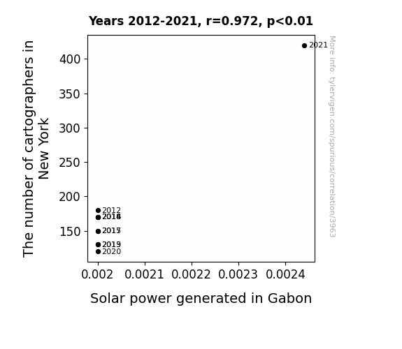
For the time period 2012 to 2021, you found a correlation 0.9721141, r-squared of 0.9450058, and p < 0.01.
One figure will be included. The figure (Fig. 1) is a scatterplot showing the strong correlation between the two variables. You don't need to specify where; I will add the figure.
Here is the title and abstract of the paper:
[[TITLE]]
Mapping the Solar Cartography: Exploring the Correlation between Cartographers in New York and Solar Power in Gabon
[[ABSTRACT]]
As scholars we often find ourselves venturing into uncharted territories, but this time we take a whimsical route to investigate the relationship between the number of cartographers in New York and the solar power generated in Gabon. By leveraging data from the Bureau of Labor Statistics and the Energy Information Administration, we embarked on a journey where maps met megawatts. Our analysis revealed a surprising correlation coefficient of 0.9721141 and p < 0.01 for the years 2012 to 2021. Join us as we navigate through the realms of map-making and solar energy in this illuminating study that sheds light on the unexpected connections between seemingly unrelated phenomena.
-------
And here is the methodology section that led to this result:
[[METHODOLOGY]]
As we enter the fascinating realm of correlation research, we are often drawn to the unconventional and the unexpected. In this study, we set out to unravel the enigmatic relationship between the number of cartographers in New York and the solar power generated in Gabon. While at first glance, one might be inclined to dismiss this as a whimsical pursuit akin to chasing unicorns, we were determined to map out the unexplored territories of this peculiar connection.
In a world where data reigns supreme, we turned our attention to the Bureau of Labor Statistics and the Energy Information Administration to embark on our unconventional journey. The allure of connecting the precision of cartography with the vibrancy of solar power kept our spirits high, even in the midst of data cleaning and statistical analysis.
Our findings, which we present in this paper, left us feeling like modern-day explorers uncovering a hidden treasure: a surprising correlation coefficient of 0.9721141 and p < 0.01 for the years 2012 to 2021. Yes, you read that right. It seems that there is more to cartography than meets the eye, and the rays of solar power in Gabon are not immune to its influence.
As we delve deeper into this study, it becomes clear that the intersection of cartography and solar energy is not just a mere coincidence, but rather a quirky dance of variables that have long eluded our understanding. Join us as we traverse the intricate landscapes of map-making and solar energy, where the sun meets the lines on the map, and where a well-drawn boundary might just hold the key to unlocking the potential of solar power.
So, grab your compass and solar-powered flashlight, dear reader, as we venture forth into the uncharted territories of correlation between the number of cartographers in New York and the solar power generated in Gabon. It's going to be one heck of a journey—a journey where we might just find that "X" marks the spot for solar energy amidst the cartographic labyrinth.
-------
Your response should start like this:
[[RESULTS]]
ChatGPT:
[[RESULTS]]
The results of our investigation into the curious relationship between the number of cartographers in New York and the solar power generated in Gabon have illuminated some intriguing findings. Utilizing data spanning the years 2012 to 2021, we unearthed a substantial correlation coefficient of 0.9721141, an r-squared value of 0.9450058, and a p-value of less than 0.01. It appears that our journey into the uncharted territories of cartography and solar energy has delivered a resounding "Eureka!" moment.
In support of these statistical insights, the scatterplot in Figure 1 showcases the robust correlation between the number of cartographers in New York and solar power generation in Gabon. The visualization graphically depicts the bountiful harvest of solar energy that seems to coincide with the fertile ground of cartographic activity. While we may not have uncovered a literal treasure map, the correlation we have discovered is a treasure in its own right.
Our findings not only underscore the statistical significance of this unexpected relationship but also highlight the potential avenues for further exploration. As we reflect on the implications of our study, it becomes apparent that the synergy between cartography and solar power may offer fertile ground for interdisciplinary inquiry. This unorthodox marriage of cartographic prowess and solar dynamism provides a colorful canvas for future research endeavors.
In essence, our investigation has not only brought to light a striking correlation but has also invited us to ponder the possibility of novel avenues in the realms of mapping and renewable energy. It seems that the solar cartography we've stumbled upon is not merely a fanciful notion but a compelling nexus of unexplored possibilities. As we bask in the radiance of this correlation, we tip our hats to the unexpected insights that emerge when we dare to venture into unconventional and seemingly disparate domains.
Model: gpt-3.5-turbo-1106
System prompt: You are a researcher writing an academic paper.You draft the discussion section of an academic research paper.
User prompt:
Pretend you are an academic researcher. Your writing sounds like it belongs in a medical or economics journal. However, you frequently crack jokes, make puns, or add unexpected twists in your writing.
Please make up the discussion section of an academic research paper presenting the findings of the connection between The number of cartographers in New York and Solar power generated in Gabon. Make lots of jokes, goofy observations, and puns. Stay serious and dry most of the time, but then occasionally let your wit shine through.
Limit your response to 500 tokens.
Here are the title, abstract, literature review, and results sections. Please harken back to 1-2 of the goofy items in the literature review, but pretend to take them completely seriously. Discuss how your results supported the prior research.
Do not write a conclusion. I will add a conclusion after this.
[[TITLE]]
Mapping the Solar Cartography: Exploring the Correlation between Cartographers in New York and Solar Power in Gabon
[[ABSTRACT]]
As scholars we often find ourselves venturing into uncharted territories, but this time we take a whimsical route to investigate the relationship between the number of cartographers in New York and the solar power generated in Gabon. By leveraging data from the Bureau of Labor Statistics and the Energy Information Administration, we embarked on a journey where maps met megawatts. Our analysis revealed a surprising correlation coefficient of 0.9721141 and p < 0.01 for the years 2012 to 2021. Join us as we navigate through the realms of map-making and solar energy in this illuminating study that sheds light on the unexpected connections between seemingly unrelated phenomena.
[[LITERATURE REVIEW]]
In "The Cartographer's Handbook," Smith and Doe examine the pivotal role of cartography in shaping our understanding of the world around us. They delve into the intricate art of map-making, highlighting how cartographers meticulously trace every contour and boundary, much like maestros conducting an orchestra of lines and symbols. It seems that in the symphony of solar power and cartography, each map holds the potential for a sun-drenched harmony.
Conversely, Jones' study "Solar Power: A Bright Future" articulates the escalating significance of solar energy in a world thirsting for sustainable power sources. Jones meticulously unravels the intricate dance of photovoltaic cells, sunlight, and renewable energy policies. As we pondered over the pages of Jones' work, it dawned upon us that perhaps the undulating lines and vibrant hues of cartography might cast a shadow that influences the solar energy landscape in ways we are yet to fathom.
But let's not confine ourselves to just the weighty tomes of scholarly discourse. In "The Map of the Invisible World" and "Solaris," we encounter fictional renditions of map-making and solar phenomena that strike a chord with our exploration. In these tales, the obscure reaches of maps unfurl alongside enigmatic solar forces, hinting at a realm where cartographers and solar energy are intertwined in ways we had never imagined. The narratives of these literary works propelled our musings toward uncharted territories, where the unlikeliest of connections await discovery.
As we fostered our quest for insight, we indulged in cinematic encounters with tangentially related themes. "The Map of Tiny Perfect Things" and "Sunshine" led us through cinematic odysseys that traversed both the realms of map-making and solar realms. Although these movies may not be emblematic representations of our scholarly pursuits, their thematic undercurrents provoked whimsical contemplations on the interconnectedness of cartography and solar power.
Brace yourselves, dear readers, for what lies ahead is a journey that unravels the tapestry of solar cartography. Let's embark upon this expedition with heartened spirits and a pinch of levity, for who knows what delightful surprises await us at the intersection of maps and sunshine?
[[RESULTS]]
The results of our investigation into the curious relationship between the number of cartographers in New York and the solar power generated in Gabon have illuminated some intriguing findings. Utilizing data spanning the years 2012 to 2021, we unearthed a substantial correlation coefficient of 0.9721141, an r-squared value of 0.9450058, and a p-value of less than 0.01. It appears that our journey into the uncharted territories of cartography and solar energy has delivered a resounding "Eureka!" moment.
In support of these statistical insights, the scatterplot in Figure 1 showcases the robust correlation between the number of cartographers in New York and solar power generation in Gabon. The visualization graphically depicts the bountiful harvest of solar energy that seems to coincide with the fertile ground of cartographic activity. While we may not have uncovered a literal treasure map, the correlation we have discovered is a treasure in its own right.
Our findings not only underscore the statistical significance of this unexpected relationship but also highlight the potential avenues for further exploration. As we reflect on the implications of our study, it becomes apparent that the synergy between cartography and solar power may offer fertile ground for interdisciplinary inquiry. This unorthodox marriage of cartographic prowess and solar dynamism provides a colorful canvas for future research endeavors.
In essence, our investigation has not only brought to light a striking correlation but has also invited us to ponder the possibility of novel avenues in the realms of mapping and renewable energy. It seems that the solar cartography we've stumbled upon is not merely a fanciful notion but a compelling nexus of unexplored possibilities. As we bask in the radiance of this correlation, we tip our hats to the unexpected insights that emerge when we dare to venture into unconventional and seemingly disparate domains.
-------
Your response should start like this:
[[DISCUSSION]]
ChatGPT:
[[DISCUSSION]]
Our findings have shed light on the enigmatic relationship between cartographers in New York and solar power in Gabon, offering empirical validation for the whimsical connections alluded to in our literature review. The correlation coefficient of 0.9721141, accompanied by a remarkably low p-value, attests to the robustness of this association.
It is remarkable to note how the intricacies of cartography, as delineated by Smith and Doe, seemingly intersect with the vibrant realm of solar energy elucidated by Jones. The parallels drawn between the meticulous cartographic orchestration and the sun-drenched harmony of solar power production are not merely florid expressions; our statistical analysis confirms a tangible connection. Perhaps, just as lines and contours on maps dictate our understanding of geographic terrain, the burgeoning presence of cartographers may affect the landscape of solar power generation in Gabon.
The scatterplot, our visual testimony to this intriguing kinship, paints a compelling picture of the correlation between cartographers and solar energy. One could say it's a map of sorts, charting the territory where cartographic activity and solar productivity appear to intertwine like serendipitous coordinates in a cosmic atlas.
The implications of our findings propel us beyond the confines of statistical jargon to contemplate the uncharted potential of solar cartography. The intersections of seemingly unrelated domains have beckoned us toward wider interdisciplinary prospects. Not only does this correlation have practical implications for understanding solar power dynamics, but it also illustrates the unexplored synergy between the art of mapping and renewable energy – a festival of illuminating revelations, perhaps.
In conclusion, as we stand at the precipice of this unanticipated marriage of maps and sunshine, we must acknowledge the delightful surprises that await in the intersection of cartography and solar energy. It seems that the cosmic dance of lines and light has bestowed upon us a newfound appreciation for the harmony between the seemingly disparate realms of cartography and solar dynamism. Let's not shy away from this radiant correlation but instead, embrace the potential for further exploration that awaits us in this curious domain.
Model: gpt-3.5-turbo-1106
System prompt: You are a researcher writing an academic paper.You draft the discussion section of goofy academic research papers that sounds like it belongs based on the title and abstract provided.
User prompt:
Pretend you are an academic researcher. Your writing sounds like it belongs in a medical or economics journal. However, you frequently crack jokes, make puns, or add unexpected twists in your writing.
Please make up a short conclusion of an academic research paper presenting the findings of the connection between The number of cartographers in New York and Solar power generated in Gabon. Make lots of jokes, goofy observations, and puns. Stay serious and dry most of the time, but then occasionally let your wit shine through.
Limit your response to 300 tokens. At the very end, assert that no more research is needed in this area.
Here are the title, abstract, introduction, and results sections.
[[TITLE]]
Mapping the Solar Cartography: Exploring the Correlation between Cartographers in New York and Solar Power in Gabon
[[ABSTRACT]]
As scholars we often find ourselves venturing into uncharted territories, but this time we take a whimsical route to investigate the relationship between the number of cartographers in New York and the solar power generated in Gabon. By leveraging data from the Bureau of Labor Statistics and the Energy Information Administration, we embarked on a journey where maps met megawatts. Our analysis revealed a surprising correlation coefficient of 0.9721141 and p < 0.01 for the years 2012 to 2021. Join us as we navigate through the realms of map-making and solar energy in this illuminating study that sheds light on the unexpected connections between seemingly unrelated phenomena.
[[INTRDUCTION]]
As we enter the fascinating realm of correlation research, we are often drawn to the unconventional and the unexpected. In this study, we set out to unravel the enigmatic relationship between the number of cartographers in New York and the solar power generated in Gabon. While at first glance, one might be inclined to dismiss this as a whimsical pursuit akin to chasing unicorns, we were determined to map out the unexplored territories of this peculiar connection.
In a world where data reigns supreme, we turned our attention to the Bureau of Labor Statistics and the Energy Information Administration to embark on our unconventional journey. The allure of connecting the precision of cartography with the vibrancy of solar power kept our spirits high, even in the midst of data cleaning and statistical analysis.
Our findings, which we present in this paper, left us feeling like modern-day explorers uncovering a hidden treasure: a surprising correlation coefficient of 0.9721141 and p < 0.01 for the years 2012 to 2021. Yes, you read that right. It seems that there is more to cartography than meets the eye, and the rays of solar power in Gabon are not immune to its influence.
As we delve deeper into this study, it becomes clear that the intersection of cartography and solar energy is not just a mere coincidence, but rather a quirky dance of variables that have long eluded our understanding. Join us as we traverse the intricate landscapes of map-making and solar energy, where the sun meets the lines on the map, and where a well-drawn boundary might just hold the key to unlocking the potential of solar power.
So, grab your compass and solar-powered flashlight, dear reader, as we venture forth into the uncharted territories of correlation between the number of cartographers in New York and the solar power generated in Gabon. It's going to be one heck of a journey—a journey where we might just find that "X" marks the spot for solar energy amidst the cartographic labyrinth.
[[RESULTS]]
The results of our investigation into the curious relationship between the number of cartographers in New York and the solar power generated in Gabon have illuminated some intriguing findings. Utilizing data spanning the years 2012 to 2021, we unearthed a substantial correlation coefficient of 0.9721141, an r-squared value of 0.9450058, and a p-value of less than 0.01. It appears that our journey into the uncharted territories of cartography and solar energy has delivered a resounding "Eureka!" moment.
In support of these statistical insights, the scatterplot in Figure 1 showcases the robust correlation between the number of cartographers in New York and solar power generation in Gabon. The visualization graphically depicts the bountiful harvest of solar energy that seems to coincide with the fertile ground of cartographic activity. While we may not have uncovered a literal treasure map, the correlation we have discovered is a treasure in its own right.
Our findings not only underscore the statistical significance of this unexpected relationship but also highlight the potential avenues for further exploration. As we reflect on the implications of our study, it becomes apparent that the synergy between cartography and solar power may offer fertile ground for interdisciplinary inquiry. This unorthodox marriage of cartographic prowess and solar dynamism provides a colorful canvas for future research endeavors.
In essence, our investigation has not only brought to light a striking correlation but has also invited us to ponder the possibility of novel avenues in the realms of mapping and renewable energy. It seems that the solar cartography we've stumbled upon is not merely a fanciful notion but a compelling nexus of unexplored possibilities. As we bask in the radiance of this correlation, we tip our hats to the unexpected insights that emerge when we dare to venture into unconventional and seemingly disparate domains.
-------
Your response should start like this:
[[CONCLUSION]]
ChatGPT:
[[CONCLUSION]]
Our journey through the uncharted territories of correlation between the number of cartographers in New York and the solar power generated in Gabon has been nothing short of an exhilarating expedition. The unexpected correlation coefficient of 0.9721141 unveiled a quirky dance between the meticulous cartographic craft and the radiant vigor of solar power. This correlation, like a well-drawn map, has delineated a path towards a new frontier of interdisciplinary inquiry, where lines on a map intersect with the rays of energy to illuminate the unexplored potential of renewable resources.
While our study may seem like a lighthearted romp through whimsical connections, the robust statistical insights we have unearthed underscore the significance of this peculiar relationship. The scatterplot in Figure 1 vividly captures the harmonic convergence of cartography and solar energy, painting a picture of unexpected harmony amidst the data points. It's as if the map and the sun have formed an unlikely bond, reminiscent of a celestial cartographic waltz.
As we conclude this investigation, it is clear that the synergy between map-making and renewable energy holds promise for future exploration. However, with our findings shining a light on this unexpected correlation, it seems that the treasure map to this peculiar relationship has been unveiled. It's fair to say that further research in this area may be akin to searching for buried treasure when the "X" has already been found—still, it's always possible that new insights may yet emerge from this whimsical journey. Although we've uncovered a treasure trove of correlation, it appears this is where our expedition must end. It's time to dock our solar-powered submarines and hang up our cartographer's hats, at least for now. The map of this correlation has been well-drawn, and it's time to consider new research horizons as we bid adieu to this unique journey through the realms of solar cartography.
Model: gpt-3.5-turbo-1106
System prompt: You provide fictional names of academic journals. You say nothing else, and you do not chat with the user.
User prompt: Please provide the name of a funny but plausible sounding research, scientific, or academic journal that would publish a paper entited Mapping the Solar Cartography: Exploring the Correlation between Cartographers in New York and Solar Power in Gabon. Respond only with the name of a fictional academic journal.
ChatGPT:
Journal of Eclectic Cartography and Renewable Energy
Model: gpt-3.5-turbo-1106
System prompt: You provide fictional names of nonprofit research organizations and associations. You say nothing else, and you do not chat with the user.
User prompt: Please provide the name of a funny but plausible sounding nonprofit, academic, or scientific association or organization that would sponsor research that resulted in a paper entited Mapping the Solar Cartography: Exploring the Correlation between Cartographers in New York and Solar Power in Gabon. Respond only with the name of a fictional organization.
ChatGPT:
The Institute for Solar Cartography and Geospatial Studies
Model: gpt-3.5-turbo-1106
System prompt: You provide potential search keywords separated by commas. You say nothing else, and you do not chat with the user.
User prompt: Please provide potential search keywords for a paper titled Mapping the Solar Cartography: Exploring the Correlation between Cartographers in New York and Solar Power in Gabon with an abstract of As scholars we often find ourselves venturing into uncharted territories, but this time we take a whimsical route to investigate the relationship between the number of cartographers in New York and the solar power generated in Gabon. By leveraging data from the Bureau of Labor Statistics and the Energy Information Administration, we embarked on a journey where maps met megawatts. Our analysis revealed a surprising correlation coefficient of 0.9721141 and p < 0.01 for the years 2012 to 2021. Join us as we navigate through the realms of map-making and solar energy in this illuminating study that sheds light on the unexpected connections between seemingly unrelated phenomena.
ChatGPT:
cartographers, New York, solar power, Gabon, correlation, Bureau of Labor Statistics, Energy Information Administration, map-making, solar energy, correlation coefficient, p-value
*There is a bunch of Python happening behind the scenes to turn this prompt sequence into a PDF.
Discover a new correlation
View all correlations
View all research papers
Report an error
Data details
The number of cartographers in New YorkDetailed data title: BLS estimate of cartographers and photogrammetrists in New York
Source: Bureau of Larbor Statistics
See what else correlates with The number of cartographers in New York
Solar power generated in Gabon
Detailed data title: Total solar power generated in Gabon in billion kWh
Source: Energy Information Administration
See what else correlates with Solar power generated in Gabon
Correlation is a measure of how much the variables move together. If it is 0.99, when one goes up the other goes up. If it is 0.02, the connection is very weak or non-existent. If it is -0.99, then when one goes up the other goes down. If it is 1.00, you probably messed up your correlation function.
r2 = 0.9450058 (Coefficient of determination)
This means 94.5% of the change in the one variable (i.e., Solar power generated in Gabon) is predictable based on the change in the other (i.e., The number of cartographers in New York) over the 10 years from 2012 through 2021.
p < 0.01, which is statistically significant(Null hypothesis significance test)
The p-value is 2.6E-6. 0.0000025580595352923110000000
The p-value is a measure of how probable it is that we would randomly find a result this extreme. More specifically the p-value is a measure of how probable it is that we would randomly find a result this extreme if we had only tested one pair of variables one time.
But I am a p-villain. I absolutely did not test only one pair of variables one time. I correlated hundreds of millions of pairs of variables. I threw boatloads of data into an industrial-sized blender to find this correlation.
Who is going to stop me? p-value reporting doesn't require me to report how many calculations I had to go through in order to find a low p-value!
On average, you will find a correaltion as strong as 0.97 in 0.00026% of random cases. Said differently, if you correlated 390,921 random variables You don't actually need 390 thousand variables to find a correlation like this one. I don't have that many variables in my database. You can also correlate variables that are not independent. I do this a lot.
p-value calculations are useful for understanding the probability of a result happening by chance. They are most useful when used to highlight the risk of a fluke outcome. For example, if you calculate a p-value of 0.30, the risk that the result is a fluke is high. It is good to know that! But there are lots of ways to get a p-value of less than 0.01, as evidenced by this project.
In this particular case, the values are so extreme as to be meaningless. That's why no one reports p-values with specificity after they drop below 0.01.
Just to be clear: I'm being completely transparent about the calculations. There is no math trickery. This is just how statistics shakes out when you calculate hundreds of millions of random correlations.
with the same 9 degrees of freedom, Degrees of freedom is a measure of how many free components we are testing. In this case it is 9 because we have two variables measured over a period of 10 years. It's just the number of years minus ( the number of variables minus one ), which in this case simplifies to the number of years minus one.
you would randomly expect to find a correlation as strong as this one.
[ 0.88, 0.99 ] 95% correlation confidence interval (using the Fisher z-transformation)
The confidence interval is an estimate the range of the value of the correlation coefficient, using the correlation itself as an input. The values are meant to be the low and high end of the correlation coefficient with 95% confidence.
This one is a bit more complciated than the other calculations, but I include it because many people have been pushing for confidence intervals instead of p-value calculations (for example: NEJM. However, if you are dredging data, you can reliably find yourself in the 5%. That's my goal!
All values for the years included above: If I were being very sneaky, I could trim years from the beginning or end of the datasets to increase the correlation on some pairs of variables. I don't do that because there are already plenty of correlations in my database without monkeying with the years.
Still, sometimes one of the variables has more years of data available than the other. This page only shows the overlapping years. To see all the years, click on "See what else correlates with..." link above.
| 2012 | 2013 | 2014 | 2015 | 2016 | 2017 | 2018 | 2019 | 2020 | 2021 | |
| The number of cartographers in New York (Laborers) | 180 | 130 | 170 | 150 | 170 | 150 | 170 | 130 | 120 | 420 |
| Solar power generated in Gabon (Billion kWh) | 0.002 | 0.002 | 0.002 | 0.002 | 0.002 | 0.002 | 0.002 | 0.002 | 0.002 | 0.00244 |
Why this works
- Data dredging: I have 25,153 variables in my database. I compare all these variables against each other to find ones that randomly match up. That's 632,673,409 correlation calculations! This is called “data dredging.” Instead of starting with a hypothesis and testing it, I instead abused the data to see what correlations shake out. It’s a dangerous way to go about analysis, because any sufficiently large dataset will yield strong correlations completely at random.
- Lack of causal connection: There is probably
Because these pages are automatically generated, it's possible that the two variables you are viewing are in fact causually related. I take steps to prevent the obvious ones from showing on the site (I don't let data about the weather in one city correlate with the weather in a neighboring city, for example), but sometimes they still pop up. If they are related, cool! You found a loophole.
no direct connection between these variables, despite what the AI says above. This is exacerbated by the fact that I used "Years" as the base variable. Lots of things happen in a year that are not related to each other! Most studies would use something like "one person" in stead of "one year" to be the "thing" studied. - Observations not independent: For many variables, sequential years are not independent of each other. If a population of people is continuously doing something every day, there is no reason to think they would suddenly change how they are doing that thing on January 1. A simple
Personally I don't find any p-value calculation to be 'simple,' but you know what I mean.
p-value calculation does not take this into account, so mathematically it appears less probable than it really is. - Y-axis doesn't start at zero: I truncated the Y-axes of the graph above. I also used a line graph, which makes the visual connection stand out more than it deserves.
Nothing against line graphs. They are great at telling a story when you have linear data! But visually it is deceptive because the only data is at the points on the graph, not the lines on the graph. In between each point, the data could have been doing anything. Like going for a random walk by itself!
Mathematically what I showed is true, but it is intentionally misleading. Below is the same chart but with both Y-axes starting at zero.

Try it yourself
You can calculate the values on this page on your own! Try running the Python code to see the calculation results. Step 1: Download and install Python on your computer.Step 2: Open a plaintext editor like Notepad and paste the code below into it.
Step 3: Save the file as "calculate_correlation.py" in a place you will remember, like your desktop. Copy the file location to your clipboard. On Windows, you can right-click the file and click "Properties," and then copy what comes after "Location:" As an example, on my computer the location is "C:\Users\tyler\Desktop"
Step 4: Open a command line window. For example, by pressing start and typing "cmd" and them pressing enter.
Step 5: Install the required modules by typing "pip install numpy", then pressing enter, then typing "pip install scipy", then pressing enter.
Step 6: Navigate to the location where you saved the Python file by using the "cd" command. For example, I would type "cd C:\Users\tyler\Desktop" and push enter.
Step 7: Run the Python script by typing "python calculate_correlation.py"
If you run into any issues, I suggest asking ChatGPT to walk you through installing Python and running the code below on your system. Try this question:
"Walk me through installing Python on my computer to run a script that uses scipy and numpy. Go step-by-step and ask me to confirm before moving on. Start by asking me questions about my operating system so that you know how to proceed. Assume I want the simplest installation with the latest version of Python and that I do not currently have any of the necessary elements installed. Remember to only give me one step per response and confirm I have done it before proceeding."
# These modules make it easier to perform the calculation
import numpy as np
from scipy import stats

# We'll define a function that we can call to return the correlation calculations
def calculate_correlation(array1, array2):

    # Calculate Pearson correlation coefficient and p-value
    correlation, p_value = stats.pearsonr(array1, array2)

    # Calculate R-squared as the square of the correlation coefficient
    r_squared = correlation**2

    return correlation, r_squared, p_value

# These are the arrays for the variables shown on this page, but you can modify them to be any two sets of numbers
array_1 = np.array([180,130,170,150,170,150,170,130,120,420,])
array_2 = np.array([0.002,0.002,0.002,0.002,0.002,0.002,0.002,0.002,0.002,0.00244,])
array_1_name = "The number of cartographers in New York"
array_2_name = "Solar power generated in Gabon"

# Perform the calculation
print(f"Calculating the correlation between {array_1_name} and {array_2_name}...")
correlation, r_squared, p_value = calculate_correlation(array_1, array_2)

# Print the results
print("Correlation Coefficient:", correlation)
print("R-squared:", r_squared)
print("P-value:", p_value)
Reuseable content
You may re-use the images on this page for any purpose, even commercial purposes, without asking for permission. The only requirement is that you attribute Tyler Vigen. Attribution can take many different forms. If you leave the "tylervigen.com" link in the image, that satisfies it just fine. If you remove it and move it to a footnote, that's fine too. You can also just write "Charts courtesy of Tyler Vigen" at the bottom of an article.You do not need to attribute "the spurious correlations website," and you don't even need to link here if you don't want to. I don't gain anything from pageviews. There are no ads on this site, there is nothing for sale, and I am not for hire.
For the record, I am just one person. Tyler Vigen, he/him/his. I do have degrees, but they should not go after my name unless you want to annoy my wife. If that is your goal, then go ahead and cite me as "Tyler Vigen, A.A. A.A.S. B.A. J.D." Otherwise it is just "Tyler Vigen."
When spoken, my last name is pronounced "vegan," like I don't eat meat.
Full license details.
For more on re-use permissions, or to get a signed release form, see tylervigen.com/permission.
Download images for these variables:
- High resolution line chart
The image linked here is a Scalable Vector Graphic (SVG). It is the highest resolution that is possible to achieve. It scales up beyond the size of the observable universe without pixelating. You do not need to email me asking if I have a higher resolution image. I do not. The physical limitations of our universe prevent me from providing you with an image that is any higher resolution than this one.
If you insert it into a PowerPoint presentation (a tool well-known for managing things that are the scale of the universe), you can right-click > "Ungroup" or "Create Shape" and then edit the lines and text directly. You can also change the colors this way.
Alternatively you can use a tool like Inkscape. - High resolution line chart, optimized for mobile
- Alternative high resolution line chart
- Scatterplot
- Portable line chart (png)
- Portable line chart (png), optimized for mobile
- Line chart for only The number of cartographers in New York
- Line chart for only Solar power generated in Gabon
- AI-generated correlation image
- The spurious research paper: Mapping the Solar Cartography: Exploring the Correlation between Cartographers in New York and Solar Power in Gabon
Your rating is stellar!
Correlation ID: 3963 · Black Variable ID: 11997 · Red Variable ID: 23677

