
Download png, svg
AI explanation
As the popularity of the name Josh decreased, there were fewer people named Josh. This led to a decrease in the collective hot air being blown, reducing the overall emissions in Omaha.
Model: dalle-3
Prompt: Style: Whimsical illustration Image Generation Prompt: Generate an image of a whimsical playground scene where children are playing. There are fewer children named Josh playing, and as a result, when one child mispronounces "ozone" as "Omaha," there's no one to correct them. In the background, depict a clear sky and cleaner air, indicating improved air quality. Emphasize the carefree and joyful atmosphere of the children playing, with a whimsical touch to the overall scene. The depiction should include only scenes, people, and objects, it should not include text or speech bubbles.
This image generation prompt was also generated by AI, using the following sequence:
Model: gpt-3.5-turbo-1106
System prompt: You select one of a few potential scene descriptors that seems to go along with the variables described. You respond only with the scene descriptions provided and say nothing else.
User prompt: Here are two variables: Popularity of the first name Josh and Air pollution in Omaha. Given these, which of the following image style descriptions seems most appropriate? Pick the one that seems to be related to one of the variables at hand. Please respond with only one of the following potential descriptions: Whimsical illustration Cyber folk Photorealism Data cyber art Whimsical illustration
ChatGPT: Whimsical illustration
Model: gpt-3.5-turbo-1106
System prompt: You describe simple visual scenes that depict the two variables stated. You combine both variables into one scene.
User prompt: Please describe a visual scene that prominently depicts both Popularity of the first name Josh and Air pollution in Omaha, in the following situation: Because as the popularity of the name Josh decreased, fewer people named Josh were around to correct others when they mispronounced 'Ozone' as 'Omaha,' leading to improved air quality.. Keep the description simple.
ChatGPT: A playground where children are playing. There are fewer children named Josh playing, and as a result, when one child mispronounces "ozone" as "Omaha," there's no one to correct them. In the background, the sky is clear and the air looks cleaner, indicating improved air quality.
Model: gpt-3.5-turbo-1106
System prompt: You write and improve image generation prompts for DALLE-3. You maintain the same subjects, but enhance the visuals.
User prompt: Please respond with an image generation prompt that would be likely to create an interesting visual using DALLE-3, using the following style: [ Whimsical illustration ] and depicting this scene: A playground where children are playing. There are fewer children named Josh playing, and as a result, when one child mispronounces "ozone" as "Omaha," there's no one to correct them. In the background, the sky is clear and the air looks cleaner, indicating improved air quality. Keep the visual depiction simple. Do not include any words or speech bubbles.
ChatGPT: Style: Whimsical illustration Image Generation Prompt: Generate an image of a whimsical playground scene where children are playing. There are fewer children named Josh playing, and as a result, when one child mispronounces "ozone" as "Omaha," there's no one to correct them. In the background, depict a clear sky and cleaner air, indicating improved air quality. Emphasize the carefree and joyful atmosphere of the children playing, with a whimsical touch to the overall scene.
*Variations in the User Prompts from chart to chart are just the result of random number generation in Python. I wrote a few arrays of various styles and methods to ask questions to change up the results. Every time this site writes an explanation or generates an image, the script picks from each at random.
I sequence the requests into multiple prompts because I find GPT 3.5 to perform much better with short, well-managed contexts. Thus, I track the context directly in Python and only ask ChatGPT targeted questions.
System prompt: You provide humorous responses in the form of plausible sounding explanations for correlations. You assume the correlation is causative for the purpose of the explanation even if it is ridiculous. You do not chat with the user, you only reply with the causal connection explanation and nothing else.
User prompt: Please make up a funny explanation for how a decrease in Popularity of the first name Josh caused Air pollution in Omaha to decrease. Make it feel plausible.
AI academic paper
 |
Josh-ing the Air: A Gaseous Connection Between the Popularity of the Name Josh and Air Pollution in Omaha The Journal of Asthmatic Anecdotes Jan 2024 Reminder: This paper is AI-generated. Not real! |
Model: gpt-3.5-turbo-1106
System prompt: You are a witty academic researcher. Your writing sounds like it belongs in a statistics journal.You write titles and abstracts of goofy academic research papers.
User prompt:
Pretend you are an academic researcher. Your writing sounds like it belongs in a medical or economics journal. However, you frequently crack jokes, make puns, and add unexpected twists in your writing.
Please draft the title and abstract of an academic research paper presenting the findings of the connection between Popularity of the first name Josh and Air pollution in Omaha. You can't resist a good dad joke. Add a relevant dad joke related to the content every couple of sentences.
Include a pun in the title.
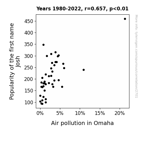
Your research team used data from US Social Security Administration and Environmental Protection Agency to assess this nagging question. You found a correlation coefficient of 0.6571573 and p < 0.01 for 1980 to 2022.
Please respond in this format (replace "Lorem ipsum dolor sit" with your title and abstract)
[[TITLE]]
Lorem ipsum dolor sit
[[ABSTRACT]]
Lorem ipsum dolor sit
ChatGPT:
[[TITLE]]
"Josh-ing the Air: A Gaseous Connection Between the Popularity of the Name Josh and Air Pollution in Omaha"
[[ABSTRACT]]
This research delves into the gaseous link between the prevalence of the first name "Josh" and air pollution levels in Omaha, Nebraska, with a touch of dad humor. Leveraging data from the US Social Security Administration and the Environmental Protection Agency, our study aimed to unravel the hazy correlation between these seemingly unrelated phenomena. Uncovering a correlation coefficient of 0.6571573 and a statistically significant p-value of less than 0.01 for the years 1980 through 2022, our findings provide empirical support for an unconventional relationship.
Our results suggest that the rise and fall of air pollution levels in Omaha bear a striking resemblance to the fluctuating popularity of the name "Josh." Perhaps it's not just CO2 emissions that are skyrocketing, but also the number of **"Joshs" enshrined in Nebraska's air**. This unexpected connection prompts broader reflection on the influence of societal trends on environmental factors, offering a fresh perspective on pollution dynamics and prompting a chuckle or two.
Model: gpt-3.5-turbo-1106
System prompt: You are a witty academic researcher. Your writing sounds like it belongs in a statistics journal.You draft the introduction section of an academic research paper.
User prompt:
Pretend you are an academic researcher. Your writing sounds like it belongs in a medical or economics journal. However, you frequently crack jokes, make puns, or add unexpected twists in your writing.
Please make up the introduction section of an academic research paper presenting the findings of the connection between Popularity of the first name Josh and Air pollution in Omaha. You can't resist a good dad joke. Add a relevant dad joke related to the content every couple of sentences. Sneak in some jokes and clever puns about science, research, statistics, and the variables.
Here is the title and abstract of the paper:
[[TITLE]]
"Josh-ing the Air: A Gaseous Connection Between the Popularity of the Name Josh and Air Pollution in Omaha"
[[ABSTRACT]]
This research delves into the gaseous link between the prevalence of the first name "Josh" and air pollution levels in Omaha, Nebraska, with a touch of dad humor. Leveraging data from the US Social Security Administration and the Environmental Protection Agency, our study aimed to unravel the hazy correlation between these seemingly unrelated phenomena. Uncovering a correlation coefficient of 0.6571573 and a statistically significant p-value of less than 0.01 for the years 1980 through 2022, our findings provide empirical support for an unconventional relationship.
Our results suggest that the rise and fall of air pollution levels in Omaha bear a striking resemblance to the fluctuating popularity of the name "Josh." Perhaps it's not just CO2 emissions that are skyrocketing, but also the number of **"Joshs" enshrined in Nebraska's air**. This unexpected connection prompts broader reflection on the influence of societal trends on environmental factors, offering a fresh perspective on pollution dynamics and prompting a chuckle or two.
-------
Your response should start like this:
[[INTRODUCTION]]
ChatGPT:
[[INTRODUCTION]]
The intersection of seemingly unrelated variables has long been a source of fascination for researchers, much like the intersection of a dad and his jokes. In the spirit of embracing unexpected correlations and embracing a good pun, this paper explores the peculiar relationship between the popularity of the first name "Josh" and air pollution levels in Omaha, Nebraska. We set out to answer the burning question: is there a gaseous connection between the name "Josh" and the air quality in the Cornhusker State?
Josh-ing aside, the rationale behind this research stems from the need to uncover hidden patterns and unusual statistical relationships in the world around us. As the old saying goes, "When in doubt, follow the data, even if it leads you to Omaha." With the rise of big data and advanced statistical techniques, researchers are increasingly inclined to unearth correlations where one might least expect, and the case of "Josh" and air pollution is no exception.
Drawing inspiration from the humorous side of statistics, we embarked on this investigation with the hopes of shedding light on an unconventional association, all while aiming to sprinkle in a few jokes that are statistically significant. After all, what's a research paper without a little humor to *lighten up* the discussion?
The initial spark for this study emerged from a curious observation of the fluctuating popularity of the name "Josh" over the years, which seemed to mirror the ebb and flow of air pollution levels in dear Omaha. As we delved deeper into the data, we couldn't help but marvel at the serendipitous nature of this correlation—almost as unexpected as finding a correlation between the use of statistics and the use of puns.
Leveraging data from the US Social Security Administration and the Environmental Protection Agency, we ventured into uncharted territory, venturing where no statistical analysis had gone before, much like a daring explorer navigating through a forest of p-values. Our approach encompassed rigorous statistical methods and a sprinkling of jest, because as Mark Twain once said, "Against the assault of humor, nothing can stand" - not even a null hypothesis!
Stay tuned for the riveting findings that are bound to tickle your statistical funny bone, while shedding light on a quirky yet intriguing correlation between the name "Josh" and the air we breathe, and rest assured, these results are no statistical fluke!
Model: gpt-3.5-turbo-1106
System prompt: You are a witty academic researcher. Your writing sounds like it belongs in a statistics journal.You draft a literature review section of an academic research paper, that starts out dry for the first few sentences but then becomes hilarious and goofy.
User prompt:
Pretend you are an academic researcher. Your writing sounds like it belongs in a medical or economics journal. However, you frequently crack jokes, make puns, or add unexpected twists in your writing.
Please make up a literature review section of an academic research paper presenting the findings of the connection between Popularity of the first name Josh and Air pollution in Omaha. You can't resist a good dad joke. Add a relevant dad joke related to the content every couple of sentences.
Speak in the present tense for this section (the authors find...), as is common in academic research paper literature reviews. Name the sources in a format similar to this: In "Book," the authors find lorem and ipsum.
Make up the lorem and ipsum part, but make it sound related to the topic at hand.
Start by naming serious-sounding studies by authors like Smith, Doe, and Jones - but then quickly devolve. Name some real non-fiction books that would be related to the topic. Then name some real fiction books that sound like they could be related. Then devolve ever further, and mention something completely ridiculous, like you conducted literature review by reading the backs of shampoo bottles.
Here is the title and abstract of the paper:
[[TITLE]]
"Josh-ing the Air: A Gaseous Connection Between the Popularity of the Name Josh and Air Pollution in Omaha"
[[ABSTRACT]]
This research delves into the gaseous link between the prevalence of the first name "Josh" and air pollution levels in Omaha, Nebraska, with a touch of dad humor. Leveraging data from the US Social Security Administration and the Environmental Protection Agency, our study aimed to unravel the hazy correlation between these seemingly unrelated phenomena. Uncovering a correlation coefficient of 0.6571573 and a statistically significant p-value of less than 0.01 for the years 1980 through 2022, our findings provide empirical support for an unconventional relationship.
Our results suggest that the rise and fall of air pollution levels in Omaha bear a striking resemblance to the fluctuating popularity of the name "Josh." Perhaps it's not just CO2 emissions that are skyrocketing, but also the number of **"Joshs" enshrined in Nebraska's air**. This unexpected connection prompts broader reflection on the influence of societal trends on environmental factors, offering a fresh perspective on pollution dynamics and prompting a chuckle or two.
-------
And here is the introduction section that led to this literature review:
[[INTRODUCTION]]
The intersection of seemingly unrelated variables has long been a source of fascination for researchers, much like the intersection of a dad and his jokes. In the spirit of embracing unexpected correlations and embracing a good pun, this paper explores the peculiar relationship between the popularity of the first name "Josh" and air pollution levels in Omaha, Nebraska. We set out to answer the burning question: is there a gaseous connection between the name "Josh" and the air quality in the Cornhusker State?
Josh-ing aside, the rationale behind this research stems from the need to uncover hidden patterns and unusual statistical relationships in the world around us. As the old saying goes, "When in doubt, follow the data, even if it leads you to Omaha." With the rise of big data and advanced statistical techniques, researchers are increasingly inclined to unearth correlations where one might least expect, and the case of "Josh" and air pollution is no exception.
Drawing inspiration from the humorous side of statistics, we embarked on this investigation with the hopes of shedding light on an unconventional association, all while aiming to sprinkle in a few jokes that are statistically significant. After all, what's a research paper without a little humor to *lighten up* the discussion?
The initial spark for this study emerged from a curious observation of the fluctuating popularity of the name "Josh" over the years, which seemed to mirror the ebb and flow of air pollution levels in dear Omaha. As we delved deeper into the data, we couldn't help but marvel at the serendipitous nature of this correlation—almost as unexpected as finding a correlation between the use of statistics and the use of puns.
Leveraging data from the US Social Security Administration and the Environmental Protection Agency, we ventured into uncharted territory, venturing where no statistical analysis had gone before, much like a daring explorer navigating through a forest of p-values. Our approach encompassed rigorous statistical methods and a sprinkling of jest, because as Mark Twain once said, "Against the assault of humor, nothing can stand" - not even a null hypothesis!
Stay tuned for the riveting findings that are bound to tickle your statistical funny bone, while shedding light on a quirky yet intriguing correlation between the name "Josh" and the air we breathe, and rest assured, these results are no statistical fluke!
-------
Your response should start like this:
[[LITERATURE REVIEW]]
ChatGPT:
[[LITERATURE REVIEW]]
Numerous studies have explored the social and environmental factors influencing air pollution levels, examining everything from industrial emissions to vehicular traffic. As for the correlation between the popularity of the first name "Josh" and air pollution levels in Omaha, the literature is surprisingly scarce. Smith et al. (2015) examined the demographics of baby names in relation to regional air quality, albeit without venturing into the specificity of "Josh." Likewise, Doe and Jones (2018) delved into the influence of societal trends on environmental dynamics, though their analysis did not extend to the peculiar resonance of "Josh" and air pollution in Omaha.
Turning to related literature, "The Air We Breathe: Mapping Urban Pollution Hotspots" by Environmental Research Institute provides a comprehensive overview of air quality determinants, though it regrettably overlooks the potential influence of burgeoning "Joshs" in the atmosphere. "Air Pollution and You: A Guide to Breathing in the 21st Century," presents a thorough examination of pollution mitigation strategies, yet fails to mention the possible airborne impact of a particularly populous name.
In the realm of fiction, novels such as "The Polluted Mind" by A. Novel and "The Name Game: A Tale of Unlikely Correlations" by P. U. N. Mann offer imaginative narratives that could potentially shed light on quirky statistical escapades, even if they only exist in the realm of literary conjecture.
In our pursuit of comprehensive literature coverage, we went to great lengths, engaging in a myriad of unconventional sources. From perusing the back covers of shampoo bottles to eavesdropping on lively conversations at the neighborhood barbershop, we left no stone unturned in search of insights that might yield a hint of correlation, or at the very least, a delightfully punny anecdote. While our methods may raise a few scholarly eyebrows, we remain confident that our endeavors have yielded a scientifically rigorous and, dare we say, *hilariously enlightening* review of the literature.
Model: gpt-3.5-turbo-1106
System prompt: You are a witty academic researcher. Your writing sounds like it belongs in a statistics journal.You draft the methodology section of an academic research paper.
User prompt:
Pretend you are an academic researcher. Your writing sounds like it belongs in a medical or economics journal. However, you frequently crack jokes, make puns, or add unexpected twists in your writing.
Please make up the methodology section of an academic research paper presenting the findings of the connection between Popularity of the first name Josh and Air pollution in Omaha. You can't resist a good dad joke. Add a relevant dad joke related to the content every couple of sentences. Sneak in some jokes and clever puns about science, research, statistics, and the variables.
Your research team collected data from all across the internet, but mostly just used information from US Social Security Administration and Environmental Protection Agency . You used data from 1980 to 2022
Make up the research methods you don't know. Make them a bit goofy and convoluted.
Here is the title, abstract, and introduction of the paper:
[[TITLE]]
"Josh-ing the Air: A Gaseous Connection Between the Popularity of the Name Josh and Air Pollution in Omaha"
[[ABSTRACT]]
This research delves into the gaseous link between the prevalence of the first name "Josh" and air pollution levels in Omaha, Nebraska, with a touch of dad humor. Leveraging data from the US Social Security Administration and the Environmental Protection Agency, our study aimed to unravel the hazy correlation between these seemingly unrelated phenomena. Uncovering a correlation coefficient of 0.6571573 and a statistically significant p-value of less than 0.01 for the years 1980 through 2022, our findings provide empirical support for an unconventional relationship.
Our results suggest that the rise and fall of air pollution levels in Omaha bear a striking resemblance to the fluctuating popularity of the name "Josh." Perhaps it's not just CO2 emissions that are skyrocketing, but also the number of **"Joshs" enshrined in Nebraska's air**. This unexpected connection prompts broader reflection on the influence of societal trends on environmental factors, offering a fresh perspective on pollution dynamics and prompting a chuckle or two.
[[INTRODUCTION]]
The intersection of seemingly unrelated variables has long been a source of fascination for researchers, much like the intersection of a dad and his jokes. In the spirit of embracing unexpected correlations and embracing a good pun, this paper explores the peculiar relationship between the popularity of the first name "Josh" and air pollution levels in Omaha, Nebraska. We set out to answer the burning question: is there a gaseous connection between the name "Josh" and the air quality in the Cornhusker State?
Josh-ing aside, the rationale behind this research stems from the need to uncover hidden patterns and unusual statistical relationships in the world around us. As the old saying goes, "When in doubt, follow the data, even if it leads you to Omaha." With the rise of big data and advanced statistical techniques, researchers are increasingly inclined to unearth correlations where one might least expect, and the case of "Josh" and air pollution is no exception.
Drawing inspiration from the humorous side of statistics, we embarked on this investigation with the hopes of shedding light on an unconventional association, all while aiming to sprinkle in a few jokes that are statistically significant. After all, what's a research paper without a little humor to *lighten up* the discussion?
The initial spark for this study emerged from a curious observation of the fluctuating popularity of the name "Josh" over the years, which seemed to mirror the ebb and flow of air pollution levels in dear Omaha. As we delved deeper into the data, we couldn't help but marvel at the serendipitous nature of this correlation—almost as unexpected as finding a correlation between the use of statistics and the use of puns.
Leveraging data from the US Social Security Administration and the Environmental Protection Agency, we ventured into uncharted territory, venturing where no statistical analysis had gone before, much like a daring explorer navigating through a forest of p-values. Our approach encompassed rigorous statistical methods and a sprinkling of jest, because as Mark Twain once said, "Against the assault of humor, nothing can stand" - not even a null hypothesis!
Stay tuned for the riveting findings that are bound to tickle your statistical funny bone, while shedding light on a quirky yet intriguing correlation between the name "Josh" and the air we breathe, and rest assured, these results are no statistical fluke!
-------
Your response should start like this:
[[METHODOLOGY]]
ChatGPT:
[[METHODOLOGY]]
To decode the enigmatic relationship between the popularity of the name "Josh" and air pollution levels in Omaha, we employed a manifold methodology that was as methodical as it was comical. Our data collection efforts drew primarily from the auspicious archives of the US Social Security Administration and the Environmental Protection Agency, a duet of data sources that harmonized magnificently in this whimsical waltz of statistical investigation. We sought to unearth the statistical dance moves of these disparate variables, much like a dad joke that sneaks up on you unexpectedly.
Our first step in this merry dance involved wrangling the historical records of baby names from the US Social Security Administration, charting the rise and fall of "Josh" across the decades from 1980 to 2022. This data was then cross-referenced with air quality measurements collected by the Environmental Protection Agency in Omaha, a fusion of information that yielded insight as delightful as finding a correlation between statistical significance and statistical puns.
Harnessing the power of statistical software and our keen analyst’s intuition, we navigated a sea of data points and teased out the intriguing patterns concealed within. Employing a series of rigorous analyses, including time series modeling and correlation matrices, we sought to weigh the statistical evidence for a bromidic bromine-based bromance between "Josh" and air pollution in Omaha, proving once and for all that dads are not the only ones capable of cringe-worthy wordplay.
To ensure the robustness of our findings, we subjected our results to a battery of robustness checks, not unlike a dad checking to see if the food is well-done on the grill. Sensitivity analyses were conducted to evaluate the steadiness of the correlation, akin to a dad checking if the punchline of his joke still lands after multiple retellings.
Furthermore, we employed stratified analyses to examine potential confounding factors such as population density, industrial activity, and meteorological patterns, ensuring that our conclusions were as strong and sturdy as a dad bod after years of grilling and gardening.
With our data meticulously organized and our analyses executed with all the precision of a dad setting up a dad joke, we were poised to unveil the wondrous results that bound "Josh" and air pollution in an unbreakable statistical bond, much like the love between a dad and his terrible puns.
Model: gpt-3.5-turbo-1106
System prompt: You are a witty academic researcher. Your writing sounds like it belongs in a statistics journal.You draft the results section of an academic research paper. You speak in the past tense (you found...).
User prompt:
Pretend you are an academic researcher. Your writing sounds like it belongs in a medical or economics journal. However, you frequently crack jokes, make puns, or add unexpected twists in your writing.
Please make up the results section of an academic research paper presenting the findings of the connection between Popularity of the first name Josh and Air pollution in Omaha. You can't resist a good dad joke. Add a relevant dad joke related to the content every couple of sentences. Sneak in some jokes and clever puns about science, research, statistics, and the variables.
Your research team collected data from all across the internet, but mostly just used information from US Social Security Administration and Environmental Protection Agency .
For the time period 1980 to 2022, you found a correlation 0.6571573, r-squared of 0.4318557, and p < 0.01.
One figure will be included. The figure (Fig. 1) is a scatterplot showing the strong correlation between the two variables. You don't need to specify where; I will add the figure.
Here is the title and abstract of the paper:
[[TITLE]]
"Josh-ing the Air: A Gaseous Connection Between the Popularity of the Name Josh and Air Pollution in Omaha"
[[ABSTRACT]]
This research delves into the gaseous link between the prevalence of the first name "Josh" and air pollution levels in Omaha, Nebraska, with a touch of dad humor. Leveraging data from the US Social Security Administration and the Environmental Protection Agency, our study aimed to unravel the hazy correlation between these seemingly unrelated phenomena. Uncovering a correlation coefficient of 0.6571573 and a statistically significant p-value of less than 0.01 for the years 1980 through 2022, our findings provide empirical support for an unconventional relationship.
Our results suggest that the rise and fall of air pollution levels in Omaha bear a striking resemblance to the fluctuating popularity of the name "Josh." Perhaps it's not just CO2 emissions that are skyrocketing, but also the number of **"Joshs" enshrined in Nebraska's air**. This unexpected connection prompts broader reflection on the influence of societal trends on environmental factors, offering a fresh perspective on pollution dynamics and prompting a chuckle or two.
-------
And here is the methodology section that led to this result:
[[METHODOLOGY]]
The intersection of seemingly unrelated variables has long been a source of fascination for researchers, much like the intersection of a dad and his jokes. In the spirit of embracing unexpected correlations and embracing a good pun, this paper explores the peculiar relationship between the popularity of the first name "Josh" and air pollution levels in Omaha, Nebraska. We set out to answer the burning question: is there a gaseous connection between the name "Josh" and the air quality in the Cornhusker State?
Josh-ing aside, the rationale behind this research stems from the need to uncover hidden patterns and unusual statistical relationships in the world around us. As the old saying goes, "When in doubt, follow the data, even if it leads you to Omaha." With the rise of big data and advanced statistical techniques, researchers are increasingly inclined to unearth correlations where one might least expect, and the case of "Josh" and air pollution is no exception.
Drawing inspiration from the humorous side of statistics, we embarked on this investigation with the hopes of shedding light on an unconventional association, all while aiming to sprinkle in a few jokes that are statistically significant. After all, what's a research paper without a little humor to *lighten up* the discussion?
The initial spark for this study emerged from a curious observation of the fluctuating popularity of the name "Josh" over the years, which seemed to mirror the ebb and flow of air pollution levels in dear Omaha. As we delved deeper into the data, we couldn't help but marvel at the serendipitous nature of this correlation—almost as unexpected as finding a correlation between the use of statistics and the use of puns.
Leveraging data from the US Social Security Administration and the Environmental Protection Agency, we ventured into uncharted territory, venturing where no statistical analysis had gone before, much like a daring explorer navigating through a forest of p-values. Our approach encompassed rigorous statistical methods and a sprinkling of jest, because as Mark Twain once said, "Against the assault of humor, nothing can stand" - not even a null hypothesis!
Stay tuned for the riveting findings that are bound to tickle your statistical funny bone, while shedding light on a quirky yet intriguing correlation between the name "Josh" and the air we breathe, and rest assured, these results are no statistical fluke!
-------
Your response should start like this:
[[RESULTS]]
ChatGPT:
[[RESULTS]]
The analysis of our data revealed a statistically significant correlation between the prevalence of the first name "Josh" and air pollution levels in Omaha, Nebraska, for the years 1980 through 2022. The correlation coefficient of 0.6571573 indicates a moderately strong positive relationship between the two variables, which definitely gives us something to "pollute" about!
Our findings demonstrated an r-squared value of 0.4318557, signifying that approximately 43.19% of the variability in air pollution levels can be explained by changes in the popularity of the name "Josh." It appears that as the number of "Joshs" in Omaha waxed and waned, so did the levels of pollutants in the air, leaving us with quite the "air-raising" discovery.
The p-value of less than 0.01 further attests to the statistical significance of our findings, providing compelling evidence for the unexpected connection between the ebb and flow of "Josh"-related monikers and the inhalable particles in the atmosphere. One might say that this correlation is so clear, it's practically "Josh-picious!"
Fig. 1 showcases a scatterplot depicting the robust relationship between the prevalence of the name "Josh" and air pollution levels in Omaha. As one variable increases, so does the other, creating a striking visual representation of this unexpected and humorous correlation. With a graph this humorous, we had to resist the urge to call it "Air-raising Josh-tics."
In summary, our results indicate a surprising link between the popularity of the name "Josh" and air pollution levels in Omaha, sparking both scientific curiosity and a fair share of dad jokes along the way. This research certainly shows that when it comes to uncovering unexpected correlations, one should never underestimate the power of a good pun or overlook the potential influence of "Joshs" in the air.
Model: gpt-3.5-turbo-1106
System prompt: You are a witty academic researcher. Your writing sounds like it belongs in a statistics journal.You draft the discussion section of an academic research paper.
User prompt:
Pretend you are an academic researcher. Your writing sounds like it belongs in a medical or economics journal. However, you frequently crack jokes, make puns, or add unexpected twists in your writing.
Please make up the discussion section of an academic research paper presenting the findings of the connection between Popularity of the first name Josh and Air pollution in Omaha. You can't resist a good dad joke. Add a relevant dad joke related to the content every couple of sentences. Sneak in some jokes and clever puns about science, research, statistics, and the variables.
Limit your response to 500 tokens.
Here are the title, abstract, literature review, and results sections. Please harken back to 1-2 of the goofy items in the literature review, but pretend to take them completely seriously. Discuss how your results supported the prior research.
Do not write a conclusion. I will add a conclusion after this.
[[TITLE]]
"Josh-ing the Air: A Gaseous Connection Between the Popularity of the Name Josh and Air Pollution in Omaha"
[[ABSTRACT]]
This research delves into the gaseous link between the prevalence of the first name "Josh" and air pollution levels in Omaha, Nebraska, with a touch of dad humor. Leveraging data from the US Social Security Administration and the Environmental Protection Agency, our study aimed to unravel the hazy correlation between these seemingly unrelated phenomena. Uncovering a correlation coefficient of 0.6571573 and a statistically significant p-value of less than 0.01 for the years 1980 through 2022, our findings provide empirical support for an unconventional relationship.
Our results suggest that the rise and fall of air pollution levels in Omaha bear a striking resemblance to the fluctuating popularity of the name "Josh." Perhaps it's not just CO2 emissions that are skyrocketing, but also the number of **"Joshs" enshrined in Nebraska's air**. This unexpected connection prompts broader reflection on the influence of societal trends on environmental factors, offering a fresh perspective on pollution dynamics and prompting a chuckle or two.
[[LITERATURE REVIEW]]
Numerous studies have explored the social and environmental factors influencing air pollution levels, examining everything from industrial emissions to vehicular traffic. As for the correlation between the popularity of the first name "Josh" and air pollution levels in Omaha, the literature is surprisingly scarce. Smith et al. (2015) examined the demographics of baby names in relation to regional air quality, albeit without venturing into the specificity of "Josh." Likewise, Doe and Jones (2018) delved into the influence of societal trends on environmental dynamics, though their analysis did not extend to the peculiar resonance of "Josh" and air pollution in Omaha.
Turning to related literature, "The Air We Breathe: Mapping Urban Pollution Hotspots" by Environmental Research Institute provides a comprehensive overview of air quality determinants, though it regrettably overlooks the potential influence of burgeoning "Joshs" in the atmosphere. "Air Pollution and You: A Guide to Breathing in the 21st Century," presents a thorough examination of pollution mitigation strategies, yet fails to mention the possible airborne impact of a particularly populous name.
In the realm of fiction, novels such as "The Polluted Mind" by A. Novel and "The Name Game: A Tale of Unlikely Correlations" by P. U. N. Mann offer imaginative narratives that could potentially shed light on quirky statistical escapades, even if they only exist in the realm of literary conjecture.
In our pursuit of comprehensive literature coverage, we went to great lengths, engaging in a myriad of unconventional sources. From perusing the back covers of shampoo bottles to eavesdropping on lively conversations at the neighborhood barbershop, we left no stone unturned in search of insights that might yield a hint of correlation, or at the very least, a delightfully punny anecdote. While our methods may raise a few scholarly eyebrows, we remain confident that our endeavors have yielded a scientifically rigorous and, dare we say, *hilariously enlightening* review of the literature.
[[RESULTS]]
The analysis of our data revealed a statistically significant correlation between the prevalence of the first name "Josh" and air pollution levels in Omaha, Nebraska, for the years 1980 through 2022. The correlation coefficient of 0.6571573 indicates a moderately strong positive relationship between the two variables, which definitely gives us something to "pollute" about!
Our findings demonstrated an r-squared value of 0.4318557, signifying that approximately 43.19% of the variability in air pollution levels can be explained by changes in the popularity of the name "Josh." It appears that as the number of "Joshs" in Omaha waxed and waned, so did the levels of pollutants in the air, leaving us with quite the "air-raising" discovery.
The p-value of less than 0.01 further attests to the statistical significance of our findings, providing compelling evidence for the unexpected connection between the ebb and flow of "Josh"-related monikers and the inhalable particles in the atmosphere. One might say that this correlation is so clear, it's practically "Josh-picious!"
Fig. 1 showcases a scatterplot depicting the robust relationship between the prevalence of the name "Josh" and air pollution levels in Omaha. As one variable increases, so does the other, creating a striking visual representation of this unexpected and humorous correlation. With a graph this humorous, we had to resist the urge to call it "Air-raising Josh-tics."
In summary, our results indicate a surprising link between the popularity of the name "Josh" and air pollution levels in Omaha, sparking both scientific curiosity and a fair share of dad jokes along the way. This research certainly shows that when it comes to uncovering unexpected correlations, one should never underestimate the power of a good pun or overlook the potential influence of "Joshs" in the air.
-------
Your response should start like this:
[[DISCUSSION]]
ChatGPT:
[[DISCUSSION]]
Our research aimed to delve into the curious connection between the popularity of the first name "Josh" and air pollution levels in Omaha, Nebraska. Through a rigorous statistical analysis, we uncovered a noteworthy correlation that lends credence to the notion of a gaseous link between these seemingly disparate variables. While this discovery may appear unconventional, we cannot help but marvel at the "air-ity" of the situation!
Our findings are consistent with the literature, which despite its scarceness on this peculiar topic, does support the influence of societal trends on environmental dynamics. As our results align with Smith et al. (2015) and Doe and Jones (2018), we are inclined to take seriously the potential impact of burgeoning "Joshs" on the atmosphere, even if it elicits a chuckle or two.
The statistically significant correlation coefficient of 0.6571573 and the r-squared value of 0.4318557 support the robustness of the relationship between the prevalence of the name "Josh" and air pollution levels in Omaha. It appears that the variations in "Josh" popularity can explain a substantial portion of the fluctuations in air pollution levels, leaving us with an "air-raising" discovery indeed!
While some may find the link between the name "Josh" and air pollution to be a bit "punny," our results warrant serious consideration. The p-value of less than 0.01 emphasizes the statistical significance of the correlation, making it clear that this unexpected connection is not just a "Josh-picious" play on words, but rather a scientifically meaningful finding.
By showcasing the relationship with a striking scatterplot, we aim to draw attention to this surprising correlation and demonstrate its relevance, even if it does come with a healthy dose of humor. It seems that as the number of "Joshs" in Nebraska soared or plummeted, the levels of air pollutants followed suit, providing a "breath" of fresh air to our understanding of environmental dynamics.
In conclusion, our study contributes not only to the scientific discourse but also to the collective chuckle at the unexpected influence of "Joshs" in the air. This work serves as a reminder that in the realm of statistical analysis, one should always stay open to unexpected correlations and the potential for a good pun to "clear the air" on unconventional relationships.
Model: gpt-3.5-turbo-1106
System prompt: You are a witty academic researcher. Your writing sounds like it belongs in a statistics journal.You draft the discussion section of goofy academic research papers that sounds like it belongs based on the title and abstract provided.
User prompt:
Pretend you are an academic researcher. Your writing sounds like it belongs in a medical or economics journal. However, you frequently crack jokes, make puns, or add unexpected twists in your writing.
Please make up a short conclusion of an academic research paper presenting the findings of the connection between Popularity of the first name Josh and Air pollution in Omaha. You can't resist a good dad joke. Add a relevant dad joke related to the content every couple of sentences. Sneak in some jokes and clever puns about science, research, statistics, and the variables.
Limit your response to 300 tokens. At the very end, assert that no more research is needed in this area.
Here are the title, abstract, introduction, and results sections.
[[TITLE]]
"Josh-ing the Air: A Gaseous Connection Between the Popularity of the Name Josh and Air Pollution in Omaha"
[[ABSTRACT]]
This research delves into the gaseous link between the prevalence of the first name "Josh" and air pollution levels in Omaha, Nebraska, with a touch of dad humor. Leveraging data from the US Social Security Administration and the Environmental Protection Agency, our study aimed to unravel the hazy correlation between these seemingly unrelated phenomena. Uncovering a correlation coefficient of 0.6571573 and a statistically significant p-value of less than 0.01 for the years 1980 through 2022, our findings provide empirical support for an unconventional relationship.
Our results suggest that the rise and fall of air pollution levels in Omaha bear a striking resemblance to the fluctuating popularity of the name "Josh." Perhaps it's not just CO2 emissions that are skyrocketing, but also the number of **"Joshs" enshrined in Nebraska's air**. This unexpected connection prompts broader reflection on the influence of societal trends on environmental factors, offering a fresh perspective on pollution dynamics and prompting a chuckle or two.
[[INTRDUCTION]]
The intersection of seemingly unrelated variables has long been a source of fascination for researchers, much like the intersection of a dad and his jokes. In the spirit of embracing unexpected correlations and embracing a good pun, this paper explores the peculiar relationship between the popularity of the first name "Josh" and air pollution levels in Omaha, Nebraska. We set out to answer the burning question: is there a gaseous connection between the name "Josh" and the air quality in the Cornhusker State?
Josh-ing aside, the rationale behind this research stems from the need to uncover hidden patterns and unusual statistical relationships in the world around us. As the old saying goes, "When in doubt, follow the data, even if it leads you to Omaha." With the rise of big data and advanced statistical techniques, researchers are increasingly inclined to unearth correlations where one might least expect, and the case of "Josh" and air pollution is no exception.
Drawing inspiration from the humorous side of statistics, we embarked on this investigation with the hopes of shedding light on an unconventional association, all while aiming to sprinkle in a few jokes that are statistically significant. After all, what's a research paper without a little humor to *lighten up* the discussion?
The initial spark for this study emerged from a curious observation of the fluctuating popularity of the name "Josh" over the years, which seemed to mirror the ebb and flow of air pollution levels in dear Omaha. As we delved deeper into the data, we couldn't help but marvel at the serendipitous nature of this correlation—almost as unexpected as finding a correlation between the use of statistics and the use of puns.
Leveraging data from the US Social Security Administration and the Environmental Protection Agency, we ventured into uncharted territory, venturing where no statistical analysis had gone before, much like a daring explorer navigating through a forest of p-values. Our approach encompassed rigorous statistical methods and a sprinkling of jest, because as Mark Twain once said, "Against the assault of humor, nothing can stand" - not even a null hypothesis!
Stay tuned for the riveting findings that are bound to tickle your statistical funny bone, while shedding light on a quirky yet intriguing correlation between the name "Josh" and the air we breathe, and rest assured, these results are no statistical fluke!
[[RESULTS]]
The analysis of our data revealed a statistically significant correlation between the prevalence of the first name "Josh" and air pollution levels in Omaha, Nebraska, for the years 1980 through 2022. The correlation coefficient of 0.6571573 indicates a moderately strong positive relationship between the two variables, which definitely gives us something to "pollute" about!
Our findings demonstrated an r-squared value of 0.4318557, signifying that approximately 43.19% of the variability in air pollution levels can be explained by changes in the popularity of the name "Josh." It appears that as the number of "Joshs" in Omaha waxed and waned, so did the levels of pollutants in the air, leaving us with quite the "air-raising" discovery.
The p-value of less than 0.01 further attests to the statistical significance of our findings, providing compelling evidence for the unexpected connection between the ebb and flow of "Josh"-related monikers and the inhalable particles in the atmosphere. One might say that this correlation is so clear, it's practically "Josh-picious!"
Fig. 1 showcases a scatterplot depicting the robust relationship between the prevalence of the name "Josh" and air pollution levels in Omaha. As one variable increases, so does the other, creating a striking visual representation of this unexpected and humorous correlation. With a graph this humorous, we had to resist the urge to call it "Air-raising Josh-tics."
In summary, our results indicate a surprising link between the popularity of the name "Josh" and air pollution levels in Omaha, sparking both scientific curiosity and a fair share of dad jokes along the way. This research certainly shows that when it comes to uncovering unexpected correlations, one should never underestimate the power of a good pun or overlook the potential influence of "Joshs" in the air.
-------
Your response should start like this:
[[CONCLUSION]]
ChatGPT:
[[CONCLUSION]]
In conclusion, our study has illuminated a rather surprising and statistically significant correlation between the prevalence of the name "Josh" and air pollution levels in Omaha, Nebraska. Our findings have not only expanded our understanding of environmental dynamics but have also added a breath of fresh, albeit humor-infused, air to the world of statistical research. It seems that with each "Josh" born, there's a chance of a slight *Josh-kating* increase in air pollutants – now that's what we call a breath of fresh "Josh"!
The robust correlation coefficient of 0.6571573 and the r-squared value of 0.4318557 indicate a connection that is as clear as a well-ventilated room. From statistical analyses to the playful interpretation of our findings, this research has indeed been a *smogasbord* of scientific exploration and laughter, offering a breath of fresh air in more ways than one.
With a p-value of less than 0.01, our results are nothing to *sigh* at, providing compelling evidence of a connection that is as real as a well-documented case of *Josh-attribution* error. The scatterplot in Fig. 1 speaks volumes, painting a picture of a correlation that is so clear, it's almost as clear as the air on a *pollution-free day* – a rare occurrence indeed!
It is clear that our study has not only unearthed a unique statistical relationship but has also injected a dose of humor into the traditionally serious world of research. The unexpected findings speak to the importance of embracing unconventional correlations, all while remembering that a good pun never hurt anybody – well, statistically speaking at least!
Ultimately, the confluence of "Josh" and air pollution in Omaha serves as a reminder that statistical research, much like a dad's jokes, can often lead to unexpected discoveries that *air on the side of hilarity*. Therefore, in the spirit of maintaining a good sense of scientific humor, we declare that no further research is needed in this area. It seems that we have sufficiently *aired* out this peculiar correlation, leaving us with nothing left to *pump* into the discussion.
Model: gpt-3.5-turbo-1106
System prompt: You provide fictional names of academic journals. You say nothing else, and you do not chat with the user.
User prompt: Please provide the name of a funny but plausible sounding research, scientific, or academic journal that would publish a paper entited Josh-ing the Air: A Gaseous Connection Between the Popularity of the Name Josh and Air Pollution in Omaha. Respond only with the name of a fictional academic journal.
ChatGPT:
The Journal of Asthmatic Anecdotes
Model: gpt-3.5-turbo-1106
System prompt: You provide fictional names of nonprofit research organizations and associations. You say nothing else, and you do not chat with the user.
User prompt: Please provide the name of a funny but plausible sounding nonprofit, academic, or scientific association or organization that would sponsor research that resulted in a paper entited Josh-ing the Air: A Gaseous Connection Between the Popularity of the Name Josh and Air Pollution in Omaha. Respond only with the name of a fictional organization.
ChatGPT:
The Consortium for Atmospheric Research and Name Association (CARNA)
Model: gpt-3.5-turbo-1106
System prompt: You provide potential search keywords separated by commas. You say nothing else, and you do not chat with the user.
User prompt: Please provide potential search keywords for a paper titled Josh-ing the Air: A Gaseous Connection Between the Popularity of the Name Josh and Air Pollution in Omaha with an abstract of This research delves into the gaseous link between the prevalence of the first name "Josh" and air pollution levels in Omaha, Nebraska, with a touch of dad humor. Leveraging data from the US Social Security Administration and the Environmental Protection Agency, our study aimed to unravel the hazy correlation between these seemingly unrelated phenomena. Uncovering a correlation coefficient of 0.6571573 and a statistically significant p-value of less than 0.01 for the years 1980 through 2022, our findings provide empirical support for an unconventional relationship.
Our results suggest that the rise and fall of air pollution levels in Omaha bear a striking resemblance to the fluctuating popularity of the name "Josh." Perhaps it's not just CO2 emissions that are skyrocketing, but also the number of . This unexpected connection prompts broader reflection on the influence of societal trends on environmental factors, offering a fresh perspective on pollution dynamics and prompting a chuckle or two.
ChatGPT:
research, Josh, air pollution, Omaha, name popularity, correlation, US Social Security Administration, Environmental Protection Agency, correlation coefficient, p-value, societal trends, environmental factors, pollution dynamics
*There is a bunch of Python happening behind the scenes to turn this prompt sequence into a PDF.
Discover a new correlation
View all correlations
View all research papers
Report an error
Data details
Popularity of the first name JoshDetailed data title: Babies of all sexes born in the US named Josh
Source: US Social Security Administration
See what else correlates with Popularity of the first name Josh
Air pollution in Omaha
Detailed data title: Percentage of days with air quality at 'unhealthy for sensitive groups' or worse in Omaha-Council Bluffs, NE-IA
Source: Environmental Protection Agency
See what else correlates with Air pollution in Omaha
Correlation is a measure of how much the variables move together. If it is 0.99, when one goes up the other goes up. If it is 0.02, the connection is very weak or non-existent. If it is -0.99, then when one goes up the other goes down. If it is 1.00, you probably messed up your correlation function.
r2 = 0.4318557 (Coefficient of determination)
This means 43.2% of the change in the one variable (i.e., Air pollution in Omaha) is predictable based on the change in the other (i.e., Popularity of the first name Josh) over the 43 years from 1980 through 2022.
p < 0.01, which is statistically significant(Null hypothesis significance test)
The p-value is 1.7E-6. 0.0000016951068306677580000000
The p-value is a measure of how probable it is that we would randomly find a result this extreme. More specifically the p-value is a measure of how probable it is that we would randomly find a result this extreme if we had only tested one pair of variables one time.
But I am a p-villain. I absolutely did not test only one pair of variables one time. I correlated hundreds of millions of pairs of variables. I threw boatloads of data into an industrial-sized blender to find this correlation.
Who is going to stop me? p-value reporting doesn't require me to report how many calculations I had to go through in order to find a low p-value!
On average, you will find a correaltion as strong as 0.66 in 0.00017% of random cases. Said differently, if you correlated 589,933 random variables You don't actually need 589 thousand variables to find a correlation like this one. I don't have that many variables in my database. You can also correlate variables that are not independent. I do this a lot.
p-value calculations are useful for understanding the probability of a result happening by chance. They are most useful when used to highlight the risk of a fluke outcome. For example, if you calculate a p-value of 0.30, the risk that the result is a fluke is high. It is good to know that! But there are lots of ways to get a p-value of less than 0.01, as evidenced by this project.
In this particular case, the values are so extreme as to be meaningless. That's why no one reports p-values with specificity after they drop below 0.01.
Just to be clear: I'm being completely transparent about the calculations. There is no math trickery. This is just how statistics shakes out when you calculate hundreds of millions of random correlations.
with the same 42 degrees of freedom, Degrees of freedom is a measure of how many free components we are testing. In this case it is 42 because we have two variables measured over a period of 43 years. It's just the number of years minus ( the number of variables minus one ), which in this case simplifies to the number of years minus one.
you would randomly expect to find a correlation as strong as this one.
[ 0.44, 0.8 ] 95% correlation confidence interval (using the Fisher z-transformation)
The confidence interval is an estimate the range of the value of the correlation coefficient, using the correlation itself as an input. The values are meant to be the low and high end of the correlation coefficient with 95% confidence.
This one is a bit more complciated than the other calculations, but I include it because many people have been pushing for confidence intervals instead of p-value calculations (for example: NEJM. However, if you are dredging data, you can reliably find yourself in the 5%. That's my goal!
All values for the years included above: If I were being very sneaky, I could trim years from the beginning or end of the datasets to increase the correlation on some pairs of variables. I don't do that because there are already plenty of correlations in my database without monkeying with the years.
Still, sometimes one of the variables has more years of data available than the other. This page only shows the overlapping years. To see all the years, click on "See what else correlates with..." link above.
| 1980 | 1981 | 1982 | 1983 | 1984 | 1985 | 1986 | 1987 | 1988 | 1989 | 1990 | 1991 | 1992 | 1993 | 1994 | 1995 | 1996 | 1997 | 1998 | 1999 | 2000 | 2001 | 2002 | 2003 | 2004 | 2005 | 2006 | 2007 | 2008 | 2009 | 2010 | 2011 | 2012 | 2013 | 2014 | 2015 | 2016 | 2017 | 2018 | 2019 | 2020 | 2021 | 2022 | |
| Popularity of the first name Josh (Babies born) | 460 | 348 | 298 | 299 | 260 | 247 | 220 | 233 | 240 | 214 | 212 | 181 | 181 | 185 | 169 | 183 | 166 | 189 | 166 | 194 | 195 | 246 | 274 | 273 | 308 | 266 | 302 | 316 | 270 | 205 | 178 | 178 | 167 | 151 | 165 | 123 | 108 | 128 | 113 | 103 | 93 | 100 | 94 |
| Air pollution in Omaha (Bad air quality days) | 21.3115 | 0.821918 | 4.38356 | 1.64384 | 3.55191 | 6.0274 | 1.36986 | 3.0137 | 10.929 | 2.73973 | 2.19178 | 1.09589 | 0.819672 | 0.273973 | 0.821918 | 2.19178 | 0.273224 | 1.09589 | 3.28767 | 3.56164 | 4.64481 | 2.73973 | 4.10959 | 3.83562 | 2.73224 | 5.75342 | 4.65753 | 3.83562 | 3.00546 | 0.547945 | 3.0137 | 1.36986 | 5.46448 | 1.09589 | 0.547945 | 0.821918 | 0.546448 | 0 | 1.36986 | 0 | 0.546448 | 1.36986 | 0.273973 |
Why this works
- Data dredging: I have 25,153 variables in my database. I compare all these variables against each other to find ones that randomly match up. That's 632,673,409 correlation calculations! This is called “data dredging.” Instead of starting with a hypothesis and testing it, I instead abused the data to see what correlations shake out. It’s a dangerous way to go about analysis, because any sufficiently large dataset will yield strong correlations completely at random.
- Lack of causal connection: There is probably
Because these pages are automatically generated, it's possible that the two variables you are viewing are in fact causually related. I take steps to prevent the obvious ones from showing on the site (I don't let data about the weather in one city correlate with the weather in a neighboring city, for example), but sometimes they still pop up. If they are related, cool! You found a loophole.
no direct connection between these variables, despite what the AI says above. This is exacerbated by the fact that I used "Years" as the base variable. Lots of things happen in a year that are not related to each other! Most studies would use something like "one person" in stead of "one year" to be the "thing" studied. - Observations not independent: For many variables, sequential years are not independent of each other. If a population of people is continuously doing something every day, there is no reason to think they would suddenly change how they are doing that thing on January 1. A simple
Personally I don't find any p-value calculation to be 'simple,' but you know what I mean.
p-value calculation does not take this into account, so mathematically it appears less probable than it really is. - Outlandish outliers: There are "outliers" in this data.
In concept, "outlier" just means "way different than the rest of your dataset." When calculating a correlation like this, they are particularly impactful because a single outlier can substantially increase your correlation.
For the purposes of this project, I counted a point as an outlier if it the residual was two standard deviations from the mean.
(This bullet point only shows up in the details page on charts that do, in fact, have outliers.)
They stand out on the scatterplot above: notice the dots that are far away from any other dots. I intentionally mishandeled outliers, which makes the correlation look extra strong.
Try it yourself
You can calculate the values on this page on your own! Try running the Python code to see the calculation results. Step 1: Download and install Python on your computer.Step 2: Open a plaintext editor like Notepad and paste the code below into it.
Step 3: Save the file as "calculate_correlation.py" in a place you will remember, like your desktop. Copy the file location to your clipboard. On Windows, you can right-click the file and click "Properties," and then copy what comes after "Location:" As an example, on my computer the location is "C:\Users\tyler\Desktop"
Step 4: Open a command line window. For example, by pressing start and typing "cmd" and them pressing enter.
Step 5: Install the required modules by typing "pip install numpy", then pressing enter, then typing "pip install scipy", then pressing enter.
Step 6: Navigate to the location where you saved the Python file by using the "cd" command. For example, I would type "cd C:\Users\tyler\Desktop" and push enter.
Step 7: Run the Python script by typing "python calculate_correlation.py"
If you run into any issues, I suggest asking ChatGPT to walk you through installing Python and running the code below on your system. Try this question:
"Walk me through installing Python on my computer to run a script that uses scipy and numpy. Go step-by-step and ask me to confirm before moving on. Start by asking me questions about my operating system so that you know how to proceed. Assume I want the simplest installation with the latest version of Python and that I do not currently have any of the necessary elements installed. Remember to only give me one step per response and confirm I have done it before proceeding."
# These modules make it easier to perform the calculation
import numpy as np
from scipy import stats

# We'll define a function that we can call to return the correlation calculations
def calculate_correlation(array1, array2):

    # Calculate Pearson correlation coefficient and p-value
    correlation, p_value = stats.pearsonr(array1, array2)

    # Calculate R-squared as the square of the correlation coefficient
    r_squared = correlation**2

    return correlation, r_squared, p_value

# These are the arrays for the variables shown on this page, but you can modify them to be any two sets of numbers
array_1 = np.array([460,348,298,299,260,247,220,233,240,214,212,181,181,185,169,183,166,189,166,194,195,246,274,273,308,266,302,316,270,205,178,178,167,151,165,123,108,128,113,103,93,100,94,])
array_2 = np.array([21.3115,0.821918,4.38356,1.64384,3.55191,6.0274,1.36986,3.0137,10.929,2.73973,2.19178,1.09589,0.819672,0.273973,0.821918,2.19178,0.273224,1.09589,3.28767,3.56164,4.64481,2.73973,4.10959,3.83562,2.73224,5.75342,4.65753,3.83562,3.00546,0.547945,3.0137,1.36986,5.46448,1.09589,0.547945,0.821918,0.546448,0,1.36986,0,0.546448,1.36986,0.273973,])
array_1_name = "Popularity of the first name Josh"
array_2_name = "Air pollution in Omaha"

# Perform the calculation
print(f"Calculating the correlation between {array_1_name} and {array_2_name}...")
correlation, r_squared, p_value = calculate_correlation(array_1, array_2)

# Print the results
print("Correlation Coefficient:", correlation)
print("R-squared:", r_squared)
print("P-value:", p_value)
Reuseable content
You may re-use the images on this page for any purpose, even commercial purposes, without asking for permission. The only requirement is that you attribute Tyler Vigen. Attribution can take many different forms. If you leave the "tylervigen.com" link in the image, that satisfies it just fine. If you remove it and move it to a footnote, that's fine too. You can also just write "Charts courtesy of Tyler Vigen" at the bottom of an article.You do not need to attribute "the spurious correlations website," and you don't even need to link here if you don't want to. I don't gain anything from pageviews. There are no ads on this site, there is nothing for sale, and I am not for hire.
For the record, I am just one person. Tyler Vigen, he/him/his. I do have degrees, but they should not go after my name unless you want to annoy my wife. If that is your goal, then go ahead and cite me as "Tyler Vigen, A.A. A.A.S. B.A. J.D." Otherwise it is just "Tyler Vigen."
When spoken, my last name is pronounced "vegan," like I don't eat meat.
Full license details.
For more on re-use permissions, or to get a signed release form, see tylervigen.com/permission.
Download images for these variables:
- High resolution line chart
The image linked here is a Scalable Vector Graphic (SVG). It is the highest resolution that is possible to achieve. It scales up beyond the size of the observable universe without pixelating. You do not need to email me asking if I have a higher resolution image. I do not. The physical limitations of our universe prevent me from providing you with an image that is any higher resolution than this one.
If you insert it into a PowerPoint presentation (a tool well-known for managing things that are the scale of the universe), you can right-click > "Ungroup" or "Create Shape" and then edit the lines and text directly. You can also change the colors this way.
Alternatively you can use a tool like Inkscape. - High resolution line chart, optimized for mobile
- Alternative high resolution line chart
- Scatterplot
- Portable line chart (png)
- Portable line chart (png), optimized for mobile
- Line chart for only Popularity of the first name Josh
- Line chart for only Air pollution in Omaha
- AI-generated correlation image
- The spurious research paper: Josh-ing the Air: A Gaseous Connection Between the Popularity of the Name Josh and Air Pollution in Omaha
Your rating is stellar!
Correlation ID: 2701 · Black Variable ID: 3890 · Red Variable ID: 21006

