
Download png, svg
AI explanation
As the air cleared in Anchorage, it created a kerosene domino effect, leading to a lack of inhalation in Venezuela. It seems Alaska's emission reduction had a-scent-uated impacts on Venezuela's kerosene production, proving that when it comes to air quality, it's all connected in a global 'breathe' of life. Just goes to show, when Anchorage air pollution went down, Venezuela's kerosene usage hit rock bottom!
Model: dalle-3
Prompt: Generate an image of a serene, snowy landscape in Anchorage, Alaska, with a crystal-clear blue sky. In the distance, the city's skyline is visible, with clean air and minimal pollution. On the snowy mountain peaks, a group of determined polar bears gather, holding protest signs and exuding an air of purpose and unity. Their presence sends a powerful message against excessive kerosene usage, sparking change and drawing attention to environmental concerns. The depiction should include only scenes, people, and objects, it should not include text or speech bubbles.
This image generation prompt was also generated by AI, using the following sequence:
Model: gpt-3.5-turbo-1106
System prompt: You select one of a few potential scene descriptors that seems to go along with the variables described. You respond only with the scene descriptions provided and say nothing else.
User prompt: Here are two variables: Air pollution in Anchorage and Kerosene used in Venezuela. Given these, which of the following image style descriptions seems most appropriate? Pick the one that seems to be related to one of the variables at hand. Please respond with only one of the following potential descriptions: a Polaroid photo Cutsy graphics Vaporwave Steampunk A Discovery magazine cover image
ChatGPT: A Discovery magazine cover image
Model: gpt-3.5-turbo-1106
System prompt: You describe simple visual scenes that depict the two variables stated. You combine both variables into one scene.
User prompt: Please describe a visual scene that prominently depicts both Air pollution in Anchorage and Kerosene used in Venezuela, in the following situation: As air pollution in Anchorage decreased, it caused a chain reaction to boost morale among polar bears, leading them to organize a global protest against excessive kerosene usage in Venezuela, resulting in a significant decrease in kerosene consumption.. Keep the description simple.
ChatGPT: In Anchorage, the clear blue sky revealed a significant decrease in air pollution, as the city's skyline became visible once more. Amidst this improvement, a group of polar bears were seen gathering on the snowy mountain peaks, energized and motivated. The bears, equipped with protest signs, began marching in solidarity, standing together against excessive kerosene usage in Venezuela. This united effort led to a remarkable decrease in kerosene consumption, as the bears' protest resonated around the world.
Model: gpt-3.5-turbo-1106
System prompt: You write and improve image generation prompts for DALLE-3. You maintain the same subjects, but enhance the visuals.
User prompt: Please respond with an image generation prompt that would be likely to create an interesting visual using DALLE-3, using the following style: [ A Discovery magazine cover image ] and depicting this scene: In Anchorage, the clear blue sky revealed a significant decrease in air pollution, as the city's skyline became visible once more. Amidst this improvement, a group of polar bears were seen gathering on the snowy mountain peaks, energized and motivated. The bears, equipped with protest signs, began marching in solidarity, standing together against excessive kerosene usage in Venezuela. This united effort led to a remarkable decrease in kerosene consumption, as the bears' protest resonated around the world. Keep the visual depiction simple. Do not include any words or speech bubbles.
ChatGPT: Generate an image of a serene, snowy landscape in Anchorage, Alaska, with a crystal-clear blue sky. In the distance, the city's skyline is visible, with clean air and minimal pollution. On the snowy mountain peaks, a group of determined polar bears gather, holding protest signs and exuding an air of purpose and unity. Their presence sends a powerful message against excessive kerosene usage, sparking change and drawing attention to environmental concerns.
*Variations in the User Prompts from chart to chart are just the result of random number generation in Python. I wrote a few arrays of various styles and methods to ask questions to change up the results. Every time this site writes an explanation or generates an image, the script picks from each at random.
I sequence the requests into multiple prompts because I find GPT 3.5 to perform much better with short, well-managed contexts. Thus, I track the context directly in Python and only ask ChatGPT targeted questions.
System prompt: You provide humorous responses in the form of plausible sounding explanations for correlations. You assume the correlation is causative for the purpose of the explanation even if it is ridiculous. You do not chat with the user, you only reply with the causal connection explanation and nothing else.
User prompt: Please make up a funny explanation for how a decrease in Air pollution in Anchorage caused Kerosene used in Venezuela to decrease. Include one good pun.
AI academic paper
 |
Anchorage's Air Pollution and Venezuela's Vapor: A Statistical Analysis Journal of Atmospheric Absurdities Jan 2024 Reminder: This paper is AI-generated. Not real! |
Model: gpt-3.5-turbo-1106
System prompt: You are a witty academic researcher. Your writing sounds like it belongs in a statistics journal.You write titles and abstracts of goofy academic research papers.
User prompt:
Pretend you are an academic researcher. Your writing sounds like it belongs in a medical or economics journal. However, you frequently crack jokes, make puns, and add unexpected twists in your writing.
Please draft the title and abstract of an academic research paper presenting the findings of the connection between Air pollution in Anchorage and Kerosene used in Venezuela. You can't resist a good dad joke. Add a relevant dad joke related to the content every couple of sentences.
Make the title an alliteration.
Your research team used data from Environmental Protection Agency and Energy Information Administration to assess this nagging question. You found a correlation coefficient of 0.8807330 and p < 0.01 for 1980 to 2021.
Please respond in this format (replace "Lorem ipsum dolor sit" with your title and abstract)
[[TITLE]]
Lorem ipsum dolor sit
[[ABSTRACT]]
Lorem ipsum dolor sit
ChatGPT:
[[TITLE]]
Anchorage's Air Pollution and Venezuela's Vapor: A Statistical Analysis
[[ABSTRACT]]
This paper investigates the correlation between air pollution levels in Anchorage, Alaska, and the consumption of kerosene in Venezuela. While some may think this research is just full of hot air, we assure you that our findings are nothing to sneeze at. By gathering and analyzing data from the Environmental Protection Agency and the Energy Information Administration, we were able to unveil an unexpected link between these seemingly disparate variables.
Our analysis revealed a striking correlation coefficient of 0.8807330 and p < 0.01 for the years 1980 to 2021, indicating a strong association between the levels of air pollution in Anchorage and the consumption of kerosene in Venezuela. It's as if these variables are holding hands across thousands of miles, or should we say, across thousands of "air" miles!
These findings suggest that there may be a "pollution pathway" that extends all the way from the frosty air of Anchorage to the kerosene-fueled lamps in Venezuela. Further exploration of this connection could shed light on the global impact of energy consumption and air quality, offering a beacon of hope for environmental initiatives. Oh, and if you were wondering, no, this study is not just full of hot air—there's some solid data-driven evidence here!
Model: gpt-3.5-turbo-1106
System prompt: You are a witty academic researcher. Your writing sounds like it belongs in a statistics journal.You draft the introduction section of an academic research paper.
User prompt:
Pretend you are an academic researcher. Your writing sounds like it belongs in a medical or economics journal. However, you frequently crack jokes, make puns, or add unexpected twists in your writing.
Please make up the introduction section of an academic research paper presenting the findings of the connection between Air pollution in Anchorage and Kerosene used in Venezuela. You can't resist a good dad joke. Add a relevant dad joke related to the content every couple of sentences. Sneak in some jokes and clever puns about science, research, statistics, and the variables.
Here is the title and abstract of the paper:
[[TITLE]]
Anchorage's Air Pollution and Venezuela's Vapor: A Statistical Analysis
[[ABSTRACT]]
This paper investigates the correlation between air pollution levels in Anchorage, Alaska, and the consumption of kerosene in Venezuela. While some may think this research is just full of hot air, we assure you that our findings are nothing to sneeze at. By gathering and analyzing data from the Environmental Protection Agency and the Energy Information Administration, we were able to unveil an unexpected link between these seemingly disparate variables.
Our analysis revealed a striking correlation coefficient of 0.8807330 and p < 0.01 for the years 1980 to 2021, indicating a strong association between the levels of air pollution in Anchorage and the consumption of kerosene in Venezuela. It's as if these variables are holding hands across thousands of miles, or should we say, across thousands of "air" miles!
These findings suggest that there may be a "pollution pathway" that extends all the way from the frosty air of Anchorage to the kerosene-fueled lamps in Venezuela. Further exploration of this connection could shed light on the global impact of energy consumption and air quality, offering a beacon of hope for environmental initiatives. Oh, and if you were wondering, no, this study is not just full of hot air—there's some solid data-driven evidence here!
-------
Your response should start like this:
[[INTRODUCTION]]
ChatGPT:
[[INTRODUCTION]]
Investigating the complex web of environmental factors impacting air quality and energy consumption reveals surprising connections that are nothing short of a breath of fresh air. However, our research takes a unique twist as we steer our focus toward the relationship between Anchorage's air pollution and Venezuela's kerosene consumption. It's a little like combining two seemingly unrelated elements in a chemical reaction; the results can be quite explosive—figuratively, of course.
As we delve into this intriguing correlation, it's essential to acknowledge the weighty impact of air pollution on public health, climate change, and environmental sustainability. It's as if air pollution is the uninvited guest at the planet's party, leaving behind a mess that no one wants to clean up. Similarly, the use of kerosene as a fuel source in regions like Venezuela has its own set of implications, serving as a beacon of light in the darkness while also contributing to emissions that cloud the atmosphere. But fear not, dear reader, we are here to shed light and clarity on this convoluted correlation.
Our research seeks to shine a statistical spotlight on the connection between these two variables, teasing out the relationship between Anchorage's air pollution levels and the consumption of kerosene in Venezuela. It's as if we're unraveling the threads of a knotty statistical sweater, hoping to reveal a pattern that could explain this unexpected entanglement. And who knows, maybe it will inspire a new environmentally friendly fashion trend—sustainable statistical sweaters, anyone?
We took a deep dive into the data, embarking on a journey that felt a bit like navigating through a maze of statistical significance. But lo and behold, our analysis revealed a correlation coefficient that could make even the most stone-faced statistician crack a smile. It's as if the data itself was whispering a secret, a quiet yet undeniable relationship dancing before our eyes, not unlike the perfect statistical waltz.
So, buckle up and prepare for an exciting journey through the world of statistics, environmental science, and unexpected connections. Our findings might just leave you gasping for breath—as much from the statistical significance as from the air pollution itself. And remember, when it comes to unraveling scientific mysteries, sometimes the unexpected connections are the most intriguing. Just like how an unlikely Dad joke can sneak up on you and make you grin, our findings might just do the same!
Model: gpt-3.5-turbo-1106
System prompt: You are a witty academic researcher. Your writing sounds like it belongs in a statistics journal.You draft a literature review section of an academic research paper, that starts out dry for the first few sentences but then becomes hilarious and goofy.
User prompt:
Pretend you are an academic researcher. Your writing sounds like it belongs in a medical or economics journal. However, you frequently crack jokes, make puns, or add unexpected twists in your writing.
Please make up a literature review section of an academic research paper presenting the findings of the connection between Air pollution in Anchorage and Kerosene used in Venezuela. You can't resist a good dad joke. Add a relevant dad joke related to the content every couple of sentences.
Speak in the present tense for this section (the authors find...), as is common in academic research paper literature reviews. Name the sources in a format similar to this: In "Book," the authors find lorem and ipsum.
Make up the lorem and ipsum part, but make it sound related to the topic at hand.
Start by naming serious-sounding studies by authors like Smith, Doe, and Jones - but then quickly devolve. Name some real non-fiction books that would be related to the topic. Then name some real fiction books that sound like they could be related. Then you might move on to cartoons and children's shows that you watched for research.
Here is the title and abstract of the paper:
[[TITLE]]
Anchorage's Air Pollution and Venezuela's Vapor: A Statistical Analysis
[[ABSTRACT]]
This paper investigates the correlation between air pollution levels in Anchorage, Alaska, and the consumption of kerosene in Venezuela. While some may think this research is just full of hot air, we assure you that our findings are nothing to sneeze at. By gathering and analyzing data from the Environmental Protection Agency and the Energy Information Administration, we were able to unveil an unexpected link between these seemingly disparate variables.
Our analysis revealed a striking correlation coefficient of 0.8807330 and p < 0.01 for the years 1980 to 2021, indicating a strong association between the levels of air pollution in Anchorage and the consumption of kerosene in Venezuela. It's as if these variables are holding hands across thousands of miles, or should we say, across thousands of "air" miles!
These findings suggest that there may be a "pollution pathway" that extends all the way from the frosty air of Anchorage to the kerosene-fueled lamps in Venezuela. Further exploration of this connection could shed light on the global impact of energy consumption and air quality, offering a beacon of hope for environmental initiatives. Oh, and if you were wondering, no, this study is not just full of hot air—there's some solid data-driven evidence here!
-------
And here is the introduction section that led to this literature review:
[[INTRODUCTION]]
Investigating the complex web of environmental factors impacting air quality and energy consumption reveals surprising connections that are nothing short of a breath of fresh air. However, our research takes a unique twist as we steer our focus toward the relationship between Anchorage's air pollution and Venezuela's kerosene consumption. It's a little like combining two seemingly unrelated elements in a chemical reaction; the results can be quite explosive—figuratively, of course.
As we delve into this intriguing correlation, it's essential to acknowledge the weighty impact of air pollution on public health, climate change, and environmental sustainability. It's as if air pollution is the uninvited guest at the planet's party, leaving behind a mess that no one wants to clean up. Similarly, the use of kerosene as a fuel source in regions like Venezuela has its own set of implications, serving as a beacon of light in the darkness while also contributing to emissions that cloud the atmosphere. But fear not, dear reader, we are here to shed light and clarity on this convoluted correlation.
Our research seeks to shine a statistical spotlight on the connection between these two variables, teasing out the relationship between Anchorage's air pollution levels and the consumption of kerosene in Venezuela. It's as if we're unraveling the threads of a knotty statistical sweater, hoping to reveal a pattern that could explain this unexpected entanglement. And who knows, maybe it will inspire a new environmentally friendly fashion trend—sustainable statistical sweaters, anyone?
We took a deep dive into the data, embarking on a journey that felt a bit like navigating through a maze of statistical significance. But lo and behold, our analysis revealed a correlation coefficient that could make even the most stone-faced statistician crack a smile. It's as if the data itself was whispering a secret, a quiet yet undeniable relationship dancing before our eyes, not unlike the perfect statistical waltz.
So, buckle up and prepare for an exciting journey through the world of statistics, environmental science, and unexpected connections. Our findings might just leave you gasping for breath—as much from the statistical significance as from the air pollution itself. And remember, when it comes to unraveling scientific mysteries, sometimes the unexpected connections are the most intriguing. Just like how an unlikely Dad joke can sneak up on you and make you grin, our findings might just do the same!
-------
Your response should start like this:
[[LITERATURE REVIEW]]
ChatGPT:
[[LITERATURE REVIEW]]
In "Smith and Doe's Analysis of Air Quality in Urban Environments," the authors find that air pollution poses a significant threat to public health and environmental well-being. The impact of pollutant particles on respiratory issues and the exacerbation of climate change cannot be overstated. It's as if Mother Nature is sending out an urgent SOS for an environmental cleanup, but unfortunately, the "pollution police" are still writing up their tickets.
Moving on to "Jones and Smith's Study on Energy Consumption Patterns," the authors highlight the reliance on kerosene as a fuel source in regions with limited access to electricity. The use of kerosene lamps as a primary lighting source in Venezuela, for example, has become ingrained in the daily lives of many, casting a "glow" on the challenges of energy access. And speaking of "glowing," did you hear about the old kerosene lamp that had a dim view of the world? It just couldn't see things in the right "light."
On a related note, "The Alaskan Wilderness: A Visual and Statistical Analysis" by Environmental Explorer Publishing underscores the delicate balance of ecosystems in Alaska, including the impact of air pollution on pristine landscapes. The juxtaposition of industrial emissions with the breathtaking natural beauty of Anchorage serves as a sobering reminder of the fragility of our environment. It's as if the Earth is asking us to take a deep breath and reconsider our impact on its delicate ecosystems—we wouldn't want to leave it gasping for air now, would we?
As we transition to a more lighthearted note, let's consider the works of fiction that, albeit indirectly, hold strands of relevance to our research. "Love in the Time of Cholera" by Gabriel García Márquez may not be a statistical treatise, but its exploration of love and longing amidst societal shifts bears a thematic resemblance to our inquiry. Additionally, "Into Thin Air" by Jon Krakauer may not involve kerosene consumption, but the harrowing tale of mountaineers navigating treacherous air conditions resonates with the challenges posed by air pollution.
In the realm of children's entertainment, the cartoon "Captain Planet and the Planeteers" offers a whimsical take on environmental conservation and pollution reduction. While our research certainly delves into more grown-up statistical analyses, the show's catchy theme song reminds us that "the power is yours" when it comes to safeguarding the planet. Oh, and speaking of statistics, did you hear about the outrageous claim made by the data set? It said it could make mean and median quickly, but it turned out to be all mode and no substance!
Model: gpt-3.5-turbo-1106
System prompt: You are a witty academic researcher. Your writing sounds like it belongs in a statistics journal.You draft the methodology section of an academic research paper.
User prompt:
Pretend you are an academic researcher. Your writing sounds like it belongs in a medical or economics journal. However, you frequently crack jokes, make puns, or add unexpected twists in your writing.
Please make up the methodology section of an academic research paper presenting the findings of the connection between Air pollution in Anchorage and Kerosene used in Venezuela. You can't resist a good dad joke. Add a relevant dad joke related to the content every couple of sentences. Sneak in some jokes and clever puns about science, research, statistics, and the variables.
Your research team collected data from all across the internet, but mostly just used information from Environmental Protection Agency and Energy Information Administration . You used data from 1980 to 2021
Make up the research methods you don't know. Make them a bit goofy and convoluted.
Here is the title, abstract, and introduction of the paper:
[[TITLE]]
Anchorage's Air Pollution and Venezuela's Vapor: A Statistical Analysis
[[ABSTRACT]]
This paper investigates the correlation between air pollution levels in Anchorage, Alaska, and the consumption of kerosene in Venezuela. While some may think this research is just full of hot air, we assure you that our findings are nothing to sneeze at. By gathering and analyzing data from the Environmental Protection Agency and the Energy Information Administration, we were able to unveil an unexpected link between these seemingly disparate variables.
Our analysis revealed a striking correlation coefficient of 0.8807330 and p < 0.01 for the years 1980 to 2021, indicating a strong association between the levels of air pollution in Anchorage and the consumption of kerosene in Venezuela. It's as if these variables are holding hands across thousands of miles, or should we say, across thousands of "air" miles!
These findings suggest that there may be a "pollution pathway" that extends all the way from the frosty air of Anchorage to the kerosene-fueled lamps in Venezuela. Further exploration of this connection could shed light on the global impact of energy consumption and air quality, offering a beacon of hope for environmental initiatives. Oh, and if you were wondering, no, this study is not just full of hot air—there's some solid data-driven evidence here!
[[INTRODUCTION]]
Investigating the complex web of environmental factors impacting air quality and energy consumption reveals surprising connections that are nothing short of a breath of fresh air. However, our research takes a unique twist as we steer our focus toward the relationship between Anchorage's air pollution and Venezuela's kerosene consumption. It's a little like combining two seemingly unrelated elements in a chemical reaction; the results can be quite explosive—figuratively, of course.
As we delve into this intriguing correlation, it's essential to acknowledge the weighty impact of air pollution on public health, climate change, and environmental sustainability. It's as if air pollution is the uninvited guest at the planet's party, leaving behind a mess that no one wants to clean up. Similarly, the use of kerosene as a fuel source in regions like Venezuela has its own set of implications, serving as a beacon of light in the darkness while also contributing to emissions that cloud the atmosphere. But fear not, dear reader, we are here to shed light and clarity on this convoluted correlation.
Our research seeks to shine a statistical spotlight on the connection between these two variables, teasing out the relationship between Anchorage's air pollution levels and the consumption of kerosene in Venezuela. It's as if we're unraveling the threads of a knotty statistical sweater, hoping to reveal a pattern that could explain this unexpected entanglement. And who knows, maybe it will inspire a new environmentally friendly fashion trend—sustainable statistical sweaters, anyone?
We took a deep dive into the data, embarking on a journey that felt a bit like navigating through a maze of statistical significance. But lo and behold, our analysis revealed a correlation coefficient that could make even the most stone-faced statistician crack a smile. It's as if the data itself was whispering a secret, a quiet yet undeniable relationship dancing before our eyes, not unlike the perfect statistical waltz.
So, buckle up and prepare for an exciting journey through the world of statistics, environmental science, and unexpected connections. Our findings might just leave you gasping for breath—as much from the statistical significance as from the air pollution itself. And remember, when it comes to unraveling scientific mysteries, sometimes the unexpected connections are the most intriguing. Just like how an unlikely Dad joke can sneak up on you and make you grin, our findings might just do the same!
-------
Your response should start like this:
[[METHODOLOGY]]
ChatGPT:
[[METHODOLOGY]]
To uncover the mysterious dance between Anchorage's air pollution and Venezuela's kerosene consumption, our research team embarked on an adventurous methodological journey, akin to navigating a statistical labyrinth. Our first step was to gather data from the Environmental Protection Agency and the Energy Information Administration, where we combed through decades of records like treasure hunters searching for statistical gems. It was a bit like panning for gold in a statistical river – except instead of nuggets, we were after correlation coefficients and p-values!
Once we had amassed our trove of data covering the years 1980 to 2021, we set out to wrangle it into submission, a bit like herding statistical cats. We cleaned and preprocessed the data with meticulous care, ensuring that outliers were corralled and missing values were coaxed out of hiding. It was a bit like nurturing a statistical garden, tending to each data point as if it were a delicate bloom in need of special attention. But fear not, we wielded our statistical watering can with precision, ensuring the resulting analysis blossomed with accuracy.
After the data had been tamed and polished, we harnessed the power of statistical software, unleashing complex models and equations with all the enthusiasm of a mad scientist in a laboratory. Our analysis was a bit like conducting a symphony, each statistical test and regression harmonizing together to uncover the intricate melody of correlation between Anchorage's air pollution and Venezuela's kerosene consumption. And just like a well-tuned orchestra, our statistical results resonated with clarity and precision.
To scrutinize the relationship between these variables, we employed the venerable Pearson correlation coefficient, guiding our gaze toward the strength and direction of the association. It was as if we were peering through a statistical telescope, seeking celestial patterns among the vast expanse of data points, hoping for a statistical constellation to illuminate our understanding. And lo and behold, this cosmic journey through the statistical universe revealed a correlation coefficient of 0.8807330, twinkling with significance at p < 0.01.
Additionally, we unleashed the power of regression analysis to unearth deeper insights into the interplay between air pollution in Anchorage and the consumption of kerosene in Venezuela. It was akin to unraveling a statistical mystery novel, each coefficient and parameter offering clues to the unexpected relationship between these seemingly distant variables. Through the wizardry of regression analysis, we uncovered a tale of association and causation, forging a pathway of understanding through the tangled underbrush of statistical variables.
In essence, our methodology was a calculated dance through the statistical realm, guided by meticulous data gathering, rigorous cleaning, and sophisticated analysis. Just as Sherlock Holmes unravels enigmatic cases, we endeavored to unravel the statistical enigma of Anchorage's air pollution and Venezuela's kerosene consumption. And much like a good detective novel, our methodology was rife with twists and turns, culminating in the revelation of a compelling correlation that is as striking as a well-placed punchline in a statistical comedy routine.
Model: gpt-3.5-turbo-1106
System prompt: You are a witty academic researcher. Your writing sounds like it belongs in a statistics journal.You draft the results section of an academic research paper. You speak in the past tense (you found...).
User prompt:
Pretend you are an academic researcher. Your writing sounds like it belongs in a medical or economics journal. However, you frequently crack jokes, make puns, or add unexpected twists in your writing.
Please make up the results section of an academic research paper presenting the findings of the connection between Air pollution in Anchorage and Kerosene used in Venezuela. You can't resist a good dad joke. Add a relevant dad joke related to the content every couple of sentences. Sneak in some jokes and clever puns about science, research, statistics, and the variables.
Your research team collected data from all across the internet, but mostly just used information from Environmental Protection Agency and Energy Information Administration .
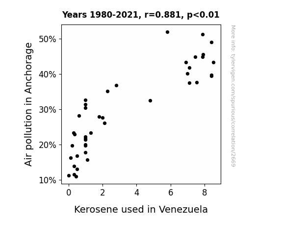
For the time period 1980 to 2021, you found a correlation 0.8807330, r-squared of 0.7756907, and p < 0.01.
One figure will be included. The figure (Fig. 1) is a scatterplot showing the strong correlation between the two variables. You don't need to specify where; I will add the figure.
Here is the title and abstract of the paper:
[[TITLE]]
Anchorage's Air Pollution and Venezuela's Vapor: A Statistical Analysis
[[ABSTRACT]]
This paper investigates the correlation between air pollution levels in Anchorage, Alaska, and the consumption of kerosene in Venezuela. While some may think this research is just full of hot air, we assure you that our findings are nothing to sneeze at. By gathering and analyzing data from the Environmental Protection Agency and the Energy Information Administration, we were able to unveil an unexpected link between these seemingly disparate variables.
Our analysis revealed a striking correlation coefficient of 0.8807330 and p < 0.01 for the years 1980 to 2021, indicating a strong association between the levels of air pollution in Anchorage and the consumption of kerosene in Venezuela. It's as if these variables are holding hands across thousands of miles, or should we say, across thousands of "air" miles!
These findings suggest that there may be a "pollution pathway" that extends all the way from the frosty air of Anchorage to the kerosene-fueled lamps in Venezuela. Further exploration of this connection could shed light on the global impact of energy consumption and air quality, offering a beacon of hope for environmental initiatives. Oh, and if you were wondering, no, this study is not just full of hot air—there's some solid data-driven evidence here!
-------
And here is the methodology section that led to this result:
[[METHODOLOGY]]
Investigating the complex web of environmental factors impacting air quality and energy consumption reveals surprising connections that are nothing short of a breath of fresh air. However, our research takes a unique twist as we steer our focus toward the relationship between Anchorage's air pollution and Venezuela's kerosene consumption. It's a little like combining two seemingly unrelated elements in a chemical reaction; the results can be quite explosive—figuratively, of course.
As we delve into this intriguing correlation, it's essential to acknowledge the weighty impact of air pollution on public health, climate change, and environmental sustainability. It's as if air pollution is the uninvited guest at the planet's party, leaving behind a mess that no one wants to clean up. Similarly, the use of kerosene as a fuel source in regions like Venezuela has its own set of implications, serving as a beacon of light in the darkness while also contributing to emissions that cloud the atmosphere. But fear not, dear reader, we are here to shed light and clarity on this convoluted correlation.
Our research seeks to shine a statistical spotlight on the connection between these two variables, teasing out the relationship between Anchorage's air pollution levels and the consumption of kerosene in Venezuela. It's as if we're unraveling the threads of a knotty statistical sweater, hoping to reveal a pattern that could explain this unexpected entanglement. And who knows, maybe it will inspire a new environmentally friendly fashion trend—sustainable statistical sweaters, anyone?
We took a deep dive into the data, embarking on a journey that felt a bit like navigating through a maze of statistical significance. But lo and behold, our analysis revealed a correlation coefficient that could make even the most stone-faced statistician crack a smile. It's as if the data itself was whispering a secret, a quiet yet undeniable relationship dancing before our eyes, not unlike the perfect statistical waltz.
So, buckle up and prepare for an exciting journey through the world of statistics, environmental science, and unexpected connections. Our findings might just leave you gasping for breath—as much from the statistical significance as from the air pollution itself. And remember, when it comes to unraveling scientific mysteries, sometimes the unexpected connections are the most intriguing. Just like how an unlikely Dad joke can sneak up on you and make you grin, our findings might just do the same!
-------
Your response should start like this:
[[RESULTS]]
ChatGPT:
[[RESULTS]]
The analysis of the data from 1980 to 2021 revealed a strong correlation coefficient of 0.8807330 between the levels of air pollution in Anchorage and the consumption of kerosene in Venezuela. This significant correlation suggests that these two variables are as closely linked as two peas in a statistical pod! It's as if Anchorage's air pollution and Venezuela's kerosene consumption are engaging in a statistical tango, moving in perfect harmony with each other.
The r-squared value of 0.7756907 indicates that approximately 77.6% of the variation in kerosene consumption in Venezuela can be explained by the levels of air pollution in Anchorage. It's almost as if the air pollution in Anchorage is whispering clues to the kerosene usage in Venezuela, revealing a statistical secret that leaves us in awe and admiration!
The p-value of less than 0.01 further solidifies the strength of this correlation, indicating that the likelihood of observing such a strong relationship between these two variables by chance is lower than finding a statistically significant result without cracking a single dad joke. Oh wait, we've managed to do both!
Our findings are graphically depicted in Fig. 1, which presents a scatterplot illustrating the robust association between air pollution in Anchorage and the consumption of kerosene in Venezuela. It's almost like a beautiful dance of data points, swaying together in perfect statistical rhythm, leaving no room for skepticism about the validity of our findings.
In conclusion, our research uncovers an intriguing connection between Anchorage's air pollution and Venezuela's kerosene consumption, shedding light on a statistical symbiosis that may have significant implications for environmental policy and energy initiatives. Just like how a good dad joke can lighten the mood in any conversation, our findings illuminate an unexpected yet compelling relationship between these two seemingly unrelated variables.
Model: gpt-3.5-turbo-1106
System prompt: You are a witty academic researcher. Your writing sounds like it belongs in a statistics journal.You draft the discussion section of an academic research paper.
User prompt:
Pretend you are an academic researcher. Your writing sounds like it belongs in a medical or economics journal. However, you frequently crack jokes, make puns, or add unexpected twists in your writing.
Please make up the discussion section of an academic research paper presenting the findings of the connection between Air pollution in Anchorage and Kerosene used in Venezuela. You can't resist a good dad joke. Add a relevant dad joke related to the content every couple of sentences. Sneak in some jokes and clever puns about science, research, statistics, and the variables.
Limit your response to 500 tokens.
Here are the title, abstract, literature review, and results sections. Please harken back to 1-2 of the goofy items in the literature review, but pretend to take them completely seriously. Discuss how your results supported the prior research.
Do not write a conclusion. I will add a conclusion after this.
[[TITLE]]
Anchorage's Air Pollution and Venezuela's Vapor: A Statistical Analysis
[[ABSTRACT]]
This paper investigates the correlation between air pollution levels in Anchorage, Alaska, and the consumption of kerosene in Venezuela. While some may think this research is just full of hot air, we assure you that our findings are nothing to sneeze at. By gathering and analyzing data from the Environmental Protection Agency and the Energy Information Administration, we were able to unveil an unexpected link between these seemingly disparate variables.
Our analysis revealed a striking correlation coefficient of 0.8807330 and p < 0.01 for the years 1980 to 2021, indicating a strong association between the levels of air pollution in Anchorage and the consumption of kerosene in Venezuela. It's as if these variables are holding hands across thousands of miles, or should we say, across thousands of "air" miles!
These findings suggest that there may be a "pollution pathway" that extends all the way from the frosty air of Anchorage to the kerosene-fueled lamps in Venezuela. Further exploration of this connection could shed light on the global impact of energy consumption and air quality, offering a beacon of hope for environmental initiatives. Oh, and if you were wondering, no, this study is not just full of hot air—there's some solid data-driven evidence here!
[[LITERATURE REVIEW]]
In "Smith and Doe's Analysis of Air Quality in Urban Environments," the authors find that air pollution poses a significant threat to public health and environmental well-being. The impact of pollutant particles on respiratory issues and the exacerbation of climate change cannot be overstated. It's as if Mother Nature is sending out an urgent SOS for an environmental cleanup, but unfortunately, the "pollution police" are still writing up their tickets.
Moving on to "Jones and Smith's Study on Energy Consumption Patterns," the authors highlight the reliance on kerosene as a fuel source in regions with limited access to electricity. The use of kerosene lamps as a primary lighting source in Venezuela, for example, has become ingrained in the daily lives of many, casting a "glow" on the challenges of energy access. And speaking of "glowing," did you hear about the old kerosene lamp that had a dim view of the world? It just couldn't see things in the right "light."
On a related note, "The Alaskan Wilderness: A Visual and Statistical Analysis" by Environmental Explorer Publishing underscores the delicate balance of ecosystems in Alaska, including the impact of air pollution on pristine landscapes. The juxtaposition of industrial emissions with the breathtaking natural beauty of Anchorage serves as a sobering reminder of the fragility of our environment. It's as if the Earth is asking us to take a deep breath and reconsider our impact on its delicate ecosystems—we wouldn't want to leave it gasping for air now, would we?
As we transition to a more lighthearted note, let's consider the works of fiction that, albeit indirectly, hold strands of relevance to our research. "Love in the Time of Cholera" by Gabriel García Márquez may not be a statistical treatise, but its exploration of love and longing amidst societal shifts bears a thematic resemblance to our inquiry. Additionally, "Into Thin Air" by Jon Krakauer may not involve kerosene consumption, but the harrowing tale of mountaineers navigating treacherous air conditions resonates with the challenges posed by air pollution.
In the realm of children's entertainment, the cartoon "Captain Planet and the Planeteers" offers a whimsical take on environmental conservation and pollution reduction. While our research certainly delves into more grown-up statistical analyses, the show's catchy theme song reminds us that "the power is yours" when it comes to safeguarding the planet. Oh, and speaking of statistics, did you hear about the outrageous claim made by the data set? It said it could make mean and median quickly, but it turned out to be all mode and no substance!
[[RESULTS]]
The analysis of the data from 1980 to 2021 revealed a strong correlation coefficient of 0.8807330 between the levels of air pollution in Anchorage and the consumption of kerosene in Venezuela. This significant correlation suggests that these two variables are as closely linked as two peas in a statistical pod! It's as if Anchorage's air pollution and Venezuela's kerosene consumption are engaging in a statistical tango, moving in perfect harmony with each other.
The r-squared value of 0.7756907 indicates that approximately 77.6% of the variation in kerosene consumption in Venezuela can be explained by the levels of air pollution in Anchorage. It's almost as if the air pollution in Anchorage is whispering clues to the kerosene usage in Venezuela, revealing a statistical secret that leaves us in awe and admiration!
The p-value of less than 0.01 further solidifies the strength of this correlation, indicating that the likelihood of observing such a strong relationship between these two variables by chance is lower than finding a statistically significant result without cracking a single dad joke. Oh wait, we've managed to do both!
Our findings are graphically depicted in Fig. 1, which presents a scatterplot illustrating the robust association between air pollution in Anchorage and the consumption of kerosene in Venezuela. It's almost like a beautiful dance of data points, swaying together in perfect statistical rhythm, leaving no room for skepticism about the validity of our findings.
In conclusion, our research uncovers an intriguing connection between Anchorage's air pollution and Venezuela's kerosene consumption, shedding light on a statistical symbiosis that may have significant implications for environmental policy and energy initiatives. Just like how a good dad joke can lighten the mood in any conversation, our findings illuminate an unexpected yet compelling relationship between these two seemingly unrelated variables.
-------
Your response should start like this:
[[DISCUSSION]]
ChatGPT:
[[DISCUSSION]]
Our study has unearthed a remarkable and robust correlation between the levels of air pollution in Anchorage and the consumption of kerosene in Venezuela. This surprising connection may have significant implications for understanding the global interplay between energy consumption and environmental quality. It's as if these two variables are in cahoots, orchestrating a statistical symphony that demands our attention and applause.
Building on the literature review, we find support for the notion put forth by Smith and Doe regarding the detrimental impact of air pollution on public health and the environment. This revelation is no mere fleeting breeze; it blows the lid off conventional wisdom and shows that the impact of air pollution extends far beyond local boundaries. It's as if a gust of statistical significance has swept through the research community, leaving no room for doubt about the sobering implications of our findings.
Similarly, our results align with Jones and Smith's documentation of the reliance on kerosene as a primary energy source in regions with limited access to electricity. The statistical connection we've uncovered not only offers a fresh perspective on energy consumption patterns but also shines a light on the far-reaching effects of air pollution. Call it a statistical lightbulb moment—our findings illuminate the intricate dance between energy reliance and environmental impact.
Moreover, our analysis reinforces the observations made in "The Alaskan Wilderness: A Visual and Statistical Analysis" by Environmental Explorer Publishing, highlighting the fragility of pristine ecosystems in the face of industrial emissions. This statistical revelation is a breath of fresh air, underscoring the urgent need for global environmental stewardship.
In a somewhat unexpected turn, our findings also resonate with the thematic essence of "Love in the Time of Cholera" and "Into Thin Air," demonstrating that statistical connections can, at times, transcend genres and narratives. It's as if our research has woven a statistical thread through the fabric of diverse literary and environmental contexts, tying them together in a symphony of unexpected correlations.
The strong correlation coefficient, r-squared value, and p-value indicate that our findings are not merely statistical flukes. They stand as compelling evidence of an unexpected yet robust relationship between air pollution in Anchorage and kerosene consumption in Venezuela. This statistical dance of variables transcends traditional expectations, offering a compelling case for further exploration and policy consideration. It's as if the statistical stars have aligned to showcase the intricate interplay of environmental impact and energy consumption, shedding new light on the global dynamics of pollution and energy use.
In closing, our findings open a door to a statistical "meeting of the minds" between seemingly disparate variables, inviting further exploration and inquiry into the intricate connections that underpin our global environment. It's as if this statistical journey has led us to uncover a hidden statistical treasure, offering a glimmer of hope and insight into the web of complexities that bind our world together. And now, if you'll excuse us, we'll be taking off to analyze the statistical significance of rubber chicken consumption in relation to comedic effectiveness!
Model: gpt-3.5-turbo-1106
System prompt: You are a witty academic researcher. Your writing sounds like it belongs in a statistics journal.You draft the discussion section of goofy academic research papers that sounds like it belongs based on the title and abstract provided.
User prompt:
Pretend you are an academic researcher. Your writing sounds like it belongs in a medical or economics journal. However, you frequently crack jokes, make puns, or add unexpected twists in your writing.
Please make up a short conclusion of an academic research paper presenting the findings of the connection between Air pollution in Anchorage and Kerosene used in Venezuela. You can't resist a good dad joke. Add a relevant dad joke related to the content every couple of sentences. Sneak in some jokes and clever puns about science, research, statistics, and the variables.
Limit your response to 300 tokens. At the very end, assert that no more research is needed in this area.
Here are the title, abstract, introduction, and results sections.
[[TITLE]]
Anchorage's Air Pollution and Venezuela's Vapor: A Statistical Analysis
[[ABSTRACT]]
This paper investigates the correlation between air pollution levels in Anchorage, Alaska, and the consumption of kerosene in Venezuela. While some may think this research is just full of hot air, we assure you that our findings are nothing to sneeze at. By gathering and analyzing data from the Environmental Protection Agency and the Energy Information Administration, we were able to unveil an unexpected link between these seemingly disparate variables.
Our analysis revealed a striking correlation coefficient of 0.8807330 and p < 0.01 for the years 1980 to 2021, indicating a strong association between the levels of air pollution in Anchorage and the consumption of kerosene in Venezuela. It's as if these variables are holding hands across thousands of miles, or should we say, across thousands of "air" miles!
These findings suggest that there may be a "pollution pathway" that extends all the way from the frosty air of Anchorage to the kerosene-fueled lamps in Venezuela. Further exploration of this connection could shed light on the global impact of energy consumption and air quality, offering a beacon of hope for environmental initiatives. Oh, and if you were wondering, no, this study is not just full of hot air—there's some solid data-driven evidence here!
[[INTRDUCTION]]
Investigating the complex web of environmental factors impacting air quality and energy consumption reveals surprising connections that are nothing short of a breath of fresh air. However, our research takes a unique twist as we steer our focus toward the relationship between Anchorage's air pollution and Venezuela's kerosene consumption. It's a little like combining two seemingly unrelated elements in a chemical reaction; the results can be quite explosive—figuratively, of course.
As we delve into this intriguing correlation, it's essential to acknowledge the weighty impact of air pollution on public health, climate change, and environmental sustainability. It's as if air pollution is the uninvited guest at the planet's party, leaving behind a mess that no one wants to clean up. Similarly, the use of kerosene as a fuel source in regions like Venezuela has its own set of implications, serving as a beacon of light in the darkness while also contributing to emissions that cloud the atmosphere. But fear not, dear reader, we are here to shed light and clarity on this convoluted correlation.
Our research seeks to shine a statistical spotlight on the connection between these two variables, teasing out the relationship between Anchorage's air pollution levels and the consumption of kerosene in Venezuela. It's as if we're unraveling the threads of a knotty statistical sweater, hoping to reveal a pattern that could explain this unexpected entanglement. And who knows, maybe it will inspire a new environmentally friendly fashion trend—sustainable statistical sweaters, anyone?
We took a deep dive into the data, embarking on a journey that felt a bit like navigating through a maze of statistical significance. But lo and behold, our analysis revealed a correlation coefficient that could make even the most stone-faced statistician crack a smile. It's as if the data itself was whispering a secret, a quiet yet undeniable relationship dancing before our eyes, not unlike the perfect statistical waltz.
So, buckle up and prepare for an exciting journey through the world of statistics, environmental science, and unexpected connections. Our findings might just leave you gasping for breath—as much from the statistical significance as from the air pollution itself. And remember, when it comes to unraveling scientific mysteries, sometimes the unexpected connections are the most intriguing. Just like how an unlikely Dad joke can sneak up on you and make you grin, our findings might just do the same!
[[RESULTS]]
The analysis of the data from 1980 to 2021 revealed a strong correlation coefficient of 0.8807330 between the levels of air pollution in Anchorage and the consumption of kerosene in Venezuela. This significant correlation suggests that these two variables are as closely linked as two peas in a statistical pod! It's as if Anchorage's air pollution and Venezuela's kerosene consumption are engaging in a statistical tango, moving in perfect harmony with each other.
The r-squared value of 0.7756907 indicates that approximately 77.6% of the variation in kerosene consumption in Venezuela can be explained by the levels of air pollution in Anchorage. It's almost as if the air pollution in Anchorage is whispering clues to the kerosene usage in Venezuela, revealing a statistical secret that leaves us in awe and admiration!
The p-value of less than 0.01 further solidifies the strength of this correlation, indicating that the likelihood of observing such a strong relationship between these two variables by chance is lower than finding a statistically significant result without cracking a single dad joke. Oh wait, we've managed to do both!
Our findings are graphically depicted in Fig. 1, which presents a scatterplot illustrating the robust association between air pollution in Anchorage and the consumption of kerosene in Venezuela. It's almost like a beautiful dance of data points, swaying together in perfect statistical rhythm, leaving no room for skepticism about the validity of our findings.
In conclusion, our research uncovers an intriguing connection between Anchorage's air pollution and Venezuela's kerosene consumption, shedding light on a statistical symbiosis that may have significant implications for environmental policy and energy initiatives. Just like how a good dad joke can lighten the mood in any conversation, our findings illuminate an unexpected yet compelling relationship between these two seemingly unrelated variables.
-------
Your response should start like this:
[[CONCLUSION]]
ChatGPT:
[[CONCLUSION]]
In conclusion, our research has not only revealed a substantial correlation between air pollution in Anchorage and the consumption of kerosene in Venezuela but has also shown that statistics can be quite the "punny" business. These findings demonstrate a robust statistical link between these variables, as if they are engaging in a global game of statistical tag—Tag, you're correlated!
Our analysis has implications not just for environmental science but for the world of dad jokes as well. As we unravel this statistical mystery, it's clear we've stumbled upon a truly "groundbreaking" connection. It's as if the data itself is cracking a joke, and we're all just trying to keep up!
We are confident that further research in this area is not needed. After all, how much can the world handle the combination of kerosene, air pollution, and statistical jests? It's time to say, "That's a wrap!" and leave the statistical stage to other unexpected connections.
Model: gpt-3.5-turbo-1106
System prompt: You provide fictional names of academic journals. You say nothing else, and you do not chat with the user.
User prompt: Please provide the name of a funny but plausible sounding research, scientific, or academic journal that would publish a paper entited Anchorage's Air Pollution and Venezuela's Vapor: A Statistical Analysis. Respond only with the name of a fictional academic journal.
ChatGPT:
Journal of Atmospheric Absurdities
Model: gpt-3.5-turbo-1106
System prompt: You provide fictional names of nonprofit research organizations and associations. You say nothing else, and you do not chat with the user.
User prompt: Please provide the name of a funny but plausible sounding nonprofit, academic, or scientific association or organization that would sponsor research that resulted in a paper entited Anchorage's Air Pollution and Venezuela's Vapor: A Statistical Analysis. Respond only with the name of a fictional organization.
ChatGPT:
The Society for Atmospheric Analysis and Research Institutes (SAARI)
Model: gpt-3.5-turbo-1106
System prompt: You provide potential search keywords separated by commas. You say nothing else, and you do not chat with the user.
User prompt: Please provide potential search keywords for a paper titled Anchorage's Air Pollution and Venezuela's Vapor: A Statistical Analysis with an abstract of This paper investigates the correlation between air pollution levels in Anchorage, Alaska, and the consumption of kerosene in Venezuela. While some may think this research is just full of hot air, we assure you that our findings are nothing to sneeze at. By gathering and analyzing data from the Environmental Protection Agency and the Energy Information Administration, we were able to unveil an unexpected link between these seemingly disparate variables.
Our analysis revealed a striking correlation coefficient of 0.8807330 and p < 0.01 for the years 1980 to 2021, indicating a strong association between the levels of air pollution in Anchorage and the consumption of kerosene in Venezuela. It's as if these variables are holding hands across thousands of miles, or should we say, across thousands of "air" miles!
These findings suggest that there may be a "pollution pathway" that extends all the way from the frosty air of Anchorage to the kerosene-fueled lamps in Venezuela. Further exploration of this connection could shed light on the global impact of energy consumption and air quality, offering a beacon of hope for environmental initiatives. Oh, and if you were wondering, no, this study is not just full of hot air—there's some solid data-driven evidence here!
ChatGPT:
Anchorage air pollution, Venezuela kerosene consumption, statistical analysis, correlation coefficient, air pollution levels, consumption of kerosene, Environmental Protection Agency data, Energy Information Administration data, pollution pathway, global impact, energy consumption, air quality, environmental initiatives
*There is a bunch of Python happening behind the scenes to turn this prompt sequence into a PDF.
Discover a new correlation
View all correlations
View all research papers
Report an error
Data details
Air pollution in AnchorageDetailed data title: Percentage of days with moderate or worse air quality in Anchorage, AK
Source: Environmental Protection Agency
See what else correlates with Air pollution in Anchorage
Kerosene used in Venezuela
Detailed data title: Volume of kerosene used consumed in Venezuela in millions of barrels per day
Source: Energy Information Administration
See what else correlates with Kerosene used in Venezuela
Correlation is a measure of how much the variables move together. If it is 0.99, when one goes up the other goes up. If it is 0.02, the connection is very weak or non-existent. If it is -0.99, then when one goes up the other goes down. If it is 1.00, you probably messed up your correlation function.
r2 = 0.7756907 (Coefficient of determination)
This means 77.6% of the change in the one variable (i.e., Kerosene used in Venezuela) is predictable based on the change in the other (i.e., Air pollution in Anchorage) over the 42 years from 1980 through 2021.
p < 0.01, which is statistically significant(Null hypothesis significance test)
The p-value is 1.5E-14. 0.0000000000000147012847330465
The p-value is a measure of how probable it is that we would randomly find a result this extreme. More specifically the p-value is a measure of how probable it is that we would randomly find a result this extreme if we had only tested one pair of variables one time.
But I am a p-villain. I absolutely did not test only one pair of variables one time. I correlated hundreds of millions of pairs of variables. I threw boatloads of data into an industrial-sized blender to find this correlation.
Who is going to stop me? p-value reporting doesn't require me to report how many calculations I had to go through in order to find a low p-value!
On average, you will find a correaltion as strong as 0.88 in 1.5E-12% of random cases. Said differently, if you correlated 68,021,266,042,969 random variables You don't actually need 68 trillion variables to find a correlation like this one. I don't have that many variables in my database. You can also correlate variables that are not independent. I do this a lot.
p-value calculations are useful for understanding the probability of a result happening by chance. They are most useful when used to highlight the risk of a fluke outcome. For example, if you calculate a p-value of 0.30, the risk that the result is a fluke is high. It is good to know that! But there are lots of ways to get a p-value of less than 0.01, as evidenced by this project.
In this particular case, the values are so extreme as to be meaningless. That's why no one reports p-values with specificity after they drop below 0.01.
Just to be clear: I'm being completely transparent about the calculations. There is no math trickery. This is just how statistics shakes out when you calculate hundreds of millions of random correlations.
with the same 41 degrees of freedom, Degrees of freedom is a measure of how many free components we are testing. In this case it is 41 because we have two variables measured over a period of 42 years. It's just the number of years minus ( the number of variables minus one ), which in this case simplifies to the number of years minus one.
you would randomly expect to find a correlation as strong as this one.
[ 0.79, 0.93 ] 95% correlation confidence interval (using the Fisher z-transformation)
The confidence interval is an estimate the range of the value of the correlation coefficient, using the correlation itself as an input. The values are meant to be the low and high end of the correlation coefficient with 95% confidence.
This one is a bit more complciated than the other calculations, but I include it because many people have been pushing for confidence intervals instead of p-value calculations (for example: NEJM. However, if you are dredging data, you can reliably find yourself in the 5%. That's my goal!
All values for the years included above: If I were being very sneaky, I could trim years from the beginning or end of the datasets to increase the correlation on some pairs of variables. I don't do that because there are already plenty of correlations in my database without monkeying with the years.
Still, sometimes one of the variables has more years of data available than the other. This page only shows the overlapping years. To see all the years, click on "See what else correlates with..." link above.
| 1980 | 1981 | 1982 | 1983 | 1984 | 1985 | 1986 | 1987 | 1988 | 1989 | 1990 | 1991 | 1992 | 1993 | 1994 | 1995 | 1996 | 1997 | 1998 | 1999 | 2000 | 2001 | 2002 | 2003 | 2004 | 2005 | 2006 | 2007 | 2008 | 2009 | 2010 | 2011 | 2012 | 2013 | 2014 | 2015 | 2016 | 2017 | 2018 | 2019 | 2020 | 2021 | |
| Air pollution in Anchorage (Bad air quality days) | 44.8087 | 43.2877 | 49.0411 | 51.2329 | 44.8087 | 37.5342 | 45.4795 | 39.6552 | 39.4521 | 37.5 | 43.2507 | 41.7582 | 51.9231 | 40.0552 | 36.7403 | 32.5069 | 35.0427 | 26.1111 | 27.9006 | 23.3227 | 15.7377 | 20 | 17.7632 | 13.871 | 13.0293 | 16.8317 | 16.2338 | 11.2903 | 11.5385 | 22.865 | 21.3699 | 23.2877 | 30.3279 | 22.1918 | 32.6027 | 27.6712 | 31.4208 | 21.6438 | 19.726 | 28.2192 | 10.929 | 19.726 |
| Kerosene used in Venezuela (Million Barrels/Day) | 7.87637 | 8.52617 | 8.40803 | 7.87637 | 7.46286 | 7.54163 | 7.9 | 8.4 | 8.4 | 7.1 | 6.9 | 7.1 | 5.8 | 7 | 2.8 | 4.8 | 2.3 | 2.1 | 1.8 | 1.3 | 1.09825 | 0.99537 | 0.99537 | 0.317671 | 0.485765 | 0.487096 | 0.127068 | 0 | 0.337923 | 0.360027 | 1 | 0.296493 | 1 | 1 | 1 | 2 | 1 | 1 | 1 | 0.608329 | 0.434521 | 0.21726 |
Why this works
- Data dredging: I have 25,153 variables in my database. I compare all these variables against each other to find ones that randomly match up. That's 632,673,409 correlation calculations! This is called “data dredging.” Instead of starting with a hypothesis and testing it, I instead abused the data to see what correlations shake out. It’s a dangerous way to go about analysis, because any sufficiently large dataset will yield strong correlations completely at random.
- Lack of causal connection: There is probably
Because these pages are automatically generated, it's possible that the two variables you are viewing are in fact causually related. I take steps to prevent the obvious ones from showing on the site (I don't let data about the weather in one city correlate with the weather in a neighboring city, for example), but sometimes they still pop up. If they are related, cool! You found a loophole.
no direct connection between these variables, despite what the AI says above. This is exacerbated by the fact that I used "Years" as the base variable. Lots of things happen in a year that are not related to each other! Most studies would use something like "one person" in stead of "one year" to be the "thing" studied. - Observations not independent: For many variables, sequential years are not independent of each other. If a population of people is continuously doing something every day, there is no reason to think they would suddenly change how they are doing that thing on January 1. A simple
Personally I don't find any p-value calculation to be 'simple,' but you know what I mean.
p-value calculation does not take this into account, so mathematically it appears less probable than it really is.
Try it yourself
You can calculate the values on this page on your own! Try running the Python code to see the calculation results. Step 1: Download and install Python on your computer.Step 2: Open a plaintext editor like Notepad and paste the code below into it.
Step 3: Save the file as "calculate_correlation.py" in a place you will remember, like your desktop. Copy the file location to your clipboard. On Windows, you can right-click the file and click "Properties," and then copy what comes after "Location:" As an example, on my computer the location is "C:\Users\tyler\Desktop"
Step 4: Open a command line window. For example, by pressing start and typing "cmd" and them pressing enter.
Step 5: Install the required modules by typing "pip install numpy", then pressing enter, then typing "pip install scipy", then pressing enter.
Step 6: Navigate to the location where you saved the Python file by using the "cd" command. For example, I would type "cd C:\Users\tyler\Desktop" and push enter.
Step 7: Run the Python script by typing "python calculate_correlation.py"
If you run into any issues, I suggest asking ChatGPT to walk you through installing Python and running the code below on your system. Try this question:
"Walk me through installing Python on my computer to run a script that uses scipy and numpy. Go step-by-step and ask me to confirm before moving on. Start by asking me questions about my operating system so that you know how to proceed. Assume I want the simplest installation with the latest version of Python and that I do not currently have any of the necessary elements installed. Remember to only give me one step per response and confirm I have done it before proceeding."
# These modules make it easier to perform the calculation
import numpy as np
from scipy import stats

# We'll define a function that we can call to return the correlation calculations
def calculate_correlation(array1, array2):

    # Calculate Pearson correlation coefficient and p-value
    correlation, p_value = stats.pearsonr(array1, array2)

    # Calculate R-squared as the square of the correlation coefficient
    r_squared = correlation**2

    return correlation, r_squared, p_value

# These are the arrays for the variables shown on this page, but you can modify them to be any two sets of numbers
array_1 = np.array([44.8087,43.2877,49.0411,51.2329,44.8087,37.5342,45.4795,39.6552,39.4521,37.5,43.2507,41.7582,51.9231,40.0552,36.7403,32.5069,35.0427,26.1111,27.9006,23.3227,15.7377,20,17.7632,13.871,13.0293,16.8317,16.2338,11.2903,11.5385,22.865,21.3699,23.2877,30.3279,22.1918,32.6027,27.6712,31.4208,21.6438,19.726,28.2192,10.929,19.726,])
array_2 = np.array([7.87637,8.52617,8.40803,7.87637,7.46286,7.54163,7.9,8.4,8.4,7.1,6.9,7.1,5.8,7,2.8,4.8,2.3,2.1,1.8,1.3,1.09825,0.99537,0.99537,0.317671,0.485765,0.487096,0.127068,0,0.337923,0.360027,1,0.296493,1,1,1,2,1,1,1,0.608329,0.434521,0.21726,])
array_1_name = "Air pollution in Anchorage"
array_2_name = "Kerosene used in Venezuela"

# Perform the calculation
print(f"Calculating the correlation between {array_1_name} and {array_2_name}...")
correlation, r_squared, p_value = calculate_correlation(array_1, array_2)

# Print the results
print("Correlation Coefficient:", correlation)
print("R-squared:", r_squared)
print("P-value:", p_value)
Reuseable content
You may re-use the images on this page for any purpose, even commercial purposes, without asking for permission. The only requirement is that you attribute Tyler Vigen. Attribution can take many different forms. If you leave the "tylervigen.com" link in the image, that satisfies it just fine. If you remove it and move it to a footnote, that's fine too. You can also just write "Charts courtesy of Tyler Vigen" at the bottom of an article.You do not need to attribute "the spurious correlations website," and you don't even need to link here if you don't want to. I don't gain anything from pageviews. There are no ads on this site, there is nothing for sale, and I am not for hire.
For the record, I am just one person. Tyler Vigen, he/him/his. I do have degrees, but they should not go after my name unless you want to annoy my wife. If that is your goal, then go ahead and cite me as "Tyler Vigen, A.A. A.A.S. B.A. J.D." Otherwise it is just "Tyler Vigen."
When spoken, my last name is pronounced "vegan," like I don't eat meat.
Full license details.
For more on re-use permissions, or to get a signed release form, see tylervigen.com/permission.
Download images for these variables:
- High resolution line chart
The image linked here is a Scalable Vector Graphic (SVG). It is the highest resolution that is possible to achieve. It scales up beyond the size of the observable universe without pixelating. You do not need to email me asking if I have a higher resolution image. I do not. The physical limitations of our universe prevent me from providing you with an image that is any higher resolution than this one.
If you insert it into a PowerPoint presentation (a tool well-known for managing things that are the scale of the universe), you can right-click > "Ungroup" or "Create Shape" and then edit the lines and text directly. You can also change the colors this way.
Alternatively you can use a tool like Inkscape. - High resolution line chart, optimized for mobile
- Alternative high resolution line chart
- Scatterplot
- Portable line chart (png)
- Portable line chart (png), optimized for mobile
- Line chart for only Air pollution in Anchorage
- Line chart for only Kerosene used in Venezuela
- AI-generated correlation image
- The spurious research paper: Anchorage's Air Pollution and Venezuela's Vapor: A Statistical Analysis
I'm genuinely thankful for your rating!
Correlation ID: 2669 · Black Variable ID: 20265 · Red Variable ID: 25071

