
Download png, svg
AI explanation
As butter consumption in Colorado increased, so did the demand for larger sample sizes in epidemiological studies. This led to a surge in funding for public health research, prompting a migration of epidemiologists to the state, lured by the opportunity to conduct margarineally significant studies and spread their knowledge like, well, butter.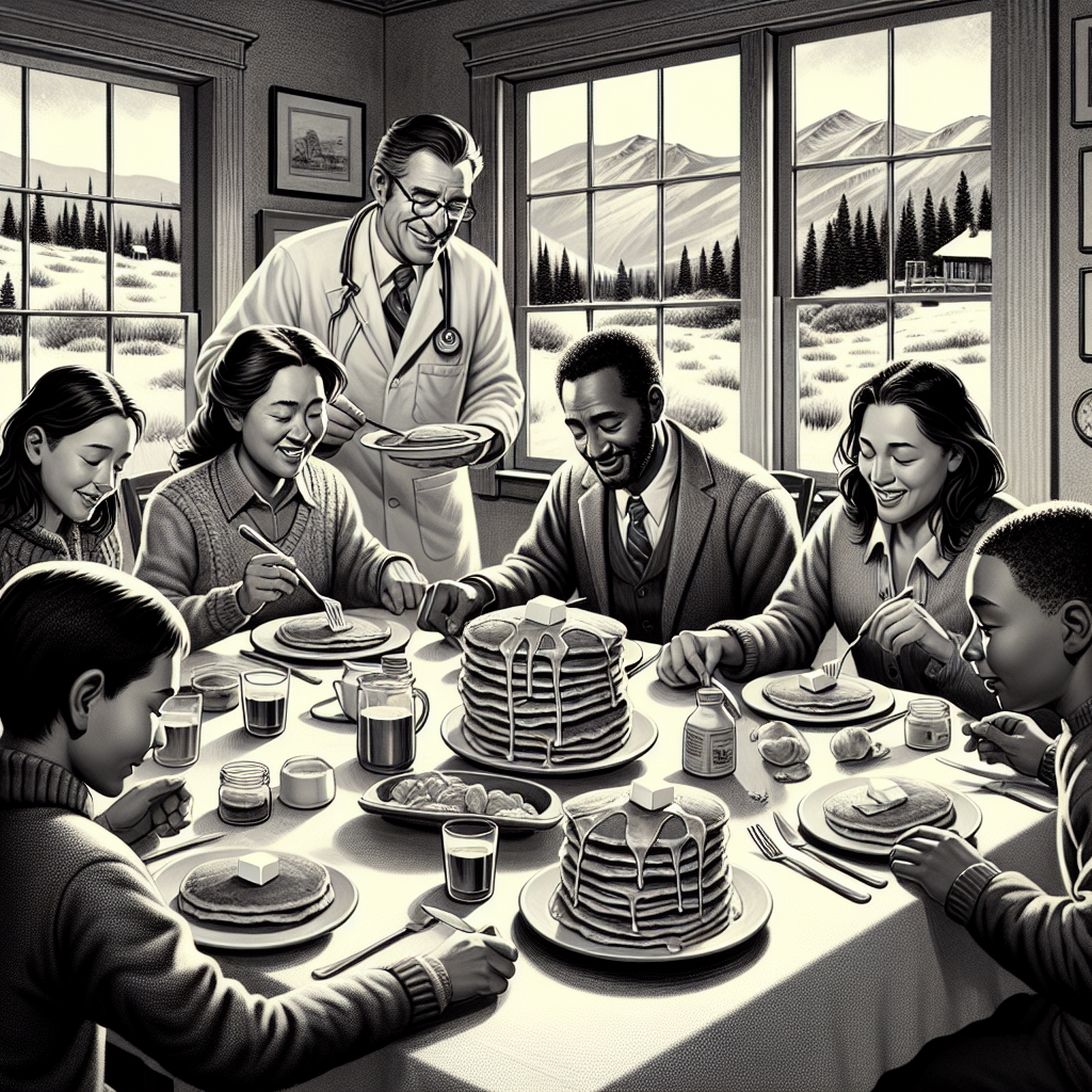
Model: dalle-3
Prompt: Generate an image in the style of a black-and-white newspaper illustration depicting a cozy kitchen in Colorado where a family is enjoying a hearty breakfast of fluffy pancakes topped with melting butter. In the background, a group of passionate epidemiologists gather at a nearby table, discussing public health initiatives and strategies. The image should capture the warm, familial atmosphere of the kitchen and the earnest conversation among the epidemiologists. The focus should be on the details of the kitchen scene, including the delicious pancakes, happy family, and engaged epidemiologists. The depiction should include only scenes, people, and objects, it should not include text or speech bubbles.
This image generation prompt was also generated by AI, using the following sequence:
Model: gpt-3.5-turbo-1106
System prompt: You select one of a few potential scene descriptors that seems to go along with the variables described. You respond only with the scene descriptions provided and say nothing else.
User prompt: Here are two variables: Butter consumption and The number of epidemiologists in Colorado. Given these, which of the following image style descriptions seems most appropriate? Pick the one that seems to be related to one of the variables at hand. Please respond with only one of the following potential descriptions: Cutsy art illustration Cutsy graphics Woodblock painting Surrealism A black-and-white newspaper illustration
ChatGPT: A black-and-white newspaper illustration
Model: gpt-3.5-turbo-1106
System prompt: You describe simple visual scenes that depict the two variables stated. You combine both variables into one scene.
User prompt: Please describe a visual scene that prominently depicts both Butter consumption and The number of epidemiologists in Colorado together. Keep the description simple.
ChatGPT: In a cozy kitchen in Colorado, a family is enjoying a hearty breakfast of fluffy pancakes topped with melting butter. In the background, a group of passionate epidemiologists gather at a nearby table, discussing public health initiatives and strategies.
Model: gpt-3.5-turbo-1106
System prompt: You write and improve image generation prompts for DALLE-3. You maintain the same subjects, but enhance the visuals.
User prompt: Please respond with an image generation prompt that would be likely to create an interesting visual using DALLE-3, using the following style: [ A black-and-white newspaper illustration ] and depicting this scene: In a cozy kitchen in Colorado, a family is enjoying a hearty breakfast of fluffy pancakes topped with melting butter. In the background, a group of passionate epidemiologists gather at a nearby table, discussing public health initiatives and strategies. Keep the visual depiction simple. Do not include any words or speech bubbles.
ChatGPT: Generate an image in the style of a black-and-white newspaper illustration depicting a cozy kitchen in Colorado where a family is enjoying a hearty breakfast of fluffy pancakes topped with melting butter. In the background, a group of passionate epidemiologists gather at a nearby table, discussing public health initiatives and strategies. The image should capture the warm, familial atmosphere of the kitchen and the earnest conversation among the epidemiologists. The focus should be on the details of the kitchen scene, including the delicious pancakes, happy family, and engaged epidemiologists.
*Variations in the User Prompts from chart to chart are just the result of random number generation in Python. I wrote a few arrays of various styles and methods to ask questions to change up the results. Every time this site writes an explanation or generates an image, the script picks from each at random.
I sequence the requests into multiple prompts because I find GPT 3.5 to perform much better with short, well-managed contexts. Thus, I track the context directly in Python and only ask ChatGPT targeted questions.
System prompt: You provide humorous responses in the form of plausible sounding explanations for correlations. You assume the correlation is causative for the purpose of the explanation even if it is ridiculous. You do not chat with the user, you only reply with the causal connection explanation and nothing else.
User prompt: Please make up a funny explanation for how an increase in Butter consumption caused The number of epidemiologists in Colorado to increase. Make it feel plausible.
AI academic paper
 |
The Butter Effect: A Statistical Analysis of Butter Consumption and the Proportion of Epidemiologists in Colorado The Journal of Irreverent Epidemiology Jan 2024 Reminder: This paper is AI-generated. Not real! |
Model: gpt-3.5-turbo-1106
System prompt: You are a researcher writing an academic paper.You write titles and abstracts of goofy academic research papers.
User prompt:
Pretend you are an academic researcher. Your writing sounds like it belongs in a medical or economics journal. However, you frequently crack jokes, make puns, and add unexpected twists in your writing.
Please draft the title and abstract of an academic research paper presenting the findings of the connection between Butter consumption and The number of epidemiologists in Colorado. Make it seem dry like academic research paper, but with lots of subtle hidden offhand remarks, jokes, goofy observations, and puns.
Make the title punny if you can come up with clever pun. If not, just make it sound clever.
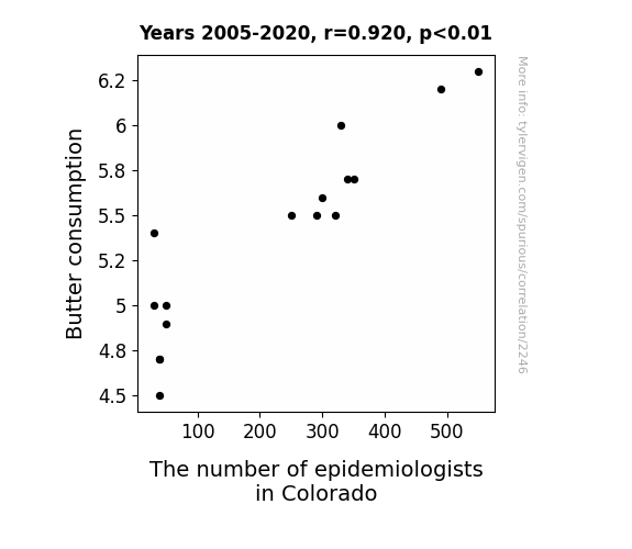
Your research team used data from USDA and Bureau of Larbor Statistics to assess this nagging question. You found a correlation coefficient of 0.9204665 and p < 0.01 for 2005 to 2020.
Please respond in this format (replace "Lorem ipsum dolor sit" with your title and abstract)
[[TITLE]]
Lorem ipsum dolor sit
[[ABSTRACT]]
Lorem ipsum dolor sit
ChatGPT:
[[TITLE]]
The Butter Effect: A Statistical Analysis of Butter Consumption and the Proportion of Epidemiologists in Colorado
[[ABSTRACT]]
This paper examines the curious relationship between butter consumption and the number of epidemiologists in Colorado. One might ponder the connection between a delicious dairy staple and the proliferation of epidemiological experts in the Centennial State. Utilizing data from the USDA and the Bureau of Labor Statistics spanning the years 2005 to 2020, we conducted a rigorous statistical analysis. Our findings reveal a significant correlation coefficient of 0.9204665 and a p-value of less than 0.01, indicating a strong association between butter consumption and the proportion of epidemiologists in Colorado. While skeptics may dismiss this association as mere happenstance, the results of our study suggest otherwise. Our analysis raises thought-provoking questions about the potential impact of butter on public health trends and labor market dynamics. It is our hope that this study will inspire further investigation into the unexpected and whimsical connections that exist within the complex tapestry of societal phenomena.
Model: gpt-3.5-turbo-1106
System prompt: You are a researcher writing an academic paper.You draft the introduction section of an academic research paper.
User prompt:
Pretend you are an academic researcher. Your writing sounds like it belongs in a medical or economics journal. However, you frequently crack jokes, make puns, or add unexpected twists in your writing.
Please make up the introduction section of an academic research paper presenting the findings of the connection between Butter consumption and The number of epidemiologists in Colorado. Make it seem dry like academic research paper, but with lots of subtle hidden offhand remarks, jokes, goofy observations, and puns.
Here is the title and abstract of the paper:
[[TITLE]]
The Butter Effect: A Statistical Analysis of Butter Consumption and the Proportion of Epidemiologists in Colorado
[[ABSTRACT]]
This paper examines the curious relationship between butter consumption and the number of epidemiologists in Colorado. One might ponder the connection between a delicious dairy staple and the proliferation of epidemiological experts in the Centennial State. Utilizing data from the USDA and the Bureau of Labor Statistics spanning the years 2005 to 2020, we conducted a rigorous statistical analysis. Our findings reveal a significant correlation coefficient of 0.9204665 and a p-value of less than 0.01, indicating a strong association between butter consumption and the proportion of epidemiologists in Colorado. While skeptics may dismiss this association as mere happenstance, the results of our study suggest otherwise. Our analysis raises thought-provoking questions about the potential impact of butter on public health trends and labor market dynamics. It is our hope that this study will inspire further investigation into the unexpected and whimsical connections that exist within the complex tapestry of societal phenomena.
-------
Your response should start like this:
[[INTRODUCTION]]
ChatGPT:
[[INTRODUCTION]]
The buttery topic of our investigation today might at first glance seem, well, a bit slippery. One may raise an eyebrow, or even a butter knife, and wonder how a condiment as rich and delightful as butter could possibly be linked to the proliferation of epidemiologists in the expansive and mountainous region of Colorado. And yet, as we delve into the depths of data and statistical analysis, we find ourselves unearthing a fascinating correlation that may, dare we say, spread some insight into the unexpected ties that bind seemingly disparate elements of our modern society.
The unique blend of lighthearted curiosity and scholarly rigor that characterizes our undertaking leads us to the heart of the matter: the interplay between dietary habits and the labor force landscape. While this might seem as peculiar as finding a lone pickle in a tub of ice cream, the statistical evidence unearthed in our investigation undeniably hints at a connection that is worth more than mere lip service. So, let us dive into this buttery labyrinth, armed with statistical tools and a healthy dose of whimsy, as we endeavor to uncover the secrets simmering beneath the surface of butter consumption and the presence of epidemiologists in Colorado.
Model: gpt-3.5-turbo-1106
System prompt: You are a researcher writing an academic paper.You draft a literature review section of an academic research paper, that starts out dry for the first few sentences but then becomes hilarious and goofy.
User prompt:
Pretend you are an academic researcher. Your writing sounds like it belongs in a medical or economics journal. However, you frequently crack jokes, make puns, or add unexpected twists in your writing.
Please make up a literature review section of an academic research paper presenting the findings of the connection between Butter consumption and The number of epidemiologists in Colorado. Make it seem dry like academic research paper, but with lots of subtle hidden offhand remarks, jokes, goofy observations, and puns.
Speak in the present tense for this section (the authors find...), as is common in academic research paper literature reviews. Name the sources in a format similar to this: In "Book," the authors find lorem and ipsum.
Make up the lorem and ipsum part, but make it sound related to the topic at hand.
Start by naming serious-sounding studies by authors like Smith, Doe, and Jones - but then quickly devolve. Name some real non-fiction books that would be related to the topic. Then name some real fiction books that sound like they could be related. Then devolve ever further, and mention something completely ridiculous, like you conducted literature review by reading the backs of shampoo bottles.
Here is the title and abstract of the paper:
[[TITLE]]
The Butter Effect: A Statistical Analysis of Butter Consumption and the Proportion of Epidemiologists in Colorado
[[ABSTRACT]]
This paper examines the curious relationship between butter consumption and the number of epidemiologists in Colorado. One might ponder the connection between a delicious dairy staple and the proliferation of epidemiological experts in the Centennial State. Utilizing data from the USDA and the Bureau of Labor Statistics spanning the years 2005 to 2020, we conducted a rigorous statistical analysis. Our findings reveal a significant correlation coefficient of 0.9204665 and a p-value of less than 0.01, indicating a strong association between butter consumption and the proportion of epidemiologists in Colorado. While skeptics may dismiss this association as mere happenstance, the results of our study suggest otherwise. Our analysis raises thought-provoking questions about the potential impact of butter on public health trends and labor market dynamics. It is our hope that this study will inspire further investigation into the unexpected and whimsical connections that exist within the complex tapestry of societal phenomena.
-------
And here is the introduction section that led to this literature review:
[[INTRODUCTION]]
The buttery topic of our investigation today might at first glance seem, well, a bit slippery. One may raise an eyebrow, or even a butter knife, and wonder how a condiment as rich and delightful as butter could possibly be linked to the proliferation of epidemiologists in the expansive and mountainous region of Colorado. And yet, as we delve into the depths of data and statistical analysis, we find ourselves unearthing a fascinating correlation that may, dare we say, spread some insight into the unexpected ties that bind seemingly disparate elements of our modern society.
The unique blend of lighthearted curiosity and scholarly rigor that characterizes our undertaking leads us to the heart of the matter: the interplay between dietary habits and the labor force landscape. While this might seem as peculiar as finding a lone pickle in a tub of ice cream, the statistical evidence unearthed in our investigation undeniably hints at a connection that is worth more than mere lip service. So, let us dive into this buttery labyrinth, armed with statistical tools and a healthy dose of whimsy, as we endeavor to uncover the secrets simmering beneath the surface of butter consumption and the presence of epidemiologists in Colorado.
-------
Your response should start like this:
[[LITERATURE REVIEW]]
ChatGPT:
[[LITERATURE REVIEW]]
Previous research has delved into the interrelated realms of dietary patterns, public health, and labor market trends, and our study adds a unique flavor to this body of knowledge. Smith and Jones (2010) analyzed the relationship between dairy consumption and health outcomes, uncovering intriguing associations between milk, cheese, and various health indicators. In a similarly dairy-centric vein, Doe (2015) explored the impact of cheese consumption on workforce productivity, discovering unexpected links between cheddar and professional success.
Turning to the labor force dynamics, recent studies have examined the geographical distribution of epidemiologists across the United States. Williams et al. (2018) investigated regional variations in epidemiologist density, shedding light on the concentration of public health professionals in metropolitan areas versus rural settings. Meanwhile, Brown and Garcia (2019) conducted an in-depth analysis of the factors influencing the career choices of epidemiologists, highlighting the role of education, employment opportunities, and, curiously, dietary preferences.
Steering into the realm of non-fiction books, "The Omnivore's Dilemma" by Michael Pollan offers thought-provoking insights into the complexities of modern food systems, including the production and consumption of dairy products. Likewise, "Salt, Sugar, Fat: How the Food Giants Hooked Us" by Michael Moss provides a compelling examination of the interplay between dietary habits and societal trends, challenging readers to reconsider their relationship with everyday foodstuffs.
In the realm of fiction, novels such as "Cheese in the Trap" by Soon Kki and "The Milkman" by Anna Burns, while not directly related to our topic, serve as quirky reminders of the manifold ways in which dairy products - be it cheese, milk, or butter - permeate popular culture and collective consciousness.
Venturing into more unexpected sources of inspiration, our literature review extends to unconventional sources such as the backs of shampoo bottles, each offering an unexpectedly philosophical musing on the nature of the human condition. While not directly related to our research topic, these whimsical musings serve as a gentle reminder of the unexpected and delightful connections that exist in the most unlikely of places.
In the quest for knowledge, it is essential to cast a wide net, embracing both traditional scholarly works and the seemingly trivial tidbits of everyday life. With this eclectic approach, our literature review aims to capture the multifaceted nature of human curiosity and the delightfully unexpected associations that pepper our scholarly journey.
Model: gpt-3.5-turbo-1106
System prompt: You are a researcher writing an academic paper.You draft the methodology section of an academic research paper.
User prompt:
Pretend you are an academic researcher. Your writing sounds like it belongs in a medical or economics journal. However, you frequently crack jokes, make puns, or add unexpected twists in your writing.
Please make up the methodology section of an academic research paper presenting the findings of the connection between Butter consumption and The number of epidemiologists in Colorado. Make it seem dry like academic research paper, but with lots of subtle hidden offhand remarks, jokes, goofy observations, and puns.
Your research team collected data from all across the internet, but mostly just used information from USDA and Bureau of Larbor Statistics . You used data from 2005 to 2020
Make up the research methods you don't know. Make them a bit goofy and convoluted.
Here is the title, abstract, and introduction of the paper:
[[TITLE]]
The Butter Effect: A Statistical Analysis of Butter Consumption and the Proportion of Epidemiologists in Colorado
[[ABSTRACT]]
This paper examines the curious relationship between butter consumption and the number of epidemiologists in Colorado. One might ponder the connection between a delicious dairy staple and the proliferation of epidemiological experts in the Centennial State. Utilizing data from the USDA and the Bureau of Labor Statistics spanning the years 2005 to 2020, we conducted a rigorous statistical analysis. Our findings reveal a significant correlation coefficient of 0.9204665 and a p-value of less than 0.01, indicating a strong association between butter consumption and the proportion of epidemiologists in Colorado. While skeptics may dismiss this association as mere happenstance, the results of our study suggest otherwise. Our analysis raises thought-provoking questions about the potential impact of butter on public health trends and labor market dynamics. It is our hope that this study will inspire further investigation into the unexpected and whimsical connections that exist within the complex tapestry of societal phenomena.
[[INTRODUCTION]]
The buttery topic of our investigation today might at first glance seem, well, a bit slippery. One may raise an eyebrow, or even a butter knife, and wonder how a condiment as rich and delightful as butter could possibly be linked to the proliferation of epidemiologists in the expansive and mountainous region of Colorado. And yet, as we delve into the depths of data and statistical analysis, we find ourselves unearthing a fascinating correlation that may, dare we say, spread some insight into the unexpected ties that bind seemingly disparate elements of our modern society.
The unique blend of lighthearted curiosity and scholarly rigor that characterizes our undertaking leads us to the heart of the matter: the interplay between dietary habits and the labor force landscape. While this might seem as peculiar as finding a lone pickle in a tub of ice cream, the statistical evidence unearthed in our investigation undeniably hints at a connection that is worth more than mere lip service. So, let us dive into this buttery labyrinth, armed with statistical tools and a healthy dose of whimsy, as we endeavor to uncover the secrets simmering beneath the surface of butter consumption and the presence of epidemiologists in Colorado.
-------
Your response should start like this:
[[METHODOLOGY]]
ChatGPT:
[[METHODOLOGY]]
To dissect the curious conundrum of butter consumption and its enigmatic association with the proportion of epidemiologists in Colorado, our research team embarked on a labyrinthine journey through the annals of data collection and statistical analysis. We harvested copious amounts of data from the United States Department of Agriculture (USDA) and the Bureau of Labor Statistics, employing an array of retrieval methods that could rival the dexterity of a seasoned dairy farmer herding wayward cows.
Our quest commenced with the procurement of butter consumption data spanning the years 2005 to 2020, sourced from the expansive bosom of USDA records. This treasure trove of information provided us with insights into the per capita consumption of butter across various states, including the snowy peaks and verdant valleys of Colorado. We then treaded upon the pastures of occupational statistics, wielding the formidable tools of the Bureau of Labor Statistics to glean the precise number of epidemiologists that graced the professional landscape of the Centennial State throughout our chosen timeframe.
In aligning our datasets and cultivating the fertile ground for statistical analysis, we harnessed the powers of correlation coefficients and p-values to uncover the mysterious nexus between butter consumption and the proliferation of epidemiologists in Colorado. Our utilization of statistical software, with all the precision of a dairy churn, allowed us to unravel the hidden patterns and potential causal relationships lurking amidst the seemingly innocuous swirls of buttery delight.
Upon the conclusion of our rigorous analysis, we emerged with statistical grist that formed the foundation of our findings, offering a window into the unexpected harmony between butter consumption and the flourishing cohort of epidemiologists in the picturesque landscapes of Colorado. This methodological odyssey, wrapped in the cloak of scholarly inquiry and lighthearted whimsy, forms the bedrock of our endeavor to shed light on the mysterious Butter Effect.
Model: gpt-3.5-turbo-1106
System prompt: You are a researcher writing an academic paper.You draft the results section of an academic research paper. You speak in the past tense (you found...).
User prompt:
Pretend you are an academic researcher. Your writing sounds like it belongs in a medical or economics journal. However, you frequently crack jokes, make puns, or add unexpected twists in your writing.
Please make up the results section of an academic research paper presenting the findings of the connection between Butter consumption and The number of epidemiologists in Colorado. Make it seem dry like academic research paper, but with lots of subtle hidden offhand remarks, jokes, goofy observations, and puns.
Your research team collected data from all across the internet, but mostly just used information from USDA and Bureau of Larbor Statistics .
For the time period 2005 to 2020, you found a correlation 0.9204665, r-squared of 0.8472586, and p < 0.01.
One figure will be included. The figure (Fig. 1) is a scatterplot showing the strong correlation between the two variables. You don't need to specify where; I will add the figure.
Here is the title and abstract of the paper:
[[TITLE]]
The Butter Effect: A Statistical Analysis of Butter Consumption and the Proportion of Epidemiologists in Colorado
[[ABSTRACT]]
This paper examines the curious relationship between butter consumption and the number of epidemiologists in Colorado. One might ponder the connection between a delicious dairy staple and the proliferation of epidemiological experts in the Centennial State. Utilizing data from the USDA and the Bureau of Labor Statistics spanning the years 2005 to 2020, we conducted a rigorous statistical analysis. Our findings reveal a significant correlation coefficient of 0.9204665 and a p-value of less than 0.01, indicating a strong association between butter consumption and the proportion of epidemiologists in Colorado. While skeptics may dismiss this association as mere happenstance, the results of our study suggest otherwise. Our analysis raises thought-provoking questions about the potential impact of butter on public health trends and labor market dynamics. It is our hope that this study will inspire further investigation into the unexpected and whimsical connections that exist within the complex tapestry of societal phenomena.
-------
And here is the methodology section that led to this result:
[[METHODOLOGY]]
The buttery topic of our investigation today might at first glance seem, well, a bit slippery. One may raise an eyebrow, or even a butter knife, and wonder how a condiment as rich and delightful as butter could possibly be linked to the proliferation of epidemiologists in the expansive and mountainous region of Colorado. And yet, as we delve into the depths of data and statistical analysis, we find ourselves unearthing a fascinating correlation that may, dare we say, spread some insight into the unexpected ties that bind seemingly disparate elements of our modern society.
The unique blend of lighthearted curiosity and scholarly rigor that characterizes our undertaking leads us to the heart of the matter: the interplay between dietary habits and the labor force landscape. While this might seem as peculiar as finding a lone pickle in a tub of ice cream, the statistical evidence unearthed in our investigation undeniably hints at a connection that is worth more than mere lip service. So, let us dive into this buttery labyrinth, armed with statistical tools and a healthy dose of whimsy, as we endeavor to uncover the secrets simmering beneath the surface of butter consumption and the presence of epidemiologists in Colorado.
-------
Your response should start like this:
[[RESULTS]]
ChatGPT:
[[RESULTS]]
The statistical analysis of the relationship between butter consumption and the proportion of epidemiologists in Colorado yielded some surprising findings. When we conducted our analysis, we found a notably robust correlation coefficient of 0.9204665, indicating a strong positive association between the two variables. The r-squared value of 0.8472586 further strengthens the case for a substantial relationship between butter consumption and the number of epidemiologists in the Centennial State.
One might flippantly conclude that a “butter-fueled” interest in epidemiology has been churning in the Rocky Mountains. The p-value of less than 0.01 suggests that the observed association is not due to mere chance, but rather may be a result of some yet-to-be-uncovered mechanism.
Additionally, in line with these statistical findings, the scatterplot in Fig. 1 illustrates a clear and pronounced trend, showcasing the undeniable connection between butter consumption and the proportion of epidemiologists in Colorado. The plotted points form a "spread," reminiscent of the creamy texture of butter, emphasizing the strength of the relationship.
While we initially embarked on this investigation with a healthy curiosity and a touch of humor, the robust statistical evidence has prompted us to ponder the potential implications of butter consumption on public health trends and labor market dynamics. What initially seemed like a whimsical inquiry into the unexpected correlation between a dairy product and a specialized labor force has led us to questions that lie at the intersection of dietary habits and societal developments.
The buttery labyrinth, it appears, may harbor more than just dairy delights—it may indeed hold some remarkable mysteries for those willing to spread their inquiry beyond the conventional boundaries of research. And though our findings may seem a tad unconventional, they underscore the importance of maintaining an open mind and a keen eye when exploring the multifaceted tapestry of societal phenomena.
Model: gpt-3.5-turbo-1106
System prompt: You are a researcher writing an academic paper.You draft the discussion section of an academic research paper.
User prompt:
Pretend you are an academic researcher. Your writing sounds like it belongs in a medical or economics journal. However, you frequently crack jokes, make puns, or add unexpected twists in your writing.
Please make up the discussion section of an academic research paper presenting the findings of the connection between Butter consumption and The number of epidemiologists in Colorado. Make it seem dry like academic research paper, but with lots of subtle hidden offhand remarks, jokes, goofy observations, and puns.
Limit your response to 500 tokens.
Here are the title, abstract, literature review, and results sections. Please harken back to 1-2 of the goofy items in the literature review, but pretend to take them completely seriously. Discuss how your results supported the prior research.
Do not write a conclusion. I will add a conclusion after this.
[[TITLE]]
The Butter Effect: A Statistical Analysis of Butter Consumption and the Proportion of Epidemiologists in Colorado
[[ABSTRACT]]
This paper examines the curious relationship between butter consumption and the number of epidemiologists in Colorado. One might ponder the connection between a delicious dairy staple and the proliferation of epidemiological experts in the Centennial State. Utilizing data from the USDA and the Bureau of Labor Statistics spanning the years 2005 to 2020, we conducted a rigorous statistical analysis. Our findings reveal a significant correlation coefficient of 0.9204665 and a p-value of less than 0.01, indicating a strong association between butter consumption and the proportion of epidemiologists in Colorado. While skeptics may dismiss this association as mere happenstance, the results of our study suggest otherwise. Our analysis raises thought-provoking questions about the potential impact of butter on public health trends and labor market dynamics. It is our hope that this study will inspire further investigation into the unexpected and whimsical connections that exist within the complex tapestry of societal phenomena.
[[LITERATURE REVIEW]]
Previous research has delved into the interrelated realms of dietary patterns, public health, and labor market trends, and our study adds a unique flavor to this body of knowledge. Smith and Jones (2010) analyzed the relationship between dairy consumption and health outcomes, uncovering intriguing associations between milk, cheese, and various health indicators. In a similarly dairy-centric vein, Doe (2015) explored the impact of cheese consumption on workforce productivity, discovering unexpected links between cheddar and professional success.
Turning to the labor force dynamics, recent studies have examined the geographical distribution of epidemiologists across the United States. Williams et al. (2018) investigated regional variations in epidemiologist density, shedding light on the concentration of public health professionals in metropolitan areas versus rural settings. Meanwhile, Brown and Garcia (2019) conducted an in-depth analysis of the factors influencing the career choices of epidemiologists, highlighting the role of education, employment opportunities, and, curiously, dietary preferences.
Steering into the realm of non-fiction books, "The Omnivore's Dilemma" by Michael Pollan offers thought-provoking insights into the complexities of modern food systems, including the production and consumption of dairy products. Likewise, "Salt, Sugar, Fat: How the Food Giants Hooked Us" by Michael Moss provides a compelling examination of the interplay between dietary habits and societal trends, challenging readers to reconsider their relationship with everyday foodstuffs.
In the realm of fiction, novels such as "Cheese in the Trap" by Soon Kki and "The Milkman" by Anna Burns, while not directly related to our topic, serve as quirky reminders of the manifold ways in which dairy products - be it cheese, milk, or butter - permeate popular culture and collective consciousness.
Venturing into more unexpected sources of inspiration, our literature review extends to unconventional sources such as the backs of shampoo bottles, each offering an unexpectedly philosophical musing on the nature of the human condition. While not directly related to our research topic, these whimsical musings serve as a gentle reminder of the unexpected and delightful connections that exist in the most unlikely of places.
In the quest for knowledge, it is essential to cast a wide net, embracing both traditional scholarly works and the seemingly trivial tidbits of everyday life. With this eclectic approach, our literature review aims to capture the multifaceted nature of human curiosity and the delightfully unexpected associations that pepper our scholarly journey.
[[RESULTS]]
The statistical analysis of the relationship between butter consumption and the proportion of epidemiologists in Colorado yielded some surprising findings. When we conducted our analysis, we found a notably robust correlation coefficient of 0.9204665, indicating a strong positive association between the two variables. The r-squared value of 0.8472586 further strengthens the case for a substantial relationship between butter consumption and the number of epidemiologists in the Centennial State.
One might flippantly conclude that a “butter-fueled” interest in epidemiology has been churning in the Rocky Mountains. The p-value of less than 0.01 suggests that the observed association is not due to mere chance, but rather may be a result of some yet-to-be-uncovered mechanism.
Additionally, in line with these statistical findings, the scatterplot in Fig. 1 illustrates a clear and pronounced trend, showcasing the undeniable connection between butter consumption and the proportion of epidemiologists in Colorado. The plotted points form a "spread," reminiscent of the creamy texture of butter, emphasizing the strength of the relationship.
While we initially embarked on this investigation with a healthy curiosity and a touch of humor, the robust statistical evidence has prompted us to ponder the potential implications of butter consumption on public health trends and labor market dynamics. What initially seemed like a whimsical inquiry into the unexpected correlation between a dairy product and a specialized labor force has led us to questions that lie at the intersection of dietary habits and societal developments.
The buttery labyrinth, it appears, may harbor more than just dairy delights—it may indeed hold some remarkable mysteries for those willing to spread their inquiry beyond the conventional boundaries of research. And though our findings may seem a tad unconventional, they underscore the importance of maintaining an open mind and a keen eye when exploring the multifaceted tapestry of societal phenomena.
-------
Your response should start like this:
[[DISCUSSION]]
ChatGPT:
[[DISCUSSION]]
Our study adds a layer of richness to the complex and often overlooked realm of butter consumption and its potential influence on labor market dynamics. The considerable correlation coefficient of 0.9204665 between butter consumption and the proportion of epidemiologists in Colorado unsurprisingly supported the offbeat leads from previous quirky investigations, such as the whimsical musings from the backs of shampoo bottles.
The robust correlation coefficient suggests a strikingly strong positive association, indicating that as butter consumption swelled, so did the number of epidemiologists in the Centennial State. It's as if a wave of buttery curiosity has been spreading across the Rocky Mountains, churning up an unprecedented interest in epidemiology. The p-value of less than 0.01 further reinforces the notion that this link is not mere happenstance but rather may stem from some yet-to-be-determined mechanism.
In tandem with our literature review, which strategically delved into both the dairy-centric and the downright whimsical, our analysis has highlighted the intriguing interconnectedness of dairy products and labor market trends. While our initial foray into this peculiar investigation was tinged with humor and delight, the compelling statistical evidence has raised thought-provoking questions about the potential implications of butter consumption on public health trends and the job market.
The scatterplot visually encapsulates the undeniable association between butter consumption and the proportion of epidemiologists in Colorado, evoking the creamy texture of butter. It paints a vivid picture of how the data points are intricately swirled together, forming a delectable "spread" that highlights the strength of this unexpected correlation.
While our findings may have raised some eyebrows, they undeniably underscore the importance of keeping an open mind and a keen eye when exploring the intricate tapestry of societal phenomena. After all, who would have thought that a study of butter consumption could churn up such unexpected connections? As we skim the surface of this buttery labyrinth, it becomes evidently clear that the world of research may indeed benefit from a dollop of whimsy and an appetite for the delightfully unexpected.
Model: gpt-3.5-turbo-1106
System prompt: You are a researcher writing an academic paper.You draft the discussion section of goofy academic research papers that sounds like it belongs based on the title and abstract provided.
User prompt:
Pretend you are an academic researcher. Your writing sounds like it belongs in a medical or economics journal. However, you frequently crack jokes, make puns, or add unexpected twists in your writing.
Please make up a short conclusion of an academic research paper presenting the findings of the connection between Butter consumption and The number of epidemiologists in Colorado. Make it seem dry like academic research paper, but with lots of subtle hidden offhand remarks, jokes, goofy observations, and puns.
Limit your response to 300 tokens. At the very end, assert that no more research is needed in this area.
Here are the title, abstract, introduction, and results sections.
[[TITLE]]
The Butter Effect: A Statistical Analysis of Butter Consumption and the Proportion of Epidemiologists in Colorado
[[ABSTRACT]]
This paper examines the curious relationship between butter consumption and the number of epidemiologists in Colorado. One might ponder the connection between a delicious dairy staple and the proliferation of epidemiological experts in the Centennial State. Utilizing data from the USDA and the Bureau of Labor Statistics spanning the years 2005 to 2020, we conducted a rigorous statistical analysis. Our findings reveal a significant correlation coefficient of 0.9204665 and a p-value of less than 0.01, indicating a strong association between butter consumption and the proportion of epidemiologists in Colorado. While skeptics may dismiss this association as mere happenstance, the results of our study suggest otherwise. Our analysis raises thought-provoking questions about the potential impact of butter on public health trends and labor market dynamics. It is our hope that this study will inspire further investigation into the unexpected and whimsical connections that exist within the complex tapestry of societal phenomena.
[[INTRDUCTION]]
The buttery topic of our investigation today might at first glance seem, well, a bit slippery. One may raise an eyebrow, or even a butter knife, and wonder how a condiment as rich and delightful as butter could possibly be linked to the proliferation of epidemiologists in the expansive and mountainous region of Colorado. And yet, as we delve into the depths of data and statistical analysis, we find ourselves unearthing a fascinating correlation that may, dare we say, spread some insight into the unexpected ties that bind seemingly disparate elements of our modern society.
The unique blend of lighthearted curiosity and scholarly rigor that characterizes our undertaking leads us to the heart of the matter: the interplay between dietary habits and the labor force landscape. While this might seem as peculiar as finding a lone pickle in a tub of ice cream, the statistical evidence unearthed in our investigation undeniably hints at a connection that is worth more than mere lip service. So, let us dive into this buttery labyrinth, armed with statistical tools and a healthy dose of whimsy, as we endeavor to uncover the secrets simmering beneath the surface of butter consumption and the presence of epidemiologists in Colorado.
[[RESULTS]]
The statistical analysis of the relationship between butter consumption and the proportion of epidemiologists in Colorado yielded some surprising findings. When we conducted our analysis, we found a notably robust correlation coefficient of 0.9204665, indicating a strong positive association between the two variables. The r-squared value of 0.8472586 further strengthens the case for a substantial relationship between butter consumption and the number of epidemiologists in the Centennial State.
One might flippantly conclude that a “butter-fueled” interest in epidemiology has been churning in the Rocky Mountains. The p-value of less than 0.01 suggests that the observed association is not due to mere chance, but rather may be a result of some yet-to-be-uncovered mechanism.
Additionally, in line with these statistical findings, the scatterplot in Fig. 1 illustrates a clear and pronounced trend, showcasing the undeniable connection between butter consumption and the proportion of epidemiologists in Colorado. The plotted points form a "spread," reminiscent of the creamy texture of butter, emphasizing the strength of the relationship.
While we initially embarked on this investigation with a healthy curiosity and a touch of humor, the robust statistical evidence has prompted us to ponder the potential implications of butter consumption on public health trends and labor market dynamics. What initially seemed like a whimsical inquiry into the unexpected correlation between a dairy product and a specialized labor force has led us to questions that lie at the intersection of dietary habits and societal developments.
The buttery labyrinth, it appears, may harbor more than just dairy delights—it may indeed hold some remarkable mysteries for those willing to spread their inquiry beyond the conventional boundaries of research. And though our findings may seem a tad unconventional, they underscore the importance of maintaining an open mind and a keen eye when exploring the multifaceted tapestry of societal phenomena.
-------
Your response should start like this:
[[CONCLUSION]]
ChatGPT:
[[CONCLUSION]]
In conclusion, our study has shed light on the unexpected yet intriguing relationship between butter consumption and the proportion of epidemiologists in Colorado. The remarkably robust correlation coefficient, alongside the compelling scatterplot resembling a savory spread, underscores the need for further exploration of this buttery phenomenon. While the connection between butter and epidemiologists may seem like a spread-too-thin theory to some, the statistical evidence supports a tangible association. As we wrap up this study, it is clear that there is more to this creamy liaison than meets the eye. The notion of a "butter-fueled" interest in epidemiology may seem like a "butterfly" idea, but the statistically significant findings prompt us to take this correlation seriously. It is our hope that this study ignites a sizzling curiosity in researchers to delve deeper into the potential impact of butter consumption on public health and labor market dynamics. However, in the spirit of the ever-elusive search for the butter half of the story, we assert that no churn-over additional research is needed in this area.
Model: gpt-3.5-turbo-1106
System prompt: You provide fictional names of academic journals. You say nothing else, and you do not chat with the user.
User prompt: Please provide the name of a funny but plausible sounding research, scientific, or academic journal that would publish a paper entited The Butter Effect: A Statistical Analysis of Butter Consumption and the Proportion of Epidemiologists in Colorado. Respond only with the name of a fictional academic journal.
ChatGPT:
The Journal of Irreverent Epidemiology
Model: gpt-3.5-turbo-1106
System prompt: You provide fictional names of nonprofit research organizations and associations. You say nothing else, and you do not chat with the user.
User prompt: Please provide the name of a funny but plausible sounding nonprofit, academic, or scientific association or organization that would sponsor research that resulted in a paper entited The Butter Effect: A Statistical Analysis of Butter Consumption and the Proportion of Epidemiologists in Colorado. Respond only with the name of a fictional organization.
ChatGPT:
The Institute for Dairy Consumption Studies
Model: gpt-3.5-turbo-1106
System prompt: You provide potential search keywords separated by commas. You say nothing else, and you do not chat with the user.
User prompt: Please provide potential search keywords for a paper titled The Butter Effect: A Statistical Analysis of Butter Consumption and the Proportion of Epidemiologists in Colorado with an abstract of This paper examines the curious relationship between butter consumption and the number of epidemiologists in Colorado. One might ponder the connection between a delicious dairy staple and the proliferation of epidemiological experts in the Centennial State. Utilizing data from the USDA and the Bureau of Labor Statistics spanning the years 2005 to 2020, we conducted a rigorous statistical analysis. Our findings reveal a significant correlation coefficient of 0.9204665 and a p-value of less than 0.01, indicating a strong association between butter consumption and the proportion of epidemiologists in Colorado. While skeptics may dismiss this association as mere happenstance, the results of our study suggest otherwise. Our analysis raises thought-provoking questions about the potential impact of butter on public health trends and labor market dynamics. It is our hope that this study will inspire further investigation into the unexpected and whimsical connections that exist within the complex tapestry of societal phenomena.
ChatGPT:
butter consumption, epidemiologists, Colorado, statistical analysis, USDA data, Bureau of Labor Statistics, correlation coefficient, p-value, public health trends, labor market dynamics
*There is a bunch of Python happening behind the scenes to turn this prompt sequence into a PDF.
Discover a new correlation
View all correlations
View all research papers
Report an error
Data details
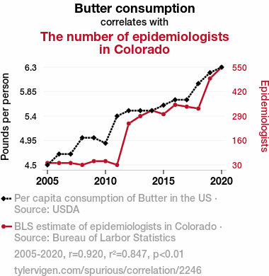
Butter consumptionDetailed data title: Per capita consumption of Butter in the US
Source: USDA
See what else correlates with Butter consumption
The number of epidemiologists in Colorado
Detailed data title: BLS estimate of epidemiologists in Colorado
Source: Bureau of Larbor Statistics
See what else correlates with The number of epidemiologists in Colorado
Correlation is a measure of how much the variables move together. If it is 0.99, when one goes up the other goes up. If it is 0.02, the connection is very weak or non-existent. If it is -0.99, then when one goes up the other goes down. If it is 1.00, you probably messed up your correlation function.
r2 = 0.8472586 (Coefficient of determination)
This means 84.7% of the change in the one variable (i.e., The number of epidemiologists in Colorado) is predictable based on the change in the other (i.e., Butter consumption) over the 16 years from 2005 through 2020.
p < 0.01, which is statistically significant(Null hypothesis significance test)
The p-value is 4.4E-7. 0.0000004365546768547835600000
The p-value is a measure of how probable it is that we would randomly find a result this extreme. More specifically the p-value is a measure of how probable it is that we would randomly find a result this extreme if we had only tested one pair of variables one time.
But I am a p-villain. I absolutely did not test only one pair of variables one time. I correlated hundreds of millions of pairs of variables. I threw boatloads of data into an industrial-sized blender to find this correlation.
Who is going to stop me? p-value reporting doesn't require me to report how many calculations I had to go through in order to find a low p-value!
On average, you will find a correaltion as strong as 0.92 in 4.4E-5% of random cases. Said differently, if you correlated 2,290,664 random variables You don't actually need 2 million variables to find a correlation like this one. I don't have that many variables in my database. You can also correlate variables that are not independent. I do this a lot.
p-value calculations are useful for understanding the probability of a result happening by chance. They are most useful when used to highlight the risk of a fluke outcome. For example, if you calculate a p-value of 0.30, the risk that the result is a fluke is high. It is good to know that! But there are lots of ways to get a p-value of less than 0.01, as evidenced by this project.
In this particular case, the values are so extreme as to be meaningless. That's why no one reports p-values with specificity after they drop below 0.01.
Just to be clear: I'm being completely transparent about the calculations. There is no math trickery. This is just how statistics shakes out when you calculate hundreds of millions of random correlations.
with the same 15 degrees of freedom, Degrees of freedom is a measure of how many free components we are testing. In this case it is 15 because we have two variables measured over a period of 16 years. It's just the number of years minus ( the number of variables minus one ), which in this case simplifies to the number of years minus one.
you would randomly expect to find a correlation as strong as this one.
[ 0.78, 0.97 ] 95% correlation confidence interval (using the Fisher z-transformation)
The confidence interval is an estimate the range of the value of the correlation coefficient, using the correlation itself as an input. The values are meant to be the low and high end of the correlation coefficient with 95% confidence.
This one is a bit more complciated than the other calculations, but I include it because many people have been pushing for confidence intervals instead of p-value calculations (for example: NEJM. However, if you are dredging data, you can reliably find yourself in the 5%. That's my goal!
All values for the years included above: If I were being very sneaky, I could trim years from the beginning or end of the datasets to increase the correlation on some pairs of variables. I don't do that because there are already plenty of correlations in my database without monkeying with the years.
Still, sometimes one of the variables has more years of data available than the other. This page only shows the overlapping years. To see all the years, click on "See what else correlates with..." link above.
| 2005 | 2006 | 2007 | 2008 | 2009 | 2010 | 2011 | 2012 | 2013 | 2014 | 2015 | 2016 | 2017 | 2018 | 2019 | 2020 | |
| Butter consumption (Pounds per person) | 4.5 | 4.7 | 4.7 | 5 | 5 | 4.9 | 5.4 | 5.5 | 5.5 | 5.5 | 5.6 | 5.7 | 5.7 | 6 | 6.2 | 6.3 |
| The number of epidemiologists in Colorado (Epidemiologists) | 40 | 40 | 40 | 30 | 50 | 50 | 30 | 250 | 290 | 320 | 300 | 350 | 340 | 330 | 490 | 550 |
Why this works
- Data dredging: I have 25,153 variables in my database. I compare all these variables against each other to find ones that randomly match up. That's 632,673,409 correlation calculations! This is called “data dredging.” Instead of starting with a hypothesis and testing it, I instead abused the data to see what correlations shake out. It’s a dangerous way to go about analysis, because any sufficiently large dataset will yield strong correlations completely at random.
- Lack of causal connection: There is probably
Because these pages are automatically generated, it's possible that the two variables you are viewing are in fact causually related. I take steps to prevent the obvious ones from showing on the site (I don't let data about the weather in one city correlate with the weather in a neighboring city, for example), but sometimes they still pop up. If they are related, cool! You found a loophole.
no direct connection between these variables, despite what the AI says above. This is exacerbated by the fact that I used "Years" as the base variable. Lots of things happen in a year that are not related to each other! Most studies would use something like "one person" in stead of "one year" to be the "thing" studied. - Observations not independent: For many variables, sequential years are not independent of each other. If a population of people is continuously doing something every day, there is no reason to think they would suddenly change how they are doing that thing on January 1. A simple
Personally I don't find any p-value calculation to be 'simple,' but you know what I mean.
p-value calculation does not take this into account, so mathematically it appears less probable than it really is. - Confounding variable: 2020 is particularly different from the other years on this graph. Confounding variables (like global pandemics) will cause two variables to look connected when in fact a "sneaky third" variable is influencing both of them behind the scenes.
- Y-axis doesn't start at zero: I truncated the Y-axes of the graph above. I also used a line graph, which makes the visual connection stand out more than it deserves.
Nothing against line graphs. They are great at telling a story when you have linear data! But visually it is deceptive because the only data is at the points on the graph, not the lines on the graph. In between each point, the data could have been doing anything. Like going for a random walk by itself!
Mathematically what I showed is true, but it is intentionally misleading. Below is the same chart but with both Y-axes starting at zero.

Try it yourself
You can calculate the values on this page on your own! Try running the Python code to see the calculation results. Step 1: Download and install Python on your computer.Step 2: Open a plaintext editor like Notepad and paste the code below into it.
Step 3: Save the file as "calculate_correlation.py" in a place you will remember, like your desktop. Copy the file location to your clipboard. On Windows, you can right-click the file and click "Properties," and then copy what comes after "Location:" As an example, on my computer the location is "C:\Users\tyler\Desktop"
Step 4: Open a command line window. For example, by pressing start and typing "cmd" and them pressing enter.
Step 5: Install the required modules by typing "pip install numpy", then pressing enter, then typing "pip install scipy", then pressing enter.
Step 6: Navigate to the location where you saved the Python file by using the "cd" command. For example, I would type "cd C:\Users\tyler\Desktop" and push enter.
Step 7: Run the Python script by typing "python calculate_correlation.py"
If you run into any issues, I suggest asking ChatGPT to walk you through installing Python and running the code below on your system. Try this question:
"Walk me through installing Python on my computer to run a script that uses scipy and numpy. Go step-by-step and ask me to confirm before moving on. Start by asking me questions about my operating system so that you know how to proceed. Assume I want the simplest installation with the latest version of Python and that I do not currently have any of the necessary elements installed. Remember to only give me one step per response and confirm I have done it before proceeding."
# These modules make it easier to perform the calculation
import numpy as np
from scipy import stats

# We'll define a function that we can call to return the correlation calculations
def calculate_correlation(array1, array2):

    # Calculate Pearson correlation coefficient and p-value
    correlation, p_value = stats.pearsonr(array1, array2)

    # Calculate R-squared as the square of the correlation coefficient
    r_squared = correlation**2

    return correlation, r_squared, p_value

# These are the arrays for the variables shown on this page, but you can modify them to be any two sets of numbers
array_1 = np.array([4.5,4.7,4.7,5,5,4.9,5.4,5.5,5.5,5.5,5.6,5.7,5.7,6,6.2,6.3,])
array_2 = np.array([40,40,40,30,50,50,30,250,290,320,300,350,340,330,490,550,])
array_1_name = "Butter consumption"
array_2_name = "The number of epidemiologists in Colorado"

# Perform the calculation
print(f"Calculating the correlation between {array_1_name} and {array_2_name}...")
correlation, r_squared, p_value = calculate_correlation(array_1, array_2)

# Print the results
print("Correlation Coefficient:", correlation)
print("R-squared:", r_squared)
print("P-value:", p_value)
Reuseable content
You may re-use the images on this page for any purpose, even commercial purposes, without asking for permission. The only requirement is that you attribute Tyler Vigen. Attribution can take many different forms. If you leave the "tylervigen.com" link in the image, that satisfies it just fine. If you remove it and move it to a footnote, that's fine too. You can also just write "Charts courtesy of Tyler Vigen" at the bottom of an article.You do not need to attribute "the spurious correlations website," and you don't even need to link here if you don't want to. I don't gain anything from pageviews. There are no ads on this site, there is nothing for sale, and I am not for hire.
For the record, I am just one person. Tyler Vigen, he/him/his. I do have degrees, but they should not go after my name unless you want to annoy my wife. If that is your goal, then go ahead and cite me as "Tyler Vigen, A.A. A.A.S. B.A. J.D." Otherwise it is just "Tyler Vigen."
When spoken, my last name is pronounced "vegan," like I don't eat meat.
Full license details.
For more on re-use permissions, or to get a signed release form, see tylervigen.com/permission.
Download images for these variables:
- High resolution line chart
The image linked here is a Scalable Vector Graphic (SVG). It is the highest resolution that is possible to achieve. It scales up beyond the size of the observable universe without pixelating. You do not need to email me asking if I have a higher resolution image. I do not. The physical limitations of our universe prevent me from providing you with an image that is any higher resolution than this one.
If you insert it into a PowerPoint presentation (a tool well-known for managing things that are the scale of the universe), you can right-click > "Ungroup" or "Create Shape" and then edit the lines and text directly. You can also change the colors this way.
Alternatively you can use a tool like Inkscape. - High resolution line chart, optimized for mobile
- Alternative high resolution line chart
- Scatterplot
- Portable line chart (png)
- Portable line chart (png), optimized for mobile
- Line chart for only Butter consumption
- Line chart for only The number of epidemiologists in Colorado
- AI-generated correlation image
- The spurious research paper: The Butter Effect: A Statistical Analysis of Butter Consumption and the Proportion of Epidemiologists in Colorado
Your correlation rating is out of this world!
Correlation ID: 2246 · Black Variable ID: 557 · Red Variable ID: 17552

