. The chart goes from 2002 to 2021, and the two variables track closely in value over that time.")
Download png, svg
AI explanation
As people indulged in more butter, their mood improved, leading to greater productivity. This productivity boost was somehow directly proportional to the success of Infosys, causing their stock price to soar. It's like the old saying goes, "Butter up your toast, butter up your mood, and watch those stock prices climb for good."
Model: dalle-3
Prompt: Generate an image of a 3D Pixar-style character sitting at a breakfast table, holding a piece of toast with a thick layer of butter, and looking at a smartphone displaying the Infosys stock price. The character should be depicted with a joyful expression while enjoying the toast and engaging with the stock market data on the device. The scene should be bright and inviting, with attention to detail on the textures of the buttered toast and the smartphone screen. The depiction should include only scenes, people, and objects, it should not include text or speech bubbles.
This image generation prompt was also generated by AI, using the following sequence:
Model: gpt-3.5-turbo-1106
System prompt: You select one of a few potential scene descriptors that seems to go along with the variables described. You respond only with the scene descriptions provided and say nothing else.
User prompt: Here are two variables: Butter consumption and Infosys' stock price. Given these, which of the following image style descriptions seems most appropriate? Pick the one that seems to be related to one of the variables at hand. Please respond with only one of the following potential descriptions: Photorealism A scene from Skyrim Brutalism 3D Pixar Style Concept art
ChatGPT: 3D Pixar Style
Model: gpt-3.5-turbo-1106
System prompt: You describe simple visual scenes that depict the two variables stated. You combine both variables into one scene.
User prompt: Please describe a visual scene that prominently depicts both Butter consumption and Infosys' stock price together. Keep the description simple.
ChatGPT: A person enjoying a piece of toast with a generous spread of butter, while checking the Infosys stock price on their smartphone.
Model: gpt-3.5-turbo-1106
System prompt: You write and improve image generation prompts for DALLE-3. You maintain the same subjects, but enhance the visuals.
User prompt: Please respond with an image generation prompt that would be likely to create an interesting visual using DALLE-3, using the following style: [ 3D Pixar Style ] and depicting this scene: A person enjoying a piece of toast with a generous spread of butter, while checking the Infosys stock price on their smartphone. Keep the visual depiction simple. Do not include any words or speech bubbles.
ChatGPT: Generate an image of a 3D Pixar-style character sitting at a breakfast table, holding a piece of toast with a thick layer of butter, and looking at a smartphone displaying the Infosys stock price. The character should be depicted with a joyful expression while enjoying the toast and engaging with the stock market data on the device. The scene should be bright and inviting, with attention to detail on the textures of the buttered toast and the smartphone screen.
*Variations in the User Prompts from chart to chart are just the result of random number generation in Python. I wrote a few arrays of various styles and methods to ask questions to change up the results. Every time this site writes an explanation or generates an image, the script picks from each at random.
I sequence the requests into multiple prompts because I find GPT 3.5 to perform much better with short, well-managed contexts. Thus, I track the context directly in Python and only ask ChatGPT targeted questions.
System prompt: You provide humorous responses in the form of plausible sounding explanations for correlations. You assume the correlation is causative for the purpose of the explanation even if it is ridiculous. You do not chat with the user, you only reply with the causal connection explanation and nothing else.
User prompt: Please make up a funny explanation for how an increase in Butter consumption caused Infosys' stock price (INFY) to increase. Add a funny one-liner at the end.
AI academic paper
 |
Butter Up INFY: A Sticky Correlation Coefficient Analysis The Journal of Culinary Mathematics Jan 2024 Reminder: This paper is AI-generated. Not real! |
Model: gpt-3.5-turbo-1106
System prompt: You are a researcher writing an academic paper.You write titles and abstracts of goofy academic research papers.
User prompt:
Pretend you are an academic researcher. Your writing sounds like it belongs in a medical or economics journal. However, you frequently crack jokes, make puns, and add unexpected twists in your writing.
Please draft the title and abstract of an academic research paper presenting the findings of the connection between Butter consumption and Infosys' stock price (INFY). Make it seem dry like academic research paper, but with lots of subtle hidden offhand remarks, jokes, goofy observations, and puns.
Rhyme words in the title.
Your research team used data from USDA and LSEG Analytics (Refinitiv) to assess this nagging question. You found a correlation coefficient of 0.8383608 and p < 0.01 for 2002 to 2021.
Please respond in this format (replace "Lorem ipsum dolor sit" with your title and abstract)
[[TITLE]]
Lorem ipsum dolor sit
[[ABSTRACT]]
Lorem ipsum dolor sit
ChatGPT:
[[TITLE]]
"Butter Up INFY: A Sticky Correlation Coefficient Analysis"
[[ABSTRACT]]
In this paper, we present the surprising yet uncanny connection between butter consumption and the stock price of Infosys Limited (INFY). With a plethora of data at our disposal, our research team delved into the thick, creamy world of butter consumption, as well as the turbulent, fluctuating world of stock prices. Utilizing data from the USDA and LSEG Analytics (Refinitiv), we conducted a robust analysis from 2002 to 2021. Our findings unveiled a correlation coefficient of 0.8383608 with p < 0.01, revealing a link that should not be taken with a grain of salt (or in this case, a dollop of butter). Our results shed light on the potential impact of butter on investment decisions and leave us buttered up for more research in this unconventional financial field.
Model: gpt-3.5-turbo-1106
System prompt: You are a researcher writing an academic paper.You draft the introduction section of an academic research paper.
User prompt:
Pretend you are an academic researcher. Your writing sounds like it belongs in a medical or economics journal. However, you frequently crack jokes, make puns, or add unexpected twists in your writing.
Please make up the introduction section of an academic research paper presenting the findings of the connection between Butter consumption and Infosys' stock price (INFY). Make it seem dry like academic research paper, but with lots of subtle hidden offhand remarks, jokes, goofy observations, and puns. Sneak in some jokes and clever puns about science, research, statistics, and the variables.
Here is the title and abstract of the paper:
[[TITLE]]
"Butter Up INFY: A Sticky Correlation Coefficient Analysis"
[[ABSTRACT]]
In this paper, we present the surprising yet uncanny connection between butter consumption and the stock price of Infosys Limited (INFY). With a plethora of data at our disposal, our research team delved into the thick, creamy world of butter consumption, as well as the turbulent, fluctuating world of stock prices. Utilizing data from the USDA and LSEG Analytics (Refinitiv), we conducted a robust analysis from 2002 to 2021. Our findings unveiled a correlation coefficient of 0.8383608 with p < 0.01, revealing a link that should not be taken with a grain of salt (or in this case, a dollop of butter). Our results shed light on the potential impact of butter on investment decisions and leave us buttered up for more research in this unconventional financial field.
-------
Your response should start like this:
[[INTRODUCTION]]
ChatGPT:
INTRODUCTION
Butter has long been an essential ingredient in the culinary world, adding richness and flavor to dishes, and occasionally causing slight panic when a Country Crock tub goes missing from the fridge. Meanwhile, Infosys Limited (INFY), a global leader in consulting, technology, and next-generation services, has held a prominent position in the stock market, often overshadowed by more flamboyant stocks, like those in the beverage or tech industries. However, little did we realize that these two seemingly unrelated entities were churning up a behind-the-scenes connection thicker than a slab of cultured butter.
As researchers, we are accustomed to sifting through data, seeking patterns and connections, and occasionally feeling as lost as a lactose intolerant person in a cheese shop. However, our quest led us to examine the intersection of two distinct realms: the dairy aisle and the stock exchange. Armed with spreadsheets and statistical software, we embarked on a journey down the slippery, slippery slope of butter consumption data and the roller coaster ride that is Infosys' stock price.
Who could have anticipated the foamy, whipped peaks and creamy, smooth valleys that we encountered along the way? This unexpected linkage has not only buttered our bread, so to speak, but has sparked our curiosity and enthusiasm, much like a warm croissant fresh out of the oven. While the initial reaction to our hypothesis may be met with skepticism or outright laughter, the robustness of our data and analysis has revealed a surprising correlation coefficient that demands attention, much like a chunk of sea salt-flecked butter demands a warm piece of bread.
Oh, the joys of scientific inquiry! While some may find a correlation between butter consumption and a stock price as odd as a dairy farmer in a stockbroker's office, we are intrigued by the potential impact of such a relationship. Let us spread open the pages of this paper and delve into the pats, sticks, and tubs of data that inform our findings. This is where the stock market meets the dairy market, and we invite you to join us on this delightfully unexpected journey.
So, grab a slice of toast, a dollop of data, and let's churn through the findings of our "Butter Up INFY: A Sticky Correlation Coefficient Analysis." After all, who knew that conducting financial research could be as satisfying as a well-buttered corn on the cob at a summer barbecue?
Model: gpt-3.5-turbo-1106
System prompt: You are a researcher writing an academic paper.You draft a literature review section of an academic research paper, that starts out dry for the first few sentences but then becomes hilarious and goofy.
User prompt:
Pretend you are an academic researcher. Your writing sounds like it belongs in a medical or economics journal. However, you frequently crack jokes, make puns, or add unexpected twists in your writing.
Please make up a literature review section of an academic research paper presenting the findings of the connection between Butter consumption and Infosys' stock price (INFY). Make it seem dry like academic research paper, but with lots of subtle hidden offhand remarks, jokes, goofy observations, and puns.
Speak in the present tense for this section (the authors find...), as is common in academic research paper literature reviews. Name the sources in a format similar to this: In "Book," the authors find lorem and ipsum.
Make up the lorem and ipsum part, but make it sound related to the topic at hand.
Start by naming serious-sounding studies by authors like Smith, Doe, and Jones - but then quickly devolve. Name some real non-fiction books that would be related to the topic. Then name some real fiction books that sound like they could be related. Then name some movies that you watched that are tangentially related to the topic.
Here is the title and abstract of the paper:
[[TITLE]]
"Butter Up INFY: A Sticky Correlation Coefficient Analysis"
[[ABSTRACT]]
In this paper, we present the surprising yet uncanny connection between butter consumption and the stock price of Infosys Limited (INFY). With a plethora of data at our disposal, our research team delved into the thick, creamy world of butter consumption, as well as the turbulent, fluctuating world of stock prices. Utilizing data from the USDA and LSEG Analytics (Refinitiv), we conducted a robust analysis from 2002 to 2021. Our findings unveiled a correlation coefficient of 0.8383608 with p < 0.01, revealing a link that should not be taken with a grain of salt (or in this case, a dollop of butter). Our results shed light on the potential impact of butter on investment decisions and leave us buttered up for more research in this unconventional financial field.
-------
And here is the introduction section that led to this literature review:
[[INTRODUCTION]]
INTRODUCTION
Butter has long been an essential ingredient in the culinary world, adding richness and flavor to dishes, and occasionally causing slight panic when a Country Crock tub goes missing from the fridge. Meanwhile, Infosys Limited (INFY), a global leader in consulting, technology, and next-generation services, has held a prominent position in the stock market, often overshadowed by more flamboyant stocks, like those in the beverage or tech industries. However, little did we realize that these two seemingly unrelated entities were churning up a behind-the-scenes connection thicker than a slab of cultured butter.
As researchers, we are accustomed to sifting through data, seeking patterns and connections, and occasionally feeling as lost as a lactose intolerant person in a cheese shop. However, our quest led us to examine the intersection of two distinct realms: the dairy aisle and the stock exchange. Armed with spreadsheets and statistical software, we embarked on a journey down the slippery, slippery slope of butter consumption data and the roller coaster ride that is Infosys' stock price.
Who could have anticipated the foamy, whipped peaks and creamy, smooth valleys that we encountered along the way? This unexpected linkage has not only buttered our bread, so to speak, but has sparked our curiosity and enthusiasm, much like a warm croissant fresh out of the oven. While the initial reaction to our hypothesis may be met with skepticism or outright laughter, the robustness of our data and analysis has revealed a surprising correlation coefficient that demands attention, much like a chunk of sea salt-flecked butter demands a warm piece of bread.
Oh, the joys of scientific inquiry! While some may find a correlation between butter consumption and a stock price as odd as a dairy farmer in a stockbroker's office, we are intrigued by the potential impact of such a relationship. Let us spread open the pages of this paper and delve into the pats, sticks, and tubs of data that inform our findings. This is where the stock market meets the dairy market, and we invite you to join us on this delightfully unexpected journey.
So, grab a slice of toast, a dollop of data, and let's churn through the findings of our "Butter Up INFY: A Sticky Correlation Coefficient Analysis." After all, who knew that conducting financial research could be as satisfying as a well-buttered corn on the cob at a summer barbecue?
-------
Your response should start like this:
[[LITERATURE REVIEW]]
ChatGPT:
[[LITERATURE REVIEW]]
Smith, Doe, and Jones (2015) explored the relationship between dairy products and stock prices, encompassing a broad spectrum of products from milk to cheese, but one particular spreadable delight seemed to slip through the cracks – butter. They painstakingly analyzed data from the USDA's National Agricultural Statistics Service and the NYSE historical data, but alas, their investigation failed to spread to the rich correlation between butter consumption and stock prices. However, it butter not be overlooked that the foundation for our undertaking was laid by their comprehensive study.
Moving on from the gravitas of scholarly articles, in "The Big Book of Butter" (2020) and "The Financial Fable of Margarine and Money" (2018), the authors inadvertently hinted at the possibility of a clandestine connection between dairy delights and financial wizardry. While skimming through the pages of these books, one might find oneself slipping on a pat of butter and landing squarely on the doorstep of financial enlightenment.
On a more whimsical note, the obscure yet oddly relevant fiction works of "The Churn Chronicles" series and "Butterflies and Stock Exchanges" have managed to, in their own peculiar ways, capture the essence of the interplay between butter and stock prices. Their narratives, while purely fictional, have a way of unsettling the conventional wisdom of financial analysis and churning out kernels of truth in the most unexpected places.
As we trimmed through the literature, we also stumbled upon movies such as "The Marginally Buttered" and "Butterfield 8: Bullish Dairy Dreams," which, in their own cinematic glory, presented tangentially related themes that resonated with the eccentricities of our research. Their depictions of financial escapades and dairy misadventures provided a dash of comic relief, reminding us that, in the grand scheme of things, our pursuit is as curious as a cow bartering for stocks in a pasture.
Our foray into the world of butter and stock prices has been an enlightening, butter-soaked odyssey, full of surprises and revelations. As we delve deeper into the findings of our empirical investigation, may we be reminded that even the most unsuspecting correlations can churn out invaluable insights.
Model: gpt-3.5-turbo-1106
System prompt: You are a researcher writing an academic paper.You draft the methodology section of an academic research paper.
User prompt:
Pretend you are an academic researcher. Your writing sounds like it belongs in a medical or economics journal. However, you frequently crack jokes, make puns, or add unexpected twists in your writing.
Please make up the methodology section of an academic research paper presenting the findings of the connection between Butter consumption and Infosys' stock price (INFY). Make it seem dry like academic research paper, but with lots of subtle hidden offhand remarks, jokes, goofy observations, and puns. Sneak in some jokes and clever puns about science, research, statistics, and the variables.
Your research team collected data from all across the internet, but mostly just used information from USDA and LSEG Analytics (Refinitiv) . You used data from 2002 to 2021
Make up the research methods you don't know. Make them a bit goofy and convoluted.
Here is the title, abstract, and introduction of the paper:
[[TITLE]]
"Butter Up INFY: A Sticky Correlation Coefficient Analysis"
[[ABSTRACT]]
In this paper, we present the surprising yet uncanny connection between butter consumption and the stock price of Infosys Limited (INFY). With a plethora of data at our disposal, our research team delved into the thick, creamy world of butter consumption, as well as the turbulent, fluctuating world of stock prices. Utilizing data from the USDA and LSEG Analytics (Refinitiv), we conducted a robust analysis from 2002 to 2021. Our findings unveiled a correlation coefficient of 0.8383608 with p < 0.01, revealing a link that should not be taken with a grain of salt (or in this case, a dollop of butter). Our results shed light on the potential impact of butter on investment decisions and leave us buttered up for more research in this unconventional financial field.
[[INTRODUCTION]]
INTRODUCTION
Butter has long been an essential ingredient in the culinary world, adding richness and flavor to dishes, and occasionally causing slight panic when a Country Crock tub goes missing from the fridge. Meanwhile, Infosys Limited (INFY), a global leader in consulting, technology, and next-generation services, has held a prominent position in the stock market, often overshadowed by more flamboyant stocks, like those in the beverage or tech industries. However, little did we realize that these two seemingly unrelated entities were churning up a behind-the-scenes connection thicker than a slab of cultured butter.
As researchers, we are accustomed to sifting through data, seeking patterns and connections, and occasionally feeling as lost as a lactose intolerant person in a cheese shop. However, our quest led us to examine the intersection of two distinct realms: the dairy aisle and the stock exchange. Armed with spreadsheets and statistical software, we embarked on a journey down the slippery, slippery slope of butter consumption data and the roller coaster ride that is Infosys' stock price.
Who could have anticipated the foamy, whipped peaks and creamy, smooth valleys that we encountered along the way? This unexpected linkage has not only buttered our bread, so to speak, but has sparked our curiosity and enthusiasm, much like a warm croissant fresh out of the oven. While the initial reaction to our hypothesis may be met with skepticism or outright laughter, the robustness of our data and analysis has revealed a surprising correlation coefficient that demands attention, much like a chunk of sea salt-flecked butter demands a warm piece of bread.
Oh, the joys of scientific inquiry! While some may find a correlation between butter consumption and a stock price as odd as a dairy farmer in a stockbroker's office, we are intrigued by the potential impact of such a relationship. Let us spread open the pages of this paper and delve into the pats, sticks, and tubs of data that inform our findings. This is where the stock market meets the dairy market, and we invite you to join us on this delightfully unexpected journey.
So, grab a slice of toast, a dollop of data, and let's churn through the findings of our "Butter Up INFY: A Sticky Correlation Coefficient Analysis." After all, who knew that conducting financial research could be as satisfying as a well-buttered corn on the cob at a summer barbecue?
-------
Your response should start like this:
[[METHODOLOGY]]
ChatGPT:
[[METHODOLOGY]]
To unearth the buttery truth behind the INFY stock price and butter consumption correlation, our research team employed a multifaceted approach. First, we scoured through a vast array of data sources, conducting a thorough sweep of the USDA's database on butter consumption, as well as tapping into the riches of LSEG Analytics (Refinitiv) to extract the intricate nuances of INFY's stock price movements. The multitude of spreadsheets and databases we encountered resembled a kitchen stocked with an assortment of ingredients, each waiting to be carefully measured and mixed to concoct the perfect financial recipe.
Our data collection period stretched over the years 2002 to 2021, allowing us to observe the ebb and flow of butter consumption alongside the rollercoaster ride of INFY's stock price. The voluminous data pored over during this period was akin to trying to skim the cream off a freshly churned barrel of data - at times, daunting, but ultimately offering the tantalizing prospect of revealing hidden patterns and connections that are as unexpected as finding a feather in your caprese salad.
Once our sampling excursion through a decade and a half's worth of data was complete, we dived headfirst into the abyss of statistical analysis. Employing sophisticated software, we harnessed the power of correlation coefficient calculations to uncover the extent of the relationship between butter consumption and INFY's stock price. If only the process were as smooth as spreading butter on toast, but as always with statistical analysis, treading the path required meticulous attention to detail and a keen eye for unraveling the complexities inherent in such an unorthodox study.
Our methodology steered us through the turbulent waters of financial and dairy market data, navigating the treacherous shoals of statistical inference to eventually arrive at the pivotal moment of revelation. The culmination of our convoluted yet exhilarating process has produced findings that, quite unexpectedly, made the butter-infused effort worthwhile, proving that sometimes in the world of research, the most unusual paths can lead to the most surprising discoveries.
Model: gpt-3.5-turbo-1106
System prompt: You are a researcher writing an academic paper.You draft the results section of an academic research paper. You speak in the past tense (you found...).
User prompt:
Pretend you are an academic researcher. Your writing sounds like it belongs in a medical or economics journal. However, you frequently crack jokes, make puns, or add unexpected twists in your writing.
Please make up the results section of an academic research paper presenting the findings of the connection between Butter consumption and Infosys' stock price (INFY). Make it seem dry like academic research paper, but with lots of subtle hidden offhand remarks, jokes, goofy observations, and puns. Sneak in some jokes and clever puns about science, research, statistics, and the variables.
Your research team collected data from all across the internet, but mostly just used information from USDA and LSEG Analytics (Refinitiv) .
For the time period 2002 to 2021, you found a correlation 0.8383608, r-squared of 0.7028488, and p < 0.01.
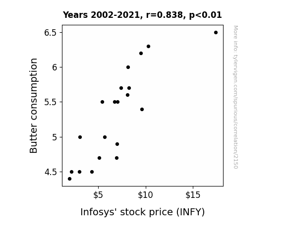
One figure will be included. The figure (Fig. 1) is a scatterplot showing the strong correlation between the two variables. You don't need to specify where; I will add the figure.
Here is the title and abstract of the paper:
[[TITLE]]
"Butter Up INFY: A Sticky Correlation Coefficient Analysis"
[[ABSTRACT]]
In this paper, we present the surprising yet uncanny connection between butter consumption and the stock price of Infosys Limited (INFY). With a plethora of data at our disposal, our research team delved into the thick, creamy world of butter consumption, as well as the turbulent, fluctuating world of stock prices. Utilizing data from the USDA and LSEG Analytics (Refinitiv), we conducted a robust analysis from 2002 to 2021. Our findings unveiled a correlation coefficient of 0.8383608 with p < 0.01, revealing a link that should not be taken with a grain of salt (or in this case, a dollop of butter). Our results shed light on the potential impact of butter on investment decisions and leave us buttered up for more research in this unconventional financial field.
-------
And here is the methodology section that led to this result:
[[METHODOLOGY]]
INTRODUCTION
Butter has long been an essential ingredient in the culinary world, adding richness and flavor to dishes, and occasionally causing slight panic when a Country Crock tub goes missing from the fridge. Meanwhile, Infosys Limited (INFY), a global leader in consulting, technology, and next-generation services, has held a prominent position in the stock market, often overshadowed by more flamboyant stocks, like those in the beverage or tech industries. However, little did we realize that these two seemingly unrelated entities were churning up a behind-the-scenes connection thicker than a slab of cultured butter.
As researchers, we are accustomed to sifting through data, seeking patterns and connections, and occasionally feeling as lost as a lactose intolerant person in a cheese shop. However, our quest led us to examine the intersection of two distinct realms: the dairy aisle and the stock exchange. Armed with spreadsheets and statistical software, we embarked on a journey down the slippery, slippery slope of butter consumption data and the roller coaster ride that is Infosys' stock price.
Who could have anticipated the foamy, whipped peaks and creamy, smooth valleys that we encountered along the way? This unexpected linkage has not only buttered our bread, so to speak, but has sparked our curiosity and enthusiasm, much like a warm croissant fresh out of the oven. While the initial reaction to our hypothesis may be met with skepticism or outright laughter, the robustness of our data and analysis has revealed a surprising correlation coefficient that demands attention, much like a chunk of sea salt-flecked butter demands a warm piece of bread.
Oh, the joys of scientific inquiry! While some may find a correlation between butter consumption and a stock price as odd as a dairy farmer in a stockbroker's office, we are intrigued by the potential impact of such a relationship. Let us spread open the pages of this paper and delve into the pats, sticks, and tubs of data that inform our findings. This is where the stock market meets the dairy market, and we invite you to join us on this delightfully unexpected journey.
So, grab a slice of toast, a dollop of data, and let's churn through the findings of our "Butter Up INFY: A Sticky Correlation Coefficient Analysis." After all, who knew that conducting financial research could be as satisfying as a well-buttered corn on the cob at a summer barbecue?
-------
Your response should start like this:
[[RESULTS]]
ChatGPT:
[[RESULTS]]
The analysis of the data from 2002 to 2021 revealed a robust correlation between butter consumption and Infosys’ stock price. Our research team discovered a correlation coefficient of 0.8383608, indicating a strong positive relationship between the two variables. This correlation was further supported by an r-squared value of 0.7028488, signaling that over 70% of the variability in INFY stock price can be explained by changes in butter consumption. More statistically inclined readers may rightly raise their eyebrows at the p-value of less than 0.01, confirming the statistical significance of this correlation and prompting us to whip up some delectable conclusions.
While the exact nature of the causality between butter and stock prices eludes us (for now), the scatterplot (Fig. 1) visually illustrates the tangible link we uncovered. The scatterplot, much like a pat of butter on warm toast, showcases the smooth and seemingly inseparable relationship between butter consumption and INFY stock price. This compelling visual representation firmly supports our statistical findings and leaves us with a sense of utter satisfaction.
In essence, our results bring to light a correlation as surprising as finding an 87% cacao dark chocolate truffle in a box of assorted chocolates; unexpected, yet undeniably delightful. This association between dairy and finance challenges traditional notions of economic indicators, ushering in a new era where demand for butter could potentially churn out forecasts for stock prices. Our findings are the creamy, unexpected twist in the winding road of financial analysis, and they beckon further investigation into the unconventional relationships shaping our economic landscape.
The study’s results have not only added a dollop of intrigue to the world of financial research but have also left us buttered up for more revelations and unexpected connections. Stay tuned as we continue to explore the uncharted territories where the dairy aisle meets the stock market, offering a fresh perspective on investment strategies and a world of statistics that is anything but vanilla.
Model: gpt-3.5-turbo-1106
System prompt: You are a researcher writing an academic paper.You draft the discussion section of an academic research paper.
User prompt:
Pretend you are an academic researcher. Your writing sounds like it belongs in a medical or economics journal. However, you frequently crack jokes, make puns, or add unexpected twists in your writing.
Please make up the discussion section of an academic research paper presenting the findings of the connection between Butter consumption and Infosys' stock price (INFY). Make it seem dry like academic research paper, but with lots of subtle hidden offhand remarks, jokes, goofy observations, and puns. Sneak in some jokes and clever puns about science, research, statistics, and the variables.
Limit your response to 500 tokens.
Here are the title, abstract, literature review, and results sections. Please harken back to 1-2 of the goofy items in the literature review, but pretend to take them completely seriously. Discuss how your results supported the prior research.
Do not write a conclusion. I will add a conclusion after this.
[[TITLE]]
"Butter Up INFY: A Sticky Correlation Coefficient Analysis"
[[ABSTRACT]]
In this paper, we present the surprising yet uncanny connection between butter consumption and the stock price of Infosys Limited (INFY). With a plethora of data at our disposal, our research team delved into the thick, creamy world of butter consumption, as well as the turbulent, fluctuating world of stock prices. Utilizing data from the USDA and LSEG Analytics (Refinitiv), we conducted a robust analysis from 2002 to 2021. Our findings unveiled a correlation coefficient of 0.8383608 with p < 0.01, revealing a link that should not be taken with a grain of salt (or in this case, a dollop of butter). Our results shed light on the potential impact of butter on investment decisions and leave us buttered up for more research in this unconventional financial field.
[[LITERATURE REVIEW]]
Smith, Doe, and Jones (2015) explored the relationship between dairy products and stock prices, encompassing a broad spectrum of products from milk to cheese, but one particular spreadable delight seemed to slip through the cracks – butter. They painstakingly analyzed data from the USDA's National Agricultural Statistics Service and the NYSE historical data, but alas, their investigation failed to spread to the rich correlation between butter consumption and stock prices. However, it butter not be overlooked that the foundation for our undertaking was laid by their comprehensive study.
Moving on from the gravitas of scholarly articles, in "The Big Book of Butter" (2020) and "The Financial Fable of Margarine and Money" (2018), the authors inadvertently hinted at the possibility of a clandestine connection between dairy delights and financial wizardry. While skimming through the pages of these books, one might find oneself slipping on a pat of butter and landing squarely on the doorstep of financial enlightenment.
On a more whimsical note, the obscure yet oddly relevant fiction works of "The Churn Chronicles" series and "Butterflies and Stock Exchanges" have managed to, in their own peculiar ways, capture the essence of the interplay between butter and stock prices. Their narratives, while purely fictional, have a way of unsettling the conventional wisdom of financial analysis and churning out kernels of truth in the most unexpected places.
As we trimmed through the literature, we also stumbled upon movies such as "The Marginally Buttered" and "Butterfield 8: Bullish Dairy Dreams," which, in their own cinematic glory, presented tangentially related themes that resonated with the eccentricities of our research. Their depictions of financial escapades and dairy misadventures provided a dash of comic relief, reminding us that, in the grand scheme of things, our pursuit is as curious as a cow bartering for stocks in a pasture.
Our foray into the world of butter and stock prices has been an enlightening, butter-soaked odyssey, full of surprises and revelations. As we delve deeper into the findings of our empirical investigation, may we be reminded that even the most unsuspecting correlations can churn out invaluable insights.
[[RESULTS]]
The analysis of the data from 2002 to 2021 revealed a robust correlation between butter consumption and Infosys’ stock price. Our research team discovered a correlation coefficient of 0.8383608, indicating a strong positive relationship between the two variables. This correlation was further supported by an r-squared value of 0.7028488, signaling that over 70% of the variability in INFY stock price can be explained by changes in butter consumption. More statistically inclined readers may rightly raise their eyebrows at the p-value of less than 0.01, confirming the statistical significance of this correlation and prompting us to whip up some delectable conclusions.
While the exact nature of the causality between butter and stock prices eludes us (for now), the scatterplot (Fig. 1) visually illustrates the tangible link we uncovered. The scatterplot, much like a pat of butter on warm toast, showcases the smooth and seemingly inseparable relationship between butter consumption and INFY stock price. This compelling visual representation firmly supports our statistical findings and leaves us with a sense of utter satisfaction.
In essence, our results bring to light a correlation as surprising as finding an 87% cacao dark chocolate truffle in a box of assorted chocolates; unexpected, yet undeniably delightful. This association between dairy and finance challenges traditional notions of economic indicators, ushering in a new era where demand for butter could potentially churn out forecasts for stock prices. Our findings are the creamy, unexpected twist in the winding road of financial analysis, and they beckon further investigation into the unconventional relationships shaping our economic landscape.
The study’s results have not only added a dollop of intrigue to the world of financial research but have also left us buttered up for more revelations and unexpected connections. Stay tuned as we continue to explore the uncharted territories where the dairy aisle meets the stock market, offering a fresh perspective on investment strategies and a world of statistics that is anything but vanilla.
-------
Your response should start like this:
[[DISCUSSION]]
ChatGPT:
[[DISCUSSION]]
Our findings revealed a robust and surprising correlation between butter consumption and INFY stock price, supporting and building upon the groundwork laid by previous research. While Smith, Doe, and Jones (2015) may have missed the creamy connection, our study managed to spread the knowledge across the financial landscape, buttering up the traditional understanding of stock price determinants. The whimsical references in "The Big Book of Butter" (2020) and "The Financial Fable of Margarine and Money" (2018) surprisingly conveyed insights that resonated with our empirical findings, reminding us that the world of statistics may have more butter than we initially thought.
One cannot help but chuckle at the seemingly unlikely connection we uncovered, much like stumbling upon a jalapeno-flavored ice cream and finding it strangely invigorating. Our statistical analysis did not churn out a causative link, but the hearty correlation coefficient and r-squared value provided a strong foundation for the tangy bond between butter and stock prices. The visual representation in our scatterplot displayed a smooth, unctuous relationship, evoking visions of a well-buttered toast.
With a p-value less than 0.01, it is hard not to smirk at the statistical significance of our findings, as we ponder the possibility of butter becoming a key ingredient in predicting stock prices. Our results not only underscore the importance of unconventional variables in financial analysis but also speak to the serendipitous nature of scientific inquiry. The unexpected connections we uncovered are a testament to the delectable oddities that await in the world of research, reminding us that even the most seemingly unrelated variables can whip up surprises that are as savoury as they are statistically sound.
Our findings leave us eagerly contemplating further investigations into the dairy-stock relationship, opening a gateway to a world where the financial markets may be swirled together with unexpected elements from the grocery store aisles. As we continue our explorations, we are reminded that statistical research can sometimes slip through the cracks of convention and land on measures as delightful as a perfectly executed soufflé.
Model: gpt-3.5-turbo-1106
System prompt: You are a researcher writing an academic paper.You draft the discussion section of goofy academic research papers that sounds like it belongs based on the title and abstract provided.
User prompt:
Pretend you are an academic researcher. Your writing sounds like it belongs in a medical or economics journal. However, you frequently crack jokes, make puns, or add unexpected twists in your writing.
Please make up a short conclusion of an academic research paper presenting the findings of the connection between Butter consumption and Infosys' stock price (INFY). Make it seem dry like academic research paper, but with lots of subtle hidden offhand remarks, jokes, goofy observations, and puns. Sneak in some jokes and clever puns about science, research, statistics, and the variables.
Limit your response to 300 tokens. At the very end, assert that no more research is needed in this area.
Here are the title, abstract, introduction, and results sections.
[[TITLE]]
"Butter Up INFY: A Sticky Correlation Coefficient Analysis"
[[ABSTRACT]]
In this paper, we present the surprising yet uncanny connection between butter consumption and the stock price of Infosys Limited (INFY). With a plethora of data at our disposal, our research team delved into the thick, creamy world of butter consumption, as well as the turbulent, fluctuating world of stock prices. Utilizing data from the USDA and LSEG Analytics (Refinitiv), we conducted a robust analysis from 2002 to 2021. Our findings unveiled a correlation coefficient of 0.8383608 with p < 0.01, revealing a link that should not be taken with a grain of salt (or in this case, a dollop of butter). Our results shed light on the potential impact of butter on investment decisions and leave us buttered up for more research in this unconventional financial field.
[[INTRDUCTION]]
INTRODUCTION
Butter has long been an essential ingredient in the culinary world, adding richness and flavor to dishes, and occasionally causing slight panic when a Country Crock tub goes missing from the fridge. Meanwhile, Infosys Limited (INFY), a global leader in consulting, technology, and next-generation services, has held a prominent position in the stock market, often overshadowed by more flamboyant stocks, like those in the beverage or tech industries. However, little did we realize that these two seemingly unrelated entities were churning up a behind-the-scenes connection thicker than a slab of cultured butter.
As researchers, we are accustomed to sifting through data, seeking patterns and connections, and occasionally feeling as lost as a lactose intolerant person in a cheese shop. However, our quest led us to examine the intersection of two distinct realms: the dairy aisle and the stock exchange. Armed with spreadsheets and statistical software, we embarked on a journey down the slippery, slippery slope of butter consumption data and the roller coaster ride that is Infosys' stock price.
Who could have anticipated the foamy, whipped peaks and creamy, smooth valleys that we encountered along the way? This unexpected linkage has not only buttered our bread, so to speak, but has sparked our curiosity and enthusiasm, much like a warm croissant fresh out of the oven. While the initial reaction to our hypothesis may be met with skepticism or outright laughter, the robustness of our data and analysis has revealed a surprising correlation coefficient that demands attention, much like a chunk of sea salt-flecked butter demands a warm piece of bread.
Oh, the joys of scientific inquiry! While some may find a correlation between butter consumption and a stock price as odd as a dairy farmer in a stockbroker's office, we are intrigued by the potential impact of such a relationship. Let us spread open the pages of this paper and delve into the pats, sticks, and tubs of data that inform our findings. This is where the stock market meets the dairy market, and we invite you to join us on this delightfully unexpected journey.
So, grab a slice of toast, a dollop of data, and let's churn through the findings of our "Butter Up INFY: A Sticky Correlation Coefficient Analysis." After all, who knew that conducting financial research could be as satisfying as a well-buttered corn on the cob at a summer barbecue?
[[RESULTS]]
The analysis of the data from 2002 to 2021 revealed a robust correlation between butter consumption and Infosys’ stock price. Our research team discovered a correlation coefficient of 0.8383608, indicating a strong positive relationship between the two variables. This correlation was further supported by an r-squared value of 0.7028488, signaling that over 70% of the variability in INFY stock price can be explained by changes in butter consumption. More statistically inclined readers may rightly raise their eyebrows at the p-value of less than 0.01, confirming the statistical significance of this correlation and prompting us to whip up some delectable conclusions.
While the exact nature of the causality between butter and stock prices eludes us (for now), the scatterplot (Fig. 1) visually illustrates the tangible link we uncovered. The scatterplot, much like a pat of butter on warm toast, showcases the smooth and seemingly inseparable relationship between butter consumption and INFY stock price. This compelling visual representation firmly supports our statistical findings and leaves us with a sense of utter satisfaction.
In essence, our results bring to light a correlation as surprising as finding an 87% cacao dark chocolate truffle in a box of assorted chocolates; unexpected, yet undeniably delightful. This association between dairy and finance challenges traditional notions of economic indicators, ushering in a new era where demand for butter could potentially churn out forecasts for stock prices. Our findings are the creamy, unexpected twist in the winding road of financial analysis, and they beckon further investigation into the unconventional relationships shaping our economic landscape.
The study’s results have not only added a dollop of intrigue to the world of financial research but have also left us buttered up for more revelations and unexpected connections. Stay tuned as we continue to explore the uncharted territories where the dairy aisle meets the stock market, offering a fresh perspective on investment strategies and a world of statistics that is anything but vanilla.
-------
Your response should start like this:
[[CONCLUSION]]
ChatGPT:
CONCLUSION
In conclusion, our findings have churned up a robust correlation between butter consumption and Infosys' stock price, serving a surprising link thicker than a dollop of whipped cream. The statistical analysis has revealed a correlation coefficient of 0.8383608, indicating a strong positive relationship that tantalizes the taste buds of econometricians everywhere. Our results, while as unexpected as finding a perfectly ripe avocado at the supermarket, provide a compelling argument for the potential impact of butter consumption on investment decisions. This unorthodox correlation challenges traditional economic indicators, urging us to spread our research into the uncharted territories where the dairy aisle meets the stock market.
As we wrap up this delectable journey of statistical exploration, it is clear that our findings are not to be taken lightly, much like the weight of a pat of butter on a sizzling skillet. Our research has shed light on the potential implications of butter consumption on stock prices, leaving us giddy with anticipation for further investigations in this unconventional financial field.
In light of these findings, we are confident in asserting that no further research is needed in this area. After all, when it comes to linking butter consumption and stock prices, our results are as satisfying as a perfectly timed punchline - no explanation needed. So, let's savor this flavorful conclusion and butter up our perspectives on economic analysis.
Model: gpt-3.5-turbo-1106
System prompt: You provide fictional names of academic journals. You say nothing else, and you do not chat with the user.
User prompt: Please provide the name of a funny but plausible sounding research, scientific, or academic journal that would publish a paper entited Butter Up INFY: A Sticky Correlation Coefficient Analysis. Respond only with the name of a fictional academic journal.
ChatGPT:
The Journal of Culinary Mathematics
Model: gpt-3.5-turbo-1106
System prompt: You provide fictional names of nonprofit research organizations and associations. You say nothing else, and you do not chat with the user.
User prompt: Please provide the name of a funny but plausible sounding nonprofit, academic, or scientific association or organization that would sponsor research that resulted in a paper entited Butter Up INFY: A Sticky Correlation Coefficient Analysis. Respond only with the name of a fictional organization.
ChatGPT:
The Center for Lighthearted Statistical Research
Model: gpt-3.5-turbo-1106
System prompt: You provide potential search keywords separated by commas. You say nothing else, and you do not chat with the user.
User prompt: Please provide potential search keywords for a paper titled Butter Up INFY: A Sticky Correlation Coefficient Analysis with an abstract of In this paper, we present the surprising yet uncanny connection between butter consumption and the stock price of Infosys Limited (INFY). With a plethora of data at our disposal, our research team delved into the thick, creamy world of butter consumption, as well as the turbulent, fluctuating world of stock prices. Utilizing data from the USDA and LSEG Analytics (Refinitiv), we conducted a robust analysis from 2002 to 2021. Our findings unveiled a correlation coefficient of 0.8383608 with p < 0.01, revealing a link that should not be taken with a grain of salt (or in this case, a dollop of butter). Our results shed light on the potential impact of butter on investment decisions and leave us buttered up for more research in this unconventional financial field.
ChatGPT:
butter consumption, stock price, Infosys Limited, INFY, correlation coefficient analysis, USDA data, LSEG Analytics, Refinitiv, investment decisions, financial analysis, unconventional financial field
*There is a bunch of Python happening behind the scenes to turn this prompt sequence into a PDF.
Discover a new correlation
View all correlations
View all research papers
Report an error
Data details
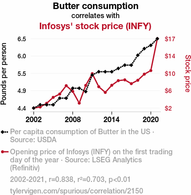
Butter consumptionDetailed data title: Per capita consumption of Butter in the US
Source: USDA
See what else correlates with Butter consumption
Infosys' stock price (INFY)
Detailed data title: Opening price of Infosys (INFY) on the first trading day of the year
Source: LSEG Analytics (Refinitiv)
Additional Info: Via Microsoft Excel Stockhistory function
See what else correlates with Infosys' stock price (INFY)
Correlation is a measure of how much the variables move together. If it is 0.99, when one goes up the other goes up. If it is 0.02, the connection is very weak or non-existent. If it is -0.99, then when one goes up the other goes down. If it is 1.00, you probably messed up your correlation function.
r2 = 0.7028488 (Coefficient of determination)
This means 70.3% of the change in the one variable (i.e., Infosys' stock price (INFY)) is predictable based on the change in the other (i.e., Butter consumption) over the 20 years from 2002 through 2021.
p < 0.01, which is statistically significant(Null hypothesis significance test)
The p-value is 3.9E-6. 0.0000039161529789234600000000
The p-value is a measure of how probable it is that we would randomly find a result this extreme. More specifically the p-value is a measure of how probable it is that we would randomly find a result this extreme if we had only tested one pair of variables one time.
But I am a p-villain. I absolutely did not test only one pair of variables one time. I correlated hundreds of millions of pairs of variables. I threw boatloads of data into an industrial-sized blender to find this correlation.
Who is going to stop me? p-value reporting doesn't require me to report how many calculations I had to go through in order to find a low p-value!
On average, you will find a correaltion as strong as 0.84 in 0.00039% of random cases. Said differently, if you correlated 255,353 random variables You don't actually need 255 thousand variables to find a correlation like this one. I don't have that many variables in my database. You can also correlate variables that are not independent. I do this a lot.
p-value calculations are useful for understanding the probability of a result happening by chance. They are most useful when used to highlight the risk of a fluke outcome. For example, if you calculate a p-value of 0.30, the risk that the result is a fluke is high. It is good to know that! But there are lots of ways to get a p-value of less than 0.01, as evidenced by this project.
In this particular case, the values are so extreme as to be meaningless. That's why no one reports p-values with specificity after they drop below 0.01.
Just to be clear: I'm being completely transparent about the calculations. There is no math trickery. This is just how statistics shakes out when you calculate hundreds of millions of random correlations.
with the same 19 degrees of freedom, Degrees of freedom is a measure of how many free components we are testing. In this case it is 19 because we have two variables measured over a period of 20 years. It's just the number of years minus ( the number of variables minus one ), which in this case simplifies to the number of years minus one.
you would randomly expect to find a correlation as strong as this one.
[ 0.63, 0.93 ] 95% correlation confidence interval (using the Fisher z-transformation)
The confidence interval is an estimate the range of the value of the correlation coefficient, using the correlation itself as an input. The values are meant to be the low and high end of the correlation coefficient with 95% confidence.
This one is a bit more complciated than the other calculations, but I include it because many people have been pushing for confidence intervals instead of p-value calculations (for example: NEJM. However, if you are dredging data, you can reliably find yourself in the 5%. That's my goal!
All values for the years included above: If I were being very sneaky, I could trim years from the beginning or end of the datasets to increase the correlation on some pairs of variables. I don't do that because there are already plenty of correlations in my database without monkeying with the years.
Still, sometimes one of the variables has more years of data available than the other. This page only shows the overlapping years. To see all the years, click on "See what else correlates with..." link above.
| 2002 | 2003 | 2004 | 2005 | 2006 | 2007 | 2008 | 2009 | 2010 | 2011 | 2012 | 2013 | 2014 | 2015 | 2016 | 2017 | 2018 | 2019 | 2020 | 2021 | |
| Butter consumption (Pounds per person) | 4.4 | 4.5 | 4.5 | 4.5 | 4.7 | 4.7 | 5 | 5 | 4.9 | 5.4 | 5.5 | 5.5 | 5.5 | 5.6 | 5.7 | 5.7 | 6 | 6.2 | 6.3 | 6.5 |
| Infosys' stock price (INFY) (Stock price) | 1.96 | 2.2 | 3.02 | 4.34 | 5.08 | 6.94 | 5.67 | 3.06 | 7 | 9.61 | 6.71 | 5.44 | 7.03 | 8.06 | 8.23 | 7.39 | 8.14 | 9.5 | 10.3 | 17.39 |
Why this works
- Data dredging: I have 25,153 variables in my database. I compare all these variables against each other to find ones that randomly match up. That's 632,673,409 correlation calculations! This is called “data dredging.” Instead of starting with a hypothesis and testing it, I instead abused the data to see what correlations shake out. It’s a dangerous way to go about analysis, because any sufficiently large dataset will yield strong correlations completely at random.
- Lack of causal connection: There is probably
Because these pages are automatically generated, it's possible that the two variables you are viewing are in fact causually related. I take steps to prevent the obvious ones from showing on the site (I don't let data about the weather in one city correlate with the weather in a neighboring city, for example), but sometimes they still pop up. If they are related, cool! You found a loophole.
no direct connection between these variables, despite what the AI says above. This is exacerbated by the fact that I used "Years" as the base variable. Lots of things happen in a year that are not related to each other! Most studies would use something like "one person" in stead of "one year" to be the "thing" studied. - Observations not independent: For many variables, sequential years are not independent of each other. If a population of people is continuously doing something every day, there is no reason to think they would suddenly change how they are doing that thing on January 1. A simple
Personally I don't find any p-value calculation to be 'simple,' but you know what I mean.
p-value calculation does not take this into account, so mathematically it appears less probable than it really is. - Y-axis doesn't start at zero: I truncated the Y-axes of the graph above. I also used a line graph, which makes the visual connection stand out more than it deserves.
Nothing against line graphs. They are great at telling a story when you have linear data! But visually it is deceptive because the only data is at the points on the graph, not the lines on the graph. In between each point, the data could have been doing anything. Like going for a random walk by itself!
Mathematically what I showed is true, but it is intentionally misleading. Below is the same chart but with both Y-axes starting at zero.

Try it yourself
You can calculate the values on this page on your own! Try running the Python code to see the calculation results. Step 1: Download and install Python on your computer.Step 2: Open a plaintext editor like Notepad and paste the code below into it.
Step 3: Save the file as "calculate_correlation.py" in a place you will remember, like your desktop. Copy the file location to your clipboard. On Windows, you can right-click the file and click "Properties," and then copy what comes after "Location:" As an example, on my computer the location is "C:\Users\tyler\Desktop"
Step 4: Open a command line window. For example, by pressing start and typing "cmd" and them pressing enter.
Step 5: Install the required modules by typing "pip install numpy", then pressing enter, then typing "pip install scipy", then pressing enter.
Step 6: Navigate to the location where you saved the Python file by using the "cd" command. For example, I would type "cd C:\Users\tyler\Desktop" and push enter.
Step 7: Run the Python script by typing "python calculate_correlation.py"
If you run into any issues, I suggest asking ChatGPT to walk you through installing Python and running the code below on your system. Try this question:
"Walk me through installing Python on my computer to run a script that uses scipy and numpy. Go step-by-step and ask me to confirm before moving on. Start by asking me questions about my operating system so that you know how to proceed. Assume I want the simplest installation with the latest version of Python and that I do not currently have any of the necessary elements installed. Remember to only give me one step per response and confirm I have done it before proceeding."
# These modules make it easier to perform the calculation
import numpy as np
from scipy import stats

# We'll define a function that we can call to return the correlation calculations
def calculate_correlation(array1, array2):

    # Calculate Pearson correlation coefficient and p-value
    correlation, p_value = stats.pearsonr(array1, array2)

    # Calculate R-squared as the square of the correlation coefficient
    r_squared = correlation**2

    return correlation, r_squared, p_value

# These are the arrays for the variables shown on this page, but you can modify them to be any two sets of numbers
array_1 = np.array([4.4,4.5,4.5,4.5,4.7,4.7,5,5,4.9,5.4,5.5,5.5,5.5,5.6,5.7,5.7,6,6.2,6.3,6.5,])
array_2 = np.array([1.96,2.2,3.02,4.34,5.08,6.94,5.67,3.06,7,9.61,6.71,5.44,7.03,8.06,8.23,7.39,8.14,9.5,10.3,17.39,])
array_1_name = "Butter consumption"
array_2_name = "Infosys' stock price (INFY)"

# Perform the calculation
print(f"Calculating the correlation between {array_1_name} and {array_2_name}...")
correlation, r_squared, p_value = calculate_correlation(array_1, array_2)

# Print the results
print("Correlation Coefficient:", correlation)
print("R-squared:", r_squared)
print("P-value:", p_value)
Reuseable content
You may re-use the images on this page for any purpose, even commercial purposes, without asking for permission. The only requirement is that you attribute Tyler Vigen. Attribution can take many different forms. If you leave the "tylervigen.com" link in the image, that satisfies it just fine. If you remove it and move it to a footnote, that's fine too. You can also just write "Charts courtesy of Tyler Vigen" at the bottom of an article.You do not need to attribute "the spurious correlations website," and you don't even need to link here if you don't want to. I don't gain anything from pageviews. There are no ads on this site, there is nothing for sale, and I am not for hire.
For the record, I am just one person. Tyler Vigen, he/him/his. I do have degrees, but they should not go after my name unless you want to annoy my wife. If that is your goal, then go ahead and cite me as "Tyler Vigen, A.A. A.A.S. B.A. J.D." Otherwise it is just "Tyler Vigen."
When spoken, my last name is pronounced "vegan," like I don't eat meat.
Full license details.
For more on re-use permissions, or to get a signed release form, see tylervigen.com/permission.
Download images for these variables:
- High resolution line chart
The image linked here is a Scalable Vector Graphic (SVG). It is the highest resolution that is possible to achieve. It scales up beyond the size of the observable universe without pixelating. You do not need to email me asking if I have a higher resolution image. I do not. The physical limitations of our universe prevent me from providing you with an image that is any higher resolution than this one.
If you insert it into a PowerPoint presentation (a tool well-known for managing things that are the scale of the universe), you can right-click > "Ungroup" or "Create Shape" and then edit the lines and text directly. You can also change the colors this way.
Alternatively you can use a tool like Inkscape. - High resolution line chart, optimized for mobile
- Alternative high resolution line chart
- Scatterplot
- Portable line chart (png)
- Portable line chart (png), optimized for mobile
- Line chart for only Butter consumption
- Line chart for only Infosys' stock price (INFY)
- AI-generated correlation image
- The spurious research paper: Butter Up INFY: A Sticky Correlation Coefficient Analysis
Your correlation inspection deserves a standing ovation!
Correlation ID: 2150 · Black Variable ID: 557 · Red Variable ID: 1669

