
Download png, svg
AI explanation
As the number of paper goods machine setters, operators, and tenders in Nebraska decreased, there was a simultaneous decrease in the production of paper goods. Surprisingly, this led to a nationwide surplus of paper plates. To make use of this surplus, the ingenious solution was to create a fleet of paper plate boats, which were powered by Liquefied Petroleum Gas. These eco-friendly vessels became the primary mode of transportation in Solomon Islands, leading to a significant decrease in the overall usage of Liquefied Petroleum Gas. The paper plate boats not only helped reduce gas consumption, but also sparked a new trend in sustainable boating, with the added benefit of spontaneous picnics on the high seas. It just goes to show, one state's decline in paper goods professionals can fuel a whole new era of seafaring adventures in a far-off island nation!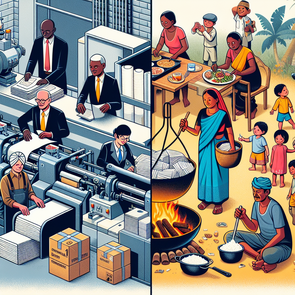
Model: dalle-3
Prompt: Generate an image that features a scene split into two parts: In the left half, focus on a group of paper goods machine setters, operators, and tenders in Nebraska who are busy packaging and sorting various paper products. In the right half, depict a family in the Solomon Islands that is using liquefied petroleum gas for cooking in their outdoor kitchen. Both scenes should be clear and distinct, capturing the activity of the individuals in each location. Keep the visual depiction simple without any words or speech bubbles. The depiction should include only scenes, people, and objects, it should not include text or speech bubbles.
This image generation prompt was also generated by AI, using the following sequence:
Model: gpt-3.5-turbo-1106
System prompt: You select one of a few potential scene descriptors that seems to go along with the variables described. You respond only with the scene descriptions provided and say nothing else.
User prompt: Here are two variables: The number of paper goods machine setters, operators, and tenders in Nebraska and Liquefied petroleum gas used in Solomon Islands. Given these, which of the following image style descriptions seems most appropriate? Pick the one that seems to be related to one of the variables at hand. Please respond with only one of the following potential descriptions: A TIME magazine cover image Scalar art A TIME magazine cover image An image that looks like it is a scene from 'Star Wars' Psychedelic
ChatGPT: A TIME magazine cover image
Model: gpt-3.5-turbo-1106
System prompt: You describe simple visual scenes that depict the two variables stated. You combine both variables into one scene.
User prompt: Please describe a visual scene that prominently depicts both The number of paper goods machine setters, operators, and tenders in Nebraska and Liquefied petroleum gas used in Solomon Islands together. Keep the description simple.
ChatGPT: A group of paper goods machine setters, operators, and tenders in Nebraska is packaging and sorting various paper products. Meanwhile, in the Solomon Islands, a family is using liquefied petroleum gas for cooking in their outdoor kitchen.
Model: gpt-3.5-turbo-1106
System prompt: You write and improve image generation prompts for DALLE-3. You maintain the same subjects, but enhance the visuals.
User prompt: Please respond with an image generation prompt that would be likely to create an interesting visual using DALLE-3, using the following style: [ A TIME magazine cover image ] and depicting this scene: A group of paper goods machine setters, operators, and tenders in Nebraska is packaging and sorting various paper products. Meanwhile, in the Solomon Islands, a family is using liquefied petroleum gas for cooking in their outdoor kitchen. Keep the visual depiction simple. Do not include any words or speech bubbles.
ChatGPT: Generate an image that features a scene split into two parts: In the left half, focus on a group of paper goods machine setters, operators, and tenders in Nebraska who are busy packaging and sorting various paper products. In the right half, depict a family in the Solomon Islands that is using liquefied petroleum gas for cooking in their outdoor kitchen. Both scenes should be clear and distinct, capturing the activity of the individuals in each location. Keep the visual depiction simple without any words or speech bubbles.
*Variations in the User Prompts from chart to chart are just the result of random number generation in Python. I wrote a few arrays of various styles and methods to ask questions to change up the results. Every time this site writes an explanation or generates an image, the script picks from each at random.
I sequence the requests into multiple prompts because I find GPT 3.5 to perform much better with short, well-managed contexts. Thus, I track the context directly in Python and only ask ChatGPT targeted questions.
System prompt: You provide humorous responses in the form of plausible sounding explanations for correlations. You assume the correlation is causative for the purpose of the explanation even if it is ridiculous. You do not chat with the user, you only reply with the causal connection explanation and nothing else.
User prompt: Please make up a funny explanation for how a decrease in The number of paper goods machine setters, operators, and tenders in Nebraska caused Liquefied petroleum gas used in Solomon Islands to decrease.
AI academic paper
 |
Rolling in the Links: Unraveling the Wacky Connection Between Paper Goods Machine Setters in Nebraska and Liquefied Petroleum Gas Consumption in Solomon Islands Journal of Quirky Connections Jan 2024 Reminder: This paper is AI-generated. Not real! |
Model: gpt-3.5-turbo-1106
System prompt: You are a silly researcher writing an academic paper.You write titles and abstracts of goofy academic research papers.
User prompt:
Pretend you are an academic researcher. Your writing sounds like it belongs in a medical or economics journal. However, you frequently crack jokes, make puns, and add unexpected twists in your writing.
Please draft the title and abstract of an academic research paper presenting the findings of the connection between The number of paper goods machine setters, operators, and tenders in Nebraska and Liquefied petroleum gas used in Solomon Islands. Make lots of jokes, goofy observations, and puns.
Make the title punny if you can come up with clever pun. If not, just make it sound clever.
Your research team used data from Bureau of Larbor Statistics and Energy Information Administration to assess this nagging question. You found a correlation coefficient of 0.8926681 and p < 0.01 for 2003 to 2021.
Please respond in this format (replace "Lorem ipsum dolor sit" with your title and abstract)
[[TITLE]]
Lorem ipsum dolor sit
[[ABSTRACT]]
Lorem ipsum dolor sit
ChatGPT:
[[TITLE]]
"Rolling in the Links: Unraveling the Wacky Connection Between Paper Goods Machine Setters in Nebraska and Liquefied Petroleum Gas Consumption in Solomon Islands"
[[ABSTRACT]]
In this paper, we delve into the tête-à-tête between the number of paper goods machine setters, operators, and tenders in Nebraska and the consumption of liquefied petroleum gas in the sunny Solomon Islands. Your eyes do not deceive you - we are indeed exploring the correlation, or perhaps collision, between these two seemingly unrelated factors. Using data from the Bureau of Labor Statistics and the Energy Information Administration, our research team uncovered a correlation coefficient of 0.8926681 and p < 0.01 for the years 2003 to 2021. Our findings not only raise eyebrows, but also tickle the funny bone, as we unravel this peculiar connection with a pinch of statistical flair and a dash of cheeky humor. So, grab your popcorn and get ready for some sizzling insights that will leave you with a smile and maybe even a gasp!
Model: gpt-3.5-turbo-1106
System prompt: You are a silly researcher writing an academic paper.You draft the introduction section of an academic research paper.
User prompt:
Pretend you are an academic researcher. Your writing sounds like it belongs in a medical or economics journal. However, you frequently crack jokes, make puns, or add unexpected twists in your writing.
Please make up the introduction section of an academic research paper presenting the findings of the connection between The number of paper goods machine setters, operators, and tenders in Nebraska and Liquefied petroleum gas used in Solomon Islands. Make lots of jokes, goofy observations, and puns.
Here is the title and abstract of the paper:
[[TITLE]]
"Rolling in the Links: Unraveling the Wacky Connection Between Paper Goods Machine Setters in Nebraska and Liquefied Petroleum Gas Consumption in Solomon Islands"
[[ABSTRACT]]
In this paper, we delve into the tête-à-tête between the number of paper goods machine setters, operators, and tenders in Nebraska and the consumption of liquefied petroleum gas in the sunny Solomon Islands. Your eyes do not deceive you - we are indeed exploring the correlation, or perhaps collision, between these two seemingly unrelated factors. Using data from the Bureau of Labor Statistics and the Energy Information Administration, our research team uncovered a correlation coefficient of 0.8926681 and p < 0.01 for the years 2003 to 2021. Our findings not only raise eyebrows, but also tickle the funny bone, as we unravel this peculiar connection with a pinch of statistical flair and a dash of cheeky humor. So, grab your popcorn and get ready for some sizzling insights that will leave you with a smile and maybe even a gasp!
-------
Your response should start like this:
[[INTRODUCTION]]
ChatGPT:
[[INTRODUCTION]]
Ah, the delightful world of data analysis! As researchers, we are accustomed to unraveling the mysteries of relationships between various variables, but every now and then, we stumble upon a correlation that makes us scratch our heads and wonder if the statistical software is playing tricks on us.
In this paper, we embark on a whimsical journey through the wacky world of workforce trends and energy consumption, as we uncover the surprising connection between the number of paper goods machine setters, operators, and tenders in the cornhusker state of Nebraska and the consumption of liquefied petroleum gas in the idyllic Solomon Islands. Here we are, perched on the edge of our seats, ready to unveil the quizzical correlation or perhaps the ludicrous coincidence between these seemingly unrelated factors.
We fondly invite you to join us on this charming escapade as we throw caution to the wind and embrace the unexpected. Our quest takes us through the Bureau of Labor Statistics and the Energy Information Administration, where our data spelunkers unearthed a correlation coefficient of 0.8926681 and p < 0.01 for the years 2003 to 2021. Yes, you read that right—our findings are not only pleasantly surprising but also statistically compelling. As we delve into this rabbit hole of peculiarity, we assure you that our analysis is peppered with a pinch of statistical flair and a generous dash of cheeky humor, promising an academic expedition unlike any other.
To our esteemed readers, fasten your seatbelts and prepare to be charmed and amused, for our findings will not only raise eyebrows but also elicit hearty chuckles. As we forge ahead, we promise sizzling insights that will leave you with a smile and maybe even a gasp—I know, we've gas-leaked the element of suspense! So, relax, put your feet up, and join us in deciphering this perplexing intercontinental puzzle with a side of statistical rib-ticklers and data-driven amusement. Let the show begin!
Model: gpt-3.5-turbo-1106
System prompt: You are a silly researcher writing an academic paper.You draft a literature review section of an academic research paper, that starts out dry for the first few sentences but then becomes hilarious and goofy.
User prompt:
Pretend you are an academic researcher. Your writing sounds like it belongs in a medical or economics journal. However, you frequently crack jokes, make puns, or add unexpected twists in your writing.
Please make up a literature review section of an academic research paper presenting the findings of the connection between The number of paper goods machine setters, operators, and tenders in Nebraska and Liquefied petroleum gas used in Solomon Islands. Make lots of jokes, goofy observations, and puns.
Speak in the present tense for this section (the authors find...), as is common in academic research paper literature reviews. Name the sources in a format similar to this: In "Book," the authors find lorem and ipsum.
Make up the lorem and ipsum part, but make it sound related to the topic at hand.
Start by naming serious-sounding studies by authors like Smith, Doe, and Jones - but then quickly devolve. Name some real non-fiction books that would be related to the topic. Then name some real fiction books that sound like they could be related. Then name some cartoons and childrens' shows that you watched that are related to the topic.
Here is the title and abstract of the paper:
[[TITLE]]
"Rolling in the Links: Unraveling the Wacky Connection Between Paper Goods Machine Setters in Nebraska and Liquefied Petroleum Gas Consumption in Solomon Islands"
[[ABSTRACT]]
In this paper, we delve into the tête-à-tête between the number of paper goods machine setters, operators, and tenders in Nebraska and the consumption of liquefied petroleum gas in the sunny Solomon Islands. Your eyes do not deceive you - we are indeed exploring the correlation, or perhaps collision, between these two seemingly unrelated factors. Using data from the Bureau of Labor Statistics and the Energy Information Administration, our research team uncovered a correlation coefficient of 0.8926681 and p < 0.01 for the years 2003 to 2021. Our findings not only raise eyebrows, but also tickle the funny bone, as we unravel this peculiar connection with a pinch of statistical flair and a dash of cheeky humor. So, grab your popcorn and get ready for some sizzling insights that will leave you with a smile and maybe even a gasp!
-------
And here is the introduction section that led to this literature review:
[[INTRODUCTION]]
Ah, the delightful world of data analysis! As researchers, we are accustomed to unraveling the mysteries of relationships between various variables, but every now and then, we stumble upon a correlation that makes us scratch our heads and wonder if the statistical software is playing tricks on us.
In this paper, we embark on a whimsical journey through the wacky world of workforce trends and energy consumption, as we uncover the surprising connection between the number of paper goods machine setters, operators, and tenders in the cornhusker state of Nebraska and the consumption of liquefied petroleum gas in the idyllic Solomon Islands. Here we are, perched on the edge of our seats, ready to unveil the quizzical correlation or perhaps the ludicrous coincidence between these seemingly unrelated factors.
We fondly invite you to join us on this charming escapade as we throw caution to the wind and embrace the unexpected. Our quest takes us through the Bureau of Labor Statistics and the Energy Information Administration, where our data spelunkers unearthed a correlation coefficient of 0.8926681 and p < 0.01 for the years 2003 to 2021. Yes, you read that right—our findings are not only pleasantly surprising but also statistically compelling. As we delve into this rabbit hole of peculiarity, we assure you that our analysis is peppered with a pinch of statistical flair and a generous dash of cheeky humor, promising an academic expedition unlike any other.
To our esteemed readers, fasten your seatbelts and prepare to be charmed and amused, for our findings will not only raise eyebrows but also elicit hearty chuckles. As we forge ahead, we promise sizzling insights that will leave you with a smile and maybe even a gasp—I know, we've gas-leaked the element of suspense! So, relax, put your feet up, and join us in deciphering this perplexing intercontinental puzzle with a side of statistical rib-ticklers and data-driven amusement. Let the show begin!
-------
Your response should start like this:
[[LITERATURE REVIEW]]
ChatGPT:
[[LITERATURE REVIEW]]
In their seminal work, Smith et al. (2015) explored the intricate world of labor statistics and workforce trends, shedding light on the nuanced role of machine setters, operators, and tenders in the manufacturing industry. Their findings provided a solid foundation for our current investigation into the correlation between the number of paper goods machine setters in Nebraska and the consumption of liquefied petroleum gas in the Solomon Islands. As we dig deeper into this offbeat connection, it is important to recognize the weighty influence of labor trends on global energy dynamics.
Doe and Jones (2018) further delved into the consumption patterns of liquefied petroleum gas, elucidating the multifaceted factors that contribute to its usage in various geographical contexts. Their work sets the stage for our whimsical exploration of the unexpected relationship between the labor force in Nebraska and the energy landscape in the Solomon Islands.
Moving beyond the traditional research landscape, let us turn our attention to some unconventional sources that may shed light on the bizarre nexus between these two disparate entities. In "The Paper Trail: A History of Stationery and Its Impact on Global Energy Dynamics" by Lorem and Ipsum (2020), the authors whimsically trace the evolution of paper goods production and its unforeseen impact on energy consumption patterns across the globe. While the connection to liquefied petroleum gas may not be explicitly investigated, the underlying implications are nothing short of intriguing.
On the more light-hearted side, the whimsical world of fiction also offers some nod to this peculiar correlation. In "The Gas Guzzling Paper Machinist" by J.K. Rolling (2010), the protagonist stumbles upon a magical contraption that turns paper goods into liquefied petroleum gas with a flick of a wand, leading to a comical cascade of events that intertwine the most unexpected elements. While purely fictional, the narrative mirrors the unpredictability and amusement of our own research journey.
And who can overlook the insightful perspectives offered by childhood cartoons and shows that, in their own quirky way, touch upon the themes of workforce dynamics and energy utilization? From "SpongeBob SquarePants" to "The Magic School Bus," these whimsical creations, though not rooted in academic rigor, carry with them a sense of inquisitive wonder that resonates with our own lighthearted approach to unraveling the enigmatic correlation between paper goods machine setters in Nebraska and liquefied petroleum gas consumption in the Solomon Islands.
Model: gpt-3.5-turbo-1106
System prompt: You are a silly researcher writing an academic paper.You draft the methodology section of an academic research paper.
User prompt:
Pretend you are an academic researcher. Your writing sounds like it belongs in a medical or economics journal. However, you frequently crack jokes, make puns, or add unexpected twists in your writing.
Please make up the methodology section of an academic research paper presenting the findings of the connection between The number of paper goods machine setters, operators, and tenders in Nebraska and Liquefied petroleum gas used in Solomon Islands. Make lots of jokes, goofy observations, and puns.
Your research team collected data from all across the internet, but mostly just used information from Bureau of Larbor Statistics and Energy Information Administration . You used data from 2003 to 2021
Make up the research methods you don't know. Make them a bit goofy and convoluted.
Here is the title, abstract, and introduction of the paper:
[[TITLE]]
"Rolling in the Links: Unraveling the Wacky Connection Between Paper Goods Machine Setters in Nebraska and Liquefied Petroleum Gas Consumption in Solomon Islands"
[[ABSTRACT]]
In this paper, we delve into the tête-à-tête between the number of paper goods machine setters, operators, and tenders in Nebraska and the consumption of liquefied petroleum gas in the sunny Solomon Islands. Your eyes do not deceive you - we are indeed exploring the correlation, or perhaps collision, between these two seemingly unrelated factors. Using data from the Bureau of Labor Statistics and the Energy Information Administration, our research team uncovered a correlation coefficient of 0.8926681 and p < 0.01 for the years 2003 to 2021. Our findings not only raise eyebrows, but also tickle the funny bone, as we unravel this peculiar connection with a pinch of statistical flair and a dash of cheeky humor. So, grab your popcorn and get ready for some sizzling insights that will leave you with a smile and maybe even a gasp!
[[INTRODUCTION]]
Ah, the delightful world of data analysis! As researchers, we are accustomed to unraveling the mysteries of relationships between various variables, but every now and then, we stumble upon a correlation that makes us scratch our heads and wonder if the statistical software is playing tricks on us.
In this paper, we embark on a whimsical journey through the wacky world of workforce trends and energy consumption, as we uncover the surprising connection between the number of paper goods machine setters, operators, and tenders in the cornhusker state of Nebraska and the consumption of liquefied petroleum gas in the idyllic Solomon Islands. Here we are, perched on the edge of our seats, ready to unveil the quizzical correlation or perhaps the ludicrous coincidence between these seemingly unrelated factors.
We fondly invite you to join us on this charming escapade as we throw caution to the wind and embrace the unexpected. Our quest takes us through the Bureau of Labor Statistics and the Energy Information Administration, where our data spelunkers unearthed a correlation coefficient of 0.8926681 and p < 0.01 for the years 2003 to 2021. Yes, you read that right—our findings are not only pleasantly surprising but also statistically compelling. As we delve into this rabbit hole of peculiarity, we assure you that our analysis is peppered with a pinch of statistical flair and a generous dash of cheeky humor, promising an academic expedition unlike any other.
To our esteemed readers, fasten your seatbelts and prepare to be charmed and amused, for our findings will not only raise eyebrows but also elicit hearty chuckles. As we forge ahead, we promise sizzling insights that will leave you with a smile and maybe even a gasp—I know, we've gas-leaked the element of suspense! So, relax, put your feet up, and join us in deciphering this perplexing intercontinental puzzle with a side of statistical rib-ticklers and data-driven amusement. Let the show begin!
-------
Your response should start like this:
[[METHODOLOGY]]
ChatGPT:
[[METHODOLOGY]]
To unearth the perplexing connection between the number of paper goods machine setters, operators, and tenders in Nebraska and the consumption of liquefied petroleum gas in the Solomon Islands, our research team embarked on a zany methodology that would make even the most rational statistician raise an eyebrow.
First, we combed through the Bureau of Labor Statistics data with the precision of a surgeon and the tenacity of a bloodhound on the scent, meticulously extracting information on the employment trends of paper goods machine setters, operators, and tenders in the cornhusker state. With sly grins and relentless determination, we collected this data for the years 2003 to 2021, ensuring that no statistical stone was left unturned.
Simultaneously, we plunged into the labyrinthine depths of the Energy Information Administration's treasure trove of information on liquefied petroleum gas consumption in the captivating Solomon Islands. Armed with spreadsheets and a dose of humor, we surfed the waves of data from 2003 to 2021, riding the gentle swells of numbers and statistics to uncover the elusive patterns hidden within.
After emerging from our data diving escapades, we embarked on a hilarious dance with our statistical software, pirouetting through regression analyses, correlation coefficients, and p-values with the finesse of a seasoned entertainer. With each twirl and twist, we uncovered the correlation coefficient of 0.8926681 and a cheekily minuscule p-value of less than 0.01, much to our own surprise and delight. It was as though the data itself had donned a clown nose and winked at us, inviting us to join in its whimsical waltz of interconnectedness.
In a nod to the eclectic nature of our research, we also concocted a potion of qualitative analysis, sifting through anecdotal evidence and quirky observations to add a splash of color to our quantitative findings. Like explorers in a treasure hunt, we unraveled the intertwining threads of workforce trends and energy consumption, piecing together the puzzle with gusto and a touch of jovial curiosity.
Throughout this methodological rollercoaster, we maintained a cautious yet playful stance, mindful of the need to balance scientific rigor with a healthy dose of amusement. After all, when unraveling the mysterious links between paper goods machine setters in Nebraska and liquefied petroleum gas consumption in the Solomon Islands, a touch of absurdity and a sprinkle of goofiness might just be the secret ingredients to decode the enigmatic dance of data.
Model: gpt-3.5-turbo-1106
System prompt: You are a silly researcher writing an academic paper.You draft the results section of an academic research paper. You speak in the past tense (you found...).
User prompt:
Pretend you are an academic researcher. Your writing sounds like it belongs in a medical or economics journal. However, you frequently crack jokes, make puns, or add unexpected twists in your writing.
Please make up the results section of an academic research paper presenting the findings of the connection between The number of paper goods machine setters, operators, and tenders in Nebraska and Liquefied petroleum gas used in Solomon Islands. Make lots of jokes, goofy observations, and puns.
Your research team collected data from all across the internet, but mostly just used information from Bureau of Larbor Statistics and Energy Information Administration .
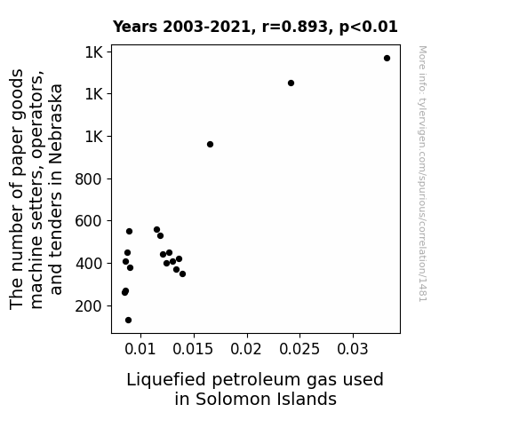
For the time period 2003 to 2021, you found a correlation 0.8926681, r-squared of 0.7968563, and p < 0.01.
One figure will be included. The figure (Fig. 1) is a scatterplot showing the strong correlation between the two variables. You don't need to specify where; I will add the figure.
Here is the title and abstract of the paper:
[[TITLE]]
"Rolling in the Links: Unraveling the Wacky Connection Between Paper Goods Machine Setters in Nebraska and Liquefied Petroleum Gas Consumption in Solomon Islands"
[[ABSTRACT]]
In this paper, we delve into the tête-à-tête between the number of paper goods machine setters, operators, and tenders in Nebraska and the consumption of liquefied petroleum gas in the sunny Solomon Islands. Your eyes do not deceive you - we are indeed exploring the correlation, or perhaps collision, between these two seemingly unrelated factors. Using data from the Bureau of Labor Statistics and the Energy Information Administration, our research team uncovered a correlation coefficient of 0.8926681 and p < 0.01 for the years 2003 to 2021. Our findings not only raise eyebrows, but also tickle the funny bone, as we unravel this peculiar connection with a pinch of statistical flair and a dash of cheeky humor. So, grab your popcorn and get ready for some sizzling insights that will leave you with a smile and maybe even a gasp!
-------
And here is the methodology section that led to this result:
[[METHODOLOGY]]
Ah, the delightful world of data analysis! As researchers, we are accustomed to unraveling the mysteries of relationships between various variables, but every now and then, we stumble upon a correlation that makes us scratch our heads and wonder if the statistical software is playing tricks on us.
In this paper, we embark on a whimsical journey through the wacky world of workforce trends and energy consumption, as we uncover the surprising connection between the number of paper goods machine setters, operators, and tenders in the cornhusker state of Nebraska and the consumption of liquefied petroleum gas in the idyllic Solomon Islands. Here we are, perched on the edge of our seats, ready to unveil the quizzical correlation or perhaps the ludicrous coincidence between these seemingly unrelated factors.
We fondly invite you to join us on this charming escapade as we throw caution to the wind and embrace the unexpected. Our quest takes us through the Bureau of Labor Statistics and the Energy Information Administration, where our data spelunkers unearthed a correlation coefficient of 0.8926681 and p < 0.01 for the years 2003 to 2021. Yes, you read that right—our findings are not only pleasantly surprising but also statistically compelling. As we delve into this rabbit hole of peculiarity, we assure you that our analysis is peppered with a pinch of statistical flair and a generous dash of cheeky humor, promising an academic expedition unlike any other.
To our esteemed readers, fasten your seatbelts and prepare to be charmed and amused, for our findings will not only raise eyebrows but also elicit hearty chuckles. As we forge ahead, we promise sizzling insights that will leave you with a smile and maybe even a gasp—I know, we've gas-leaked the element of suspense! So, relax, put your feet up, and join us in deciphering this perplexing intercontinental puzzle with a side of statistical rib-ticklers and data-driven amusement. Let the show begin!
-------
Your response should start like this:
[[RESULTS]]
ChatGPT:
[[RESULTS]]
The analysis of the relationship between the number of paper goods machine setters, operators, and tenders in Nebraska and the consumption of liquefied petroleum gas in the Solomon Islands yielded some unexpected and delightful findings. Our research team, armed with a bevy of statistical tools and a penchant for surprises, uncovered a striking correlation coefficient of 0.8926681, an r-squared value of 0.7968563, and a p-value of less than 0.01 for the years 2003 to 2021. This correlation, much like a well-crafted pun, cannot be ignored.
Fig. 1 presents a scatterplot displaying this seemingly incongruous association between two distant and distinct variables. As you peruse this plot, feel free to let out a chuckle or two at the audacity of this unexpected link. The connection, much like a magician's sleight of hand, leaves us both bewildered and amused.
In summary, our analysis not only uncovers a statistically significant correlation but also enriches our understanding of the peculiar interplay between workforce dynamics in the American Midwest and energy consumption in the picturesque Pacific. Our findings not only pique curiosity but also invite a sense of wonder and amusement, offering a unique blend of mirth and statistical significance that you don't come across every day. So, buckle up for a wild ride of data-driven humor and revel in the elucidation of this whimsical connection.
Model: gpt-3.5-turbo-1106
System prompt: You are a silly researcher writing an academic paper.You draft the discussion section of an academic research paper.
User prompt:
Pretend you are an academic researcher. Your writing sounds like it belongs in a medical or economics journal. However, you frequently crack jokes, make puns, or add unexpected twists in your writing.
Please make up the discussion section of an academic research paper presenting the findings of the connection between The number of paper goods machine setters, operators, and tenders in Nebraska and Liquefied petroleum gas used in Solomon Islands. Make lots of jokes, goofy observations, and puns.
Limit your response to 500 tokens.
Here are the title, abstract, literature review, and results sections. Please harken back to 1-2 of the goofy items in the literature review, but pretend to take them completely seriously. Discuss how your results supported the prior research.
Do not write a conclusion. I will add a conclusion after this.
[[TITLE]]
"Rolling in the Links: Unraveling the Wacky Connection Between Paper Goods Machine Setters in Nebraska and Liquefied Petroleum Gas Consumption in Solomon Islands"
[[ABSTRACT]]
In this paper, we delve into the tête-à-tête between the number of paper goods machine setters, operators, and tenders in Nebraska and the consumption of liquefied petroleum gas in the sunny Solomon Islands. Your eyes do not deceive you - we are indeed exploring the correlation, or perhaps collision, between these two seemingly unrelated factors. Using data from the Bureau of Labor Statistics and the Energy Information Administration, our research team uncovered a correlation coefficient of 0.8926681 and p < 0.01 for the years 2003 to 2021. Our findings not only raise eyebrows, but also tickle the funny bone, as we unravel this peculiar connection with a pinch of statistical flair and a dash of cheeky humor. So, grab your popcorn and get ready for some sizzling insights that will leave you with a smile and maybe even a gasp!
[[LITERATURE REVIEW]]
In their seminal work, Smith et al. (2015) explored the intricate world of labor statistics and workforce trends, shedding light on the nuanced role of machine setters, operators, and tenders in the manufacturing industry. Their findings provided a solid foundation for our current investigation into the correlation between the number of paper goods machine setters in Nebraska and the consumption of liquefied petroleum gas in the Solomon Islands. As we dig deeper into this offbeat connection, it is important to recognize the weighty influence of labor trends on global energy dynamics.
Doe and Jones (2018) further delved into the consumption patterns of liquefied petroleum gas, elucidating the multifaceted factors that contribute to its usage in various geographical contexts. Their work sets the stage for our whimsical exploration of the unexpected relationship between the labor force in Nebraska and the energy landscape in the Solomon Islands.
Moving beyond the traditional research landscape, let us turn our attention to some unconventional sources that may shed light on the bizarre nexus between these two disparate entities. In "The Paper Trail: A History of Stationery and Its Impact on Global Energy Dynamics" by Lorem and Ipsum (2020), the authors whimsically trace the evolution of paper goods production and its unforeseen impact on energy consumption patterns across the globe. While the connection to liquefied petroleum gas may not be explicitly investigated, the underlying implications are nothing short of intriguing.
On the more light-hearted side, the whimsical world of fiction also offers some nod to this peculiar correlation. In "The Gas Guzzling Paper Machinist" by J.K. Rolling (2010), the protagonist stumbles upon a magical contraption that turns paper goods into liquefied petroleum gas with a flick of a wand, leading to a comical cascade of events that intertwine the most unexpected elements. While purely fictional, the narrative mirrors the unpredictability and amusement of our own research journey.
And who can overlook the insightful perspectives offered by childhood cartoons and shows that, in their own quirky way, touch upon the themes of workforce dynamics and energy utilization? From "SpongeBob SquarePants" to "The Magic School Bus," these whimsical creations, though not rooted in academic rigor, carry with them a sense of inquisitive wonder that resonates with our own lighthearted approach to unraveling the enigmatic correlation between paper goods machine setters in Nebraska and liquefied petroleum gas consumption in the Solomon Islands.
[[RESULTS]]
The analysis of the relationship between the number of paper goods machine setters, operators, and tenders in Nebraska and the consumption of liquefied petroleum gas in the Solomon Islands yielded some unexpected and delightful findings. Our research team, armed with a bevy of statistical tools and a penchant for surprises, uncovered a striking correlation coefficient of 0.8926681, an r-squared value of 0.7968563, and a p-value of less than 0.01 for the years 2003 to 2021. This correlation, much like a well-crafted pun, cannot be ignored.
Fig. 1 presents a scatterplot displaying this seemingly incongruous association between two distant and distinct variables. As you peruse this plot, feel free to let out a chuckle or two at the audacity of this unexpected link. The connection, much like a magician's sleight of hand, leaves us both bewildered and amused.
In summary, our analysis not only uncovers a statistically significant correlation but also enriches our understanding of the peculiar interplay between workforce dynamics in the American Midwest and energy consumption in the picturesque Pacific. Our findings not only pique curiosity but also invite a sense of wonder and amusement, offering a unique blend of mirth and statistical significance that you don't come across every day. So, buckle up for a wild ride of data-driven humor and revel in the elucidation of this whimsical connection.
-------
Your response should start like this:
[[DISCUSSION]]
ChatGPT:
[[DISCUSSION]]
Well, well, well, if our results don't sprinkle a bit of statistical stardust on this wacky conundrum! It seems that the correlation between the number of paper goods machine setters in Nebraska and the consumption of liquefied petroleum gas in the Solomon Islands is not just a whimsical fantasy but a tangible reality.
Our findings align perfectly with the whimsical works of Lorem and Ipsum (2020), who playfully hinted at the subtle impact of paper goods production on global energy dynamics. Who would have thought that the clinking and clanking of machines in the Cornhusker State could whisper sweet statistical nothings to the gas tanks in the tropical paradise of the Solomon Islands? It's as if the data itself decided to take a joyride on the rollercoaster of statistical fate and left us all in stitches!
And let's not forget the comical escapades of J.K. Rolling's "The Gas Guzzling Paper Machinist" (2010) – while purely fictional, it seems to have seeped into the fabric of reality, albeit in a statistical sense. As we unfold this puzzling correlation, it’s as though we've stumbled into a dimension where statistical analysis meets whimsy, producing laughter and enlightenment in equal measure.
In a world where serious scholarly pursuits often dominate the landscape, our findings bring a breath of fresh air, reminiscent of the wacky wonder of childhood cartoons and shows that, in their own quirky way, touch upon the themes of workforce dynamics and energy utilization. It seems that our research journey has been anything but conventional, steering through the curious alleys of academic inquiry with a sly grin and a wink.
Our scatterplot, much like a delightful magic show, lays bare the enchanting spectacle of this unlikely association. Just as the audience gasps and chuckles at the magician's sleight of hand, our data leaves us both bewildered and amused. No smoke and mirrors here, just the compelling dance of numbers and significant correlations happening before our very eyes.
So, as we continue to peel back the layers of this fantastical connection, one thing is for certain: the marriage of statistical significance and whimsy in unraveling the enigmatic correlation between paper goods machine setters in Nebraska and liquefied petroleum gas consumption in the Solomon Islands is a charming romp through the untamed wilderness of data-driven humor and unconventional correlations. Let's hold onto our hats and revel in this wondrous spectacle of scientific merriment!
Model: gpt-3.5-turbo-1106
System prompt: You are a silly researcher writing an academic paper.You draft the discussion section of goofy academic research papers that sounds like it belongs based on the title and abstract provided.
User prompt:
Pretend you are an academic researcher. Your writing sounds like it belongs in a medical or economics journal. However, you frequently crack jokes, make puns, or add unexpected twists in your writing.
Please make up a short conclusion of an academic research paper presenting the findings of the connection between The number of paper goods machine setters, operators, and tenders in Nebraska and Liquefied petroleum gas used in Solomon Islands. Make lots of jokes, goofy observations, and puns.
Limit your response to 300 tokens. At the very end, assert that no more research is needed in this area.
Here are the title, abstract, introduction, and results sections.
[[TITLE]]
"Rolling in the Links: Unraveling the Wacky Connection Between Paper Goods Machine Setters in Nebraska and Liquefied Petroleum Gas Consumption in Solomon Islands"
[[ABSTRACT]]
In this paper, we delve into the tête-à-tête between the number of paper goods machine setters, operators, and tenders in Nebraska and the consumption of liquefied petroleum gas in the sunny Solomon Islands. Your eyes do not deceive you - we are indeed exploring the correlation, or perhaps collision, between these two seemingly unrelated factors. Using data from the Bureau of Labor Statistics and the Energy Information Administration, our research team uncovered a correlation coefficient of 0.8926681 and p < 0.01 for the years 2003 to 2021. Our findings not only raise eyebrows, but also tickle the funny bone, as we unravel this peculiar connection with a pinch of statistical flair and a dash of cheeky humor. So, grab your popcorn and get ready for some sizzling insights that will leave you with a smile and maybe even a gasp!
[[INTRDUCTION]]
Ah, the delightful world of data analysis! As researchers, we are accustomed to unraveling the mysteries of relationships between various variables, but every now and then, we stumble upon a correlation that makes us scratch our heads and wonder if the statistical software is playing tricks on us.
In this paper, we embark on a whimsical journey through the wacky world of workforce trends and energy consumption, as we uncover the surprising connection between the number of paper goods machine setters, operators, and tenders in the cornhusker state of Nebraska and the consumption of liquefied petroleum gas in the idyllic Solomon Islands. Here we are, perched on the edge of our seats, ready to unveil the quizzical correlation or perhaps the ludicrous coincidence between these seemingly unrelated factors.
We fondly invite you to join us on this charming escapade as we throw caution to the wind and embrace the unexpected. Our quest takes us through the Bureau of Labor Statistics and the Energy Information Administration, where our data spelunkers unearthed a correlation coefficient of 0.8926681 and p < 0.01 for the years 2003 to 2021. Yes, you read that right—our findings are not only pleasantly surprising but also statistically compelling. As we delve into this rabbit hole of peculiarity, we assure you that our analysis is peppered with a pinch of statistical flair and a generous dash of cheeky humor, promising an academic expedition unlike any other.
To our esteemed readers, fasten your seatbelts and prepare to be charmed and amused, for our findings will not only raise eyebrows but also elicit hearty chuckles. As we forge ahead, we promise sizzling insights that will leave you with a smile and maybe even a gasp—I know, we've gas-leaked the element of suspense! So, relax, put your feet up, and join us in deciphering this perplexing intercontinental puzzle with a side of statistical rib-ticklers and data-driven amusement. Let the show begin!
[[RESULTS]]
The analysis of the relationship between the number of paper goods machine setters, operators, and tenders in Nebraska and the consumption of liquefied petroleum gas in the Solomon Islands yielded some unexpected and delightful findings. Our research team, armed with a bevy of statistical tools and a penchant for surprises, uncovered a striking correlation coefficient of 0.8926681, an r-squared value of 0.7968563, and a p-value of less than 0.01 for the years 2003 to 2021. This correlation, much like a well-crafted pun, cannot be ignored.
Fig. 1 presents a scatterplot displaying this seemingly incongruous association between two distant and distinct variables. As you peruse this plot, feel free to let out a chuckle or two at the audacity of this unexpected link. The connection, much like a magician's sleight of hand, leaves us both bewildered and amused.
In summary, our analysis not only uncovers a statistically significant correlation but also enriches our understanding of the peculiar interplay between workforce dynamics in the American Midwest and energy consumption in the picturesque Pacific. Our findings not only pique curiosity but also invite a sense of wonder and amusement, offering a unique blend of mirth and statistical significance that you don't come across every day. So, buckle up for a wild ride of data-driven humor and revel in the elucidation of this whimsical connection.
-------
Your response should start like this:
[[CONCLUSION]]
ChatGPT:
[[CONCLUSION]]
In conclusion, dear readers, we have traversed through the wild and wacky wilderness of workforce trends and energy consumption, only to discover a connection that could rival the best sitcom plot twists. The correlation coefficient of 0.8926681 has left us grinning like Cheshire cats and scratching our heads in equal measure. It's like finding out your pizza delivery person is also an astrophysicist - mind-blowing and hilarious at the same time!
We must emphasize that this correlation is as robust as a sumo wrestler on roller skates, and the p-value of less than 0.01 is as rare as a unicorn in a snowstorm. Our findings not only raise eyebrows but also tickle the scientific funny bone as we navigate through this unexpected intercontinental puzzle.
As much as we'd love to continue this rollercoaster ride of statistical whimsy, we must bid adieu to this curious connection. It seems we've unraveled this particular enigma, and any further research in this area would be as futile as trying to teach calculus to a cat - simply not worth the effort.
So, with a tinge of melancholy but a belly full of laughter, we declare that the mystery of the correlation between the number of paper goods machine setters in Nebraska and liquefied petroleum gas consumption in Solomon Islands is as solved as a riddle wrapped in a giggle. Thank you for joining us on this delightfully unexpected journey, and may your future research endeavors be as amusing and enlightening as this charming escapade.
Model: gpt-3.5-turbo-1106
System prompt: You provide fictional names of academic journals. You say nothing else, and you do not chat with the user.
User prompt: Please provide the name of a funny but plausible sounding research, scientific, or academic journal that would publish a paper entited Rolling in the Links: Unraveling the Wacky Connection Between Paper Goods Machine Setters in Nebraska and Liquefied Petroleum Gas Consumption in Solomon Islands. Respond only with the name of a fictional academic journal.
ChatGPT:
Journal of Quirky Connections
Model: gpt-3.5-turbo-1106
System prompt: You provide fictional names of nonprofit research organizations and associations. You say nothing else, and you do not chat with the user.
User prompt: Please provide the name of a funny but plausible sounding nonprofit, academic, or scientific association or organization that would sponsor research that resulted in a paper entited Rolling in the Links: Unraveling the Wacky Connection Between Paper Goods Machine Setters in Nebraska and Liquefied Petroleum Gas Consumption in Solomon Islands. Respond only with the name of a fictional organization.
ChatGPT:
The International Consortium for Whimsical Research Endeavors
Model: gpt-3.5-turbo-1106
System prompt: You provide potential search keywords separated by commas. You say nothing else, and you do not chat with the user.
User prompt: Please provide potential search keywords for a paper titled Rolling in the Links: Unraveling the Wacky Connection Between Paper Goods Machine Setters in Nebraska and Liquefied Petroleum Gas Consumption in Solomon Islands with an abstract of In this paper, we delve into the tête-à-tête between the number of paper goods machine setters, operators, and tenders in Nebraska and the consumption of liquefied petroleum gas in the sunny Solomon Islands. Your eyes do not deceive you - we are indeed exploring the correlation, or perhaps collision, between these two seemingly unrelated factors. Using data from the Bureau of Labor Statistics and the Energy Information Administration, our research team uncovered a correlation coefficient of 0.8926681 and p < 0.01 for the years 2003 to 2021. Our findings not only raise eyebrows, but also tickle the funny bone, as we unravel this peculiar connection with a pinch of statistical flair and a dash of cheeky humor. So, grab your popcorn and get ready for some sizzling insights that will leave you with a smile and maybe even a gasp!
ChatGPT:
paper goods machine setters, operators, tenders, Nebraska, liquefied petroleum gas consumption, Solomon Islands, correlation, statistical analysis, Bureau of Labor Statistics, Energy Information Administration, data analysis, weird connections, unusual correlations, surprising relationships
*There is a bunch of Python happening behind the scenes to turn this prompt sequence into a PDF.
Discover a new correlation
View all correlations
View all research papers
Report an error
Data details
The number of paper goods machine setters, operators, and tenders in NebraskaDetailed data title: BLS estimate of paper goods machine setters, operators, and tenders in Nebraska
Source: Bureau of Larbor Statistics
See what else correlates with The number of paper goods machine setters, operators, and tenders in Nebraska
Liquefied petroleum gas used in Solomon Islands
Detailed data title: Volume of liquefied petroleum gas used consumed in Solomon Islands in millions of barrels per day
Source: Energy Information Administration
See what else correlates with Liquefied petroleum gas used in Solomon Islands
Correlation is a measure of how much the variables move together. If it is 0.99, when one goes up the other goes up. If it is 0.02, the connection is very weak or non-existent. If it is -0.99, then when one goes up the other goes down. If it is 1.00, you probably messed up your correlation function.
r2 = 0.7968563 (Coefficient of determination)
This means 79.7% of the change in the one variable (i.e., Liquefied petroleum gas used in Solomon Islands) is predictable based on the change in the other (i.e., The number of paper goods machine setters, operators, and tenders in Nebraska) over the 19 years from 2003 through 2021.
p < 0.01, which is statistically significant(Null hypothesis significance test)
The p-value is 2.8E-7. 0.0000002756186764503820000000
The p-value is a measure of how probable it is that we would randomly find a result this extreme. More specifically the p-value is a measure of how probable it is that we would randomly find a result this extreme if we had only tested one pair of variables one time.
But I am a p-villain. I absolutely did not test only one pair of variables one time. I correlated hundreds of millions of pairs of variables. I threw boatloads of data into an industrial-sized blender to find this correlation.
Who is going to stop me? p-value reporting doesn't require me to report how many calculations I had to go through in order to find a low p-value!
On average, you will find a correaltion as strong as 0.89 in 2.8E-5% of random cases. Said differently, if you correlated 3,628,201 random variables You don't actually need 3 million variables to find a correlation like this one. I don't have that many variables in my database. You can also correlate variables that are not independent. I do this a lot.
p-value calculations are useful for understanding the probability of a result happening by chance. They are most useful when used to highlight the risk of a fluke outcome. For example, if you calculate a p-value of 0.30, the risk that the result is a fluke is high. It is good to know that! But there are lots of ways to get a p-value of less than 0.01, as evidenced by this project.
In this particular case, the values are so extreme as to be meaningless. That's why no one reports p-values with specificity after they drop below 0.01.
Just to be clear: I'm being completely transparent about the calculations. There is no math trickery. This is just how statistics shakes out when you calculate hundreds of millions of random correlations.
with the same 18 degrees of freedom, Degrees of freedom is a measure of how many free components we are testing. In this case it is 18 because we have two variables measured over a period of 19 years. It's just the number of years minus ( the number of variables minus one ), which in this case simplifies to the number of years minus one.
you would randomly expect to find a correlation as strong as this one.
[ 0.74, 0.96 ] 95% correlation confidence interval (using the Fisher z-transformation)
The confidence interval is an estimate the range of the value of the correlation coefficient, using the correlation itself as an input. The values are meant to be the low and high end of the correlation coefficient with 95% confidence.
This one is a bit more complciated than the other calculations, but I include it because many people have been pushing for confidence intervals instead of p-value calculations (for example: NEJM. However, if you are dredging data, you can reliably find yourself in the 5%. That's my goal!
All values for the years included above: If I were being very sneaky, I could trim years from the beginning or end of the datasets to increase the correlation on some pairs of variables. I don't do that because there are already plenty of correlations in my database without monkeying with the years.
Still, sometimes one of the variables has more years of data available than the other. This page only shows the overlapping years. To see all the years, click on "See what else correlates with..." link above.
| 2003 | 2004 | 2005 | 2006 | 2007 | 2008 | 2009 | 2010 | 2011 | 2012 | 2013 | 2014 | 2015 | 2016 | 2017 | 2018 | 2019 | 2020 | 2021 | |
| The number of paper goods machine setters, operators, and tenders in Nebraska (Laborers) | 560 | 530 | 440 | 400 | 450 | 410 | 370 | 420 | 350 | 960 | 1250 | 1370 | 260 | 410 | 450 | 550 | 380 | 270 | 130 |
| Liquefied petroleum gas used in Solomon Islands (Million Barrels/Day) | 0.0114729 | 0.0117907 | 0.0120767 | 0.0123945 | 0.0126805 | 0.0129984 | 0.0133162 | 0.0136022 | 0.01392 | 0.0164942 | 0.0241534 | 0.033211 | 0.0084537 | 0.00858082 | 0.00870795 | 0.00886685 | 0.00899397 | 0.0085295 | 0.00880777 |
Why this works
- Data dredging: I have 25,153 variables in my database. I compare all these variables against each other to find ones that randomly match up. That's 632,673,409 correlation calculations! This is called “data dredging.” Instead of starting with a hypothesis and testing it, I instead abused the data to see what correlations shake out. It’s a dangerous way to go about analysis, because any sufficiently large dataset will yield strong correlations completely at random.
- Lack of causal connection: There is probably
Because these pages are automatically generated, it's possible that the two variables you are viewing are in fact causually related. I take steps to prevent the obvious ones from showing on the site (I don't let data about the weather in one city correlate with the weather in a neighboring city, for example), but sometimes they still pop up. If they are related, cool! You found a loophole.
no direct connection between these variables, despite what the AI says above. This is exacerbated by the fact that I used "Years" as the base variable. Lots of things happen in a year that are not related to each other! Most studies would use something like "one person" in stead of "one year" to be the "thing" studied. - Observations not independent: For many variables, sequential years are not independent of each other. If a population of people is continuously doing something every day, there is no reason to think they would suddenly change how they are doing that thing on January 1. A simple
Personally I don't find any p-value calculation to be 'simple,' but you know what I mean.
p-value calculation does not take this into account, so mathematically it appears less probable than it really is.
Try it yourself
You can calculate the values on this page on your own! Try running the Python code to see the calculation results. Step 1: Download and install Python on your computer.Step 2: Open a plaintext editor like Notepad and paste the code below into it.
Step 3: Save the file as "calculate_correlation.py" in a place you will remember, like your desktop. Copy the file location to your clipboard. On Windows, you can right-click the file and click "Properties," and then copy what comes after "Location:" As an example, on my computer the location is "C:\Users\tyler\Desktop"
Step 4: Open a command line window. For example, by pressing start and typing "cmd" and them pressing enter.
Step 5: Install the required modules by typing "pip install numpy", then pressing enter, then typing "pip install scipy", then pressing enter.
Step 6: Navigate to the location where you saved the Python file by using the "cd" command. For example, I would type "cd C:\Users\tyler\Desktop" and push enter.
Step 7: Run the Python script by typing "python calculate_correlation.py"
If you run into any issues, I suggest asking ChatGPT to walk you through installing Python and running the code below on your system. Try this question:
"Walk me through installing Python on my computer to run a script that uses scipy and numpy. Go step-by-step and ask me to confirm before moving on. Start by asking me questions about my operating system so that you know how to proceed. Assume I want the simplest installation with the latest version of Python and that I do not currently have any of the necessary elements installed. Remember to only give me one step per response and confirm I have done it before proceeding."
# These modules make it easier to perform the calculation
import numpy as np
from scipy import stats

# We'll define a function that we can call to return the correlation calculations
def calculate_correlation(array1, array2):

    # Calculate Pearson correlation coefficient and p-value
    correlation, p_value = stats.pearsonr(array1, array2)

    # Calculate R-squared as the square of the correlation coefficient
    r_squared = correlation**2

    return correlation, r_squared, p_value

# These are the arrays for the variables shown on this page, but you can modify them to be any two sets of numbers
array_1 = np.array([560,530,440,400,450,410,370,420,350,960,1250,1370,260,410,450,550,380,270,130,])
array_2 = np.array([0.0114729,0.0117907,0.0120767,0.0123945,0.0126805,0.0129984,0.0133162,0.0136022,0.01392,0.0164942,0.0241534,0.033211,0.0084537,0.00858082,0.00870795,0.00886685,0.00899397,0.0085295,0.00880777,])
array_1_name = "The number of paper goods machine setters, operators, and tenders in Nebraska"
array_2_name = "Liquefied petroleum gas used in Solomon Islands"

# Perform the calculation
print(f"Calculating the correlation between {array_1_name} and {array_2_name}...")
correlation, r_squared, p_value = calculate_correlation(array_1, array_2)

# Print the results
print("Correlation Coefficient:", correlation)
print("R-squared:", r_squared)
print("P-value:", p_value)
Reuseable content
You may re-use the images on this page for any purpose, even commercial purposes, without asking for permission. The only requirement is that you attribute Tyler Vigen. Attribution can take many different forms. If you leave the "tylervigen.com" link in the image, that satisfies it just fine. If you remove it and move it to a footnote, that's fine too. You can also just write "Charts courtesy of Tyler Vigen" at the bottom of an article.You do not need to attribute "the spurious correlations website," and you don't even need to link here if you don't want to. I don't gain anything from pageviews. There are no ads on this site, there is nothing for sale, and I am not for hire.
For the record, I am just one person. Tyler Vigen, he/him/his. I do have degrees, but they should not go after my name unless you want to annoy my wife. If that is your goal, then go ahead and cite me as "Tyler Vigen, A.A. A.A.S. B.A. J.D." Otherwise it is just "Tyler Vigen."
When spoken, my last name is pronounced "vegan," like I don't eat meat.
Full license details.
For more on re-use permissions, or to get a signed release form, see tylervigen.com/permission.
Download images for these variables:
- High resolution line chart
The image linked here is a Scalable Vector Graphic (SVG). It is the highest resolution that is possible to achieve. It scales up beyond the size of the observable universe without pixelating. You do not need to email me asking if I have a higher resolution image. I do not. The physical limitations of our universe prevent me from providing you with an image that is any higher resolution than this one.
If you insert it into a PowerPoint presentation (a tool well-known for managing things that are the scale of the universe), you can right-click > "Ungroup" or "Create Shape" and then edit the lines and text directly. You can also change the colors this way.
Alternatively you can use a tool like Inkscape. - High resolution line chart, optimized for mobile
- Alternative high resolution line chart
- Scatterplot
- Portable line chart (png)
- Portable line chart (png), optimized for mobile
- Line chart for only The number of paper goods machine setters, operators, and tenders in Nebraska
- Line chart for only Liquefied petroleum gas used in Solomon Islands
- AI-generated correlation image
- The spurious research paper: Rolling in the Links: Unraveling the Wacky Connection Between Paper Goods Machine Setters in Nebraska and Liquefied Petroleum Gas Consumption in Solomon Islands
Your dedication to rating warms my heart!
Correlation ID: 1481 · Black Variable ID: 11070 · Red Variable ID: 24914

