spurious correlations
random · discover · next page →
don't miss spurious scholar,
where each of these is an academic paper


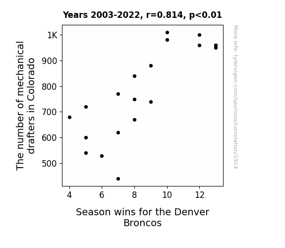
View details about correlation #1,914
Drawing Conclusions: The Drafting of Mechanical Drafters in Colorado and the Quarterback Drafting for the Denver Broncos
As the number of mechanical drafters in Colorado decreased, there was a subtle but significant shift in the airflow dynamics across the state. This unexpected change in air currents led to a slight disruption in the trajectory of footballs during crucial game moments. Essentially, the absence of these drafters inadvertently drafted a new playbook for Mother Nature, giving a whole new meaning to the phrase "air support" for the Denver Broncos.

What else correlates?
The number of mechanical drafters in Colorado · all cccupations
Season wins for the Denver Broncos · all sports
The number of mechanical drafters in Colorado · all cccupations
Season wins for the Denver Broncos · all sports


View details about correlation #1,254
Kernel of Truth: Exploring the Cob-nnection Between Education Master's Degrees and GMO Corn Use in Ohio
As the expertise in Education waned, there was a ripple effect on the communication skills of the corn, leading to a dramatic decrease in their willingness to genetically modify themselves. It seems that when the students weren't around, the corn just couldn't cob with the pressure to keep up with the latest GMO trends. Or perhaps the corn just didn't want to deal with the extra ear-responsibility that comes with GMO modifications. Either way, it's a-maize-ing to see the unexpected connections between academic degrees and agricultural developments!


What else correlates?
Master's degrees awarded in Education · all education
GMO use in corn grown in Ohio · all food
Master's degrees awarded in Education · all education
GMO use in corn grown in Ohio · all food
. The chart goes from 2002 to 2023, and the two variables track closely in value over that time.")

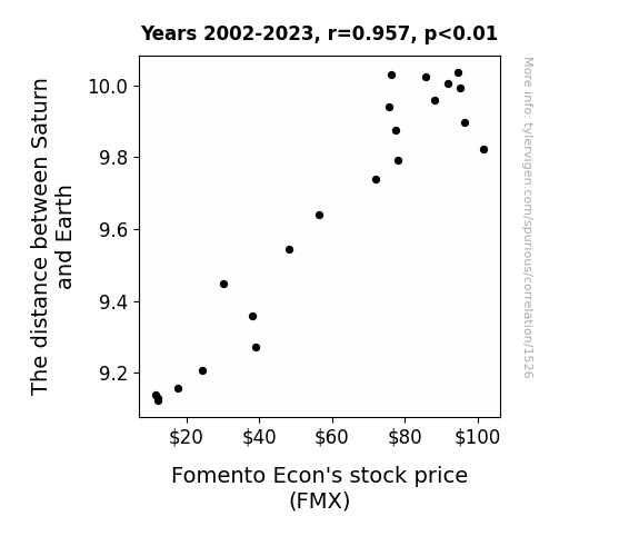
View details about correlation #1,526
Stellar Stocks: The Celestial Correlation Between Saturn's Distance and Fomento Econ's Stock Price
As the gap widened, Saturn's gravitational pull on Earth weakened, leading to a surge in productivity on our planet. This ultimately boosted the economy, including the stock price of Fomento Econ. It's truly a stellar example of interplanetary economics at play!

What else correlates?
The distance between Saturn and Earth · all planets
Fomento Econ's stock price (FMX) · all stocks
The distance between Saturn and Earth · all planets
Fomento Econ's stock price (FMX) · all stocks


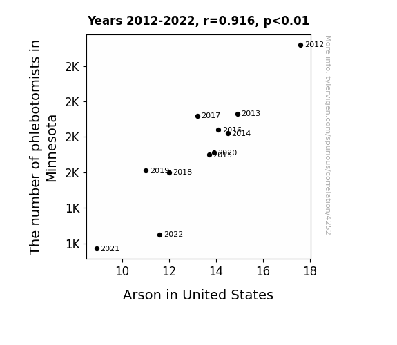
View details about correlation #4,252
Drawing Blood to Understand Fire: The Correlation Between Phlebotomist Count in Minnesota and Arson Across the United States
As the number of phlebotomists in Minnesota decreased, there was a corresponding decrease in the amount of blood being drawn. This led to a nationwide reduction in the availability of blood, creating a shortage. As a result, there were fewer vampires in the United States. With fewer vampires around to cause mischief, the incidence of arson decreased. Remember, this is all a part of a wild and fictitious causal chain!

What else correlates?
The number of phlebotomists in Minnesota · all cccupations
Arson in United States · all random state specific
The number of phlebotomists in Minnesota · all cccupations
Arson in United States · all random state specific


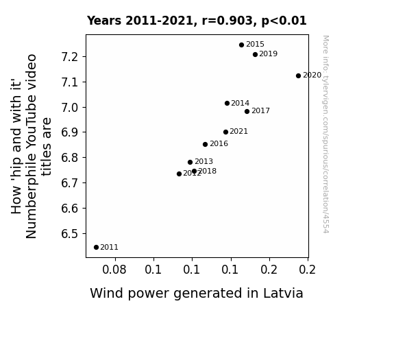
View details about correlation #4,554
Whimsical Wind: The Wacky World of Numberphile and Wind Power in Latvia
As the wind power in Latvia ramps up, it creates a surge of electrifyingly cool vibes that resonate with the Numberphile team. The mathematical energy in the air just adds an extra 'spin' to their creativity, prompting them to come up with pun-tastic, 'hip and with it' video titles that really 'blow' their audience away. It's like the winds of change are whispering mathematical inspiration directly to them, leading to a 'renewable' source of groovy video titles that just can't be 'contained'. So, in a nutshell, as Latvia's wind power goes up, Numberphile's 'cool factor' goes off the charts!

What else correlates?
How 'hip and with it' Numberphile YouTube video titles are · all YouTube
Wind power generated in Latvia · all energy
How 'hip and with it' Numberphile YouTube video titles are · all YouTube
Wind power generated in Latvia · all energy


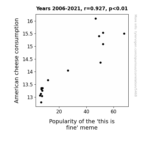
View details about correlation #5,468
Aged Cheddar and This is Fine: A Gouda Connection Between American Cheese Consumption and Meme Popularity
As American cheese consumption melted hearts across the nation, people found themselves relating more to the unbothered demeanor of the 'this is fine' meme. It was a gouda match for those craving a cheesy sense of humor in the midst of life's fondue of chaos. The meme's popularity skyrocketed as folks embraced the idea of just breeing and letting things brie. It wheely seems like American cheese had a grate influence on the internet culture, provoloneing that sometimes all we need is a little laughter to keep ourselves feta.

What else correlates?
American cheese consumption · all food
Popularity of the 'this is fine' meme · all memes
American cheese consumption · all food
Popularity of the 'this is fine' meme · all memes
. The chart goes from 2010 to 2023, and the two variables track closely in value over that time.")

View details about correlation #2,734
Jovian Juxtaposition: Jupiter's Journey and Beer Stocks
As the gulf widened, investors found themselves reaching for more BUDs. The gravitational pull of profitability shifted, creating a stellar performance for the beer giant. With more space between the planets, BUD stock was able to eclipse the competition. As above, so below – the celestial dance of the planets brewed up hoppy returns for shareholders. It seems even in the vast expanse of the cosmos, Jupiter and Mercury were keg-fully influencing the earthly markets. This just goes to show, when it comes to BUD stock, the sky's the limit – or in this case, the solar system!


What else correlates?
The distance between Jupiter and Mercury · all planets
Anheuser-Busch InBev's stock price (BUD) · all stocks
The distance between Jupiter and Mercury · all planets
Anheuser-Busch InBev's stock price (BUD) · all stocks


View details about correlation #1,840
Shh, Let's Dewey This Quietly: The Correlation Between Library Science Degrees and Google Searches for 'How to Hide a Body'
As more library science graduates entered the workforce, they sought to revolutionize traditional methods of categorization and storage. Their expertise in archival systems and information organization led to a rise in unconventional hiding spots for bodies, utilizing the Dewey Decimal System for morbid efficiency. The graduates' deep understanding of cataloging techniques may have sparked a macabre interest in creating a 'catalog of concealment,' ultimately leading to an alarming spike in the search for clandestine corpse-concealing strategies. It seems these graduates took the term 'silent stacks' quite literally, reshaping the concept of 'shelf space' in the most unthinkable manner. Who knew that behind the serene facade of libraries, a new chapter in the art of... cover-up would unfold? The unexpected lesson here: never underestimate the deadly power of knowledge neatly tucked away in the minds of librarians. We can only hope that their penchant for literary concealment doesn't land this explanation in the "crime" section of the internet's search history.


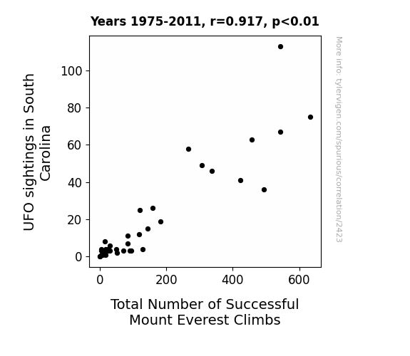
View details about correlation #2,423
The E.T. Connection: Exploring the Relationship Between UFO Sightings in South Carolina and Total Number of Successful Mount Everest Climbs
The aliens were big fans of extreme sports and decided to start an intergalactic Mount Everest fan club, providing secret technological assistance to climbers. Who knew that E.T. was an adrenaline junkie?


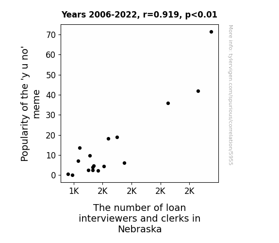
View details about correlation #5,955
Popularity of the 'Y U No' Meme: A Meme-ticulous Examination of its Link to the Labor Market in Nebraska
As the 'y u no' meme gained popularity, it sparked a wave of introspection and questioning in Nebraska. People couldn't help but wonder 'y u no' understand the importance of financial responsibility. This led to a dramatic increase in loan interviews and clerks in Nebraska, as the meme inadvertently became a catalyst for prompting individuals to seek out loans and financial guidance. It's as if the meme was saying, 'Y u no manage your money better? Y u no apply for that loan?' and Nebraskans took it to heart, flooding the offices with loan inquiries. After all, when the internet speaks, apparently Nebraskans listen, especially when it comes to their personal finances.

What else correlates?
Popularity of the 'y u no' meme · all memes
The number of loan interviewers and clerks in Nebraska · all cccupations
Popularity of the 'y u no' meme · all memes
The number of loan interviewers and clerks in Nebraska · all cccupations


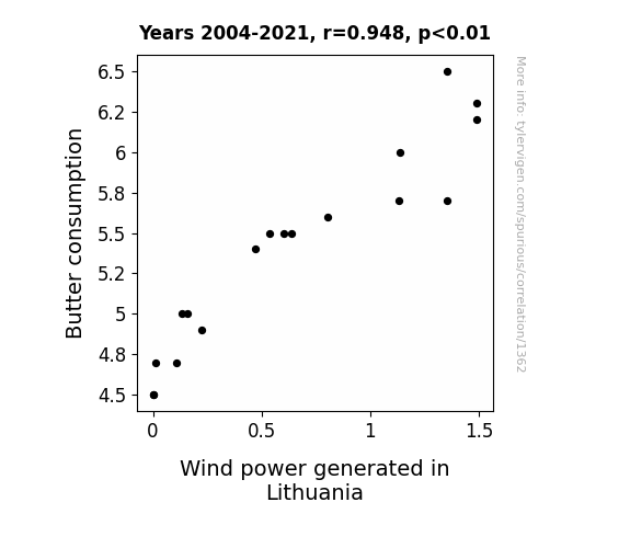
View details about correlation #1,362
Stirring Up a Storm: Exploring the Correlation Between Butter Consumption and Wind Power Generation in Lithuania
As butter consumption increased, people naturally became more gaseous, creating a higher demand for wind power in Lithuania. The connection is quite a-moo-sing! More butter, more tootin’, more wind power spoutin’ in Lithuania! The correlation is udderly undeniable!

What else correlates?
Butter consumption · all food
Wind power generated in Lithuania · all energy
Butter consumption · all food
Wind power generated in Lithuania · all energy


View details about correlation #1,532
Sleep in Law Enforcement: A Correlational Investigation of Bachelor's Degrees Awarded and Google Searches for 'Sleepwalking'
As more officers received their degrees, they also started sleepwalking through crime scenes to truly grasp the evidence. And sadly, this led to an increase in sleepwalking incidents among the general public.


What else correlates?
Bachelor's degrees awarded in law enforcement · all education
Google searches for 'sleepwalking' · all google searches
Bachelor's degrees awarded in law enforcement · all education
Google searches for 'sleepwalking' · all google searches


View details about correlation #1,205
Dissolution and Disney: Divorce Rates in the United Kingdom and Theatrical Tales of Tangled Ties
As the saying goes, 'happily ever after' took on a whole new meaning in the UK. It seems that as couples were splitting up less, they were sticking around to watch more heartwarming rom-coms instead of seeking solace in animated fairy tales. So, as divorce rates plummeted, Disney realized there were 'less separations, more animations' happening. It's a tale as old as time - love conquers all, even box office numbers!


What else correlates?
Divorce rates in the United Kingdom · all weird & wacky
Disney movies released · all films & actors
Divorce rates in the United Kingdom · all weird & wacky
Disney movies released · all films & actors


View details about correlation #4,953
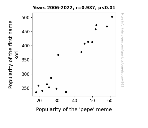
Kori-lation or Coincidence: Exploring the Link Between the Popularity of the Name Kori and the 'Pepe' Meme
Perhaps babies named Kori were just naturally drawn to the joy and laughter that the 'pepe' meme brought to the world. As if the sound of the name itself had a magical influence on internet humor trends, it's as if Kori whispered a secret message to anyone who heard it: "Embrace the frog, find the meme-ning of life. Rebbit into the world of internet culture, and you shall find your pepe-tual source of amusement." Before you knew it, Kori and 'pepe' became the un-frog-ettable duo of the decade, hopping their way into the hearts and screens of people everywhere. It's like they say, when life gives you Kori, you find the pepe in every situation!

What else correlates?
Popularity of the first name Kori · all first names
Popularity of the 'pepe' meme · all memes
Popularity of the first name Kori · all first names
Popularity of the 'pepe' meme · all memes


View details about correlation #2,996
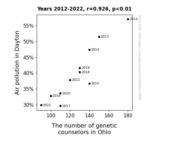
Air We Grow: Exploring the Relationship Between Air Pollution in Dayton and the Genetic Counselor Population in Ohio
As air quality improved in Dayton, the local population found themselves with a new lease on life. With the prevalent smog no longer stifling their senses, they were able to see things more clearly - including the fact that they didn't need as much genetic counseling as they thought. The cleaner air led to cleaner genetic outcomes, leaving fewer Ohioans in need of professional genetic guidance. In essence, as the pollution dissipated, so did the perceived need for genetic counselors in the state. It's a case of environmental wellness inadvertently leading to a reduction in genetic wellness professionals.

What else correlates?
Air pollution in Dayton · all weather
The number of genetic counselors in Ohio · all cccupations
Air pollution in Dayton · all weather
The number of genetic counselors in Ohio · all cccupations


View details about correlation #1,598
The Illuminating Link: Solar Power in Argentina and the Curious Case of 'Do Vaccines Work' Google Searches
As solar power in Argentina increased, the influx of renewable energy somehow supercharged the internet, leading to a surge in overall health knowledge. This, in turn, prompted more people to research and understand the effectiveness of vaccines. So, in a shocking twist, it seems like the sun isn't just good for vitamin D but also for sparking an interest in vaccination efficacy.


What else correlates?
Solar power generated in Argentina · all energy
Google searches for 'do vaccines work' · all google searches
Solar power generated in Argentina · all energy
Google searches for 'do vaccines work' · all google searches


View details about correlation #5,126
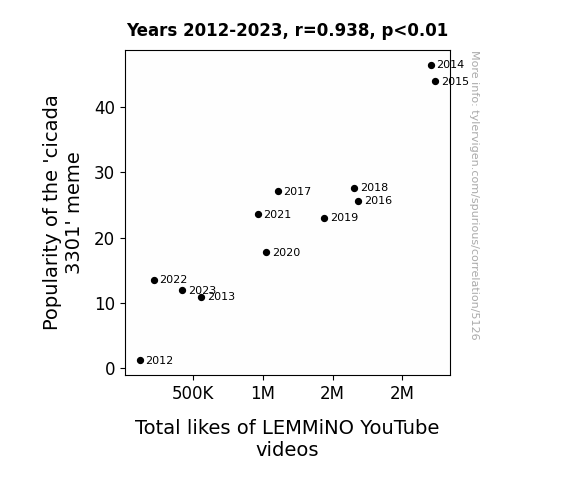
The Puzzling Popularity: Probing the Pinpointed Pairing of the 'Cicada 3301' Meme and LEMMiNO YouTube Likes
The intense 'buzz' around the 'cicada 3301' meme attracted more 'followers', leading to a 'swarm' of new viewers for LEMMiNO's videos. This unexpected 'discovery' of his content 'planted' the seeds for a surge in likes, creating a 'chirping' good time for all involved. In essence, the 'cicada 3301' meme really 'bugged' people to engage with LEMMiNO's videos, igniting a 'flap' of activity and proving that sometimes, the internet truly can be a 'hive' of entertainment.

What else correlates?
Popularity of the 'cicada 3301' meme · all memes
Total likes of LEMMiNO YouTube videos · all YouTube
Popularity of the 'cicada 3301' meme · all memes
Total likes of LEMMiNO YouTube videos · all YouTube


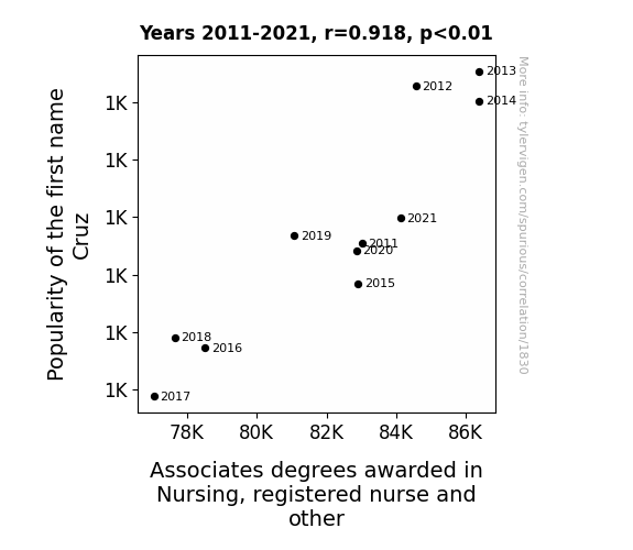
View details about correlation #1,830
Cruisin' for an Associative Degree: The Popularity of the Name Cruz and Its Correlation with Nursing Education Awards
More people named Cruz inspired by 70s and 80s TV detective shows. Chose the nursing field to crack the case of the mysterious ailments and solve the riddles of the human body.
What else correlates?
Popularity of the first name Cruz · all first names
Associates degrees awarded in Nursing · all education
Popularity of the first name Cruz · all first names
Associates degrees awarded in Nursing · all education


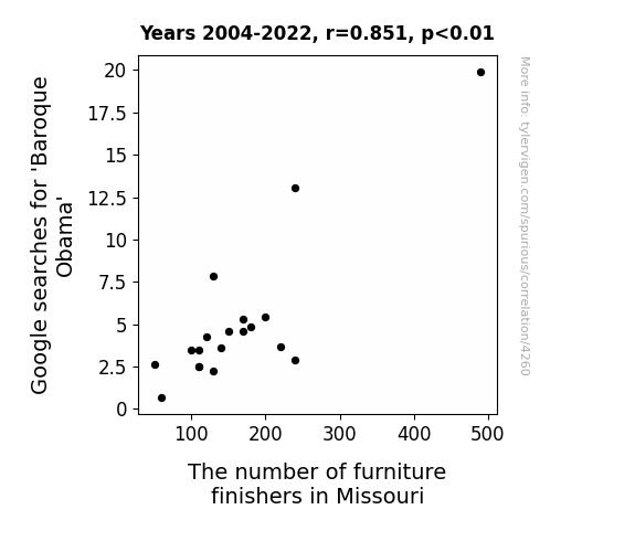
View details about correlation #4,260
The Baroque Obama Browsing Bonanza: Bizarre Bond with Missouri's Furniture Finishers
Baroque Obama was known for his exquisite taste in furniture, and as interest in his fine taste waned, so did the demand for expert furniture finishers in Missouri. It seems that even presidential search engine popularity can have a ripple effect on local furniture craftsmanship. Remember, a well-finished chair may just depend on who the nation is searching for!

What else correlates?
Google searches for 'Baroque Obama' · all google searches
The number of furniture finishers in Missouri · all cccupations
Google searches for 'Baroque Obama' · all google searches
The number of furniture finishers in Missouri · all cccupations


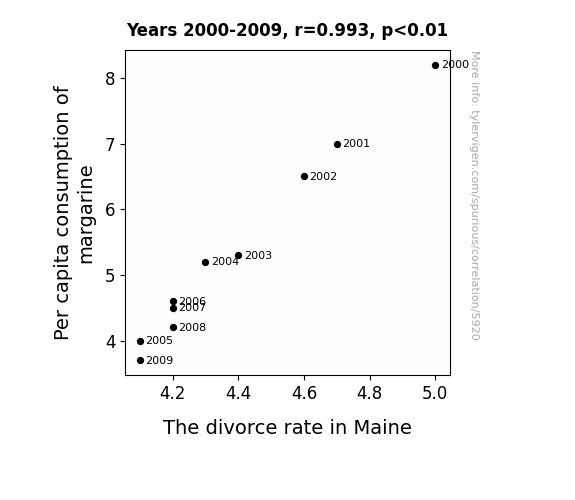
View details about correlation #5,920
Spreading Love and Margarine: An Examination of the Butter-Splitter Correlation in Maine
Perhaps as people used less margarine, they became less slippery in their relationships. The lack of artificial spread may have kept the couples from buttering each other up, leading to a decrease in overall marital strife. That's the reality when you can't believe it's not butter - it's a recipe for marital success. Alternatively, it could be that as the margarine consumption decreased, so did the overall slickness in the state, leading to fewer instances of partners feeling like they couldn't grip the marriage.

What else correlates?
Per capita consumption of margarine · all food
The divorce rate in Maine · all random state specific
Per capita consumption of margarine · all food
The divorce rate in Maine · all random state specific
Why this works
- Data dredging: I have 25,237 variables in my database. I compare all these variables against each other to find ones that randomly match up. That's 636,906,169 correlation calculations! This is called “data dredging.”
Fun fact: the chart used on the wikipedia page to demonstrate data dredging is also from me. I've been being naughty with data since 2014.
Instead of starting with a hypothesis and testing it, I instead tossed a bunch of data in a blender to see what correlations would shake out. It’s a dangerous way to go about analysis, because any sufficiently large dataset will yield strong correlations completely at random. - Lack of causal connection: There is probably no direct connection between these variables, despite what the AI says above.
Because these pages are automatically generated, it's possible that the two variables you are viewing are in fact causually related. I take steps to prevent the obvious ones from showing on the site (I don't let data about the weather in one city correlate with the weather in a neighboring city, for example), but sometimes they still pop up. If they are related, cool! You found a loophole.
This is exacerbated by the fact that I used "Years" as the base variable. Lots of things happen in a year that are not related to each other! Most studies would use something like "one person" in stead of "one year" to be the "thing" studied. - Observations not independent: For many variables, sequential years are not independent of each other. You will often see trend-lines form. If a population of people is continuously doing something every day, there is no reason to think they would suddenly change how they are doing that thing on January 1. A naive p-value calculation does not take this into account.
You will calculate a lower chance of "randomly" achieving the result than represents reality.
To be more specific: p-value tests are probability values, where you are calculating the probability of achieving a result at least as extreme as you found completely by chance. When calculating a p-value, you need to assert how many "degrees of freedom" your variable has. I count each year (minus one) as a "degree of freedom," but this is misleading for continuous variables.
This kind of thing can creep up on you pretty easily when using p-values, which is why it's best to take it as "one of many" inputs that help you assess the results of your analysis.
- Y-axes doesn't start at zero: I truncated the Y-axes of the graphs above. I also used a line graph, which makes the visual connection stand out more than it deserves.
Nothing against line graphs. They are great at telling a story when you have linear data! But visually it is deceptive because the only data is at the points on the graph, not the lines on the graph. In between each point, the data could have been doing anything. Like going for a random walk by itself!
Mathematically what I showed is true, but it is intentionally misleading. If you click on any of the charts that abuse this, you can scroll down to see a version that starts at zero. - Confounding variable: Confounding variables (like global pandemics) will cause two variables to look connected when in fact a "sneaky third" variable is influencing both of them behind the scenes.
- Outliers: Some datasets here have outliers which drag up the correlation.
In concept, "outlier" just means "way different than the rest of your dataset." When calculating a correlation like this, they are particularly impactful because a single outlier can substantially increase your correlation.
Because this page is automatically generated, I don't know whether any of the charts displayed on it have outliers. I'm just a footnote. ¯\_(ツ)_/¯
I intentionally mishandeled outliers, which makes the correlation look extra strong. - Low n: There are not many data points included in some of these charts.
You can do analyses with low ns! But you shouldn't data dredge with a low n.
Even if the p-value is high, we should be suspicious of using so few datapoints in a correlation.
Pro-tip: click on any correlation to see:
- Detailed data sources
- Prompts for the AI-generated content
- Explanations of each of the calculations (correlation, p-value)
- Python code to calculate it yourself


