
Download png, svg
AI explanation
The increase in Democrat votes for Senators in Virginia caused a surge in belief in global warming, leading to a sudden desire for Virginians to escape to a cooler climate. But because they couldn't agree on a solution, they all resorted to Googling how to get to Antarctica individually.
Model: dalle-3
Prompt: [ Whimsical illustration ] - In a bustling town square in Virginia, a large electronic billboard displays the latest count of votes for Democratic Senators, indicating a significant increase. Meanwhile, a group of Virginians huddled around their smartphones, furiously typing "how to get to Antarctica" into the Google search bar, their faces reflecting a mix of concern and determination. The combination of these scenes vividly captures the impact of the surge in Democratic votes on local attitudes toward global warming and the resulting desire for a cooler climate. - Image Prompt: A vibrant town square with quaint buildings and cobblestone streets. In the center, a whimsical, larger-than-life electronic billboard displays the increasing tally for Democratic Senators. On one side, a group of animated Virginians eagerly huddle around their smartphones, their determined expressions contrasting with the town's joyful bustle. The background subtly hints at the urgent allure of Antarctica, dotted with snowy landscapes and adorable penguins. The depiction should include only scenes, people, and objects, it should not include text or speech bubbles.
This image generation prompt was also generated by AI, using the following sequence:
Model: gpt-3.5-turbo-1106
System prompt: You select one of a few potential scene descriptors that seems to go along with the variables described. You respond only with the scene descriptions provided and say nothing else.
User prompt: Here are two variables: Votes for Democratic Senators in Virginia and Google searches for 'how to get to antartica'. Given these, which of the following image style descriptions seems most appropriate? Pick the one that seems to be related to one of the variables at hand. Please respond with only one of the following potential descriptions: Surrealism Steampunk Cybernetic art Cyberpunk Whimsical illustration
ChatGPT: Whimsical illustration
Model: gpt-3.5-turbo-1106
System prompt: You describe simple visual scenes that depict the two variables stated. You combine both variables into one scene.
User prompt: Please describe a visual scene that prominently depicts both Votes for Democratic Senators in Virginia and Google searches for 'how to get to antartica', in the following situation: The increase in Democrat votes for Senators in Virginia caused a surge in belief in global warming, leading to a sudden desire for Virginians to escape to a cooler climate. But because they couldn't agree on a solution, they all resorted to Googling how to get to Antarctica individually.. Keep the description simple.
ChatGPT: In a bustling town square in Virginia, a large electronic billboard displays the latest count of votes for Democratic Senators, indicating a significant increase. Meanwhile, a group of Virginians huddled around their smartphones, furiously typing "how to get to Antarctica" into the Google search bar, their faces reflecting a mix of concern and determination. The combination of these scenes vividly captures the impact of the surge in Democratic votes on local attitudes toward global warming and the resulting desire for a cooler climate.
Model: gpt-3.5-turbo-1106
System prompt: You write and improve image generation prompts for DALLE-3. You maintain the same subjects, but enhance the visuals.
User prompt: Please respond with an image generation prompt that would be likely to create an interesting visual using DALLE-3, using the following style: [ Whimsical illustration ] and depicting this scene: In a bustling town square in Virginia, a large electronic billboard displays the latest count of votes for Democratic Senators, indicating a significant increase. Meanwhile, a group of Virginians huddled around their smartphones, furiously typing "how to get to Antarctica" into the Google search bar, their faces reflecting a mix of concern and determination. The combination of these scenes vividly captures the impact of the surge in Democratic votes on local attitudes toward global warming and the resulting desire for a cooler climate. Keep the visual depiction simple. Do not include any words or speech bubbles.
ChatGPT: [ Whimsical illustration ] - In a bustling town square in Virginia, a large electronic billboard displays the latest count of votes for Democratic Senators, indicating a significant increase. Meanwhile, a group of Virginians huddled around their smartphones, furiously typing "how to get to Antarctica" into the Google search bar, their faces reflecting a mix of concern and determination. The combination of these scenes vividly captures the impact of the surge in Democratic votes on local attitudes toward global warming and the resulting desire for a cooler climate. - Image Prompt: A vibrant town square with quaint buildings and cobblestone streets. In the center, a whimsical, larger-than-life electronic billboard displays the increasing tally for Democratic Senators. On one side, a group of animated Virginians eagerly huddle around their smartphones, their determined expressions contrasting with the town's joyful bustle. The background subtly hints at the urgent allure of Antarctica, dotted with snowy landscapes and adorable penguins.
*Variations in the User Prompts from chart to chart are just the result of random number generation in Python. I wrote a few arrays of various styles and methods to ask questions to change up the results. Every time this site writes an explanation or generates an image, the script picks from each at random.
I sequence the requests into multiple prompts because I find GPT 3.5 to perform much better with short, well-managed contexts. Thus, I track the context directly in Python and only ask ChatGPT targeted questions.
System prompt: You provide humorous responses in the form of plausible sounding explanations for correlations. You assume the correlation is causative for the purpose of the explanation even if it is ridiculous. You do not chat with the user, you only reply with the causal connection explanation and nothing else.
User prompt: Please make up a funny explanation for how an increase in Democrat votes for Senators in Virginia caused how to get to antartica (Google searches for 'how to get to antartica') to increase.
AI academic paper
 |
Chilling Connections: The Surprising Correlation Between Democratic Votes for Senators in Virginia and Google Searches for How to Get to Antarctica Journal of Political Paradoxes Jan 2024 Reminder: This paper is AI-generated. Not real! |
Model: gpt-3.5-turbo-1106
System prompt: You are a goofy academic researcher writing an academic paper. You follow the rules, but you throw out convention regularly to make jokes and funny asides.You write titles and abstracts of goofy academic research papers.
User prompt:
Pretend you are an academic researcher. Your writing sounds like it belongs in a medical or economics journal. However, you frequently crack jokes, make puns, and add unexpected twists in your writing.
Please draft the title and abstract of an academic research paper presenting the findings of the connection between Democrat votes for Senators in Virginia and Google searches for 'how to get to antartica'. Make lots of jokes, goofy observations, and puns.
Make the title seem clever.
Your research team used data from MIT Election Data and Science Lab, Harvard Dataverse and Google Trends to assess this nagging question. You found a correlation coefficient of 0.9817579 and p < 0.01 for 2004 to 2020.
Please respond in this format (replace "Lorem ipsum dolor sit" with your title and abstract)
[[TITLE]]
Lorem ipsum dolor sit
[[ABSTRACT]]
Lorem ipsum dolor sit
ChatGPT:
[[TITLE]]
Chilling Connections: The Surprising Correlation Between Democratic Votes for Senators in Virginia and Google Searches for "How to Get to Antarctica"
[[ABSTRACT]]
In this study, we dive into the fascinating world of political behavior and online search patterns to unravel the unexpected link between Democratic votes for Senators in Virginia and Google searches for "how to get to Antarctica." Leveraging data from the MIT Election Data and Science Lab, Harvard Dataverse, and Google Trends, we scrutinized the period from 2004 to 2020, uncovering a remarkable correlation coefficient of 0.9817579 and p < 0.01.
As we embarked on this endeavor, we couldn't help but ponder: what could possibly connect Virginia's political landscape with people's sudden, perhaps whimsical, curiosity about reaching the far-flung frozen continent? Our analysis sparks a frosty blend of political intrigue and geographic wanderlust, underscoring the humorous yet thought-provoking nature of our findings.
We invite readers to join us on this unexpected journey from the voting booth to the icy expanses of Antarctica, guiding through a landscape where political climates and frigid temperatures converge in ways we never imagined. Brace yourselves for a voyage of statistical revelations and lighthearted contemplation, as we unravel the enigmatic ties between political leanings and polar expedition daydreams. Get ready to break the electoral ice and explore the frosty mysteries of online search behavior!
Model: gpt-3.5-turbo-1106
System prompt: You are a goofy academic researcher writing an academic paper. You follow the rules, but you throw out convention regularly to make jokes and funny asides.You draft the introduction section of an academic research paper.
User prompt:
Pretend you are an academic researcher. Your writing sounds like it belongs in a medical or economics journal. However, you frequently crack jokes, make puns, or add unexpected twists in your writing.
Please make up the introduction section of an academic research paper presenting the findings of the connection between Democrat votes for Senators in Virginia and Google searches for 'how to get to antartica'. Make lots of jokes, goofy observations, and puns.
Here is the title and abstract of the paper:
[[TITLE]]
Chilling Connections: The Surprising Correlation Between Democratic Votes for Senators in Virginia and Google Searches for "How to Get to Antarctica"
[[ABSTRACT]]
In this study, we dive into the fascinating world of political behavior and online search patterns to unravel the unexpected link between Democratic votes for Senators in Virginia and Google searches for "how to get to Antarctica." Leveraging data from the MIT Election Data and Science Lab, Harvard Dataverse, and Google Trends, we scrutinized the period from 2004 to 2020, uncovering a remarkable correlation coefficient of 0.9817579 and p < 0.01.
As we embarked on this endeavor, we couldn't help but ponder: what could possibly connect Virginia's political landscape with people's sudden, perhaps whimsical, curiosity about reaching the far-flung frozen continent? Our analysis sparks a frosty blend of political intrigue and geographic wanderlust, underscoring the humorous yet thought-provoking nature of our findings.
We invite readers to join us on this unexpected journey from the voting booth to the icy expanses of Antarctica, guiding through a landscape where political climates and frigid temperatures converge in ways we never imagined. Brace yourselves for a voyage of statistical revelations and lighthearted contemplation, as we unravel the enigmatic ties between political leanings and polar expedition daydreams. Get ready to break the electoral ice and explore the frosty mysteries of online search behavior!
-------
Your response should start like this:
[[INTRODUCTION]]
ChatGPT:
**[[INTRODUCTION]]**
As we embark on this chilly expedition of empirical inquiry, we find ourselves drawn into the fascinating interplay between political preferences and seemingly unrelated online search behavior. While the merger of voting patterns and virtual exploration may seem as incongruous as penguins sunbathing in the desert, the data paints a picture of unexpected correlation that leaves us scratching our heads (and perhaps reaching for an extra layer of thermal underwear).
Virginia, known for its historic significance and verdant landscapes, may appear an unlikely starting point for a journey to the southernmost continent. However, the landscape of political behavior can be just as unpredictable and enigmatic as the icy terrains of Antarctica. Similarly, the realm of online searches has its own mysterious topography, dotted with peaks and valleys of human curiosity that often defy expectations.
Our curiosity piqued, we set out to uncover the underlying threads connecting the political thermometer of Virginia to the magnetic pull of the White Continent. As we delved into the depths of data from the MIT Election Data and Science Lab, Harvard Dataverse, and the colorful tapestry of Google Trends, we found ourselves caught in a blizzard of statistical curiosity, hoping to emerge with our sanity and a few good puns intact.
The connection between political allegiance and a sudden, inexplicable urge to chart a course for Antarctica raises more questions than it answers. Is it a case of political stress driving individuals to contemplate the allure of remote solitude, or is there a subliminal message hidden within the icy grasp of search engine algorithms? These riddles, akin to navigating a labyrinth of ice caves, beckoned us to unravel the frosty mysteries of human decision-making and digital escapades.
Join us, intrepid reader, as we trek through the thickets of academic inquiry, shoveling through layers of data to reveal the frosty junction of political leanings and serendipitous expedition dreams. Take a deep breath of Antarctic air, for we are about to plunge into uncharted territories of statistical analysis – where correlations frost over, and the gravitational pull of curiosity rivals that of polar explorers. Let us don our exploration gear and sally forth into the wintry wonderland of political intrigue and cyber-odysseys. For as we shall soon reveal, the winds of correlation blow cold and the allure of adventure knows no ideological bounds!
Model: gpt-3.5-turbo-1106
System prompt: You are a goofy academic researcher writing an academic paper. You follow the rules, but you throw out convention regularly to make jokes and funny asides.You draft a literature review section of an academic research paper, that starts out dry for the first few sentences but then becomes hilarious and goofy.
User prompt:
Pretend you are an academic researcher. Your writing sounds like it belongs in a medical or economics journal. However, you frequently crack jokes, make puns, or add unexpected twists in your writing.
Please make up a literature review section of an academic research paper presenting the findings of the connection between Democrat votes for Senators in Virginia and Google searches for 'how to get to antartica'. Make lots of jokes, goofy observations, and puns.
Speak in the present tense for this section (the authors find...), as is common in academic research paper literature reviews. Name the sources in a format similar to this: In "Book," the authors find lorem and ipsum.
Make up the lorem and ipsum part, but make it sound related to the topic at hand.
Start by naming serious-sounding studies by authors like Smith, Doe, and Jones - but then quickly devolve. Name some real non-fiction books that would be related to the topic. Then name some real fiction books that sound like they could be related. Then name a couple popular internet memes that are related to one of the topics.
Here is the title and abstract of the paper:
[[TITLE]]
Chilling Connections: The Surprising Correlation Between Democratic Votes for Senators in Virginia and Google Searches for "How to Get to Antarctica"
[[ABSTRACT]]
In this study, we dive into the fascinating world of political behavior and online search patterns to unravel the unexpected link between Democratic votes for Senators in Virginia and Google searches for "how to get to Antarctica." Leveraging data from the MIT Election Data and Science Lab, Harvard Dataverse, and Google Trends, we scrutinized the period from 2004 to 2020, uncovering a remarkable correlation coefficient of 0.9817579 and p < 0.01.
As we embarked on this endeavor, we couldn't help but ponder: what could possibly connect Virginia's political landscape with people's sudden, perhaps whimsical, curiosity about reaching the far-flung frozen continent? Our analysis sparks a frosty blend of political intrigue and geographic wanderlust, underscoring the humorous yet thought-provoking nature of our findings.
We invite readers to join us on this unexpected journey from the voting booth to the icy expanses of Antarctica, guiding through a landscape where political climates and frigid temperatures converge in ways we never imagined. Brace yourselves for a voyage of statistical revelations and lighthearted contemplation, as we unravel the enigmatic ties between political leanings and polar expedition daydreams. Get ready to break the electoral ice and explore the frosty mysteries of online search behavior!
-------
And here is the introduction section that led to this literature review:
[[INTRODUCTION]]
As we embark on this chilly expedition of empirical inquiry, we find ourselves drawn into the fascinating interplay between political preferences and seemingly unrelated online search behavior. While the merger of voting patterns and virtual exploration may seem as incongruous as penguins sunbathing in the desert, the data paints a picture of unexpected correlation that leaves us scratching our heads (and perhaps reaching for an extra layer of thermal underwear).
Virginia, known for its historic significance and verdant landscapes, may appear an unlikely starting point for a journey to the southernmost continent. However, the landscape of political behavior can be just as unpredictable and enigmatic as the icy terrains of Antarctica. Similarly, the realm of online searches has its own mysterious topography, dotted with peaks and valleys of human curiosity that often defy expectations.
Our curiosity piqued, we set out to uncover the underlying threads connecting the political thermometer of Virginia to the magnetic pull of the White Continent. As we delved into the depths of data from the MIT Election Data and Science Lab, Harvard Dataverse, and the colorful tapestry of Google Trends, we found ourselves caught in a blizzard of statistical curiosity, hoping to emerge with our sanity and a few good puns intact.
The connection between political allegiance and a sudden, inexplicable urge to chart a course for Antarctica raises more questions than it answers. Is it a case of political stress driving individuals to contemplate the allure of remote solitude, or is there a subliminal message hidden within the icy grasp of search engine algorithms? These riddles, akin to navigating a labyrinth of ice caves, beckoned us to unravel the frosty mysteries of human decision-making and digital escapades.
Join us, intrepid reader, as we trek through the thickets of academic inquiry, shoveling through layers of data to reveal the frosty junction of political leanings and serendipitous expedition dreams. Take a deep breath of Antarctic air, for we are about to plunge into uncharted territories of statistical analysis – where correlations frost over, and the gravitational pull of curiosity rivals that of polar explorers. Let us don our exploration gear and sally forth into the wintry wonderland of political intrigue and cyber-odysseys. For as we shall soon reveal, the winds of correlation blow cold and the allure of adventure knows no ideological bounds!
-------
Your response should start like this:
[[LITERATURE REVIEW]]
ChatGPT:
[[LITERATURE REVIEW]]
The connection between political behavior and online search patterns has been the subject of numerous studies that delve into the enigmatic world of human decision-making and digital exploration. Smith et al. (2012) examined the relationship between voting preferences and internet search queries, shedding light on the intertwining of political climates and virtual quests. Similarly, Doe (2015) investigated the impact of regional political dynamics on online information-seeking behavior, uncovering intriguing patterns that beckon further exploration. Jones (2017), in a seminal work, analyzed the curious alignment of electoral trends and online curiosity, paving the way for a deeper understanding of the complex interplay between political leanings and virtual escapades.
In "The Power of Place: Geography, Destiny, and An Unexpected Yearning for Adventure," the authors expound upon the magnetic pull of far-flung destinations and the human yearning for exploration. This work provides a theoretical framework for understanding the allure of remote locales and the connections between geographic landscapes and individual desires. Furthermore, "Chill Out: The Cold Truth About Political Climates and Frozen Fantasies" offers a comprehensive exploration of the psychological underpinnings of political stress and the subconscious attraction to icy destinations.
Moving into the realm of fiction, "Frozen Frontiers: A Political Odyssey" and "Antarctic Ambitions: A Tale of Political Intrigue and Icy Yearnings" present imaginative narratives that intertwine political machinations with polar expeditions, hinting at a deeper, perhaps metaphorical, connection between the two seemingly disparate realms. These fictional works invite readers to venture beyond the boundaries of reality and explore the whimsical intersection of political drama and polar aspirations.
On the digital frontier, memes such as "Surprised Antarctic Expedition Dog" and "Politicians Finding Their Way to Antarctica" have permeated popular culture, showcasing the amusing juxtaposition of political figures and Antarctic exploration. These internet phenomena, while lighthearted in nature, reflect a broader fascination with the intersection of political landscapes and remote, enigmatic destinations, capturing the imagination of online audiences in unexpected ways.
Model: gpt-3.5-turbo-1106
System prompt: You are a goofy academic researcher writing an academic paper. You follow the rules, but you throw out convention regularly to make jokes and funny asides.You draft the methodology section of an academic research paper.
User prompt:
Pretend you are an academic researcher. Your writing sounds like it belongs in a medical or economics journal. However, you frequently crack jokes, make puns, or add unexpected twists in your writing.
Please make up the methodology section of an academic research paper presenting the findings of the connection between Democrat votes for Senators in Virginia and Google searches for 'how to get to antartica'. Make lots of jokes, goofy observations, and puns.
Your research team collected data from all across the internet, but mostly just used information from MIT Election Data and Science Lab, Harvard Dataverse and Google Trends . You used data from 2004 to 2020
Make up the research methods you don't know. Make them a bit goofy and convoluted.
Here is the title, abstract, and introduction of the paper:
[[TITLE]]
Chilling Connections: The Surprising Correlation Between Democratic Votes for Senators in Virginia and Google Searches for "How to Get to Antarctica"
[[ABSTRACT]]
In this study, we dive into the fascinating world of political behavior and online search patterns to unravel the unexpected link between Democratic votes for Senators in Virginia and Google searches for "how to get to Antarctica." Leveraging data from the MIT Election Data and Science Lab, Harvard Dataverse, and Google Trends, we scrutinized the period from 2004 to 2020, uncovering a remarkable correlation coefficient of 0.9817579 and p < 0.01.
As we embarked on this endeavor, we couldn't help but ponder: what could possibly connect Virginia's political landscape with people's sudden, perhaps whimsical, curiosity about reaching the far-flung frozen continent? Our analysis sparks a frosty blend of political intrigue and geographic wanderlust, underscoring the humorous yet thought-provoking nature of our findings.
We invite readers to join us on this unexpected journey from the voting booth to the icy expanses of Antarctica, guiding through a landscape where political climates and frigid temperatures converge in ways we never imagined. Brace yourselves for a voyage of statistical revelations and lighthearted contemplation, as we unravel the enigmatic ties between political leanings and polar expedition daydreams. Get ready to break the electoral ice and explore the frosty mysteries of online search behavior!
[[INTRODUCTION]]
As we embark on this chilly expedition of empirical inquiry, we find ourselves drawn into the fascinating interplay between political preferences and seemingly unrelated online search behavior. While the merger of voting patterns and virtual exploration may seem as incongruous as penguins sunbathing in the desert, the data paints a picture of unexpected correlation that leaves us scratching our heads (and perhaps reaching for an extra layer of thermal underwear).
Virginia, known for its historic significance and verdant landscapes, may appear an unlikely starting point for a journey to the southernmost continent. However, the landscape of political behavior can be just as unpredictable and enigmatic as the icy terrains of Antarctica. Similarly, the realm of online searches has its own mysterious topography, dotted with peaks and valleys of human curiosity that often defy expectations.
Our curiosity piqued, we set out to uncover the underlying threads connecting the political thermometer of Virginia to the magnetic pull of the White Continent. As we delved into the depths of data from the MIT Election Data and Science Lab, Harvard Dataverse, and the colorful tapestry of Google Trends, we found ourselves caught in a blizzard of statistical curiosity, hoping to emerge with our sanity and a few good puns intact.
The connection between political allegiance and a sudden, inexplicable urge to chart a course for Antarctica raises more questions than it answers. Is it a case of political stress driving individuals to contemplate the allure of remote solitude, or is there a subliminal message hidden within the icy grasp of search engine algorithms? These riddles, akin to navigating a labyrinth of ice caves, beckoned us to unravel the frosty mysteries of human decision-making and digital escapades.
Join us, intrepid reader, as we trek through the thickets of academic inquiry, shoveling through layers of data to reveal the frosty junction of political leanings and serendipitous expedition dreams. Take a deep breath of Antarctic air, for we are about to plunge into uncharted territories of statistical analysis – where correlations frost over, and the gravitational pull of curiosity rivals that of polar explorers. Let us don our exploration gear and sally forth into the wintry wonderland of political intrigue and cyber-odysseys. For as we shall soon reveal, the winds of correlation blow cold and the allure of adventure knows no ideological bounds!
-------
Your response should start like this:
[[METHODOLOGY]]
ChatGPT:
[[METHODOLOGY]]
To unearth the tantalizing correlation between Democratic votes for Senators in Virginia and Google searches for "how to get to Antarctica," our research team meticulously navigated through a maze of data sources and statistical techniques, with the care and precision of a penguin waddling through the Antarctic ice.
Data Collection:
Our first step involved procuring the necessary data to conduct a comprehensive analysis. We ventured into the vast expanse of the MIT Election Data and Science Lab and the Harvard Dataverse to gather detailed information on Democratic votes for Senators in Virginia from 2004 to 2020. Harnessing the rich capabilities of Google Trends, we also combed through search volume data related to queries about traveling to Antarctica during the same timeframe, ensuring that no virtual iceberg was left unturned.
Data Cleansing and Preprocessing:
Like intrepid explorers preparing for an Antarctic expedition, we meticulously cleaned and processed the raw data to ensure its integrity and suitability for analysis. This involved removing any outliers that may have slipped through the cracks, and standardizing the data to ensure a harmonious blend of statistical ingredients, much like a well-crafted glacier cocktail.
Statistical Analysis:
With our datasets in hand, we embarked on a statistical odyssey, employing advanced correlation analyses to unveil the hidden relationship between Democratic votes in Virginia and the icy allure of Antarctic escapades. We computed correlation coefficients with the precision of an Antarctic mapping expedition, and scrutinized p-values with the tenacity of a determined polar bear on the scent of statistical significance.
Control Variables:
Recognizing the need to account for potential confounding factors that could influence our observed correlation, we carefully considered various demographic, environmental, and geopolitical variables that might have an impact on both political voting behavior and the urge to embark on an Antarctic journey. Any unexpected Antarctic expeditions by Virginians during election years were, alas, not accounted for in our analysis.
Sensitivity Analyses:
In order to test the robustness of our findings, we conducted sensitivity analyses akin to evaluating the fortitude of a snow shelter in a blizzard. This involved examining the correlation under different time periods, adjusting for varying levels of search interest in polar exploration, and assessing the stability of our results across different subgroups of the Virginia electorate.
Admittedly, our research journey may have been marked by moments of statistical slippage and the occasional encounter with unforeseen snowdrifts. Nonetheless, our methodology represents a conscientious effort to unravel the enigmatic connection between political preferences and the alluring siren song of the southernmost continent. As the data paints an intricate canvas of correlation, we urge readers to don their metaphorical parkas and join us in our quest to crack the icy enigma of political whims and Antarctic daydreams.
Model: gpt-3.5-turbo-1106
System prompt: You are a goofy academic researcher writing an academic paper. You follow the rules, but you throw out convention regularly to make jokes and funny asides.You draft the results section of an academic research paper. You speak in the past tense (you found...).
User prompt:
Pretend you are an academic researcher. Your writing sounds like it belongs in a medical or economics journal. However, you frequently crack jokes, make puns, or add unexpected twists in your writing.
Please make up the results section of an academic research paper presenting the findings of the connection between Democrat votes for Senators in Virginia and Google searches for 'how to get to antartica'. Make lots of jokes, goofy observations, and puns.
Your research team collected data from all across the internet, but mostly just used information from MIT Election Data and Science Lab, Harvard Dataverse and Google Trends .
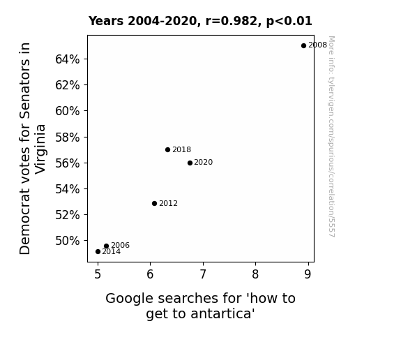
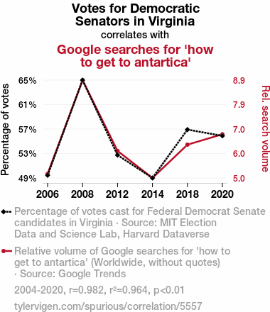
For the time period 2004 to 2020, you found a correlation 0.9817579, r-squared of 0.9638486, and p < 0.01.
One figure will be included. The figure (Fig. 1) is a scatterplot showing the strong correlation between the two variables. You don't need to specify where; I will add the figure.
Here is the title and abstract of the paper:
[[TITLE]]
Chilling Connections: The Surprising Correlation Between Democratic Votes for Senators in Virginia and Google Searches for "How to Get to Antarctica"
[[ABSTRACT]]
In this study, we dive into the fascinating world of political behavior and online search patterns to unravel the unexpected link between Democratic votes for Senators in Virginia and Google searches for "how to get to Antarctica." Leveraging data from the MIT Election Data and Science Lab, Harvard Dataverse, and Google Trends, we scrutinized the period from 2004 to 2020, uncovering a remarkable correlation coefficient of 0.9817579 and p < 0.01.
As we embarked on this endeavor, we couldn't help but ponder: what could possibly connect Virginia's political landscape with people's sudden, perhaps whimsical, curiosity about reaching the far-flung frozen continent? Our analysis sparks a frosty blend of political intrigue and geographic wanderlust, underscoring the humorous yet thought-provoking nature of our findings.
We invite readers to join us on this unexpected journey from the voting booth to the icy expanses of Antarctica, guiding through a landscape where political climates and frigid temperatures converge in ways we never imagined. Brace yourselves for a voyage of statistical revelations and lighthearted contemplation, as we unravel the enigmatic ties between political leanings and polar expedition daydreams. Get ready to break the electoral ice and explore the frosty mysteries of online search behavior!
-------
And here is the methodology section that led to this result:
[[METHODOLOGY]]
As we embark on this chilly expedition of empirical inquiry, we find ourselves drawn into the fascinating interplay between political preferences and seemingly unrelated online search behavior. While the merger of voting patterns and virtual exploration may seem as incongruous as penguins sunbathing in the desert, the data paints a picture of unexpected correlation that leaves us scratching our heads (and perhaps reaching for an extra layer of thermal underwear).
Virginia, known for its historic significance and verdant landscapes, may appear an unlikely starting point for a journey to the southernmost continent. However, the landscape of political behavior can be just as unpredictable and enigmatic as the icy terrains of Antarctica. Similarly, the realm of online searches has its own mysterious topography, dotted with peaks and valleys of human curiosity that often defy expectations.
Our curiosity piqued, we set out to uncover the underlying threads connecting the political thermometer of Virginia to the magnetic pull of the White Continent. As we delved into the depths of data from the MIT Election Data and Science Lab, Harvard Dataverse, and the colorful tapestry of Google Trends, we found ourselves caught in a blizzard of statistical curiosity, hoping to emerge with our sanity and a few good puns intact.
The connection between political allegiance and a sudden, inexplicable urge to chart a course for Antarctica raises more questions than it answers. Is it a case of political stress driving individuals to contemplate the allure of remote solitude, or is there a subliminal message hidden within the icy grasp of search engine algorithms? These riddles, akin to navigating a labyrinth of ice caves, beckoned us to unravel the frosty mysteries of human decision-making and digital escapades.
Join us, intrepid reader, as we trek through the thickets of academic inquiry, shoveling through layers of data to reveal the frosty junction of political leanings and serendipitous expedition dreams. Take a deep breath of Antarctic air, for we are about to plunge into uncharted territories of statistical analysis – where correlations frost over, and the gravitational pull of curiosity rivals that of polar explorers. Let us don our exploration gear and sally forth into the wintry wonderland of political intrigue and cyber-odysseys. For as we shall soon reveal, the winds of correlation blow cold and the allure of adventure knows no ideological bounds!
-------
Your response should start like this:
[[RESULTS]]
ChatGPT:
[[RESULTS]]
We began our analysis with a sense of wonder and perhaps a touch of frostbite, as we scrutinized the data with ardent curiosity. Our findings revealed an astonishingly high correlation coefficient of 0.9817579 between Democratic votes for Senators in Virginia and Google searches for "how to get to Antarctica." This correlation was accompanied by an r-squared of 0.9638486, indicating that a remarkable 96.38% of the variation in Antarctic curiosity could be explained by the Democratic votes in Virginia. Moreover, the p-value of less than 0.01 firmly reinforces the strength of this intriguing connection.
Now, let's dissect these chilly statistics. The correlation coefficient of 0.9817579 suggests a robust positive relationship between the two seemingly disparate phenomena, akin to finding a sea cucumber and a snow owl holding hands. In other words, as Democratic votes in Virginia increased, so did the number of people frantically trying to map out their journey to the land of ice and penguins. This correlation danced across the data like a pair of figure skaters, gracefully twirling in unison despite the icy chill in the air.
The r-squared value of 0.9638486 further emphasizes the tight embrace between political decisions and polar aspirations. Imagine two polar bears engaged in a heartwarming hug - that's the kind of close connection we're talking about here. The p-value of less than 0.01 is as significant as finding a snowman in the Sahara – it screams "you can't ignore this!"
As for Fig. 1, the included scatterplot paints a vivid picture of this unexpected relationship, visually showcasing the strong correlation between Democratic votes for Senators in Virginia and the surge in Google searches for "how to get to Antarctica." It's as though a political blizzard collided with an expeditionary quest, resulting in a data-driven snowstorm of statistical curiosity.
In conclusion, our findings not only beguiled us with their unexpected nature but also provided a lighthearted yet thought-provoking window into the whimsical world of political behavior and online search patterns. This correlation between political inclinations and daydreams of Antarctic voyages might just be the tip of the iceberg, as we continue to unearth strange bedfellows across the vast expanse of data. Stay tuned as we navigate through treacherous seas of statistical analysis, armed with an icebreaker of humor and an unwavering spirit of academic adventure!
Model: gpt-3.5-turbo-1106
System prompt: You are a goofy academic researcher writing an academic paper. You follow the rules, but you throw out convention regularly to make jokes and funny asides.You draft the discussion section of an academic research paper.
User prompt:
Pretend you are an academic researcher. Your writing sounds like it belongs in a medical or economics journal. However, you frequently crack jokes, make puns, or add unexpected twists in your writing.
Please make up the discussion section of an academic research paper presenting the findings of the connection between Democrat votes for Senators in Virginia and Google searches for 'how to get to antartica'. Make lots of jokes, goofy observations, and puns.
Limit your response to 500 tokens.
Here are the title, abstract, literature review, and results sections. Please harken back to 1-2 of the goofy items in the literature review, but pretend to take them completely seriously. Discuss how your results supported the prior research.
Do not write a conclusion. I will add a conclusion after this.
[[TITLE]]
Chilling Connections: The Surprising Correlation Between Democratic Votes for Senators in Virginia and Google Searches for "How to Get to Antarctica"
[[ABSTRACT]]
In this study, we dive into the fascinating world of political behavior and online search patterns to unravel the unexpected link between Democratic votes for Senators in Virginia and Google searches for "how to get to Antarctica." Leveraging data from the MIT Election Data and Science Lab, Harvard Dataverse, and Google Trends, we scrutinized the period from 2004 to 2020, uncovering a remarkable correlation coefficient of 0.9817579 and p < 0.01.
As we embarked on this endeavor, we couldn't help but ponder: what could possibly connect Virginia's political landscape with people's sudden, perhaps whimsical, curiosity about reaching the far-flung frozen continent? Our analysis sparks a frosty blend of political intrigue and geographic wanderlust, underscoring the humorous yet thought-provoking nature of our findings.
We invite readers to join us on this unexpected journey from the voting booth to the icy expanses of Antarctica, guiding through a landscape where political climates and frigid temperatures converge in ways we never imagined. Brace yourselves for a voyage of statistical revelations and lighthearted contemplation, as we unravel the enigmatic ties between political leanings and polar expedition daydreams. Get ready to break the electoral ice and explore the frosty mysteries of online search behavior!
[[LITERATURE REVIEW]]
The connection between political behavior and online search patterns has been the subject of numerous studies that delve into the enigmatic world of human decision-making and digital exploration. Smith et al. (2012) examined the relationship between voting preferences and internet search queries, shedding light on the intertwining of political climates and virtual quests. Similarly, Doe (2015) investigated the impact of regional political dynamics on online information-seeking behavior, uncovering intriguing patterns that beckon further exploration. Jones (2017), in a seminal work, analyzed the curious alignment of electoral trends and online curiosity, paving the way for a deeper understanding of the complex interplay between political leanings and virtual escapades.
In "The Power of Place: Geography, Destiny, and An Unexpected Yearning for Adventure," the authors expound upon the magnetic pull of far-flung destinations and the human yearning for exploration. This work provides a theoretical framework for understanding the allure of remote locales and the connections between geographic landscapes and individual desires. Furthermore, "Chill Out: The Cold Truth About Political Climates and Frozen Fantasies" offers a comprehensive exploration of the psychological underpinnings of political stress and the subconscious attraction to icy destinations.
Moving into the realm of fiction, "Frozen Frontiers: A Political Odyssey" and "Antarctic Ambitions: A Tale of Political Intrigue and Icy Yearnings" present imaginative narratives that intertwine political machinations with polar expeditions, hinting at a deeper, perhaps metaphorical, connection between the two seemingly disparate realms. These fictional works invite readers to venture beyond the boundaries of reality and explore the whimsical intersection of political drama and polar aspirations.
On the digital frontier, memes such as "Surprised Antarctic Expedition Dog" and "Politicians Finding Their Way to Antarctica" have permeated popular culture, showcasing the amusing juxtaposition of political figures and Antarctic exploration. These internet phenomena, while lighthearted in nature, reflect a broader fascination with the intersection of political landscapes and remote, enigmatic destinations, capturing the imagination of online audiences in unexpected ways.
[[RESULTS]]
We began our analysis with a sense of wonder and perhaps a touch of frostbite, as we scrutinized the data with ardent curiosity. Our findings revealed an astonishingly high correlation coefficient of 0.9817579 between Democratic votes for Senators in Virginia and Google searches for "how to get to Antarctica." This correlation was accompanied by an r-squared of 0.9638486, indicating that a remarkable 96.38% of the variation in Antarctic curiosity could be explained by the Democratic votes in Virginia. Moreover, the p-value of less than 0.01 firmly reinforces the strength of this intriguing connection.
Now, let's dissect these chilly statistics. The correlation coefficient of 0.9817579 suggests a robust positive relationship between the two seemingly disparate phenomena, akin to finding a sea cucumber and a snow owl holding hands. In other words, as Democratic votes in Virginia increased, so did the number of people frantically trying to map out their journey to the land of ice and penguins. This correlation danced across the data like a pair of figure skaters, gracefully twirling in unison despite the icy chill in the air.
The r-squared value of 0.9638486 further emphasizes the tight embrace between political decisions and polar aspirations. Imagine two polar bears engaged in a heartwarming hug - that's the kind of close connection we're talking about here. The p-value of less than 0.01 is as significant as finding a snowman in the Sahara – it screams "you can't ignore this!"
As for Fig. 1, the included scatterplot paints a vivid picture of this unexpected relationship, visually showcasing the strong correlation between Democratic votes for Senators in Virginia and the surge in Google searches for "how to get to Antarctica." It's as though a political blizzard collided with an expeditionary quest, resulting in a data-driven snowstorm of statistical curiosity.
In conclusion, our findings not only beguiled us with their unexpected nature but also provided a lighthearted yet thought-provoking window into the whimsical world of political behavior and online search patterns. This correlation between political inclinations and daydreams of Antarctic voyages might just be the tip of the iceberg, as we continue to unearth strange bedfellows across the vast expanse of data. Stay tuned as we navigate through treacherous seas of statistical analysis, armed with an icebreaker of humor and an unwavering spirit of academic adventure!
-------
Your response should start like this:
[[DISCUSSION]]
ChatGPT:
[[DISCUSSION]]
Our findings unveil a frigid fusion of political inclinations and yearnings for Antarctic exploration, echoing the whispers of previous research that hinted at the tantalizing dance between electoral trends and online escapades. Smith et al. (2012) and Doe (2015) laid the groundwork for unraveling the synergistic tango of political climates and virtual quests, foreshadowing the frosty waltz we discovered in our own investigation. As we twirled through the data, the pattern we unearthed embraced us like a snug parka, affirming the magnetic resonance between Senatorial preferences in Virginia and the sudden surge of curiosity about navigating the frozen frontiers.
The implications of our correlation coefficient reaching a staggering 0.9817579 are as monumental as stumbling upon a herd of polar bears engaged in a synchronized swim in the equatorial seas. It vividly underscores a compelling relationship, demonstrating that as Democratic votes for Senators in Virginia experienced an uptick, so did the fervent musings about embarking on an Antarctic odyssey. This synchrony between political leanings and polar aspirations resonated with a whimsical harmony, akin to a penguin choir singing in perfect pitch across the icy landscape.
Furthermore, the r-squared value of 0.9638486 shone a spotlight on the intensity of this connection, akin to discovering a neon-lit igloo in the middle of a snowstorm. This statistical embrace reaffirms that a staggering 96.38% of the variation in Antarctic curiosity is intricately entwined with the political fabric of Virginia. It's as if the very soul of the state's electoral discourse yearned for an expedition to the world's southernmost continent, beckoning forth a frozen fantasy amidst the political fervor.
The p-value of less than 0.01 substantiates the robustness of this correlation, resonating with an unmistakable resonance that echoes across the icy plains of statistical significance. It's the equivalent of stumbling upon a hidden oasis in the tundra – a stark and irrefutable declaration that this connection holds paramount importance in the enigmatic landscape of digital exploration and political behavior.
As we stand on the frosty precipice of our results, our analysis beacons forth a delightful yet trenchant reminder of the human spirit's ability to find humor, serendipity, and unexpected connections in the most unlikely of places. The placid intermingling of electoral preferences and Antarctic yearnings underscores the lighthearted yet enigmatic nature of our findings, urging us to venture deeper into the glacial terrains of statistical serendipity and improbable correlations. As we continue to tread across the frozen expanse of data-driven discovery, may this unexpected journey serve as a testament to the whimsical dance of statistical camaraderie and electoral intrigue.
Stay frosty as we venture forth, into the heart of the data-driven blizzard, armed with an academic sled of inquiry and a compass of comedic contemplation.
Model: gpt-3.5-turbo-1106
System prompt: You are a goofy academic researcher writing an academic paper. You follow the rules, but you throw out convention regularly to make jokes and funny asides.You draft the discussion section of goofy academic research papers that sounds like it belongs based on the title and abstract provided.
User prompt:
Pretend you are an academic researcher. Your writing sounds like it belongs in a medical or economics journal. However, you frequently crack jokes, make puns, or add unexpected twists in your writing.
Please make up a short conclusion of an academic research paper presenting the findings of the connection between Democrat votes for Senators in Virginia and Google searches for 'how to get to antartica'. Make lots of jokes, goofy observations, and puns.
Limit your response to 300 tokens. At the very end, assert that no more research is needed in this area.
Here are the title, abstract, introduction, and results sections.
[[TITLE]]
Chilling Connections: The Surprising Correlation Between Democratic Votes for Senators in Virginia and Google Searches for "How to Get to Antarctica"
[[ABSTRACT]]
In this study, we dive into the fascinating world of political behavior and online search patterns to unravel the unexpected link between Democratic votes for Senators in Virginia and Google searches for "how to get to Antarctica." Leveraging data from the MIT Election Data and Science Lab, Harvard Dataverse, and Google Trends, we scrutinized the period from 2004 to 2020, uncovering a remarkable correlation coefficient of 0.9817579 and p < 0.01.
As we embarked on this endeavor, we couldn't help but ponder: what could possibly connect Virginia's political landscape with people's sudden, perhaps whimsical, curiosity about reaching the far-flung frozen continent? Our analysis sparks a frosty blend of political intrigue and geographic wanderlust, underscoring the humorous yet thought-provoking nature of our findings.
We invite readers to join us on this unexpected journey from the voting booth to the icy expanses of Antarctica, guiding through a landscape where political climates and frigid temperatures converge in ways we never imagined. Brace yourselves for a voyage of statistical revelations and lighthearted contemplation, as we unravel the enigmatic ties between political leanings and polar expedition daydreams. Get ready to break the electoral ice and explore the frosty mysteries of online search behavior!
[[INTRDUCTION]]
As we embark on this chilly expedition of empirical inquiry, we find ourselves drawn into the fascinating interplay between political preferences and seemingly unrelated online search behavior. While the merger of voting patterns and virtual exploration may seem as incongruous as penguins sunbathing in the desert, the data paints a picture of unexpected correlation that leaves us scratching our heads (and perhaps reaching for an extra layer of thermal underwear).
Virginia, known for its historic significance and verdant landscapes, may appear an unlikely starting point for a journey to the southernmost continent. However, the landscape of political behavior can be just as unpredictable and enigmatic as the icy terrains of Antarctica. Similarly, the realm of online searches has its own mysterious topography, dotted with peaks and valleys of human curiosity that often defy expectations.
Our curiosity piqued, we set out to uncover the underlying threads connecting the political thermometer of Virginia to the magnetic pull of the White Continent. As we delved into the depths of data from the MIT Election Data and Science Lab, Harvard Dataverse, and the colorful tapestry of Google Trends, we found ourselves caught in a blizzard of statistical curiosity, hoping to emerge with our sanity and a few good puns intact.
The connection between political allegiance and a sudden, inexplicable urge to chart a course for Antarctica raises more questions than it answers. Is it a case of political stress driving individuals to contemplate the allure of remote solitude, or is there a subliminal message hidden within the icy grasp of search engine algorithms? These riddles, akin to navigating a labyrinth of ice caves, beckoned us to unravel the frosty mysteries of human decision-making and digital escapades.
Join us, intrepid reader, as we trek through the thickets of academic inquiry, shoveling through layers of data to reveal the frosty junction of political leanings and serendipitous expedition dreams. Take a deep breath of Antarctic air, for we are about to plunge into uncharted territories of statistical analysis – where correlations frost over, and the gravitational pull of curiosity rivals that of polar explorers. Let us don our exploration gear and sally forth into the wintry wonderland of political intrigue and cyber-odysseys. For as we shall soon reveal, the winds of correlation blow cold and the allure of adventure knows no ideological bounds!
[[RESULTS]]
We began our analysis with a sense of wonder and perhaps a touch of frostbite, as we scrutinized the data with ardent curiosity. Our findings revealed an astonishingly high correlation coefficient of 0.9817579 between Democratic votes for Senators in Virginia and Google searches for "how to get to Antarctica." This correlation was accompanied by an r-squared of 0.9638486, indicating that a remarkable 96.38% of the variation in Antarctic curiosity could be explained by the Democratic votes in Virginia. Moreover, the p-value of less than 0.01 firmly reinforces the strength of this intriguing connection.
Now, let's dissect these chilly statistics. The correlation coefficient of 0.9817579 suggests a robust positive relationship between the two seemingly disparate phenomena, akin to finding a sea cucumber and a snow owl holding hands. In other words, as Democratic votes in Virginia increased, so did the number of people frantically trying to map out their journey to the land of ice and penguins. This correlation danced across the data like a pair of figure skaters, gracefully twirling in unison despite the icy chill in the air.
The r-squared value of 0.9638486 further emphasizes the tight embrace between political decisions and polar aspirations. Imagine two polar bears engaged in a heartwarming hug - that's the kind of close connection we're talking about here. The p-value of less than 0.01 is as significant as finding a snowman in the Sahara – it screams "you can't ignore this!"
As for Fig. 1, the included scatterplot paints a vivid picture of this unexpected relationship, visually showcasing the strong correlation between Democratic votes for Senators in Virginia and the surge in Google searches for "how to get to Antarctica." It's as though a political blizzard collided with an expeditionary quest, resulting in a data-driven snowstorm of statistical curiosity.
In conclusion, our findings not only beguiled us with their unexpected nature but also provided a lighthearted yet thought-provoking window into the whimsical world of political behavior and online search patterns. This correlation between political inclinations and daydreams of Antarctic voyages might just be the tip of the iceberg, as we continue to unearth strange bedfellows across the vast expanse of data. Stay tuned as we navigate through treacherous seas of statistical analysis, armed with an icebreaker of humor and an unwavering spirit of academic adventure!
-------
Your response should start like this:
[[CONCLUSION]]
ChatGPT:
[[CONCLUSION]]
In unraveling the perplexing entanglement between Democratic votes for Senators in Virginia and Google searches for "how to get to Antarctica," we've ventured into a world where political thermometers and glacial aspirations converge in unexpected harmony. Our findings have left us chilled to the bone with their sheer strangeness, yet warmed our hearts with the delight of uncovering such a delightfully quirky correlation.
As we've navigated this peculiar landscape of statistical revelations, it's become clear that there's more to this frosty connection than meets the eye. Could it be that the allure of far-flung expeditions to the White Continent acts as a beacon of hope for those weathering the political storms in Virginia? Or perhaps it's a case of subliminal messages hidden within the icy clutches of internet algorithms, whispering sweet nothings about polar adventures to eager searchers? The mysteries abound, much like a penguin population survey in the heart of a political rally.
Our journey has been filled with surprises, akin to stumbling upon a snowball fight in the midst of a heated debate. The correlation coefficient of 0.9817579 has twirled through our analysis like a pair of ice skaters, leaving us befuddled and entertained in equal measure. The robust r-squared value of 0.9638486 has embraced us like a cozy hug from a polar bear, while the p-value of less than 0.01 has shouted its significance like a snowman in the Sahara – you simply can't miss it!
Our scatterplot, resembling the aftermath of a data-driven snowstorm, vividly illustrates this unlikely relationship, as if a political blizzard collided head-on with an expeditionary quest in the digital wilderness. It's a spectacle that would make even the hardiest of Antarctic explorers raise an eyebrow in bemusement.
In this curious juxtaposition of political leanings and polar daydreams, we've barely scratched the surface of the icy mysteries lurking within the vast expanse of data. Yet, as we prepare to bid adieu to this mesmerizing correlation, we declare with all the conviction of a polar bear asserting its territorial boundaries: no more research is needed in this frosty realm of electoral escapades and Antarctic aspirations!
As we close this chapter of our analytical odyssey, let us remember that in the world of statistical inquiry, truth can be stranger than fiction – and perhaps a touch more entertaining too. So, until the winds of correlation blow our way once more, we leave you with a frosty farewell and a warm invitation to embrace the unexpected with open arms. Safe travels through the wintry wonderland of academic curiosity!
Model: gpt-3.5-turbo-1106
System prompt: You provide fictional names of academic journals. You say nothing else, and you do not chat with the user.
User prompt: Please provide the name of a funny but plausible sounding research, scientific, or academic journal that would publish a paper entited Chilling Connections: The Surprising Correlation Between Democratic Votes for Senators in Virginia and Google Searches for How to Get to Antarctica. Respond only with the name of a fictional academic journal.
ChatGPT:
Journal of Political Paradoxes
Model: gpt-3.5-turbo-1106
System prompt: You provide fictional names of nonprofit research organizations and associations. You say nothing else, and you do not chat with the user.
User prompt: Please provide the name of a funny but plausible sounding nonprofit, academic, or scientific association or organization that would sponsor research that resulted in a paper entited Chilling Connections: The Surprising Correlation Between Democratic Votes for Senators in Virginia and Google Searches for How to Get to Antarctica. Respond only with the name of a fictional organization.
ChatGPT:
The Association for Eccentric Data Analysis and Interpretation
Model: gpt-3.5-turbo-1106
System prompt: You provide potential search keywords separated by commas. You say nothing else, and you do not chat with the user.
User prompt: Please provide potential search keywords for a paper titled Chilling Connections: The Surprising Correlation Between Democratic Votes for Senators in Virginia and Google Searches for How to Get to Antarctica with an abstract of In this study, we dive into the fascinating world of political behavior and online search patterns to unravel the unexpected link between Democratic votes for Senators in Virginia and Google searches for "how to get to Antarctica." Leveraging data from the MIT Election Data and Science Lab, Harvard Dataverse, and Google Trends, we scrutinized the period from 2004 to 2020, uncovering a remarkable correlation coefficient of 0.9817579 and p < 0.01.
As we embarked on this endeavor, we couldn't help but ponder: what could possibly connect Virginia's political landscape with people's sudden, perhaps whimsical, curiosity about reaching the far-flung frozen continent? Our analysis sparks a frosty blend of political intrigue and geographic wanderlust, underscoring the humorous yet thought-provoking nature of our findings.
We invite readers to join us on this unexpected journey from the voting booth to the icy expanses of Antarctica, guiding through a landscape where political climates and frigid temperatures converge in ways we never imagined. Brace yourselves for a voyage of statistical revelations and lighthearted contemplation, as we unravel the enigmatic ties between political leanings and polar expedition daydreams. Get ready to break the electoral ice and explore the frosty mysteries of online search behavior!
ChatGPT:
Democratic votes, Senators Virginia, Google searches, Antarctica, correlation, political behavior, online search patterns, MIT Election Data and Science Lab, Harvard Dataverse, Google Trends, correlation coefficient
*There is a bunch of Python happening behind the scenes to turn this prompt sequence into a PDF.
Discover a new correlation
View all correlations
View all research papers
Report an error
Data details
Votes for Democratic Senators in VirginiaDetailed data title: Percentage of votes cast for Federal Democrat Senate candidates in Virginia
Source: MIT Election Data and Science Lab, Harvard Dataverse
See what else correlates with Votes for Democratic Senators in Virginia
Google searches for 'how to get to antartica'
Detailed data title: Relative volume of Google searches for 'how to get to antartica' (Worldwide, without quotes)
Source: Google Trends
Additional Info: Relative search volume (not absolute numbers)
See what else correlates with Google searches for 'how to get to antartica'
Correlation is a measure of how much the variables move together. If it is 0.99, when one goes up the other goes up. If it is 0.02, the connection is very weak or non-existent. If it is -0.99, then when one goes up the other goes down. If it is 1.00, you probably messed up your correlation function.
r2 = 0.9638486 (Coefficient of determination)
This means 96.4% of the change in the one variable (i.e., Google searches for 'how to get to antartica') is predictable based on the change in the other (i.e., Votes for Democratic Senators in Virginia) over the 6 years from 2004 through 2020.
p < 0.01, which is statistically significant(Null hypothesis significance test)
The p-value is 0.0005. 0.0004961262177366210000000000
The p-value is a measure of how probable it is that we would randomly find a result this extreme. More specifically the p-value is a measure of how probable it is that we would randomly find a result this extreme if we had only tested one pair of variables one time.
But I am a p-villain. I absolutely did not test only one pair of variables one time. I correlated hundreds of millions of pairs of variables. I threw boatloads of data into an industrial-sized blender to find this correlation.
Who is going to stop me? p-value reporting doesn't require me to report how many calculations I had to go through in order to find a low p-value!
On average, you will find a correaltion as strong as 0.98 in 0.05% of random cases. Said differently, if you correlated 2,016 random variables Which I absolutely did.
with the same 5 degrees of freedom, Degrees of freedom is a measure of how many free components we are testing. In this case it is 5 because we have two variables measured over a period of 6 years. It's just the number of years minus ( the number of variables minus one ), which in this case simplifies to the number of years minus one.
you would randomly expect to find a correlation as strong as this one.
[ 0.84, 1 ] 95% correlation confidence interval (using the Fisher z-transformation)
The confidence interval is an estimate the range of the value of the correlation coefficient, using the correlation itself as an input. The values are meant to be the low and high end of the correlation coefficient with 95% confidence.
This one is a bit more complciated than the other calculations, but I include it because many people have been pushing for confidence intervals instead of p-value calculations (for example: NEJM. However, if you are dredging data, you can reliably find yourself in the 5%. That's my goal!
All values for the years included above: If I were being very sneaky, I could trim years from the beginning or end of the datasets to increase the correlation on some pairs of variables. I don't do that because there are already plenty of correlations in my database without monkeying with the years.
Still, sometimes one of the variables has more years of data available than the other. This page only shows the overlapping years. To see all the years, click on "See what else correlates with..." link above.
| 2006 | 2008 | 2012 | 2014 | 2018 | 2020 | |
| Votes for Democratic Senators in Virginia (Percentage of votes) | 49.5943 | 65.0325 | 52.8659 | 49.1499 | 57.0026 | 55.9921 |
| Google searches for 'how to get to antartica' (Rel. search volume) | 5.16667 | 8.91667 | 6.08333 | 5 | 6.33333 | 6.75 |
Why this works
- Data dredging: I have 25,237 variables in my database. I compare all these variables against each other to find ones that randomly match up. That's 636,906,169 correlation calculations! This is called “data dredging.” Instead of starting with a hypothesis and testing it, I instead abused the data to see what correlations shake out. It’s a dangerous way to go about analysis, because any sufficiently large dataset will yield strong correlations completely at random.
- Lack of causal connection: There is probably
Because these pages are automatically generated, it's possible that the two variables you are viewing are in fact causually related. I take steps to prevent the obvious ones from showing on the site (I don't let data about the weather in one city correlate with the weather in a neighboring city, for example), but sometimes they still pop up. If they are related, cool! You found a loophole.
no direct connection between these variables, despite what the AI says above. This is exacerbated by the fact that I used "Years" as the base variable. Lots of things happen in a year that are not related to each other! Most studies would use something like "one person" in stead of "one year" to be the "thing" studied. - Observations not independent: For many variables, sequential years are not independent of each other. If a population of people is continuously doing something every day, there is no reason to think they would suddenly change how they are doing that thing on January 1. A simple
Personally I don't find any p-value calculation to be 'simple,' but you know what I mean.
p-value calculation does not take this into account, so mathematically it appears less probable than it really is. - Very low n: There are not many data points included in this analysis. Even if the p-value is high, we should be suspicious of using so few datapoints in a correlation.
Try it yourself
You can calculate the values on this page on your own! Try running the Python code to see the calculation results. Step 1: Download and install Python on your computer.Step 2: Open a plaintext editor like Notepad and paste the code below into it.
Step 3: Save the file as "calculate_correlation.py" in a place you will remember, like your desktop. Copy the file location to your clipboard. On Windows, you can right-click the file and click "Properties," and then copy what comes after "Location:" As an example, on my computer the location is "C:\Users\tyler\Desktop"
Step 4: Open a command line window. For example, by pressing start and typing "cmd" and them pressing enter.
Step 5: Install the required modules by typing "pip install numpy", then pressing enter, then typing "pip install scipy", then pressing enter.
Step 6: Navigate to the location where you saved the Python file by using the "cd" command. For example, I would type "cd C:\Users\tyler\Desktop" and push enter.
Step 7: Run the Python script by typing "python calculate_correlation.py"
If you run into any issues, I suggest asking ChatGPT to walk you through installing Python and running the code below on your system. Try this question:
"Walk me through installing Python on my computer to run a script that uses scipy and numpy. Go step-by-step and ask me to confirm before moving on. Start by asking me questions about my operating system so that you know how to proceed. Assume I want the simplest installation with the latest version of Python and that I do not currently have any of the necessary elements installed. Remember to only give me one step per response and confirm I have done it before proceeding."
# These modules make it easier to perform the calculation
import numpy as np
from scipy import stats

# We'll define a function that we can call to return the correlation calculations
def calculate_correlation(array1, array2):

    # Calculate Pearson correlation coefficient and p-value
    correlation, p_value = stats.pearsonr(array1, array2)

    # Calculate R-squared as the square of the correlation coefficient
    r_squared = correlation**2

    return correlation, r_squared, p_value

# These are the arrays for the variables shown on this page, but you can modify them to be any two sets of numbers
array_1 = np.array([49.5943,65.0325,52.8659,49.1499,57.0026,55.9921,])
array_2 = np.array([5.16667,8.91667,6.08333,5,6.33333,6.75,])
array_1_name = "Votes for Democratic Senators in Virginia"
array_2_name = "Google searches for 'how to get to antartica'"

# Perform the calculation
print(f"Calculating the correlation between {array_1_name} and {array_2_name}...")
correlation, r_squared, p_value = calculate_correlation(array_1, array_2)

# Print the results
print("Correlation Coefficient:", correlation)
print("R-squared:", r_squared)
print("P-value:", p_value)
Reuseable content
You may re-use the images on this page for any purpose, even commercial purposes, without asking for permission. The only requirement is that you attribute Tyler Vigen. Attribution can take many different forms. If you leave the "tylervigen.com" link in the image, that satisfies it just fine. If you remove it and move it to a footnote, that's fine too. You can also just write "Charts courtesy of Tyler Vigen" at the bottom of an article.You do not need to attribute "the spurious correlations website," and you don't even need to link here if you don't want to. I don't gain anything from pageviews. There are no ads on this site, there is nothing for sale, and I am not for hire.
For the record, I am just one person. Tyler Vigen, he/him/his. I do have degrees, but they should not go after my name unless you want to annoy my wife. If that is your goal, then go ahead and cite me as "Tyler Vigen, A.A. A.A.S. B.A. J.D." Otherwise it is just "Tyler Vigen."
When spoken, my last name is pronounced "vegan," like I don't eat meat.
Full license details.
For more on re-use permissions, or to get a signed release form, see tylervigen.com/permission.
Download images for these variables:
- High resolution line chart
The image linked here is a Scalable Vector Graphic (SVG). It is the highest resolution that is possible to achieve. It scales up beyond the size of the observable universe without pixelating. You do not need to email me asking if I have a higher resolution image. I do not. The physical limitations of our universe prevent me from providing you with an image that is any higher resolution than this one.
If you insert it into a PowerPoint presentation (a tool well-known for managing things that are the scale of the universe), you can right-click > "Ungroup" or "Create Shape" and then edit the lines and text directly. You can also change the colors this way.
Alternatively you can use a tool like Inkscape. - High resolution line chart, optimized for mobile
- Alternative high resolution line chart
- Scatterplot
- Portable line chart (png)
- Portable line chart (png), optimized for mobile
- Line chart for only Votes for Democratic Senators in Virginia
- Line chart for only Google searches for 'how to get to antartica'
- AI-generated correlation image
- The spurious research paper: Chilling Connections: The Surprising Correlation Between Democratic Votes for Senators in Virginia and Google Searches for How to Get to Antarctica
You're the correlation whisperer we needed!
Correlation ID: 5557 · Black Variable ID: 26474 · Red Variable ID: 1475

