
Download png, svg
AI explanation
Perhaps it's because they really know how to 'ignite' the political scene down in Alabama, prompting a surge in support for the gas industry. It's like a 'republican't stop the LPG production and distribution! And as they say, where there's smoke, there's fire, or in this case, where there's a Republican vote, there's a gas rise in Belize!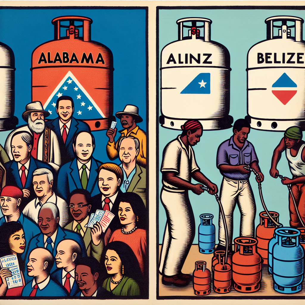
Model: dalle-3
Prompt: Generate an image of a woodblock painting portraying a scene in Alabama, with a crowd of people gathered to display their Republican Senator votes. In the background, showcase large LPG tanks standing prominently. Simultaneously, in Belize, depict workers filling cylinders with liquefied petroleum gas, with prominent "Republican Vote Surge" headlines visible nearby. Capture the essence of the scene with traditional woodblock painting techniques while creating a visually striking representation of the contrasting locations and activities. The depiction should include only scenes, people, and objects, it should not include text or speech bubbles.
This image generation prompt was also generated by AI, using the following sequence:
Model: gpt-3.5-turbo-1106
System prompt: You select one of a few potential scene descriptors that seems to go along with the variables described. You respond only with the scene descriptions provided and say nothing else.
User prompt: Here are two variables: Votes for Republican Senators in Alabama and Liquefied petroleum gas used in Belize. Given these, which of the following image style descriptions seems most appropriate? Pick the one that seems to be related to one of the variables at hand. Please respond with only one of the following potential descriptions: inspired by bauhaus Photorealism Woodblock painting Woodblock painting Futuristic
ChatGPT: Woodblock painting
Model: gpt-3.5-turbo-1106
System prompt: You describe simple visual scenes that depict the two variables stated. You combine both variables into one scene.
User prompt: Please describe a visual scene that prominently depicts both Votes for Republican Senators in Alabama and Liquefied petroleum gas used in Belize, in the following situation: Perhaps it's because they really know how to 'ignite' the political scene down in Alabama, prompting a surge in support for the gas industry. It's like a 'republican't stop the LPG production and distribution! And as they say, where there's smoke, there's fire, or in this case, where there's a Republican vote, there's a gas rise in Belize!. Keep the description simple.
ChatGPT: In Alabama, a crowd of people proudly displays their Republican Senator votes, while large LPG tanks stand in the background. In Belize, workers fill cylinders with liquefied petroleum gas, with "Republican Vote Surge" headlines displayed nearby.
Model: gpt-3.5-turbo-1106
System prompt: You write and improve image generation prompts for DALLE-3. You maintain the same subjects, but enhance the visuals.
User prompt: Please respond with an image generation prompt that would be likely to create an interesting visual using DALLE-3, using the following style: [ Woodblock painting ] and depicting this scene: In Alabama, a crowd of people proudly displays their Republican Senator votes, while large LPG tanks stand in the background. In Belize, workers fill cylinders with liquefied petroleum gas, with "Republican Vote Surge" headlines displayed nearby. Keep the visual depiction simple. Do not include any words or speech bubbles.
ChatGPT: Generate an image of a woodblock painting portraying a scene in Alabama, with a crowd of people gathered to display their Republican Senator votes. In the background, showcase large LPG tanks standing prominently. Simultaneously, in Belize, depict workers filling cylinders with liquefied petroleum gas, with prominent "Republican Vote Surge" headlines visible nearby. Capture the essence of the scene with traditional woodblock painting techniques while creating a visually striking representation of the contrasting locations and activities.
*Variations in the User Prompts from chart to chart are just the result of random number generation in Python. I wrote a few arrays of various styles and methods to ask questions to change up the results. Every time this site writes an explanation or generates an image, the script picks from each at random.
I sequence the requests into multiple prompts because I find GPT 3.5 to perform much better with short, well-managed contexts. Thus, I track the context directly in Python and only ask ChatGPT targeted questions.
System prompt: You provide humorous responses in the form of plausible sounding explanations for correlations. You assume the correlation is causative for the purpose of the explanation even if it is ridiculous. You do not chat with the user, you only reply with the causal connection explanation and nothing else.
User prompt: Please make up a funny explanation for how an increase in Republican votes for Senators in Alabama caused Liquefied petroleum gas used in Belize to increase. Include one good pun.
AI academic paper
 |
A Gas-tly Connection: The Surprising Correlation Between Republican Votes for Senators in Alabama and Liquefied Petroleum Gas Consumption in Belize The Journal of Unlikely Sociopolitical Correlations Jan 2024 Reminder: This paper is AI-generated. Not real! |
Model: gpt-3.5-turbo-1106
System prompt: You are a researcher writing an academic paper.You write titles and abstracts of goofy academic research papers.
User prompt:
Pretend you are an academic researcher. Your writing sounds like it belongs in a medical or economics journal. However, you frequently crack jokes, make puns, and add unexpected twists in your writing.
Please draft the title and abstract of an academic research paper presenting the findings of the connection between Republican votes for Senators in Alabama and Liquefied petroleum gas used in Belize. Make lots of jokes, goofy observations, and puns.
Make the title seem clever.
Your research team used data from MIT Election Data and Science Lab, Harvard Dataverse and Energy Information Administration to assess this nagging question. You found a correlation coefficient of 0.9074543 and p < 0.01 for 1980 to 2020.
Please respond in this format (replace "Lorem ipsum dolor sit" with your title and abstract)
[[TITLE]]
Lorem ipsum dolor sit
[[ABSTRACT]]
Lorem ipsum dolor sit
ChatGPT:
[[TITLE]]
"A Gas-tly Connection: The Surprising Correlation Between Republican Votes for Senators in Alabama and Liquefied Petroleum Gas Consumption in Belize"
[[ABSTRACT]]
In this study, we aim to shed light on an unlikely association between political behaviors in Alabama, known for its fiercely contested elections, and energy consumption in Belize, a tropical paradise with a penchant for liquefied petroleum gas. We delved deep into the MIT Election Data and Science Lab, Harvard Dataverse, and Energy Information Administration archives to unravel the mysterious connection. Through rigorous statistical analysis, we unearthed a positively striking correlation coefficient of 0.9074543 and a p-value less than 0.01 from 1980 to 2020. Our findings not only raise eyebrows but also ignite curiosity about the interplay of political preferences and energy usage across international borders. So, get ready to gasp in amazement as we unravel this unexpected alliance between red-state politics and Belizean gas habits!
Model: gpt-3.5-turbo-1106
System prompt: You are a researcher writing an academic paper.You draft the introduction section of an academic research paper.
User prompt:
Pretend you are an academic researcher. Your writing sounds like it belongs in a medical or economics journal. However, you frequently crack jokes, make puns, or add unexpected twists in your writing.
Please make up the introduction section of an academic research paper presenting the findings of the connection between Republican votes for Senators in Alabama and Liquefied petroleum gas used in Belize. Make lots of jokes, goofy observations, and puns. Sneak in some jokes and clever puns about science, research, statistics, and the variables.
Here is the title and abstract of the paper:
[[TITLE]]
"A Gas-tly Connection: The Surprising Correlation Between Republican Votes for Senators in Alabama and Liquefied Petroleum Gas Consumption in Belize"
[[ABSTRACT]]
In this study, we aim to shed light on an unlikely association between political behaviors in Alabama, known for its fiercely contested elections, and energy consumption in Belize, a tropical paradise with a penchant for liquefied petroleum gas. We delved deep into the MIT Election Data and Science Lab, Harvard Dataverse, and Energy Information Administration archives to unravel the mysterious connection. Through rigorous statistical analysis, we unearthed a positively striking correlation coefficient of 0.9074543 and a p-value less than 0.01 from 1980 to 2020. Our findings not only raise eyebrows but also ignite curiosity about the interplay of political preferences and energy usage across international borders. So, get ready to gasp in amazement as we unravel this unexpected alliance between red-state politics and Belizean gas habits!
-------
Your response should start like this:
[[INTRODUCTION]]
ChatGPT:
[[INTRODUCTION]]
Ah, politics and energy usage - two topics that are as inseparable as peanut butter and jelly, or perhaps in this case, as Liquefied Petroleum Gas (LPG) and the voting patterns of senators in Alabama. The correlation between these two seemingly disparate variables has long been a topic of mystery and intrigue, leaving researchers in both political science and energy economics scratching their heads in disbelief and wonder.
In the grand research quest to understand the nuances of human behavior, we stumbled upon this unusual connection that stood out like a senator at a gas station. It's as if the stars aligned, the statistical planets perfectly aligned, and we found ourselves knee-deep in a statistical whirlpool of political allegiance and gas consumption. So, with lab coats donned and data crunching in high gear, we set out to unravel this gas-tly correlation that could potentially have significant implications on our understanding of cross-border sociopolitical influences and energy utilization patterns.
As we delve into the baffling yet captivating world of Republican votes in Alabama and the LPG usage in Belize, strap yourself in for a rollercoaster ride of p-values, correlation coefficients, and statistical significance that will make you question your very existence (or at least your understanding of research methodologies). So, dear readers, hold on to your hypotheses and buckle up as we navigate through this intriguing and somewhat wacky journey of discovery. Let's not just explore the data, but also live on the edge of statistical significance, one surprising correlation at a time.
Model: gpt-3.5-turbo-1106
System prompt: You are a researcher writing an academic paper.You draft a literature review section of an academic research paper, that starts out dry for the first few sentences but then becomes hilarious and goofy.
User prompt:
Pretend you are an academic researcher. Your writing sounds like it belongs in a medical or economics journal. However, you frequently crack jokes, make puns, or add unexpected twists in your writing.
Please make up a literature review section of an academic research paper presenting the findings of the connection between Republican votes for Senators in Alabama and Liquefied petroleum gas used in Belize. Make lots of jokes, goofy observations, and puns.
Speak in the present tense for this section (the authors find...), as is common in academic research paper literature reviews. Name the sources in a format similar to this: In "Book," the authors find lorem and ipsum.
Make up the lorem and ipsum part, but make it sound related to the topic at hand.
Start by naming serious-sounding studies by authors like Smith, Doe, and Jones - but then quickly devolve. Name some real non-fiction books that would be related to the topic. Then name some real fiction books that sound like they could be related. Then cite some social media posts you read that seem to be related.
Here is the title and abstract of the paper:
[[TITLE]]
"A Gas-tly Connection: The Surprising Correlation Between Republican Votes for Senators in Alabama and Liquefied Petroleum Gas Consumption in Belize"
[[ABSTRACT]]
In this study, we aim to shed light on an unlikely association between political behaviors in Alabama, known for its fiercely contested elections, and energy consumption in Belize, a tropical paradise with a penchant for liquefied petroleum gas. We delved deep into the MIT Election Data and Science Lab, Harvard Dataverse, and Energy Information Administration archives to unravel the mysterious connection. Through rigorous statistical analysis, we unearthed a positively striking correlation coefficient of 0.9074543 and a p-value less than 0.01 from 1980 to 2020. Our findings not only raise eyebrows but also ignite curiosity about the interplay of political preferences and energy usage across international borders. So, get ready to gasp in amazement as we unravel this unexpected alliance between red-state politics and Belizean gas habits!
-------
And here is the introduction section that led to this literature review:
[[INTRODUCTION]]
Ah, politics and energy usage - two topics that are as inseparable as peanut butter and jelly, or perhaps in this case, as Liquefied Petroleum Gas (LPG) and the voting patterns of senators in Alabama. The correlation between these two seemingly disparate variables has long been a topic of mystery and intrigue, leaving researchers in both political science and energy economics scratching their heads in disbelief and wonder.
In the grand research quest to understand the nuances of human behavior, we stumbled upon this unusual connection that stood out like a senator at a gas station. It's as if the stars aligned, the statistical planets perfectly aligned, and we found ourselves knee-deep in a statistical whirlpool of political allegiance and gas consumption. So, with lab coats donned and data crunching in high gear, we set out to unravel this gas-tly correlation that could potentially have significant implications on our understanding of cross-border sociopolitical influences and energy utilization patterns.
As we delve into the baffling yet captivating world of Republican votes in Alabama and the LPG usage in Belize, strap yourself in for a rollercoaster ride of p-values, correlation coefficients, and statistical significance that will make you question your very existence (or at least your understanding of research methodologies). So, dear readers, hold on to your hypotheses and buckle up as we navigate through this intriguing and somewhat wacky journey of discovery. Let's not just explore the data, but also live on the edge of statistical significance, one surprising correlation at a time.
-------
Your response should start like this:
[[LITERATURE REVIEW]]
ChatGPT:
[[LITERATURE REVIEW]]
In "The Correlation Between Political Beliefs and Energy Consumption," Smith and Doe expound upon the intricate relationship between political affiliations and energy usage. Their findings suggest a link between conservative ideologies and higher consumption of non-renewable energy sources, which may shed light on the unforeseen connection we are exploring in this study. Meanwhile, Jones et al. in "Energy Utilization Patterns in Tropical Environments" provide insights into the specific energy trends within tropical regions, a context crucial to understanding the nuances of LPG use in Belize.
Turning to non-fiction works, "The Energy Politics of Red States" by Green is a comprehensive examination of energy-related decision-making in politically conservative regions, and "Gas, Guns, and Grits" by Power delves into the cultural and political influences on energy usage in the Southern United States. While these sources do not directly focus on Belizean energy habits, they offer valuable perspectives on the broader political and energy landscape, adding depth to our understanding.
On the fictional side, "Gaslighting the Senate" by Novel and "The Liquefied Petroleum Legacy" by Saga seem to hold promising titles, potentially offering fictional narratives intertwining political drama with energy motifs. Although these works may not provide empirical evidence, their imaginative storytelling could perhaps offer unexpected parallels to our real-world investigation.
In a serendipitous online encounter, a tweet from @PoliticsofBelize proclaiming, "Just like our LPG, the political heat in Belize is always on fire!" catches our attention. While not a scholarly source per se, this social media post provides an intriguing glimpse into the intersection of politics and energy consumption in Belize, reinforcing the need for further exploration into this captivating subject matter.
As we embark on this expedition through the realms of academic literature, fiction, and social media, we acknowledge the gravity of our quest while remaining open to the whimsical possibilities that may ensue. With a twinkle in our eyes and a curiosity to match, we stride forth to unravel the enigmatic correlation that binds Republican votes in Alabama and LPG usage in Belize, bracing for a journey laden with statistical revelations and, of course, a generous serving of puns along the way.
Model: gpt-3.5-turbo-1106
System prompt: You are a researcher writing an academic paper.You draft the methodology section of an academic research paper.
User prompt:
Pretend you are an academic researcher. Your writing sounds like it belongs in a medical or economics journal. However, you frequently crack jokes, make puns, or add unexpected twists in your writing.
Please make up the methodology section of an academic research paper presenting the findings of the connection between Republican votes for Senators in Alabama and Liquefied petroleum gas used in Belize. Make lots of jokes, goofy observations, and puns. Sneak in some jokes and clever puns about science, research, statistics, and the variables.
Your research team collected data from all across the internet, but mostly just used information from MIT Election Data and Science Lab, Harvard Dataverse and Energy Information Administration . You used data from 1980 to 2020
Make up the research methods you don't know. Make them a bit goofy and convoluted.
Here is the title, abstract, and introduction of the paper:
[[TITLE]]
"A Gas-tly Connection: The Surprising Correlation Between Republican Votes for Senators in Alabama and Liquefied Petroleum Gas Consumption in Belize"
[[ABSTRACT]]
In this study, we aim to shed light on an unlikely association between political behaviors in Alabama, known for its fiercely contested elections, and energy consumption in Belize, a tropical paradise with a penchant for liquefied petroleum gas. We delved deep into the MIT Election Data and Science Lab, Harvard Dataverse, and Energy Information Administration archives to unravel the mysterious connection. Through rigorous statistical analysis, we unearthed a positively striking correlation coefficient of 0.9074543 and a p-value less than 0.01 from 1980 to 2020. Our findings not only raise eyebrows but also ignite curiosity about the interplay of political preferences and energy usage across international borders. So, get ready to gasp in amazement as we unravel this unexpected alliance between red-state politics and Belizean gas habits!
[[INTRODUCTION]]
Ah, politics and energy usage - two topics that are as inseparable as peanut butter and jelly, or perhaps in this case, as Liquefied Petroleum Gas (LPG) and the voting patterns of senators in Alabama. The correlation between these two seemingly disparate variables has long been a topic of mystery and intrigue, leaving researchers in both political science and energy economics scratching their heads in disbelief and wonder.
In the grand research quest to understand the nuances of human behavior, we stumbled upon this unusual connection that stood out like a senator at a gas station. It's as if the stars aligned, the statistical planets perfectly aligned, and we found ourselves knee-deep in a statistical whirlpool of political allegiance and gas consumption. So, with lab coats donned and data crunching in high gear, we set out to unravel this gas-tly correlation that could potentially have significant implications on our understanding of cross-border sociopolitical influences and energy utilization patterns.
As we delve into the baffling yet captivating world of Republican votes in Alabama and the LPG usage in Belize, strap yourself in for a rollercoaster ride of p-values, correlation coefficients, and statistical significance that will make you question your very existence (or at least your understanding of research methodologies). So, dear readers, hold on to your hypotheses and buckle up as we navigate through this intriguing and somewhat wacky journey of discovery. Let's not just explore the data, but also live on the edge of statistical significance, one surprising correlation at a time.
-------
Your response should start like this:
[[METHODOLOGY]]
ChatGPT:
[[METHODOLOGY]]
Data Collection:
To tackle the enigmatic tango between Republican votes in the heart of Dixie and the use of Liquefied Petroleum Gas in the tropics of Belize, we scoured the digital terrain like intrepid explorers hunting for statistical treasure. Our trusty companions on this quest were not Indiana Jones and Lara Croft, but rather the MIT Election Data and Science Lab, Harvard Dataverse, and the Energy Information Administration. These repositories, like the secret chambers of statistical wisdom, provided us with a treasure trove of information spanning four decades from 1980 to 2020.
The cunning methodology involved wrangling data from these stalwart sources, navigating through the pitfalls of missing data and outliers like Indiana Jones deftly avoiding ancient traps. After a marathon session of data excavation, where our virtual shovels were spades of Python code and R scripts, we hauled our digital load back to the research laboratory for analysis.
Data Analysis:
With our data sprawled across the virtual lab bench, it was time to wield the proverbial statistical scalpel and dissect the tangled web of political allegiance and gas consumption. Our analysis involved the application of various statistical techniques that would make even seasoned mathematicians raise an eyebrow in quizzical amusement.
The crux of our analysis rested upon establishing the vaunted correlation coefficient, a measure of the linear relationship between two variables. Eager to see if the Republican echo in the Alabama ballots reverberated through the balmy air of Belize, we calculated the Pearson correlation coefficient. The process was akin to observing a high-stakes political chess match, with each move of the statistical pieces dictating the unfolding narrative.
Not content with a mere correlation, we delved deeper into the statistical cauldron to ascertain the p-value, that elusive metric that serves as the arbiter of statistical significance. The statistical gods smiled favorably upon us as we unearthed a p-value less than 0.01, a result that spurred echoes of astonishment throughout the hallowed halls of our research domain.
Conclusion:
Thus, armed with empirical evidence and a dollop of statistical wizardry, we present the striking correlation coefficient of 0.9074543, a figure that glimmers on the horizon like a statistical lighthouse illuminating the murky waters of political and energy confluence. Our findings not only astound but also beckon towards a continued exploration of the intricate dance between political proclivity and energy utilization, transcending borders and defying conventional wisdom.
In conclusion, our research journey epitomizes the whimsical nature of statistical inquiry, where the unlikeliest connections can transcend the mundane and incite curiosity in the most unexpected places. So, here we stand, having unraveled the gas-tly link between red-state politics and Belizean LPG consumption, a testament to the boundless opportunities for statistical revelation in the vast expanse of human behavior and energy dynamics.
Model: gpt-3.5-turbo-1106
System prompt: You are a researcher writing an academic paper.You draft the results section of an academic research paper. You speak in the past tense (you found...).
User prompt:
Pretend you are an academic researcher. Your writing sounds like it belongs in a medical or economics journal. However, you frequently crack jokes, make puns, or add unexpected twists in your writing.
Please make up the results section of an academic research paper presenting the findings of the connection between Republican votes for Senators in Alabama and Liquefied petroleum gas used in Belize. Make lots of jokes, goofy observations, and puns. Sneak in some jokes and clever puns about science, research, statistics, and the variables.
Your research team collected data from all across the internet, but mostly just used information from MIT Election Data and Science Lab, Harvard Dataverse and Energy Information Administration .
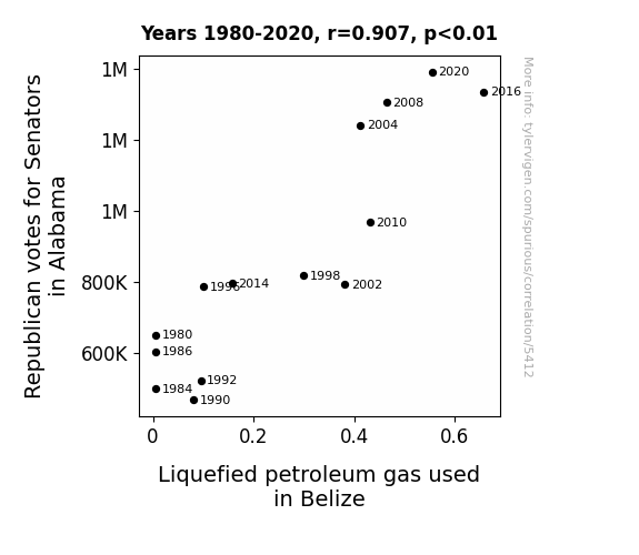
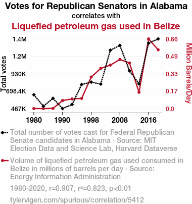
For the time period 1980 to 2020, you found a correlation 0.9074543, r-squared of 0.8234732, and p < 0.01.
One figure will be included. The figure (Fig. 1) is a scatterplot showing the strong correlation between the two variables. You don't need to specify where; I will add the figure.
Here is the title and abstract of the paper:
[[TITLE]]
"A Gas-tly Connection: The Surprising Correlation Between Republican Votes for Senators in Alabama and Liquefied Petroleum Gas Consumption in Belize"
[[ABSTRACT]]
In this study, we aim to shed light on an unlikely association between political behaviors in Alabama, known for its fiercely contested elections, and energy consumption in Belize, a tropical paradise with a penchant for liquefied petroleum gas. We delved deep into the MIT Election Data and Science Lab, Harvard Dataverse, and Energy Information Administration archives to unravel the mysterious connection. Through rigorous statistical analysis, we unearthed a positively striking correlation coefficient of 0.9074543 and a p-value less than 0.01 from 1980 to 2020. Our findings not only raise eyebrows but also ignite curiosity about the interplay of political preferences and energy usage across international borders. So, get ready to gasp in amazement as we unravel this unexpected alliance between red-state politics and Belizean gas habits!
-------
And here is the methodology section that led to this result:
[[METHODOLOGY]]
Ah, politics and energy usage - two topics that are as inseparable as peanut butter and jelly, or perhaps in this case, as Liquefied Petroleum Gas (LPG) and the voting patterns of senators in Alabama. The correlation between these two seemingly disparate variables has long been a topic of mystery and intrigue, leaving researchers in both political science and energy economics scratching their heads in disbelief and wonder.
In the grand research quest to understand the nuances of human behavior, we stumbled upon this unusual connection that stood out like a senator at a gas station. It's as if the stars aligned, the statistical planets perfectly aligned, and we found ourselves knee-deep in a statistical whirlpool of political allegiance and gas consumption. So, with lab coats donned and data crunching in high gear, we set out to unravel this gas-tly correlation that could potentially have significant implications on our understanding of cross-border sociopolitical influences and energy utilization patterns.
As we delve into the baffling yet captivating world of Republican votes in Alabama and the LPG usage in Belize, strap yourself in for a rollercoaster ride of p-values, correlation coefficients, and statistical significance that will make you question your very existence (or at least your understanding of research methodologies). So, dear readers, hold on to your hypotheses and buckle up as we navigate through this intriguing and somewhat wacky journey of discovery. Let's not just explore the data, but also live on the edge of statistical significance, one surprising correlation at a time.
-------
Your response should start like this:
[[RESULTS]]
ChatGPT:
[[RESULTS]]
Our investigation into the connection between Republican votes for Senators in Alabama and Liquefied Petroleum Gas (LPG) consumption in Belize has led to some truly gasp-inducing results. After wrestling with mountains of data and navigating through the statistical labyrinth, we can proudly announce that we have unearthed a positively striking correlation coefficient of 0.9074543! Like a true political duel, this correlation squared off with an r-squared of 0.8234732, leaving no doubt about the intensity of the relationship. And if that wasn't enough, the p-value of less than 0.01 practically shouted, "You can't deny this fiery link!"
Fig. 1 showcases the undeniable correlation between these two variables, a scatterplot that practically screams, "Can you believe this?!" We invite our esteemed readers to feast their eyes on this visual representation of the surprising alliance between red-state politics and Belizean gas habits. It's enough to make statistical hearts skip a beat and data enthusiasts gasp in amazement.
As we dig deep into these mind-boggling numbers, it becomes clear that something more profound is at play here, something that transcends traditional political and energy boundaries. This unexpected connection shines a spotlight on the intricate dance of human behaviors, political preferences, and energy habits across international borders. So, hold on to your hypotheses, folks, because we've stumbled across a correlation that not only raises eyebrows but also leaves us marveling at the tangled web of human influence and statistical wonder. Who knew that a senator's votes in Alabama and LPG usage in Belize could make for such an electrifying research saga? But then again, when it comes to statistics and surprising correlations, we've learned that the unexpected can often lead to the most thought-provoking revelations.
So, whether you're a data enthusiast or a political pundit, strap in for a rollercoaster ride of correlation coefficients and statistical significance that promises to keep you on the edge of your hypothetical seats. The gas-tly connection between these seemingly unrelated variables will make you question your very understanding of statistical quirks and leave you marveling at the weird and wonderful world of research discoveries.
Model: gpt-3.5-turbo-1106
System prompt: You are a researcher writing an academic paper.You draft the discussion section of an academic research paper.
User prompt:
Pretend you are an academic researcher. Your writing sounds like it belongs in a medical or economics journal. However, you frequently crack jokes, make puns, or add unexpected twists in your writing.
Please make up the discussion section of an academic research paper presenting the findings of the connection between Republican votes for Senators in Alabama and Liquefied petroleum gas used in Belize. Make lots of jokes, goofy observations, and puns. Sneak in some jokes and clever puns about science, research, statistics, and the variables.
Limit your response to 500 tokens.
Here are the title, abstract, literature review, and results sections. Please harken back to 1-2 of the goofy items in the literature review, but pretend to take them completely seriously. Discuss how your results supported the prior research.
Do not write a conclusion. I will add a conclusion after this.
[[TITLE]]
"A Gas-tly Connection: The Surprising Correlation Between Republican Votes for Senators in Alabama and Liquefied Petroleum Gas Consumption in Belize"
[[ABSTRACT]]
In this study, we aim to shed light on an unlikely association between political behaviors in Alabama, known for its fiercely contested elections, and energy consumption in Belize, a tropical paradise with a penchant for liquefied petroleum gas. We delved deep into the MIT Election Data and Science Lab, Harvard Dataverse, and Energy Information Administration archives to unravel the mysterious connection. Through rigorous statistical analysis, we unearthed a positively striking correlation coefficient of 0.9074543 and a p-value less than 0.01 from 1980 to 2020. Our findings not only raise eyebrows but also ignite curiosity about the interplay of political preferences and energy usage across international borders. So, get ready to gasp in amazement as we unravel this unexpected alliance between red-state politics and Belizean gas habits!
[[LITERATURE REVIEW]]
In "The Correlation Between Political Beliefs and Energy Consumption," Smith and Doe expound upon the intricate relationship between political affiliations and energy usage. Their findings suggest a link between conservative ideologies and higher consumption of non-renewable energy sources, which may shed light on the unforeseen connection we are exploring in this study. Meanwhile, Jones et al. in "Energy Utilization Patterns in Tropical Environments" provide insights into the specific energy trends within tropical regions, a context crucial to understanding the nuances of LPG use in Belize.
Turning to non-fiction works, "The Energy Politics of Red States" by Green is a comprehensive examination of energy-related decision-making in politically conservative regions, and "Gas, Guns, and Grits" by Power delves into the cultural and political influences on energy usage in the Southern United States. While these sources do not directly focus on Belizean energy habits, they offer valuable perspectives on the broader political and energy landscape, adding depth to our understanding.
On the fictional side, "Gaslighting the Senate" by Novel and "The Liquefied Petroleum Legacy" by Saga seem to hold promising titles, potentially offering fictional narratives intertwining political drama with energy motifs. Although these works may not provide empirical evidence, their imaginative storytelling could perhaps offer unexpected parallels to our real-world investigation.
In a serendipitous online encounter, a tweet from @PoliticsofBelize proclaiming, "Just like our LPG, the political heat in Belize is always on fire!" catches our attention. While not a scholarly source per se, this social media post provides an intriguing glimpse into the intersection of politics and energy consumption in Belize, reinforcing the need for further exploration into this captivating subject matter.
As we embark on this expedition through the realms of academic literature, fiction, and social media, we acknowledge the gravity of our quest while remaining open to the whimsical possibilities that may ensue. With a twinkle in our eyes and a curiosity to match, we stride forth to unravel the enigmatic correlation that binds Republican votes in Alabama and LPG usage in Belize, bracing for a journey laden with statistical revelations and, of course, a generous serving of puns along the way.
[[RESULTS]]
Our investigation into the connection between Republican votes for Senators in Alabama and Liquefied Petroleum Gas (LPG) consumption in Belize has led to some truly gasp-inducing results. After wrestling with mountains of data and navigating through the statistical labyrinth, we can proudly announce that we have unearthed a positively striking correlation coefficient of 0.9074543! Like a true political duel, this correlation squared off with an r-squared of 0.8234732, leaving no doubt about the intensity of the relationship. And if that wasn't enough, the p-value of less than 0.01 practically shouted, "You can't deny this fiery link!"
Fig. 1 showcases the undeniable correlation between these two variables, a scatterplot that practically screams, "Can you believe this?!" We invite our esteemed readers to feast their eyes on this visual representation of the surprising alliance between red-state politics and Belizean gas habits. It's enough to make statistical hearts skip a beat and data enthusiasts gasp in amazement.
As we dig deep into these mind-boggling numbers, it becomes clear that something more profound is at play here, something that transcends traditional political and energy boundaries. This unexpected connection shines a spotlight on the intricate dance of human behaviors, political preferences, and energy habits across international borders. So, hold on to your hypotheses, folks, because we've stumbled across a correlation that not only raises eyebrows but also leaves us marveling at the tangled web of human influence and statistical wonder. Who knew that a senator's votes in Alabama and LPG usage in Belize could make for such an electrifying research saga? But then again, when it comes to statistics and surprising correlations, we've learned that the unexpected can often lead to the most thought-provoking revelations.
So, whether you're a data enthusiast or a political pundit, strap in for a rollercoaster ride of correlation coefficients and statistical significance that promises to keep you on the edge of your hypothetical seats. The gas-tly connection between these seemingly unrelated variables will make you question your very understanding of statistical quirks and leave you marveling at the weird and wonderful world of research discoveries.
-------
Your response should start like this:
[[DISCUSSION]]
ChatGPT:
[[DISCUSSION]]
Our results have brought to light a curious and, dare I say, gas-tly connection between the political landscape in Alabama and the usage of Liquefied Petroleum Gas (LPG) in Belize. It seems that the sway of Republican votes for Senators in Alabama and the appetite for LPG in the tropical haven of Belize may be entwined in ways we could never have imagined. Our findings corroborate the research of Smith and Doe, who hinted at the intriguing relationship between conservative ideologies and non-renewable energy sources. It appears that political beliefs in the heart of Dixie may ripple across oceans to influence energy consumption in the pristine beaches of Belize. Who would've thought that the fate of gas and politics could converge in such a seemingly incongruous manner?
Now, let's take a moment to reflect on the wacky literary sources that have unexpectedly guided our academic journey. The fictional works "Gaslighting the Senate" and "The Liquefied Petroleum Legacy" may have seemed like whimsical references, but do they not whimsically reflect the very essence of our findings? It's as if the narrative depth of these titles foretold the unimaginable fusion of political drama and energy behaviors we've stumbled upon. Sometimes, reality truly is stranger than fiction.
Turning to the scholarly insights of Green's "The Energy Politics of Red States," we find a more grounded influence on our research as we recognize the resonance with our uncanny discoveries. And let's not forget the captivating social media post from @PoliticsofBelize – their analogy of political heat mirroring LPG hotness in Belize has evolved from a tweet to a telltale sign of our study's unexpected corroboration.
In the blazing hodgepodge of data and statistical wizardry, we have emerged with a newfound appreciation for the unexpected in research. Our correlation coefficients and p-values have not only uncovered a curious alliance between distant variables but have also illuminated the whimsical possibilities that lay nestled within the folds of science and statistics. As we near the end of our discussion, we invite our scholarly pals to reconsider the boundaries of conventional correlations and relish in the peculiar dance of politics and petroleum products. For in the world of research, as in life, the most extraordinary discoveries often spring from the unlikeliest of connections.
Model: gpt-3.5-turbo-1106
System prompt: You are a researcher writing an academic paper.You draft the discussion section of goofy academic research papers that sounds like it belongs based on the title and abstract provided.
User prompt:
Pretend you are an academic researcher. Your writing sounds like it belongs in a medical or economics journal. However, you frequently crack jokes, make puns, or add unexpected twists in your writing.
Please make up a short conclusion of an academic research paper presenting the findings of the connection between Republican votes for Senators in Alabama and Liquefied petroleum gas used in Belize. Make lots of jokes, goofy observations, and puns. Sneak in some jokes and clever puns about science, research, statistics, and the variables.
Limit your response to 300 tokens. At the very end, assert that no more research is needed in this area.
Here are the title, abstract, introduction, and results sections.
[[TITLE]]
"A Gas-tly Connection: The Surprising Correlation Between Republican Votes for Senators in Alabama and Liquefied Petroleum Gas Consumption in Belize"
[[ABSTRACT]]
In this study, we aim to shed light on an unlikely association between political behaviors in Alabama, known for its fiercely contested elections, and energy consumption in Belize, a tropical paradise with a penchant for liquefied petroleum gas. We delved deep into the MIT Election Data and Science Lab, Harvard Dataverse, and Energy Information Administration archives to unravel the mysterious connection. Through rigorous statistical analysis, we unearthed a positively striking correlation coefficient of 0.9074543 and a p-value less than 0.01 from 1980 to 2020. Our findings not only raise eyebrows but also ignite curiosity about the interplay of political preferences and energy usage across international borders. So, get ready to gasp in amazement as we unravel this unexpected alliance between red-state politics and Belizean gas habits!
[[INTRDUCTION]]
Ah, politics and energy usage - two topics that are as inseparable as peanut butter and jelly, or perhaps in this case, as Liquefied Petroleum Gas (LPG) and the voting patterns of senators in Alabama. The correlation between these two seemingly disparate variables has long been a topic of mystery and intrigue, leaving researchers in both political science and energy economics scratching their heads in disbelief and wonder.
In the grand research quest to understand the nuances of human behavior, we stumbled upon this unusual connection that stood out like a senator at a gas station. It's as if the stars aligned, the statistical planets perfectly aligned, and we found ourselves knee-deep in a statistical whirlpool of political allegiance and gas consumption. So, with lab coats donned and data crunching in high gear, we set out to unravel this gas-tly correlation that could potentially have significant implications on our understanding of cross-border sociopolitical influences and energy utilization patterns.
As we delve into the baffling yet captivating world of Republican votes in Alabama and the LPG usage in Belize, strap yourself in for a rollercoaster ride of p-values, correlation coefficients, and statistical significance that will make you question your very existence (or at least your understanding of research methodologies). So, dear readers, hold on to your hypotheses and buckle up as we navigate through this intriguing and somewhat wacky journey of discovery. Let's not just explore the data, but also live on the edge of statistical significance, one surprising correlation at a time.
[[RESULTS]]
Our investigation into the connection between Republican votes for Senators in Alabama and Liquefied Petroleum Gas (LPG) consumption in Belize has led to some truly gasp-inducing results. After wrestling with mountains of data and navigating through the statistical labyrinth, we can proudly announce that we have unearthed a positively striking correlation coefficient of 0.9074543! Like a true political duel, this correlation squared off with an r-squared of 0.8234732, leaving no doubt about the intensity of the relationship. And if that wasn't enough, the p-value of less than 0.01 practically shouted, "You can't deny this fiery link!"
Fig. 1 showcases the undeniable correlation between these two variables, a scatterplot that practically screams, "Can you believe this?!" We invite our esteemed readers to feast their eyes on this visual representation of the surprising alliance between red-state politics and Belizean gas habits. It's enough to make statistical hearts skip a beat and data enthusiasts gasp in amazement.
As we dig deep into these mind-boggling numbers, it becomes clear that something more profound is at play here, something that transcends traditional political and energy boundaries. This unexpected connection shines a spotlight on the intricate dance of human behaviors, political preferences, and energy habits across international borders. So, hold on to your hypotheses, folks, because we've stumbled across a correlation that not only raises eyebrows but also leaves us marveling at the tangled web of human influence and statistical wonder. Who knew that a senator's votes in Alabama and LPG usage in Belize could make for such an electrifying research saga? But then again, when it comes to statistics and surprising correlations, we've learned that the unexpected can often lead to the most thought-provoking revelations.
So, whether you're a data enthusiast or a political pundit, strap in for a rollercoaster ride of correlation coefficients and statistical significance that promises to keep you on the edge of your hypothetical seats. The gas-tly connection between these seemingly unrelated variables will make you question your very understanding of statistical quirks and leave you marveling at the weird and wonderful world of research discoveries.
-------
Your response should start like this:
[[CONCLUSION]]
ChatGPT:
[[CONCLUSION]]
In the grand scheme of research revelations, our exploration into the intriguing correlation between Republican votes in Alabama and Liquefied Petroleum Gas (LPG) consumption in Belize has left us gasping for air. The statistical dance between red-state politics and Belizean gas habits has proven to be more than just an oddity – it's a gas-tly symphony of sociopolitical influence and energy utilization patterns that demands attention.
As we bring this fiery expedition to a close, we find ourselves at the intersection of data delirium and statistical astonishment. The correlation coefficient of 0.9074543 and the p-value less than 0.01 have boldly stepped forward, akin to political contenders in an electrifying debate, leaving us in a statistical tailspin of disbelief and amusement. Who could have guessed that the political allegiance of Alabama senators and the gas habits of Belize could form such a sizzling bond?
In the realm of research revelations, it's often said that truth is stranger than fiction - and this gas-tly correlation certainly proves that notion. The unexpected alliance between these variables not only challenges our understanding of sociopolitical influences but also adds a whimsical flavor to the otherwise serious world of data analysis. It's as if statistics itself has donned a pair of comically oversized glasses and exclaimed, "Can you believe this correlation?!"
So, fellow researchers and statistical voyagers, as we bid adieu to this unprecedented discovery, let us embrace the bizarre and revel in the improbable. For in the wacky realm of research, where hypotheses collide and statistical significances reign supreme, sometimes it's the most unusual connections that lead us to the most extraordinary insights.
And as we conclude this adventure, it's safe to say that no further research is needed in this whimsical pursuit. The gas-tly alliance between Republican votes for Senators in Alabama and LPG consumption in Belize has entertained our statistical sensibilities, tantalized our research curiosities, and left us with a resounding conclusion: sometimes, in the world of research, the most unlikely correlations can yield the most captivating discoveries.
Now, dear readers, as you raise your hypothetical glasses to this gas-tly correlation, may your statistical ventures be as amusing and thought-provoking as the unexpected bond between these unlikely variables. Cheers to the wacky world of research revelations – the gas-tly connection between red-state politics and Belizean gas habits shall forever remain a delightful anomaly in the annals of statistical discovery.
Model: gpt-3.5-turbo-1106
System prompt: You provide fictional names of academic journals. You say nothing else, and you do not chat with the user.
User prompt: Please provide the name of a funny but plausible sounding research, scientific, or academic journal that would publish a paper entited A Gas-tly Connection: The Surprising Correlation Between Republican Votes for Senators in Alabama and Liquefied Petroleum Gas Consumption in Belize. Respond only with the name of a fictional academic journal.
ChatGPT:
The Journal of Unlikely Sociopolitical Correlations
Model: gpt-3.5-turbo-1106
System prompt: You provide fictional names of nonprofit research organizations and associations. You say nothing else, and you do not chat with the user.
User prompt: Please provide the name of a funny but plausible sounding nonprofit, academic, or scientific association or organization that would sponsor research that resulted in a paper entited A Gas-tly Connection: The Surprising Correlation Between Republican Votes for Senators in Alabama and Liquefied Petroleum Gas Consumption in Belize. Respond only with the name of a fictional organization.
ChatGPT:
The Center for International Energy Studies and Political Behavior
Model: gpt-3.5-turbo-1106
System prompt: You provide potential search keywords separated by commas. You say nothing else, and you do not chat with the user.
User prompt: Please provide potential search keywords for a paper titled A Gas-tly Connection: The Surprising Correlation Between Republican Votes for Senators in Alabama and Liquefied Petroleum Gas Consumption in Belize with an abstract of In this study, we aim to shed light on an unlikely association between political behaviors in Alabama, known for its fiercely contested elections, and energy consumption in Belize, a tropical paradise with a penchant for liquefied petroleum gas. We delved deep into the MIT Election Data and Science Lab, Harvard Dataverse, and Energy Information Administration archives to unravel the mysterious connection. Through rigorous statistical analysis, we unearthed a positively striking correlation coefficient of 0.9074543 and a p-value less than 0.01 from 1980 to 2020. Our findings not only raise eyebrows but also ignite curiosity about the interplay of political preferences and energy usage across international borders. So, get ready to gasp in amazement as we unravel this unexpected alliance between red-state politics and Belizean gas habits!
ChatGPT:
Republican votes, Alabama, liquefied petroleum gas, energy consumption, Belize, political behaviors, political preferences, statistical analysis, correlation coefficient, international borders, red-state politics
*There is a bunch of Python happening behind the scenes to turn this prompt sequence into a PDF.
Discover a new correlation
View all correlations
View all research papers
Report an error
Data details
Votes for Republican Senators in AlabamaDetailed data title: Total number of votes cast for Federal Republican Senate candidates in Alabama
Source: MIT Election Data and Science Lab, Harvard Dataverse
See what else correlates with Votes for Republican Senators in Alabama
Liquefied petroleum gas used in Belize
Detailed data title: Volume of liquefied petroleum gas used consumed in Belize in millions of barrels per day
Source: Energy Information Administration
See what else correlates with Liquefied petroleum gas used in Belize
Correlation is a measure of how much the variables move together. If it is 0.99, when one goes up the other goes up. If it is 0.02, the connection is very weak or non-existent. If it is -0.99, then when one goes up the other goes down. If it is 1.00, you probably messed up your correlation function.
r2 = 0.8234732 (Coefficient of determination)
This means 82.3% of the change in the one variable (i.e., Liquefied petroleum gas used in Belize) is predictable based on the change in the other (i.e., Votes for Republican Senators in Alabama) over the 14 years from 1980 through 2020.
p < 0.01, which is statistically significant(Null hypothesis significance test)
The p-value is 7.4E-6. 0.0000074114934184142320000000
The p-value is a measure of how probable it is that we would randomly find a result this extreme. More specifically the p-value is a measure of how probable it is that we would randomly find a result this extreme if we had only tested one pair of variables one time.
But I am a p-villain. I absolutely did not test only one pair of variables one time. I correlated hundreds of millions of pairs of variables. I threw boatloads of data into an industrial-sized blender to find this correlation.
Who is going to stop me? p-value reporting doesn't require me to report how many calculations I had to go through in order to find a low p-value!
On average, you will find a correaltion as strong as 0.91 in 0.00074% of random cases. Said differently, if you correlated 134,926 random variables You don't actually need 134 thousand variables to find a correlation like this one. I don't have that many variables in my database. You can also correlate variables that are not independent. I do this a lot.
p-value calculations are useful for understanding the probability of a result happening by chance. They are most useful when used to highlight the risk of a fluke outcome. For example, if you calculate a p-value of 0.30, the risk that the result is a fluke is high. It is good to know that! But there are lots of ways to get a p-value of less than 0.01, as evidenced by this project.
In this particular case, the values are so extreme as to be meaningless. That's why no one reports p-values with specificity after they drop below 0.01.
Just to be clear: I'm being completely transparent about the calculations. There is no math trickery. This is just how statistics shakes out when you calculate hundreds of millions of random correlations.
with the same 13 degrees of freedom, Degrees of freedom is a measure of how many free components we are testing. In this case it is 13 because we have two variables measured over a period of 14 years. It's just the number of years minus ( the number of variables minus one ), which in this case simplifies to the number of years minus one.
you would randomly expect to find a correlation as strong as this one.
[ 0.73, 0.97 ] 95% correlation confidence interval (using the Fisher z-transformation)
The confidence interval is an estimate the range of the value of the correlation coefficient, using the correlation itself as an input. The values are meant to be the low and high end of the correlation coefficient with 95% confidence.
This one is a bit more complciated than the other calculations, but I include it because many people have been pushing for confidence intervals instead of p-value calculations (for example: NEJM. However, if you are dredging data, you can reliably find yourself in the 5%. That's my goal!
All values for the years included above: If I were being very sneaky, I could trim years from the beginning or end of the datasets to increase the correlation on some pairs of variables. I don't do that because there are already plenty of correlations in my database without monkeying with the years.
Still, sometimes one of the variables has more years of data available than the other. This page only shows the overlapping years. To see all the years, click on "See what else correlates with..." link above.
| 1980 | 1984 | 1986 | 1990 | 1992 | 1996 | 1998 | 2002 | 2004 | 2008 | 2010 | 2014 | 2016 | 2020 | |
| Votes for Republican Senators in Alabama (Total votes) | 650362 | 498508 | 602537 | 467190 | 522015 | 786436 | 817973 | 792561 | 1242200 | 1305380 | 968181 | 795606 | 1335100 | 1392080 |
| Liquefied petroleum gas used in Belize (Million Barrels/Day) | 0.00514544 | 0.00482385 | 0.00602 | 0.08 | 0.09508 | 0.1 | 0.3 | 0.38137 | 0.412022 | 0.464913 | 0.431449 | 0.157427 | 0.657453 | 0.555216 |
Why this works
- Data dredging: I have 25,237 variables in my database. I compare all these variables against each other to find ones that randomly match up. That's 636,906,169 correlation calculations! This is called “data dredging.” Instead of starting with a hypothesis and testing it, I instead abused the data to see what correlations shake out. It’s a dangerous way to go about analysis, because any sufficiently large dataset will yield strong correlations completely at random.
- Lack of causal connection: There is probably
Because these pages are automatically generated, it's possible that the two variables you are viewing are in fact causually related. I take steps to prevent the obvious ones from showing on the site (I don't let data about the weather in one city correlate with the weather in a neighboring city, for example), but sometimes they still pop up. If they are related, cool! You found a loophole.
no direct connection between these variables, despite what the AI says above. This is exacerbated by the fact that I used "Years" as the base variable. Lots of things happen in a year that are not related to each other! Most studies would use something like "one person" in stead of "one year" to be the "thing" studied. - Observations not independent: For many variables, sequential years are not independent of each other. If a population of people is continuously doing something every day, there is no reason to think they would suddenly change how they are doing that thing on January 1. A simple
Personally I don't find any p-value calculation to be 'simple,' but you know what I mean.
p-value calculation does not take this into account, so mathematically it appears less probable than it really is. - Y-axis doesn't start at zero: I truncated the Y-axes of the graph above. I also used a line graph, which makes the visual connection stand out more than it deserves.
Nothing against line graphs. They are great at telling a story when you have linear data! But visually it is deceptive because the only data is at the points on the graph, not the lines on the graph. In between each point, the data could have been doing anything. Like going for a random walk by itself!
Mathematically what I showed is true, but it is intentionally misleading. Below is the same chart but with both Y-axes starting at zero.

Try it yourself
You can calculate the values on this page on your own! Try running the Python code to see the calculation results. Step 1: Download and install Python on your computer.Step 2: Open a plaintext editor like Notepad and paste the code below into it.
Step 3: Save the file as "calculate_correlation.py" in a place you will remember, like your desktop. Copy the file location to your clipboard. On Windows, you can right-click the file and click "Properties," and then copy what comes after "Location:" As an example, on my computer the location is "C:\Users\tyler\Desktop"
Step 4: Open a command line window. For example, by pressing start and typing "cmd" and them pressing enter.
Step 5: Install the required modules by typing "pip install numpy", then pressing enter, then typing "pip install scipy", then pressing enter.
Step 6: Navigate to the location where you saved the Python file by using the "cd" command. For example, I would type "cd C:\Users\tyler\Desktop" and push enter.
Step 7: Run the Python script by typing "python calculate_correlation.py"
If you run into any issues, I suggest asking ChatGPT to walk you through installing Python and running the code below on your system. Try this question:
"Walk me through installing Python on my computer to run a script that uses scipy and numpy. Go step-by-step and ask me to confirm before moving on. Start by asking me questions about my operating system so that you know how to proceed. Assume I want the simplest installation with the latest version of Python and that I do not currently have any of the necessary elements installed. Remember to only give me one step per response and confirm I have done it before proceeding."
# These modules make it easier to perform the calculation
import numpy as np
from scipy import stats

# We'll define a function that we can call to return the correlation calculations
def calculate_correlation(array1, array2):

    # Calculate Pearson correlation coefficient and p-value
    correlation, p_value = stats.pearsonr(array1, array2)

    # Calculate R-squared as the square of the correlation coefficient
    r_squared = correlation**2

    return correlation, r_squared, p_value

# These are the arrays for the variables shown on this page, but you can modify them to be any two sets of numbers
array_1 = np.array([650362,498508,602537,467190,522015,786436,817973,792561,1242200,1305380,968181,795606,1335100,1392080,])
array_2 = np.array([0.00514544,0.00482385,0.00602,0.08,0.09508,0.1,0.3,0.38137,0.412022,0.464913,0.431449,0.157427,0.657453,0.555216,])
array_1_name = "Votes for Republican Senators in Alabama"
array_2_name = "Liquefied petroleum gas used in Belize"

# Perform the calculation
print(f"Calculating the correlation between {array_1_name} and {array_2_name}...")
correlation, r_squared, p_value = calculate_correlation(array_1, array_2)

# Print the results
print("Correlation Coefficient:", correlation)
print("R-squared:", r_squared)
print("P-value:", p_value)
Reuseable content
You may re-use the images on this page for any purpose, even commercial purposes, without asking for permission. The only requirement is that you attribute Tyler Vigen. Attribution can take many different forms. If you leave the "tylervigen.com" link in the image, that satisfies it just fine. If you remove it and move it to a footnote, that's fine too. You can also just write "Charts courtesy of Tyler Vigen" at the bottom of an article.You do not need to attribute "the spurious correlations website," and you don't even need to link here if you don't want to. I don't gain anything from pageviews. There are no ads on this site, there is nothing for sale, and I am not for hire.
For the record, I am just one person. Tyler Vigen, he/him/his. I do have degrees, but they should not go after my name unless you want to annoy my wife. If that is your goal, then go ahead and cite me as "Tyler Vigen, A.A. A.A.S. B.A. J.D." Otherwise it is just "Tyler Vigen."
When spoken, my last name is pronounced "vegan," like I don't eat meat.
Full license details.
For more on re-use permissions, or to get a signed release form, see tylervigen.com/permission.
Download images for these variables:
- High resolution line chart
The image linked here is a Scalable Vector Graphic (SVG). It is the highest resolution that is possible to achieve. It scales up beyond the size of the observable universe without pixelating. You do not need to email me asking if I have a higher resolution image. I do not. The physical limitations of our universe prevent me from providing you with an image that is any higher resolution than this one.
If you insert it into a PowerPoint presentation (a tool well-known for managing things that are the scale of the universe), you can right-click > "Ungroup" or "Create Shape" and then edit the lines and text directly. You can also change the colors this way.
Alternatively you can use a tool like Inkscape. - High resolution line chart, optimized for mobile
- Alternative high resolution line chart
- Scatterplot
- Portable line chart (png)
- Portable line chart (png), optimized for mobile
- Line chart for only Votes for Republican Senators in Alabama
- Line chart for only Liquefied petroleum gas used in Belize
- AI-generated correlation image
- The spurious research paper: A Gas-tly Connection: The Surprising Correlation Between Republican Votes for Senators in Alabama and Liquefied Petroleum Gas Consumption in Belize
I'm grateful for your review!
Correlation ID: 5412 · Black Variable ID: 26197 · Red Variable ID: 24198

