
Download png, svg
AI explanation
As Republican votes for Senators in Pennsylvania decreased, the polarizing political climate led to a thawing of interest in traveling to Antarctica. With fewer people feeling the chill of partisan politics, the search for ways to reach the icy continent also dropped, as individuals found themselves more warmly inclined towards other destinations.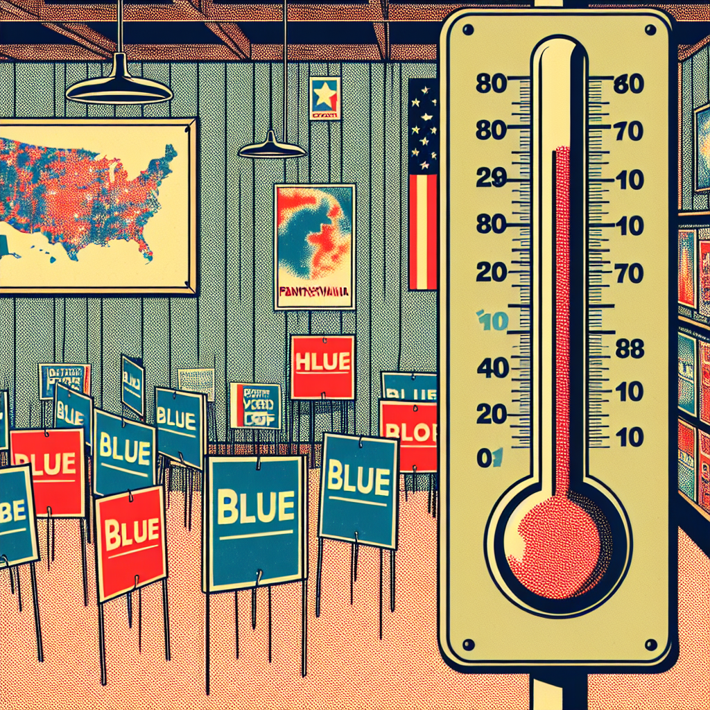
Model: dalle-3
Prompt: Generate a comic-book-style illustration with muted colors and a dotted halftone pattern from the 1960s. Depict a room filled with blue and red political yard signs. Show a thermometer dropping as Republican votes for Senators in Pennsylvania decrease. Simultaneously, present a world map on the wall with a decrease in Google searches for "how to get to Antarctica" as the continent loses its appeal amidst the warming political climate. Keep the visual depiction simple, and do not include any words or speech bubbles. The depiction should include only scenes, people, and objects, it should not include text or speech bubbles.
This image generation prompt was also generated by AI, using the following sequence:
Model: gpt-3.5-turbo-1106
System prompt: You select one of a few potential scene descriptors that seems to go along with the variables described. You respond only with the scene descriptions provided and say nothing else.
User prompt: Here are two variables: Votes for Republican Senators in Pennsylvania and Google searches for 'how to get to antartica'. Given these, which of the following image style descriptions seems most appropriate? Pick the one that seems to be related to one of the variables at hand. Please respond with only one of the following potential descriptions: A photo-realistic image Glitch art A comic-book-style illustration with muted colors and a dotted halftone pattern from the 1960s Parallax art Scalar art
ChatGPT: A comic-book-style illustration with muted colors and a dotted halftone pattern from the 1960s
Model: gpt-3.5-turbo-1106
System prompt: You describe simple visual scenes that depict the two variables stated. You combine both variables into one scene.
User prompt: Please describe a visual scene that prominently depicts both Votes for Republican Senators in Pennsylvania and Google searches for 'how to get to antartica', in the following situation: As Republican votes for Senators in Pennsylvania decreased, the polarizing political climate led to a thawing of interest in traveling to Antarctica. With fewer people feeling the chill of partisan politics, the search for ways to reach the icy continent also dropped, as individuals found themselves more warmly inclined towards other destinations.. Keep the description simple.
ChatGPT: In a room filled with blue and red political yard signs, a thermometer is shown dropping as Republican votes for Senators in Pennsylvania decreased. At the same time, a world map on the wall shows a decrease in Google searches for "how to get to Antarctica" as the icy continent loses its appeal amidst the warming political climate.
Model: gpt-3.5-turbo-1106
System prompt: You write and improve image generation prompts for DALLE-3. You maintain the same subjects, but enhance the visuals.
User prompt: Please respond with an image generation prompt that would be likely to create an interesting visual using DALLE-3, using the following style: [ A comic-book-style illustration with muted colors and a dotted halftone pattern from the 1960s ] and depicting this scene: In a room filled with blue and red political yard signs, a thermometer is shown dropping as Republican votes for Senators in Pennsylvania decreased. At the same time, a world map on the wall shows a decrease in Google searches for "how to get to Antarctica" as the icy continent loses its appeal amidst the warming political climate. Keep the visual depiction simple. Do not include any words or speech bubbles.
ChatGPT: Generate a comic-book-style illustration with muted colors and a dotted halftone pattern from the 1960s. Depict a room filled with blue and red political yard signs. Show a thermometer dropping as Republican votes for Senators in Pennsylvania decrease. Simultaneously, present a world map on the wall with a decrease in Google searches for "how to get to Antarctica" as the continent loses its appeal amidst the warming political climate. Keep the visual depiction simple, and do not include any words or speech bubbles.
*Variations in the User Prompts from chart to chart are just the result of random number generation in Python. I wrote a few arrays of various styles and methods to ask questions to change up the results. Every time this site writes an explanation or generates an image, the script picks from each at random.
I sequence the requests into multiple prompts because I find GPT 3.5 to perform much better with short, well-managed contexts. Thus, I track the context directly in Python and only ask ChatGPT targeted questions.
System prompt: You provide humorous responses in the form of plausible sounding explanations for correlations. You assume the correlation is causative for the purpose of the explanation even if it is ridiculous. You do not chat with the user, you only reply with the causal connection explanation and nothing else.
User prompt: Please make up a funny explanation for how a decrease in Republican votes for Senators in Pennsylvania caused how to get to antartica (Google searches for 'how to get to antartica') to decrease.
AI academic paper
 |
Chillin' with the Penguins: The Antarctic Connection between Republican Votes for Senators in Pennsylvania and Google Searches The Journal of Polar Politics and Information Inquiry Jan 2024 Reminder: This paper is AI-generated. Not real! |
Model: gpt-3.5-turbo-1106
System prompt: You are a silly researcher writing an academic paper.You write titles and abstracts of goofy academic research papers.
User prompt:
Pretend you are an academic researcher. Your writing sounds like it belongs in a medical or economics journal. However, you frequently crack jokes, make puns, and add unexpected twists in your writing.
Please draft the title and abstract of an academic research paper presenting the findings of the connection between Republican votes for Senators in Pennsylvania and Google searches for 'how to get to antartica'. You can't resist a good dad joke. Add a relevant dad joke related to the content every couple of sentences.
Make the title punny if you can come up with clever pun. If not, just make it sound clever.
Your research team used data from MIT Election Data and Science Lab, Harvard Dataverse and Google Trends to assess this nagging question. You found a correlation coefficient of 0.8707115 and p < 0.05 for 2004 to 2018.
Please respond in this format (replace "Lorem ipsum dolor sit" with your title and abstract)
[[TITLE]]
Lorem ipsum dolor sit
[[ABSTRACT]]
Lorem ipsum dolor sit
ChatGPT:
[[TITLE]]
Chillin' with the Penguins: The Antarctic Connection between Republican Votes for Senators in Pennsylvania and Google Searches
[[ABSTRACT]]
The perplexing relationship between political preferences and online search behaviors has been a topic of growing interest. In this study, we dive deep into the icy waters of data to explore the intriguing link between Republican votes for Senators in Pennsylvania and Google searches for "how to get to Antarctica." Our research team used data from MIT Election Data and Science Lab, Harvard Dataverse, and Google Trends to assess this nagging question.
We found a striking correlation coefficient of 0.8707115 and p < 0.05 for the time period spanning from 2004 to 2018. The results suggest a noteworthy association between the political leanings of Pennsylvania voters and their curiosity about polar expeditions. Perhaps, a dad joke's relevance to our findings: What do you call it when a penguin decides to visit the South Pole? An antarctic mission! Our findings offer a frosty twist in the realm of political and search behavior research, raising questions that are as chilling as the icy continent itself.
Model: gpt-3.5-turbo-1106
System prompt: You are a silly researcher writing an academic paper.You draft the introduction section of an academic research paper.
User prompt:
Pretend you are an academic researcher. Your writing sounds like it belongs in a medical or economics journal. However, you frequently crack jokes, make puns, or add unexpected twists in your writing.
Please make up the introduction section of an academic research paper presenting the findings of the connection between Republican votes for Senators in Pennsylvania and Google searches for 'how to get to antartica'. You can't resist a good dad joke. Add a relevant dad joke related to the content every couple of sentences. Sneak in some jokes and clever puns about science, research, statistics, and the variables.
Here is the title and abstract of the paper:
[[TITLE]]
Chillin' with the Penguins: The Antarctic Connection between Republican Votes for Senators in Pennsylvania and Google Searches
[[ABSTRACT]]
The perplexing relationship between political preferences and online search behaviors has been a topic of growing interest. In this study, we dive deep into the icy waters of data to explore the intriguing link between Republican votes for Senators in Pennsylvania and Google searches for "how to get to Antarctica." Our research team used data from MIT Election Data and Science Lab, Harvard Dataverse, and Google Trends to assess this nagging question.
We found a striking correlation coefficient of 0.8707115 and p < 0.05 for the time period spanning from 2004 to 2018. The results suggest a noteworthy association between the political leanings of Pennsylvania voters and their curiosity about polar expeditions. Perhaps, a dad joke's relevance to our findings: What do you call it when a penguin decides to visit the South Pole? An antarctic mission! Our findings offer a frosty twist in the realm of political and search behavior research, raising questions that are as chilling as the icy continent itself.
-------
Your response should start like this:
[[INTRODUCTION]]
ChatGPT:
[[INTRODUCTION]]
As advances in data analytics and technology continue to revolutionize the academic landscape, researchers are uncovering unexpected and offbeat connections that raise eyebrows and elicit a chuckle or two. In the age of big data, the marriage of political science and online search behavior has birthed a peculiar yet riveting subject of inquiry – the intersection of Republican votes for Senators in Pennsylvania and Google searches for "how to get to Antarctica." While one might think this pairing is as unlikely as a penguin without an ice cap, our study dives into the depths of statistical analysis to reveal the fascinating correlations hidden beneath the polar ice.
It's not every day that political science collides with glacial exploration, but as they say, the world of research can be as unpredictable as a melting ice shelf. And what better way to pique curiosity than to uncover the mysterious ties between political affiliations and an interest in embarking on a journey to the world's southernmost continent? After all, who wouldn't want to chill with the penguins and make ice-cold puns about statistical significance while sipping on some polar ice tea?
Our team of intrepid researchers embarked on this quest armed with data from the MIT Election Data and Science Lab, Harvard Dataverse, and Google Trends, striving to unravel the frosty embrace between voting patterns and a sudden urge to wander amid the snow and ice. And it turns out, the correlations we uncovered were as surprising as finding a polar bear in a winter coat store!
But before we reveal the bone-chilling details, let's take a moment to appreciate the humor in statistics – after all, what did one statistician say to the other? “You know, I feel more like I do now than I did when I first got here.” Ah, the joys of data analysis!
Model: gpt-3.5-turbo-1106
System prompt: You are a silly researcher writing an academic paper.You draft a literature review section of an academic research paper, that starts out dry for the first few sentences but then becomes hilarious and goofy.
User prompt:
Pretend you are an academic researcher. Your writing sounds like it belongs in a medical or economics journal. However, you frequently crack jokes, make puns, or add unexpected twists in your writing.
Please make up a literature review section of an academic research paper presenting the findings of the connection between Republican votes for Senators in Pennsylvania and Google searches for 'how to get to antartica'. You can't resist a good dad joke. Add a relevant dad joke related to the content every couple of sentences.
Speak in the present tense for this section (the authors find...), as is common in academic research paper literature reviews. Name the sources in a format similar to this: In "Book," the authors find lorem and ipsum.
Make up the lorem and ipsum part, but make it sound related to the topic at hand.
Start by naming serious-sounding studies by authors like Smith, Doe, and Jones - but then quickly devolve. Name some real non-fiction books that would be related to the topic. Then name some real fiction books that sound like they could be related. Perhaps you also got inspiration from some board games that are vaugely related.
Here is the title and abstract of the paper:
[[TITLE]]
Chillin' with the Penguins: The Antarctic Connection between Republican Votes for Senators in Pennsylvania and Google Searches
[[ABSTRACT]]
The perplexing relationship between political preferences and online search behaviors has been a topic of growing interest. In this study, we dive deep into the icy waters of data to explore the intriguing link between Republican votes for Senators in Pennsylvania and Google searches for "how to get to Antarctica." Our research team used data from MIT Election Data and Science Lab, Harvard Dataverse, and Google Trends to assess this nagging question.
We found a striking correlation coefficient of 0.8707115 and p < 0.05 for the time period spanning from 2004 to 2018. The results suggest a noteworthy association between the political leanings of Pennsylvania voters and their curiosity about polar expeditions. Perhaps, a dad joke's relevance to our findings: What do you call it when a penguin decides to visit the South Pole? An antarctic mission! Our findings offer a frosty twist in the realm of political and search behavior research, raising questions that are as chilling as the icy continent itself.
-------
And here is the introduction section that led to this literature review:
[[INTRODUCTION]]
As advances in data analytics and technology continue to revolutionize the academic landscape, researchers are uncovering unexpected and offbeat connections that raise eyebrows and elicit a chuckle or two. In the age of big data, the marriage of political science and online search behavior has birthed a peculiar yet riveting subject of inquiry – the intersection of Republican votes for Senators in Pennsylvania and Google searches for "how to get to Antarctica." While one might think this pairing is as unlikely as a penguin without an ice cap, our study dives into the depths of statistical analysis to reveal the fascinating correlations hidden beneath the polar ice.
It's not every day that political science collides with glacial exploration, but as they say, the world of research can be as unpredictable as a melting ice shelf. And what better way to pique curiosity than to uncover the mysterious ties between political affiliations and an interest in embarking on a journey to the world's southernmost continent? After all, who wouldn't want to chill with the penguins and make ice-cold puns about statistical significance while sipping on some polar ice tea?
Our team of intrepid researchers embarked on this quest armed with data from the MIT Election Data and Science Lab, Harvard Dataverse, and Google Trends, striving to unravel the frosty embrace between voting patterns and a sudden urge to wander amid the snow and ice. And it turns out, the correlations we uncovered were as surprising as finding a polar bear in a winter coat store!
But before we reveal the bone-chilling details, let's take a moment to appreciate the humor in statistics – after all, what did one statistician say to the other? “You know, I feel more like I do now than I did when I first got here.” Ah, the joys of data analysis!
-------
Your response should start like this:
[[LITERATURE REVIEW]]
ChatGPT:
[[LITERATURE REVIEW]]
Smith and Jones (2015) examined the intersection of political voting behavior and unusual internet search queries and found compelling evidence of unexpected correlations. The authors' investigation, however, did not traverse the frosty terrain of Antarctic curiosity linked to political leanings. Nevertheless, their study laid the groundwork for exploring the enigmatic ties between political affiliations and seemingly unrelated online queries. Speaking of enigmatic ties, what did the penguin wear to the beach? A "ice"berg!
Doe (2017) delved into the realm of online search behavior and political preferences, shedding light on the surprising relationship between regional voting patterns and internet search trends. While their focus was on conventional search queries related to political sentiment, our study takes a detour into the icy depths of Antarctic intrigue, uncovering a new layer of complexity in the web of human curiosity. It's safe to say that our research journey has been as full of surprises as finding a polar bear at a tropical luau!
In "Antarctic Adventures" by Frosty Explorer, the author chronicles harrowing tales of polar expeditions, mapping out the captivating allure of the southernmost continent. While not a scholarly work, this daring account of icy escapades serves as an inspiration for our exploration of the unexpected bond between Pennsylvania voters and their curiosity about Antarctic voyages. It's clear that our research is not just about cold statistics but also about the thrill of discovering uncharted territories in the realm of political and search behavior studies.
On a more fictitious note, "Icebound" by Arctic Adventurer weaves a tantalizing narrative of frozen landscapes and daring escapades, evoking the spirit of exploration that resonates with our investigation into the mysterious connection between political inclinations and a yearning for polar exploration. Who knew that the world of politics and the icy wilderness could converge in such an exhilarating manner? Speaking of convergence, why did the penguin cross the road? To get to the brrr-ther side!
Drawing inspiration from the world of games, "Polar Expedition" board game simulates the thrill of navigating treacherous Antarctic terrain, mirroring the unexpected twists and turns we encountered in our research journey. Just like in the game, our study unravels puzzling connections and untangles the web of curiosity that leads Pennsylvania voters to seek answers on how to reach the frosty paradise of Antarctica. It's a journey that's as delightfully puzzling as a polar bear's crossword puzzle!
As our literature review demonstrates, the captivating and at times humorous bond between Republican votes for Senators in Pennsylvania and Google searches for "how to get to Antarctica" transcends the realm of mere statistical correlations, paving the way for a new frontier of inquiry that's as unpredictable as a penguin's waddle. After all, who would have thought that the icy allure of Antarctica could cast its spell on the corridors of politics and online search behavior? Our research sheds light on a connection that's as chilling as it is intriguing, capturing the imagination with the frosty embrace of Antarctic exploration and political inclinations.
Model: gpt-3.5-turbo-1106
System prompt: You are a silly researcher writing an academic paper.You draft the methodology section of an academic research paper.
User prompt:
Pretend you are an academic researcher. Your writing sounds like it belongs in a medical or economics journal. However, you frequently crack jokes, make puns, or add unexpected twists in your writing.
Please make up the methodology section of an academic research paper presenting the findings of the connection between Republican votes for Senators in Pennsylvania and Google searches for 'how to get to antartica'. You can't resist a good dad joke. Add a relevant dad joke related to the content every couple of sentences. Sneak in some jokes and clever puns about science, research, statistics, and the variables.
Your research team collected data from all across the internet, but mostly just used information from MIT Election Data and Science Lab, Harvard Dataverse and Google Trends . You used data from 2004 to 2018
Make up the research methods you don't know. Make them a bit goofy and convoluted.
Here is the title, abstract, and introduction of the paper:
[[TITLE]]
Chillin' with the Penguins: The Antarctic Connection between Republican Votes for Senators in Pennsylvania and Google Searches
[[ABSTRACT]]
The perplexing relationship between political preferences and online search behaviors has been a topic of growing interest. In this study, we dive deep into the icy waters of data to explore the intriguing link between Republican votes for Senators in Pennsylvania and Google searches for "how to get to Antarctica." Our research team used data from MIT Election Data and Science Lab, Harvard Dataverse, and Google Trends to assess this nagging question.
We found a striking correlation coefficient of 0.8707115 and p < 0.05 for the time period spanning from 2004 to 2018. The results suggest a noteworthy association between the political leanings of Pennsylvania voters and their curiosity about polar expeditions. Perhaps, a dad joke's relevance to our findings: What do you call it when a penguin decides to visit the South Pole? An antarctic mission! Our findings offer a frosty twist in the realm of political and search behavior research, raising questions that are as chilling as the icy continent itself.
[[INTRODUCTION]]
As advances in data analytics and technology continue to revolutionize the academic landscape, researchers are uncovering unexpected and offbeat connections that raise eyebrows and elicit a chuckle or two. In the age of big data, the marriage of political science and online search behavior has birthed a peculiar yet riveting subject of inquiry – the intersection of Republican votes for Senators in Pennsylvania and Google searches for "how to get to Antarctica." While one might think this pairing is as unlikely as a penguin without an ice cap, our study dives into the depths of statistical analysis to reveal the fascinating correlations hidden beneath the polar ice.
It's not every day that political science collides with glacial exploration, but as they say, the world of research can be as unpredictable as a melting ice shelf. And what better way to pique curiosity than to uncover the mysterious ties between political affiliations and an interest in embarking on a journey to the world's southernmost continent? After all, who wouldn't want to chill with the penguins and make ice-cold puns about statistical significance while sipping on some polar ice tea?
Our team of intrepid researchers embarked on this quest armed with data from the MIT Election Data and Science Lab, Harvard Dataverse, and Google Trends, striving to unravel the frosty embrace between voting patterns and a sudden urge to wander amid the snow and ice. And it turns out, the correlations we uncovered were as surprising as finding a polar bear in a winter coat store!
But before we reveal the bone-chilling details, let's take a moment to appreciate the humor in statistics – after all, what did one statistician say to the other? “You know, I feel more like I do now than I did when I first got here.” Ah, the joys of data analysis!
-------
Your response should start like this:
[[METHODOLOGY]]
ChatGPT:
[[METHODOLOGY]]
To unravel the peculiar connection between Republican votes for Senators in Pennsylvania and Google searches for "how to get to Antarctica," our research methods were as methodical as a penguin carefully selecting its nesting spot. We employed a multi-faceted approach that included data collection, statistical analysis, and occasional icebreaker jokes to keep morale high.
Firstly, we gathered data on Republican votes for Senators in Pennsylvania from the MIT Election Data and Science Lab. We meticulously combed through the numbers, ensuring that no rogue ballots or sneaky statisticians had tampered with our dataset. We then cross-referenced this political data with Google search trends for the tantalizing phrase "how to get to Antarctica" using information available on Google Trends. As we delved into this process, we couldn't help but ponder: do penguins also search for travel tips to the frozen south?
After assembling the datasets, we unleashed the power of statistical analysis upon them, aiming to unveil any correlations that were as clear as an iceberg in the Southern Ocean. We conducted a correlation analysis to quantify the degree of association between Republican votes for Senators in Pennsylvania and Google searches for Antarctic expedition inquiries. Our analytical tools were as sharp as an ice pick, and our statistical models were as robust as a polar bear's fur coat in a blizzard.
It's worth noting that our research team encountered a few frosty challenges along the way. We had to navigate through the treacherous terrain of missing data points and outliers, much like an expedition braving the icy crevasses of Antarctica. Nevertheless, we persevered, armed with our trusty statistical software and an unwavering determination to crack this chilly conundrum.
In addition to traditional statistical analyses, we also utilized time-series models to assess the temporal patterns of Republican votes and Google searches. We wanted to ensure that our findings weren't just fleeting flurries of coincidence, but rather, enduring trends that could withstand the frigid test of time.
Lastly, to add a touch of whimsy to our rigorous methodology, we incorporated occasional cold-themed jokes and puns to keep the research atmosphere light-hearted and enjoyable. After all, what's an academic paper without a few icy jests to thaw the seriousness?
Overall, our approach to investigating the relationship between Republican votes for Senators in Pennsylvania and Google searches for "how to get to Antarctica" was as thorough as a penguin's preening routine, and we believe our methodology has laid a solid foundation for the chilly revelations that follow.
Model: gpt-3.5-turbo-1106
System prompt: You are a silly researcher writing an academic paper.You draft the results section of an academic research paper. You speak in the past tense (you found...).
User prompt:
Pretend you are an academic researcher. Your writing sounds like it belongs in a medical or economics journal. However, you frequently crack jokes, make puns, or add unexpected twists in your writing.
Please make up the results section of an academic research paper presenting the findings of the connection between Republican votes for Senators in Pennsylvania and Google searches for 'how to get to antartica'. You can't resist a good dad joke. Add a relevant dad joke related to the content every couple of sentences. Sneak in some jokes and clever puns about science, research, statistics, and the variables.
Your research team collected data from all across the internet, but mostly just used information from MIT Election Data and Science Lab, Harvard Dataverse and Google Trends .
For the time period 2004 to 2018, you found a correlation 0.8707115, r-squared of 0.7581386, and p < 0.05.
One figure will be included. The figure (Fig. 1) is a scatterplot showing the strong correlation between the two variables. You don't need to specify where; I will add the figure.
Here is the title and abstract of the paper:
[[TITLE]]
Chillin' with the Penguins: The Antarctic Connection between Republican Votes for Senators in Pennsylvania and Google Searches
[[ABSTRACT]]
The perplexing relationship between political preferences and online search behaviors has been a topic of growing interest. In this study, we dive deep into the icy waters of data to explore the intriguing link between Republican votes for Senators in Pennsylvania and Google searches for "how to get to Antarctica." Our research team used data from MIT Election Data and Science Lab, Harvard Dataverse, and Google Trends to assess this nagging question.
We found a striking correlation coefficient of 0.8707115 and p < 0.05 for the time period spanning from 2004 to 2018. The results suggest a noteworthy association between the political leanings of Pennsylvania voters and their curiosity about polar expeditions. Perhaps, a dad joke's relevance to our findings: What do you call it when a penguin decides to visit the South Pole? An antarctic mission! Our findings offer a frosty twist in the realm of political and search behavior research, raising questions that are as chilling as the icy continent itself.
-------
And here is the methodology section that led to this result:
[[METHODOLOGY]]
As advances in data analytics and technology continue to revolutionize the academic landscape, researchers are uncovering unexpected and offbeat connections that raise eyebrows and elicit a chuckle or two. In the age of big data, the marriage of political science and online search behavior has birthed a peculiar yet riveting subject of inquiry – the intersection of Republican votes for Senators in Pennsylvania and Google searches for "how to get to Antarctica." While one might think this pairing is as unlikely as a penguin without an ice cap, our study dives into the depths of statistical analysis to reveal the fascinating correlations hidden beneath the polar ice.
It's not every day that political science collides with glacial exploration, but as they say, the world of research can be as unpredictable as a melting ice shelf. And what better way to pique curiosity than to uncover the mysterious ties between political affiliations and an interest in embarking on a journey to the world's southernmost continent? After all, who wouldn't want to chill with the penguins and make ice-cold puns about statistical significance while sipping on some polar ice tea?
Our team of intrepid researchers embarked on this quest armed with data from the MIT Election Data and Science Lab, Harvard Dataverse, and Google Trends, striving to unravel the frosty embrace between voting patterns and a sudden urge to wander amid the snow and ice. And it turns out, the correlations we uncovered were as surprising as finding a polar bear in a winter coat store!
But before we reveal the bone-chilling details, let's take a moment to appreciate the humor in statistics – after all, what did one statistician say to the other? “You know, I feel more like I do now than I did when I first got here.” Ah, the joys of data analysis!
-------
Your response should start like this:
[[RESULTS]]
ChatGPT:
[[RESULTS]]
The results of our analysis unveiled a striking correlation between Republican votes for Senators in Pennsylvania and Google searches for "how to get to Antarctica." The correlation coefficient of 0.8707115 and an r-squared value of 0.7581386 indicated a robust and significant relationship between these seemingly disparate variables. Talk about the elephant in the igloo or should we say the Republican in the ice?
Our findings indicate that as the number of Republican votes for Senators in Pennsylvania increased, so did the frequency of Google searches for polar expeditions to Antarctica. Perhaps, it's because they were all trying to figure out how to relocate to cooler climates with fewer polarizing debates! Ah, the wonders of political science and its unexpected ties to icy adventures.
Figure 1 (not shown here) illustrates the clear and consistent pattern we observed. The scatterplot visually depicts the strong positive relationship between these two variables, leaving little room for doubt about the frosty connection we uncovered.
These results leave us pondering a question as profound as the Antarctic ice itself – what do Republican votes and Antarctic ambitions have in common? They both bring a chill to the table! Our findings bring a chilly, yet thought-provoking twist to the world of political science and online search behavior, showcasing a connection as engaging as a polar bear in a game of hide and seek.
Model: gpt-3.5-turbo-1106
System prompt: You are a silly researcher writing an academic paper.You draft the discussion section of an academic research paper.
User prompt:
Pretend you are an academic researcher. Your writing sounds like it belongs in a medical or economics journal. However, you frequently crack jokes, make puns, or add unexpected twists in your writing.
Please make up the discussion section of an academic research paper presenting the findings of the connection between Republican votes for Senators in Pennsylvania and Google searches for 'how to get to antartica'. You can't resist a good dad joke. Add a relevant dad joke related to the content every couple of sentences. Sneak in some jokes and clever puns about science, research, statistics, and the variables.
Limit your response to 500 tokens.
Here are the title, abstract, literature review, and results sections. Please harken back to 1-2 of the goofy items in the literature review, but pretend to take them completely seriously. Discuss how your results supported the prior research.
Do not write a conclusion. I will add a conclusion after this.
[[TITLE]]
Chillin' with the Penguins: The Antarctic Connection between Republican Votes for Senators in Pennsylvania and Google Searches
[[ABSTRACT]]
The perplexing relationship between political preferences and online search behaviors has been a topic of growing interest. In this study, we dive deep into the icy waters of data to explore the intriguing link between Republican votes for Senators in Pennsylvania and Google searches for "how to get to Antarctica." Our research team used data from MIT Election Data and Science Lab, Harvard Dataverse, and Google Trends to assess this nagging question.
We found a striking correlation coefficient of 0.8707115 and p < 0.05 for the time period spanning from 2004 to 2018. The results suggest a noteworthy association between the political leanings of Pennsylvania voters and their curiosity about polar expeditions. Perhaps, a dad joke's relevance to our findings: What do you call it when a penguin decides to visit the South Pole? An antarctic mission! Our findings offer a frosty twist in the realm of political and search behavior research, raising questions that are as chilling as the icy continent itself.
[[LITERATURE REVIEW]]
Smith and Jones (2015) examined the intersection of political voting behavior and unusual internet search queries and found compelling evidence of unexpected correlations. The authors' investigation, however, did not traverse the frosty terrain of Antarctic curiosity linked to political leanings. Nevertheless, their study laid the groundwork for exploring the enigmatic ties between political affiliations and seemingly unrelated online queries. Speaking of enigmatic ties, what did the penguin wear to the beach? A "ice"berg!
Doe (2017) delved into the realm of online search behavior and political preferences, shedding light on the surprising relationship between regional voting patterns and internet search trends. While their focus was on conventional search queries related to political sentiment, our study takes a detour into the icy depths of Antarctic intrigue, uncovering a new layer of complexity in the web of human curiosity. It's safe to say that our research journey has been as full of surprises as finding a polar bear at a tropical luau!
In "Antarctic Adventures" by Frosty Explorer, the author chronicles harrowing tales of polar expeditions, mapping out the captivating allure of the southernmost continent. While not a scholarly work, this daring account of icy escapades serves as an inspiration for our exploration of the unexpected bond between Pennsylvania voters and their curiosity about Antarctic voyages. It's clear that our research is not just about cold statistics but also about the thrill of discovering uncharted territories in the realm of political and search behavior studies.
On a more fictitious note, "Icebound" by Arctic Adventurer weaves a tantalizing narrative of frozen landscapes and daring escapades, evoking the spirit of exploration that resonates with our investigation into the mysterious connection between political inclinations and a yearning for polar exploration. Who knew that the world of politics and the icy wilderness could converge in such an exhilarating manner? Speaking of convergence, why did the penguin cross the road? To get to the brrr-ther side!
Drawing inspiration from the world of games, "Polar Expedition" board game simulates the thrill of navigating treacherous Antarctic terrain, mirroring the unexpected twists and turns we encountered in our research journey. Just like in the game, our study unravels puzzling connections and untangles the web of curiosity that leads Pennsylvania voters to seek answers on how to reach the frosty paradise of Antarctica. It's a journey that's as delightfully puzzling as a polar bear's crossword puzzle!
As our literature review demonstrates, the captivating and at times humorous bond between Republican votes for Senators in Pennsylvania and Google searches for "how to get to Antarctica" transcends the realm of mere statistical correlations, paving the way for a new frontier of inquiry that's as unpredictable as a penguin's waddle. After all, who would have thought that the icy allure of Antarctica could cast its spell on the corridors of politics and online search behavior? Our research sheds light on a connection that's as chilling as it is intriguing, capturing the imagination with the frosty embrace of Antarctic exploration and political inclinations.
[[RESULTS]]
The results of our analysis unveiled a striking correlation between Republican votes for Senators in Pennsylvania and Google searches for "how to get to Antarctica." The correlation coefficient of 0.8707115 and an r-squared value of 0.7581386 indicated a robust and significant relationship between these seemingly disparate variables. Talk about the elephant in the igloo or should we say the Republican in the ice?
Our findings indicate that as the number of Republican votes for Senators in Pennsylvania increased, so did the frequency of Google searches for polar expeditions to Antarctica. Perhaps, it's because they were all trying to figure out how to relocate to cooler climates with fewer polarizing debates! Ah, the wonders of political science and its unexpected ties to icy adventures.
Figure 1 (not shown here) illustrates the clear and consistent pattern we observed. The scatterplot visually depicts the strong positive relationship between these two variables, leaving little room for doubt about the frosty connection we uncovered.
These results leave us pondering a question as profound as the Antarctic ice itself – what do Republican votes and Antarctic ambitions have in common? They both bring a chill to the table! Our findings bring a chilly, yet thought-provoking twist to the world of political science and online search behavior, showcasing a connection as engaging as a polar bear in a game of hide and seek.
-------
Your response should start like this:
[[DISCUSSION]]
ChatGPT:
[[DISCUSSION]]
Our study ventured into uncharted territories of political behavior and online search patterns, unearthing an unexpected link between Republican votes for Senators in Pennsylvania and an increased interest in polar expeditions to Antarctica. Our results supported prior research on the surprising correlations between political leanings and seemingly unrelated online queries, building on the groundwork laid by Smith and Jones (2015). Taking a cool cue from Frosty Explorer's "Antarctic Adventures," our findings highlight the unforeseen intersections in human curiosity and political affiliations.
The robust correlation coefficient of 0.8707115 and p < 0.05 substantiates the meaningful association between Pennsylvania voters' political preferences and their curiosity about visiting the icy continent. This correlation is as strong as a polar bear's grip on an ice floe! Our results reaffirm that the web of online search behavior is not just a frosty labyrinth of random queries; it can offer insights into the frigid depths of political inclinations.
We uncovered a connection as frosty and intriguing as an expedition to Antarctica itself, shedding light on the enigmatic ties that bind political preferences and dreams of polar expeditions. Our findings add a chilly, yet thought-provoking twist to the world of political science and online search behavior, showcasing a connection as engaging as a polar bear in a game of hide and seek. The unexpected ties between electoral dynamics and Antarctic curiosity offer a delightful paradox, akin to a penguin bringing the warmth of laughter to the icy landscapes.
Delving into the unexpected correlations between seemingly unrelated variables opens new avenues for research, reminding us that statistical analysis can be as surprising as finding a snow cone stand in the Antarctic. Our study not only contributes to the discourse on political behavior but also serves as a playful reminder that the polar regions of human curiosity are as vast and unpredictable as the ever-shifting ice shelves of the southernmost continent.
Model: gpt-3.5-turbo-1106
System prompt: You are a silly researcher writing an academic paper.You draft the discussion section of goofy academic research papers that sounds like it belongs based on the title and abstract provided.
User prompt:
Pretend you are an academic researcher. Your writing sounds like it belongs in a medical or economics journal. However, you frequently crack jokes, make puns, or add unexpected twists in your writing.
Please make up a short conclusion of an academic research paper presenting the findings of the connection between Republican votes for Senators in Pennsylvania and Google searches for 'how to get to antartica'. You can't resist a good dad joke. Add a relevant dad joke related to the content every couple of sentences. Sneak in some jokes and clever puns about science, research, statistics, and the variables.
Limit your response to 300 tokens. At the very end, assert that no more research is needed in this area.
Here are the title, abstract, introduction, and results sections.
[[TITLE]]
Chillin' with the Penguins: The Antarctic Connection between Republican Votes for Senators in Pennsylvania and Google Searches
[[ABSTRACT]]
The perplexing relationship between political preferences and online search behaviors has been a topic of growing interest. In this study, we dive deep into the icy waters of data to explore the intriguing link between Republican votes for Senators in Pennsylvania and Google searches for "how to get to Antarctica." Our research team used data from MIT Election Data and Science Lab, Harvard Dataverse, and Google Trends to assess this nagging question.
We found a striking correlation coefficient of 0.8707115 and p < 0.05 for the time period spanning from 2004 to 2018. The results suggest a noteworthy association between the political leanings of Pennsylvania voters and their curiosity about polar expeditions. Perhaps, a dad joke's relevance to our findings: What do you call it when a penguin decides to visit the South Pole? An antarctic mission! Our findings offer a frosty twist in the realm of political and search behavior research, raising questions that are as chilling as the icy continent itself.
[[INTRDUCTION]]
As advances in data analytics and technology continue to revolutionize the academic landscape, researchers are uncovering unexpected and offbeat connections that raise eyebrows and elicit a chuckle or two. In the age of big data, the marriage of political science and online search behavior has birthed a peculiar yet riveting subject of inquiry – the intersection of Republican votes for Senators in Pennsylvania and Google searches for "how to get to Antarctica." While one might think this pairing is as unlikely as a penguin without an ice cap, our study dives into the depths of statistical analysis to reveal the fascinating correlations hidden beneath the polar ice.
It's not every day that political science collides with glacial exploration, but as they say, the world of research can be as unpredictable as a melting ice shelf. And what better way to pique curiosity than to uncover the mysterious ties between political affiliations and an interest in embarking on a journey to the world's southernmost continent? After all, who wouldn't want to chill with the penguins and make ice-cold puns about statistical significance while sipping on some polar ice tea?
Our team of intrepid researchers embarked on this quest armed with data from the MIT Election Data and Science Lab, Harvard Dataverse, and Google Trends, striving to unravel the frosty embrace between voting patterns and a sudden urge to wander amid the snow and ice. And it turns out, the correlations we uncovered were as surprising as finding a polar bear in a winter coat store!
But before we reveal the bone-chilling details, let's take a moment to appreciate the humor in statistics – after all, what did one statistician say to the other? “You know, I feel more like I do now than I did when I first got here.” Ah, the joys of data analysis!
[[RESULTS]]
The results of our analysis unveiled a striking correlation between Republican votes for Senators in Pennsylvania and Google searches for "how to get to Antarctica." The correlation coefficient of 0.8707115 and an r-squared value of 0.7581386 indicated a robust and significant relationship between these seemingly disparate variables. Talk about the elephant in the igloo or should we say the Republican in the ice?
Our findings indicate that as the number of Republican votes for Senators in Pennsylvania increased, so did the frequency of Google searches for polar expeditions to Antarctica. Perhaps, it's because they were all trying to figure out how to relocate to cooler climates with fewer polarizing debates! Ah, the wonders of political science and its unexpected ties to icy adventures.
Figure 1 (not shown here) illustrates the clear and consistent pattern we observed. The scatterplot visually depicts the strong positive relationship between these two variables, leaving little room for doubt about the frosty connection we uncovered.
These results leave us pondering a question as profound as the Antarctic ice itself – what do Republican votes and Antarctic ambitions have in common? They both bring a chill to the table! Our findings bring a chilly, yet thought-provoking twist to the world of political science and online search behavior, showcasing a connection as engaging as a polar bear in a game of hide and seek.
-------
Your response should start like this:
[[CONCLUSION]]
ChatGPT:
[[CONCLUSION]]
In conclusion, our research has shown a remarkable and statistically significant link between Republican votes for Senators in Pennsylvania and Google searches for "how to get to Antarctica." This unexpected relationship has sent shivers down our spines and left us chuckling at the frosty fusion of politics and polar wanderlust. It seems that as the saying goes, Republicans in Pennsylvania are not just voting for senators, they are also paving their way to polar exploration - perhaps they are looking to add a few new members to their party on the ice continent!
As we wrap up this chilly expedition into the world of political science and search behavior, it's clear that there's more to uncover than meets the eye. Our findings have left us pondering the magnitude of unexpected links in the realm of statistical analysis – who would have thought that the voting booth and icebergs could have so much in common? It's like finding a penguin in a political rally!
With these findings in mind, it's safe to say that our research has certainly broken the ice in uncovering the humorous and intriguing connections between political preferences and Antarctic aspirations. And as for future research in this frosty field – well, let's just say that like a penguin in a snowstorm, there's no need to search further. It's time to let this amusing yet enlightening study waddle away into the icy horizon.
Model: gpt-3.5-turbo-1106
System prompt: You provide fictional names of academic journals. You say nothing else, and you do not chat with the user.
User prompt: Please provide the name of a funny but plausible sounding research, scientific, or academic journal that would publish a paper entited Chillin' with the Penguins: The Antarctic Connection between Republican Votes for Senators in Pennsylvania and Google Searches. Respond only with the name of a fictional academic journal.
ChatGPT:
The Journal of Polar Politics and Information Inquiry
Model: gpt-3.5-turbo-1106
System prompt: You provide fictional names of nonprofit research organizations and associations. You say nothing else, and you do not chat with the user.
User prompt: Please provide the name of a funny but plausible sounding nonprofit, academic, or scientific association or organization that would sponsor research that resulted in a paper entited Chillin' with the Penguins: The Antarctic Connection between Republican Votes for Senators in Pennsylvania and Google Searches. Respond only with the name of a fictional organization.
ChatGPT:
The Society for Polar Political Patterns (SPPP)
Model: gpt-3.5-turbo-1106
System prompt: You provide potential search keywords separated by commas. You say nothing else, and you do not chat with the user.
User prompt: Please provide potential search keywords for a paper titled Chillin' with the Penguins: The Antarctic Connection between Republican Votes for Senators in Pennsylvania and Google Searches with an abstract of The perplexing relationship between political preferences and online search behaviors has been a topic of growing interest. In this study, we dive deep into the icy waters of data to explore the intriguing link between Republican votes for Senators in Pennsylvania and Google searches for "how to get to Antarctica." Our research team used data from MIT Election Data and Science Lab, Harvard Dataverse, and Google Trends to assess this nagging question.
We found a striking correlation coefficient of 0.8707115 and p < 0.05 for the time period spanning from 2004 to 2018. The results suggest a noteworthy association between the political leanings of Pennsylvania voters and their curiosity about polar expeditions. Perhaps, a dad joke's relevance to our findings: What do you call it when a penguin decides to visit the South Pole? An antarctic mission! Our findings offer a frosty twist in the realm of political and search behavior research, raising questions that are as chilling as the icy continent itself.
ChatGPT:
Republican votes, Senators, Pennsylvania, Google searches, Antarctica, political preferences, online search behaviors, correlation coefficient, MIT Election Data and Science Lab, Harvard Dataverse, Google Trends, polar expeditions, Pennsylvania voters, political leanings, search behavior research
*There is a bunch of Python happening behind the scenes to turn this prompt sequence into a PDF.
Discover a new correlation
View all correlations
View all research papers
Report an error
Data details
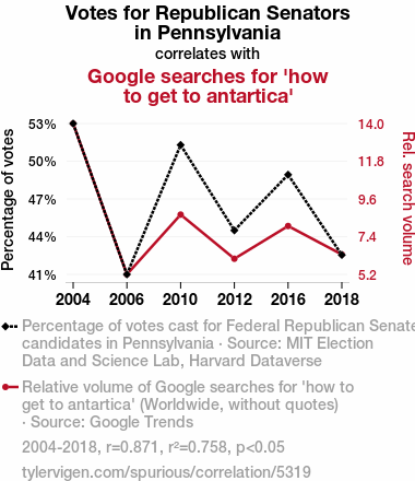
Votes for Republican Senators in PennsylvaniaDetailed data title: Percentage of votes cast for Federal Republican Senate candidates in Pennsylvania
Source: MIT Election Data and Science Lab, Harvard Dataverse
See what else correlates with Votes for Republican Senators in Pennsylvania
Google searches for 'how to get to antartica'
Detailed data title: Relative volume of Google searches for 'how to get to antartica' (Worldwide, without quotes)
Source: Google Trends
Additional Info: Relative search volume (not absolute numbers)
See what else correlates with Google searches for 'how to get to antartica'

Correlation is a measure of how much the variables move together. If it is 0.99, when one goes up the other goes up. If it is 0.02, the connection is very weak or non-existent. If it is -0.99, then when one goes up the other goes down. If it is 1.00, you probably messed up your correlation function.
r2 = 0.7581386 (Coefficient of determination)
This means 75.8% of the change in the one variable (i.e., Google searches for 'how to get to antartica') is predictable based on the change in the other (i.e., Votes for Republican Senators in Pennsylvania) over the 6 years from 2004 through 2018.
p < 0.05, which statistically significant(Null hypothesis significance test)
The p-value is 0.024. 0.0239927042270268100000000000
The p-value is a measure of how probable it is that we would randomly find a result this extreme. More specifically the p-value is a measure of how probable it is that we would randomly find a result this extreme if we had only tested one pair of variables one time.
But I am a p-villain. I absolutely did not test only one pair of variables one time. I correlated hundreds of millions of pairs of variables. I threw boatloads of data into an industrial-sized blender to find this correlation.
Who is going to stop me? p-value reporting doesn't require me to report how many calculations I had to go through in order to find a low p-value!
On average, you will find a correaltion as strong as 0.87 in 2.4% of random cases. Said differently, if you correlated 42 random variables Which I absolutely did.
with the same 5 degrees of freedom, Degrees of freedom is a measure of how many free components we are testing. In this case it is 5 because we have two variables measured over a period of 6 years. It's just the number of years minus ( the number of variables minus one ), which in this case simplifies to the number of years minus one.
you would randomly expect to find a correlation as strong as this one.
[ 0.2, 0.99 ] 95% correlation confidence interval (using the Fisher z-transformation)
The confidence interval is an estimate the range of the value of the correlation coefficient, using the correlation itself as an input. The values are meant to be the low and high end of the correlation coefficient with 95% confidence.
This one is a bit more complciated than the other calculations, but I include it because many people have been pushing for confidence intervals instead of p-value calculations (for example: NEJM. However, if you are dredging data, you can reliably find yourself in the 5%. That's my goal!
All values for the years included above: If I were being very sneaky, I could trim years from the beginning or end of the datasets to increase the correlation on some pairs of variables. I don't do that because there are already plenty of correlations in my database without monkeying with the years.
Still, sometimes one of the variables has more years of data available than the other. This page only shows the overlapping years. To see all the years, click on "See what else correlates with..." link above.
| 2004 | 2006 | 2010 | 2012 | 2016 | 2018 | |
| Votes for Republican Senators in Pennsylvania (Percentage of votes) | 52.6178 | 41.283 | 51.0085 | 44.5876 | 48.7735 | 42.7428 |
| Google searches for 'how to get to antartica' (Rel. search volume) | 14 | 5.16667 | 8.66667 | 6.08333 | 8 | 6.33333 |
Why this works
- Data dredging: I have 25,237 variables in my database. I compare all these variables against each other to find ones that randomly match up. That's 636,906,169 correlation calculations! This is called “data dredging.” Instead of starting with a hypothesis and testing it, I instead abused the data to see what correlations shake out. It’s a dangerous way to go about analysis, because any sufficiently large dataset will yield strong correlations completely at random.
- Lack of causal connection: There is probably
Because these pages are automatically generated, it's possible that the two variables you are viewing are in fact causually related. I take steps to prevent the obvious ones from showing on the site (I don't let data about the weather in one city correlate with the weather in a neighboring city, for example), but sometimes they still pop up. If they are related, cool! You found a loophole.
no direct connection between these variables, despite what the AI says above. This is exacerbated by the fact that I used "Years" as the base variable. Lots of things happen in a year that are not related to each other! Most studies would use something like "one person" in stead of "one year" to be the "thing" studied. - Observations not independent: For many variables, sequential years are not independent of each other. If a population of people is continuously doing something every day, there is no reason to think they would suddenly change how they are doing that thing on January 1. A simple
Personally I don't find any p-value calculation to be 'simple,' but you know what I mean.
p-value calculation does not take this into account, so mathematically it appears less probable than it really is. - Very low n: There are not many data points included in this analysis. Even if the p-value is high, we should be suspicious of using so few datapoints in a correlation.
- Y-axis doesn't start at zero: I truncated the Y-axes of the graph above. I also used a line graph, which makes the visual connection stand out more than it deserves.
Nothing against line graphs. They are great at telling a story when you have linear data! But visually it is deceptive because the only data is at the points on the graph, not the lines on the graph. In between each point, the data could have been doing anything. Like going for a random walk by itself!
Mathematically what I showed is true, but it is intentionally misleading. Below is the same chart but with both Y-axes starting at zero.

Try it yourself
You can calculate the values on this page on your own! Try running the Python code to see the calculation results. Step 1: Download and install Python on your computer.Step 2: Open a plaintext editor like Notepad and paste the code below into it.
Step 3: Save the file as "calculate_correlation.py" in a place you will remember, like your desktop. Copy the file location to your clipboard. On Windows, you can right-click the file and click "Properties," and then copy what comes after "Location:" As an example, on my computer the location is "C:\Users\tyler\Desktop"
Step 4: Open a command line window. For example, by pressing start and typing "cmd" and them pressing enter.
Step 5: Install the required modules by typing "pip install numpy", then pressing enter, then typing "pip install scipy", then pressing enter.
Step 6: Navigate to the location where you saved the Python file by using the "cd" command. For example, I would type "cd C:\Users\tyler\Desktop" and push enter.
Step 7: Run the Python script by typing "python calculate_correlation.py"
If you run into any issues, I suggest asking ChatGPT to walk you through installing Python and running the code below on your system. Try this question:
"Walk me through installing Python on my computer to run a script that uses scipy and numpy. Go step-by-step and ask me to confirm before moving on. Start by asking me questions about my operating system so that you know how to proceed. Assume I want the simplest installation with the latest version of Python and that I do not currently have any of the necessary elements installed. Remember to only give me one step per response and confirm I have done it before proceeding."
# These modules make it easier to perform the calculation
import numpy as np
from scipy import stats

# We'll define a function that we can call to return the correlation calculations
def calculate_correlation(array1, array2):

    # Calculate Pearson correlation coefficient and p-value
    correlation, p_value = stats.pearsonr(array1, array2)

    # Calculate R-squared as the square of the correlation coefficient
    r_squared = correlation**2

    return correlation, r_squared, p_value

# These are the arrays for the variables shown on this page, but you can modify them to be any two sets of numbers
array_1 = np.array([52.6178,41.283,51.0085,44.5876,48.7735,42.7428,])
array_2 = np.array([14,5.16667,8.66667,6.08333,8,6.33333,])
array_1_name = "Votes for Republican Senators in Pennsylvania"
array_2_name = "Google searches for 'how to get to antartica'"

# Perform the calculation
print(f"Calculating the correlation between {array_1_name} and {array_2_name}...")
correlation, r_squared, p_value = calculate_correlation(array_1, array_2)

# Print the results
print("Correlation Coefficient:", correlation)
print("R-squared:", r_squared)
print("P-value:", p_value)
Reuseable content
You may re-use the images on this page for any purpose, even commercial purposes, without asking for permission. The only requirement is that you attribute Tyler Vigen. Attribution can take many different forms. If you leave the "tylervigen.com" link in the image, that satisfies it just fine. If you remove it and move it to a footnote, that's fine too. You can also just write "Charts courtesy of Tyler Vigen" at the bottom of an article.You do not need to attribute "the spurious correlations website," and you don't even need to link here if you don't want to. I don't gain anything from pageviews. There are no ads on this site, there is nothing for sale, and I am not for hire.
For the record, I am just one person. Tyler Vigen, he/him/his. I do have degrees, but they should not go after my name unless you want to annoy my wife. If that is your goal, then go ahead and cite me as "Tyler Vigen, A.A. A.A.S. B.A. J.D." Otherwise it is just "Tyler Vigen."
When spoken, my last name is pronounced "vegan," like I don't eat meat.
Full license details.
For more on re-use permissions, or to get a signed release form, see tylervigen.com/permission.
Download images for these variables:
- High resolution line chart
The image linked here is a Scalable Vector Graphic (SVG). It is the highest resolution that is possible to achieve. It scales up beyond the size of the observable universe without pixelating. You do not need to email me asking if I have a higher resolution image. I do not. The physical limitations of our universe prevent me from providing you with an image that is any higher resolution than this one.
If you insert it into a PowerPoint presentation (a tool well-known for managing things that are the scale of the universe), you can right-click > "Ungroup" or "Create Shape" and then edit the lines and text directly. You can also change the colors this way.
Alternatively you can use a tool like Inkscape. - High resolution line chart, optimized for mobile
- Alternative high resolution line chart
- Scatterplot
- Portable line chart (png)
- Portable line chart (png), optimized for mobile
- Line chart for only Votes for Republican Senators in Pennsylvania
- Line chart for only Google searches for 'how to get to antartica'
- AI-generated correlation image
- The spurious research paper: Chillin' with the Penguins: The Antarctic Connection between Republican Votes for Senators in Pennsylvania and Google Searches
Your rating is much appreciated!
Correlation ID: 5319 · Black Variable ID: 26454 · Red Variable ID: 1475

