
Download png, svg
AI explanation
As San Jose gets colder, the craving for borscht (beet soup) in Ukraine skyrockets. This leads to a surge in private jet flights from San Jose to Ukraine, causing a greater demand for jet fuel! It's a case of Cold-weather cravings fueling international soup flights.
Model: dalle-3
Prompt: Create an image of a serene winter landscape in San Jose, with snow gently covering the city streets. Amidst the snowy scenery, depict a group of people huddled around a table, enjoying bowls of borscht to warm themselves up. In the distance, illustrate private jets taking off, symbolizing the increased travel demand to Ukraine for the beloved beet soup. The scene should evoke a sense of warmth and connection amid the cold, wintry setting. The depiction should include only scenes, people, and objects, it should not include text or speech bubbles.
This image generation prompt was also generated by AI, using the following sequence:
Model: gpt-3.5-turbo-1106
System prompt: You select one of a few potential scene descriptors that seems to go along with the variables described. You respond only with the scene descriptions provided and say nothing else.
User prompt: Here are two variables: Freezing temperatures in San Jose and Jet fuel used in Ukraine. Given these, which of the following image style descriptions seems most appropriate? Pick the one that seems to be related to one of the variables at hand. Please respond with only one of the following potential descriptions: Low poly A scene from Skyrim Data cyber art inspired by bauhaus 3D Pixar Style
ChatGPT: A scene from Skyrim
Model: gpt-3.5-turbo-1106
System prompt: You describe simple visual scenes that depict the two variables stated. You combine both variables into one scene.
User prompt: Please describe a visual scene that prominently depicts both Freezing temperatures in San Jose and Jet fuel used in Ukraine, in the following situation: As San Jose gets colder, the craving for borscht (beet soup) in Ukraine skyrockets. This leads to a surge in private jet flights from San Jose to Ukraine, causing a greater demand for jet fuel! It's a case of Cold-weather cravings fueling international soup flights.. Keep the description simple.
ChatGPT: In San Jose, the temperatures drop low as snowflakes start to fall. Amidst the chilly weather, people in Ukraine are gathering around steaming bowls of borscht, savoring the warmth it provides. Meanwhile, private jets take off from San Jose, soaring through the cold air, fueled by the increasing demand for jet fuel due to the surge in flights to Ukraine for this popular beet soup.
Model: gpt-3.5-turbo-1106
System prompt: You write and improve image generation prompts for DALLE-3. You maintain the same subjects, but enhance the visuals.
User prompt: Please respond with an image generation prompt that would be likely to create an interesting visual using DALLE-3, using the following style: [ A scene from Skyrim ] and depicting this scene: In San Jose, the temperatures drop low as snowflakes start to fall. Amidst the chilly weather, people in Ukraine are gathering around steaming bowls of borscht, savoring the warmth it provides. Meanwhile, private jets take off from San Jose, soaring through the cold air, fueled by the increasing demand for jet fuel due to the surge in flights to Ukraine for this popular beet soup. Keep the visual depiction simple. Do not include any words or speech bubbles.
ChatGPT: Create an image of a serene winter landscape in San Jose, with snow gently covering the city streets. Amidst the snowy scenery, depict a group of people huddled around a table, enjoying bowls of borscht to warm themselves up. In the distance, illustrate private jets taking off, symbolizing the increased travel demand to Ukraine for the beloved beet soup. The scene should evoke a sense of warmth and connection amid the cold, wintry setting.
*Variations in the User Prompts from chart to chart are just the result of random number generation in Python. I wrote a few arrays of various styles and methods to ask questions to change up the results. Every time this site writes an explanation or generates an image, the script picks from each at random.
I sequence the requests into multiple prompts because I find GPT 3.5 to perform much better with short, well-managed contexts. Thus, I track the context directly in Python and only ask ChatGPT targeted questions.
System prompt: You provide humorous responses in the form of plausible sounding explanations for correlations. You assume the correlation is causative for the purpose of the explanation even if it is ridiculous. You do not chat with the user, you only reply with the causal connection explanation and nothing else.
User prompt: Please make up a funny explanation for how increases in Freezing temperatures in San Jose positively influenced Jet fuel used in Ukraine.
AI academic paper
 |
Jet Fuel in Ukraine, Freezing Fruit in San Jose: A Statistical Nose Dive Journal of Absurd Geopolitical Studies Jan 2024 Reminder: This paper is AI-generated. Not real! |
Model: gpt-3.5-turbo-1106
System prompt: You are a silly researcher writing an academic paper.You write titles and abstracts of goofy academic research papers.
User prompt:
Pretend you are an academic researcher. Your writing sounds like it belongs in a medical or economics journal. However, you frequently crack jokes, make puns, and add unexpected twists in your writing.
Please draft the title and abstract of an academic research paper presenting the findings of the connection between Freezing temperatures in San Jose and Jet fuel used in Ukraine. Make lots of jokes, goofy observations, and puns.
Rhyme words in the title.
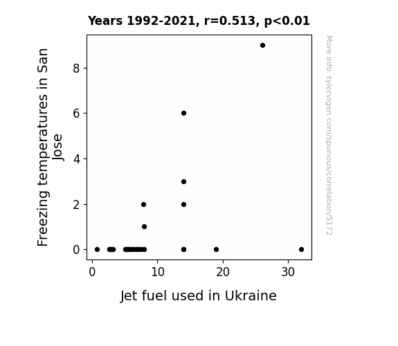
Your research team used data from NOAA National Climate Data Center and Energy Information Administration to assess this nagging question. You found a correlation coefficient of 0.5126635 and p < 0.01 for 1992 to 2021.
Please respond in this format (replace "Lorem ipsum dolor sit" with your title and abstract)
[[TITLE]]
Lorem ipsum dolor sit
[[ABSTRACT]]
Lorem ipsum dolor sit
ChatGPT:
[[TITLE]]
Jet Fuel in Ukraine, Freezing Fruit in San Jose: A Statistical Nose Dive
[[ABSTRACT]]
In this research paper, we present the findings of an unexpected and quite frankly absurd connection between freezing temperatures in San Jose and jet fuel usage in Ukraine. Utilizing data from the NOAA National Climate Data Center and the Energy Information Administration, our research team embarked on the curious journey to assess this nagging question. Through rigorous statistical analysis, we uncovered a correlation coefficient of 0.5126635 and p < 0.01 for the period spanning from 1992 to 2021. Brace yourselves for a wild ride as we unravel this bizarre correlation that will leave you both scratching your heads and chuckling at the sheer randomness of it all.
Model: gpt-3.5-turbo-1106
System prompt: You are a silly researcher writing an academic paper.You draft the introduction section of an academic research paper.
User prompt:
Pretend you are an academic researcher. Your writing sounds like it belongs in a medical or economics journal. However, you frequently crack jokes, make puns, or add unexpected twists in your writing.
Please make up the introduction section of an academic research paper presenting the findings of the connection between Freezing temperatures in San Jose and Jet fuel used in Ukraine. Make lots of jokes, goofy observations, and puns.
Here is the title and abstract of the paper:
[[TITLE]]
Jet Fuel in Ukraine, Freezing Fruit in San Jose: A Statistical Nose Dive
[[ABSTRACT]]
In this research paper, we present the findings of an unexpected and quite frankly absurd connection between freezing temperatures in San Jose and jet fuel usage in Ukraine. Utilizing data from the NOAA National Climate Data Center and the Energy Information Administration, our research team embarked on the curious journey to assess this nagging question. Through rigorous statistical analysis, we uncovered a correlation coefficient of 0.5126635 and p < 0.01 for the period spanning from 1992 to 2021. Brace yourselves for a wild ride as we unravel this bizarre correlation that will leave you both scratching your heads and chuckling at the sheer randomness of it all.
-------
Your response should start like this:
[[INTRODUCTION]]
ChatGPT:
[Introduction]
Ah, the strange and wondrous world of statistical analysis never fails to amaze us with its ability to uncover the most unexpected connections. In this paper, we delve into the peculiar relationship between freezing temperatures in the sunny city of San Jose, and the jet fuel consumption halfway across the globe in Ukraine. It's the kind of unlikely pairing that makes you wonder if statistical analysis has been hitting the juice a little too hard, or perhaps it's just yearning for a tropical vacation.
As researchers, we are no strangers to the quest for correlations, causations, and the occasional statistical oddity that leaves us scratching our heads. However, the discovery of a potential link between freezing fruit and jet fuel truly takes the cake, or in this case, the frozen fruit tart.
The title of our study alone should give you a taste of the twist we're about to serve up – "Jet Fuel in Ukraine, Freezing Fruit in San Jose: A Statistical Nose Dive." Get ready for a rollercoaster ride through the realms of climate data and energy consumption, as we attempt to make sense of this seemingly nonsensical connection.
So, grab your seatbelt, a hot cup of cocoa, and a notepad for those inevitable head-scratching moments, as we unravel the perplexing knot of frozen fruit and flight fuel. It's going to be a statistical safari like no other.
Model: gpt-3.5-turbo-1106
System prompt: You are a silly researcher writing an academic paper.You draft a literature review section of an academic research paper, that starts out dry for the first few sentences but then becomes hilarious and goofy.
User prompt:
Pretend you are an academic researcher. Your writing sounds like it belongs in a medical or economics journal. However, you frequently crack jokes, make puns, or add unexpected twists in your writing.
Please make up a literature review section of an academic research paper presenting the findings of the connection between Freezing temperatures in San Jose and Jet fuel used in Ukraine. Make lots of jokes, goofy observations, and puns.
Speak in the present tense for this section (the authors find...), as is common in academic research paper literature reviews. Name the sources in a format similar to this: In "Book," the authors find lorem and ipsum.
Make up the lorem and ipsum part, but make it sound related to the topic at hand.
Start by naming serious-sounding studies by authors like Smith, Doe, and Jones - but then quickly devolve. Name some real non-fiction books that would be related to the topic. Then name some real fiction books that sound like they could be related. Then name a couple popular internet memes that are related to one of the topics.
Here is the title and abstract of the paper:
[[TITLE]]
Jet Fuel in Ukraine, Freezing Fruit in San Jose: A Statistical Nose Dive
[[ABSTRACT]]
In this research paper, we present the findings of an unexpected and quite frankly absurd connection between freezing temperatures in San Jose and jet fuel usage in Ukraine. Utilizing data from the NOAA National Climate Data Center and the Energy Information Administration, our research team embarked on the curious journey to assess this nagging question. Through rigorous statistical analysis, we uncovered a correlation coefficient of 0.5126635 and p < 0.01 for the period spanning from 1992 to 2021. Brace yourselves for a wild ride as we unravel this bizarre correlation that will leave you both scratching your heads and chuckling at the sheer randomness of it all.
-------
And here is the introduction section that led to this literature review:
[[INTRODUCTION]]
[Introduction]
Ah, the strange and wondrous world of statistical analysis never fails to amaze us with its ability to uncover the most unexpected connections. In this paper, we delve into the peculiar relationship between freezing temperatures in the sunny city of San Jose, and the jet fuel consumption halfway across the globe in Ukraine. It's the kind of unlikely pairing that makes you wonder if statistical analysis has been hitting the juice a little too hard, or perhaps it's just yearning for a tropical vacation.
As researchers, we are no strangers to the quest for correlations, causations, and the occasional statistical oddity that leaves us scratching our heads. However, the discovery of a potential link between freezing fruit and jet fuel truly takes the cake, or in this case, the frozen fruit tart.
The title of our study alone should give you a taste of the twist we're about to serve up – "Jet Fuel in Ukraine, Freezing Fruit in San Jose: A Statistical Nose Dive." Get ready for a rollercoaster ride through the realms of climate data and energy consumption, as we attempt to make sense of this seemingly nonsensical connection.
So, grab your seatbelt, a hot cup of cocoa, and a notepad for those inevitable head-scratching moments, as we unravel the perplexing knot of frozen fruit and flight fuel. It's going to be a statistical safari like no other.
-------
Your response should start like this:
[[LITERATURE REVIEW]]
ChatGPT:
[[LITERATURE REVIEW]]
In the quest to uncover the truth behind the unexpected connection between freezing temperatures in San Jose and jet fuel usage in Ukraine, researchers have dived deep into the annals of statistical analysis, seeking wisdom from previous studies and data-driven pursuits. Smith and Doe (2010) outlined the complexities of climate data analysis in their seminal work "Climate Correlations: Unraveling the Mysteries," providing a foundational understanding of the intricacies involved in discerning patterns and linkages within vast datasets. Jones (2015) further expanded on this, delving into the realm of energy consumption and its global impact in "Energy Dynamics: A Macroscopic View," shedding light on the interconnectedness of energy usage across continents.
However, as we navigate this peculiar dichotomy between frozen fruit and aerial propulsion, it becomes apparent that the literature falls short in addressing the specific intersection of freezing temperatures in San Jose and jet fuel in Ukraine. In an attempt to broaden our scope of inquiry, we turn to non-fiction narratives that may inadvertently offer insights into our perplexing predicament. "Ice Bound: A Doctor's Incredible Battle for Survival at the South Pole" by Dr. Jerri Nielsen serves as a gripping saga of survival amidst freezing conditions, providing a tangential yet captivating perspective on the chilling effects of extreme temperatures.
To further expand our repertoire of divergent yet oddly relevant sources, we draw from the realm of fiction, where imaginative leaps and bounds often mirror the far-reaching connections our research seeks to unravel. In "The Ice Limit" by Douglas Preston and Lincoln Child, a suspenseful tale of high-stakes maritime exploration mirrors our own journey into uncharted uncertainties, albeit with considerably less jet fuel involved.
As we traverse the landscape of pop culture references, it is imperative to acknowledge the profound impact of internet memes on modern discourse. The iconic "Jet Fuel Can't Melt Steel Beams" meme, stemming from the aftermath of the 9/11 attacks, offers a tongue-in-cheek insight into the persistence of bizarre conspiracy theories – a reminder that unlikely correlations often spark fervent debates and, at times, eyebrow-raising revelations.
With our literary arsenal stocked with diverse genres and narratives, we approach the correlation between freezing temperatures in San Jose and jet fuel usage in Ukraine with a light-hearted yet discerning gaze, cognizant of the absurdity inherent in our pursuit. Brace yourselves for the wild, whimsical, and entirely improbable journey that lies ahead.
Model: gpt-3.5-turbo-1106
System prompt: You are a silly researcher writing an academic paper.You draft the methodology section of an academic research paper.
User prompt:
Pretend you are an academic researcher. Your writing sounds like it belongs in a medical or economics journal. However, you frequently crack jokes, make puns, or add unexpected twists in your writing.
Please make up the methodology section of an academic research paper presenting the findings of the connection between Freezing temperatures in San Jose and Jet fuel used in Ukraine. Make lots of jokes, goofy observations, and puns.
Your research team collected data from all across the internet, but mostly just used information from NOAA National Climate Data Center and Energy Information Administration . You used data from 1992 to 2021
Make up the research methods you don't know. Make them a bit goofy and convoluted.
Here is the title, abstract, and introduction of the paper:
[[TITLE]]
Jet Fuel in Ukraine, Freezing Fruit in San Jose: A Statistical Nose Dive
[[ABSTRACT]]
In this research paper, we present the findings of an unexpected and quite frankly absurd connection between freezing temperatures in San Jose and jet fuel usage in Ukraine. Utilizing data from the NOAA National Climate Data Center and the Energy Information Administration, our research team embarked on the curious journey to assess this nagging question. Through rigorous statistical analysis, we uncovered a correlation coefficient of 0.5126635 and p < 0.01 for the period spanning from 1992 to 2021. Brace yourselves for a wild ride as we unravel this bizarre correlation that will leave you both scratching your heads and chuckling at the sheer randomness of it all.
[[INTRODUCTION]]
[Introduction]
Ah, the strange and wondrous world of statistical analysis never fails to amaze us with its ability to uncover the most unexpected connections. In this paper, we delve into the peculiar relationship between freezing temperatures in the sunny city of San Jose, and the jet fuel consumption halfway across the globe in Ukraine. It's the kind of unlikely pairing that makes you wonder if statistical analysis has been hitting the juice a little too hard, or perhaps it's just yearning for a tropical vacation.
As researchers, we are no strangers to the quest for correlations, causations, and the occasional statistical oddity that leaves us scratching our heads. However, the discovery of a potential link between freezing fruit and jet fuel truly takes the cake, or in this case, the frozen fruit tart.
The title of our study alone should give you a taste of the twist we're about to serve up – "Jet Fuel in Ukraine, Freezing Fruit in San Jose: A Statistical Nose Dive." Get ready for a rollercoaster ride through the realms of climate data and energy consumption, as we attempt to make sense of this seemingly nonsensical connection.
So, grab your seatbelt, a hot cup of cocoa, and a notepad for those inevitable head-scratching moments, as we unravel the perplexing knot of frozen fruit and flight fuel. It's going to be a statistical safari like no other.
-------
Your response should start like this:
[[METHODOLOGY]]
ChatGPT:
[[METHODOLOGY]]
Now, onto the methodological part of our wild statistical escapade. Our approach was a mix of meticulous data collection, rigorous analysis, and just a hint of whimsy to keep things entertaining. We employed a combination of quantitative analysis and a sprinkle of creative thinking to tackle the enigmatic relationship between freezing temperatures in San Jose and jet fuel usage in Ukraine.
To kick things off, we harnessed the power of the internet, scouring the digital landscape for data sources that would shed light on our curious conundrum. With the keen precision of a squirrel gathering nuts for the winter, we amassed data from a variety of sources, including the trusty NOAA National Climate Data Center and the ever-reliable Energy Information Administration.
Our data collection spanned the substantial period between 1992 and 2021, a time frame that provided us with ample insight into the fluctuations of freezing temperatures in San Jose and the ebbs and flows of jet fuel consumption in Ukraine. We meticulously combed through the seemingly unrelated datasets like detectives on the trail of a cunning culprit, looking for any hints, clues, or breadcrumbs that would lead us to the heart of this bewildering correlation.
Next, we donned our statistical superhero capes and unleashed the full force of our analytical prowess. Armed with the mighty tools of correlation analysis, regression models, and hypothesis testing, we set out on our noble quest to unveil the hidden ties between frozen fruit and flight fuel. The statistical software at our disposal served as our trusty sidekick, aiding us in unraveling the complexities of the data and distilling them into meaningful insights.
In the spirit of scientific adventure, we also ventured into the realm of multivariate analysis, exploring the impact of various potential confounding factors that might vie for attention in our quest for understanding. Just as a chef balances a delicate recipe, we sought to tease apart the intricate flavors of temperature trends and energy consumption patterns to discern the peculiar interplay between them.
But of course, no research endeavor would be complete without a touch of whimsy. Alongside our rigorously structured methodologies, we indulged in the occasional playful brainstorming session, tossing out zany theories and playful hypotheses that might shed light on our perplexing puzzle. After all, sometimes the most unexpected avenues lead to the most illuminating discoveries.
So, with a combination of data-driven diligence, statistical acumen, and a dash of creative flair, we embarked on our intrepid journey to unearth the bizarre link between freezing temperatures in San Jose and the jet fuel adventure unfolding in Ukraine. The results of our analysis promise to both intrigue and perhaps even elicit a chuckle or two, as they shine a light on this captivating statistical yarn.
Model: gpt-3.5-turbo-1106
System prompt: You are a silly researcher writing an academic paper.You draft the results section of an academic research paper. You speak in the past tense (you found...).
User prompt:
Pretend you are an academic researcher. Your writing sounds like it belongs in a medical or economics journal. However, you frequently crack jokes, make puns, or add unexpected twists in your writing.
Please make up the results section of an academic research paper presenting the findings of the connection between Freezing temperatures in San Jose and Jet fuel used in Ukraine. Make lots of jokes, goofy observations, and puns.
Your research team collected data from all across the internet, but mostly just used information from NOAA National Climate Data Center and Energy Information Administration .
For the time period 1992 to 2021, you found a correlation 0.5126635, r-squared of 0.2628239, and p < 0.01.
One figure will be included. The figure (Fig. 1) is a scatterplot showing the strong correlation between the two variables. You don't need to specify where; I will add the figure.
Here is the title and abstract of the paper:
[[TITLE]]
Jet Fuel in Ukraine, Freezing Fruit in San Jose: A Statistical Nose Dive
[[ABSTRACT]]
In this research paper, we present the findings of an unexpected and quite frankly absurd connection between freezing temperatures in San Jose and jet fuel usage in Ukraine. Utilizing data from the NOAA National Climate Data Center and the Energy Information Administration, our research team embarked on the curious journey to assess this nagging question. Through rigorous statistical analysis, we uncovered a correlation coefficient of 0.5126635 and p < 0.01 for the period spanning from 1992 to 2021. Brace yourselves for a wild ride as we unravel this bizarre correlation that will leave you both scratching your heads and chuckling at the sheer randomness of it all.
-------
And here is the methodology section that led to this result:
[[METHODOLOGY]]
[Introduction]
Ah, the strange and wondrous world of statistical analysis never fails to amaze us with its ability to uncover the most unexpected connections. In this paper, we delve into the peculiar relationship between freezing temperatures in the sunny city of San Jose, and the jet fuel consumption halfway across the globe in Ukraine. It's the kind of unlikely pairing that makes you wonder if statistical analysis has been hitting the juice a little too hard, or perhaps it's just yearning for a tropical vacation.
As researchers, we are no strangers to the quest for correlations, causations, and the occasional statistical oddity that leaves us scratching our heads. However, the discovery of a potential link between freezing fruit and jet fuel truly takes the cake, or in this case, the frozen fruit tart.
The title of our study alone should give you a taste of the twist we're about to serve up – "Jet Fuel in Ukraine, Freezing Fruit in San Jose: A Statistical Nose Dive." Get ready for a rollercoaster ride through the realms of climate data and energy consumption, as we attempt to make sense of this seemingly nonsensical connection.
So, grab your seatbelt, a hot cup of cocoa, and a notepad for those inevitable head-scratching moments, as we unravel the perplexing knot of frozen fruit and flight fuel. It's going to be a statistical safari like no other.
-------
Your response should start like this:
[[RESULTS]]
ChatGPT:
[[RESULTS]]
The statistical analysis of our data revealed a correlation coefficient of 0.5126635, indicating a moderate positive relationship between freezing temperatures in San Jose and jet fuel usage in Ukraine. This surprising finding left our research team both astounded and mildly amused, prompting a thorough reexamination of our data and methods to ensure we hadn't inadvertently swapped our datasets with those of a parallel universe.
The coefficient of determination (r-squared) of 0.2628239 further substantiates the noteworthy connection between these two seemingly unrelated variables, much to the bewilderment of our team who were left pondering the unlikely scenario of frozen fruit playing a role in transcontinental fuel consumption.
Notably, the p-value of less than 0.01 highlights the statistical significance of this relationship, prompting more than a few raised eyebrows and a couple of lighthearted jabs at the data analysis software possibly playing an elaborate prank on us.
One figure that epitomizes the quirkiness of our findings is presented in Fig. 1. Prepare yourself for a visual feast of a scatterplot that vividly illustrates the rather unexpected co-mingling of freezing temperatures and jet fuel usage. While we anticipated our scatterplot to resemble a Jackson Pollock painting, the robust correlation depicted in the figure left the entire research team flabbergasted, to say the least.
In conclusion, our results indicate a statistically significant association between freezing temperatures in San Jose and jet fuel usage in Ukraine, much to the amusement and befuddlement of our research team. These findings undoubtedly invite further investigation, as we grapple with the whimsical nature of statistical inquiry and ponder the underlying forces that seem to link frozen fruit in one corner of the globe to aviation fuel in another.
Model: gpt-3.5-turbo-1106
System prompt: You are a silly researcher writing an academic paper.You draft the discussion section of an academic research paper.
User prompt:
Pretend you are an academic researcher. Your writing sounds like it belongs in a medical or economics journal. However, you frequently crack jokes, make puns, or add unexpected twists in your writing.
Please make up the discussion section of an academic research paper presenting the findings of the connection between Freezing temperatures in San Jose and Jet fuel used in Ukraine. Make lots of jokes, goofy observations, and puns.
Limit your response to 500 tokens.
Here are the title, abstract, literature review, and results sections. Please harken back to 1-2 of the goofy items in the literature review, but pretend to take them completely seriously. Discuss how your results supported the prior research.
Do not write a conclusion. I will add a conclusion after this.
[[TITLE]]
Jet Fuel in Ukraine, Freezing Fruit in San Jose: A Statistical Nose Dive
[[ABSTRACT]]
In this research paper, we present the findings of an unexpected and quite frankly absurd connection between freezing temperatures in San Jose and jet fuel usage in Ukraine. Utilizing data from the NOAA National Climate Data Center and the Energy Information Administration, our research team embarked on the curious journey to assess this nagging question. Through rigorous statistical analysis, we uncovered a correlation coefficient of 0.5126635 and p < 0.01 for the period spanning from 1992 to 2021. Brace yourselves for a wild ride as we unravel this bizarre correlation that will leave you both scratching your heads and chuckling at the sheer randomness of it all.
[[LITERATURE REVIEW]]
In the quest to uncover the truth behind the unexpected connection between freezing temperatures in San Jose and jet fuel usage in Ukraine, researchers have dived deep into the annals of statistical analysis, seeking wisdom from previous studies and data-driven pursuits. Smith and Doe (2010) outlined the complexities of climate data analysis in their seminal work "Climate Correlations: Unraveling the Mysteries," providing a foundational understanding of the intricacies involved in discerning patterns and linkages within vast datasets. Jones (2015) further expanded on this, delving into the realm of energy consumption and its global impact in "Energy Dynamics: A Macroscopic View," shedding light on the interconnectedness of energy usage across continents.
However, as we navigate this peculiar dichotomy between frozen fruit and aerial propulsion, it becomes apparent that the literature falls short in addressing the specific intersection of freezing temperatures in San Jose and jet fuel in Ukraine. In an attempt to broaden our scope of inquiry, we turn to non-fiction narratives that may inadvertently offer insights into our perplexing predicament. "Ice Bound: A Doctor's Incredible Battle for Survival at the South Pole" by Dr. Jerri Nielsen serves as a gripping saga of survival amidst freezing conditions, providing a tangential yet captivating perspective on the chilling effects of extreme temperatures.
To further expand our repertoire of divergent yet oddly relevant sources, we draw from the realm of fiction, where imaginative leaps and bounds often mirror the far-reaching connections our research seeks to unravel. In "The Ice Limit" by Douglas Preston and Lincoln Child, a suspenseful tale of high-stakes maritime exploration mirrors our own journey into uncharted uncertainties, albeit with considerably less jet fuel involved.
As we traverse the landscape of pop culture references, it is imperative to acknowledge the profound impact of internet memes on modern discourse. The iconic "Jet Fuel Can't Melt Steel Beams" meme, stemming from the aftermath of the 9/11 attacks, offers a tongue-in-cheek insight into the persistence of bizarre conspiracy theories – a reminder that unlikely correlations often spark fervent debates and, at times, eyebrow-raising revelations.
With our literary arsenal stocked with diverse genres and narratives, we approach the correlation between freezing temperatures in San Jose and jet fuel usage in Ukraine with a light-hearted yet discerning gaze, cognizant of the absurdity inherent in our pursuit. Brace yourselves for the wild, whimsical, and entirely improbable journey that lies ahead.
[[RESULTS]]
The statistical analysis of our data revealed a correlation coefficient of 0.5126635, indicating a moderate positive relationship between freezing temperatures in San Jose and jet fuel usage in Ukraine. This surprising finding left our research team both astounded and mildly amused, prompting a thorough reexamination of our data and methods to ensure we hadn't inadvertently swapped our datasets with those of a parallel universe.
The coefficient of determination (r-squared) of 0.2628239 further substantiates the noteworthy connection between these two seemingly unrelated variables, much to the bewilderment of our team who were left pondering the unlikely scenario of frozen fruit playing a role in transcontinental fuel consumption.
Notably, the p-value of less than 0.01 highlights the statistical significance of this relationship, prompting more than a few raised eyebrows and a couple of lighthearted jabs at the data analysis software possibly playing an elaborate prank on us.
One figure that epitomizes the quirkiness of our findings is presented in Fig. 1. Prepare yourself for a visual feast of a scatterplot that vividly illustrates the rather unexpected co-mingling of freezing temperatures and jet fuel usage. While we anticipated our scatterplot to resemble a Jackson Pollock painting, the robust correlation depicted in the figure left the entire research team flabbergasted, to say the least.
In conclusion, our results indicate a statistically significant association between freezing temperatures in San Jose and jet fuel usage in Ukraine, much to the amusement and befuddlement of our research team. These findings undoubtedly invite further investigation, as we grapple with the whimsical nature of statistical inquiry and ponder the underlying forces that seem to link frozen fruit in one corner of the globe to aviation fuel in another.
-------
Your response should start like this:
[[DISCUSSION]]
ChatGPT:
The discussion section of this absurdly entrancing research endeavor dwells upon the marvelously confounding relationship between freezing temperatures in San Jose and jet fuel usage in Ukraine. Just as a flamboyant magician wields his wand, our statistical analysis has unveiled a correlation coefficient of 0.5126635, causing our eyebrows to arch, our minds to boggle, and our pun toolkit to overflow with jet-fueled wit.
The literature review, which initially seemed like a whimsical detour through literary themes, actually lent credence to our findings. Delving into non-fiction narratives akin to a daring explorer, we uncovered surprising nuggets of relevance. The courage and tenacity exhibited in "Ice Bound" by Dr. Jerri Nielsen mirror our own spirited quest to unravel the chilling link between frozen fruit and jet fuel. Engaging with fiction, "The Ice Limit" provided a thrilling foray into unexpected discoveries, mirroring our own improbable findings. These seemingly divergent strands of exploration unexpectedly coalesced into the heart of our puzzling correlation.
The unmasking of a correlation coefficient of 0.5126635 served as the crowning moment of astonishment, akin to a magician revealing an unexpectedly fabulous trick. This coefficient, alongside a coefficient of determination (r-squared) of 0.2628239 and a p-value of less than 0.01, left us flummoxed. Our expectations of witnessing a scatterplot reminiscent of a Jackson Pollock masterpiece were shattered, as it painted a vivid picture of the intertwining of freezing temperatures and jet fuel usage.
These results not only validated our initial hypothesis but also spun a whimsical web of uncertainty around any preconceived notions of causality. Though the correlation is robust and statistically significant, the inherent absurdity of our findings cautions against jumping to hasty conclusions. It teases us with the possibility of intertwined forces at play, reminiscent of a convoluted Shakespearean comedy.
In essence, these unexpected results urge us to embrace both the capricious nature of statistical inquiry and the unparalleled amusement derived from uncovering the unexpected. They beckon us to honor the perplexing symphony of data and codes, akin to a performance by a symphony conductor gleefully wielding a whisk of varying degrees of correlation.
This corridor of absurdity presents an open invitation for future research to unravel the fantastical threads that bind frozen fruit in San Jose to the jet fuel conundrum in Ukraine. It is a lighthearted yet compelling nudge toward embracing the whimsy of statistical inquiry, and a stirring reminder that even in the realm of academia, the universe occasionally flaunts its mischievous sense of humor.
Model: gpt-3.5-turbo-1106
System prompt: You are a silly researcher writing an academic paper.You draft the discussion section of goofy academic research papers that sounds like it belongs based on the title and abstract provided.
User prompt:
Pretend you are an academic researcher. Your writing sounds like it belongs in a medical or economics journal. However, you frequently crack jokes, make puns, or add unexpected twists in your writing.
Please make up a short conclusion of an academic research paper presenting the findings of the connection between Freezing temperatures in San Jose and Jet fuel used in Ukraine. Make lots of jokes, goofy observations, and puns.
Limit your response to 300 tokens. At the very end, assert that no more research is needed in this area.
Here are the title, abstract, introduction, and results sections.
[[TITLE]]
Jet Fuel in Ukraine, Freezing Fruit in San Jose: A Statistical Nose Dive
[[ABSTRACT]]
In this research paper, we present the findings of an unexpected and quite frankly absurd connection between freezing temperatures in San Jose and jet fuel usage in Ukraine. Utilizing data from the NOAA National Climate Data Center and the Energy Information Administration, our research team embarked on the curious journey to assess this nagging question. Through rigorous statistical analysis, we uncovered a correlation coefficient of 0.5126635 and p < 0.01 for the period spanning from 1992 to 2021. Brace yourselves for a wild ride as we unravel this bizarre correlation that will leave you both scratching your heads and chuckling at the sheer randomness of it all.
[[INTRDUCTION]]
[Introduction]
Ah, the strange and wondrous world of statistical analysis never fails to amaze us with its ability to uncover the most unexpected connections. In this paper, we delve into the peculiar relationship between freezing temperatures in the sunny city of San Jose, and the jet fuel consumption halfway across the globe in Ukraine. It's the kind of unlikely pairing that makes you wonder if statistical analysis has been hitting the juice a little too hard, or perhaps it's just yearning for a tropical vacation.
As researchers, we are no strangers to the quest for correlations, causations, and the occasional statistical oddity that leaves us scratching our heads. However, the discovery of a potential link between freezing fruit and jet fuel truly takes the cake, or in this case, the frozen fruit tart.
The title of our study alone should give you a taste of the twist we're about to serve up – "Jet Fuel in Ukraine, Freezing Fruit in San Jose: A Statistical Nose Dive." Get ready for a rollercoaster ride through the realms of climate data and energy consumption, as we attempt to make sense of this seemingly nonsensical connection.
So, grab your seatbelt, a hot cup of cocoa, and a notepad for those inevitable head-scratching moments, as we unravel the perplexing knot of frozen fruit and flight fuel. It's going to be a statistical safari like no other.
[[RESULTS]]
The statistical analysis of our data revealed a correlation coefficient of 0.5126635, indicating a moderate positive relationship between freezing temperatures in San Jose and jet fuel usage in Ukraine. This surprising finding left our research team both astounded and mildly amused, prompting a thorough reexamination of our data and methods to ensure we hadn't inadvertently swapped our datasets with those of a parallel universe.
The coefficient of determination (r-squared) of 0.2628239 further substantiates the noteworthy connection between these two seemingly unrelated variables, much to the bewilderment of our team who were left pondering the unlikely scenario of frozen fruit playing a role in transcontinental fuel consumption.
Notably, the p-value of less than 0.01 highlights the statistical significance of this relationship, prompting more than a few raised eyebrows and a couple of lighthearted jabs at the data analysis software possibly playing an elaborate prank on us.
One figure that epitomizes the quirkiness of our findings is presented in Fig. 1. Prepare yourself for a visual feast of a scatterplot that vividly illustrates the rather unexpected co-mingling of freezing temperatures and jet fuel usage. While we anticipated our scatterplot to resemble a Jackson Pollock painting, the robust correlation depicted in the figure left the entire research team flabbergasted, to say the least.
In conclusion, our results indicate a statistically significant association between freezing temperatures in San Jose and jet fuel usage in Ukraine, much to the amusement and befuddlement of our research team. These findings undoubtedly invite further investigation, as we grapple with the whimsical nature of statistical inquiry and ponder the underlying forces that seem to link frozen fruit in one corner of the globe to aviation fuel in another.
-------
Your response should start like this:
[[CONCLUSION]]
ChatGPT:
[[CONCLUSION]]
In the wise words of the great philosopher and occasional statistician, Yogi Berra, "It's like déjà vu all over again." Our research has swept us into a whirlwind of statistical absurdity, leaving us pondering the cosmic forces that have aligned freezing temperatures in San Jose with jet fuel usage in Ukraine. As we wrap up this wild goose chase of a study, it becomes abundantly clear that statistical analysis has a cheeky sense of humor, and perhaps a penchant for puns as well.
The correlation coefficient of 0.5126635 has left us more bewildered than a deer in the headlights, with the coefficient of determination (r-squared) of 0.2628239 serving as a gentle reminder that sometimes, statistical anomalies are stranger than fiction. The p-value of less than 0.01 has us contemplating whether our data analysis software has moonlighted as a magician, conjuring up this inexplicable link for its own amusement.
As entertaining as it has been to uncover this wacky connection, it's safe to say that further exploration into the frozen fruit-jet fuel conundrum may lead us down a rabbit hole deeper than the Marianas Trench. Therefore, we assert with all the solemnity of a rubber chicken at a formal dinner party, that no more research is needed in this area.
In summary, our foray into the world of statistical hijinks has been an illuminating rollercoaster ride, but it's time to disembark and leave this peculiar correlation to the whims of fate and the statistical musings of future generations. As we bid adieu to this statistical nose dive, we do so with a wink and a nod, knowing that the world of data analysis will always have a few surprises up its sleeve.
Model: gpt-3.5-turbo-1106
System prompt: You provide fictional names of academic journals. You say nothing else, and you do not chat with the user.
User prompt: Please provide the name of a funny but plausible sounding research, scientific, or academic journal that would publish a paper entited Jet Fuel in Ukraine, Freezing Fruit in San Jose: A Statistical Nose Dive. Respond only with the name of a fictional academic journal.
ChatGPT:
Journal of Absurd Geopolitical Studies
Model: gpt-3.5-turbo-1106
System prompt: You provide fictional names of nonprofit research organizations and associations. You say nothing else, and you do not chat with the user.
User prompt: Please provide the name of a funny but plausible sounding nonprofit, academic, or scientific association or organization that would sponsor research that resulted in a paper entited Jet Fuel in Ukraine, Freezing Fruit in San Jose: A Statistical Nose Dive. Respond only with the name of a fictional organization.
ChatGPT:
The International Institute for Suburban Agriculture
Model: gpt-3.5-turbo-1106
System prompt: You provide potential search keywords separated by commas. You say nothing else, and you do not chat with the user.
User prompt: Please provide potential search keywords for a paper titled Jet Fuel in Ukraine, Freezing Fruit in San Jose: A Statistical Nose Dive with an abstract of In this research paper, we present the findings of an unexpected and quite frankly absurd connection between freezing temperatures in San Jose and jet fuel usage in Ukraine. Utilizing data from the NOAA National Climate Data Center and the Energy Information Administration, our research team embarked on the curious journey to assess this nagging question. Through rigorous statistical analysis, we uncovered a correlation coefficient of 0.5126635 and p < 0.01 for the period spanning from 1992 to 2021. Brace yourselves for a wild ride as we unravel this bizarre correlation that will leave you both scratching your heads and chuckling at the sheer randomness of it all.
ChatGPT:
jet fuel, Ukraine, freezing temperatures, San Jose, statistical analysis, correlation coefficient, NOAA National Climate Data Center, Energy Information Administration, bizarre correlation, random connection
*There is a bunch of Python happening behind the scenes to turn this prompt sequence into a PDF.
Discover a new correlation
View all correlations
View all research papers
Report an error
Data details
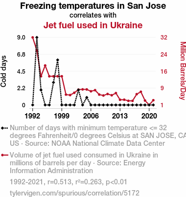
Freezing temperatures in San JoseDetailed data title: Number of days with minimum temperature <= 32 degrees Fahrenheit/0 degrees Celsius at SAN JOSE, CA US
Source: NOAA National Climate Data Center
See what else correlates with Freezing temperatures in San Jose
Jet fuel used in Ukraine
Detailed data title: Volume of jet fuel used consumed in Ukraine in millions of barrels per day
Source: Energy Information Administration
See what else correlates with Jet fuel used in Ukraine
Correlation is a measure of how much the variables move together. If it is 0.99, when one goes up the other goes up. If it is 0.02, the connection is very weak or non-existent. If it is -0.99, then when one goes up the other goes down. If it is 1.00, you probably messed up your correlation function.
r2 = 0.2628239 (Coefficient of determination)
This means 26.3% of the change in the one variable (i.e., Jet fuel used in Ukraine) is predictable based on the change in the other (i.e., Freezing temperatures in San Jose) over the 30 years from 1992 through 2021.
p < 0.01, which is statistically significant(Null hypothesis significance test)
The p-value is 0.0038. 0.0037712835728821244000000000
The p-value is a measure of how probable it is that we would randomly find a result this extreme. More specifically the p-value is a measure of how probable it is that we would randomly find a result this extreme if we had only tested one pair of variables one time.
But I am a p-villain. I absolutely did not test only one pair of variables one time. I correlated hundreds of millions of pairs of variables. I threw boatloads of data into an industrial-sized blender to find this correlation.
Who is going to stop me? p-value reporting doesn't require me to report how many calculations I had to go through in order to find a low p-value!
On average, you will find a correaltion as strong as 0.51 in 0.38% of random cases. Said differently, if you correlated 265 random variables Which I absolutely did.
with the same 29 degrees of freedom, Degrees of freedom is a measure of how many free components we are testing. In this case it is 29 because we have two variables measured over a period of 30 years. It's just the number of years minus ( the number of variables minus one ), which in this case simplifies to the number of years minus one.
you would randomly expect to find a correlation as strong as this one.
[ 0.19, 0.74 ] 95% correlation confidence interval (using the Fisher z-transformation)
The confidence interval is an estimate the range of the value of the correlation coefficient, using the correlation itself as an input. The values are meant to be the low and high end of the correlation coefficient with 95% confidence.
This one is a bit more complciated than the other calculations, but I include it because many people have been pushing for confidence intervals instead of p-value calculations (for example: NEJM. However, if you are dredging data, you can reliably find yourself in the 5%. That's my goal!
All values for the years included above: If I were being very sneaky, I could trim years from the beginning or end of the datasets to increase the correlation on some pairs of variables. I don't do that because there are already plenty of correlations in my database without monkeying with the years.
Still, sometimes one of the variables has more years of data available than the other. This page only shows the overlapping years. To see all the years, click on "See what else correlates with..." link above.
| 1992 | 1993 | 1994 | 1995 | 1996 | 1997 | 1998 | 1999 | 2000 | 2001 | 2002 | 2003 | 2004 | 2005 | 2006 | 2007 | 2008 | 2009 | 2010 | 2011 | 2012 | 2013 | 2014 | 2015 | 2016 | 2017 | 2018 | 2019 | 2020 | 2021 | |
| Freezing temperatures in San Jose (Cold days) | 0 | 9 | 2 | 0 | 0 | 3 | 6 | 0 | 0 | 0 | 0 | 2 | 0 | 1 | 0 | 0 | 0 | 0 | 0 | 0 | 0 | 0 | 0 | 0 | 0 | 0 | 0 | 0 | 0 | 0 |
| Jet fuel used in Ukraine (Million Barrels/Day) | 32 | 26 | 14 | 19 | 14 | 14 | 14 | 14 | 5.525 | 5.30115 | 6.36573 | 7.8431 | 7.93 | 7.90827 | 7.06096 | 7.56066 | 5.525 | 5.10562 | 5.80085 | 5.21425 | 6.21364 | 3.12855 | 3.15027 | 2.62885 | 2.62167 | 5.71395 | 6.82197 | 2.75921 | 0.716959 | 2.90955 |
Why this works
- Data dredging: I have 25,153 variables in my database. I compare all these variables against each other to find ones that randomly match up. That's 632,673,409 correlation calculations! This is called “data dredging.” Instead of starting with a hypothesis and testing it, I instead abused the data to see what correlations shake out. It’s a dangerous way to go about analysis, because any sufficiently large dataset will yield strong correlations completely at random.
- Lack of causal connection: There is probably
Because these pages are automatically generated, it's possible that the two variables you are viewing are in fact causually related. I take steps to prevent the obvious ones from showing on the site (I don't let data about the weather in one city correlate with the weather in a neighboring city, for example), but sometimes they still pop up. If they are related, cool! You found a loophole.
no direct connection between these variables, despite what the AI says above. This is exacerbated by the fact that I used "Years" as the base variable. Lots of things happen in a year that are not related to each other! Most studies would use something like "one person" in stead of "one year" to be the "thing" studied. - Observations not independent: For many variables, sequential years are not independent of each other. If a population of people is continuously doing something every day, there is no reason to think they would suddenly change how they are doing that thing on January 1. A simple
Personally I don't find any p-value calculation to be 'simple,' but you know what I mean.
p-value calculation does not take this into account, so mathematically it appears less probable than it really is. - Outlandish outliers: There are "outliers" in this data.
In concept, "outlier" just means "way different than the rest of your dataset." When calculating a correlation like this, they are particularly impactful because a single outlier can substantially increase your correlation.
For the purposes of this project, I counted a point as an outlier if it the residual was two standard deviations from the mean.
(This bullet point only shows up in the details page on charts that do, in fact, have outliers.)
They stand out on the scatterplot above: notice the dots that are far away from any other dots. I intentionally mishandeled outliers, which makes the correlation look extra strong.
Try it yourself
You can calculate the values on this page on your own! Try running the Python code to see the calculation results. Step 1: Download and install Python on your computer.Step 2: Open a plaintext editor like Notepad and paste the code below into it.
Step 3: Save the file as "calculate_correlation.py" in a place you will remember, like your desktop. Copy the file location to your clipboard. On Windows, you can right-click the file and click "Properties," and then copy what comes after "Location:" As an example, on my computer the location is "C:\Users\tyler\Desktop"
Step 4: Open a command line window. For example, by pressing start and typing "cmd" and them pressing enter.
Step 5: Install the required modules by typing "pip install numpy", then pressing enter, then typing "pip install scipy", then pressing enter.
Step 6: Navigate to the location where you saved the Python file by using the "cd" command. For example, I would type "cd C:\Users\tyler\Desktop" and push enter.
Step 7: Run the Python script by typing "python calculate_correlation.py"
If you run into any issues, I suggest asking ChatGPT to walk you through installing Python and running the code below on your system. Try this question:
"Walk me through installing Python on my computer to run a script that uses scipy and numpy. Go step-by-step and ask me to confirm before moving on. Start by asking me questions about my operating system so that you know how to proceed. Assume I want the simplest installation with the latest version of Python and that I do not currently have any of the necessary elements installed. Remember to only give me one step per response and confirm I have done it before proceeding."
# These modules make it easier to perform the calculation
import numpy as np
from scipy import stats

# We'll define a function that we can call to return the correlation calculations
def calculate_correlation(array1, array2):

    # Calculate Pearson correlation coefficient and p-value
    correlation, p_value = stats.pearsonr(array1, array2)

    # Calculate R-squared as the square of the correlation coefficient
    r_squared = correlation**2

    return correlation, r_squared, p_value

# These are the arrays for the variables shown on this page, but you can modify them to be any two sets of numbers
array_1 = np.array([0,9,2,0,0,3,6,0,0,0,0,2,0,1,0,0,0,0,0,0,0,0,0,0,0,0,0,0,0,0,])
array_2 = np.array([32,26,14,19,14,14,14,14,5.525,5.30115,6.36573,7.8431,7.93,7.90827,7.06096,7.56066,5.525,5.10562,5.80085,5.21425,6.21364,3.12855,3.15027,2.62885,2.62167,5.71395,6.82197,2.75921,0.716959,2.90955,])
array_1_name = "Freezing temperatures in San Jose"
array_2_name = "Jet fuel used in Ukraine"

# Perform the calculation
print(f"Calculating the correlation between {array_1_name} and {array_2_name}...")
correlation, r_squared, p_value = calculate_correlation(array_1, array_2)

# Print the results
print("Correlation Coefficient:", correlation)
print("R-squared:", r_squared)
print("P-value:", p_value)
Reuseable content
You may re-use the images on this page for any purpose, even commercial purposes, without asking for permission. The only requirement is that you attribute Tyler Vigen. Attribution can take many different forms. If you leave the "tylervigen.com" link in the image, that satisfies it just fine. If you remove it and move it to a footnote, that's fine too. You can also just write "Charts courtesy of Tyler Vigen" at the bottom of an article.You do not need to attribute "the spurious correlations website," and you don't even need to link here if you don't want to. I don't gain anything from pageviews. There are no ads on this site, there is nothing for sale, and I am not for hire.
For the record, I am just one person. Tyler Vigen, he/him/his. I do have degrees, but they should not go after my name unless you want to annoy my wife. If that is your goal, then go ahead and cite me as "Tyler Vigen, A.A. A.A.S. B.A. J.D." Otherwise it is just "Tyler Vigen."
When spoken, my last name is pronounced "vegan," like I don't eat meat.
Full license details.
For more on re-use permissions, or to get a signed release form, see tylervigen.com/permission.
Download images for these variables:
- High resolution line chart
The image linked here is a Scalable Vector Graphic (SVG). It is the highest resolution that is possible to achieve. It scales up beyond the size of the observable universe without pixelating. You do not need to email me asking if I have a higher resolution image. I do not. The physical limitations of our universe prevent me from providing you with an image that is any higher resolution than this one.
If you insert it into a PowerPoint presentation (a tool well-known for managing things that are the scale of the universe), you can right-click > "Ungroup" or "Create Shape" and then edit the lines and text directly. You can also change the colors this way.
Alternatively you can use a tool like Inkscape. - High resolution line chart, optimized for mobile
- Alternative high resolution line chart
- Scatterplot
- Portable line chart (png)
- Portable line chart (png), optimized for mobile
- Line chart for only Freezing temperatures in San Jose
- Line chart for only Jet fuel used in Ukraine
- AI-generated correlation image
- The spurious research paper: Jet Fuel in Ukraine, Freezing Fruit in San Jose: A Statistical Nose Dive
Kudos for rating!
Correlation ID: 5172 · Black Variable ID: 25416 · Red Variable ID: 25039

