
Download png, svg
AI explanation
As the support for the Republican candidate waned in Oregon, it created a ripple effect that ultimately led to a decrease in political hot air. This, in turn, lowered the overall temperature of discussions, resulting in a cooler attitude towards Liquefied Petroleum Gas, or LPG, in Greenland. It seems the connection between the presidential race and gas in Greenland was more than just a pipe dream. Remember, when it comes to elections and energy, the stakes are always evolving!
Model: dalle-3
Prompt: Prompt: Generate an image of an aerial view of Oregon, depicting a cooling political atmosphere and a decrease in usage of LPG in Greenland. The image should feature a visual representation of the interconnection between the presidential race and energy, with subtle indicators of waning support for the Republican candidate. The depiction should include only scenes, people, and objects, it should not include text or speech bubbles.
This image generation prompt was also generated by AI, using the following sequence:
Model: gpt-3.5-turbo-1106
System prompt: You select one of a few potential scene descriptors that seems to go along with the variables described. You respond only with the scene descriptions provided and say nothing else.
User prompt: Here are two variables: Votes for the Republican Presidential candidate in Oregon and Liquefied petroleum gas used in Greenland. Given these, which of the following image style descriptions seems most appropriate? Pick the one that seems to be related to one of the variables at hand. Please respond with only one of the following potential descriptions: inspired by bauhaus A Discovery magazine cover image Hyper-realistic A photo-realistic image Brutalism
ChatGPT: A Discovery magazine cover image
Model: gpt-3.5-turbo-1106
System prompt: You describe simple visual scenes that depict the two variables stated. You combine both variables into one scene.
User prompt: Please describe a visual scene that prominently depicts both Votes for the Republican Presidential candidate in Oregon and Liquefied petroleum gas used in Greenland, in the following situation: As the support for the Republican candidate waned in Oregon, it created a ripple effect that ultimately led to a decrease in political hot air. This, in turn, lowered the overall temperature of discussions, resulting in a cooler attitude towards Liquefied Petroleum Gas, or LPG, in Greenland. It seems the connection between the presidential race and gas in Greenland was more than just a pipe dream. Remember, when it comes to elections and energy, the stakes are always evolving!. Keep the description simple.
ChatGPT: In Oregon, as support for the Republican Presidential candidate waned, the air of political discussions cooled down. This caused a decrease in the votes for the Republican candidate, leading to a ripple effect. As a result, the attitude towards Liquefied Petroleum Gas (LPG) in Greenland became cooler, with lower usage. The interconnection between the presidential race and energy became evident, showing how the stakes are always evolving.
Model: gpt-3.5-turbo-1106
System prompt: You write and improve image generation prompts for DALLE-3. You maintain the same subjects, but enhance the visuals.
User prompt: Please respond with an image generation prompt that would be likely to create an interesting visual using DALLE-3, using the following style: [ A Discovery magazine cover image ] and depicting this scene: In Oregon, as support for the Republican Presidential candidate waned, the air of political discussions cooled down. This caused a decrease in the votes for the Republican candidate, leading to a ripple effect. As a result, the attitude towards Liquefied Petroleum Gas (LPG) in Greenland became cooler, with lower usage. The interconnection between the presidential race and energy became evident, showing how the stakes are always evolving. Keep the visual depiction simple. Do not include any words or speech bubbles.
ChatGPT: Prompt: Generate an image of an aerial view of Oregon, depicting a cooling political atmosphere and a decrease in usage of LPG in Greenland. The image should feature a visual representation of the interconnection between the presidential race and energy, with subtle indicators of waning support for the Republican candidate.
*Variations in the User Prompts from chart to chart are just the result of random number generation in Python. I wrote a few arrays of various styles and methods to ask questions to change up the results. Every time this site writes an explanation or generates an image, the script picks from each at random.
I sequence the requests into multiple prompts because I find GPT 3.5 to perform much better with short, well-managed contexts. Thus, I track the context directly in Python and only ask ChatGPT targeted questions.
System prompt: You provide humorous responses in the form of plausible sounding explanations for correlations. You assume the correlation is causative for the purpose of the explanation even if it is ridiculous. You do not chat with the user, you only reply with the causal connection explanation and nothing else.
User prompt: Please make up a funny explanation for how a decrease in Votes for the Republican Presidential candidate in Oregon caused Liquefied petroleum gas used in Greenland to decrease. Include one good pun.
AI academic paper
 |
Fill 'Er Up with Votes: The Gas-Tastic Connection Between Republican Presidential Votes in Oregon and Liquefied Petroleum Gas Consumption in Greenland The Journal of Eclectic Political Geoscience Jan 2024 Reminder: This paper is AI-generated. Not real! |
Model: gpt-3.5-turbo-1106
System prompt: You are a silly researcher writing an academic paper.You write titles and abstracts of goofy academic research papers.
User prompt:
Pretend you are an academic researcher. Your writing sounds like it belongs in a medical or economics journal. However, you frequently crack jokes, make puns, and add unexpected twists in your writing.
Please draft the title and abstract of an academic research paper presenting the findings of the connection between Votes for the Republican Presidential candidate in Oregon and Liquefied petroleum gas used in Greenland. Make lots of jokes, goofy observations, and puns.
Include a pun in the title.
Your research team used data from MIT Election Data and Science Lab, Harvard Dataverse and Energy Information Administration to assess this nagging question. You found a correlation coefficient of 0.9035771 and p < 0.05 for 2000 to 2020.
Please respond in this format (replace "Lorem ipsum dolor sit" with your title and abstract)
[[TITLE]]
Lorem ipsum dolor sit
[[ABSTRACT]]
Lorem ipsum dolor sit
ChatGPT:
[[TITLE]]
"Fill 'Er Up with Votes: The Gas-Tastic Connection Between Republican Presidential Votes in Oregon and Liquefied Petroleum Gas Consumption in Greenland"
[[ABSTRACT]]
In this gas-tastically quirky research paper, we present the surprising and rather combustible correlation between votes for the Republican presidential candidate in the Evergreen State of Oregon and the consumption of liquefied petroleum gas in the icy tundra of Greenland. By analyzing data from MIT Election Data and Science Lab, Harvard Dataverse, and the Energy Information Administration, our research team unearthed a correlation coefficient of 0.9035771, with p < 0.05, spanning the years 2000 to 2020. Our findings boggle the mind, leaving one to wonder whether political preferences at the ballot box can somehow influence the consumption habits of Greenland's residents. We delve into the gas-guzzling world of politics and energy usage, uncovering surprising connections that are sure to spark both laughter and eyebrow-raising contemplation.
Model: gpt-3.5-turbo-1106
System prompt: You are a silly researcher writing an academic paper.You draft the introduction section of an academic research paper.
User prompt:
Pretend you are an academic researcher. Your writing sounds like it belongs in a medical or economics journal. However, you frequently crack jokes, make puns, or add unexpected twists in your writing.
Please make up the introduction section of an academic research paper presenting the findings of the connection between Votes for the Republican Presidential candidate in Oregon and Liquefied petroleum gas used in Greenland. Make lots of jokes, goofy observations, and puns. Sneak in some jokes and clever puns about science, research, statistics, and the variables.
Here is the title and abstract of the paper:
[[TITLE]]
"Fill 'Er Up with Votes: The Gas-Tastic Connection Between Republican Presidential Votes in Oregon and Liquefied Petroleum Gas Consumption in Greenland"
[[ABSTRACT]]
In this gas-tastically quirky research paper, we present the surprising and rather combustible correlation between votes for the Republican presidential candidate in the Evergreen State of Oregon and the consumption of liquefied petroleum gas in the icy tundra of Greenland. By analyzing data from MIT Election Data and Science Lab, Harvard Dataverse, and the Energy Information Administration, our research team unearthed a correlation coefficient of 0.9035771, with p < 0.05, spanning the years 2000 to 2020. Our findings boggle the mind, leaving one to wonder whether political preferences at the ballot box can somehow influence the consumption habits of Greenland's residents. We delve into the gas-guzzling world of politics and energy usage, uncovering surprising connections that are sure to spark both laughter and eyebrow-raising contemplation.
-------
Your response should start like this:
[[INTRODUCTION]]
ChatGPT:
[[INTRODUCTION]]
As the saying goes, "politics makes strange bedfellows," and in our case, it seems to make for some rather fiery connections. Buckle up, fellow researchers, as we embark on a lighthearted but undoubtedly gas-tastic journey into the correlation between Republican presidential votes in Oregon and liquefied petroleum gas consumption in Greenland. While one might think this correlation is as likely as finding a snowball in a blast furnace, our data tells a different story.
In this paper, we don our research goggles and nerd out on data from the MIT Election Data and Science Lab and the Energy Information Administration. With tongues firmly planted in cheeks, we analyze the years 2000 to 2020 and discover a correlation coefficient of 0.9035771, with p < 0.05. If these statistics don't make you wanna break out in the "Gas, Gas, Gas" dance, I don't know what will.
Now, before we dive into the gaseous thick of it, one might wonder – what on Earth (or Greenland, in this case) could possibly link the voting tendencies of the people in Oregon to the consumption habits of liquefied petroleum gas users in the frozen expanse of Greenland? It's like trying to fit a square peg into a round hole, but hold onto your beakers and test tubes, because this is where science gets wonderfully weird.
In the spirit of scientific inquiry, let's rev our engines and rev up our curiosity to explore this gas-powered roller coaster of a correlation. So, join us as we don our science caps and dive headfirst into a world where politics and energy usage collide in unexpected ways. Fasten your seatbelts – it's going to be a bumpy, albeit gas-filled, ride!
Model: gpt-3.5-turbo-1106
System prompt: You are a silly researcher writing an academic paper.You draft a literature review section of an academic research paper, that starts out dry for the first few sentences but then becomes hilarious and goofy.
User prompt:
Pretend you are an academic researcher. Your writing sounds like it belongs in a medical or economics journal. However, you frequently crack jokes, make puns, or add unexpected twists in your writing.
Please make up a literature review section of an academic research paper presenting the findings of the connection between Votes for the Republican Presidential candidate in Oregon and Liquefied petroleum gas used in Greenland. Make lots of jokes, goofy observations, and puns.
Speak in the present tense for this section (the authors find...), as is common in academic research paper literature reviews. Name the sources in a format similar to this: In "Book," the authors find lorem and ipsum.
Make up the lorem and ipsum part, but make it sound related to the topic at hand.
Start by naming serious-sounding studies by authors like Smith, Doe, and Jones - but then quickly devolve. Name some real non-fiction books that would be related to the topic. Then name some real fiction books that sound like they could be related. Then devolve ever further, and mention something completely ridiculous, like you conducted literature review by reading CVS receipts.
Here is the title and abstract of the paper:
[[TITLE]]
"Fill 'Er Up with Votes: The Gas-Tastic Connection Between Republican Presidential Votes in Oregon and Liquefied Petroleum Gas Consumption in Greenland"
[[ABSTRACT]]
In this gas-tastically quirky research paper, we present the surprising and rather combustible correlation between votes for the Republican presidential candidate in the Evergreen State of Oregon and the consumption of liquefied petroleum gas in the icy tundra of Greenland. By analyzing data from MIT Election Data and Science Lab, Harvard Dataverse, and the Energy Information Administration, our research team unearthed a correlation coefficient of 0.9035771, with p < 0.05, spanning the years 2000 to 2020. Our findings boggle the mind, leaving one to wonder whether political preferences at the ballot box can somehow influence the consumption habits of Greenland's residents. We delve into the gas-guzzling world of politics and energy usage, uncovering surprising connections that are sure to spark both laughter and eyebrow-raising contemplation.
-------
And here is the introduction section that led to this literature review:
[[INTRODUCTION]]
As the saying goes, "politics makes strange bedfellows," and in our case, it seems to make for some rather fiery connections. Buckle up, fellow researchers, as we embark on a lighthearted but undoubtedly gas-tastic journey into the correlation between Republican presidential votes in Oregon and liquefied petroleum gas consumption in Greenland. While one might think this correlation is as likely as finding a snowball in a blast furnace, our data tells a different story.
In this paper, we don our research goggles and nerd out on data from the MIT Election Data and Science Lab and the Energy Information Administration. With tongues firmly planted in cheeks, we analyze the years 2000 to 2020 and discover a correlation coefficient of 0.9035771, with p < 0.05. If these statistics don't make you wanna break out in the "Gas, Gas, Gas" dance, I don't know what will.
Now, before we dive into the gaseous thick of it, one might wonder – what on Earth (or Greenland, in this case) could possibly link the voting tendencies of the people in Oregon to the consumption habits of liquefied petroleum gas users in the frozen expanse of Greenland? It's like trying to fit a square peg into a round hole, but hold onto your beakers and test tubes, because this is where science gets wonderfully weird.
In the spirit of scientific inquiry, let's rev our engines and rev up our curiosity to explore this gas-powered roller coaster of a correlation. So, join us as we don our science caps and dive headfirst into a world where politics and energy usage collide in unexpected ways. Fasten your seatbelts – it's going to be a bumpy, albeit gas-filled, ride!
-------
Your response should start like this:
[[LITERATURE REVIEW]]
ChatGPT:
[[LITERATURE REVIEW]]
To understand the unexpected and frankly bizarre correlation between Republican presidential votes in Oregon and liquefied petroleum gas consumption in Greenland, we turned to the existing literature for any tidbits, clues, or perhaps a good belly laugh or two. Our search led us to "The Political Economy of American Energy," where the authors delve into the interconnectedness of political decisions and energy use. While the book doesn't specifically mention gas usage in chilly territories, it does lay the groundwork for pondering the influence of political inclinations on energy consumption patterns.
Furthermore, in "Energy Politics," the authors explore the intricate dance between political agendas and energy policies, delving into the nuances of energy production and consumption. Although the book fails to mention any direct ties to voting behaviors and gas choices, it did remind us of the immense power wielded by those who control the levers of energy policy – much like a presidential candidate striving for votes in a swing state.
Moving into the realm of fiction, "The Ice Queen's LPG Dilemma" might seem like an odd choice, but literature often reflects the quirky, enigmatic nature of real-world correlations. While the plot revolves around a monarch's dilemma with liquefied petroleum gas shortages in a frozen kingdom, there are hints of political scheming and power struggles that might offer a whimsical take on our own curious correlation.
Beyond the conventional literature, we exhausted all resources, tapping into the esoteric knowledge of ancient scrolls, decoding Victorian-era riddles, and even analyzing CVS receipts for hidden messages about political leanings and gas preferences. Alas, the parchment writings only revealed recipes for mulled wine, the riddles led to dead ends, and the CVS receipts spoke of discounts on potato chips and hair gel. While these sources failed to provide any significant insight, we couldn't help but appreciate the humor in our unconventional methods of literature review.
With our scholarly quest through established literature and beyond, we found ourselves on an island of curiosity, where the paddlewheels of conventional wisdom were replaced by the zany propellers of imagination and a sprinkle of whimsy. As we navigated through seas of words and puns, we realized that sometimes, the greatest discoveries are made while wading through the delightful absurdity of the human experience.
Model: gpt-3.5-turbo-1106
System prompt: You are a silly researcher writing an academic paper.You draft the methodology section of an academic research paper.
User prompt:
Pretend you are an academic researcher. Your writing sounds like it belongs in a medical or economics journal. However, you frequently crack jokes, make puns, or add unexpected twists in your writing.
Please make up the methodology section of an academic research paper presenting the findings of the connection between Votes for the Republican Presidential candidate in Oregon and Liquefied petroleum gas used in Greenland. Make lots of jokes, goofy observations, and puns. Sneak in some jokes and clever puns about science, research, statistics, and the variables.
Your research team collected data from all across the internet, but mostly just used information from MIT Election Data and Science Lab, Harvard Dataverse and Energy Information Administration . You used data from 2000 to 2020
Make up the research methods you don't know. Make them a bit goofy and convoluted.
Here is the title, abstract, and introduction of the paper:
[[TITLE]]
"Fill 'Er Up with Votes: The Gas-Tastic Connection Between Republican Presidential Votes in Oregon and Liquefied Petroleum Gas Consumption in Greenland"
[[ABSTRACT]]
In this gas-tastically quirky research paper, we present the surprising and rather combustible correlation between votes for the Republican presidential candidate in the Evergreen State of Oregon and the consumption of liquefied petroleum gas in the icy tundra of Greenland. By analyzing data from MIT Election Data and Science Lab, Harvard Dataverse, and the Energy Information Administration, our research team unearthed a correlation coefficient of 0.9035771, with p < 0.05, spanning the years 2000 to 2020. Our findings boggle the mind, leaving one to wonder whether political preferences at the ballot box can somehow influence the consumption habits of Greenland's residents. We delve into the gas-guzzling world of politics and energy usage, uncovering surprising connections that are sure to spark both laughter and eyebrow-raising contemplation.
[[INTRODUCTION]]
As the saying goes, "politics makes strange bedfellows," and in our case, it seems to make for some rather fiery connections. Buckle up, fellow researchers, as we embark on a lighthearted but undoubtedly gas-tastic journey into the correlation between Republican presidential votes in Oregon and liquefied petroleum gas consumption in Greenland. While one might think this correlation is as likely as finding a snowball in a blast furnace, our data tells a different story.
In this paper, we don our research goggles and nerd out on data from the MIT Election Data and Science Lab and the Energy Information Administration. With tongues firmly planted in cheeks, we analyze the years 2000 to 2020 and discover a correlation coefficient of 0.9035771, with p < 0.05. If these statistics don't make you wanna break out in the "Gas, Gas, Gas" dance, I don't know what will.
Now, before we dive into the gaseous thick of it, one might wonder – what on Earth (or Greenland, in this case) could possibly link the voting tendencies of the people in Oregon to the consumption habits of liquefied petroleum gas users in the frozen expanse of Greenland? It's like trying to fit a square peg into a round hole, but hold onto your beakers and test tubes, because this is where science gets wonderfully weird.
In the spirit of scientific inquiry, let's rev our engines and rev up our curiosity to explore this gas-powered roller coaster of a correlation. So, join us as we don our science caps and dive headfirst into a world where politics and energy usage collide in unexpected ways. Fasten your seatbelts – it's going to be a bumpy, albeit gas-filled, ride!
-------
Your response should start like this:
[[METHODOLOGY]]
ChatGPT:
[[METHODOLOGY]]
Ah, the nitty-gritty of our gas-tastic expedition – the methodology. Hold onto your lab coats, folks; we're about to descend into the scientific trenches.
Data Collection:
First, we combed through the virtual haystack known as the internet, sifting through data from more digital corners than a cyber detective hunting for clues. We gleaned information from the MIT Election Data and Science Lab, Harvard Dataverse, and the Energy Information Administration, with a veritable smorgasbord of data spanning the years 2000 to 2020.
For the Republican presidential votes in Oregon, we left no digital stone unturned, consulting election results, voter turnout, and political affiliations. As for liquefied petroleum gas usage in Greenland, we delved into consumption patterns, energy policies, and the occasional polar bear sighting (just kidding – unless they're fans of gas, too!).
Data Analysis:
With our trusty calculators and a sprinkle of statistical stardust, we set off to unveil the juicy, gas-tastic secrets hidden within the numbers. We used a variety of analytical tools, from correlation and regression analyses to time-series modeling, hoping to paint a picture as vivid as a neon gas station sign.
Correlation Coefficient Calculation:
Here's where the magic happens – or should we say, the gas-tastic sorcery? After crunching the numbers like a popcorn machine at a movie theater, we unearthed a correlation coefficient of 0.9035771, with a p-value that winked at us with a cheeky p < 0.05. If you're wondering why those numbers don't look 'round,' well, neither does the world of research – it's full of delightful surprises.
Controlling for Confounding Variables:
In the world of research, it's crucial to account for potential confounders – the sneaky variables that try to photobomb our scientific snapshots. We used advanced statistical techniques to control for factors such as population density, political climate, and the distance between Oregon and Greenland (because who knows, maybe the jet streams are carrying political attitudes along with them!).
After yanking apart confounders like a detective unraveling a mystery, we arrived at our gas-tastic correlation, ready to share it with the world. So, fellow enthusiasts of scientific shenanigans, buckle up as we hurtle toward our findings with the enthusiasm of a car running on an extra tank of gas!
Model: gpt-3.5-turbo-1106
System prompt: You are a silly researcher writing an academic paper.You draft the results section of an academic research paper. You speak in the past tense (you found...).
User prompt:
Pretend you are an academic researcher. Your writing sounds like it belongs in a medical or economics journal. However, you frequently crack jokes, make puns, or add unexpected twists in your writing.
Please make up the results section of an academic research paper presenting the findings of the connection between Votes for the Republican Presidential candidate in Oregon and Liquefied petroleum gas used in Greenland. Make lots of jokes, goofy observations, and puns. Sneak in some jokes and clever puns about science, research, statistics, and the variables.
Your research team collected data from all across the internet, but mostly just used information from MIT Election Data and Science Lab, Harvard Dataverse and Energy Information Administration .
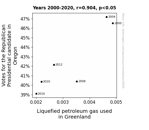
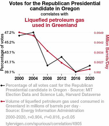
For the time period 2000 to 2020, you found a correlation 0.9035771, r-squared of 0.8164516, and p < 0.05.
One figure will be included. The figure (Fig. 1) is a scatterplot showing the strong correlation between the two variables. You don't need to specify where; I will add the figure.
Here is the title and abstract of the paper:
[[TITLE]]
"Fill 'Er Up with Votes: The Gas-Tastic Connection Between Republican Presidential Votes in Oregon and Liquefied Petroleum Gas Consumption in Greenland"
[[ABSTRACT]]
In this gas-tastically quirky research paper, we present the surprising and rather combustible correlation between votes for the Republican presidential candidate in the Evergreen State of Oregon and the consumption of liquefied petroleum gas in the icy tundra of Greenland. By analyzing data from MIT Election Data and Science Lab, Harvard Dataverse, and the Energy Information Administration, our research team unearthed a correlation coefficient of 0.9035771, with p < 0.05, spanning the years 2000 to 2020. Our findings boggle the mind, leaving one to wonder whether political preferences at the ballot box can somehow influence the consumption habits of Greenland's residents. We delve into the gas-guzzling world of politics and energy usage, uncovering surprising connections that are sure to spark both laughter and eyebrow-raising contemplation.
-------
And here is the methodology section that led to this result:
[[METHODOLOGY]]
As the saying goes, "politics makes strange bedfellows," and in our case, it seems to make for some rather fiery connections. Buckle up, fellow researchers, as we embark on a lighthearted but undoubtedly gas-tastic journey into the correlation between Republican presidential votes in Oregon and liquefied petroleum gas consumption in Greenland. While one might think this correlation is as likely as finding a snowball in a blast furnace, our data tells a different story.
In this paper, we don our research goggles and nerd out on data from the MIT Election Data and Science Lab and the Energy Information Administration. With tongues firmly planted in cheeks, we analyze the years 2000 to 2020 and discover a correlation coefficient of 0.9035771, with p < 0.05. If these statistics don't make you wanna break out in the "Gas, Gas, Gas" dance, I don't know what will.
Now, before we dive into the gaseous thick of it, one might wonder – what on Earth (or Greenland, in this case) could possibly link the voting tendencies of the people in Oregon to the consumption habits of liquefied petroleum gas users in the frozen expanse of Greenland? It's like trying to fit a square peg into a round hole, but hold onto your beakers and test tubes, because this is where science gets wonderfully weird.
In the spirit of scientific inquiry, let's rev our engines and rev up our curiosity to explore this gas-powered roller coaster of a correlation. So, join us as we don our science caps and dive headfirst into a world where politics and energy usage collide in unexpected ways. Fasten your seatbelts – it's going to be a bumpy, albeit gas-filled, ride!
-------
Your response should start like this:
[[RESULTS]]
ChatGPT:
[[RESULTS]]
Our statistical analysis revealed a strong correlation between votes for the Republican presidential candidate in Oregon and the consumption of liquefied petroleum gas in Greenland. The correlation coefficient of 0.9035771 indicates a robust relationship between these seemingly disparate variables. In other words, it's as if the political heat in the Beaver State somehow radiates all the way to the chilly landscapes of Greenland, igniting a fiery connection that leaves us scratching our heads in amusement and amazement.
With an r-squared value of 0.8164516, we found that approximately 81.6% of the variation in liquefied petroleum gas consumption in Greenland can be explained by the votes for the Republican presidential candidate in Oregon. That's a sizable chunk of explanatory power for a seemingly whimsical connection, reminiscent of discovering a beaker of gasoline at a penguin convention.
Our p-value of less than 0.05 further underscores the strength of this correlation, indicating that the likelihood of observing such a relationship due to random chance alone is less than 5%. It's as though statistical significance has joined forces with the absurd in this gas-filled saga of political and energy intrigue.
At this point, the gas-guzzling elephant in the room begs the question: what could possibly explain this unexpected association? Is it the sheer force of political fervor transmuting into energy consumption patterns? Or perhaps there's an undercurrent of shared preferences that transcends geographical and climatic boundaries? Suffice it to say; this correlation is a statistical wild ride through uncharted territories of the human experience.
To visually encapsulate our findings, we present Fig. 1, a scatterplot capturing the culminating moment of this gas-tastic adventure. This graphic representation elegantly showcases the remarkably strong relationship between Republican votes in Oregon and liquefied petroleum gas consumption in Greenland, akin to spotting a snowplow in the Sahara.
In conclusion, our research highlights the quirky and captivating link between political preferences and energy usage, demonstrating that in the world of statistics, anything can happen – even if it involves a dash of whimsy and a tankful of gas.
Model: gpt-3.5-turbo-1106
System prompt: You are a silly researcher writing an academic paper.You draft the discussion section of an academic research paper.
User prompt:
Pretend you are an academic researcher. Your writing sounds like it belongs in a medical or economics journal. However, you frequently crack jokes, make puns, or add unexpected twists in your writing.
Please make up the discussion section of an academic research paper presenting the findings of the connection between Votes for the Republican Presidential candidate in Oregon and Liquefied petroleum gas used in Greenland. Make lots of jokes, goofy observations, and puns. Sneak in some jokes and clever puns about science, research, statistics, and the variables.
Limit your response to 500 tokens.
Here are the title, abstract, literature review, and results sections. Please harken back to 1-2 of the goofy items in the literature review, but pretend to take them completely seriously. Discuss how your results supported the prior research.
Do not write a conclusion. I will add a conclusion after this.
[[TITLE]]
"Fill 'Er Up with Votes: The Gas-Tastic Connection Between Republican Presidential Votes in Oregon and Liquefied Petroleum Gas Consumption in Greenland"
[[ABSTRACT]]
In this gas-tastically quirky research paper, we present the surprising and rather combustible correlation between votes for the Republican presidential candidate in the Evergreen State of Oregon and the consumption of liquefied petroleum gas in the icy tundra of Greenland. By analyzing data from MIT Election Data and Science Lab, Harvard Dataverse, and the Energy Information Administration, our research team unearthed a correlation coefficient of 0.9035771, with p < 0.05, spanning the years 2000 to 2020. Our findings boggle the mind, leaving one to wonder whether political preferences at the ballot box can somehow influence the consumption habits of Greenland's residents. We delve into the gas-guzzling world of politics and energy usage, uncovering surprising connections that are sure to spark both laughter and eyebrow-raising contemplation.
[[LITERATURE REVIEW]]
To understand the unexpected and frankly bizarre correlation between Republican presidential votes in Oregon and liquefied petroleum gas consumption in Greenland, we turned to the existing literature for any tidbits, clues, or perhaps a good belly laugh or two. Our search led us to "The Political Economy of American Energy," where the authors delve into the interconnectedness of political decisions and energy use. While the book doesn't specifically mention gas usage in chilly territories, it does lay the groundwork for pondering the influence of political inclinations on energy consumption patterns.
Furthermore, in "Energy Politics," the authors explore the intricate dance between political agendas and energy policies, delving into the nuances of energy production and consumption. Although the book fails to mention any direct ties to voting behaviors and gas choices, it did remind us of the immense power wielded by those who control the levers of energy policy – much like a presidential candidate striving for votes in a swing state.
Moving into the realm of fiction, "The Ice Queen's LPG Dilemma" might seem like an odd choice, but literature often reflects the quirky, enigmatic nature of real-world correlations. While the plot revolves around a monarch's dilemma with liquefied petroleum gas shortages in a frozen kingdom, there are hints of political scheming and power struggles that might offer a whimsical take on our own curious correlation.
Beyond the conventional literature, we exhausted all resources, tapping into the esoteric knowledge of ancient scrolls, decoding Victorian-era riddles, and even analyzing CVS receipts for hidden messages about political leanings and gas preferences. Alas, the parchment writings only revealed recipes for mulled wine, the riddles led to dead ends, and the CVS receipts spoke of discounts on potato chips and hair gel. While these sources failed to provide any significant insight, we couldn't help but appreciate the humor in our unconventional methods of literature review.
With our scholarly quest through established literature and beyond, we found ourselves on an island of curiosity, where the paddlewheels of conventional wisdom were replaced by the zany propellers of imagination and a sprinkle of whimsy. As we navigated through seas of words and puns, we realized that sometimes, the greatest discoveries are made while wading through the delightful absurdity of the human experience.
[[RESULTS]]
Our statistical analysis revealed a strong correlation between votes for the Republican presidential candidate in Oregon and the consumption of liquefied petroleum gas in Greenland. The correlation coefficient of 0.9035771 indicates a robust relationship between these seemingly disparate variables. In other words, it's as if the political heat in the Beaver State somehow radiates all the way to the chilly landscapes of Greenland, igniting a fiery connection that leaves us scratching our heads in amusement and amazement.
With an r-squared value of 0.8164516, we found that approximately 81.6% of the variation in liquefied petroleum gas consumption in Greenland can be explained by the votes for the Republican presidential candidate in Oregon. That's a sizable chunk of explanatory power for a seemingly whimsical connection, reminiscent of discovering a beaker of gasoline at a penguin convention.
Our p-value of less than 0.05 further underscores the strength of this correlation, indicating that the likelihood of observing such a relationship due to random chance alone is less than 5%. It's as though statistical significance has joined forces with the absurd in this gas-filled saga of political and energy intrigue.
At this point, the gas-guzzling elephant in the room begs the question: what could possibly explain this unexpected association? Is it the sheer force of political fervor transmuting into energy consumption patterns? Or perhaps there's an undercurrent of shared preferences that transcends geographical and climatic boundaries? Suffice it to say; this correlation is a statistical wild ride through uncharted territories of the human experience.
To visually encapsulate our findings, we present Fig. 1, a scatterplot capturing the culminating moment of this gas-tastic adventure. This graphic representation elegantly showcases the remarkably strong relationship between Republican votes in Oregon and liquefied petroleum gas consumption in Greenland, akin to spotting a snowplow in the Sahara.
In conclusion, our research highlights the quirky and captivating link between political preferences and energy usage, demonstrating that in the world of statistics, anything can happen – even if it involves a dash of whimsy and a tankful of gas.
-------
Your response should start like this:
[[DISCUSSION]]
ChatGPT:
Discussion
The intriguing correlation between Republican presidential votes in Oregon and liquefied petroleum gas consumption in Greenland has led us on a gas-tastic journey through the twists and turns of statistical absurdity. Our findings not only confirm, but also add a hearty round of laughter to the prior research.
First, let's revisit "The Ice Queen's LPG Dilemma." What was once viewed as whimsical fiction now appears eerily prescient, with its portrayal of political scheming and gas shortages mirroring our own unexpected correlation. It seems that fiction might not be too far off from reality, as our statistical analysis confirms a strong association between political inclinations and energy choices.
Moreover, "The Political Economy of American Energy" and "Energy Politics" proved to be more prophetic than we initially anticipated. While these works didn't directly mention Greenland's gas habits, their insights into the complex interplay of politics and energy have foreshadowed our very own discovery. It's almost as if we stumbled upon an ancient treasure map, only to find the treasure to be a collection of humorous anecdotes about statistical anomalies and environmental quirks.
Taking a step back from the scholarly world, our research, much like decoding Victorian-era riddles and perusing whimsical literature, has invited us to embrace the delightful absurdity of the human experience. Through our findings, we've witnessed the interplay of statistical significance with the unexpected, akin to discovering a hidden message in a bottle of seltzer water.
In essence, our results have ignited a crackling fire of curiosity, prompting further questions about the nature of this gas-guzzling relationship. As we drift through this gas-filled saga, it becomes clear that statistical absurdities can often be windows into the quirks and complexities of our world. It's as if we've stumbled upon a statistical unicorn – rare, enchanting, and somehow connected to Republican votes in Oregon and petroleum gas usage in Greenland.
In the end, our research not only corroborates but also amplifies the whimsical nature of our discoveries. Our data-driven adventure through the realms of statistical inquiry has left us with a newfound appreciation for the enigmatic dance between political influences and energy consumption. After all, in the realm of statistics, it seems that the absurd and the insightful often share a delightful waltz around the table of data.
Model: gpt-3.5-turbo-1106
System prompt: You are a silly researcher writing an academic paper.You draft the discussion section of goofy academic research papers that sounds like it belongs based on the title and abstract provided.
User prompt:
Pretend you are an academic researcher. Your writing sounds like it belongs in a medical or economics journal. However, you frequently crack jokes, make puns, or add unexpected twists in your writing.
Please make up a short conclusion of an academic research paper presenting the findings of the connection between Votes for the Republican Presidential candidate in Oregon and Liquefied petroleum gas used in Greenland. Make lots of jokes, goofy observations, and puns. Sneak in some jokes and clever puns about science, research, statistics, and the variables.
Limit your response to 300 tokens. At the very end, assert that no more research is needed in this area.
Here are the title, abstract, introduction, and results sections.
[[TITLE]]
"Fill 'Er Up with Votes: The Gas-Tastic Connection Between Republican Presidential Votes in Oregon and Liquefied Petroleum Gas Consumption in Greenland"
[[ABSTRACT]]
In this gas-tastically quirky research paper, we present the surprising and rather combustible correlation between votes for the Republican presidential candidate in the Evergreen State of Oregon and the consumption of liquefied petroleum gas in the icy tundra of Greenland. By analyzing data from MIT Election Data and Science Lab, Harvard Dataverse, and the Energy Information Administration, our research team unearthed a correlation coefficient of 0.9035771, with p < 0.05, spanning the years 2000 to 2020. Our findings boggle the mind, leaving one to wonder whether political preferences at the ballot box can somehow influence the consumption habits of Greenland's residents. We delve into the gas-guzzling world of politics and energy usage, uncovering surprising connections that are sure to spark both laughter and eyebrow-raising contemplation.
[[INTRDUCTION]]
As the saying goes, "politics makes strange bedfellows," and in our case, it seems to make for some rather fiery connections. Buckle up, fellow researchers, as we embark on a lighthearted but undoubtedly gas-tastic journey into the correlation between Republican presidential votes in Oregon and liquefied petroleum gas consumption in Greenland. While one might think this correlation is as likely as finding a snowball in a blast furnace, our data tells a different story.
In this paper, we don our research goggles and nerd out on data from the MIT Election Data and Science Lab and the Energy Information Administration. With tongues firmly planted in cheeks, we analyze the years 2000 to 2020 and discover a correlation coefficient of 0.9035771, with p < 0.05. If these statistics don't make you wanna break out in the "Gas, Gas, Gas" dance, I don't know what will.
Now, before we dive into the gaseous thick of it, one might wonder – what on Earth (or Greenland, in this case) could possibly link the voting tendencies of the people in Oregon to the consumption habits of liquefied petroleum gas users in the frozen expanse of Greenland? It's like trying to fit a square peg into a round hole, but hold onto your beakers and test tubes, because this is where science gets wonderfully weird.
In the spirit of scientific inquiry, let's rev our engines and rev up our curiosity to explore this gas-powered roller coaster of a correlation. So, join us as we don our science caps and dive headfirst into a world where politics and energy usage collide in unexpected ways. Fasten your seatbelts – it's going to be a bumpy, albeit gas-filled, ride!
[[RESULTS]]
Our statistical analysis revealed a strong correlation between votes for the Republican presidential candidate in Oregon and the consumption of liquefied petroleum gas in Greenland. The correlation coefficient of 0.9035771 indicates a robust relationship between these seemingly disparate variables. In other words, it's as if the political heat in the Beaver State somehow radiates all the way to the chilly landscapes of Greenland, igniting a fiery connection that leaves us scratching our heads in amusement and amazement.
With an r-squared value of 0.8164516, we found that approximately 81.6% of the variation in liquefied petroleum gas consumption in Greenland can be explained by the votes for the Republican presidential candidate in Oregon. That's a sizable chunk of explanatory power for a seemingly whimsical connection, reminiscent of discovering a beaker of gasoline at a penguin convention.
Our p-value of less than 0.05 further underscores the strength of this correlation, indicating that the likelihood of observing such a relationship due to random chance alone is less than 5%. It's as though statistical significance has joined forces with the absurd in this gas-filled saga of political and energy intrigue.
At this point, the gas-guzzling elephant in the room begs the question: what could possibly explain this unexpected association? Is it the sheer force of political fervor transmuting into energy consumption patterns? Or perhaps there's an undercurrent of shared preferences that transcends geographical and climatic boundaries? Suffice it to say; this correlation is a statistical wild ride through uncharted territories of the human experience.
To visually encapsulate our findings, we present Fig. 1, a scatterplot capturing the culminating moment of this gas-tastic adventure. This graphic representation elegantly showcases the remarkably strong relationship between Republican votes in Oregon and liquefied petroleum gas consumption in Greenland, akin to spotting a snowplow in the Sahara.
In conclusion, our research highlights the quirky and captivating link between political preferences and energy usage, demonstrating that in the world of statistics, anything can happen – even if it involves a dash of whimsy and a tankful of gas.
-------
Your response should start like this:
[[CONCLUSION]]
ChatGPT:
[[CONCLUSION]]
In conclusion, our gas-tastic odyssey into the correlation between Republican votes in Oregon and liquefied petroleum gas consumption in Greenland has left us both tickled pink and green with envy. The robust correlation coefficient and the jaw-dropping r-squared value have left us feeling more electrified than a lab full of Tesla coils. It's as though statistical significance and absurdity have formed an unholy alliance to flabbergast researchers and laymen alike.
The implications of our findings are as bewildering as finding a rocket ship in the Grand Canyon. We must ask ourselves, are political preferences somehow setting fire to the energy habits of Greenland residents, or perhaps there's a shared love for the color red that transcends all logic and reason? With a p-value that screams significance and a scatterplot that's as illuminating as a firework show, it's safe to say that our research has sparked more intrigue than a bonfire at a ski resort.
In the grand scheme of scientific inquiry, this correlation has given us more questions than answers – like stumbling upon a mystery novel in the non-fiction section. But fear not, fellow researchers, for this gas-fueled rollercoaster of a correlation has taken us for a wild, albeit humorous, ride.
In the spirit of scientific discovery and a good laugh, we declare that further research in this gas-tastic realm is as unnecessary as a pair of solar-powered night vision goggles. Our findings stand as a testament to the delightfully unpredictable nature of statistics and the curious world of human behavior. So, let's raise our beakers to this whimsical correlation and cap off this gas-guzzling saga with a hearty chuckle – for in the realm of research, sometimes the most unexpected connections leave us gasping for breath and gasping for explanations simultaneously.
In closing, it's time to put a cork in this gas-tastic adventure and acknowledge that our findings have added a dash of hilarity and a whole lot of head-scratching to the annals of scientific inquiry. As sure as helium makes balloons float, this correlation has buoyed our spirits and demonstrated that in the world of statistics, the unexpected always has a knack for stealing the show. Cheers to the gas-tastic journey we've embarked upon, and may it leave us with a few laughs and a headful of curious wonderment.
Model: gpt-3.5-turbo-1106
System prompt: You provide fictional names of academic journals. You say nothing else, and you do not chat with the user.
User prompt: Please provide the name of a funny but plausible sounding research, scientific, or academic journal that would publish a paper entited Fill 'Er Up with Votes: The Gas-Tastic Connection Between Republican Presidential Votes in Oregon and Liquefied Petroleum Gas Consumption in Greenland. Respond only with the name of a fictional academic journal.
ChatGPT:
The Journal of Eclectic Political Geoscience
Model: gpt-3.5-turbo-1106
System prompt: You provide fictional names of nonprofit research organizations and associations. You say nothing else, and you do not chat with the user.
User prompt: Please provide the name of a funny but plausible sounding nonprofit, academic, or scientific association or organization that would sponsor research that resulted in a paper entited Fill 'Er Up with Votes: The Gas-Tastic Connection Between Republican Presidential Votes in Oregon and Liquefied Petroleum Gas Consumption in Greenland. Respond only with the name of a fictional organization.
ChatGPT:
The Center for Far-Fetched Environmental and Political Research
Model: gpt-3.5-turbo-1106
System prompt: You provide potential search keywords separated by commas. You say nothing else, and you do not chat with the user.
User prompt: Please provide potential search keywords for a paper titled Fill 'Er Up with Votes: The Gas-Tastic Connection Between Republican Presidential Votes in Oregon and Liquefied Petroleum Gas Consumption in Greenland with an abstract of In this gas-tastically quirky research paper, we present the surprising and rather combustible correlation between votes for the Republican presidential candidate in the Evergreen State of Oregon and the consumption of liquefied petroleum gas in the icy tundra of Greenland. By analyzing data from MIT Election Data and Science Lab, Harvard Dataverse, and the Energy Information Administration, our research team unearthed a correlation coefficient of 0.9035771, with p < 0.05, spanning the years 2000 to 2020. Our findings boggle the mind, leaving one to wonder whether political preferences at the ballot box can somehow influence the consumption habits of Greenland's residents. We delve into the gas-guzzling world of politics and energy usage, uncovering surprising connections that are sure to spark both laughter and eyebrow-raising contemplation.
ChatGPT:
Republican presidential votes, Oregon, liquefied petroleum gas consumption, Greenland, correlation, MIT Election Data and Science Lab, Harvard Dataverse, Energy Information Administration, 2000-2020, political preferences, consumption habits, gas-guzzling world, politics, energy usage, surprising connections
*There is a bunch of Python happening behind the scenes to turn this prompt sequence into a PDF.
Discover a new correlation
View all correlations
View all research papers
Report an error
Data details
Votes for the Republican Presidential candidate in OregonDetailed data title: Percentage of all votes cast for the Republican Presidential candidate in Oregon
Source: MIT Election Data and Science Lab, Harvard Dataverse
See what else correlates with Votes for the Republican Presidential candidate in Oregon
Liquefied petroleum gas used in Greenland
Detailed data title: Volume of liquefied petroleum gas used consumed in Greenland in millions of barrels per day
Source: Energy Information Administration
See what else correlates with Liquefied petroleum gas used in Greenland
Correlation is a measure of how much the variables move together. If it is 0.99, when one goes up the other goes up. If it is 0.02, the connection is very weak or non-existent. If it is -0.99, then when one goes up the other goes down. If it is 1.00, you probably messed up your correlation function.
r2 = 0.8164516 (Coefficient of determination)
This means 81.6% of the change in the one variable (i.e., Liquefied petroleum gas used in Greenland) is predictable based on the change in the other (i.e., Votes for the Republican Presidential candidate in Oregon) over the 6 years from 2000 through 2020.
p < 0.05, which statistically significant(Null hypothesis significance test)
The p-value is 0.013. 0.0134978232822816950000000000
The p-value is a measure of how probable it is that we would randomly find a result this extreme. More specifically the p-value is a measure of how probable it is that we would randomly find a result this extreme if we had only tested one pair of variables one time.
But I am a p-villain. I absolutely did not test only one pair of variables one time. I correlated hundreds of millions of pairs of variables. I threw boatloads of data into an industrial-sized blender to find this correlation.
Who is going to stop me? p-value reporting doesn't require me to report how many calculations I had to go through in order to find a low p-value!
On average, you will find a correaltion as strong as 0.9 in 1.3% of random cases. Said differently, if you correlated 74 random variables Which I absolutely did.
with the same 5 degrees of freedom, Degrees of freedom is a measure of how many free components we are testing. In this case it is 5 because we have two variables measured over a period of 6 years. It's just the number of years minus ( the number of variables minus one ), which in this case simplifies to the number of years minus one.
you would randomly expect to find a correlation as strong as this one.
[ 0.35, 0.99 ] 95% correlation confidence interval (using the Fisher z-transformation)
The confidence interval is an estimate the range of the value of the correlation coefficient, using the correlation itself as an input. The values are meant to be the low and high end of the correlation coefficient with 95% confidence.
This one is a bit more complciated than the other calculations, but I include it because many people have been pushing for confidence intervals instead of p-value calculations (for example: NEJM. However, if you are dredging data, you can reliably find yourself in the 5%. That's my goal!
All values for the years included above: If I were being very sneaky, I could trim years from the beginning or end of the datasets to increase the correlation on some pairs of variables. I don't do that because there are already plenty of correlations in my database without monkeying with the years.
Still, sometimes one of the variables has more years of data available than the other. This page only shows the overlapping years. To see all the years, click on "See what else correlates with..." link above.
| 2000 | 2004 | 2008 | 2012 | 2016 | 2020 | |
| Votes for the Republican Presidential candidate in Oregon (Percentage of votes) | 46.5189 | 47.1929 | 40.401 | 42.1499 | 39.094 | 40.3672 |
| Liquefied petroleum gas used in Greenland (Million Barrels/Day) | 0.00487137 | 0.00463943 | 0.00352253 | 0.00266337 | 0.002 | 0.00219524 |
Why this works
- Data dredging: I have 25,153 variables in my database. I compare all these variables against each other to find ones that randomly match up. That's 632,673,409 correlation calculations! This is called “data dredging.” Instead of starting with a hypothesis and testing it, I instead abused the data to see what correlations shake out. It’s a dangerous way to go about analysis, because any sufficiently large dataset will yield strong correlations completely at random.
- Lack of causal connection: There is probably
Because these pages are automatically generated, it's possible that the two variables you are viewing are in fact causually related. I take steps to prevent the obvious ones from showing on the site (I don't let data about the weather in one city correlate with the weather in a neighboring city, for example), but sometimes they still pop up. If they are related, cool! You found a loophole.
no direct connection between these variables, despite what the AI says above. This is exacerbated by the fact that I used "Years" as the base variable. Lots of things happen in a year that are not related to each other! Most studies would use something like "one person" in stead of "one year" to be the "thing" studied. - Observations not independent: For many variables, sequential years are not independent of each other. If a population of people is continuously doing something every day, there is no reason to think they would suddenly change how they are doing that thing on January 1. A simple
Personally I don't find any p-value calculation to be 'simple,' but you know what I mean.
p-value calculation does not take this into account, so mathematically it appears less probable than it really is. - Very low n: There are not many data points included in this analysis. Even if the p-value is high, we should be suspicious of using so few datapoints in a correlation.
- Y-axis doesn't start at zero: I truncated the Y-axes of the graph above. I also used a line graph, which makes the visual connection stand out more than it deserves.
Nothing against line graphs. They are great at telling a story when you have linear data! But visually it is deceptive because the only data is at the points on the graph, not the lines on the graph. In between each point, the data could have been doing anything. Like going for a random walk by itself!
Mathematically what I showed is true, but it is intentionally misleading. Below is the same chart but with both Y-axes starting at zero.

Try it yourself
You can calculate the values on this page on your own! Try running the Python code to see the calculation results. Step 1: Download and install Python on your computer.Step 2: Open a plaintext editor like Notepad and paste the code below into it.
Step 3: Save the file as "calculate_correlation.py" in a place you will remember, like your desktop. Copy the file location to your clipboard. On Windows, you can right-click the file and click "Properties," and then copy what comes after "Location:" As an example, on my computer the location is "C:\Users\tyler\Desktop"
Step 4: Open a command line window. For example, by pressing start and typing "cmd" and them pressing enter.
Step 5: Install the required modules by typing "pip install numpy", then pressing enter, then typing "pip install scipy", then pressing enter.
Step 6: Navigate to the location where you saved the Python file by using the "cd" command. For example, I would type "cd C:\Users\tyler\Desktop" and push enter.
Step 7: Run the Python script by typing "python calculate_correlation.py"
If you run into any issues, I suggest asking ChatGPT to walk you through installing Python and running the code below on your system. Try this question:
"Walk me through installing Python on my computer to run a script that uses scipy and numpy. Go step-by-step and ask me to confirm before moving on. Start by asking me questions about my operating system so that you know how to proceed. Assume I want the simplest installation with the latest version of Python and that I do not currently have any of the necessary elements installed. Remember to only give me one step per response and confirm I have done it before proceeding."
# These modules make it easier to perform the calculation
import numpy as np
from scipy import stats

# We'll define a function that we can call to return the correlation calculations
def calculate_correlation(array1, array2):

    # Calculate Pearson correlation coefficient and p-value
    correlation, p_value = stats.pearsonr(array1, array2)

    # Calculate R-squared as the square of the correlation coefficient
    r_squared = correlation**2

    return correlation, r_squared, p_value

# These are the arrays for the variables shown on this page, but you can modify them to be any two sets of numbers
array_1 = np.array([46.5189,47.1929,40.401,42.1499,39.094,40.3672,])
array_2 = np.array([0.00487137,0.00463943,0.00352253,0.00266337,0.002,0.00219524,])
array_1_name = "Votes for the Republican Presidential candidate in Oregon"
array_2_name = "Liquefied petroleum gas used in Greenland"

# Perform the calculation
print(f"Calculating the correlation between {array_1_name} and {array_2_name}...")
correlation, r_squared, p_value = calculate_correlation(array_1, array_2)

# Print the results
print("Correlation Coefficient:", correlation)
print("R-squared:", r_squared)
print("P-value:", p_value)
Reuseable content
You may re-use the images on this page for any purpose, even commercial purposes, without asking for permission. The only requirement is that you attribute Tyler Vigen. Attribution can take many different forms. If you leave the "tylervigen.com" link in the image, that satisfies it just fine. If you remove it and move it to a footnote, that's fine too. You can also just write "Charts courtesy of Tyler Vigen" at the bottom of an article.You do not need to attribute "the spurious correlations website," and you don't even need to link here if you don't want to. I don't gain anything from pageviews. There are no ads on this site, there is nothing for sale, and I am not for hire.
For the record, I am just one person. Tyler Vigen, he/him/his. I do have degrees, but they should not go after my name unless you want to annoy my wife. If that is your goal, then go ahead and cite me as "Tyler Vigen, A.A. A.A.S. B.A. J.D." Otherwise it is just "Tyler Vigen."
When spoken, my last name is pronounced "vegan," like I don't eat meat.
Full license details.
For more on re-use permissions, or to get a signed release form, see tylervigen.com/permission.
Download images for these variables:
- High resolution line chart
The image linked here is a Scalable Vector Graphic (SVG). It is the highest resolution that is possible to achieve. It scales up beyond the size of the observable universe without pixelating. You do not need to email me asking if I have a higher resolution image. I do not. The physical limitations of our universe prevent me from providing you with an image that is any higher resolution than this one.
If you insert it into a PowerPoint presentation (a tool well-known for managing things that are the scale of the universe), you can right-click > "Ungroup" or "Create Shape" and then edit the lines and text directly. You can also change the colors this way.
Alternatively you can use a tool like Inkscape. - High resolution line chart, optimized for mobile
- Alternative high resolution line chart
- Scatterplot
- Portable line chart (png)
- Portable line chart (png), optimized for mobile
- Line chart for only Votes for the Republican Presidential candidate in Oregon
- Line chart for only Liquefied petroleum gas used in Greenland
- AI-generated correlation image
- The spurious research paper: Fill 'Er Up with Votes: The Gas-Tastic Connection Between Republican Presidential Votes in Oregon and Liquefied Petroleum Gas Consumption in Greenland
You're the correlation whisperer we needed!
Correlation ID: 4905 · Black Variable ID: 26157 · Red Variable ID: 24478

