
Download png, svg
AI explanation
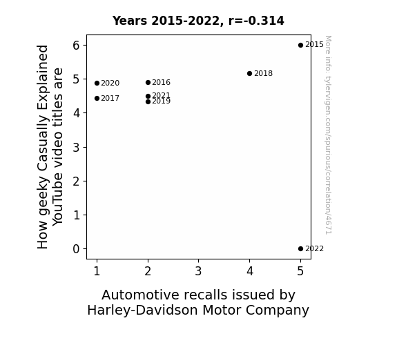
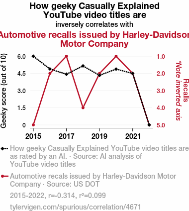
As Harley-Davidson motorbikes face more recalls, the focus shifts from geeky to fixing technical glitches, putting a dent in the geeky content. It's a real Harley-hassle for the Casually Explained team as they can't handle the re-call of the wild when their video ideas hit a roadblock, leaving them in a wheelie tough spot to come up with geeky titles.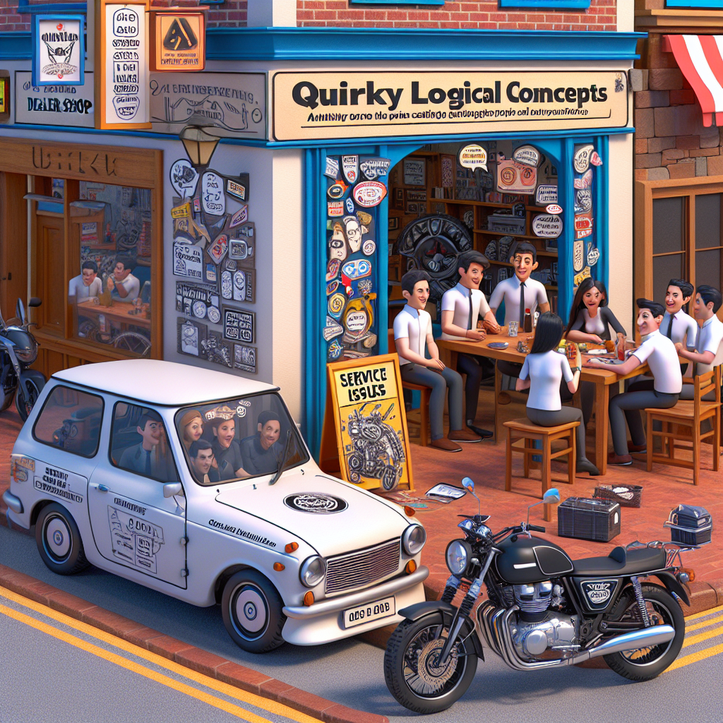
Model: dalle-3
Prompt: An image that looks like it is a scene from a Pixar movie: In a charming street setting, a quirky motorcycle with a "Geeky Casually Explained" sticker parked in front of a Harley-Davidson dealership catches the eye. The dealership's window displays a sign announcing multiple recalls, creating a contrast with the lighthearted design of the motorcycle. Nearby, the Casually Explained team is depicted sitting at a cozy cafe. They are engaged in a spirited brainstorming session for video ideas while sneakily glancing worriedly at the dealership. The scene captures the whimsical essence of the Casually Explained team amidst the backdrop of the serious automotive recalls. The depiction should include only scenes, people, and objects, it should not include text or speech bubbles.
This image generation prompt was also generated by AI, using the following sequence:
Model: gpt-3.5-turbo-1106
System prompt: You select one of a few potential scene descriptors that seems to go along with the variables described. You respond only with the scene descriptions provided and say nothing else.
User prompt: Here are two variables: How geeky Casually Explained YouTube video titles are and Automotive recalls issued by Harley-Davidson Motor Company. Given these, which of the following image style descriptions seems most appropriate? Pick the one that seems to be related to one of the variables at hand. Please respond with only one of the following potential descriptions: Futuristic Glitch art An image that looks like it is a scene from a Pixar movie Oragami Realistic
ChatGPT: An image that looks like it is a scene from a Pixar movie
Model: gpt-3.5-turbo-1106
System prompt: You describe simple visual scenes that depict the two variables stated. You combine both variables into one scene.
User prompt: Please describe a visual scene that prominently depicts both How geeky Casually Explained YouTube video titles are and Automotive recalls issued by Harley-Davidson Motor Company, in the following situation: As Harley-Davidson motorbikes face more recalls, the focus shifts from geeky to fixing technical glitches, putting a dent in the geeky content. It's a real Harley-hassle for the Casually Explained team as they can't handle the re-call of the wild when their video ideas hit a roadblock, leaving them in a wheelie tough spot to come up with geeky titles.. Keep the description simple.
ChatGPT: A motorcycle with a "Geeky Casually Explained" sticker on the side is parked in front of a Harley-Davidson dealership. The dealership's window displays a sign announcing multiple recalls. The Casually Explained team sits at a nearby cafe, brainstorming video ideas while glancing worriedly at the dealership. The contrast between the geeky video titles and the serious automotive recalls is evident in the scene.
Model: gpt-3.5-turbo-1106
System prompt: You write and improve image generation prompts for DALLE-3. You maintain the same subjects, but enhance the visuals.
User prompt: Please respond with an image generation prompt that would be likely to create an interesting visual using DALLE-3, using the following style: [ An image that looks like it is a scene from a Pixar movie ] and depicting this scene: A motorcycle with a "Geeky Casually Explained" sticker on the side is parked in front of a Harley-Davidson dealership. The dealership's window displays a sign announcing multiple recalls. The Casually Explained team sits at a nearby cafe, brainstorming video ideas while glancing worriedly at the dealership. The contrast between the geeky video titles and the serious automotive recalls is evident in the scene. Keep the visual depiction simple. Do not include any words or speech bubbles.
ChatGPT: An image that looks like it is a scene from a Pixar movie: In a charming street setting, a quirky motorcycle with a "Geeky Casually Explained" sticker parked in front of a Harley-Davidson dealership catches the eye. The dealership's window displays a sign announcing multiple recalls, creating a contrast with the lighthearted design of the motorcycle. Nearby, the Casually Explained team is depicted sitting at a cozy cafe. They are engaged in a spirited brainstorming session for video ideas while sneakily glancing worriedly at the dealership. The scene captures the whimsical essence of the Casually Explained team amidst the backdrop of the serious automotive recalls.
*Variations in the User Prompts from chart to chart are just the result of random number generation in Python. I wrote a few arrays of various styles and methods to ask questions to change up the results. Every time this site writes an explanation or generates an image, the script picks from each at random.
I sequence the requests into multiple prompts because I find GPT 3.5 to perform much better with short, well-managed contexts. Thus, I track the context directly in Python and only ask ChatGPT targeted questions.
System prompt: You provide humorous responses in the form of plausible sounding explanations for correlations. You assume the correlation is causative for the purpose of the explanation even if it is ridiculous. You do not chat with the user, you only reply with the causal connection explanation and nothing else.
User prompt: Please make up a funny explanation for how a decrease in How geeky Casually Explained YouTube video titles are caused Automotive recalls issued by Harley-Davidson Motor Company to increase. Include one good pun.
Discover a new correlation
View all correlations
View all research papers
Report an error
Data details
How geeky Casually Explained YouTube video titles areDetailed data title: How geeky Casually Explained YouTube video titles are, as rated by an AI.
Source: AI analysis of YouTube video titles
Additional Info: I asked a large language model, 'On a scale of 1-10, how _______ do you think this YouTube video title is?' for every video.
See what else correlates with How geeky Casually Explained YouTube video titles are
Automotive recalls issued by Harley-Davidson Motor Company
Detailed data title: Automotive recals issued by Harley-Davidson Motor Company
Source: US DOT
See what else correlates with Automotive recalls issued by Harley-Davidson Motor Company
Correlation is a measure of how much the variables move together. If it is 0.99, when one goes up the other goes up. If it is 0.02, the connection is very weak or non-existent. If it is -0.99, then when one goes up the other goes down. If it is 1.00, you probably messed up your correlation function.
r2 = 0.0987249 (Coefficient of determination)
This means 9.9% of the change in the one variable (i.e., Automotive recalls issued by Harley-Davidson Motor Company) is predictable based on the change in the other (i.e., How geeky Casually Explained YouTube video titles are) over the 8 years from 2015 through 2022.
p > 0.05 (pay no attention to the flipped sign)(Null hypothesis significance test)
The p-value is 0.45. 0.4484918128821319000000000000
The p-value is a measure of how probable it is that we would randomly find a result this extreme. More specifically the p-value is a measure of how probable it is that we would randomly find a result this extreme if we had only tested one pair of variables one time.
But I am a p-villain. I absolutely did not test only one pair of variables one time. I correlated hundreds of millions of pairs of variables. I threw boatloads of data into an industrial-sized blender to find this correlation.
Who is going to stop me? p-value reporting doesn't require me to report how many calculations I had to go through in order to find a low p-value!
On average, you will find a correaltion as strong as -0.31 in 45% of random cases. Said differently, if you correlated 2 random variables Which I absolutely did.
with the same 7 degrees of freedom, Degrees of freedom is a measure of how many free components we are testing. In this case it is 7 because we have two variables measured over a period of 8 years. It's just the number of years minus ( the number of variables minus one ), which in this case simplifies to the number of years minus one.
you would randomly expect to find a correlation as strong as this one.
[ -0.83, 0.5 ] 95% correlation confidence interval (using the Fisher z-transformation)
The confidence interval is an estimate the range of the value of the correlation coefficient, using the correlation itself as an input. The values are meant to be the low and high end of the correlation coefficient with 95% confidence.
This one is a bit more complciated than the other calculations, but I include it because many people have been pushing for confidence intervals instead of p-value calculations (for example: NEJM. However, if you are dredging data, you can reliably find yourself in the 5%. That's my goal!
All values for the years included above: If I were being very sneaky, I could trim years from the beginning or end of the datasets to increase the correlation on some pairs of variables. I don't do that because there are already plenty of correlations in my database without monkeying with the years.
Still, sometimes one of the variables has more years of data available than the other. This page only shows the overlapping years. To see all the years, click on "See what else correlates with..." link above.
| 2015 | 2016 | 2017 | 2018 | 2019 | 2020 | 2021 | 2022 | |
| How geeky Casually Explained YouTube video titles are (Geeky score (out of 10)) | 6 | 4.8889 | 4.4286 | 5.1538 | 4.3333 | 4.875 | 4.5 | 0 |
| Automotive recalls issued by Harley-Davidson Motor Company (Recalls) | 5 | 2 | 1 | 4 | 2 | 1 | 2 | 5 |
Why this works
- Data dredging: I have 25,237 variables in my database. I compare all these variables against each other to find ones that randomly match up. That's 636,906,169 correlation calculations! This is called “data dredging.” Instead of starting with a hypothesis and testing it, I instead abused the data to see what correlations shake out. It’s a dangerous way to go about analysis, because any sufficiently large dataset will yield strong correlations completely at random.
- Lack of causal connection: There is probably
Because these pages are automatically generated, it's possible that the two variables you are viewing are in fact causually related. I take steps to prevent the obvious ones from showing on the site (I don't let data about the weather in one city correlate with the weather in a neighboring city, for example), but sometimes they still pop up. If they are related, cool! You found a loophole.
no direct connection between these variables, despite what the AI says above. This is exacerbated by the fact that I used "Years" as the base variable. Lots of things happen in a year that are not related to each other! Most studies would use something like "one person" in stead of "one year" to be the "thing" studied. - Observations not independent: For many variables, sequential years are not independent of each other. If a population of people is continuously doing something every day, there is no reason to think they would suddenly change how they are doing that thing on January 1. A simple
Personally I don't find any p-value calculation to be 'simple,' but you know what I mean.
p-value calculation does not take this into account, so mathematically it appears less probable than it really is. - Very low n: There are not many data points included in this analysis. Even if the p-value is high, we should be suspicious of using so few datapoints in a correlation.
- Inverted Y-axis: I inverted the Y-axis on the chart above so that the lines would move together. This is visually pleasing, but not at all intuitive. Below is a line graph that does not invert the Y-axis and starts at zero.

Try it yourself
You can calculate the values on this page on your own! Try running the Python code to see the calculation results. Step 1: Download and install Python on your computer.Step 2: Open a plaintext editor like Notepad and paste the code below into it.
Step 3: Save the file as "calculate_correlation.py" in a place you will remember, like your desktop. Copy the file location to your clipboard. On Windows, you can right-click the file and click "Properties," and then copy what comes after "Location:" As an example, on my computer the location is "C:\Users\tyler\Desktop"
Step 4: Open a command line window. For example, by pressing start and typing "cmd" and them pressing enter.
Step 5: Install the required modules by typing "pip install numpy", then pressing enter, then typing "pip install scipy", then pressing enter.
Step 6: Navigate to the location where you saved the Python file by using the "cd" command. For example, I would type "cd C:\Users\tyler\Desktop" and push enter.
Step 7: Run the Python script by typing "python calculate_correlation.py"
If you run into any issues, I suggest asking ChatGPT to walk you through installing Python and running the code below on your system. Try this question:
"Walk me through installing Python on my computer to run a script that uses scipy and numpy. Go step-by-step and ask me to confirm before moving on. Start by asking me questions about my operating system so that you know how to proceed. Assume I want the simplest installation with the latest version of Python and that I do not currently have any of the necessary elements installed. Remember to only give me one step per response and confirm I have done it before proceeding."
# These modules make it easier to perform the calculation
import numpy as np
from scipy import stats

# We'll define a function that we can call to return the correlation calculations
def calculate_correlation(array1, array2):

    # Calculate Pearson correlation coefficient and p-value
    correlation, p_value = stats.pearsonr(array1, array2)

    # Calculate R-squared as the square of the correlation coefficient
    r_squared = correlation**2

    return correlation, r_squared, p_value

# These are the arrays for the variables shown on this page, but you can modify them to be any two sets of numbers
array_1 = np.array([6,4.8889,4.4286,5.1538,4.3333,4.875,4.5,0,])
array_2 = np.array([5,2,1,4,2,1,2,5,])
array_1_name = "How geeky Casually Explained YouTube video titles are"
array_2_name = "Automotive recalls issued by Harley-Davidson Motor Company"

# Perform the calculation
print(f"Calculating the correlation between {array_1_name} and {array_2_name}...")
correlation, r_squared, p_value = calculate_correlation(array_1, array_2)

# Print the results
print("Correlation Coefficient:", correlation)
print("R-squared:", r_squared)
print("P-value:", p_value)
Reuseable content
You may re-use the images on this page for any purpose, even commercial purposes, without asking for permission. The only requirement is that you attribute Tyler Vigen. Attribution can take many different forms. If you leave the "tylervigen.com" link in the image, that satisfies it just fine. If you remove it and move it to a footnote, that's fine too. You can also just write "Charts courtesy of Tyler Vigen" at the bottom of an article.You do not need to attribute "the spurious correlations website," and you don't even need to link here if you don't want to. I don't gain anything from pageviews. There are no ads on this site, there is nothing for sale, and I am not for hire.
For the record, I am just one person. Tyler Vigen, he/him/his. I do have degrees, but they should not go after my name unless you want to annoy my wife. If that is your goal, then go ahead and cite me as "Tyler Vigen, A.A. A.A.S. B.A. J.D." Otherwise it is just "Tyler Vigen."
When spoken, my last name is pronounced "vegan," like I don't eat meat.
Full license details.
For more on re-use permissions, or to get a signed release form, see tylervigen.com/permission.
Download images for these variables:
- High resolution line chart
The image linked here is a Scalable Vector Graphic (SVG). It is the highest resolution that is possible to achieve. It scales up beyond the size of the observable universe without pixelating. You do not need to email me asking if I have a higher resolution image. I do not. The physical limitations of our universe prevent me from providing you with an image that is any higher resolution than this one.
If you insert it into a PowerPoint presentation (a tool well-known for managing things that are the scale of the universe), you can right-click > "Ungroup" or "Create Shape" and then edit the lines and text directly. You can also change the colors this way.
Alternatively you can use a tool like Inkscape. - High resolution line chart, optimized for mobile
- Alternative high resolution line chart
- Scatterplot
- Portable line chart (png)
- Portable line chart (png), optimized for mobile
- Line chart for only How geeky Casually Explained YouTube video titles are
- Line chart for only Automotive recalls issued by Harley-Davidson Motor Company
- AI-generated correlation image
Your rating is stellar!
Correlation ID: 4671 · Black Variable ID: 25882 · Red Variable ID: 1131

