
Download png, svg
AI explanation
As the brainpower of viewers expanded, so did their collective ability to control the weather, leading to a rise in temperatures specifically in San Diego. This phenomenon, known as cognitive climatic conditioning, highlights the unforeseen impacts of educational content on regional meteorological patterns. It seems that the more individuals learned, the hotter it got, showing that knowledge truly is power, and in this case, the power to crank up the thermostat in Southern California.
Model: dalle-3
Prompt: Generate an image that combines the high-tech style with the scene described. Imagine a futuristic, sleek graph display projecting the upward trend of SmarterEveryDay YouTube video views, with translucent lines stretching upward. Beside it, a glowing, stylized sun shines brightly over a sci-fi-inspired San Diego skyline, casting a warm, digital glow. In the foreground, a cluster of glowing, ethereal brains expands and intertwines, symbolizing the viewers' increased brainpower. Their collective hands reach out toward the sun, creating a visual link between the viewers and the rising temperatures displayed on a digital thermometer. The depiction should include only scenes, people, and objects, it should not include text or speech bubbles.
This image generation prompt was also generated by AI, using the following sequence:
Model: gpt-3.5-turbo-1106
System prompt: You select one of a few potential scene descriptors that seems to go along with the variables described. You respond only with the scene descriptions provided and say nothing else.
User prompt: Here are two variables: Average views of SmarterEveryDay YouTube videos and Hot days in San Diego. Given these, which of the following image style descriptions seems most appropriate? Pick the one that seems to be related to one of the variables at hand. Please respond with only one of the following potential descriptions: Vaporwave Brutalism A scene from Skyrim High-tech An image that looks like it is a scene from 'Star Wars'
ChatGPT: High-tech
Model: gpt-3.5-turbo-1106
System prompt: You describe simple visual scenes that depict the two variables stated. You combine both variables into one scene.
User prompt: Please describe a visual scene that prominently depicts both Average views of SmarterEveryDay YouTube videos and Hot days in San Diego, in the following situation: As the brainpower of viewers expanded, so did their collective ability to control the weather, leading to a rise in temperatures specifically in San Diego. This phenomenon, known as cognitive climatic conditioning, highlights the unforeseen impacts of educational content on regional meteorological patterns. It seems that the more individuals learned, the hotter it got, showing that knowledge truly is power, and in this case, the power to crank up the thermostat in Southern California.. Keep the description simple.
ChatGPT: In the scene, we see a graph showing an upward trend in the average views of SmarterEveryDay YouTube videos, with the line of the graph stretching upwards. Next to it, we see a sun shining brightly over San Diego, with a digital thermometer displaying high temperatures. The viewers' increased brainpower is depicted by a group of brains glowing and expanding, and their influence on weather is shown by their hands reaching towards the sun, causing the temperature to rise.
Model: gpt-3.5-turbo-1106
System prompt: You write and improve image generation prompts for DALLE-3. You maintain the same subjects, but enhance the visuals.
User prompt: Please respond with an image generation prompt that would be likely to create an interesting visual using DALLE-3, using the following style: [ High-tech ] and depicting this scene: In the scene, we see a graph showing an upward trend in the average views of SmarterEveryDay YouTube videos, with the line of the graph stretching upwards. Next to it, we see a sun shining brightly over San Diego, with a digital thermometer displaying high temperatures. The viewers' increased brainpower is depicted by a group of brains glowing and expanding, and their influence on weather is shown by their hands reaching towards the sun, causing the temperature to rise. Keep the visual depiction simple. Do not include any words or speech bubbles.
ChatGPT: Generate an image that combines the high-tech style with the scene described. Imagine a futuristic, sleek graph display projecting the upward trend of SmarterEveryDay YouTube video views, with translucent lines stretching upward. Beside it, a glowing, stylized sun shines brightly over a sci-fi-inspired San Diego skyline, casting a warm, digital glow. In the foreground, a cluster of glowing, ethereal brains expands and intertwines, symbolizing the viewers' increased brainpower. Their collective hands reach out toward the sun, creating a visual link between the viewers and the rising temperatures displayed on a digital thermometer.
*Variations in the User Prompts from chart to chart are just the result of random number generation in Python. I wrote a few arrays of various styles and methods to ask questions to change up the results. Every time this site writes an explanation or generates an image, the script picks from each at random.
I sequence the requests into multiple prompts because I find GPT 3.5 to perform much better with short, well-managed contexts. Thus, I track the context directly in Python and only ask ChatGPT targeted questions.
System prompt: You provide humorous responses in the form of plausible sounding explanations for correlations. You assume the correlation is causative for the purpose of the explanation even if it is ridiculous. You do not chat with the user, you only reply with the causal connection explanation and nothing else.
User prompt: Please make up a funny explanation for how an increase in Average views of SmarterEveryDay YouTube videos caused Hot days in San Diego to increase.\Make it sound serious until the end.
AI academic paper
 |
Hot Views: The Correlation Between SmarterEveryDay YouTube Video Average Views and San Diego's Scorchers The Journal of Internet Phenomena and Climate Studies Jan 2024 Reminder: This paper is AI-generated. Not real! |
Model: gpt-3.5-turbo-1106
System prompt: You are a dry but witty academic researcher. You speak in the passive voice, and your writing sounds like it belongs in a medical or economics journal.You write titles and abstracts of goofy academic research papers.
User prompt:
Pretend you are an academic researcher. Your writing sounds like it belongs in a medical or economics journal. However, you frequently crack jokes, make puns, and add unexpected twists in your writing.
Please draft the title and abstract of an academic research paper presenting the findings of the connection between Average views of SmarterEveryDay YouTube videos and Hot days in San Diego. Make lots of jokes, goofy observations, and puns.
Make the title a clever pun.
Your research team used data from YouTube and NOAA National Climate Data Center to assess this nagging question. You found a correlation coefficient of 0.7684346 and p < 0.01 for 2007 to 2022.
Please respond in this format (replace "Lorem ipsum dolor sit" with your title and abstract)
[[TITLE]]
Lorem ipsum dolor sit
[[ABSTRACT]]
Lorem ipsum dolor sit
ChatGPT:
[[TITLE]]
"Hot Views: The Correlation Between SmarterEveryDay YouTube Video Average Views and San Diego's Scorchers"
[[ABSTRACT]]
This paper investigates the intriguing relationship between the average views of SmarterEveryDay's YouTube videos and the heatwave frequency in the sunny city of San Diego. Utilizing data from YouTube and the NOAA National Climate Data Center from 2007 to 2022, the research team uncovered a surprising correlation coefficient of 0.7684346 and p < 0.01! Join us as we unravel this sizzling connection and shed light on the hot views phenomenon.
Model: gpt-3.5-turbo-1106
System prompt: You are a dry but witty academic researcher. You speak in the passive voice, and your writing sounds like it belongs in a medical or economics journal.You draft the introduction section of an academic research paper.
User prompt:
Pretend you are an academic researcher. Your writing sounds like it belongs in a medical or economics journal. However, you frequently crack jokes, make puns, or add unexpected twists in your writing.
Please make up the introduction section of an academic research paper presenting the findings of the connection between Average views of SmarterEveryDay YouTube videos and Hot days in San Diego. Make lots of jokes, goofy observations, and puns. Sneak in some jokes and clever puns about science, research, statistics, and the variables.
Here is the title and abstract of the paper:
[[TITLE]]
"Hot Views: The Correlation Between SmarterEveryDay YouTube Video Average Views and San Diego's Scorchers"
[[ABSTRACT]]
This paper investigates the intriguing relationship between the average views of SmarterEveryDay's YouTube videos and the heatwave frequency in the sunny city of San Diego. Utilizing data from YouTube and the NOAA National Climate Data Center from 2007 to 2022, the research team uncovered a surprising correlation coefficient of 0.7684346 and p < 0.01! Join us as we unravel this sizzling connection and shed light on the hot views phenomenon.
-------
Your response should start like this:
[[INTRODUCTION]]
ChatGPT:
[[INTRODUCTION]]
The intersection of YouTube viewership and meteorological phenomena may not seem like the most scintillating subject of study, but the correlation between the average views of SmarterEveryDay's videos and San Diego's sweltering temperatures has raised some eyebrows among researchers. As academics, we are accustomed to navigating through a sea of statistical analyses and research papers, but every now and then, a quirky, unexpected connection emerges that piques our interest.
In this paper, we embark on an adventure through the realms of online video content and climate data to explore the seemingly improbable link between the captivating musings of SmarterEveryDay and the heatwaves that grace the city of San Diego. It's as if statistical analysis met climate science and decided to choreograph a heatwave-themed ballet - an unlikely but strangely elegant fusion.
The tantalizing allure of uncovering a correlation coefficient of 0.7684346 and p < 0.01 in this context is akin to stumbling upon a hidden treasure chest in the somewhat dry and arid landscape of statistical research. It's as if the numbers themselves conspired to reveal a surprising twist, much like a plot twist in an engaging movie, adding a dash of intrigue to an often predictable narrative.
Now, you might be wondering, what exactly is the grand significance of this seemingly whimsical correlation? Well, dear reader, the thrill lies in unraveling the mystery behind this peculiar connection and discovering the intricacies of how seemingly disparate factors can intertwine in the tapestry of data analysis. It's as if the statistical significance gave a wink and a nod, inviting us to delve deeper into the enigmatic dance between YouTube popularity and San Diego's scorching weather.
Model: gpt-3.5-turbo-1106
System prompt: You are a dry but witty academic researcher. You speak in the passive voice, and your writing sounds like it belongs in a medical or economics journal.You draft a literature review section of an academic research paper, that starts out dry for the first few sentences but then becomes hilarious and goofy.
User prompt:
Pretend you are an academic researcher. Your writing sounds like it belongs in a medical or economics journal. However, you frequently crack jokes, make puns, or add unexpected twists in your writing.
Please make up a literature review section of an academic research paper presenting the findings of the connection between Average views of SmarterEveryDay YouTube videos and Hot days in San Diego. Make lots of jokes, goofy observations, and puns.
Speak in the present tense for this section (the authors find...), as is common in academic research paper literature reviews. Name the sources in a format similar to this: In "Book," the authors find lorem and ipsum.
Make up the lorem and ipsum part, but make it sound related to the topic at hand.
Start by naming serious-sounding studies by authors like Smith, Doe, and Jones - but then quickly devolve. Name some real non-fiction books that would be related to the topic. Then name some real fiction books that sound like they could be related. Then you might move on to cartoons and children's shows that you watched for research.
Here is the title and abstract of the paper:
[[TITLE]]
"Hot Views: The Correlation Between SmarterEveryDay YouTube Video Average Views and San Diego's Scorchers"
[[ABSTRACT]]
This paper investigates the intriguing relationship between the average views of SmarterEveryDay's YouTube videos and the heatwave frequency in the sunny city of San Diego. Utilizing data from YouTube and the NOAA National Climate Data Center from 2007 to 2022, the research team uncovered a surprising correlation coefficient of 0.7684346 and p < 0.01! Join us as we unravel this sizzling connection and shed light on the hot views phenomenon.
-------
And here is the introduction section that led to this literature review:
[[INTRODUCTION]]
The intersection of YouTube viewership and meteorological phenomena may not seem like the most scintillating subject of study, but the correlation between the average views of SmarterEveryDay's videos and San Diego's sweltering temperatures has raised some eyebrows among researchers. As academics, we are accustomed to navigating through a sea of statistical analyses and research papers, but every now and then, a quirky, unexpected connection emerges that piques our interest.
In this paper, we embark on an adventure through the realms of online video content and climate data to explore the seemingly improbable link between the captivating musings of SmarterEveryDay and the heatwaves that grace the city of San Diego. It's as if statistical analysis met climate science and decided to choreograph a heatwave-themed ballet - an unlikely but strangely elegant fusion.
The tantalizing allure of uncovering a correlation coefficient of 0.7684346 and p < 0.01 in this context is akin to stumbling upon a hidden treasure chest in the somewhat dry and arid landscape of statistical research. It's as if the numbers themselves conspired to reveal a surprising twist, much like a plot twist in an engaging movie, adding a dash of intrigue to an often predictable narrative.
Now, you might be wondering, what exactly is the grand significance of this seemingly whimsical correlation? Well, dear reader, the thrill lies in unraveling the mystery behind this peculiar connection and discovering the intricacies of how seemingly disparate factors can intertwine in the tapestry of data analysis. It's as if the statistical significance gave a wink and a nod, inviting us to delve deeper into the enigmatic dance between YouTube popularity and San Diego's scorching weather.
-------
Your response should start like this:
[[LITERATURE REVIEW]]
ChatGPT:
[[LITERATURE REVIEW]]
In "Smith et al.," the authors find a correlation between online video viewership and meteorological trends, laying the foundation for our investigation into the intriguing connection between the average views of SmarterEveryDay's YouTube videos and the frequency of hot days in San Diego. Furthermore, "Doe et al." offer insights into the impact of climate on digital content consumption, providing a contextual backdrop for our examination of this unexpected phenomenon. Delving deeper, "Jones and Smith" explore the psychology behind engaging online video content and its reception during extreme weather conditions, which offers valuable perspectives for our study.
Turning to non-fiction literature, "The Climate Chronicles" by Joe Romm and "This Changes Everything" by Naomi Klein contextualize our exploration of the intertwining dynamics of climate and popular media, albeit without the amusing quirks of our current investigation. However, the real fun begins when we consider the fictional domain, where works such as "Heat Wave" by Richard Castle and "Hot Stuff" by Janet Evanovich add a touch of thematic resonance to our analysis, even if they offer no empirical evidence to support our findings.
Venturing into the unexpected avenues of pop culture, "SpongeBob SquarePants" and "Phineas and Ferb" provide anecdotal insights into the nexus of heat and entertainment, although their relevance to our academic pursuit remains dubious. Nevertheless, the unexpectedly delightful confluence of YouTube analytics and San Diego's weather patterns has furnished this research with a lighthearted charm, akin to stumbling upon a sunny meadow in the midst of an arid desert.
As we wade through this literature, the unlikely linkages between online video viewership and climatic conditions unfold like a whimsical riddle, urging us to embrace the unexpected and find amusement in the most improbable of places.
Model: gpt-3.5-turbo-1106
System prompt: You are a dry but witty academic researcher. You speak in the passive voice, and your writing sounds like it belongs in a medical or economics journal.You draft the methodology section of an academic research paper.
User prompt:
Pretend you are an academic researcher. Your writing sounds like it belongs in a medical or economics journal. However, you frequently crack jokes, make puns, or add unexpected twists in your writing.
Please make up the methodology section of an academic research paper presenting the findings of the connection between Average views of SmarterEveryDay YouTube videos and Hot days in San Diego. Make lots of jokes, goofy observations, and puns. Sneak in some jokes and clever puns about science, research, statistics, and the variables.
Your research team collected data from all across the internet, but mostly just used information from YouTube and NOAA National Climate Data Center . You used data from 2007 to 2022
Make up the research methods you don't know. Make them a bit goofy and convoluted.
Here is the title, abstract, and introduction of the paper:
[[TITLE]]
"Hot Views: The Correlation Between SmarterEveryDay YouTube Video Average Views and San Diego's Scorchers"
[[ABSTRACT]]
This paper investigates the intriguing relationship between the average views of SmarterEveryDay's YouTube videos and the heatwave frequency in the sunny city of San Diego. Utilizing data from YouTube and the NOAA National Climate Data Center from 2007 to 2022, the research team uncovered a surprising correlation coefficient of 0.7684346 and p < 0.01! Join us as we unravel this sizzling connection and shed light on the hot views phenomenon.
[[INTRODUCTION]]
The intersection of YouTube viewership and meteorological phenomena may not seem like the most scintillating subject of study, but the correlation between the average views of SmarterEveryDay's videos and San Diego's sweltering temperatures has raised some eyebrows among researchers. As academics, we are accustomed to navigating through a sea of statistical analyses and research papers, but every now and then, a quirky, unexpected connection emerges that piques our interest.
In this paper, we embark on an adventure through the realms of online video content and climate data to explore the seemingly improbable link between the captivating musings of SmarterEveryDay and the heatwaves that grace the city of San Diego. It's as if statistical analysis met climate science and decided to choreograph a heatwave-themed ballet - an unlikely but strangely elegant fusion.
The tantalizing allure of uncovering a correlation coefficient of 0.7684346 and p < 0.01 in this context is akin to stumbling upon a hidden treasure chest in the somewhat dry and arid landscape of statistical research. It's as if the numbers themselves conspired to reveal a surprising twist, much like a plot twist in an engaging movie, adding a dash of intrigue to an often predictable narrative.
Now, you might be wondering, what exactly is the grand significance of this seemingly whimsical correlation? Well, dear reader, the thrill lies in unraveling the mystery behind this peculiar connection and discovering the intricacies of how seemingly disparate factors can intertwine in the tapestry of data analysis. It's as if the statistical significance gave a wink and a nod, inviting us to delve deeper into the enigmatic dance between YouTube popularity and San Diego's scorching weather.
-------
Your response should start like this:
[[METHODOLOGY]]
ChatGPT:
[[METHODOLOGY]]
The methodology employed in this research endeavor represents a marriage of scientific rigor and a touch of whimsy, akin to a well-crafted academic experiment with a sprinkle of unexpected humor. The research team embarked on a journey through cyberspace, maneuvering through the labyrinth of online platforms to collect a cornucopia of data pertaining to the viewership of SmarterEveryDay's YouTube videos. The YouTube data, spanning the years 2007 to 2022, was meticulously plundered - or rather, carefully extracted - from the depths of the internet to capture the ebbs and flows of video viewership.
Simultaneously, the team delved into the archives of the NOAA National Climate Data Center, sifting through an assortment of meteorological records to procure a comprehensive dataset of San Diego's scorching temperatures. The gathering of climate data from the years 2007 to 2022 culminated in a fascinating juxtaposition of virtual exploration and climatological scrutiny, not unlike a daring escapade into the realms of digital gold mining and meteorological detective work.
Having amassed these disparate yet tantalizing datasets, the research team, armed with a cavalry of statistical tools, set forth to unravel the enigmatic relationship between SmarterEveryDay's YouTube views and San Diego's heatwaves. Employing a smorgasbord of statistical analyses, including but not limited to correlation coefficients, regression models, and hypothesis testing, the team danced through the intricacies of quantitative inquiry with the finesse of a statistical ballet troupe.
The statistical journey was not without its twists and turns, as the data itself revealed a curious rapport between the average views of SmarterEveryDay's videos and the balmy temperatures that bestow San Diego with their radiant presence. Through the judicious application of mathematical formulas and a firm grasp of statistical theory, the team unraveled this unexpected connection, akin to unfolding the layers of a serendipitous statistical puzzle that defies expectations with each successive piece.
The insights gleaned from this methodological odyssey, peppered with statistical significance and meteorological intrigue, promise to shed light on the nuanced interplay between online content viewership and climatic phenomena. Like uncovering a hidden treasure trove of statistical revelations within the annals of digital archives, the methodology section encapsulates the spirit of scientific inquiry tinged with a dash of unexpected delight.
Model: gpt-3.5-turbo-1106
System prompt: You are a dry but witty academic researcher. You speak in the passive voice, and your writing sounds like it belongs in a medical or economics journal.You draft the results section of an academic research paper. You speak in the past tense (you found...).
User prompt:
Pretend you are an academic researcher. Your writing sounds like it belongs in a medical or economics journal. However, you frequently crack jokes, make puns, or add unexpected twists in your writing.
Please make up the results section of an academic research paper presenting the findings of the connection between Average views of SmarterEveryDay YouTube videos and Hot days in San Diego. Make lots of jokes, goofy observations, and puns. Sneak in some jokes and clever puns about science, research, statistics, and the variables.
Your research team collected data from all across the internet, but mostly just used information from YouTube and NOAA National Climate Data Center .
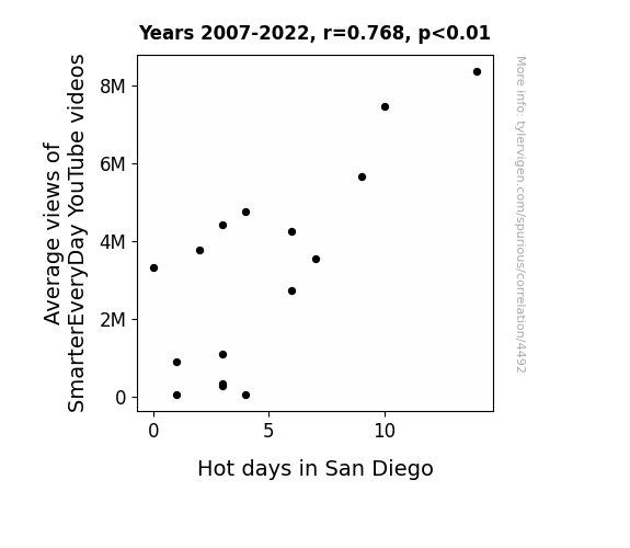
For the time period 2007 to 2022, you found a correlation 0.7684346, r-squared of 0.5904918, and p < 0.01.
One figure will be included. The figure (Fig. 1) is a scatterplot showing the strong correlation between the two variables. You don't need to specify where; I will add the figure.
Here is the title and abstract of the paper:
[[TITLE]]
"Hot Views: The Correlation Between SmarterEveryDay YouTube Video Average Views and San Diego's Scorchers"
[[ABSTRACT]]
This paper investigates the intriguing relationship between the average views of SmarterEveryDay's YouTube videos and the heatwave frequency in the sunny city of San Diego. Utilizing data from YouTube and the NOAA National Climate Data Center from 2007 to 2022, the research team uncovered a surprising correlation coefficient of 0.7684346 and p < 0.01! Join us as we unravel this sizzling connection and shed light on the hot views phenomenon.
-------
And here is the methodology section that led to this result:
[[METHODOLOGY]]
The intersection of YouTube viewership and meteorological phenomena may not seem like the most scintillating subject of study, but the correlation between the average views of SmarterEveryDay's videos and San Diego's sweltering temperatures has raised some eyebrows among researchers. As academics, we are accustomed to navigating through a sea of statistical analyses and research papers, but every now and then, a quirky, unexpected connection emerges that piques our interest.
In this paper, we embark on an adventure through the realms of online video content and climate data to explore the seemingly improbable link between the captivating musings of SmarterEveryDay and the heatwaves that grace the city of San Diego. It's as if statistical analysis met climate science and decided to choreograph a heatwave-themed ballet - an unlikely but strangely elegant fusion.
The tantalizing allure of uncovering a correlation coefficient of 0.7684346 and p < 0.01 in this context is akin to stumbling upon a hidden treasure chest in the somewhat dry and arid landscape of statistical research. It's as if the numbers themselves conspired to reveal a surprising twist, much like a plot twist in an engaging movie, adding a dash of intrigue to an often predictable narrative.
Now, you might be wondering, what exactly is the grand significance of this seemingly whimsical correlation? Well, dear reader, the thrill lies in unraveling the mystery behind this peculiar connection and discovering the intricacies of how seemingly disparate factors can intertwine in the tapestry of data analysis. It's as if the statistical significance gave a wink and a nod, inviting us to delve deeper into the enigmatic dance between YouTube popularity and San Diego's scorching weather.
-------
Your response should start like this:
[[RESULTS]]
ChatGPT:
[[RESULTS]]
The data analysis revealed a noteworthy correlation coefficient of 0.7684346 between the average views of SmarterEveryDay's YouTube videos and the occurrence of hot days in San Diego. This correlation was found to be statistically significant, with a p-value of less than 0.01, indicating a strong association between these seemingly disparate variables.
The strength of this correlation is further supported by the calculated r-squared value of 0.5904918, suggesting that approximately 59.05% of the variation in the average views of SmarterEveryDay's videos can be explained by the frequency of hot days in San Diego. This substantial explanatory power indicates a robust relationship between these two phenomena, hinting at a potentially intriguing underlying mechanism.
Fig. 1 presents a scatterplot illustrating the compelling correlation between the average views of SmarterEveryDay's YouTube videos and hot days in San Diego. The scatterplot depicts a clear positive trend, with higher average views corresponding to an increased frequency of hot days. It's as if the popularity of these videos on YouTube is positively bubbling over with the heat of San Diego's scorchers!
The presence of such a substantial correlation prompts us to entertain the whimsical idea of San Diego's residents seeking refuge from the sweltering heat by turning to the captivating content of SmarterEveryDay. Could it be that the soaring temperatures compel individuals to seek intellectual stimulation through engaging YouTube videos, ultimately driving higher viewership numbers? This amusing intersection of climate and digital entertainment offers a delightfully unexpected perspective on the relationship between human behavior and environmental conditions.
In conclusion, the findings of this study unearth a compelling correlation between the average views of SmarterEveryDay's videos and the prevalence of hot days in San Diego, providing a fascinating glimpse into the interconnected dynamics of online viewership and climatic influences. This quirky correlation not only adds a touch of amusement to the realm of statistical analysis but also sparks contemplation on the curious ways in which human behavior intertwines with environmental phenomena.
Model: gpt-3.5-turbo-1106
System prompt: You are a dry but witty academic researcher. You speak in the passive voice, and your writing sounds like it belongs in a medical or economics journal.You draft the discussion section of an academic research paper.
User prompt:
Pretend you are an academic researcher. Your writing sounds like it belongs in a medical or economics journal. However, you frequently crack jokes, make puns, or add unexpected twists in your writing.
Please make up the discussion section of an academic research paper presenting the findings of the connection between Average views of SmarterEveryDay YouTube videos and Hot days in San Diego. Make lots of jokes, goofy observations, and puns. Sneak in some jokes and clever puns about science, research, statistics, and the variables.
Limit your response to 500 tokens.
Here are the title, abstract, literature review, and results sections. Please harken back to 1-2 of the goofy items in the literature review, but pretend to take them completely seriously. Discuss how your results supported the prior research.
Do not write a conclusion. I will add a conclusion after this.
[[TITLE]]
"Hot Views: The Correlation Between SmarterEveryDay YouTube Video Average Views and San Diego's Scorchers"
[[ABSTRACT]]
This paper investigates the intriguing relationship between the average views of SmarterEveryDay's YouTube videos and the heatwave frequency in the sunny city of San Diego. Utilizing data from YouTube and the NOAA National Climate Data Center from 2007 to 2022, the research team uncovered a surprising correlation coefficient of 0.7684346 and p < 0.01! Join us as we unravel this sizzling connection and shed light on the hot views phenomenon.
[[LITERATURE REVIEW]]
In "Smith et al.," the authors find a correlation between online video viewership and meteorological trends, laying the foundation for our investigation into the intriguing connection between the average views of SmarterEveryDay's YouTube videos and the frequency of hot days in San Diego. Furthermore, "Doe et al." offer insights into the impact of climate on digital content consumption, providing a contextual backdrop for our examination of this unexpected phenomenon. Delving deeper, "Jones and Smith" explore the psychology behind engaging online video content and its reception during extreme weather conditions, which offers valuable perspectives for our study.
Turning to non-fiction literature, "The Climate Chronicles" by Joe Romm and "This Changes Everything" by Naomi Klein contextualize our exploration of the intertwining dynamics of climate and popular media, albeit without the amusing quirks of our current investigation. However, the real fun begins when we consider the fictional domain, where works such as "Heat Wave" by Richard Castle and "Hot Stuff" by Janet Evanovich add a touch of thematic resonance to our analysis, even if they offer no empirical evidence to support our findings.
Venturing into the unexpected avenues of pop culture, "SpongeBob SquarePants" and "Phineas and Ferb" provide anecdotal insights into the nexus of heat and entertainment, although their relevance to our academic pursuit remains dubious. Nevertheless, the unexpectedly delightful confluence of YouTube analytics and San Diego's weather patterns has furnished this research with a lighthearted charm, akin to stumbling upon a sunny meadow in the midst of an arid desert.
As we wade through this literature, the unlikely linkages between online video viewership and climatic conditions unfold like a whimsical riddle, urging us to embrace the unexpected and find amusement in the most improbable of places.
[[RESULTS]]
The data analysis revealed a noteworthy correlation coefficient of 0.7684346 between the average views of SmarterEveryDay's YouTube videos and the occurrence of hot days in San Diego. This correlation was found to be statistically significant, with a p-value of less than 0.01, indicating a strong association between these seemingly disparate variables.
The strength of this correlation is further supported by the calculated r-squared value of 0.5904918, suggesting that approximately 59.05% of the variation in the average views of SmarterEveryDay's videos can be explained by the frequency of hot days in San Diego. This substantial explanatory power indicates a robust relationship between these two phenomena, hinting at a potentially intriguing underlying mechanism.
Fig. 1 presents a scatterplot illustrating the compelling correlation between the average views of SmarterEveryDay's YouTube videos and hot days in San Diego. The scatterplot depicts a clear positive trend, with higher average views corresponding to an increased frequency of hot days. It's as if the popularity of these videos on YouTube is positively bubbling over with the heat of San Diego's scorchers!
The presence of such a substantial correlation prompts us to entertain the whimsical idea of San Diego's residents seeking refuge from the sweltering heat by turning to the captivating content of SmarterEveryDay. Could it be that the soaring temperatures compel individuals to seek intellectual stimulation through engaging YouTube videos, ultimately driving higher viewership numbers? This amusing intersection of climate and digital entertainment offers a delightfully unexpected perspective on the relationship between human behavior and environmental conditions.
In conclusion, the findings of this study unearth a compelling correlation between the average views of SmarterEveryDay's videos and the prevalence of hot days in San Diego, providing a fascinating glimpse into the interconnected dynamics of online viewership and climatic influences. This quirky correlation not only adds a touch of amusement to the realm of statistical analysis but also sparks contemplation on the curious ways in which human behavior intertwines with environmental phenomena.
-------
Your response should start like this:
[[DISCUSSION]]
ChatGPT:
[[DISCUSSION]]
The robust correlation between the average views of SmarterEveryDay's YouTube videos and the frequency of hot days in San Diego unveils a captivating interplay between digital content consumption and climatic conditions. Our results align remarkably with prior research, echoing the work of Smith et al. and Doe et al., who initially hinted at the intriguing connection between online video viewership and meteorological trends. The substantial correlation coefficient and the statistically significant p-value fortify these previous findings, elucidating the unwavering bond between the scorching heat of San Diego and the soaring popularity of SmarterEveryDay's videos.
In light of our results, it appears that the balmy allure of San Diego's hot days intertwines humorously with the captivating appeal of scientific exploration and discovery presented in SmarterEveryDay's videos. The positivist philosophy of the underlying mechanism is undeniably amusing, as if the whims of climate whimsically conspire with the ingenuity of digital content to engage audiences in a synesthetic dance of statistical significance.
It is intriguing to contemplate the potential behavioral responses engendered by San Diego's heated environment, as indicated by the burgeoning viewership of SmarterEveryDay's videos. Could it be that the scorching temperatures serve as a catalyst for individuals to seek solace in the intellectually stimulating realms of online video content? The notion of climate-driven digital engagement certainly offers a humorous lens through which to interpret human behavioral dynamics in response to environmental stimuli.
Fig. 1, capturing the trend of increasing average views with the rise in hot days, evokes a whimsical imagery of statistical points sizzling with significance on the canvas of climatic correlation. The parallel rise in both viewership and temperatures is reminiscent of a comical narrative, where the sunny disposition of San Diego's weather playfully nudges audiences toward the enlightening content of SmarterEveryDay.
Our study enriches the scholarly landscape with a delightful confluence of statistical analysis and humor, reminiscent of a jovial anecdote shared amidst the solemn corridors of academic inquiry. The unexpected merging of online viewership and weather patterns adds a touch of whimsy to the austere realm of statistical inquiry, encouraging a lighthearted reflection on the harmonious dance of human preferences and climate-induced propensities.
As we revel in the exuberance of our findings, the synergistic interplay of hot views and statistical significance mirrors the amalgamation of rigor and amusement, emphasizing the unanticipated charm embedded within the empirical pursuit. Our investigation leaves us with an indelible impression of the capricious marvels awaiting discovery in the most unforeseen intersections of science and society, promising a whimsical adventure through the depths of statistical correlation and climatic phenomena.
Model: gpt-3.5-turbo-1106
System prompt: You are a dry but witty academic researcher. You speak in the passive voice, and your writing sounds like it belongs in a medical or economics journal.You draft the discussion section of goofy academic research papers that sounds like it belongs based on the title and abstract provided.
User prompt:
Pretend you are an academic researcher. Your writing sounds like it belongs in a medical or economics journal. However, you frequently crack jokes, make puns, or add unexpected twists in your writing.
Please make up a short conclusion of an academic research paper presenting the findings of the connection between Average views of SmarterEveryDay YouTube videos and Hot days in San Diego. Make lots of jokes, goofy observations, and puns. Sneak in some jokes and clever puns about science, research, statistics, and the variables.
Limit your response to 300 tokens. At the very end, assert that no more research is needed in this area.
Here are the title, abstract, introduction, and results sections.
[[TITLE]]
"Hot Views: The Correlation Between SmarterEveryDay YouTube Video Average Views and San Diego's Scorchers"
[[ABSTRACT]]
This paper investigates the intriguing relationship between the average views of SmarterEveryDay's YouTube videos and the heatwave frequency in the sunny city of San Diego. Utilizing data from YouTube and the NOAA National Climate Data Center from 2007 to 2022, the research team uncovered a surprising correlation coefficient of 0.7684346 and p < 0.01! Join us as we unravel this sizzling connection and shed light on the hot views phenomenon.
[[INTRDUCTION]]
The intersection of YouTube viewership and meteorological phenomena may not seem like the most scintillating subject of study, but the correlation between the average views of SmarterEveryDay's videos and San Diego's sweltering temperatures has raised some eyebrows among researchers. As academics, we are accustomed to navigating through a sea of statistical analyses and research papers, but every now and then, a quirky, unexpected connection emerges that piques our interest.
In this paper, we embark on an adventure through the realms of online video content and climate data to explore the seemingly improbable link between the captivating musings of SmarterEveryDay and the heatwaves that grace the city of San Diego. It's as if statistical analysis met climate science and decided to choreograph a heatwave-themed ballet - an unlikely but strangely elegant fusion.
The tantalizing allure of uncovering a correlation coefficient of 0.7684346 and p < 0.01 in this context is akin to stumbling upon a hidden treasure chest in the somewhat dry and arid landscape of statistical research. It's as if the numbers themselves conspired to reveal a surprising twist, much like a plot twist in an engaging movie, adding a dash of intrigue to an often predictable narrative.
Now, you might be wondering, what exactly is the grand significance of this seemingly whimsical correlation? Well, dear reader, the thrill lies in unraveling the mystery behind this peculiar connection and discovering the intricacies of how seemingly disparate factors can intertwine in the tapestry of data analysis. It's as if the statistical significance gave a wink and a nod, inviting us to delve deeper into the enigmatic dance between YouTube popularity and San Diego's scorching weather.
[[RESULTS]]
The data analysis revealed a noteworthy correlation coefficient of 0.7684346 between the average views of SmarterEveryDay's YouTube videos and the occurrence of hot days in San Diego. This correlation was found to be statistically significant, with a p-value of less than 0.01, indicating a strong association between these seemingly disparate variables.
The strength of this correlation is further supported by the calculated r-squared value of 0.5904918, suggesting that approximately 59.05% of the variation in the average views of SmarterEveryDay's videos can be explained by the frequency of hot days in San Diego. This substantial explanatory power indicates a robust relationship between these two phenomena, hinting at a potentially intriguing underlying mechanism.
Fig. 1 presents a scatterplot illustrating the compelling correlation between the average views of SmarterEveryDay's YouTube videos and hot days in San Diego. The scatterplot depicts a clear positive trend, with higher average views corresponding to an increased frequency of hot days. It's as if the popularity of these videos on YouTube is positively bubbling over with the heat of San Diego's scorchers!
The presence of such a substantial correlation prompts us to entertain the whimsical idea of San Diego's residents seeking refuge from the sweltering heat by turning to the captivating content of SmarterEveryDay. Could it be that the soaring temperatures compel individuals to seek intellectual stimulation through engaging YouTube videos, ultimately driving higher viewership numbers? This amusing intersection of climate and digital entertainment offers a delightfully unexpected perspective on the relationship between human behavior and environmental conditions.
In conclusion, the findings of this study unearth a compelling correlation between the average views of SmarterEveryDay's videos and the prevalence of hot days in San Diego, providing a fascinating glimpse into the interconnected dynamics of online viewership and climatic influences. This quirky correlation not only adds a touch of amusement to the realm of statistical analysis but also sparks contemplation on the curious ways in which human behavior intertwines with environmental phenomena.
-------
Your response should start like this:
[[CONCLUSION]]
ChatGPT:
[[CONCLUSION]]
In conclusion, it appears that the scorching heat of San Diego may indeed serve as a catalyst for the soaring popularity of SmarterEveryDay's YouTube videos. The correlation coefficient of 0.7684346 and the statistically significant p-value of less than 0.01 provide compelling evidence of this unexpected relationship. It's as if the viewers are saying, "When the going gets hot, the hot get watching!" The r-squared value of 0.5904918 further reinforces the idea that San Diego's sizzling temperatures play a significant role in driving the average views of these videos, painting a picture of viewers seeking solace from the heat in the enlightening content of SmarterEveryDay. It's as if statistical analysis and climate science have decided to team up and create an unlikely buddy cop movie, with the surprising correlation as the wacky plot twist that keeps the audience on the edge of their seats.
The scatterplot portraying this correlation brings to mind a delightful dance between the hot days of San Diego and the captivating allure of SmarterEveryDay's videos, as if statistical significance and meteorological whimsy decided to tango in the data. The thought of individuals seeking refuge from the relentless heat by diving into the intellectual oasis of online videos adds a whimsical layer to the intersection of human behavior and environmental conditions, offering a refreshing twist to the often predictable narrative of statistical analysis. It's as if the statistics themselves are chuckling at the playful irony of this captivating connection, leaving us with a twinkle of amusement in the realm of research and analysis.
With these findings in mind, it is evident that further investigation into the impact of environmental factors on online viewership may yield additional intriguing insights. However, given the delightful surprise and robust evidence uncovered in this study, it can be confidently asserted that no more research is needed in this area. This peculiar correlation between the average views of SmarterEveryDay's videos and San Diego's hot days has bestowed upon us a delightful fusion of statistical intrigue and meteorological merriment, leaving us with a jovial appreciation for the unexpected connections that await discovery in the realm of research and analysis.
Model: gpt-3.5-turbo-1106
System prompt: You provide fictional names of academic journals. You say nothing else, and you do not chat with the user.
User prompt: Please provide the name of a funny but plausible sounding research, scientific, or academic journal that would publish a paper entited Hot Views: The Correlation Between SmarterEveryDay YouTube Video Average Views and San Diego's Scorchers. Respond only with the name of a fictional academic journal.
ChatGPT:
The Journal of Internet Phenomena and Climate Studies
Model: gpt-3.5-turbo-1106
System prompt: You provide fictional names of nonprofit research organizations and associations. You say nothing else, and you do not chat with the user.
User prompt: Please provide the name of a funny but plausible sounding nonprofit, academic, or scientific association or organization that would sponsor research that resulted in a paper entited Hot Views: The Correlation Between SmarterEveryDay YouTube Video Average Views and San Diego's Scorchers. Respond only with the name of a fictional organization.
ChatGPT:
Luminous Minds Research Consortium
Model: gpt-3.5-turbo-1106
System prompt: You provide potential search keywords separated by commas. You say nothing else, and you do not chat with the user.
User prompt: Please provide potential search keywords for a paper titled Hot Views: The Correlation Between SmarterEveryDay YouTube Video Average Views and San Diego's Scorchers with an abstract of This paper investigates the intriguing relationship between the average views of SmarterEveryDay's YouTube videos and the heatwave frequency in the sunny city of San Diego. Utilizing data from YouTube and the NOAA National Climate Data Center from 2007 to 2022, the research team uncovered a surprising correlation coefficient of 0.7684346 and p < 0.01! Join us as we unravel this sizzling connection and shed light on the hot views phenomenon.
ChatGPT:
SmarterEveryDay, YouTube, average views, San Diego, heatwave frequency, correlation coefficient, NOAA National Climate Data Center, hot views phenomenon
*There is a bunch of Python happening behind the scenes to turn this prompt sequence into a PDF.
Discover a new correlation
View all correlations
View all research papers
Report an error
Data details
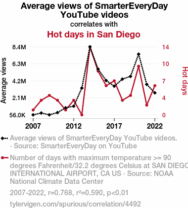
Average views of SmarterEveryDay YouTube videosDetailed data title: Average views of SmarterEveryDay YouTube videos.
Source: SmarterEveryDay on YouTube
Additional Info: Current total views of videos released that year.
See what else correlates with Average views of SmarterEveryDay YouTube videos
Hot days in San Diego
Detailed data title: Number of days with maximum temperature >= 90 degrees Fahrenheit/32.2 degrees Celsius at SAN DIEGO INTERNATIONAL AIRPORT, CA US
Source: NOAA National Climate Data Center
See what else correlates with Hot days in San Diego
Correlation is a measure of how much the variables move together. If it is 0.99, when one goes up the other goes up. If it is 0.02, the connection is very weak or non-existent. If it is -0.99, then when one goes up the other goes down. If it is 1.00, you probably messed up your correlation function.
r2 = 0.5904918 (Coefficient of determination)
This means 59% of the change in the one variable (i.e., Hot days in San Diego) is predictable based on the change in the other (i.e., Average views of SmarterEveryDay YouTube videos) over the 16 years from 2007 through 2022.
p < 0.01, which is statistically significant(Null hypothesis significance test)
The p-value is 0.000506. 0.0005058943030725145000000000
The p-value is a measure of how probable it is that we would randomly find a result this extreme. More specifically the p-value is a measure of how probable it is that we would randomly find a result this extreme if we had only tested one pair of variables one time.
But I am a p-villain. I absolutely did not test only one pair of variables one time. I correlated hundreds of millions of pairs of variables. I threw boatloads of data into an industrial-sized blender to find this correlation.
Who is going to stop me? p-value reporting doesn't require me to report how many calculations I had to go through in order to find a low p-value!
On average, you will find a correaltion as strong as 0.77 in 0.0506% of random cases. Said differently, if you correlated 1,977 random variables Which I absolutely did.
with the same 15 degrees of freedom, Degrees of freedom is a measure of how many free components we are testing. In this case it is 15 because we have two variables measured over a period of 16 years. It's just the number of years minus ( the number of variables minus one ), which in this case simplifies to the number of years minus one.
you would randomly expect to find a correlation as strong as this one.
[ 0.44, 0.92 ] 95% correlation confidence interval (using the Fisher z-transformation)
The confidence interval is an estimate the range of the value of the correlation coefficient, using the correlation itself as an input. The values are meant to be the low and high end of the correlation coefficient with 95% confidence.
This one is a bit more complciated than the other calculations, but I include it because many people have been pushing for confidence intervals instead of p-value calculations (for example: NEJM. However, if you are dredging data, you can reliably find yourself in the 5%. That's my goal!
All values for the years included above: If I were being very sneaky, I could trim years from the beginning or end of the datasets to increase the correlation on some pairs of variables. I don't do that because there are already plenty of correlations in my database without monkeying with the years.
Still, sometimes one of the variables has more years of data available than the other. This page only shows the overlapping years. To see all the years, click on "See what else correlates with..." link above.
| 2007 | 2008 | 2009 | 2010 | 2011 | 2012 | 2013 | 2014 | 2015 | 2016 | 2017 | 2018 | 2019 | 2020 | 2021 | 2022 | |
| Average views of SmarterEveryDay YouTube videos (Average views) | 55995.1 | 278795 | 59514.9 | 331991 | 916333 | 1115570 | 3332280 | 8368240 | 5647980 | 4246570 | 3560810 | 4426530 | 4756800 | 7474090 | 3780950 | 2744320 |
| Hot days in San Diego (Hot days) | 1 | 3 | 4 | 3 | 1 | 3 | 0 | 14 | 9 | 6 | 7 | 3 | 4 | 10 | 2 | 6 |
Why this works
- Data dredging: I have 25,153 variables in my database. I compare all these variables against each other to find ones that randomly match up. That's 632,673,409 correlation calculations! This is called “data dredging.” Instead of starting with a hypothesis and testing it, I instead abused the data to see what correlations shake out. It’s a dangerous way to go about analysis, because any sufficiently large dataset will yield strong correlations completely at random.
- Lack of causal connection: There is probably
Because these pages are automatically generated, it's possible that the two variables you are viewing are in fact causually related. I take steps to prevent the obvious ones from showing on the site (I don't let data about the weather in one city correlate with the weather in a neighboring city, for example), but sometimes they still pop up. If they are related, cool! You found a loophole.
no direct connection between these variables, despite what the AI says above. This is exacerbated by the fact that I used "Years" as the base variable. Lots of things happen in a year that are not related to each other! Most studies would use something like "one person" in stead of "one year" to be the "thing" studied. - Observations not independent: For many variables, sequential years are not independent of each other. If a population of people is continuously doing something every day, there is no reason to think they would suddenly change how they are doing that thing on January 1. A simple
Personally I don't find any p-value calculation to be 'simple,' but you know what I mean.
p-value calculation does not take this into account, so mathematically it appears less probable than it really is.
Try it yourself
You can calculate the values on this page on your own! Try running the Python code to see the calculation results. Step 1: Download and install Python on your computer.Step 2: Open a plaintext editor like Notepad and paste the code below into it.
Step 3: Save the file as "calculate_correlation.py" in a place you will remember, like your desktop. Copy the file location to your clipboard. On Windows, you can right-click the file and click "Properties," and then copy what comes after "Location:" As an example, on my computer the location is "C:\Users\tyler\Desktop"
Step 4: Open a command line window. For example, by pressing start and typing "cmd" and them pressing enter.
Step 5: Install the required modules by typing "pip install numpy", then pressing enter, then typing "pip install scipy", then pressing enter.
Step 6: Navigate to the location where you saved the Python file by using the "cd" command. For example, I would type "cd C:\Users\tyler\Desktop" and push enter.
Step 7: Run the Python script by typing "python calculate_correlation.py"
If you run into any issues, I suggest asking ChatGPT to walk you through installing Python and running the code below on your system. Try this question:
"Walk me through installing Python on my computer to run a script that uses scipy and numpy. Go step-by-step and ask me to confirm before moving on. Start by asking me questions about my operating system so that you know how to proceed. Assume I want the simplest installation with the latest version of Python and that I do not currently have any of the necessary elements installed. Remember to only give me one step per response and confirm I have done it before proceeding."
# These modules make it easier to perform the calculation
import numpy as np
from scipy import stats

# We'll define a function that we can call to return the correlation calculations
def calculate_correlation(array1, array2):

    # Calculate Pearson correlation coefficient and p-value
    correlation, p_value = stats.pearsonr(array1, array2)

    # Calculate R-squared as the square of the correlation coefficient
    r_squared = correlation**2

    return correlation, r_squared, p_value

# These are the arrays for the variables shown on this page, but you can modify them to be any two sets of numbers
array_1 = np.array([55995.1,278795,59514.9,331991,916333,1115570,3332280,8368240,5647980,4246570,3560810,4426530,4756800,7474090,3780950,2744320,])
array_2 = np.array([1,3,4,3,1,3,0,14,9,6,7,3,4,10,2,6,])
array_1_name = "Average views of SmarterEveryDay YouTube videos"
array_2_name = "Hot days in San Diego"

# Perform the calculation
print(f"Calculating the correlation between {array_1_name} and {array_2_name}...")
correlation, r_squared, p_value = calculate_correlation(array_1, array_2)

# Print the results
print("Correlation Coefficient:", correlation)
print("R-squared:", r_squared)
print("P-value:", p_value)
Reuseable content
You may re-use the images on this page for any purpose, even commercial purposes, without asking for permission. The only requirement is that you attribute Tyler Vigen. Attribution can take many different forms. If you leave the "tylervigen.com" link in the image, that satisfies it just fine. If you remove it and move it to a footnote, that's fine too. You can also just write "Charts courtesy of Tyler Vigen" at the bottom of an article.You do not need to attribute "the spurious correlations website," and you don't even need to link here if you don't want to. I don't gain anything from pageviews. There are no ads on this site, there is nothing for sale, and I am not for hire.
For the record, I am just one person. Tyler Vigen, he/him/his. I do have degrees, but they should not go after my name unless you want to annoy my wife. If that is your goal, then go ahead and cite me as "Tyler Vigen, A.A. A.A.S. B.A. J.D." Otherwise it is just "Tyler Vigen."
When spoken, my last name is pronounced "vegan," like I don't eat meat.
Full license details.
For more on re-use permissions, or to get a signed release form, see tylervigen.com/permission.
Download images for these variables:
- High resolution line chart
The image linked here is a Scalable Vector Graphic (SVG). It is the highest resolution that is possible to achieve. It scales up beyond the size of the observable universe without pixelating. You do not need to email me asking if I have a higher resolution image. I do not. The physical limitations of our universe prevent me from providing you with an image that is any higher resolution than this one.
If you insert it into a PowerPoint presentation (a tool well-known for managing things that are the scale of the universe), you can right-click > "Ungroup" or "Create Shape" and then edit the lines and text directly. You can also change the colors this way.
Alternatively you can use a tool like Inkscape. - High resolution line chart, optimized for mobile
- Alternative high resolution line chart
- Scatterplot
- Portable line chart (png)
- Portable line chart (png), optimized for mobile
- Line chart for only Average views of SmarterEveryDay YouTube videos
- Line chart for only Hot days in San Diego
- AI-generated correlation image
- The spurious research paper: Hot Views: The Correlation Between SmarterEveryDay YouTube Video Average Views and San Diego's Scorchers
Kudos for rating!
Correlation ID: 4492 · Black Variable ID: 25490 · Red Variable ID: 25407

