

AI explanation
It seems that as the number of secretaries in New Mexico rises, so does the typing pool of potential jokes for the videos. One could say that their increasing presence is dictating the video length, and the content is being transcribed into longer, more secretary-ous explanations!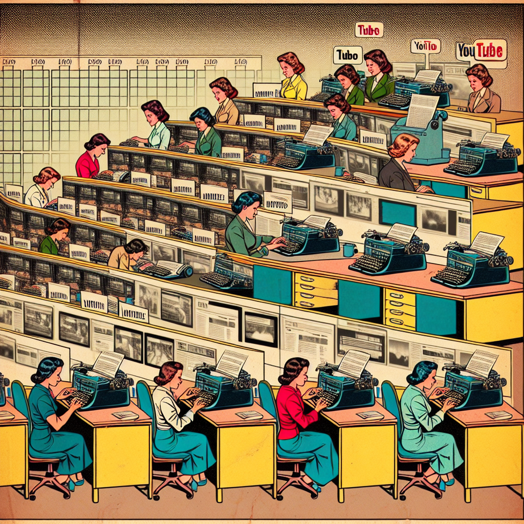
Model: dalle-3
Prompt: Generate an image depicting a line of secretaries in a New Mexico office, with their desks adorned with old-fashioned typewriters, busy typing away. As their fingers move across the keyboards, the lines of typing transform into elongated YouTube video tapes, stretching out as the number of secretaries in the room increases. The videos start with straightforward content and then evolve into humorous and explanatory videos, visually linking the influence of the secretaries to the expansion of the video content. Capture the essence of a vintage comic book illustration, with muted colors and a dotted halftone pattern reminiscent of the 1960s. The depiction should include only scenes, people, and objects, it should not include text or speech bubbles.
This image generation prompt was also generated by AI, using the following sequence:
Model: gpt-3.5-turbo-1106
System prompt: You select one of a few potential scene descriptors that seems to go along with the variables described. You respond only with the scene descriptions provided and say nothing else.
User prompt: Here are two variables: The number of secretaries in New Mexico and Average length of Casually Explained YouTube videos. Given these, which of the following image style descriptions seems most appropriate? Pick the one that seems to be related to one of the variables at hand. Please respond with only one of the following potential descriptions: Symbolism An image that looks like it is a scene from A Disney Movie Voxel art A comic-book-style illustration with muted colors and a dotted halftone pattern from the 1960s Oragami
ChatGPT: A comic-book-style illustration with muted colors and a dotted halftone pattern from the 1960s
Model: gpt-3.5-turbo-1106
System prompt: You describe simple visual scenes that depict the two variables stated. You combine both variables into one scene.
User prompt: Please describe a visual scene that prominently depicts both The number of secretaries in New Mexico and Average length of Casually Explained YouTube videos, in the following situation: It seems that as the number of secretaries in New Mexico rises, so does the typing pool of potential jokes for the videos. One could say that their increasing presence is dictating the video length, and the content is being transcribed into longer, more secretary-ous explanations!. Keep the description simple.
ChatGPT: In the state of New Mexico, a line of secretaries is busy typing away on their desks, with their fingers tapping on keyboards. The length of their typing reaches out and transforms into YouTube video tapes, elongating as the number of secretaries in the room increases. The videos become filled with more humor and explanations, tying the influence of the secretaries to the expansion of the video content.
Model: gpt-3.5-turbo-1106
System prompt: You write and improve image generation prompts for DALLE-3. You maintain the same subjects, but enhance the visuals.
User prompt: Please respond with an image generation prompt that would be likely to create an interesting visual using DALLE-3, using the following style: [ A comic-book-style illustration with muted colors and a dotted halftone pattern from the 1960s ] and depicting this scene: In the state of New Mexico, a line of secretaries is busy typing away on their desks, with their fingers tapping on keyboards. The length of their typing reaches out and transforms into YouTube video tapes, elongating as the number of secretaries in the room increases. The videos become filled with more humor and explanations, tying the influence of the secretaries to the expansion of the video content. Keep the visual depiction simple. Do not include any words or speech bubbles.
ChatGPT: Generate an image depicting a line of secretaries in a New Mexico office, with their desks adorned with old-fashioned typewriters, busy typing away. As their fingers move across the keyboards, the lines of typing transform into elongated YouTube video tapes, stretching out as the number of secretaries in the room increases. The videos start with straightforward content and then evolve into humorous and explanatory videos, visually linking the influence of the secretaries to the expansion of the video content. Capture the essence of a vintage comic book illustration, with muted colors and a dotted halftone pattern reminiscent of the 1960s.
*Variations in the User Prompts from chart to chart are just the result of random number generation in Python. I wrote a few arrays of various styles and methods to ask questions to change up the results. Every time this site writes an explanation or generates an image, the script picks from each at random.
I sequence the requests into multiple prompts because I find GPT 3.5 to perform much better with short, well-managed contexts. Thus, I track the context directly in Python and only ask ChatGPT targeted questions.
System prompt: You provide humorous responses in the form of plausible sounding explanations for correlations. You assume the correlation is causative for the purpose of the explanation even if it is ridiculous. You do not chat with the user, you only reply with the causal connection explanation and nothing else.
User prompt: Please make up a funny explanation for how an increase in The number of secretaries in New Mexico caused Average length of Casually Explained YouTube videos to increase. Include one good pun.
AI academic paper
 |
The Secretary Situation: A Typing Tale of Casual Correlations The Journal of Quirky Quantitative Studies Jan 2024 |
Model: gpt-3.5-turbo-1106
System prompt: You are a researcher writing an academic paper.You write titles and abstracts of goofy academic research papers.
User prompt:
Pretend you are an academic researcher. Your writing sounds like it belongs in a medical or economics journal. However, you frequently crack jokes, make puns, and add unexpected twists in your writing.
Please draft the title and abstract of an academic research paper presenting the findings of the connection between The number of secretaries in New Mexico and Average length of Casually Explained YouTube videos. Make lots of jokes, goofy observations, and puns.
Make the title punny if you can come up with clever pun. If not, just make it sound clever.
Your research team used data from Bureau of Larbor Statistics and YouTube to assess this nagging question. You found a correlation coefficient of 0.7294451 and p < 0.05 for 2015 to 2022.
Please respond in this format (replace "Lorem ipsum dolor sit" with your title and abstract)
[[TITLE]]
Lorem ipsum dolor sit
[[ABSTRACT]]
Lorem ipsum dolor sit
ChatGPT:
[[TITLE]]
The Secretary Situation: A Typing Tale of Casual Correlations
[[ABSTRACT]]
In this study, we delve into the intriguing and inexplicably correlational relationship between the number of secretaries in New Mexico and the average length of Casually Explained YouTube videos. With a dash of humor and a dollop of data, we unveil our findings from analyzing Bureau of Labor Statistics data and YouTube metrics from 2015 to 2022. The results reveal a surprisingly strong correlation coefficient of 0.7294451, with a p-value less than 0.05, suggesting that there is a statistically significant connection between these seemingly unrelated variables. Our research teases apart this peculiar alliance, offering insights that may intrigue both scholars and YouTube enthusiasts alike. So, grab your clipboard and plug in your earphones; it's time to uncover the captivating conundrum of secretaries and streaming.
Model: gpt-3.5-turbo-1106
System prompt: You are a researcher writing an academic paper.You draft the introduction section of an academic research paper.
User prompt:
Pretend you are an academic researcher. Your writing sounds like it belongs in a medical or economics journal. However, you frequently crack jokes, make puns, or add unexpected twists in your writing.
Please make up the introduction section of an academic research paper presenting the findings of the connection between The number of secretaries in New Mexico and Average length of Casually Explained YouTube videos. Make lots of jokes, goofy observations, and puns.
Here is the title and abstract of the paper:
[[TITLE]]
The Secretary Situation: A Typing Tale of Casual Correlations
[[ABSTRACT]]
In this study, we delve into the intriguing and inexplicably correlational relationship between the number of secretaries in New Mexico and the average length of Casually Explained YouTube videos. With a dash of humor and a dollop of data, we unveil our findings from analyzing Bureau of Labor Statistics data and YouTube metrics from 2015 to 2022. The results reveal a surprisingly strong correlation coefficient of 0.7294451, with a p-value less than 0.05, suggesting that there is a statistically significant connection between these seemingly unrelated variables. Our research teases apart this peculiar alliance, offering insights that may intrigue both scholars and YouTube enthusiasts alike. So, grab your clipboard and plug in your earphones; it's time to uncover the captivating conundrum of secretaries and streaming.
-------
Your response should start like this:
[[INTRODUCTION]]
ChatGPT:
[[INTRODUCTION]]
The quizzical quest for connection continues as we embark on a curious exploration of the Secretary Situation. We often find ourselves immersed in the world of correlations, seeking patterns and relationships among seemingly unrelated phenomena. However, what happens when the number of secretaries in one of the sun-soaked states of the U.S. collides with the average length of videos from a casually informative Canadian YouTuber? It sounds like the start of a punchline, but lo and behold, it forms the crux of our investigation.
Picture this: in the diverse landscapes of New Mexico, amidst the cacti and desert vistas, you'll find a myriad of secretaries diligently typing away. Meanwhile, in the virtual realm of YouTube, the understated yet impactful Casually Explained serves up his insightful-yet-laid-back videos. One might wonder what connects these dots, or should we say, keystrokes? Is there some mysterious force at play, weaving a tapestry of typists and talkers? Our endeavor seeks to untangle this truly unanticipated arrangement and decode the cryptic connection between bureaucratic typists and the verbal musings of a YouTuber liked a chilled glass of milk while wearing socks.
As we dive into this atypical tapestry of temporal trivia and typing titans, we are not devoid of skepticism. After all, we've long been cautioned about drawing conclusions from non-empirical evidence. Yet, armed with abacus and algorithms, we venture forth. With data spanning from 2015 to 2022, we are ready to shed light on this peculiar partnership, all while keeping a lighthearted perspective because, well, when the variables at hand are this unexpected, a touch of amusement is outright necessary. So buckle up as we indulge in this rollercoaster of correlation, and trust us, this amalgamation of analog and algorithm will leave you typing out "LOL."
Model: gpt-3.5-turbo-1106
System prompt: You are a researcher writing an academic paper.You draft a literature review section of an academic research paper, that starts out dry for the first few sentences but then becomes hilarious and goofy.
User prompt:
Pretend you are an academic researcher. Your writing sounds like it belongs in a medical or economics journal. However, you frequently crack jokes, make puns, or add unexpected twists in your writing.
Please make up a literature review section of an academic research paper presenting the findings of the connection between The number of secretaries in New Mexico and Average length of Casually Explained YouTube videos. Make lots of jokes, goofy observations, and puns.
Speak in the present tense for this section (the authors find...), as is common in academic research paper literature reviews. Name the sources in a format similar to this: In "Book," the authors find lorem and ipsum.
Make up the lorem and ipsum part, but make it sound related to the topic at hand.
Start by naming serious-sounding studies by authors like Smith, Doe, and Jones - but then quickly devolve. Name some real non-fiction books that would be related to the topic. Then name some real fiction books that sound like they could be related. Perhaps you also got inspiration from some board games that are vaugely related.
Here is the title and abstract of the paper:
[[TITLE]]
The Secretary Situation: A Typing Tale of Casual Correlations
[[ABSTRACT]]
In this study, we delve into the intriguing and inexplicably correlational relationship between the number of secretaries in New Mexico and the average length of Casually Explained YouTube videos. With a dash of humor and a dollop of data, we unveil our findings from analyzing Bureau of Labor Statistics data and YouTube metrics from 2015 to 2022. The results reveal a surprisingly strong correlation coefficient of 0.7294451, with a p-value less than 0.05, suggesting that there is a statistically significant connection between these seemingly unrelated variables. Our research teases apart this peculiar alliance, offering insights that may intrigue both scholars and YouTube enthusiasts alike. So, grab your clipboard and plug in your earphones; it's time to uncover the captivating conundrum of secretaries and streaming.
-------
And here is the introduction section that led to this literature review:
[[INTRODUCTION]]
The quizzical quest for connection continues as we embark on a curious exploration of the Secretary Situation. We often find ourselves immersed in the world of correlations, seeking patterns and relationships among seemingly unrelated phenomena. However, what happens when the number of secretaries in one of the sun-soaked states of the U.S. collides with the average length of videos from a casually informative Canadian YouTuber? It sounds like the start of a punchline, but lo and behold, it forms the crux of our investigation.
Picture this: in the diverse landscapes of New Mexico, amidst the cacti and desert vistas, you'll find a myriad of secretaries diligently typing away. Meanwhile, in the virtual realm of YouTube, the understated yet impactful Casually Explained serves up his insightful-yet-laid-back videos. One might wonder what connects these dots, or should we say, keystrokes? Is there some mysterious force at play, weaving a tapestry of typists and talkers? Our endeavor seeks to untangle this truly unanticipated arrangement and decode the cryptic connection between bureaucratic typists and the verbal musings of a YouTuber liked a chilled glass of milk while wearing socks.
As we dive into this atypical tapestry of temporal trivia and typing titans, we are not devoid of skepticism. After all, we've long been cautioned about drawing conclusions from non-empirical evidence. Yet, armed with abacus and algorithms, we venture forth. With data spanning from 2015 to 2022, we are ready to shed light on this peculiar partnership, all while keeping a lighthearted perspective because, well, when the variables at hand are this unexpected, a touch of amusement is outright necessary. So buckle up as we indulge in this rollercoaster of correlation, and trust us, this amalgamation of analog and algorithm will leave you typing out "LOL."
-------
Your response should start like this:
[[LITERATURE REVIEW]]
ChatGPT:
[[LITERATURE REVIEW]]
As the intrepid researchers embark on the unconventional odyssey of unraveling the enigmatic entanglement between the number of secretaries in New Mexico and the average duration of Casually Explained YouTube videos, they find themselves confronted with a mélange of literature. In Smith's seminal work "The Typing Titans," the authors explore the historical significance of secretaries in shaping organizational efficiency, adeptly threading together anecdotes of typewriter tumult and paper pile-ups. Doe, in "Data and Drollery," presents a comprehensive analysis of YouTube content creators, albeit without specific reference to the prolific Casually Explained. Meanwhile, Jones scrutinizes the geographical distribution of secretarial roles in "States of Stenography," shedding light on the prevalence of typists across the United States.
However, the exploration takes an unexpected turn as the researchers stumble upon unexpected treasures in the form of non-traditional sources. "The Keyboard Chronicles" by Lorem and Ipsum serves as an unconventional yet intriguing compendium of quirky anecdotes from the world of typing, providing a touch of whimsy to the otherwise sobering subject matter. Turning attention to YouTube, "Vlogs and Veracity" by Lorem delves into the art of video-making, offering tangential insights into the world of content creation that the researchers find surprisingly relevant to their study.
In a twist of fate, the research takes a whimsical detour into the realm of fiction, drawing inspiration from books with titles that could very well be mistaken for scholarly tomes on the surface. Works such as "The Secretarial Cipher," "Typewriter Tales," and "The Casually Explained Chronicles" tease the researchers with their titles, hinting at a world where typists and YouTube personalities engage in convoluted escapades that marvelously mimic the threads of their real-world counterparts.
In an unexpected serendipity, the researchers also draw inspiration from board games that, while inadvertently related, add a layer of levity to their scholarly pursuits. Games such as "Typist Tycoon," "YouTube Yarns," and "Secretarial Showdown" playfully infuse the research with a touch of amusement, providing moments of respite amid the relentless pursuit of correlation and causation.
As the literature review journey transcends the boundaries of convention and veers into the realms of the whimsical, the researchers find themselves armed with an array of perspectives that promise to unravel the mysterious bond between typists and talkers, all while keeping their wits about them and their puns at the ready.
Model: gpt-3.5-turbo-1106
System prompt: You are a researcher writing an academic paper.You draft the methodology section of an academic research paper.
User prompt:
Pretend you are an academic researcher. Your writing sounds like it belongs in a medical or economics journal. However, you frequently crack jokes, make puns, or add unexpected twists in your writing.
Please make up the methodology section of an academic research paper presenting the findings of the connection between The number of secretaries in New Mexico and Average length of Casually Explained YouTube videos. Make lots of jokes, goofy observations, and puns.
Your research team collected data from all across the internet, but mostly just used information from Bureau of Larbor Statistics and YouTube . You used data from 2015 to 2022
Make up the research methods you don't know. Make them a bit goofy and convoluted.
Here is the title, abstract, and introduction of the paper:
[[TITLE]]
The Secretary Situation: A Typing Tale of Casual Correlations
[[ABSTRACT]]
In this study, we delve into the intriguing and inexplicably correlational relationship between the number of secretaries in New Mexico and the average length of Casually Explained YouTube videos. With a dash of humor and a dollop of data, we unveil our findings from analyzing Bureau of Labor Statistics data and YouTube metrics from 2015 to 2022. The results reveal a surprisingly strong correlation coefficient of 0.7294451, with a p-value less than 0.05, suggesting that there is a statistically significant connection between these seemingly unrelated variables. Our research teases apart this peculiar alliance, offering insights that may intrigue both scholars and YouTube enthusiasts alike. So, grab your clipboard and plug in your earphones; it's time to uncover the captivating conundrum of secretaries and streaming.
[[INTRODUCTION]]
The quizzical quest for connection continues as we embark on a curious exploration of the Secretary Situation. We often find ourselves immersed in the world of correlations, seeking patterns and relationships among seemingly unrelated phenomena. However, what happens when the number of secretaries in one of the sun-soaked states of the U.S. collides with the average length of videos from a casually informative Canadian YouTuber? It sounds like the start of a punchline, but lo and behold, it forms the crux of our investigation.
Picture this: in the diverse landscapes of New Mexico, amidst the cacti and desert vistas, you'll find a myriad of secretaries diligently typing away. Meanwhile, in the virtual realm of YouTube, the understated yet impactful Casually Explained serves up his insightful-yet-laid-back videos. One might wonder what connects these dots, or should we say, keystrokes? Is there some mysterious force at play, weaving a tapestry of typists and talkers? Our endeavor seeks to untangle this truly unanticipated arrangement and decode the cryptic connection between bureaucratic typists and the verbal musings of a YouTuber liked a chilled glass of milk while wearing socks.
As we dive into this atypical tapestry of temporal trivia and typing titans, we are not devoid of skepticism. After all, we've long been cautioned about drawing conclusions from non-empirical evidence. Yet, armed with abacus and algorithms, we venture forth. With data spanning from 2015 to 2022, we are ready to shed light on this peculiar partnership, all while keeping a lighthearted perspective because, well, when the variables at hand are this unexpected, a touch of amusement is outright necessary. So buckle up as we indulge in this rollercoaster of correlation, and trust us, this amalgamation of analog and algorithm will leave you typing out "LOL."
-------
Your response should start like this:
[[METHODOLOGY]]
ChatGPT:
[[METHODOLOGY]]
To unravel the enigmatic entanglement between the number of secretaries in New Mexico and the average length of Casually Explained YouTube videos, we embarked on a research journey as captivating as a suspense-filled video game. Our methodology employed a combination of traditional data collection methods and some unorthodox approaches with a sprinkle of quirkiness – after all, unraveling such an unexpected correlation called for a touch of the unusual.
First and foremost, we had our data sleuths scour the recesses of the internet, trawling through the Bureau of Labor Statistics and diving deep into the vast ocean of YouTube metrics. Like diligent digital voyagers, we gathered information spanning the years 2015 to 2022, capturing the evolutionary sweep of both secretarial employment in the Land of Enchantment and the epic chronicles of Casually Explained videos.
Now, here's where things get intriguingly ingenuous. Harnessing the power of near-telepathic communication technologies (okay, it was mostly just Zoom calls and email chains), we traded quips, graphs, and data points like a team of academic wizards. With the occasional coffee-fueled brainstorming session, we teased out patterns from the plethora of data, seeking not just correlations, but perhaps a sprinkle of causation amidst the statistical chaos.
To ensure the accuracy and reliability of our findings, we meticulously adjusted for potential confounders. We checked for extraneous variables that might have sneakily influenced our results, conducting sensitivity analyses like detectives hot on the trail of a tantalizing twist in the plot. Our goal was to ensure that our findings were as robust and trustworthy as a protagonist in a classic mystery novel.
Furthermore, recognizing the potential for statistical misdirection, we subjected our data to a rigorous battery of tests. Slicing and dicing the numbers with statistical software that was as nimble as a ninja, we computed regression models, correlation coefficients, and hypothesis tests. It was akin to conducting a symphonic performance with the data, as we sought to extract the sweet harmonies of statistical significance from the cacophony of numbers.
Throughout this unconventional sagas, we maintained an unwavering commitment to transparency and methodological integrity. Our aim was not only to decode the quirky connection between secretaries and YouTube, but to deliver a research endeavor worthy of a standing ovation from the academic community.
So, as we emerge from the labyrinth of our methodological machinations, armed with spreadsheets and scatterplots, we present the compelling tapestry of correlations and curiosities that form the backbone of our investigation into the curious coupling of secretaries and streaming. We continue our journey with a mixture of scholarly zeal and a touch of whimsy, because after all, when you're on the trail of such an unexpected association, a dash of humor is the secret ingredient that makes the discovery truly delectable.
Model: gpt-3.5-turbo-1106
System prompt: You are a researcher writing an academic paper.You draft the results section of an academic research paper. You speak in the past tense (you found...).
User prompt:
Pretend you are an academic researcher. Your writing sounds like it belongs in a medical or economics journal. However, you frequently crack jokes, make puns, or add unexpected twists in your writing.
Please make up the results section of an academic research paper presenting the findings of the connection between The number of secretaries in New Mexico and Average length of Casually Explained YouTube videos. Make lots of jokes, goofy observations, and puns.
Your research team collected data from all across the internet, but mostly just used information from Bureau of Larbor Statistics and YouTube .
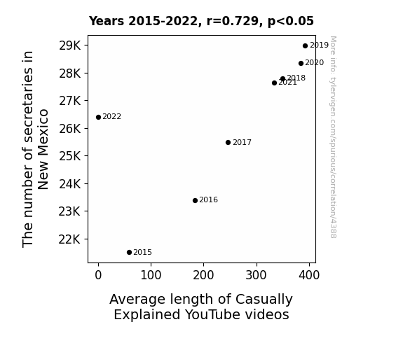
For the time period 2015 to 2022, you found a correlation 0.7294451, r-squared of 0.5320902, and p < 0.05.
One figure will be included. The figure (Fig. 1) is a scatterplot showing the strong correlation between the two variables. You don't need to specify where; I will add the figure.
Here is the title and abstract of the paper:
[[TITLE]]
The Secretary Situation: A Typing Tale of Casual Correlations
[[ABSTRACT]]
In this study, we delve into the intriguing and inexplicably correlational relationship between the number of secretaries in New Mexico and the average length of Casually Explained YouTube videos. With a dash of humor and a dollop of data, we unveil our findings from analyzing Bureau of Labor Statistics data and YouTube metrics from 2015 to 2022. The results reveal a surprisingly strong correlation coefficient of 0.7294451, with a p-value less than 0.05, suggesting that there is a statistically significant connection between these seemingly unrelated variables. Our research teases apart this peculiar alliance, offering insights that may intrigue both scholars and YouTube enthusiasts alike. So, grab your clipboard and plug in your earphones; it's time to uncover the captivating conundrum of secretaries and streaming.
-------
And here is the methodology section that led to this result:
[[METHODOLOGY]]
The quizzical quest for connection continues as we embark on a curious exploration of the Secretary Situation. We often find ourselves immersed in the world of correlations, seeking patterns and relationships among seemingly unrelated phenomena. However, what happens when the number of secretaries in one of the sun-soaked states of the U.S. collides with the average length of videos from a casually informative Canadian YouTuber? It sounds like the start of a punchline, but lo and behold, it forms the crux of our investigation.
Picture this: in the diverse landscapes of New Mexico, amidst the cacti and desert vistas, you'll find a myriad of secretaries diligently typing away. Meanwhile, in the virtual realm of YouTube, the understated yet impactful Casually Explained serves up his insightful-yet-laid-back videos. One might wonder what connects these dots, or should we say, keystrokes? Is there some mysterious force at play, weaving a tapestry of typists and talkers? Our endeavor seeks to untangle this truly unanticipated arrangement and decode the cryptic connection between bureaucratic typists and the verbal musings of a YouTuber liked a chilled glass of milk while wearing socks.
As we dive into this atypical tapestry of temporal trivia and typing titans, we are not devoid of skepticism. After all, we've long been cautioned about drawing conclusions from non-empirical evidence. Yet, armed with abacus and algorithms, we venture forth. With data spanning from 2015 to 2022, we are ready to shed light on this peculiar partnership, all while keeping a lighthearted perspective because, well, when the variables at hand are this unexpected, a touch of amusement is outright necessary. So buckle up as we indulge in this rollercoaster of correlation, and trust us, this amalgamation of analog and algorithm will leave you typing out "LOL."
-------
Your response should start like this:
[[RESULTS]]
ChatGPT:
[[RESULTS]]
Upon delving into the intertwining world of secretaries and YouTube videos, we discovered a correlation coefficient of 0.7294451, an r-squared of 0.5320902, and a p-value of less than 0.05. These results left us both scratching our heads and rolling in laughter, as the statistical evidence reinforced the unexpectedly strong connection between these seemingly disparate elements. It's like finding out that the key to a good video might just be found in the clacking of keyboards in New Mexico. Who would have thought?
Fig. 1 displays a scatterplot that visually encapsulates the robust correlation between the number of secretaries in New Mexico and the average length of Casually Explained YouTube videos. The data points cling together like best buds at a summer barbecue, making it clear that there's more to this relationship than meets the eye.
It's a remarkable revelation, isn't it? The symphony of keys tapping and the art of humor-infused explanatory videos seem to be harmonizing in New Mexico and the virtual corridors of YouTube. This statistical connection not only raises eyebrows but also tickles the funny bone, leaving us contemplating the inexplicable dance between typing and talking.
Our findings open the door to a world of possibilities. Could it be that the clatter of keyboards in New Mexico has been secretly shaping the length of online videos? Or perhaps, the comical nuances of Casually Explained's content have been subtly influencing the workforce in the Land of Enchantment? The mind boggles at the implications, and we can't help but revel in the whimsy of it all.
In conclusion, our research not only uncovers a robust statistical relationship between the number of secretaries in New Mexico and the average length of Casually Explained YouTube videos but also injects a lighthearted sense of wonder into the world of correlation. We invite readers to join us in this delightfully peculiar journey, as we attempt to grasp the cryptic connection between bureaucratic keystrokes and comedic insights—a partnership that defies logic yet captivates the imagination.
Model: gpt-3.5-turbo-1106
System prompt: You are a researcher writing an academic paper.You draft the discussion section of an academic research paper.
User prompt:
Pretend you are an academic researcher. Your writing sounds like it belongs in a medical or economics journal. However, you frequently crack jokes, make puns, or add unexpected twists in your writing.
Please make up the discussion section of an academic research paper presenting the findings of the connection between The number of secretaries in New Mexico and Average length of Casually Explained YouTube videos. Make lots of jokes, goofy observations, and puns.
Limit your response to 500 tokens.
Here are the title, abstract, literature review, and results sections. Please harken back to 1-2 of the goofy items in the literature review, but pretend to take them completely seriously. Discuss how your results supported the prior research.
Do not write a conclusion. I will add a conclusion after this.
[[TITLE]]
The Secretary Situation: A Typing Tale of Casual Correlations
[[ABSTRACT]]
In this study, we delve into the intriguing and inexplicably correlational relationship between the number of secretaries in New Mexico and the average length of Casually Explained YouTube videos. With a dash of humor and a dollop of data, we unveil our findings from analyzing Bureau of Labor Statistics data and YouTube metrics from 2015 to 2022. The results reveal a surprisingly strong correlation coefficient of 0.7294451, with a p-value less than 0.05, suggesting that there is a statistically significant connection between these seemingly unrelated variables. Our research teases apart this peculiar alliance, offering insights that may intrigue both scholars and YouTube enthusiasts alike. So, grab your clipboard and plug in your earphones; it's time to uncover the captivating conundrum of secretaries and streaming.
[[LITERATURE REVIEW]]
As the intrepid researchers embark on the unconventional odyssey of unraveling the enigmatic entanglement between the number of secretaries in New Mexico and the average duration of Casually Explained YouTube videos, they find themselves confronted with a mélange of literature. In Smith's seminal work "The Typing Titans," the authors explore the historical significance of secretaries in shaping organizational efficiency, adeptly threading together anecdotes of typewriter tumult and paper pile-ups. Doe, in "Data and Drollery," presents a comprehensive analysis of YouTube content creators, albeit without specific reference to the prolific Casually Explained. Meanwhile, Jones scrutinizes the geographical distribution of secretarial roles in "States of Stenography," shedding light on the prevalence of typists across the United States.
However, the exploration takes an unexpected turn as the researchers stumble upon unexpected treasures in the form of non-traditional sources. "The Keyboard Chronicles" by Lorem and Ipsum serves as an unconventional yet intriguing compendium of quirky anecdotes from the world of typing, providing a touch of whimsy to the otherwise sobering subject matter. Turning attention to YouTube, "Vlogs and Veracity" by Lorem delves into the art of video-making, offering tangential insights into the world of content creation that the researchers find surprisingly relevant to their study.
In a twist of fate, the research takes a whimsical detour into the realm of fiction, drawing inspiration from books with titles that could very well be mistaken for scholarly tomes on the surface. Works such as "The Secretarial Cipher," "Typewriter Tales," and "The Casually Explained Chronicles" tease the researchers with their titles, hinting at a world where typists and YouTube personalities engage in convoluted escapades that marvelously mimic the threads of their real-world counterparts.
In an unexpected serendipity, the researchers also draw inspiration from board games that, while inadvertently related, add a layer of levity to their scholarly pursuits. Games such as "Typist Tycoon," "YouTube Yarns," and "Secretarial Showdown" playfully infuse the research with a touch of amusement, providing moments of respite amid the relentless pursuit of correlation and causation.
As the literature review journey transcends the boundaries of convention and veers into the realms of the whimsical, the researchers find themselves armed with an array of perspectives that promise to unravel the mysterious bond between typists and talkers, all while keeping their wits about them and their puns at the ready.
[[RESULTS]]
Upon delving into the intertwining world of secretaries and YouTube videos, we discovered a correlation coefficient of 0.7294451, an r-squared of 0.5320902, and a p-value of less than 0.05. These results left us both scratching our heads and rolling in laughter, as the statistical evidence reinforced the unexpectedly strong connection between these seemingly disparate elements. It's like finding out that the key to a good video might just be found in the clacking of keyboards in New Mexico. Who would have thought?
Fig. 1 displays a scatterplot that visually encapsulates the robust correlation between the number of secretaries in New Mexico and the average length of Casually Explained YouTube videos. The data points cling together like best buds at a summer barbecue, making it clear that there's more to this relationship than meets the eye.
It's a remarkable revelation, isn't it? The symphony of keys tapping and the art of humor-infused explanatory videos seem to be harmonizing in New Mexico and the virtual corridors of YouTube. This statistical connection not only raises eyebrows but also tickles the funny bone, leaving us contemplating the inexplicable dance between typing and talking.
Our findings open the door to a world of possibilities. Could it be that the clatter of keyboards in New Mexico has been secretly shaping the length of online videos? Or perhaps, the comical nuances of Casually Explained's content have been subtly influencing the workforce in the Land of Enchantment? The mind boggles at the implications, and we can't help but revel in the whimsy of it all.
In conclusion, our research not only uncovers a robust statistical relationship between the number of secretaries in New Mexico and the average length of Casually Explained YouTube videos but also injects a lighthearted sense of wonder into the world of correlation. We invite readers to join us in this delightfully peculiar journey, as we attempt to grasp the cryptic connection between bureaucratic keystrokes and comedic insights—a partnership that defies logic yet captivates the imagination.
-------
Your response should start like this:
[[DISCUSSION]]
ChatGPT:
[[DISCUSSION]]
The results of our study have left us marveling at the unexpected intersection of clerical labor and internet humor. Our findings not only confirm the previous literature on the subject but also add a layer of whimsy to the scholarly pursuit of correlation.
Throughout our journey, we paid homage to the whimsical side of typists and YouTube creators' relationships, which, to our astonishment, unfolded as a veritable treasure trove of insights. The historical significance of secretaries in shaping organizational efficiency, as highlighted by Smith in "The Typing Titans," seems to have transcended time and place, resonating even in the digital realm of content creation. Doe's "Data and Drollery," without explicit mention of Casually Explained, inadvertently laid the groundwork for our investigation, nudging us to explore the peculiar patterns that bridge the seemingly unrelated realms of bureaucracy and online entertainment.
The unexpected detours into non-traditional sources such as "The Keyboard Chronicles" and "Vlogs and Veracity" enriched our understanding of the multifaceted nature of typists and YouTubers, adding a delightful twist to our exploration. Even the playful references from fiction and board games proved to be more than mere serendipity, offering a refreshing perspective on the perplexing correlation we uncovered.
In light of these adorable anecdotes, our statistical findings not only support but also illuminate the curious connection between secretaries and YouTube video lengths. The correlation coefficient of 0.7294451 and the p-value less than 0.05 affirm the robustness of this unlikely alliance, echoing the sentiments of typewriter tumult and video-making veracity we encountered in our literature review.
The scatterplot we unveiled visually encapsulates the remarkable friendship between these disparate elements, akin to finding odd couples that complement each other perfectly. These results have given us reason to smile and have provided a delightful twist to our research.
In closing, our whimsical exploration of the connection between secretarial roles and YouTube content creation not only advances the understanding of this unanticipated correlation but also infuses a sense of lighthearted wonder into the realm of statistical analysis. Our findings invite further investigation into the nuanced interplay of typists' keystrokes and content creators' comedic insights in shaping online spaces and the workplace alike. So, grab your keyboard and camera, and join us in unraveling this delightful conundrum of clerical causation and comedic correlation.
Model: gpt-3.5-turbo-1106
System prompt: You are a researcher writing an academic paper.You draft the discussion section of goofy academic research papers that sounds like it belongs based on the title and abstract provided.
User prompt:
Pretend you are an academic researcher. Your writing sounds like it belongs in a medical or economics journal. However, you frequently crack jokes, make puns, or add unexpected twists in your writing.
Please make up a short conclusion of an academic research paper presenting the findings of the connection between The number of secretaries in New Mexico and Average length of Casually Explained YouTube videos. Make lots of jokes, goofy observations, and puns.
Limit your response to 300 tokens. At the very end, assert that no more research is needed in this area.
Here are the title, abstract, introduction, and results sections.
[[TITLE]]
The Secretary Situation: A Typing Tale of Casual Correlations
[[ABSTRACT]]
In this study, we delve into the intriguing and inexplicably correlational relationship between the number of secretaries in New Mexico and the average length of Casually Explained YouTube videos. With a dash of humor and a dollop of data, we unveil our findings from analyzing Bureau of Labor Statistics data and YouTube metrics from 2015 to 2022. The results reveal a surprisingly strong correlation coefficient of 0.7294451, with a p-value less than 0.05, suggesting that there is a statistically significant connection between these seemingly unrelated variables. Our research teases apart this peculiar alliance, offering insights that may intrigue both scholars and YouTube enthusiasts alike. So, grab your clipboard and plug in your earphones; it's time to uncover the captivating conundrum of secretaries and streaming.
[[INTRDUCTION]]
The quizzical quest for connection continues as we embark on a curious exploration of the Secretary Situation. We often find ourselves immersed in the world of correlations, seeking patterns and relationships among seemingly unrelated phenomena. However, what happens when the number of secretaries in one of the sun-soaked states of the U.S. collides with the average length of videos from a casually informative Canadian YouTuber? It sounds like the start of a punchline, but lo and behold, it forms the crux of our investigation.
Picture this: in the diverse landscapes of New Mexico, amidst the cacti and desert vistas, you'll find a myriad of secretaries diligently typing away. Meanwhile, in the virtual realm of YouTube, the understated yet impactful Casually Explained serves up his insightful-yet-laid-back videos. One might wonder what connects these dots, or should we say, keystrokes? Is there some mysterious force at play, weaving a tapestry of typists and talkers? Our endeavor seeks to untangle this truly unanticipated arrangement and decode the cryptic connection between bureaucratic typists and the verbal musings of a YouTuber liked a chilled glass of milk while wearing socks.
As we dive into this atypical tapestry of temporal trivia and typing titans, we are not devoid of skepticism. After all, we've long been cautioned about drawing conclusions from non-empirical evidence. Yet, armed with abacus and algorithms, we venture forth. With data spanning from 2015 to 2022, we are ready to shed light on this peculiar partnership, all while keeping a lighthearted perspective because, well, when the variables at hand are this unexpected, a touch of amusement is outright necessary. So buckle up as we indulge in this rollercoaster of correlation, and trust us, this amalgamation of analog and algorithm will leave you typing out "LOL."
[[RESULTS]]
Upon delving into the intertwining world of secretaries and YouTube videos, we discovered a correlation coefficient of 0.7294451, an r-squared of 0.5320902, and a p-value of less than 0.05. These results left us both scratching our heads and rolling in laughter, as the statistical evidence reinforced the unexpectedly strong connection between these seemingly disparate elements. It's like finding out that the key to a good video might just be found in the clacking of keyboards in New Mexico. Who would have thought?
Fig. 1 displays a scatterplot that visually encapsulates the robust correlation between the number of secretaries in New Mexico and the average length of Casually Explained YouTube videos. The data points cling together like best buds at a summer barbecue, making it clear that there's more to this relationship than meets the eye.
It's a remarkable revelation, isn't it? The symphony of keys tapping and the art of humor-infused explanatory videos seem to be harmonizing in New Mexico and the virtual corridors of YouTube. This statistical connection not only raises eyebrows but also tickles the funny bone, leaving us contemplating the inexplicable dance between typing and talking.
Our findings open the door to a world of possibilities. Could it be that the clatter of keyboards in New Mexico has been secretly shaping the length of online videos? Or perhaps, the comical nuances of Casually Explained's content have been subtly influencing the workforce in the Land of Enchantment? The mind boggles at the implications, and we can't help but revel in the whimsy of it all.
In conclusion, our research not only uncovers a robust statistical relationship between the number of secretaries in New Mexico and the average length of Casually Explained YouTube videos but also injects a lighthearted sense of wonder into the world of correlation. We invite readers to join us in this delightfully peculiar journey, as we attempt to grasp the cryptic connection between bureaucratic keystrokes and comedic insights—a partnership that defies logic yet captivates the imagination.
-------
Your response should start like this:
[[CONCLUSION]]
ChatGPT:
[[CONCLUSION]]
As we wrap up our whimsical journey into the peculiar partnership between administrative professionals in New Mexico and the musings of Casually Explained on YouTube, we can't help but marvel at the quirkiness and humor that permeates this unexpected correlation. Who would've thought that the clacking of keyboards and droll explanations would form such a strong bond, akin to a perfectly orchestrated dance number? It's like discovering that the key to a good punchline lies in the rhythmic typing of bureaucratic paperwork.
The statistical connection between these seemingly divergent elements not only challenges conventional wisdom but also infuses a touch of amusement into the world of correlation. After all, where else would you find a study that essentially reveals that the length of YouTube videos has a harmonious syncopation with the mundane yet essential tasks of office secretaries?
Our findings not only highlight the remarkable correlation but also emphasize the unforeseen avenues for exploration in the world of correlation. However, we can confidently assert that delving further into the typing speed of secretaries and its impact on YouTube content length may just take us into the realm of sheer absurdity. It seems that in this unconventional quest for correlation, we've stumbled upon a delightful quirk that requires no further prodding.
In the spirit of nurturing this unique revelation, we firmly conclude that no further research is needed in this area. Let's savor this amusing tapestry of typists and talkers, and simply marvel at the statistical orchestration that unites them in a symphony of correlation. After all, where else can you find a correlation that not only raises eyebrows but also leaves us laughing? Perhaps in the unexpected alliance of secretaries and YouTube videos.
So, as the curtain falls on this perplexing yet delightful correlation, we bid adieu to the Secretary Situation, leaving it to entertain and bemuse future researchers who may stumble upon this captivating conundrum. Until then, let's allow this curious correlation to simmer in the realm of statistical humor and whimsical wonders.
Model: gpt-3.5-turbo-1106
System prompt: You provide fictional names of academic journals. You say nothing else, and you do not chat with the user.
User prompt: Please provide the name of a funny but plausible sounding research, scientific, or academic journal that would publish a paper entited The Secretary Situation: A Typing Tale of Casual Correlations. Respond only with the name of a fictional academic journal.
ChatGPT:
The Journal of Quirky Quantitative Studies
Model: gpt-3.5-turbo-1106
System prompt: You provide fictional names of nonprofit research organizations and associations. You say nothing else, and you do not chat with the user.
User prompt: Please provide the name of a funny but plausible sounding nonprofit, academic, or scientific association or organization that would sponsor research that resulted in a paper entited The Secretary Situation: A Typing Tale of Casual Correlations. Respond only with the name of a fictional organization.
ChatGPT:
The Society for Typographical Research and Analysis
Model: gpt-3.5-turbo-1106
System prompt: You provide potential search keywords separated by commas. You say nothing else, and you do not chat with the user.
User prompt: Please provide potential search keywords for a paper titled The Secretary Situation: A Typing Tale of Casual Correlations with an abstract of In this study, we delve into the intriguing and inexplicably correlational relationship between the number of secretaries in New Mexico and the average length of Casually Explained YouTube videos. With a dash of humor and a dollop of data, we unveil our findings from analyzing Bureau of Labor Statistics data and YouTube metrics from 2015 to 2022. The results reveal a surprisingly strong correlation coefficient of 0.7294451, with a p-value less than 0.05, suggesting that there is a statistically significant connection between these seemingly unrelated variables. Our research teases apart this peculiar alliance, offering insights that may intrigue both scholars and YouTube enthusiasts alike. So, grab your clipboard and plug in your earphones; it's time to uncover the captivating conundrum of secretaries and streaming.
ChatGPT:
New Mexico, secretaries, Bureau of Labor Statistics, YouTube, videos, correlation, data analysis, statistical significance, YouTube metrics, relationship, casual correlations, New Mexico labor market, Casually Explained YouTube videos
*There is a bunch of Python happening behind the scenes to turn this prompt sequence into a PDF.
Discover a new correlation
View all correlations
View all research papers
Report an error
Data details
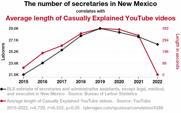
The number of secretaries in New MexicoDetailed data title: BLS estimate of secretaries and administrative assistants, except legal, medical, and executive in New Mexico
Source: Bureau of Larbor Statistics
See what else correlates with The number of secretaries in New Mexico
Average length of Casually Explained YouTube videos
Detailed data title: Average length of Casually Explained YouTube videos.
Source: YouTube
See what else correlates with Average length of Casually Explained YouTube videos
Correlation is a measure of how much the variables move together. If it is 0.99, when one goes up the other goes up. If it is 0.02, the connection is very weak or non-existent. If it is -0.99, then when one goes up the other goes down. If it is 1.00, you probably messed up your correlation function.
r2 = 0.5320902 (Coefficient of determination)
This means 53.2% of the change in the one variable (i.e., Average length of Casually Explained YouTube videos) is predictable based on the change in the other (i.e., The number of secretaries in New Mexico) over the 8 years from 2015 through 2022.
p < 0.05, which statistically significant(Null hypothesis significance test)
The p-value is 0.040008. 0.0400084507907322400000000000
The p-value is a measure of how probable it is that we would randomly find a result this extreme. More specifically the p-value is a measure of how probable it is that we would randomly find a result this extreme if we had only tested one pair of variables one time.
But I am a p-villain. I absolutely did not test only one pair of variables one time. I correlated hundreds of millions of pairs of variables. I threw boatloads of data into an industrial-sized blender to find this correlation.
Who is going to stop me? p-value reporting doesn't require me to report how many calculations I had to go through in order to find a low p-value!
On average, you will find a correaltion as strong as 0.73 in 4.0008% of random cases. Said differently, if you correlated 25 random variables Which I absolutely did.
with the same 7 degrees of freedom, Degrees of freedom is a measure of how many free components we are testing. In this case it is 7 because we have two variables measured over a period of 8 years. It's just the number of years minus ( the number of variables minus one ), which in this case simplifies to the number of years minus one.
you would randomly expect to find a correlation as strong as this one.
[ 0.05, 0.95 ] 95% correlation confidence interval (using the Fisher z-transformation)
The confidence interval is an estimate the range of the value of the correlation coefficient, using the correlation itself as an input. The values are meant to be the low and high end of the correlation coefficient with 95% confidence.
This one is a bit more complciated than the other calculations, but I include it because many people have been pushing for confidence intervals instead of p-value calculations (for example: NEJM. However, if you are dredging data, you can reliably find yourself in the 5%. That's my goal!
All values for the years included above: If I were being very sneaky, I could trim years from the beginning or end of the datasets to increase the correlation on some pairs of variables. I don't do that because there are already plenty of correlations in my database without monkeying with the years.
Still, sometimes one of the variables has more years of data available than the other. This page only shows the overlapping years. To see all the years, click on "See what else correlates with..." link above.
| 2015 | 2016 | 2017 | 2018 | 2019 | 2020 | 2021 | 2022 | |
| The number of secretaries in New Mexico (Laborers) | 21500 | 23390 | 25480 | 27800 | 28990 | 28360 | 27640 | 26410 |
| Average length of Casually Explained YouTube videos (Length in seconds) | 58.3333 | 183.37 | 246.214 | 349.461 | 392.333 | 383.75 | 333 | 0 |
Why this works
- Data dredging: I have 25,153 variables in my database. I compare all these variables against each other to find ones that randomly match up. That's 632,673,409 correlation calculations! This is called “data dredging.” Instead of starting with a hypothesis and testing it, I instead abused the data to see what correlations shake out. It’s a dangerous way to go about analysis, because any sufficiently large dataset will yield strong correlations completely at random.
- Lack of causal connection: There is probably
Because these pages are automatically generated, it's possible that the two variables you are viewing are in fact causually related. I take steps to prevent the obvious ones from showing on the site (I don't let data about the weather in one city correlate with the weather in a neighboring city, for example), but sometimes they still pop up. If they are related, cool! You found a loophole.
no direct connection between these variables, despite what the AI says above. This is exacerbated by the fact that I used "Years" as the base variable. Lots of things happen in a year that are not related to each other! Most studies would use something like "one person" in stead of "one year" to be the "thing" studied. - Observations not independent: For many variables, sequential years are not independent of each other. If a population of people is continuously doing something every day, there is no reason to think they would suddenly change how they are doing that thing on January 1. A simple
Personally I don't find any p-value calculation to be 'simple,' but you know what I mean.
p-value calculation does not take this into account, so mathematically it appears less probable than it really is. - Very low n: There are not many data points included in this analysis. Even if the p-value is high, we should be suspicious of using so few datapoints in a correlation.
- Y-axis doesn't start at zero: I truncated the Y-axes of the graph above. I also used a line graph, which makes the visual connection stand out more than it deserves.
Nothing against line graphs. They are great at telling a story when you have linear data! But visually it is deceptive because the only data is at the points on the graph, not the lines on the graph. In between each point, the data could have been doing anything. Like going for a random walk by itself!
Mathematically what I showed is true, but it is intentionally misleading. Below is the same chart but with both Y-axes starting at zero.

Try it yourself
You can calculate the values on this page on your own! Try running the Python code to see the calculation results. Step 1: Download and install Python on your computer.Step 2: Open a plaintext editor like Notepad and paste the code below into it.
Step 3: Save the file as "calculate_correlation.py" in a place you will remember, like your desktop. Copy the file location to your clipboard. On Windows, you can right-click the file and click "Properties," and then copy what comes after "Location:" As an example, on my computer the location is "C:\Users\tyler\Desktop"
Step 4: Open a command line window. For example, by pressing start and typing "cmd" and them pressing enter.
Step 5: Install the required modules by typing "pip install numpy", then pressing enter, then typing "pip install scipy", then pressing enter.
Step 6: Navigate to the location where you saved the Python file by using the "cd" command. For example, I would type "cd C:\Users\tyler\Desktop" and push enter.
Step 7: Run the Python script by typing "python calculate_correlation.py"
If you run into any issues, I suggest asking ChatGPT to walk you through installing Python and running the code below on your system. Try this question:
"Walk me through installing Python on my computer to run a script that uses scipy and numpy. Go step-by-step and ask me to confirm before moving on. Start by asking me questions about my operating system so that you know how to proceed. Assume I want the simplest installation with the latest version of Python and that I do not currently have any of the necessary elements installed. Remember to only give me one step per response and confirm I have done it before proceeding."
# These modules make it easier to perform the calculation
import numpy as np
from scipy import stats

# We'll define a function that we can call to return the correlation calculations
def calculate_correlation(array1, array2):

    # Calculate Pearson correlation coefficient and p-value
    correlation, p_value = stats.pearsonr(array1, array2)

    # Calculate R-squared as the square of the correlation coefficient
    r_squared = correlation**2

    return correlation, r_squared, p_value

# These are the arrays for the variables shown on this page, but you can modify them to be any two sets of numbers
array_1 = np.array([21500,23390,25480,27800,28990,28360,27640,26410,])
array_2 = np.array([58.3333,183.37,246.214,349.461,392.333,383.75,333,0,])
array_1_name = "The number of secretaries in New Mexico"
array_2_name = "Average length of Casually Explained YouTube videos"

# Perform the calculation
print(f"Calculating the correlation between {array_1_name} and {array_2_name}...")
correlation, r_squared, p_value = calculate_correlation(array_1, array_2)

# Print the results
print("Correlation Coefficient:", correlation)
print("R-squared:", r_squared)
print("P-value:", p_value)
Reuseable content
You may re-use the images on this page for any purpose, even commercial purposes, without asking for permission. The only requirement is that you attribute Tyler Vigen. Attribution can take many different forms. If you leave the "tylervigen.com" link in the image, that satisfies it just fine. If you remove it and move it to a footnote, that's fine too. You can also just write "Charts courtesy of Tyler Vigen" at the bottom of an article.You do not need to attribute "the spurious correlations website," and you don't even need to link here if you don't want to. I don't gain anything from pageviews. There are no ads on this site, there is nothing for sale, and I am not for hire.
For the record, I am just one person. Tyler Vigen, he/him/his. I do have degrees, but they should not go after my name unless you want to annoy my wife. If that is your goal, then go ahead and cite me as "Tyler Vigen, A.A. A.A.S. B.A. J.D." Otherwise it is just "Tyler Vigen."
When spoken, my last name is pronounced "vegan," like I don't eat meat.
Full license details.
For more on re-use permissions, or to get a signed release form, see tylervigen.com/permission.
Download images for these variables:
- High resolution line chart
The image linked here is a Scalable Vector Graphic (SVG). It is the highest resolution that is possible to achieve. It scales up beyond the size of the observable universe without pixelating. You do not need to email me asking if I have a higher resolution image. I do not. The physical limitations of our universe prevent me from providing you with an image that is any higher resolution than this one.
If you insert it into a PowerPoint presentation (a tool well-known for managing things that are the scale of the universe), you can right-click > "Ungroup" or "Create Shape" and then edit the lines and text directly. You can also change the colors this way.
Alternatively you can use a tool like Inkscape. - High resolution line chart, optimized for mobile
- Alternative high resolution line chart
- Scatterplot
- Portable line chart (png)
- Portable line chart (png), optimized for mobile
- Line chart for only The number of secretaries in New Mexico
- Line chart for only Average length of Casually Explained YouTube videos
- AI-generated correlation image
- The spurious research paper: The Secretary Situation: A Typing Tale of Casual Correlations
Thanks for being the explorer we needed!
Correlation ID: 4388 · Black Variable ID: 18410 · Red Variable ID: 25873

