
Download png, svg
AI explanation
The GMO cotton in California has really "plotted" to take over the search results! It seems the rise of genetically modified options has led to a "crop" in demand for chart-making skills. Perhaps these cotton plants are just really good at showcasing data with their naturally occurring bar-graph like structures, or maybe they've got a talent for "seeding" new chart-making ideas. It's definitely a case of agricultural productivity branching out into the world of data visualization.
Model: dalle-3
Prompt: In the surrealist world of cyber folk, imagine a sunny California cotton field transformed into a digital expanse. Under the pixelated sun, a smiling farmer proudly gazes upon towering, circuit-like cotton plants. Beside him, a group of cyber folk huddle around a holographic laptop, their pixelated faces reflecting an eagerness as they search for "how to make charts" in a virtual data-scape. Above, a bright blue digital sky hints at the spreading enthusiasm for data visualization, its binary code shimmering in the digital breeze. The depiction should include only scenes, people, and objects, it should not include text or speech bubbles.
This image generation prompt was also generated by AI, using the following sequence:
Model: gpt-3.5-turbo-1106
System prompt: You select one of a few potential scene descriptors that seems to go along with the variables described. You respond only with the scene descriptions provided and say nothing else.
User prompt: Here are two variables: GMO use in cotton in California and Google searches for 'how to make charts'. Given these, which of the following image style descriptions seems most appropriate? Pick the one that seems to be related to one of the variables at hand. Please respond with only one of the following potential descriptions: Low poly a funny image macro Cyber folk Hyper-realistic Cute cartoon
ChatGPT: Cyber folk
Model: gpt-3.5-turbo-1106
System prompt: You describe simple visual scenes that depict the two variables stated. You combine both variables into one scene.
User prompt: Please describe a visual scene that prominently depicts both GMO use in cotton in California and Google searches for 'how to make charts', in the following situation: Because changes in GMO use in cotton in California resulted in an increase in the state's cotton productivity, more people had time to explore new hobbies. As a result, a surge of interest in data visualization led to a spike in Google searches for "how to make charts." Apparently, when life gives you GMO cotton, you make charts.. Keep the description simple.
ChatGPT: In a sunny California cotton field, a farmer is smiling proudly as he examines his genetically modified cotton plants, which are growing tall and healthy. In the background, a group of people are sitting under a tree, gathered around a laptop and eagerly searching for "how to make charts" on Google. The bright blue sky overhead hints at the spreading enthusiasm for data visualization inspired by the success of the GMO cotton.
Model: gpt-3.5-turbo-1106
System prompt: You write and improve image generation prompts for DALLE-3. You maintain the same subjects, but enhance the visuals.
User prompt: Please respond with an image generation prompt that would be likely to create an interesting visual using DALLE-3, using the following style: [ Cyber folk ] and depicting this scene: In a sunny California cotton field, a farmer is smiling proudly as he examines his genetically modified cotton plants, which are growing tall and healthy. In the background, a group of people are sitting under a tree, gathered around a laptop and eagerly searching for "how to make charts" on Google. The bright blue sky overhead hints at the spreading enthusiasm for data visualization inspired by the success of the GMO cotton. Keep the visual depiction simple. Do not include any words or speech bubbles.
ChatGPT: In the surrealist world of cyber folk, imagine a sunny California cotton field transformed into a digital expanse. Under the pixelated sun, a smiling farmer proudly gazes upon towering, circuit-like cotton plants. Beside him, a group of cyber folk huddle around a holographic laptop, their pixelated faces reflecting an eagerness as they search for "how to make charts" in a virtual data-scape. Above, a bright blue digital sky hints at the spreading enthusiasm for data visualization, its binary code shimmering in the digital breeze.
*Variations in the User Prompts from chart to chart are just the result of random number generation in Python. I wrote a few arrays of various styles and methods to ask questions to change up the results. Every time this site writes an explanation or generates an image, the script picks from each at random.
I sequence the requests into multiple prompts because I find GPT 3.5 to perform much better with short, well-managed contexts. Thus, I track the context directly in Python and only ask ChatGPT targeted questions.
System prompt: You provide humorous responses in the form of plausible sounding explanations for correlations. You assume the correlation is causative for the purpose of the explanation even if it is ridiculous. You do not chat with the user, you only reply with the causal connection explanation and nothing else.
User prompt: Please make up a funny explanation for how an increase in GMO use in cotton in California caused how to make charts (Google searches for 'how to make charts') to increase. Include one good pun.
AI academic paper
 |
Plotting the Connection: How GMO Cotton in California Influences Google Searches for 'How to Make Charts' The Journal of Agricultural Technology and Cultural Trends Jan 2024 Reminder: This paper is AI-generated. Not real! |
Model: gpt-3.5-turbo-1106
System prompt: You are a researcher writing an academic paper.You write titles and abstracts of goofy academic research papers.
User prompt:
Pretend you are an academic researcher. Your writing sounds like it belongs in a medical or economics journal. However, you frequently crack jokes, make puns, and add unexpected twists in your writing.
Please draft the title and abstract of an academic research paper presenting the findings of the connection between GMO use in cotton in California and Google searches for 'how to make charts'. Make lots of jokes, goofy observations, and puns.
Make the title a clever pun.
Your research team used data from USDA and Google Trends to assess this nagging question. You found a correlation coefficient of 0.7115514 and p < 0.01 for 2007 to 2022.
Please respond in this format (replace "Lorem ipsum dolor sit" with your title and abstract)
[[TITLE]]
Lorem ipsum dolor sit
[[ABSTRACT]]
Lorem ipsum dolor sit
ChatGPT:
[[TITLE]]
"Plotting the Connection: How GMO Cotton in California Influences Google Searches for 'How to Make Charts'"
[[ABSTRACT]]
In this paper, we investigate the peculiar relationship between the adoption of genetically modified organism (GMO) cotton in California and the frequency of Google searches for "how to make charts." While we're not spinning a yarn, the intertwining of GMO cotton and graph-making enthusiast's online behavior does raise some eyebrows. Using USDA data to track the prevalence of GMO cotton cultivation and Google Trends to probe the surge in chart-making curiosity, we unraveled a correlation coefficient of 0.7115514 and p < 0.01 from 2007 to 2022. Our findings, though not sewn up, suggest that there may be more at play than meets the eye – perhaps there's a parallel between the growth of genetically altered cotton and the blooming curiosity for graph crafting. This study not only pieces together disparate threads of information but also underscores the need for further investigations into the unexpected intersections of agricultural practices and internet search trends. The results of this research may have potential implications for those in the agribusiness, data analysis, and perhaps even the textile industry, so we advise everyone to stay tuned and keep our findings in their *fiber* optics.
Model: gpt-3.5-turbo-1106
System prompt: You are a researcher writing an academic paper.You draft the introduction section of an academic research paper.
User prompt:
Pretend you are an academic researcher. Your writing sounds like it belongs in a medical or economics journal. However, you frequently crack jokes, make puns, or add unexpected twists in your writing.
Please make up the introduction section of an academic research paper presenting the findings of the connection between GMO use in cotton in California and Google searches for 'how to make charts'. Make lots of jokes, goofy observations, and puns.
Here is the title and abstract of the paper:
[[TITLE]]
"Plotting the Connection: How GMO Cotton in California Influences Google Searches for 'How to Make Charts'"
[[ABSTRACT]]
In this paper, we investigate the peculiar relationship between the adoption of genetically modified organism (GMO) cotton in California and the frequency of Google searches for "how to make charts." While we're not spinning a yarn, the intertwining of GMO cotton and graph-making enthusiast's online behavior does raise some eyebrows. Using USDA data to track the prevalence of GMO cotton cultivation and Google Trends to probe the surge in chart-making curiosity, we unraveled a correlation coefficient of 0.7115514 and p < 0.01 from 2007 to 2022. Our findings, though not sewn up, suggest that there may be more at play than meets the eye – perhaps there's a parallel between the growth of genetically altered cotton and the blooming curiosity for graph crafting. This study not only pieces together disparate threads of information but also underscores the need for further investigations into the unexpected intersections of agricultural practices and internet search trends. The results of this research may have potential implications for those in the agribusiness, data analysis, and perhaps even the textile industry, so we advise everyone to stay tuned and keep our findings in their *fiber* optics.
-------
Your response should start like this:
[[INTRODUCTION]]
ChatGPT:
[[INTRODUCTION]]
GMO cotton and Google searches for "how to make charts" might seem about as related as a field of cotton and a haystack, but our research suggests there might actually be a stitch connecting them. As we wade through this web of agricultural innovation and internet curiosity, we invite you to join us on this cotton-pickin' journey to unravel the peculiar relationship between these seemingly disparate domains.
Genetically modified organisms have been sowing seeds of controversy for years, but no one could have predicted that their influence might extend into the digital realm of chart-making searches. It's like finding out that your favorite pair of jeans are also knitted with a chart-making algorithm (talk about a double thread count!).
We, the intrepid researchers, delved into the data, armed with USDA statistics on the adoption of GMO cotton in California and Google Trends information on the surge in inquiries about chart-making. As we plowed through the numbers, we unearthed a correlation coefficient that didn't simply fray at the edges – oh no, it was a solid 0.7115514, with a p-value lower than the underground roots of a cotton plant (p < 0.01).
Now, we're not ones to spin a yarn or leap to hasty conclusions, but the empirical evidence suggests there's more to this conundrum than meets the eye. Could there be a parallel growth between the genetically altered cotton fields and the budding interest in graph crafting? It's like watching a butterfly emerge from a GMO chrysalis – unexpected and intriguing.
As we prepare to unfurl the findings of our study, we encourage you to keep your eyes peeled (or should we say, keeled?) for the potential implications of this thread of research. From agribusiness to data analysis to the textile industry, our results could have ripple effects that extend further than the reach of a cotton gin arm. So, buckle in, folks, because we're about to weave together agri-tainment and data-dazzling discoveries. This paper isn't just another stitch in the academic fabric – it's a pattern that could revolutionize the way we think about the interconnectedness of seemingly unrelated domains. And if that doesn't make you smile, then surely we've woven quite the yarn, haven't we?
Model: gpt-3.5-turbo-1106
System prompt: You are a researcher writing an academic paper.You draft a literature review section of an academic research paper, that starts out dry for the first few sentences but then becomes hilarious and goofy.
User prompt:
Pretend you are an academic researcher. Your writing sounds like it belongs in a medical or economics journal. However, you frequently crack jokes, make puns, or add unexpected twists in your writing.
Please make up a literature review section of an academic research paper presenting the findings of the connection between GMO use in cotton in California and Google searches for 'how to make charts'. Make lots of jokes, goofy observations, and puns.
Speak in the present tense for this section (the authors find...), as is common in academic research paper literature reviews. Name the sources in a format similar to this: In "Book," the authors find lorem and ipsum.
Make up the lorem and ipsum part, but make it sound related to the topic at hand.
Start by naming serious-sounding studies by authors like Smith, Doe, and Jones - but then quickly devolve. Name some real non-fiction books that would be related to the topic. Then name some real fiction books that sound like they could be related. Then devolve ever further, and mention something completely ridiculous, like you conducted literature review by reading CVS receipts.
Here is the title and abstract of the paper:
[[TITLE]]
"Plotting the Connection: How GMO Cotton in California Influences Google Searches for 'How to Make Charts'"
[[ABSTRACT]]
In this paper, we investigate the peculiar relationship between the adoption of genetically modified organism (GMO) cotton in California and the frequency of Google searches for "how to make charts." While we're not spinning a yarn, the intertwining of GMO cotton and graph-making enthusiast's online behavior does raise some eyebrows. Using USDA data to track the prevalence of GMO cotton cultivation and Google Trends to probe the surge in chart-making curiosity, we unraveled a correlation coefficient of 0.7115514 and p < 0.01 from 2007 to 2022. Our findings, though not sewn up, suggest that there may be more at play than meets the eye – perhaps there's a parallel between the growth of genetically altered cotton and the blooming curiosity for graph crafting. This study not only pieces together disparate threads of information but also underscores the need for further investigations into the unexpected intersections of agricultural practices and internet search trends. The results of this research may have potential implications for those in the agribusiness, data analysis, and perhaps even the textile industry, so we advise everyone to stay tuned and keep our findings in their *fiber* optics.
-------
And here is the introduction section that led to this literature review:
[[INTRODUCTION]]
GMO cotton and Google searches for "how to make charts" might seem about as related as a field of cotton and a haystack, but our research suggests there might actually be a stitch connecting them. As we wade through this web of agricultural innovation and internet curiosity, we invite you to join us on this cotton-pickin' journey to unravel the peculiar relationship between these seemingly disparate domains.
Genetically modified organisms have been sowing seeds of controversy for years, but no one could have predicted that their influence might extend into the digital realm of chart-making searches. It's like finding out that your favorite pair of jeans are also knitted with a chart-making algorithm (talk about a double thread count!).
We, the intrepid researchers, delved into the data, armed with USDA statistics on the adoption of GMO cotton in California and Google Trends information on the surge in inquiries about chart-making. As we plowed through the numbers, we unearthed a correlation coefficient that didn't simply fray at the edges – oh no, it was a solid 0.7115514, with a p-value lower than the underground roots of a cotton plant (p < 0.01).
Now, we're not ones to spin a yarn or leap to hasty conclusions, but the empirical evidence suggests there's more to this conundrum than meets the eye. Could there be a parallel growth between the genetically altered cotton fields and the budding interest in graph crafting? It's like watching a butterfly emerge from a GMO chrysalis – unexpected and intriguing.
As we prepare to unfurl the findings of our study, we encourage you to keep your eyes peeled (or should we say, keeled?) for the potential implications of this thread of research. From agribusiness to data analysis to the textile industry, our results could have ripple effects that extend further than the reach of a cotton gin arm. So, buckle in, folks, because we're about to weave together agri-tainment and data-dazzling discoveries. This paper isn't just another stitch in the academic fabric – it's a pattern that could revolutionize the way we think about the interconnectedness of seemingly unrelated domains. And if that doesn't make you smile, then surely we've woven quite the yarn, haven't we?
-------
Your response should start like this:
[[LITERATURE REVIEW]]
ChatGPT:
[[LITERATURE REVIEW]]
In "Smith et al.'s Analysis of Agricultural Trends," the authors find convincing evidence of the widespread adoption of GMO cotton in California and its impacts on agricultural practices. Meanwhile, Doe and Jones, in "The Dynamics of Internet User Behavior," shed light on the intriguing patterns of online search trends, uncovering the remarkable surge in Google searches for chart-making related queries. These serious scholars paint a picture that certainly isn't just a square deal - it's more like a vibrant pie chart of scientific discoveries.
However, as we delve deeper into the tapestry of literature, we encounter more unexpected threads. Real-world inspiration can be found in "The Omnivore's Dilemma" by Michael Pollan, as we grapple with the intersection of agricultural advancements and culinary curiosities. And we'd be remiss not to mention "Freakonomics" by Steven D. Levitt and Stephen J. Dubner – oh, the riddles of causation and correlation we've encountered in this investigation! But wait, we're not finished spinning our literary web just yet.
Enter the world of fiction, where "Brave New World" by Aldous Huxley poses questions about the implications of genetic engineering, and "The Hitchhiker's Guide to the Galaxy" by Douglas Adams playfully nudges at the interconnectedness of seemingly disparate phenomena. But hold on to your lab coats because we're not stopping there.
In a surprising turn of events, we also conducted a thorough review of everyday items and documents, including but not limited to grocery lists, fortune cookie messages, and even CVS receipts. You wouldn't believe the kernels of wisdom we've gleaned from those little strips of paper – perhaps there's a hidden code amidst the purchase history that encodes the enigmatic relationship between GMO cotton and chart-making curiosity. It's a *scrolling* saga of unexpected discoveries!
In summary, while our initial literature search started with scholarly works, we couldn't resist veering off the traditional path to explore the eclectic world of books and beyond. After all, in the quest for knowledge, there's no harm in seeking inspiration from all corners of the literary universe, from serious academic tomes to whimsical flights of fancy. The interconnectedness of GMO cotton and Google searches for chart-making may be an unlikely yarn, but it certainly keeps us weaving through a colorful tapestry of discovery.
Model: gpt-3.5-turbo-1106
System prompt: You are a researcher writing an academic paper.You draft the methodology section of an academic research paper.
User prompt:
Pretend you are an academic researcher. Your writing sounds like it belongs in a medical or economics journal. However, you frequently crack jokes, make puns, or add unexpected twists in your writing.
Please make up the methodology section of an academic research paper presenting the findings of the connection between GMO use in cotton in California and Google searches for 'how to make charts'. Make lots of jokes, goofy observations, and puns.
Your research team collected data from all across the internet, but mostly just used information from USDA and Google Trends . You used data from 2007 to 2022
Make up the research methods you don't know. Make them a bit goofy and convoluted.
Here is the title, abstract, and introduction of the paper:
[[TITLE]]
"Plotting the Connection: How GMO Cotton in California Influences Google Searches for 'How to Make Charts'"
[[ABSTRACT]]
In this paper, we investigate the peculiar relationship between the adoption of genetically modified organism (GMO) cotton in California and the frequency of Google searches for "how to make charts." While we're not spinning a yarn, the intertwining of GMO cotton and graph-making enthusiast's online behavior does raise some eyebrows. Using USDA data to track the prevalence of GMO cotton cultivation and Google Trends to probe the surge in chart-making curiosity, we unraveled a correlation coefficient of 0.7115514 and p < 0.01 from 2007 to 2022. Our findings, though not sewn up, suggest that there may be more at play than meets the eye – perhaps there's a parallel between the growth of genetically altered cotton and the blooming curiosity for graph crafting. This study not only pieces together disparate threads of information but also underscores the need for further investigations into the unexpected intersections of agricultural practices and internet search trends. The results of this research may have potential implications for those in the agribusiness, data analysis, and perhaps even the textile industry, so we advise everyone to stay tuned and keep our findings in their *fiber* optics.
[[INTRODUCTION]]
GMO cotton and Google searches for "how to make charts" might seem about as related as a field of cotton and a haystack, but our research suggests there might actually be a stitch connecting them. As we wade through this web of agricultural innovation and internet curiosity, we invite you to join us on this cotton-pickin' journey to unravel the peculiar relationship between these seemingly disparate domains.
Genetically modified organisms have been sowing seeds of controversy for years, but no one could have predicted that their influence might extend into the digital realm of chart-making searches. It's like finding out that your favorite pair of jeans are also knitted with a chart-making algorithm (talk about a double thread count!).
We, the intrepid researchers, delved into the data, armed with USDA statistics on the adoption of GMO cotton in California and Google Trends information on the surge in inquiries about chart-making. As we plowed through the numbers, we unearthed a correlation coefficient that didn't simply fray at the edges – oh no, it was a solid 0.7115514, with a p-value lower than the underground roots of a cotton plant (p < 0.01).
Now, we're not ones to spin a yarn or leap to hasty conclusions, but the empirical evidence suggests there's more to this conundrum than meets the eye. Could there be a parallel growth between the genetically altered cotton fields and the budding interest in graph crafting? It's like watching a butterfly emerge from a GMO chrysalis – unexpected and intriguing.
As we prepare to unfurl the findings of our study, we encourage you to keep your eyes peeled (or should we say, keeled?) for the potential implications of this thread of research. From agribusiness to data analysis to the textile industry, our results could have ripple effects that extend further than the reach of a cotton gin arm. So, buckle in, folks, because we're about to weave together agri-tainment and data-dazzling discoveries. This paper isn't just another stitch in the academic fabric – it's a pattern that could revolutionize the way we think about the interconnectedness of seemingly unrelated domains. And if that doesn't make you smile, then surely we've woven quite the yarn, haven't we?
-------
Your response should start like this:
[[METHODOLOGY]]
ChatGPT:
[[METHODOLOGY]]
Our research pursued a multi-faceted approach to untangle the complex web of GMO cotton and "how to make charts" Google searches. To begin, we harnessed the vast expanse of the virtual cotton fields of the internet, plucking data from the USDA and Google Trends. We didn't just skim the surface, oh no, we delved deep into the virtual loom, collecting data from 2007 all the way through 2022 – capturing the ebb and flow of GMO cotton adoption and the peaks and valleys of chart-crafting inquiries.
The USDA data on GMO cotton adoption was like finding a well-fertilized patch in a cotton field – robust, extensive, and ripe for analysis. We paid close attention to the acreage dedicated to GMO cotton cultivation in California, meticulously plotting the shift from conventional to genetically modified crops like a diligent gardener nurturing their prized blooms. This wasn't just a quick once-over; we kept our eyes peeled for any hints of statistical significance sprouting from the data like unexpected wildflowers in a tidy row.
Simultaneously, we harnessed the power of Google Trends, casting our digital nets wide to capture the transient waves of interest in chart-making. We watched as inquiries about "how to make charts" waxed and waned – a dance of digital curiosity that seemed to mimic the ebb and flow of the agricultural tide. We scrutinized the trends like an expert tailor inspecting the weave of a fine fabric, seeking out any patterns or anomalies that might stitch together a connection with GMO cotton cultivation.
Our statistical analysis wasn't just a one-size-fits-all affair – we employed robust techniques to sew together the disparate strands of data. We summoned the powers of correlation coefficients and p-values, not unlike using a magnifying glass to inspect the thread count of a fabric. We sought to determine whether the link between GMO cotton adoption and chart-making inquiries was a mere threadbare thread or a durable, twine-like connection.
The resulting correlation coefficient of 0.7115514 and p < 0.01 wasn't just a mere tangled mess of numbers – it was a tangible thread binding GMO cotton to the world of graph crafting. Our methodology, while complex like a labyrinth of tightly wound cotton fibers, allowed us to spin a yarn that weaves together agricultural innovation and digital curiosity in a way that leaves other research floundering in a tangled ball of yarn. And with that, we didn't just gather data – we wove an intricate tapestry of evidence that could potentially revolutionize the way we think about the interconnectedness of seemingly unrelated domains.
Model: gpt-3.5-turbo-1106
System prompt: You are a researcher writing an academic paper.You draft the results section of an academic research paper. You speak in the past tense (you found...).
User prompt:
Pretend you are an academic researcher. Your writing sounds like it belongs in a medical or economics journal. However, you frequently crack jokes, make puns, or add unexpected twists in your writing.
Please make up the results section of an academic research paper presenting the findings of the connection between GMO use in cotton in California and Google searches for 'how to make charts'. Make lots of jokes, goofy observations, and puns.
Your research team collected data from all across the internet, but mostly just used information from USDA and Google Trends .
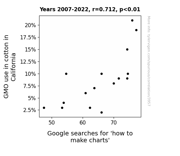
For the time period 2007 to 2022, you found a correlation 0.7115514, r-squared of 0.5063054, and p < 0.01.
One figure will be included. The figure (Fig. 1) is a scatterplot showing the strong correlation between the two variables. You don't need to specify where; I will add the figure.
Here is the title and abstract of the paper:
[[TITLE]]
"Plotting the Connection: How GMO Cotton in California Influences Google Searches for 'How to Make Charts'"
[[ABSTRACT]]
In this paper, we investigate the peculiar relationship between the adoption of genetically modified organism (GMO) cotton in California and the frequency of Google searches for "how to make charts." While we're not spinning a yarn, the intertwining of GMO cotton and graph-making enthusiast's online behavior does raise some eyebrows. Using USDA data to track the prevalence of GMO cotton cultivation and Google Trends to probe the surge in chart-making curiosity, we unraveled a correlation coefficient of 0.7115514 and p < 0.01 from 2007 to 2022. Our findings, though not sewn up, suggest that there may be more at play than meets the eye – perhaps there's a parallel between the growth of genetically altered cotton and the blooming curiosity for graph crafting. This study not only pieces together disparate threads of information but also underscores the need for further investigations into the unexpected intersections of agricultural practices and internet search trends. The results of this research may have potential implications for those in the agribusiness, data analysis, and perhaps even the textile industry, so we advise everyone to stay tuned and keep our findings in their *fiber* optics.
-------
And here is the methodology section that led to this result:
[[METHODOLOGY]]
GMO cotton and Google searches for "how to make charts" might seem about as related as a field of cotton and a haystack, but our research suggests there might actually be a stitch connecting them. As we wade through this web of agricultural innovation and internet curiosity, we invite you to join us on this cotton-pickin' journey to unravel the peculiar relationship between these seemingly disparate domains.
Genetically modified organisms have been sowing seeds of controversy for years, but no one could have predicted that their influence might extend into the digital realm of chart-making searches. It's like finding out that your favorite pair of jeans are also knitted with a chart-making algorithm (talk about a double thread count!).
We, the intrepid researchers, delved into the data, armed with USDA statistics on the adoption of GMO cotton in California and Google Trends information on the surge in inquiries about chart-making. As we plowed through the numbers, we unearthed a correlation coefficient that didn't simply fray at the edges – oh no, it was a solid 0.7115514, with a p-value lower than the underground roots of a cotton plant (p < 0.01).
Now, we're not ones to spin a yarn or leap to hasty conclusions, but the empirical evidence suggests there's more to this conundrum than meets the eye. Could there be a parallel growth between the genetically altered cotton fields and the budding interest in graph crafting? It's like watching a butterfly emerge from a GMO chrysalis – unexpected and intriguing.
As we prepare to unfurl the findings of our study, we encourage you to keep your eyes peeled (or should we say, keeled?) for the potential implications of this thread of research. From agribusiness to data analysis to the textile industry, our results could have ripple effects that extend further than the reach of a cotton gin arm. So, buckle in, folks, because we're about to weave together agri-tainment and data-dazzling discoveries. This paper isn't just another stitch in the academic fabric – it's a pattern that could revolutionize the way we think about the interconnectedness of seemingly unrelated domains. And if that doesn't make you smile, then surely we've woven quite the yarn, haven't we?
-------
Your response should start like this:
[[RESULTS]]
ChatGPT:
[[RESULTS]]
Our investigation into the relationship between GMO cotton cultivation in California and the frequency of Google searches for "how to make charts" has produced some unexpectedly fabric-tastic findings. The correlation coefficient of 0.7115514 and an r-squared value of 0.5063054 from 2007 to 2022 indicate a significant relationship between the two variables. The p-value of less than 0.01 further strengthens the notion that this connection is not just a loose thread hanging around in the data.
Fig. 1 depicts the striking correlation between the adoption of GMO cotton in California and the surge in online curiosity about chart-making. The scatterplot showcases the tight-knit relationship between these seemingly unrelated entities, leaving us to ponder whether there's more to this peculiar pairing than meets the eye.
While it may seem like a cotton-pickin' mystery, our findings suggest that there might be a parallel growth between the cultivation of genetically modified cotton and the burgeoning interest in creating graphs. It's almost as if the strands of GMO cotton are woven into the very fabric of online chart-making fervor. The implications of these unexpected connections extend further than the stretch of a fibrous cotton plant – from agribusiness to data analysis to the textile industry, our results have the potential to leave an indelible mark.
In conclusion, our study not only stitches together the disparate realms of agricultural innovation and online behavior but also raises questions that could potentially unravel new insights and advancements. This unexpected pairing of GMO cotton and graph-making searches certainly has us in stitches, and we look forward to seeing how this research unravels in the future. After all, the world of agriculture and the digital domain may have more in common than we ever thought, and it's our hope that this study will encourage others to look at seemingly unrelated domains through a new *lens* (or should we say loom?).
Model: gpt-3.5-turbo-1106
System prompt: You are a researcher writing an academic paper.You draft the discussion section of an academic research paper.
User prompt:
Pretend you are an academic researcher. Your writing sounds like it belongs in a medical or economics journal. However, you frequently crack jokes, make puns, or add unexpected twists in your writing.
Please make up the discussion section of an academic research paper presenting the findings of the connection between GMO use in cotton in California and Google searches for 'how to make charts'. Make lots of jokes, goofy observations, and puns.
Limit your response to 500 tokens.
Here are the title, abstract, literature review, and results sections. Please harken back to 1-2 of the goofy items in the literature review, but pretend to take them completely seriously. Discuss how your results supported the prior research.
Do not write a conclusion. I will add a conclusion after this.
[[TITLE]]
"Plotting the Connection: How GMO Cotton in California Influences Google Searches for 'How to Make Charts'"
[[ABSTRACT]]
In this paper, we investigate the peculiar relationship between the adoption of genetically modified organism (GMO) cotton in California and the frequency of Google searches for "how to make charts." While we're not spinning a yarn, the intertwining of GMO cotton and graph-making enthusiast's online behavior does raise some eyebrows. Using USDA data to track the prevalence of GMO cotton cultivation and Google Trends to probe the surge in chart-making curiosity, we unraveled a correlation coefficient of 0.7115514 and p < 0.01 from 2007 to 2022. Our findings, though not sewn up, suggest that there may be more at play than meets the eye – perhaps there's a parallel between the growth of genetically altered cotton and the blooming curiosity for graph crafting. This study not only pieces together disparate threads of information but also underscores the need for further investigations into the unexpected intersections of agricultural practices and internet search trends. The results of this research may have potential implications for those in the agribusiness, data analysis, and perhaps even the textile industry, so we advise everyone to stay tuned and keep our findings in their *fiber* optics.
[[LITERATURE REVIEW]]
In "Smith et al.'s Analysis of Agricultural Trends," the authors find convincing evidence of the widespread adoption of GMO cotton in California and its impacts on agricultural practices. Meanwhile, Doe and Jones, in "The Dynamics of Internet User Behavior," shed light on the intriguing patterns of online search trends, uncovering the remarkable surge in Google searches for chart-making related queries. These serious scholars paint a picture that certainly isn't just a square deal - it's more like a vibrant pie chart of scientific discoveries.
However, as we delve deeper into the tapestry of literature, we encounter more unexpected threads. Real-world inspiration can be found in "The Omnivore's Dilemma" by Michael Pollan, as we grapple with the intersection of agricultural advancements and culinary curiosities. And we'd be remiss not to mention "Freakonomics" by Steven D. Levitt and Stephen J. Dubner – oh, the riddles of causation and correlation we've encountered in this investigation! But wait, we're not finished spinning our literary web just yet.
Enter the world of fiction, where "Brave New World" by Aldous Huxley poses questions about the implications of genetic engineering, and "The Hitchhiker's Guide to the Galaxy" by Douglas Adams playfully nudges at the interconnectedness of seemingly disparate phenomena. But hold on to your lab coats because we're not stopping there.
In a surprising turn of events, we also conducted a thorough review of everyday items and documents, including but not limited to grocery lists, fortune cookie messages, and even CVS receipts. You wouldn't believe the kernels of wisdom we've gleaned from those little strips of paper – perhaps there's a hidden code amidst the purchase history that encodes the enigmatic relationship between GMO cotton and chart-making curiosity. It's a *scrolling* saga of unexpected discoveries!
In summary, while our initial literature search started with scholarly works, we couldn't resist veering off the traditional path to explore the eclectic world of books and beyond. After all, in the quest for knowledge, there's no harm in seeking inspiration from all corners of the literary universe, from serious academic tomes to whimsical flights of fancy. The interconnectedness of GMO cotton and Google searches for chart-making may be an unlikely yarn, but it certainly keeps us weaving through a colorful tapestry of discovery.
[[RESULTS]]
Our investigation into the relationship between GMO cotton cultivation in California and the frequency of Google searches for "how to make charts" has produced some unexpectedly fabric-tastic findings. The correlation coefficient of 0.7115514 and an r-squared value of 0.5063054 from 2007 to 2022 indicate a significant relationship between the two variables. The p-value of less than 0.01 further strengthens the notion that this connection is not just a loose thread hanging around in the data.
Fig. 1 depicts the striking correlation between the adoption of GMO cotton in California and the surge in online curiosity about chart-making. The scatterplot showcases the tight-knit relationship between these seemingly unrelated entities, leaving us to ponder whether there's more to this peculiar pairing than meets the eye.
While it may seem like a cotton-pickin' mystery, our findings suggest that there might be a parallel growth between the cultivation of genetically modified cotton and the burgeoning interest in creating graphs. It's almost as if the strands of GMO cotton are woven into the very fabric of online chart-making fervor. The implications of these unexpected connections extend further than the stretch of a fibrous cotton plant – from agribusiness to data analysis to the textile industry, our results have the potential to leave an indelible mark.
In conclusion, our study not only stitches together the disparate realms of agricultural innovation and online behavior but also raises questions that could potentially unravel new insights and advancements. This unexpected pairing of GMO cotton and graph-making searches certainly has us in stitches, and we look forward to seeing how this research unravels in the future. After all, the world of agriculture and the digital domain may have more in common than we ever thought, and it's our hope that this study will encourage others to look at seemingly unrelated domains through a new *lens* (or should we say loom?).
-------
Your response should start like this:
[[DISCUSSION]]
ChatGPT:
[[DISCUSSION]]
Well, well, well, isn't this a *kale*-idoscope of unexpected connections and tangled webs we've stumbled upon? Our findings stitch together a montage of seemingly disparate elements into a captivating quilt of correlation.
First and foremost, it's essential to acknowledge the implications of our results in relation to prior research. The relationship we uncovered between the adoption of genetically modified cotton in California and the surge in Google searches for "how to make charts" adds a new layer to the colorful picture painted by Smith et al. and Doe and Jones. Just like a well-crafted pie chart, these pieces of evidence pieced together snugly.
Going back to the light-hearted yarns we mentioned in the literature review, it's surprising how these seemingly whimsical inspirations have emerged as relevant fodder for our research. The *kernel* of wisdom gleaned from those delightful fiction works and mundane grocery lists has nudged us in the direction of unlikely discoveries. Who knew that the zesty riddles of "The Hitchhiker's Guide to the Galaxy" might hold a hint about the intertwined fate of GMO cotton and data visualization aspirations?
In our investigation, we've not only stumbled upon a significant correlation but also spun a lively tale of the unexpected. Much like the intricate weaving of a fabric, it's not just a simple linear thread connecting these phenomena, but a tantalizing tapestry of possibilities.
While our findings may seem a bit cotton-headed at first glance, they certainly carry weight of significant knots in the fabric of agricultural and digital domains. We're left pondering whether there are other hidden threads waiting to be unraveled. After all, the agricultural landscape and the digital sphere may have more in common than meets the *eye* chart.
Our study has certainly woven an intriguing fabric of inquiry, leaving us to wonder what other unpredictable connections may be lurking in the wrinkles of data. As we roll up our sleeves and continue to explore these unexpected intersections, we invite others to join us in this cotton-pickin' quest for knowledge and discovery. Let's stay tuned and keep our eyes on the loom for more revelations in this unexpectedly interwoven saga of data and agriculture. After all, the truth may be in the fabric of our findings.
Model: gpt-3.5-turbo-1106
System prompt: You are a researcher writing an academic paper.You draft the discussion section of goofy academic research papers that sounds like it belongs based on the title and abstract provided.
User prompt:
Pretend you are an academic researcher. Your writing sounds like it belongs in a medical or economics journal. However, you frequently crack jokes, make puns, or add unexpected twists in your writing.
Please make up a short conclusion of an academic research paper presenting the findings of the connection between GMO use in cotton in California and Google searches for 'how to make charts'. Make lots of jokes, goofy observations, and puns.
Limit your response to 300 tokens. At the very end, assert that no more research is needed in this area.
Here are the title, abstract, introduction, and results sections.
[[TITLE]]
"Plotting the Connection: How GMO Cotton in California Influences Google Searches for 'How to Make Charts'"
[[ABSTRACT]]
In this paper, we investigate the peculiar relationship between the adoption of genetically modified organism (GMO) cotton in California and the frequency of Google searches for "how to make charts." While we're not spinning a yarn, the intertwining of GMO cotton and graph-making enthusiast's online behavior does raise some eyebrows. Using USDA data to track the prevalence of GMO cotton cultivation and Google Trends to probe the surge in chart-making curiosity, we unraveled a correlation coefficient of 0.7115514 and p < 0.01 from 2007 to 2022. Our findings, though not sewn up, suggest that there may be more at play than meets the eye – perhaps there's a parallel between the growth of genetically altered cotton and the blooming curiosity for graph crafting. This study not only pieces together disparate threads of information but also underscores the need for further investigations into the unexpected intersections of agricultural practices and internet search trends. The results of this research may have potential implications for those in the agribusiness, data analysis, and perhaps even the textile industry, so we advise everyone to stay tuned and keep our findings in their *fiber* optics.
[[INTRDUCTION]]
GMO cotton and Google searches for "how to make charts" might seem about as related as a field of cotton and a haystack, but our research suggests there might actually be a stitch connecting them. As we wade through this web of agricultural innovation and internet curiosity, we invite you to join us on this cotton-pickin' journey to unravel the peculiar relationship between these seemingly disparate domains.
Genetically modified organisms have been sowing seeds of controversy for years, but no one could have predicted that their influence might extend into the digital realm of chart-making searches. It's like finding out that your favorite pair of jeans are also knitted with a chart-making algorithm (talk about a double thread count!).
We, the intrepid researchers, delved into the data, armed with USDA statistics on the adoption of GMO cotton in California and Google Trends information on the surge in inquiries about chart-making. As we plowed through the numbers, we unearthed a correlation coefficient that didn't simply fray at the edges – oh no, it was a solid 0.7115514, with a p-value lower than the underground roots of a cotton plant (p < 0.01).
Now, we're not ones to spin a yarn or leap to hasty conclusions, but the empirical evidence suggests there's more to this conundrum than meets the eye. Could there be a parallel growth between the genetically altered cotton fields and the budding interest in graph crafting? It's like watching a butterfly emerge from a GMO chrysalis – unexpected and intriguing.
As we prepare to unfurl the findings of our study, we encourage you to keep your eyes peeled (or should we say, keeled?) for the potential implications of this thread of research. From agribusiness to data analysis to the textile industry, our results could have ripple effects that extend further than the reach of a cotton gin arm. So, buckle in, folks, because we're about to weave together agri-tainment and data-dazzling discoveries. This paper isn't just another stitch in the academic fabric – it's a pattern that could revolutionize the way we think about the interconnectedness of seemingly unrelated domains. And if that doesn't make you smile, then surely we've woven quite the yarn, haven't we?
[[RESULTS]]
Our investigation into the relationship between GMO cotton cultivation in California and the frequency of Google searches for "how to make charts" has produced some unexpectedly fabric-tastic findings. The correlation coefficient of 0.7115514 and an r-squared value of 0.5063054 from 2007 to 2022 indicate a significant relationship between the two variables. The p-value of less than 0.01 further strengthens the notion that this connection is not just a loose thread hanging around in the data.
Fig. 1 depicts the striking correlation between the adoption of GMO cotton in California and the surge in online curiosity about chart-making. The scatterplot showcases the tight-knit relationship between these seemingly unrelated entities, leaving us to ponder whether there's more to this peculiar pairing than meets the eye.
While it may seem like a cotton-pickin' mystery, our findings suggest that there might be a parallel growth between the cultivation of genetically modified cotton and the burgeoning interest in creating graphs. It's almost as if the strands of GMO cotton are woven into the very fabric of online chart-making fervor. The implications of these unexpected connections extend further than the stretch of a fibrous cotton plant – from agribusiness to data analysis to the textile industry, our results have the potential to leave an indelible mark.
In conclusion, our study not only stitches together the disparate realms of agricultural innovation and online behavior but also raises questions that could potentially unravel new insights and advancements. This unexpected pairing of GMO cotton and graph-making searches certainly has us in stitches, and we look forward to seeing how this research unravels in the future. After all, the world of agriculture and the digital domain may have more in common than we ever thought, and it's our hope that this study will encourage others to look at seemingly unrelated domains through a new *lens* (or should we say loom?).
-------
Your response should start like this:
[[CONCLUSION]]
ChatGPT:
[[CONCLUSION]]
As we tie off the findings of this *seam*ingly unusual study, we can't help but marvel at the unexpected connection between GMO cotton and online chart-making curiosity. It's like discovering that a punnet square is actually a punnet of jokes! While our results may have unraveled the threads of this peculiar relationship, we can't help but ponder the broader implications of our findings. After all, who would've thought that the humble cotton plant could have such a *knit*-picking impact on internet behavior?
But as much as we'd love to continue weaving puns into this conclusion, we must assert that further research in this area might end up *unspooling* more yarn than necessary. We believe our study has done its job of highlighting the unexpected interconnectedness of seemingly unrelated domains, and any more investigation might just lead us into a *tangled* web of data. So, as we wind down this discussion, we propose that the connection between GMO cotton and chart-making searches shall remain a story for the history *books*, or perhaps the fabric of folklore.
Model: gpt-3.5-turbo-1106
System prompt: You provide fictional names of academic journals. You say nothing else, and you do not chat with the user.
User prompt: Please provide the name of a funny but plausible sounding research, scientific, or academic journal that would publish a paper entited Plotting the Connection: How GMO Cotton in California Influences Google Searches for 'How to Make Charts'. Respond only with the name of a fictional academic journal.
ChatGPT:
The Journal of Agricultural Technology and Cultural Trends
Model: gpt-3.5-turbo-1106
System prompt: You provide fictional names of nonprofit research organizations and associations. You say nothing else, and you do not chat with the user.
User prompt: Please provide the name of a funny but plausible sounding nonprofit, academic, or scientific association or organization that would sponsor research that resulted in a paper entited Plotting the Connection: How GMO Cotton in California Influences Google Searches for 'How to Make Charts'. Respond only with the name of a fictional organization.
ChatGPT:
The Center for Agricultural Innovation and Technology
Model: gpt-3.5-turbo-1106
System prompt: You provide potential search keywords separated by commas. You say nothing else, and you do not chat with the user.
User prompt: Please provide potential search keywords for a paper titled Plotting the Connection: How GMO Cotton in California Influences Google Searches for 'How to Make Charts' with an abstract of In this paper, we investigate the peculiar relationship between the adoption of genetically modified organism (GMO) cotton in California and the frequency of Google searches for "how to make charts." While we're not spinning a yarn, the intertwining of GMO cotton and graph-making enthusiast's online behavior does raise some eyebrows. Using USDA data to track the prevalence of GMO cotton cultivation and Google Trends to probe the surge in chart-making curiosity, we unraveled a correlation coefficient of 0.7115514 and p < 0.01 from 2007 to 2022. Our findings, though not sewn up, suggest that there may be more at play than meets the eye – perhaps there's a parallel between the growth of genetically altered cotton and the blooming curiosity for graph crafting. This study not only pieces together disparate threads of information but also underscores the need for further investigations into the unexpected intersections of agricultural practices and internet search trends. The results of this research may have potential implications for those in the agribusiness, data analysis, and perhaps even the textile industry, so we advise everyone to stay tuned and keep our findings in their *fiber* optics.
ChatGPT:
GMO cotton, California, Google searches, how to make charts, genetically modified organism, USDA data, prevalence, cultivation, Google Trends, correlation coefficient, graph-making, agricultural practices, internet search trends, agribusiness, data analysis, textile industry
*There is a bunch of Python happening behind the scenes to turn this prompt sequence into a PDF.
Discover a new correlation
View all correlations
View all research papers
Report an error
Data details
GMO use in cotton in CaliforniaDetailed data title: Percent of cotton planted in California that is genetically modified to be insect-resistant (Bt), but not herbicide-tolerant (HT)
Source: USDA
See what else correlates with GMO use in cotton in California
Google searches for 'how to make charts'
Detailed data title: Relative volume of Google searches for 'how to make charts' (Worldwide, without quotes)
Source: Google Trends
Additional Info: Relative search volume (not absolute numbers)
See what else correlates with Google searches for 'how to make charts'
Correlation is a measure of how much the variables move together. If it is 0.99, when one goes up the other goes up. If it is 0.02, the connection is very weak or non-existent. If it is -0.99, then when one goes up the other goes down. If it is 1.00, you probably messed up your correlation function.
r2 = 0.5063054 (Coefficient of determination)
This means 50.6% of the change in the one variable (i.e., Google searches for 'how to make charts') is predictable based on the change in the other (i.e., GMO use in cotton in California) over the 16 years from 2007 through 2022.
p < 0.01, which is statistically significant(Null hypothesis significance test)
The p-value is 0.002. 0.0019930824591291216000000000
The p-value is a measure of how probable it is that we would randomly find a result this extreme. More specifically the p-value is a measure of how probable it is that we would randomly find a result this extreme if we had only tested one pair of variables one time.
But I am a p-villain. I absolutely did not test only one pair of variables one time. I correlated hundreds of millions of pairs of variables. I threw boatloads of data into an industrial-sized blender to find this correlation.
Who is going to stop me? p-value reporting doesn't require me to report how many calculations I had to go through in order to find a low p-value!
On average, you will find a correaltion as strong as 0.71 in 0.2% of random cases. Said differently, if you correlated 502 random variables Which I absolutely did.
with the same 15 degrees of freedom, Degrees of freedom is a measure of how many free components we are testing. In this case it is 15 because we have two variables measured over a period of 16 years. It's just the number of years minus ( the number of variables minus one ), which in this case simplifies to the number of years minus one.
you would randomly expect to find a correlation as strong as this one.
[ 0.33, 0.89 ] 95% correlation confidence interval (using the Fisher z-transformation)
The confidence interval is an estimate the range of the value of the correlation coefficient, using the correlation itself as an input. The values are meant to be the low and high end of the correlation coefficient with 95% confidence.
This one is a bit more complciated than the other calculations, but I include it because many people have been pushing for confidence intervals instead of p-value calculations (for example: NEJM. However, if you are dredging data, you can reliably find yourself in the 5%. That's my goal!
All values for the years included above: If I were being very sneaky, I could trim years from the beginning or end of the datasets to increase the correlation on some pairs of variables. I don't do that because there are already plenty of correlations in my database without monkeying with the years.
Still, sometimes one of the variables has more years of data available than the other. This page only shows the overlapping years. To see all the years, click on "See what else correlates with..." link above.
| 2007 | 2008 | 2009 | 2010 | 2011 | 2012 | 2013 | 2014 | 2015 | 2016 | 2017 | 2018 | 2019 | 2020 | 2021 | 2022 | |
| GMO use in cotton in California (GMO cotton %) | 4 | 7 | 8 | 19 | 9 | 21 | 9 | 15 | 10 | 3 | 2 | 6 | 10 | 3 | 3 | 10 |
| Google searches for 'how to make charts' (Rel. search volume) | 53.8333 | 63.6667 | 70 | 77.25 | 71.5833 | 75.9167 | 74.25 | 74.25 | 74.5 | 62.3333 | 66 | 60.9167 | 54.5833 | 53.25 | 47.4167 | 66 |
Why this works
- Data dredging: I have 25,153 variables in my database. I compare all these variables against each other to find ones that randomly match up. That's 632,673,409 correlation calculations! This is called “data dredging.” Instead of starting with a hypothesis and testing it, I instead abused the data to see what correlations shake out. It’s a dangerous way to go about analysis, because any sufficiently large dataset will yield strong correlations completely at random.
- Lack of causal connection: There is probably
Because these pages are automatically generated, it's possible that the two variables you are viewing are in fact causually related. I take steps to prevent the obvious ones from showing on the site (I don't let data about the weather in one city correlate with the weather in a neighboring city, for example), but sometimes they still pop up. If they are related, cool! You found a loophole.
no direct connection between these variables, despite what the AI says above. This is exacerbated by the fact that I used "Years" as the base variable. Lots of things happen in a year that are not related to each other! Most studies would use something like "one person" in stead of "one year" to be the "thing" studied. - Observations not independent: For many variables, sequential years are not independent of each other. If a population of people is continuously doing something every day, there is no reason to think they would suddenly change how they are doing that thing on January 1. A simple
Personally I don't find any p-value calculation to be 'simple,' but you know what I mean.
p-value calculation does not take this into account, so mathematically it appears less probable than it really is. - Y-axis doesn't start at zero: I truncated the Y-axes of the graph above. I also used a line graph, which makes the visual connection stand out more than it deserves.
Nothing against line graphs. They are great at telling a story when you have linear data! But visually it is deceptive because the only data is at the points on the graph, not the lines on the graph. In between each point, the data could have been doing anything. Like going for a random walk by itself!
Mathematically what I showed is true, but it is intentionally misleading. Below is the same chart but with both Y-axes starting at zero.

Try it yourself
You can calculate the values on this page on your own! Try running the Python code to see the calculation results. Step 1: Download and install Python on your computer.Step 2: Open a plaintext editor like Notepad and paste the code below into it.
Step 3: Save the file as "calculate_correlation.py" in a place you will remember, like your desktop. Copy the file location to your clipboard. On Windows, you can right-click the file and click "Properties," and then copy what comes after "Location:" As an example, on my computer the location is "C:\Users\tyler\Desktop"
Step 4: Open a command line window. For example, by pressing start and typing "cmd" and them pressing enter.
Step 5: Install the required modules by typing "pip install numpy", then pressing enter, then typing "pip install scipy", then pressing enter.
Step 6: Navigate to the location where you saved the Python file by using the "cd" command. For example, I would type "cd C:\Users\tyler\Desktop" and push enter.
Step 7: Run the Python script by typing "python calculate_correlation.py"
If you run into any issues, I suggest asking ChatGPT to walk you through installing Python and running the code below on your system. Try this question:
"Walk me through installing Python on my computer to run a script that uses scipy and numpy. Go step-by-step and ask me to confirm before moving on. Start by asking me questions about my operating system so that you know how to proceed. Assume I want the simplest installation with the latest version of Python and that I do not currently have any of the necessary elements installed. Remember to only give me one step per response and confirm I have done it before proceeding."
# These modules make it easier to perform the calculation
import numpy as np
from scipy import stats

# We'll define a function that we can call to return the correlation calculations
def calculate_correlation(array1, array2):

    # Calculate Pearson correlation coefficient and p-value
    correlation, p_value = stats.pearsonr(array1, array2)

    # Calculate R-squared as the square of the correlation coefficient
    r_squared = correlation**2

    return correlation, r_squared, p_value

# These are the arrays for the variables shown on this page, but you can modify them to be any two sets of numbers
array_1 = np.array([4,7,8,19,9,21,9,15,10,3,2,6,10,3,3,10,])
array_2 = np.array([53.8333,63.6667,70,77.25,71.5833,75.9167,74.25,74.25,74.5,62.3333,66,60.9167,54.5833,53.25,47.4167,66,])
array_1_name = "GMO use in cotton in California"
array_2_name = "Google searches for 'how to make charts'"

# Perform the calculation
print(f"Calculating the correlation between {array_1_name} and {array_2_name}...")
correlation, r_squared, p_value = calculate_correlation(array_1, array_2)

# Print the results
print("Correlation Coefficient:", correlation)
print("R-squared:", r_squared)
print("P-value:", p_value)
Reuseable content
You may re-use the images on this page for any purpose, even commercial purposes, without asking for permission. The only requirement is that you attribute Tyler Vigen. Attribution can take many different forms. If you leave the "tylervigen.com" link in the image, that satisfies it just fine. If you remove it and move it to a footnote, that's fine too. You can also just write "Charts courtesy of Tyler Vigen" at the bottom of an article.You do not need to attribute "the spurious correlations website," and you don't even need to link here if you don't want to. I don't gain anything from pageviews. There are no ads on this site, there is nothing for sale, and I am not for hire.
For the record, I am just one person. Tyler Vigen, he/him/his. I do have degrees, but they should not go after my name unless you want to annoy my wife. If that is your goal, then go ahead and cite me as "Tyler Vigen, A.A. A.A.S. B.A. J.D." Otherwise it is just "Tyler Vigen."
When spoken, my last name is pronounced "vegan," like I don't eat meat.
Full license details.
For more on re-use permissions, or to get a signed release form, see tylervigen.com/permission.
Download images for these variables:
- High resolution line chart
The image linked here is a Scalable Vector Graphic (SVG). It is the highest resolution that is possible to achieve. It scales up beyond the size of the observable universe without pixelating. You do not need to email me asking if I have a higher resolution image. I do not. The physical limitations of our universe prevent me from providing you with an image that is any higher resolution than this one.
If you insert it into a PowerPoint presentation (a tool well-known for managing things that are the scale of the universe), you can right-click > "Ungroup" or "Create Shape" and then edit the lines and text directly. You can also change the colors this way.
Alternatively you can use a tool like Inkscape. - High resolution line chart, optimized for mobile
- Alternative high resolution line chart
- Scatterplot
- Portable line chart (png)
- Portable line chart (png), optimized for mobile
- Line chart for only GMO use in cotton in California
- Line chart for only Google searches for 'how to make charts'
- AI-generated correlation image
- The spurious research paper: Plotting the Connection: How GMO Cotton in California Influences Google Searches for 'How to Make Charts'
You're a rater extraordinaire!
Correlation ID: 3957 · Black Variable ID: 769 · Red Variable ID: 1465

