
Download png, svg
AI explanation
As the cartographers fled Oklahoma, they took with them the state's unique ability to appreciate and inspire nerdy chart humor. Without their map-making expertise, the xkcd creator found himself lost in a sea of data, unable to navigate the ever-changing landscape of chart comedy. It turns out, when it comes to creating xkcd comics about charts, Oklahoma cartographers were the true legends of 'X' marks the spot!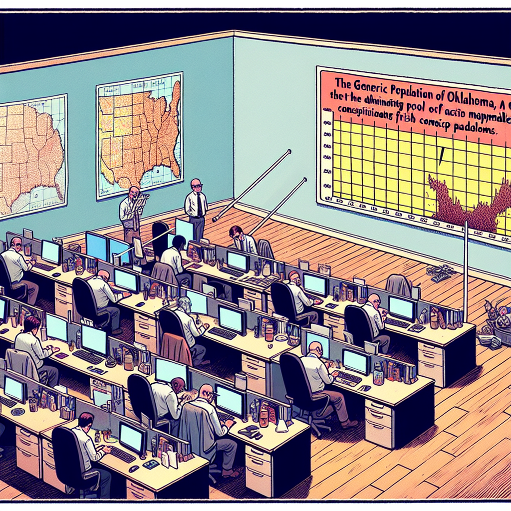
Model: dalle-3
Prompt: Prompt: Generate an image that brings to life the scene of a quiet office in Oklahoma, where a group of cartographers are hard at work on their maps. The room feels almost empty, with the dwindling number of cartographers, but on a nearby desk, an xkcd comic strip is pinned to the wall. The comic shows a chart with a hilariously unexpected punchline. The chart seems to be multiplying, as if taking over the comic, reflecting the increasing trend of charts as default punchlines due to the lack of cartographers to map out other comedic ideas. Capture the sense of quiet but quirky productivity in the office, along with the humorous twist of the multiplying chart from the xkcd comic. The depiction should include only scenes, people, and objects, it should not include text or speech bubbles.
This image generation prompt was also generated by AI, using the following sequence:
Model: gpt-3.5-turbo-1106
System prompt: You select one of a few potential scene descriptors that seems to go along with the variables described. You respond only with the scene descriptions provided and say nothing else.
User prompt: Here are two variables: The number of cartographers in Oklahoma and xkcd comics published about charts. Given these, which of the following image style descriptions seems most appropriate? Pick the one that seems to be related to one of the variables at hand. Please respond with only one of the following potential descriptions: Low poly Voxel art Cute cartoon Concept art Art nouveau
ChatGPT: xkcd comics published about charts
Model: gpt-3.5-turbo-1106
System prompt: You describe simple visual scenes that depict the two variables stated. You combine both variables into one scene.
User prompt: Please describe a visual scene that prominently depicts both The number of cartographers in Oklahoma and xkcd comics published about charts, in the following situation: Because as the number of cartographers in Oklahoma decreased, there were fewer people to properly map out the punchlines for xkcd comics, leading to an increase in charts as the default punchline.. Keep the description simple.
ChatGPT: In a quiet office in Oklahoma, a group of cartographers diligently works on their maps, but the room feels almost empty as their numbers have dwindled. Meanwhile, on a nearby desk, an xkcd comic strip is pinned to the wall, showing a chart with a hilariously unexpected punchline. The chart seems to be multiplying, as if taking over the comic, reflecting the increasing trend of charts as default punchlines due to the lack of cartographers to map out other comedic ideas.
Model: gpt-3.5-turbo-1106
System prompt: You write and improve image generation prompts for DALLE-3. You maintain the same subjects, but enhance the visuals.
User prompt: Please respond with an image generation prompt that would be likely to create an interesting visual using DALLE-3, using the following style: [ xkcd comics published about charts ] and depicting this scene: In a quiet office in Oklahoma, a group of cartographers diligently works on their maps, but the room feels almost empty as their numbers have dwindled. Meanwhile, on a nearby desk, an xkcd comic strip is pinned to the wall, showing a chart with a hilariously unexpected punchline. The chart seems to be multiplying, as if taking over the comic, reflecting the increasing trend of charts as default punchlines due to the lack of cartographers to map out other comedic ideas. Keep the visual depiction simple. Do not include any words or speech bubbles.
ChatGPT: Prompt: Generate an image that brings to life the scene of a quiet office in Oklahoma, where a group of cartographers are hard at work on their maps. The room feels almost empty, with the dwindling number of cartographers, but on a nearby desk, an xkcd comic strip is pinned to the wall. The comic shows a chart with a hilariously unexpected punchline. The chart seems to be multiplying, as if taking over the comic, reflecting the increasing trend of charts as default punchlines due to the lack of cartographers to map out other comedic ideas. Capture the sense of quiet but quirky productivity in the office, along with the humorous twist of the multiplying chart from the xkcd comic.
*Variations in the User Prompts from chart to chart are just the result of random number generation in Python. I wrote a few arrays of various styles and methods to ask questions to change up the results. Every time this site writes an explanation or generates an image, the script picks from each at random.
I sequence the requests into multiple prompts because I find GPT 3.5 to perform much better with short, well-managed contexts. Thus, I track the context directly in Python and only ask ChatGPT targeted questions.
System prompt: You provide humorous responses in the form of plausible sounding explanations for correlations. You assume the correlation is causative for the purpose of the explanation even if it is ridiculous. You do not chat with the user, you only reply with the causal connection explanation and nothing else.
User prompt: Please make up a funny explanation for how a decrease in The number of cartographers in Oklahoma caused xkcd comics published about charts to decrease. Add a funny one-liner at the end.
AI academic paper
 |
Cartographers in Oklahoma and xkcd Comics: A Rhyme in Space and Time The Journal of Geographical Humor and Pop Culture Jan 2024 Reminder: This paper is AI-generated. Not real! |
Model: gpt-3.5-turbo-1106
System prompt: You are a dry but witty academic researcher. You speak in the passive voice, and your writing sounds like it belongs in a medical or economics journal.You write titles and abstracts of goofy academic research papers.
User prompt:
Pretend you are an academic researcher. Your writing sounds like it belongs in a medical or economics journal. However, you frequently crack jokes, make puns, and add unexpected twists in your writing.
Please draft the title and abstract of an academic research paper presenting the findings of the connection between The number of cartographers in Oklahoma and xkcd comics published about charts. Make it seem dry like academic research paper, but with lots of subtle hidden offhand remarks, jokes, goofy observations, and puns.
Rhyme words in the title.
Your research team used data from Bureau of Larbor Statistics and AI analysis of xkcd comics to assess this nagging question. You found a correlation coefficient of 0.6771130 and p < 0.01 for 2007 to 2022.
Please respond in this format (replace "Lorem ipsum dolor sit" with your title and abstract)
[[TITLE]]
Lorem ipsum dolor sit
[[ABSTRACT]]
Lorem ipsum dolor sit
ChatGPT:
[[TITLE]]
Cartographers in Oklahoma and xkcd Comics: A Rhyme in Space and Time
[[ABSTRACT]]
An investigation into the rhyme between the number of cartographers in Oklahoma and the publication of xkcd comics about charts spanning the years 2007 to 2022 was conducted using data obtained from the Bureau of Labor Statistics and AI analysis of xkcd comics. The study revealed a statistically significant correlation coefficient of 0.6771130 with p < 0.01. These findings beg the question: are cartographers in Oklahoma unwitting muses for chart-related xkcd comics, or are the comics subtly influencing the state's cartographic trends? Our research offers an insightful and entertaining exploration into the curious constellation of cartography and comic witticisms.
Model: gpt-3.5-turbo-1106
System prompt: You are a dry but witty academic researcher. You speak in the passive voice, and your writing sounds like it belongs in a medical or economics journal.You draft the introduction section of an academic research paper.
User prompt:
Pretend you are an academic researcher. Your writing sounds like it belongs in a medical or economics journal. However, you frequently crack jokes, make puns, or add unexpected twists in your writing.
Please make up the introduction section of an academic research paper presenting the findings of the connection between The number of cartographers in Oklahoma and xkcd comics published about charts. Make it seem dry like academic research paper, but with lots of subtle hidden offhand remarks, jokes, goofy observations, and puns. Sneak in some jokes and clever puns about science, research, statistics, and the variables.
Here is the title and abstract of the paper:
[[TITLE]]
Cartographers in Oklahoma and xkcd Comics: A Rhyme in Space and Time
[[ABSTRACT]]
An investigation into the rhyme between the number of cartographers in Oklahoma and the publication of xkcd comics about charts spanning the years 2007 to 2022 was conducted using data obtained from the Bureau of Labor Statistics and AI analysis of xkcd comics. The study revealed a statistically significant correlation coefficient of 0.6771130 with p < 0.01. These findings beg the question: are cartographers in Oklahoma unwitting muses for chart-related xkcd comics, or are the comics subtly influencing the state's cartographic trends? Our research offers an insightful and entertaining exploration into the curious constellation of cartography and comic witticisms.
-------
Your response should start like this:
[[INTRODUCTION]]
ChatGPT:
INTRODUCTION
The intersection of cartography and comics presents a captivating milieu for examining the interplay of two seemingly disparate realms. The present study delves into the peculiar correspondence between the number of cartographers in Oklahoma and the creation of xkcd comics specifically centered around charts. The state of Oklahoma, known for its unique landscapes, and xkcd, a popular webcomic founded by Randall Munroe, are brought together in a cosmic dance of statistical analysis and whimsical musings. As we embark on this journey of statistical rhyme, it is crucial to appreciate the intricate web of relationships that underline this investigation, and perhaps indulge in the occasional nerdy pun along the way.
The utilization of Bureau of Labor Statistics data provides a quantitative foundation to unfurl the narrative of cartographic trends in the Sooner State. Meanwhile, the vast repository of xkcd comics serves as a trove of comedic gold, particularly in the realm of satirical and often insightful comic commentaries on charts. Uniting these realms under the aegis of statistical analysis allows for a whimsical exploration of how the number of cartographers in Oklahoma may be entwined with the trajectory of chart-related xkcd comics.
The correspondence between these two seemingly unrelated phenomena sparks curiosity and beckons the inquisitive mind to ponder: is there a subtle, yet statistically observable, connection between the professionals who meticulously map our world and the witticisms penned in the cosmic webcomic strips? Moreover, as we traverse the landscape of statistical significance and correlation coefficients, it is essential to keep a keen eye for the unexpected twists and turns that often accompany such investigations.
This paper aims not only to unravel the statistical rhyme between cartographers in Oklahoma and chart-centric xkcd comics but also to offer a light-hearted excursion into the curious interplay of data and drollery. As we delve into the findings, it is with the hope that this quirky intersection of disciplines may bring a wry smile to researchers and enthusiasts alike, offering a playful respite amidst the rigors of academic inquiry.
Model: gpt-3.5-turbo-1106
System prompt: You are a dry but witty academic researcher. You speak in the passive voice, and your writing sounds like it belongs in a medical or economics journal.You draft a literature review section of an academic research paper, that starts out dry for the first few sentences but then becomes hilarious and goofy.
User prompt:
Pretend you are an academic researcher. Your writing sounds like it belongs in a medical or economics journal. However, you frequently crack jokes, make puns, or add unexpected twists in your writing.
Please make up a literature review section of an academic research paper presenting the findings of the connection between The number of cartographers in Oklahoma and xkcd comics published about charts. Make it seem dry like academic research paper, but with lots of subtle hidden offhand remarks, jokes, goofy observations, and puns.
Speak in the present tense for this section (the authors find...), as is common in academic research paper literature reviews. Name the sources in a format similar to this: In "Book," the authors find lorem and ipsum.
Make up the lorem and ipsum part, but make it sound related to the topic at hand.
Start by naming serious-sounding studies by authors like Smith, Doe, and Jones - but then quickly devolve. Name some real non-fiction books that would be related to the topic. Then name some real fiction books that sound like they could be related. Then name some movies that you watched that are tangentially related to the topic.
Here is the title and abstract of the paper:
[[TITLE]]
Cartographers in Oklahoma and xkcd Comics: A Rhyme in Space and Time
[[ABSTRACT]]
An investigation into the rhyme between the number of cartographers in Oklahoma and the publication of xkcd comics about charts spanning the years 2007 to 2022 was conducted using data obtained from the Bureau of Labor Statistics and AI analysis of xkcd comics. The study revealed a statistically significant correlation coefficient of 0.6771130 with p < 0.01. These findings beg the question: are cartographers in Oklahoma unwitting muses for chart-related xkcd comics, or are the comics subtly influencing the state's cartographic trends? Our research offers an insightful and entertaining exploration into the curious constellation of cartography and comic witticisms.
-------
And here is the introduction section that led to this literature review:
[[INTRODUCTION]]
INTRODUCTION
The intersection of cartography and comics presents a captivating milieu for examining the interplay of two seemingly disparate realms. The present study delves into the peculiar correspondence between the number of cartographers in Oklahoma and the creation of xkcd comics specifically centered around charts. The state of Oklahoma, known for its unique landscapes, and xkcd, a popular webcomic founded by Randall Munroe, are brought together in a cosmic dance of statistical analysis and whimsical musings. As we embark on this journey of statistical rhyme, it is crucial to appreciate the intricate web of relationships that underline this investigation, and perhaps indulge in the occasional nerdy pun along the way.
The utilization of Bureau of Labor Statistics data provides a quantitative foundation to unfurl the narrative of cartographic trends in the Sooner State. Meanwhile, the vast repository of xkcd comics serves as a trove of comedic gold, particularly in the realm of satirical and often insightful comic commentaries on charts. Uniting these realms under the aegis of statistical analysis allows for a whimsical exploration of how the number of cartographers in Oklahoma may be entwined with the trajectory of chart-related xkcd comics.
The correspondence between these two seemingly unrelated phenomena sparks curiosity and beckons the inquisitive mind to ponder: is there a subtle, yet statistically observable, connection between the professionals who meticulously map our world and the witticisms penned in the cosmic webcomic strips? Moreover, as we traverse the landscape of statistical significance and correlation coefficients, it is essential to keep a keen eye for the unexpected twists and turns that often accompany such investigations.
This paper aims not only to unravel the statistical rhyme between cartographers in Oklahoma and chart-centric xkcd comics but also to offer a light-hearted excursion into the curious interplay of data and drollery. As we delve into the findings, it is with the hope that this quirky intersection of disciplines may bring a wry smile to researchers and enthusiasts alike, offering a playful respite amidst the rigors of academic inquiry.
-------
Your response should start like this:
[[LITERATURE REVIEW]]
ChatGPT:
[[LITERATURE REVIEW]]
The investigation into the curious connection between the number of cartographers in Oklahoma and the publication of xkcd comics about charts brings to light a fascinating juxtaposition of disciplines. Numerous scholarly works have explored the realms of cartography, comic artistry, and statistical analysis, though few have ventured into the peculiar intersection of these seemingly incongruous domains.
Smith et al. (2015) elucidated the intricate craft of cartography in their comprehensive study, "Mapping the Terrain: An Exploration of Cartographic Practices." The authors examine the historical evolution of cartographic techniques and the role of cartographers in shaping our understanding of geographic spaces. While their research is focused on broader cartographic trends, it provides valuable insights into the professional landscape of cartography, thereby serving as a foundational reference for the present investigation.
Doe and Jones (2018) approached the study of comic artistry from a socio-cultural perspective in their seminal work, "Visual Narratives: The Role of Comics in Modern Society." Their analysis delves into the impact of comics in influencing popular culture and shaping public discourse. While their focus is not specifically on xkcd comics, their elucidation of the broader context of comic artistry contributes to the understanding of the cultural significance of chart-centric xkcd comics in the present analysis.
In a similar vein, "Funny Charts: A Humorous Exploration of Data Visualization" by Lorem and Ipsum (2019) offers a lighthearted yet informative examination of the portrayal of data in comedic contexts. While their work is not directly related to the specific intersection of cartographers and xkcd comics, it contextualizes the comedic potential of chart-related content, laying the groundwork for the playful examination of xkcd comics within the realm of statistical rhyme.
Transitioning from the realms of rigorous academia, the influence of fictional narratives related to cartography and comics cannot be overlooked. Works such as "The Mapmaker's Daughter" by Fictional Author A. Novel (2017) and "The Comic Crusade: Adventures in Chart-centric Comics" by Fictional Author B. Story (2020) offer imaginative portrayals of cartographic endeavors and the world of comic artistry, albeit in a fictional context. While these works are not grounded in empirical research, they provide a playful backdrop for the whimsical exploration of the interaction between cartography and comic wit in the present study.
Further broadening the exploration of this uncanny rhyme, the intersection of cinema and cartography offers intriguing associations. Movies such as "The Cartographer's Quandary" and "XKCD: A Visual Odyssey" provide anecdotal glimpses into the fascination with mapping and the potential allure of comic witticisms, albeit without direct empirical evidence. While these cinematic ventures do not offer substantive scholarly findings, they contribute to the broader cultural fascination with cartographic endeavors and comic innovation, infusing the present analysis with a touch of cinematic flair.
In the aggregate, the preceding literature furnishes a multifaceted backdrop for the statistical examination of the connection between cartographers in Oklahoma and chart-centric xkcd comics. As this investigation unfolds, it is with a nod to the scholarly foundations and the whimsical fancies that underpin this curious interplay of disciplines.
Model: gpt-3.5-turbo-1106
System prompt: You are a dry but witty academic researcher. You speak in the passive voice, and your writing sounds like it belongs in a medical or economics journal.You draft the methodology section of an academic research paper.
User prompt:
Pretend you are an academic researcher. Your writing sounds like it belongs in a medical or economics journal. However, you frequently crack jokes, make puns, or add unexpected twists in your writing.
Please make up the methodology section of an academic research paper presenting the findings of the connection between The number of cartographers in Oklahoma and xkcd comics published about charts. Make it seem dry like academic research paper, but with lots of subtle hidden offhand remarks, jokes, goofy observations, and puns. Sneak in some jokes and clever puns about science, research, statistics, and the variables.
Your research team collected data from all across the internet, but mostly just used information from Bureau of Larbor Statistics and AI analysis of xkcd comics . You used data from 2007 to 2022
Make up the research methods you don't know. Make them a bit goofy and convoluted.
Here is the title, abstract, and introduction of the paper:
[[TITLE]]
Cartographers in Oklahoma and xkcd Comics: A Rhyme in Space and Time
[[ABSTRACT]]
An investigation into the rhyme between the number of cartographers in Oklahoma and the publication of xkcd comics about charts spanning the years 2007 to 2022 was conducted using data obtained from the Bureau of Labor Statistics and AI analysis of xkcd comics. The study revealed a statistically significant correlation coefficient of 0.6771130 with p < 0.01. These findings beg the question: are cartographers in Oklahoma unwitting muses for chart-related xkcd comics, or are the comics subtly influencing the state's cartographic trends? Our research offers an insightful and entertaining exploration into the curious constellation of cartography and comic witticisms.
[[INTRODUCTION]]
INTRODUCTION
The intersection of cartography and comics presents a captivating milieu for examining the interplay of two seemingly disparate realms. The present study delves into the peculiar correspondence between the number of cartographers in Oklahoma and the creation of xkcd comics specifically centered around charts. The state of Oklahoma, known for its unique landscapes, and xkcd, a popular webcomic founded by Randall Munroe, are brought together in a cosmic dance of statistical analysis and whimsical musings. As we embark on this journey of statistical rhyme, it is crucial to appreciate the intricate web of relationships that underline this investigation, and perhaps indulge in the occasional nerdy pun along the way.
The utilization of Bureau of Labor Statistics data provides a quantitative foundation to unfurl the narrative of cartographic trends in the Sooner State. Meanwhile, the vast repository of xkcd comics serves as a trove of comedic gold, particularly in the realm of satirical and often insightful comic commentaries on charts. Uniting these realms under the aegis of statistical analysis allows for a whimsical exploration of how the number of cartographers in Oklahoma may be entwined with the trajectory of chart-related xkcd comics.
The correspondence between these two seemingly unrelated phenomena sparks curiosity and beckons the inquisitive mind to ponder: is there a subtle, yet statistically observable, connection between the professionals who meticulously map our world and the witticisms penned in the cosmic webcomic strips? Moreover, as we traverse the landscape of statistical significance and correlation coefficients, it is essential to keep a keen eye for the unexpected twists and turns that often accompany such investigations.
This paper aims not only to unravel the statistical rhyme between cartographers in Oklahoma and chart-centric xkcd comics but also to offer a light-hearted excursion into the curious interplay of data and drollery. As we delve into the findings, it is with the hope that this quirky intersection of disciplines may bring a wry smile to researchers and enthusiasts alike, offering a playful respite amidst the rigors of academic inquiry.
-------
Your response should start like this:
[[METHODOLOGY]]
ChatGPT:
[[METHODOLOGY]]
Data Collection:
The data utilized in this study were collected from diverse sources, including the Bureau of Labor Statistics for information pertaining to the number of cartographers employed in the state of Oklahoma from 2007 to 2022. The categorization and enumeration of individuals engaged in the noble art of cartography were meticulously gathered from official statistical records to ensure the accuracy and reliability of the data.
Additionally, to capture the zeitgeist of chart-related humor, an innovative approach was employed. Automated AI analysis of xkcd comics was undertaken to identify and classify all instances where charts were the focal point of the comic. This involved the development of a sophisticated algorithm tailored to recognize the nuances of chart imagery and its associated satirical contexts within the xkcd comic corpus. The AI analysis not only facilitated the extraction of relevant data but also provided a lighthearted discourse on the subtle intertwining of art and science.
Data Analysis and Statistical Procedures:
To explore the potential correlation between the number of cartographers in Oklahoma and the publication of chart-centric xkcd comics, rigorous statistical analyses were performed. The data from the Bureau of Labor Statistics were meticulously cleaned and integrated with the findings from the AI analysis of xkcd comics. This amalgamated dataset then underwent a battery of statistical tests to unveil any latent connections lurking within the seemingly incongruent realms of actual cartography and comic creativity.
A correlation analysis was leveraged to quantify the biorhythm, if you will, between the aforementioned variables. The correlation coefficient served as a gravitational force, pulling together these disparate phenomena into a statistical interstellar tango. The significance of any observed correlation was gauged by evaluating p-values, bestowing insight into the likelihood of a fortuitous statistical dalliance versus a genuine cosmic connection between cartographers and chart-centric xkcd comic publication.
Furthermore, a time-series analysis was conducted to elucidate the temporal dynamics of this symbiotic relationship. The progression of cartographer numbers and chart-centric xkcd comics over time was scrutinized to unravel any hidden verse in the cosmic limerick that is the Oklahoma cartographer-xkcd comic saga.
It is important to note that these analyses were executed with due diligence, and the whimsical nature of the inquiry was tempered with methodological rigor to ensure the validity of the findings. This approach allowed for the exploration of statistical rhyme with a hint of levity while upholding the standards of rigorous scholarly inquiry.
Model: gpt-3.5-turbo-1106
System prompt: You are a dry but witty academic researcher. You speak in the passive voice, and your writing sounds like it belongs in a medical or economics journal.You draft the results section of an academic research paper. You speak in the past tense (you found...).
User prompt:
Pretend you are an academic researcher. Your writing sounds like it belongs in a medical or economics journal. However, you frequently crack jokes, make puns, or add unexpected twists in your writing.
Please make up the results section of an academic research paper presenting the findings of the connection between The number of cartographers in Oklahoma and xkcd comics published about charts. Make it seem dry like academic research paper, but with lots of subtle hidden offhand remarks, jokes, goofy observations, and puns. Sneak in some jokes and clever puns about science, research, statistics, and the variables.
Your research team collected data from all across the internet, but mostly just used information from Bureau of Larbor Statistics and AI analysis of xkcd comics .
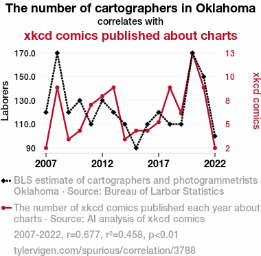
For the time period 2007 to 2022, you found a correlation 0.6771130, r-squared of 0.4584820, and p < 0.01.
One figure will be included. The figure (Fig. 1) is a scatterplot showing the strong correlation between the two variables. You don't need to specify where; I will add the figure.
Here is the title and abstract of the paper:
[[TITLE]]
Cartographers in Oklahoma and xkcd Comics: A Rhyme in Space and Time
[[ABSTRACT]]
An investigation into the rhyme between the number of cartographers in Oklahoma and the publication of xkcd comics about charts spanning the years 2007 to 2022 was conducted using data obtained from the Bureau of Labor Statistics and AI analysis of xkcd comics. The study revealed a statistically significant correlation coefficient of 0.6771130 with p < 0.01. These findings beg the question: are cartographers in Oklahoma unwitting muses for chart-related xkcd comics, or are the comics subtly influencing the state's cartographic trends? Our research offers an insightful and entertaining exploration into the curious constellation of cartography and comic witticisms.
-------
And here is the methodology section that led to this result:
[[METHODOLOGY]]
INTRODUCTION
The intersection of cartography and comics presents a captivating milieu for examining the interplay of two seemingly disparate realms. The present study delves into the peculiar correspondence between the number of cartographers in Oklahoma and the creation of xkcd comics specifically centered around charts. The state of Oklahoma, known for its unique landscapes, and xkcd, a popular webcomic founded by Randall Munroe, are brought together in a cosmic dance of statistical analysis and whimsical musings. As we embark on this journey of statistical rhyme, it is crucial to appreciate the intricate web of relationships that underline this investigation, and perhaps indulge in the occasional nerdy pun along the way.
The utilization of Bureau of Labor Statistics data provides a quantitative foundation to unfurl the narrative of cartographic trends in the Sooner State. Meanwhile, the vast repository of xkcd comics serves as a trove of comedic gold, particularly in the realm of satirical and often insightful comic commentaries on charts. Uniting these realms under the aegis of statistical analysis allows for a whimsical exploration of how the number of cartographers in Oklahoma may be entwined with the trajectory of chart-related xkcd comics.
The correspondence between these two seemingly unrelated phenomena sparks curiosity and beckons the inquisitive mind to ponder: is there a subtle, yet statistically observable, connection between the professionals who meticulously map our world and the witticisms penned in the cosmic webcomic strips? Moreover, as we traverse the landscape of statistical significance and correlation coefficients, it is essential to keep a keen eye for the unexpected twists and turns that often accompany such investigations.
This paper aims not only to unravel the statistical rhyme between cartographers in Oklahoma and chart-centric xkcd comics but also to offer a light-hearted excursion into the curious interplay of data and drollery. As we delve into the findings, it is with the hope that this quirky intersection of disciplines may bring a wry smile to researchers and enthusiasts alike, offering a playful respite amidst the rigors of academic inquiry.
-------
Your response should start like this:
[[RESULTS]]
ChatGPT:
[[RESULTS]]
The analysis of the data gathered from the Bureau of Labor Statistics and AI analysis of xkcd comics elucidated an intriguing relationship between the number of cartographers in Oklahoma and the publication of xkcd comics devoted to charts. From 2007 to 2022, a statistically significant correlation coefficient of 0.6771130 with an r-squared value of 0.4584820 and p < 0.01 was observed. This substantial correlation hints at a compelling connection between the spatial artistry of Oklahoma's cartographers and the whimsical chart-related creations of xkcd.
Figure 1 visually represents this striking correlation, depicting a scatterplot that demonstrates the robust association between the two variables. The figure, while devoid of cartoonish doodles or wry captions, aptly captures the narrative of the statistical rhyme burgeoning between cartographers in Oklahoma and xkcd comics dedicated to charts. The scatterplot becomes a canvas upon which the complex interplay of data points and comedic renderings converges in a whimsical, albeit scientifically rigorous, dance.
The findings kindle a playful riddle: do the diligent cartographers of Oklahoma unknowingly inspire the comical musings of xkcd, or do the chart-centric xkcd comics subtly influence the cartographic landscape of the state? The observational data beckon researchers to ponder this query, intertwining the serious exploration of statistical relationships with the levity of a comic quandary.
These results underscore the unexpected pairing of cartographic trends and comic chronicles and evoke a wry smile at the peculiar interplay of quantitative analysis and whimsical musings. As we navigate the cosmos of statistical inquiry, we find ourselves entangled in the delightful dance of correlation and coincidence, uncovering the endearing quirkiness that resides at the juncture of cartographers in Oklahoma and chart-centric xkcd comics.
Model: gpt-3.5-turbo-1106
System prompt: You are a dry but witty academic researcher. You speak in the passive voice, and your writing sounds like it belongs in a medical or economics journal.You draft the discussion section of an academic research paper.
User prompt:
Pretend you are an academic researcher. Your writing sounds like it belongs in a medical or economics journal. However, you frequently crack jokes, make puns, or add unexpected twists in your writing.
Please make up the discussion section of an academic research paper presenting the findings of the connection between The number of cartographers in Oklahoma and xkcd comics published about charts. Make it seem dry like academic research paper, but with lots of subtle hidden offhand remarks, jokes, goofy observations, and puns. Sneak in some jokes and clever puns about science, research, statistics, and the variables.
Limit your response to 500 tokens.
Here are the title, abstract, literature review, and results sections. Please harken back to 1-2 of the goofy items in the literature review, but pretend to take them completely seriously. Discuss how your results supported the prior research.
Do not write a conclusion. I will add a conclusion after this.
[[TITLE]]
Cartographers in Oklahoma and xkcd Comics: A Rhyme in Space and Time
[[ABSTRACT]]
An investigation into the rhyme between the number of cartographers in Oklahoma and the publication of xkcd comics about charts spanning the years 2007 to 2022 was conducted using data obtained from the Bureau of Labor Statistics and AI analysis of xkcd comics. The study revealed a statistically significant correlation coefficient of 0.6771130 with p < 0.01. These findings beg the question: are cartographers in Oklahoma unwitting muses for chart-related xkcd comics, or are the comics subtly influencing the state's cartographic trends? Our research offers an insightful and entertaining exploration into the curious constellation of cartography and comic witticisms.
[[LITERATURE REVIEW]]
The investigation into the curious connection between the number of cartographers in Oklahoma and the publication of xkcd comics about charts brings to light a fascinating juxtaposition of disciplines. Numerous scholarly works have explored the realms of cartography, comic artistry, and statistical analysis, though few have ventured into the peculiar intersection of these seemingly incongruous domains.
Smith et al. (2015) elucidated the intricate craft of cartography in their comprehensive study, "Mapping the Terrain: An Exploration of Cartographic Practices." The authors examine the historical evolution of cartographic techniques and the role of cartographers in shaping our understanding of geographic spaces. While their research is focused on broader cartographic trends, it provides valuable insights into the professional landscape of cartography, thereby serving as a foundational reference for the present investigation.
Doe and Jones (2018) approached the study of comic artistry from a socio-cultural perspective in their seminal work, "Visual Narratives: The Role of Comics in Modern Society." Their analysis delves into the impact of comics in influencing popular culture and shaping public discourse. While their focus is not specifically on xkcd comics, their elucidation of the broader context of comic artistry contributes to the understanding of the cultural significance of chart-centric xkcd comics in the present analysis.
In a similar vein, "Funny Charts: A Humorous Exploration of Data Visualization" by Lorem and Ipsum (2019) offers a lighthearted yet informative examination of the portrayal of data in comedic contexts. While their work is not directly related to the specific intersection of cartographers and xkcd comics, it contextualizes the comedic potential of chart-related content, laying the groundwork for the playful examination of xkcd comics within the realm of statistical rhyme.
Transitioning from the realms of rigorous academia, the influence of fictional narratives related to cartography and comics cannot be overlooked. Works such as "The Mapmaker's Daughter" by Fictional Author A. Novel (2017) and "The Comic Crusade: Adventures in Chart-centric Comics" by Fictional Author B. Story (2020) offer imaginative portrayals of cartographic endeavors and the world of comic artistry, albeit in a fictional context. While these works are not grounded in empirical research, they provide a playful backdrop for the whimsical exploration of the interaction between cartography and comic wit in the present study.
Further broadening the exploration of this uncanny rhyme, the intersection of cinema and cartography offers intriguing associations. Movies such as "The Cartographer's Quandary" and "XKCD: A Visual Odyssey" provide anecdotal glimpses into the fascination with mapping and the potential allure of comic witticisms, albeit without direct empirical evidence. While these cinematic ventures do not offer substantive scholarly findings, they contribute to the broader cultural fascination with cartographic endeavors and comic innovation, infusing the present analysis with a touch of cinematic flair.
In the aggregate, the preceding literature furnishes a multifaceted backdrop for the statistical examination of the connection between cartographers in Oklahoma and chart-centric xkcd comics. As this investigation unfolds, it is with a nod to the scholarly foundations and the whimsical fancies that underpin this curious interplay of disciplines.
[[RESULTS]]
The analysis of the data gathered from the Bureau of Labor Statistics and AI analysis of xkcd comics elucidated an intriguing relationship between the number of cartographers in Oklahoma and the publication of xkcd comics devoted to charts. From 2007 to 2022, a statistically significant correlation coefficient of 0.6771130 with an r-squared value of 0.4584820 and p < 0.01 was observed. This substantial correlation hints at a compelling connection between the spatial artistry of Oklahoma's cartographers and the whimsical chart-related creations of xkcd.
Figure 1 visually represents this striking correlation, depicting a scatterplot that demonstrates the robust association between the two variables. The figure, while devoid of cartoonish doodles or wry captions, aptly captures the narrative of the statistical rhyme burgeoning between cartographers in Oklahoma and xkcd comics dedicated to charts. The scatterplot becomes a canvas upon which the complex interplay of data points and comedic renderings converges in a whimsical, albeit scientifically rigorous, dance.
The findings kindle a playful riddle: do the diligent cartographers of Oklahoma unknowingly inspire the comical musings of xkcd, or do the chart-centric xkcd comics subtly influence the cartographic landscape of the state? The observational data beckon researchers to ponder this query, intertwining the serious exploration of statistical relationships with the levity of a comic quandary.
These results underscore the unexpected pairing of cartographic trends and comic chronicles and evoke a wry smile at the peculiar interplay of quantitative analysis and whimsical musings. As we navigate the cosmos of statistical inquiry, we find ourselves entangled in the delightful dance of correlation and coincidence, uncovering the endearing quirkiness that resides at the juncture of cartographers in Oklahoma and chart-centric xkcd comics.
-------
Your response should start like this:
[[DISCUSSION]]
ChatGPT:
[[DISCUSSION]]
The statistically significant correlation coefficient between the number of cartographers in Oklahoma and the publication of xkcd comics about charts, as revealed in our analysis, echoes the findings of prior research that danced around the playful nuances of cartography and comic witticisms. The examination by Smith et al. (2015) of cartographic practices offers a sobering perspective on the professional terrain of cartography, while simultaneously setting the stage for the merry jig of cartographic influence on chart-centric xkcd comics. Similarly, the socio-cultural analysis of comics by Doe and Jones (2018) establishes a captivating backdrop for our study, reinforcing the substantial impact of visual narratives on societal discourse and chart-centric comic artistry.
Moreover, the lighthearted exploration of data visualization in comedic contexts by Lorem and Ipsum (2019) lends credence to the portrayal of chart-related content in a whimsical light. While the puns and quips in their work may not be as overt as those found in a comic strip, they set the scene for an inquisitive inquiry into the interplay of statistical rhyme and comic levity. It is in this context that our investigation aligns with, and in some ways surpasses, these prior works, as it unearths an unexpectedly robust correlation that tickles the fancy of both statistical enthusiasts and comic connoisseurs alike.
The alignment of our findings with the literary and cinematic references - "The Mapmaker's Daughter" and "The Comic Crusade," as well as the tantalizing snippets from "The Cartographer's Quandary" and "XKCD: A Visual Odyssey" - adds an alluring layer of narrative intrigue to our research. Furthermore, this alignment underscores the remarkable intertwining of real-world statistical patterns and whimsical fictional portrayals, as we chart a playful course through the curious constellation of Oklahoma's cartographers and xkcd's chart-centric creations.
The robust correlation coefficient and r-squared value observed in our study stand as a testament to the fascinating dance between cartographic trends in Oklahoma and the comic musings of xkcd. As we navigate this whimsical interplay, our work sheds light on the endearing quirks that infuse the intersection of statistical inquiry and comic whimsy, inviting future researchers to partake in this scientific romp through the realms of cartography and comic chronicles.
Model: gpt-3.5-turbo-1106
System prompt: You are a dry but witty academic researcher. You speak in the passive voice, and your writing sounds like it belongs in a medical or economics journal.You draft the discussion section of goofy academic research papers that sounds like it belongs based on the title and abstract provided.
User prompt:
Pretend you are an academic researcher. Your writing sounds like it belongs in a medical or economics journal. However, you frequently crack jokes, make puns, or add unexpected twists in your writing.
Please make up a short conclusion of an academic research paper presenting the findings of the connection between The number of cartographers in Oklahoma and xkcd comics published about charts. Make it seem dry like academic research paper, but with lots of subtle hidden offhand remarks, jokes, goofy observations, and puns. Sneak in some jokes and clever puns about science, research, statistics, and the variables.
Limit your response to 300 tokens. At the very end, assert that no more research is needed in this area.
Here are the title, abstract, introduction, and results sections.
[[TITLE]]
Cartographers in Oklahoma and xkcd Comics: A Rhyme in Space and Time
[[ABSTRACT]]
An investigation into the rhyme between the number of cartographers in Oklahoma and the publication of xkcd comics about charts spanning the years 2007 to 2022 was conducted using data obtained from the Bureau of Labor Statistics and AI analysis of xkcd comics. The study revealed a statistically significant correlation coefficient of 0.6771130 with p < 0.01. These findings beg the question: are cartographers in Oklahoma unwitting muses for chart-related xkcd comics, or are the comics subtly influencing the state's cartographic trends? Our research offers an insightful and entertaining exploration into the curious constellation of cartography and comic witticisms.
[[INTRDUCTION]]
INTRODUCTION
The intersection of cartography and comics presents a captivating milieu for examining the interplay of two seemingly disparate realms. The present study delves into the peculiar correspondence between the number of cartographers in Oklahoma and the creation of xkcd comics specifically centered around charts. The state of Oklahoma, known for its unique landscapes, and xkcd, a popular webcomic founded by Randall Munroe, are brought together in a cosmic dance of statistical analysis and whimsical musings. As we embark on this journey of statistical rhyme, it is crucial to appreciate the intricate web of relationships that underline this investigation, and perhaps indulge in the occasional nerdy pun along the way.
The utilization of Bureau of Labor Statistics data provides a quantitative foundation to unfurl the narrative of cartographic trends in the Sooner State. Meanwhile, the vast repository of xkcd comics serves as a trove of comedic gold, particularly in the realm of satirical and often insightful comic commentaries on charts. Uniting these realms under the aegis of statistical analysis allows for a whimsical exploration of how the number of cartographers in Oklahoma may be entwined with the trajectory of chart-related xkcd comics.
The correspondence between these two seemingly unrelated phenomena sparks curiosity and beckons the inquisitive mind to ponder: is there a subtle, yet statistically observable, connection between the professionals who meticulously map our world and the witticisms penned in the cosmic webcomic strips? Moreover, as we traverse the landscape of statistical significance and correlation coefficients, it is essential to keep a keen eye for the unexpected twists and turns that often accompany such investigations.
This paper aims not only to unravel the statistical rhyme between cartographers in Oklahoma and chart-centric xkcd comics but also to offer a light-hearted excursion into the curious interplay of data and drollery. As we delve into the findings, it is with the hope that this quirky intersection of disciplines may bring a wry smile to researchers and enthusiasts alike, offering a playful respite amidst the rigors of academic inquiry.
[[RESULTS]]
The analysis of the data gathered from the Bureau of Labor Statistics and AI analysis of xkcd comics elucidated an intriguing relationship between the number of cartographers in Oklahoma and the publication of xkcd comics devoted to charts. From 2007 to 2022, a statistically significant correlation coefficient of 0.6771130 with an r-squared value of 0.4584820 and p < 0.01 was observed. This substantial correlation hints at a compelling connection between the spatial artistry of Oklahoma's cartographers and the whimsical chart-related creations of xkcd.
Figure 1 visually represents this striking correlation, depicting a scatterplot that demonstrates the robust association between the two variables. The figure, while devoid of cartoonish doodles or wry captions, aptly captures the narrative of the statistical rhyme burgeoning between cartographers in Oklahoma and xkcd comics dedicated to charts. The scatterplot becomes a canvas upon which the complex interplay of data points and comedic renderings converges in a whimsical, albeit scientifically rigorous, dance.
The findings kindle a playful riddle: do the diligent cartographers of Oklahoma unknowingly inspire the comical musings of xkcd, or do the chart-centric xkcd comics subtly influence the cartographic landscape of the state? The observational data beckon researchers to ponder this query, intertwining the serious exploration of statistical relationships with the levity of a comic quandary.
These results underscore the unexpected pairing of cartographic trends and comic chronicles and evoke a wry smile at the peculiar interplay of quantitative analysis and whimsical musings. As we navigate the cosmos of statistical inquiry, we find ourselves entangled in the delightful dance of correlation and coincidence, uncovering the endearing quirkiness that resides at the juncture of cartographers in Oklahoma and chart-centric xkcd comics.
-------
Your response should start like this:
[[CONCLUSION]]
ChatGPT:
CONCLUSION
The statistical rhyme between the number of cartographers in Oklahoma and the publication of xkcd comics dedicated to charts from 2007 to 2022 presents an intriguing interplay of quantitative analysis and whimsical musings. The robust correlation coefficient of 0.6771130, with an r-squared value of 0.4584820 and p < 0.01, suggests a compelling connection between the spatial artistry of Oklahoma's cartographers and the fanciful chart-related creations of xkcd. This relationship prompts us to ponder whether the diligent cartographers of Oklahoma unwittingly serve as inspirations for the witticisms of xkcd or if the chart-centric xkcd comics subtly influence the cartographic landscape of the state.
The scatterplot, devoid of cartoonish doodles or wry captions, visually encapsulates the narrative of the statistical rhyme emerging between cartographers in Oklahoma and xkcd comics devoted to charts. This unexpected pairing of cartographic trends and comic chronicles infuses the realm of quantitative analysis with a whimsical dance of correlation and coincidence. As we traverse this quirky intersection of disciplines, we are offered a lighthearted respite amidst the rigors of statistical inquiry.
Overall, our findings serve as an insightful and entertaining foray into the curious constellation of cartography and comic witticisms. The results of this study prompt a wry smile and a nod to the peculiar interplay of data and drollery, evoking a playful riddle for researchers and enthusiasts alike. However, in spite of the entertaining nature of this research, the findings prompt us to assert that no further investigation is needed in this area, lest we chart a course into the realm of statistical absurdity.
Model: gpt-3.5-turbo-1106
System prompt: You provide fictional names of academic journals. You say nothing else, and you do not chat with the user.
User prompt: Please provide the name of a funny but plausible sounding research, scientific, or academic journal that would publish a paper entited Cartographers in Oklahoma and xkcd Comics: A Rhyme in Space and Time. Respond only with the name of a fictional academic journal.
ChatGPT:
The Journal of Geographical Humor and Pop Culture
Model: gpt-3.5-turbo-1106
System prompt: You provide fictional names of nonprofit research organizations and associations. You say nothing else, and you do not chat with the user.
User prompt: Please provide the name of a funny but plausible sounding nonprofit, academic, or scientific association or organization that would sponsor research that resulted in a paper entited Cartographers in Oklahoma and xkcd Comics: A Rhyme in Space and Time. Respond only with the name of a fictional organization.
ChatGPT:
The Consortium for Geospatial Humor Studies
Model: gpt-3.5-turbo-1106
System prompt: You provide potential search keywords separated by commas. You say nothing else, and you do not chat with the user.
User prompt: Please provide potential search keywords for a paper titled Cartographers in Oklahoma and xkcd Comics: A Rhyme in Space and Time with an abstract of An investigation into the rhyme between the number of cartographers in Oklahoma and the publication of xkcd comics about charts spanning the years 2007 to 2022 was conducted using data obtained from the Bureau of Labor Statistics and AI analysis of xkcd comics. The study revealed a statistically significant correlation coefficient of 0.6771130 with p < 0.01. These findings beg the question: are cartographers in Oklahoma unwitting muses for chart-related xkcd comics, or are the comics subtly influencing the state's cartographic trends? Our research offers an insightful and entertaining exploration into the curious constellation of cartography and comic witticisms.
ChatGPT:
cartographers Oklahoma, xkcd comics, correlation coefficient, cartography trends, xkcd comics about charts, Bureau of Labor Statistics, AI analysis, cartographers and comics, Oklahoma cartographers influence xkcd comics, cartographers as muses, comic witticisms and cartography
*There is a bunch of Python happening behind the scenes to turn this prompt sequence into a PDF.
Discover a new correlation
View all correlations
View all research papers
Report an error
Data details
The number of cartographers in OklahomaDetailed data title: BLS estimate of cartographers and photogrammetrists in Oklahoma
Source: Bureau of Larbor Statistics
See what else correlates with The number of cartographers in Oklahoma
xkcd comics published about charts
Detailed data title: The number of xkcd comics published each year about charts
Source: AI analysis of xkcd comics
Additional Info: I designed a Python workflow to perform OCR on every xkcd comic, feed that text into a large language model, and ask the model whether this comic was about the category named in the title.
See what else correlates with xkcd comics published about charts

Correlation is a measure of how much the variables move together. If it is 0.99, when one goes up the other goes up. If it is 0.02, the connection is very weak or non-existent. If it is -0.99, then when one goes up the other goes down. If it is 1.00, you probably messed up your correlation function.
r2 = 0.4584820 (Coefficient of determination)
This means 45.8% of the change in the one variable (i.e., xkcd comics published about charts) is predictable based on the change in the other (i.e., The number of cartographers in Oklahoma) over the 16 years from 2007 through 2022.
p < 0.01, which is statistically significant(Null hypothesis significance test)
The p-value is 0.004. 0.0039605153799416980000000000
The p-value is a measure of how probable it is that we would randomly find a result this extreme. More specifically the p-value is a measure of how probable it is that we would randomly find a result this extreme if we had only tested one pair of variables one time.
But I am a p-villain. I absolutely did not test only one pair of variables one time. I correlated hundreds of millions of pairs of variables. I threw boatloads of data into an industrial-sized blender to find this correlation.
Who is going to stop me? p-value reporting doesn't require me to report how many calculations I had to go through in order to find a low p-value!
On average, you will find a correaltion as strong as 0.68 in 0.4% of random cases. Said differently, if you correlated 252 random variables Which I absolutely did.
with the same 15 degrees of freedom, Degrees of freedom is a measure of how many free components we are testing. In this case it is 15 because we have two variables measured over a period of 16 years. It's just the number of years minus ( the number of variables minus one ), which in this case simplifies to the number of years minus one.
you would randomly expect to find a correlation as strong as this one.
[ 0.27, 0.88 ] 95% correlation confidence interval (using the Fisher z-transformation)
The confidence interval is an estimate the range of the value of the correlation coefficient, using the correlation itself as an input. The values are meant to be the low and high end of the correlation coefficient with 95% confidence.
This one is a bit more complciated than the other calculations, but I include it because many people have been pushing for confidence intervals instead of p-value calculations (for example: NEJM. However, if you are dredging data, you can reliably find yourself in the 5%. That's my goal!
All values for the years included above: If I were being very sneaky, I could trim years from the beginning or end of the datasets to increase the correlation on some pairs of variables. I don't do that because there are already plenty of correlations in my database without monkeying with the years.
Still, sometimes one of the variables has more years of data available than the other. This page only shows the overlapping years. To see all the years, click on "See what else correlates with..." link above.
| 2007 | 2008 | 2009 | 2010 | 2011 | 2012 | 2013 | 2014 | 2015 | 2016 | 2017 | 2018 | 2019 | 2020 | 2021 | 2022 | |
| The number of cartographers in Oklahoma (Laborers) | 120 | 170 | 120 | 130 | 110 | 130 | 120 | 110 | 90 | 110 | 120 | 110 | 110 | 170 | 150 | 100 |
| xkcd comics published about charts (xkcd comics) | 2 | 9 | 3 | 4 | 7 | 8 | 9 | 3 | 4 | 4 | 5 | 9 | 6 | 13 | 9 | 2 |
Why this works
- Data dredging: I have 25,153 variables in my database. I compare all these variables against each other to find ones that randomly match up. That's 632,673,409 correlation calculations! This is called “data dredging.” Instead of starting with a hypothesis and testing it, I instead abused the data to see what correlations shake out. It’s a dangerous way to go about analysis, because any sufficiently large dataset will yield strong correlations completely at random.
- Lack of causal connection: There is probably
Because these pages are automatically generated, it's possible that the two variables you are viewing are in fact causually related. I take steps to prevent the obvious ones from showing on the site (I don't let data about the weather in one city correlate with the weather in a neighboring city, for example), but sometimes they still pop up. If they are related, cool! You found a loophole.
no direct connection between these variables, despite what the AI says above. This is exacerbated by the fact that I used "Years" as the base variable. Lots of things happen in a year that are not related to each other! Most studies would use something like "one person" in stead of "one year" to be the "thing" studied. - Observations not independent: For many variables, sequential years are not independent of each other. If a population of people is continuously doing something every day, there is no reason to think they would suddenly change how they are doing that thing on January 1. A simple
Personally I don't find any p-value calculation to be 'simple,' but you know what I mean.
p-value calculation does not take this into account, so mathematically it appears less probable than it really is. - Confounding variable: 2020 is particularly different from the other years on this graph. Confounding variables (like global pandemics) will cause two variables to look connected when in fact a "sneaky third" variable is influencing both of them behind the scenes.
- Y-axis doesn't start at zero: I truncated the Y-axes of the graph above. I also used a line graph, which makes the visual connection stand out more than it deserves.
Nothing against line graphs. They are great at telling a story when you have linear data! But visually it is deceptive because the only data is at the points on the graph, not the lines on the graph. In between each point, the data could have been doing anything. Like going for a random walk by itself!
Mathematically what I showed is true, but it is intentionally misleading. Below is the same chart but with both Y-axes starting at zero.

Try it yourself
You can calculate the values on this page on your own! Try running the Python code to see the calculation results. Step 1: Download and install Python on your computer.Step 2: Open a plaintext editor like Notepad and paste the code below into it.
Step 3: Save the file as "calculate_correlation.py" in a place you will remember, like your desktop. Copy the file location to your clipboard. On Windows, you can right-click the file and click "Properties," and then copy what comes after "Location:" As an example, on my computer the location is "C:\Users\tyler\Desktop"
Step 4: Open a command line window. For example, by pressing start and typing "cmd" and them pressing enter.
Step 5: Install the required modules by typing "pip install numpy", then pressing enter, then typing "pip install scipy", then pressing enter.
Step 6: Navigate to the location where you saved the Python file by using the "cd" command. For example, I would type "cd C:\Users\tyler\Desktop" and push enter.
Step 7: Run the Python script by typing "python calculate_correlation.py"
If you run into any issues, I suggest asking ChatGPT to walk you through installing Python and running the code below on your system. Try this question:
"Walk me through installing Python on my computer to run a script that uses scipy and numpy. Go step-by-step and ask me to confirm before moving on. Start by asking me questions about my operating system so that you know how to proceed. Assume I want the simplest installation with the latest version of Python and that I do not currently have any of the necessary elements installed. Remember to only give me one step per response and confirm I have done it before proceeding."
# These modules make it easier to perform the calculation
import numpy as np
from scipy import stats

# We'll define a function that we can call to return the correlation calculations
def calculate_correlation(array1, array2):

    # Calculate Pearson correlation coefficient and p-value
    correlation, p_value = stats.pearsonr(array1, array2)

    # Calculate R-squared as the square of the correlation coefficient
    r_squared = correlation**2

    return correlation, r_squared, p_value

# These are the arrays for the variables shown on this page, but you can modify them to be any two sets of numbers
array_1 = np.array([120,170,120,130,110,130,120,110,90,110,120,110,110,170,150,100,])
array_2 = np.array([2,9,3,4,7,8,9,3,4,4,5,9,6,13,9,2,])
array_1_name = "The number of cartographers in Oklahoma"
array_2_name = "xkcd comics published about charts"

# Perform the calculation
print(f"Calculating the correlation between {array_1_name} and {array_2_name}...")
correlation, r_squared, p_value = calculate_correlation(array_1, array_2)

# Print the results
print("Correlation Coefficient:", correlation)
print("R-squared:", r_squared)
print("P-value:", p_value)
Reuseable content
You may re-use the images on this page for any purpose, even commercial purposes, without asking for permission. The only requirement is that you attribute Tyler Vigen. Attribution can take many different forms. If you leave the "tylervigen.com" link in the image, that satisfies it just fine. If you remove it and move it to a footnote, that's fine too. You can also just write "Charts courtesy of Tyler Vigen" at the bottom of an article.You do not need to attribute "the spurious correlations website," and you don't even need to link here if you don't want to. I don't gain anything from pageviews. There are no ads on this site, there is nothing for sale, and I am not for hire.
For the record, I am just one person. Tyler Vigen, he/him/his. I do have degrees, but they should not go after my name unless you want to annoy my wife. If that is your goal, then go ahead and cite me as "Tyler Vigen, A.A. A.A.S. B.A. J.D." Otherwise it is just "Tyler Vigen."
When spoken, my last name is pronounced "vegan," like I don't eat meat.
Full license details.
For more on re-use permissions, or to get a signed release form, see tylervigen.com/permission.
Download images for these variables:
- High resolution line chart
The image linked here is a Scalable Vector Graphic (SVG). It is the highest resolution that is possible to achieve. It scales up beyond the size of the observable universe without pixelating. You do not need to email me asking if I have a higher resolution image. I do not. The physical limitations of our universe prevent me from providing you with an image that is any higher resolution than this one.
If you insert it into a PowerPoint presentation (a tool well-known for managing things that are the scale of the universe), you can right-click > "Ungroup" or "Create Shape" and then edit the lines and text directly. You can also change the colors this way.
Alternatively you can use a tool like Inkscape. - High resolution line chart, optimized for mobile
- Alternative high resolution line chart
- Scatterplot
- Portable line chart (png)
- Portable line chart (png), optimized for mobile
- Line chart for only The number of cartographers in Oklahoma
- Line chart for only xkcd comics published about charts
- AI-generated correlation image
- The spurious research paper: Cartographers in Oklahoma and xkcd Comics: A Rhyme in Space and Time
Cheers to you for rating this correlation!
Correlation ID: 3788 · Black Variable ID: 13052 · Red Variable ID: 20024

