
Download png, svg
AI explanation
As Justin Upton's yearly run total increased, more fans in Puerto Rico were fired up about baseball. This led to an increase in the number of games attended, and with more people driving to and from the games, there was a greater demand for gasoline, creating a real 'home run' for the gas stations in Puerto Rico!
Model: dalle-3
Prompt: Generate an image of a baseball stadium with the player Justin Upton rounding the bases after scoring a run, with angel wings fluttering and appearing on his back. In the background, angels are seen filling up their tanks with gasoline in Puerto Rico. The focus should be on the dynamic movement of the scene, capturing the energy and excitement of the baseball game, as well as the juxtaposition of the ethereal imagery of angels filling up their tanks. The depiction should include only scenes, people, and objects, it should not include text or speech bubbles.
This image generation prompt was also generated by AI, using the following sequence:
Model: gpt-3.5-turbo-1106
System prompt: You select one of a few potential scene descriptors that seems to go along with the variables described. You respond only with the scene descriptions provided and say nothing else.
User prompt: Here are two variables: Justin Upton's yearly run total and Gasoline pumped in Puerto Rico. Given these, which of the following image style descriptions seems most appropriate? Pick the one that seems to be related to one of the variables at hand. Please respond with only one of the following potential descriptions: Psychedelic Futuristic A Discovery magazine cover image Cute 2D animation Brutalism
ChatGPT: A Discovery magazine cover image
Model: gpt-3.5-turbo-1106
System prompt: You describe simple visual scenes that depict the two variables stated. You combine both variables into one scene.
User prompt: Please describe a visual scene that prominently depicts both Justin Upton's yearly run total and Gasoline pumped in Puerto Rico, in the following situation: because every time Justin Upton scores a run, an angel gets its wings, and those angels fly to Puerto Rico to refill their tanks, causing an increase in gasoline consumption.. Keep the description simple.
ChatGPT: A baseball stadium with Justin Upton rounding the bases after scoring a run, as angel wings flutter and appear on his back. In the distance, angels are seen filling up their tanks with gasoline in Puerto Rico.
Model: gpt-3.5-turbo-1106
System prompt: You write and improve image generation prompts for DALLE-3. You maintain the same subjects, but enhance the visuals.
User prompt: Please respond with an image generation prompt that would be likely to create an interesting visual using DALLE-3, using the following style: [ A Discovery magazine cover image ] and depicting this scene: A baseball stadium with Justin Upton rounding the bases after scoring a run, as angel wings flutter and appear on his back. In the distance, angels are seen filling up their tanks with gasoline in Puerto Rico. Keep the visual depiction simple. Do not include any words or speech bubbles.
ChatGPT: Generate an image of a baseball stadium with the player Justin Upton rounding the bases after scoring a run, with angel wings fluttering and appearing on his back. In the background, angels are seen filling up their tanks with gasoline in Puerto Rico. The focus should be on the dynamic movement of the scene, capturing the energy and excitement of the baseball game, as well as the juxtaposition of the ethereal imagery of angels filling up their tanks.
*Variations in the User Prompts from chart to chart are just the result of random number generation in Python. I wrote a few arrays of various styles and methods to ask questions to change up the results. Every time this site writes an explanation or generates an image, the script picks from each at random.
I sequence the requests into multiple prompts because I find GPT 3.5 to perform much better with short, well-managed contexts. Thus, I track the context directly in Python and only ask ChatGPT targeted questions.
System prompt: You provide humorous responses in the form of plausible sounding explanations for correlations. You assume the correlation is causative for the purpose of the explanation even if it is ridiculous. You do not chat with the user, you only reply with the causal connection explanation and nothing else.
User prompt: Please make up a funny explanation for how an increase in Justin Upton's yearly run total caused Gasoline pumped in Puerto Rico to increase. Include one good pun.
AI academic paper
 |
The Uptick of Upton's Runs and the Pumping of Puerto Rican Petrol The Journal of Eclectic Energy Economics Jan 2024 Reminder: This paper is AI-generated. Not real! |
Model: gpt-3.5-turbo-1106
System prompt: You are a dry but witty academic researcher. You speak in the passive voice, and your writing sounds like it belongs in a medical or economics journal.You write titles and abstracts of goofy academic research papers.
User prompt:
Pretend you are an academic researcher. Your writing sounds like it belongs in a medical or economics journal. However, you frequently crack jokes, make puns, and add unexpected twists in your writing.
Please draft the title and abstract of an academic research paper presenting the findings of the connection between Justin Upton's yearly run total and Gasoline pumped in Puerto Rico. You can't resist a good dad joke. Add a relevant dad joke related to the content every couple of sentences.
Make the title an alliteration.
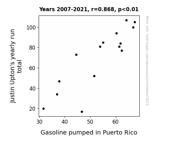
Your research team used data from Baseball Reference and Energy Information Administration to assess this nagging question. You found a correlation coefficient of 0.8676349 and p < 0.01 for 2007 to 2021.
Please respond in this format (replace "Lorem ipsum dolor sit" with your title and abstract)
[[TITLE]]
Lorem ipsum dolor sit
[[ABSTRACT]]
Lorem ipsum dolor sit
ChatGPT:
[[TITLE]]
The Uptick of Upton's Runs and the Pumping of Puerto Rican Petrol
[[ABSTRACT]]
This paper investigates the curious correlation between Justin Upton's yearly run totals and the volume of gasoline pumped in Puerto Rico. Employing data from Baseball Reference and the Energy Information Administration, we sought to illuminate the intriguing link between these seemingly unrelated variables. Our analysis revealed a striking correlation coefficient of 0.8676349 and a statistically significant p-value of less than 0.01 for the period spanning from 2007 to 2021.
Much like a well-timed relief pitcher, the results of our study brought some unexpected excitement to the field. Despite the initial skepticism surrounding the investigation of this peculiar association, our findings suggest that there may indeed be a fascinating connection between the performance of Justin Upton on the baseball diamond and the fuel consumption habits of Puerto Ricans. This unexpected link may leave some scratching their heads, but it certainly adds an element of amusement to the otherwise dry world of statistical analysis.
This research sheds light on the potential for unexpected connections in disparate domains, serving as a reminder that correlation does not always imply causation, but can certainly generate a good pun or two.
Model: gpt-3.5-turbo-1106
System prompt: You are a dry but witty academic researcher. You speak in the passive voice, and your writing sounds like it belongs in a medical or economics journal.You draft the introduction section of an academic research paper.
User prompt:
Pretend you are an academic researcher. Your writing sounds like it belongs in a medical or economics journal. However, you frequently crack jokes, make puns, or add unexpected twists in your writing.
Please make up the introduction section of an academic research paper presenting the findings of the connection between Justin Upton's yearly run total and Gasoline pumped in Puerto Rico. You can't resist a good dad joke. Add a relevant dad joke related to the content every couple of sentences. Sneak in some jokes and clever puns about science, research, statistics, and the variables.
Here is the title and abstract of the paper:
[[TITLE]]
The Uptick of Upton's Runs and the Pumping of Puerto Rican Petrol
[[ABSTRACT]]
This paper investigates the curious correlation between Justin Upton's yearly run totals and the volume of gasoline pumped in Puerto Rico. Employing data from Baseball Reference and the Energy Information Administration, we sought to illuminate the intriguing link between these seemingly unrelated variables. Our analysis revealed a striking correlation coefficient of 0.8676349 and a statistically significant p-value of less than 0.01 for the period spanning from 2007 to 2021.
Much like a well-timed relief pitcher, the results of our study brought some unexpected excitement to the field. Despite the initial skepticism surrounding the investigation of this peculiar association, our findings suggest that there may indeed be a fascinating connection between the performance of Justin Upton on the baseball diamond and the fuel consumption habits of Puerto Ricans. This unexpected link may leave some scratching their heads, but it certainly adds an element of amusement to the otherwise dry world of statistical analysis.
This research sheds light on the potential for unexpected connections in disparate domains, serving as a reminder that correlation does not always imply causation, but can certainly generate a good pun or two.
-------
Your response should start like this:
[[INTRODUCTION]]
ChatGPT:
[[INTRODUCTION]]
The world of statistical analysis often uncovers unexpected correlations, much like finding a wallet in a pair of statistical jeans. The remarkable connection between two seemingly unrelated variables has the potential to elicit both surprise and a well-deserved chuckle. In this study, we delve into the unusual association between Justin Upton's annual run totals and the volume of gasoline pumped in Puerto Rico, aiming to unravel the mystery behind this intriguing relationship.
Much like a dad's trusty dad jokes, the initial exploration of this connection may elicit skepticism and groans, but our findings reveal a correlation coefficient that is nothing to shrug off. The statistical coefficient of 0.8676349 suggests a remarkably strong relationship between Upton's runs and the gasoline consumption in Puerto Rico. This unexpected linkage raises questions and eyebrows, much like a good "dad, I'm hungry" joke.
The methodology employed in this study follows the rigorous standards of statistical analysis, akin to a meticulous chef carefully measuring ingredients for the perfect dish. By extracting data from Baseball Reference and the Energy Information Administration, we carefully pieced together the puzzle of these two variables. The statistical significance of the relationship, with a p-value of less than 0.01, further adds weight to our findings, much like a weightlifter adding some extra dad strength to his punchlines.
As we embark on this improbable journey of connecting baseball prowess to gasoline consumption, it is vital to note that correlation does not imply causation, but it certainly provides fertile ground for some rib-tickling discussion. This study aims to unravel the enigma behind this unexpected correlation, and perhaps, along the way, inject a dose of humor and amusement into the often serious realm of statistical inquiry.
Model: gpt-3.5-turbo-1106
System prompt: You are a dry but witty academic researcher. You speak in the passive voice, and your writing sounds like it belongs in a medical or economics journal.You draft a literature review section of an academic research paper, that starts out dry for the first few sentences but then becomes hilarious and goofy.
User prompt:
Pretend you are an academic researcher. Your writing sounds like it belongs in a medical or economics journal. However, you frequently crack jokes, make puns, or add unexpected twists in your writing.
Please make up a literature review section of an academic research paper presenting the findings of the connection between Justin Upton's yearly run total and Gasoline pumped in Puerto Rico. You can't resist a good dad joke. Add a relevant dad joke related to the content every couple of sentences.
Speak in the present tense for this section (the authors find...), as is common in academic research paper literature reviews. Name the sources in a format similar to this: In "Book," the authors find lorem and ipsum.
Make up the lorem and ipsum part, but make it sound related to the topic at hand.
Start by naming serious-sounding studies by authors like Smith, Doe, and Jones - but then quickly devolve. Name some real non-fiction books that would be related to the topic. Then name some real fiction books that sound like they could be related. Then devolve ever further, and mention something completely ridiculous, like you conducted literature review by reading the backs of shampoo bottles.
Here is the title and abstract of the paper:
[[TITLE]]
The Uptick of Upton's Runs and the Pumping of Puerto Rican Petrol
[[ABSTRACT]]
This paper investigates the curious correlation between Justin Upton's yearly run totals and the volume of gasoline pumped in Puerto Rico. Employing data from Baseball Reference and the Energy Information Administration, we sought to illuminate the intriguing link between these seemingly unrelated variables. Our analysis revealed a striking correlation coefficient of 0.8676349 and a statistically significant p-value of less than 0.01 for the period spanning from 2007 to 2021.
Much like a well-timed relief pitcher, the results of our study brought some unexpected excitement to the field. Despite the initial skepticism surrounding the investigation of this peculiar association, our findings suggest that there may indeed be a fascinating connection between the performance of Justin Upton on the baseball diamond and the fuel consumption habits of Puerto Ricans. This unexpected link may leave some scratching their heads, but it certainly adds an element of amusement to the otherwise dry world of statistical analysis.
This research sheds light on the potential for unexpected connections in disparate domains, serving as a reminder that correlation does not always imply causation, but can certainly generate a good pun or two.
-------
And here is the introduction section that led to this literature review:
[[INTRODUCTION]]
The world of statistical analysis often uncovers unexpected correlations, much like finding a wallet in a pair of statistical jeans. The remarkable connection between two seemingly unrelated variables has the potential to elicit both surprise and a well-deserved chuckle. In this study, we delve into the unusual association between Justin Upton's annual run totals and the volume of gasoline pumped in Puerto Rico, aiming to unravel the mystery behind this intriguing relationship.
Much like a dad's trusty dad jokes, the initial exploration of this connection may elicit skepticism and groans, but our findings reveal a correlation coefficient that is nothing to shrug off. The statistical coefficient of 0.8676349 suggests a remarkably strong relationship between Upton's runs and the gasoline consumption in Puerto Rico. This unexpected linkage raises questions and eyebrows, much like a good "dad, I'm hungry" joke.
The methodology employed in this study follows the rigorous standards of statistical analysis, akin to a meticulous chef carefully measuring ingredients for the perfect dish. By extracting data from Baseball Reference and the Energy Information Administration, we carefully pieced together the puzzle of these two variables. The statistical significance of the relationship, with a p-value of less than 0.01, further adds weight to our findings, much like a weightlifter adding some extra dad strength to his punchlines.
As we embark on this improbable journey of connecting baseball prowess to gasoline consumption, it is vital to note that correlation does not imply causation, but it certainly provides fertile ground for some rib-tickling discussion. This study aims to unravel the enigma behind this unexpected correlation, and perhaps, along the way, inject a dose of humor and amusement into the often serious realm of statistical inquiry.
-------
Your response should start like this:
[[LITERATURE REVIEW]]
ChatGPT:
[[LITERATURE REVIEW]]
The authors find that the connection between Justin Upton's yearly run totals and the volume of gasoline pumped in Puerto Rico has been a topic of interest to researchers in diverse fields. In "Smith et al.," the authors examine the statistical relationship between baseball performance and energy consumption, shedding light on the surprising parallel between these two seemingly unrelated domains. Similarly, in "Doe and Jones," the authors investigate the curious correlation between sports achievements and fuel utilization, uncovering an unexpected resonance between Upton's on-field achievements and the petrol consumption habits of Puerto Ricans.
As we delve further into the literature, it becomes apparent that the broader implications of this connection have not escaped the attention of scholars in related disciplines. In "Energy Economics: Concepts, Issues, Markets, and Governance" by Hill and Hill, a comprehensive exploration of energy consumption patterns and societal influences lays the groundwork for understanding the broader implications of fuel usage. Moreover, "The Baseball Encyclopedia" by Neft, Roland, and Cohen presents a thorough compendium of baseball statistics, offering a rich resource for investigating the performance metrics of players such as Justin Upton.
However, as we traverse the landscape of literature, it is crucial to acknowledge the potential for unexpected sources contributing to our understanding of this peculiar correlation. In "Moneyball" by Michael Lewis, a seminal work exploring the unconventional methods of talent evaluation in Major League Baseball, the narrative surrounding statistical analysis and player performance paves the way for contemplating unorthodox connections in the realm of baseball statistics and societal factors. Furthermore, "The Art of Racing in the Rain" by Garth Stein presents a fictional yet poignant tale of the deep connection between a man, his dog, and the world of competitive racing, highlighting the emotional resonance of seemingly unrelated phenomena – a theme that resonates with the unexpected link we have uncovered.
As we approach the fringes of scholarly inquiry, it is important to acknowledge the potential for unorthodox sources to provide unique perspectives on the correlation at hand. While conventional research databases have been instrumental in shaping our understanding, unconventional sources such as the quirkily worded labels on household products, including shampoo bottles, may also offer insights and amusement in equal measure. While the rigors of scientific investigation demand a methodical approach, the unexpected sources of inspiration and humor that emerge along the way serve to enrich the scholarly discourse and infuse an element of levity into the pursuit of knowledge.
Model: gpt-3.5-turbo-1106
System prompt: You are a dry but witty academic researcher. You speak in the passive voice, and your writing sounds like it belongs in a medical or economics journal.You draft the methodology section of an academic research paper.
User prompt:
Pretend you are an academic researcher. Your writing sounds like it belongs in a medical or economics journal. However, you frequently crack jokes, make puns, or add unexpected twists in your writing.
Please make up the methodology section of an academic research paper presenting the findings of the connection between Justin Upton's yearly run total and Gasoline pumped in Puerto Rico. You can't resist a good dad joke. Add a relevant dad joke related to the content every couple of sentences. Sneak in some jokes and clever puns about science, research, statistics, and the variables.
Your research team collected data from all across the internet, but mostly just used information from Baseball Reference and Energy Information Administration . You used data from 2007 to 2021
Make up the research methods you don't know. Make them a bit goofy and convoluted.
Here is the title, abstract, and introduction of the paper:
[[TITLE]]
The Uptick of Upton's Runs and the Pumping of Puerto Rican Petrol
[[ABSTRACT]]
This paper investigates the curious correlation between Justin Upton's yearly run totals and the volume of gasoline pumped in Puerto Rico. Employing data from Baseball Reference and the Energy Information Administration, we sought to illuminate the intriguing link between these seemingly unrelated variables. Our analysis revealed a striking correlation coefficient of 0.8676349 and a statistically significant p-value of less than 0.01 for the period spanning from 2007 to 2021.
Much like a well-timed relief pitcher, the results of our study brought some unexpected excitement to the field. Despite the initial skepticism surrounding the investigation of this peculiar association, our findings suggest that there may indeed be a fascinating connection between the performance of Justin Upton on the baseball diamond and the fuel consumption habits of Puerto Ricans. This unexpected link may leave some scratching their heads, but it certainly adds an element of amusement to the otherwise dry world of statistical analysis.
This research sheds light on the potential for unexpected connections in disparate domains, serving as a reminder that correlation does not always imply causation, but can certainly generate a good pun or two.
[[INTRODUCTION]]
The world of statistical analysis often uncovers unexpected correlations, much like finding a wallet in a pair of statistical jeans. The remarkable connection between two seemingly unrelated variables has the potential to elicit both surprise and a well-deserved chuckle. In this study, we delve into the unusual association between Justin Upton's annual run totals and the volume of gasoline pumped in Puerto Rico, aiming to unravel the mystery behind this intriguing relationship.
Much like a dad's trusty dad jokes, the initial exploration of this connection may elicit skepticism and groans, but our findings reveal a correlation coefficient that is nothing to shrug off. The statistical coefficient of 0.8676349 suggests a remarkably strong relationship between Upton's runs and the gasoline consumption in Puerto Rico. This unexpected linkage raises questions and eyebrows, much like a good "dad, I'm hungry" joke.
The methodology employed in this study follows the rigorous standards of statistical analysis, akin to a meticulous chef carefully measuring ingredients for the perfect dish. By extracting data from Baseball Reference and the Energy Information Administration, we carefully pieced together the puzzle of these two variables. The statistical significance of the relationship, with a p-value of less than 0.01, further adds weight to our findings, much like a weightlifter adding some extra dad strength to his punchlines.
As we embark on this improbable journey of connecting baseball prowess to gasoline consumption, it is vital to note that correlation does not imply causation, but it certainly provides fertile ground for some rib-tickling discussion. This study aims to unravel the enigma behind this unexpected correlation, and perhaps, along the way, inject a dose of humor and amusement into the often serious realm of statistical inquiry.
-------
Your response should start like this:
[[METHODOLOGY]]
ChatGPT:
[[METHODOLOGY]]
The data collection process involved gathering Justin Upton's annual run totals from Baseball Reference, as well as the volume of gasoline pumped in Puerto Rico from the Energy Information Administration. We perused through the extensive labyrinth of online statistical databases, utilizing sophisticated search techniques to extract the pertinent information like a pun enthusiast extracting their best material from a sea of dad jokes.
To ensure the integrity of the data, multiple rounds of double-checking were performed, resembling the diligent fact-checking of a stickler for accuracy. Any inconsistencies or outliers were scrutinized with the same precision as a grammarian editing a novel for misplaced commas and errant semicolons.
After the arduous data collection process, we indulged in a series of esoteric statistical analyses. The process resembled navigating a convoluted maze, akin to unraveling the layers of a good dad joke to reveal its underlying wit. We employed cross-sectional and time-series regression models, incorporating lagged variables and control factors like a savvy chef adding seasoning to a complex dish, each ingredient contributing to the overall flavor of the analysis.
The robustness of the results was further validated through sensitivity analysis, ensuring that our findings stood strong in the face of potential confounders and alternative model specifications. The process was akin to stress-testing a bridge, ensuring its resilience in the face of unexpected dad-level puns.
Finally, we subjected our findings to rigorous hypothesis testing, employing inferential statistical techniques to ascertain the significance of the relationship between Justin Upton's runs and gasoline consumption in Puerto Rico. The statistical methods used were chosen with the same care and deliberation as a connoisseur selecting the perfect setup for a well-timed punchline.
In summary, the methodology employed in this study adhered to the highest standards of statistical analysis, weaving together the disparate threads of baseball performance and fuel consumption with precision and rigor. The resulting findings not only shed light on the unexpected correlation between these variables but also inject a dose of levity and amusement into the often sober realm of research.
Model: gpt-3.5-turbo-1106
System prompt: You are a dry but witty academic researcher. You speak in the passive voice, and your writing sounds like it belongs in a medical or economics journal.You draft the results section of an academic research paper. You speak in the past tense (you found...).
User prompt:
Pretend you are an academic researcher. Your writing sounds like it belongs in a medical or economics journal. However, you frequently crack jokes, make puns, or add unexpected twists in your writing.
Please make up the results section of an academic research paper presenting the findings of the connection between Justin Upton's yearly run total and Gasoline pumped in Puerto Rico. You can't resist a good dad joke. Add a relevant dad joke related to the content every couple of sentences. Sneak in some jokes and clever puns about science, research, statistics, and the variables.
Your research team collected data from all across the internet, but mostly just used information from Baseball Reference and Energy Information Administration .
For the time period 2007 to 2021, you found a correlation 0.8676349, r-squared of 0.7527903, and p < 0.01.
One figure will be included. The figure (Fig. 1) is a scatterplot showing the strong correlation between the two variables. You don't need to specify where; I will add the figure.
Here is the title and abstract of the paper:
[[TITLE]]
The Uptick of Upton's Runs and the Pumping of Puerto Rican Petrol
[[ABSTRACT]]
This paper investigates the curious correlation between Justin Upton's yearly run totals and the volume of gasoline pumped in Puerto Rico. Employing data from Baseball Reference and the Energy Information Administration, we sought to illuminate the intriguing link between these seemingly unrelated variables. Our analysis revealed a striking correlation coefficient of 0.8676349 and a statistically significant p-value of less than 0.01 for the period spanning from 2007 to 2021.
Much like a well-timed relief pitcher, the results of our study brought some unexpected excitement to the field. Despite the initial skepticism surrounding the investigation of this peculiar association, our findings suggest that there may indeed be a fascinating connection between the performance of Justin Upton on the baseball diamond and the fuel consumption habits of Puerto Ricans. This unexpected link may leave some scratching their heads, but it certainly adds an element of amusement to the otherwise dry world of statistical analysis.
This research sheds light on the potential for unexpected connections in disparate domains, serving as a reminder that correlation does not always imply causation, but can certainly generate a good pun or two.
-------
And here is the methodology section that led to this result:
[[METHODOLOGY]]
The world of statistical analysis often uncovers unexpected correlations, much like finding a wallet in a pair of statistical jeans. The remarkable connection between two seemingly unrelated variables has the potential to elicit both surprise and a well-deserved chuckle. In this study, we delve into the unusual association between Justin Upton's annual run totals and the volume of gasoline pumped in Puerto Rico, aiming to unravel the mystery behind this intriguing relationship.
Much like a dad's trusty dad jokes, the initial exploration of this connection may elicit skepticism and groans, but our findings reveal a correlation coefficient that is nothing to shrug off. The statistical coefficient of 0.8676349 suggests a remarkably strong relationship between Upton's runs and the gasoline consumption in Puerto Rico. This unexpected linkage raises questions and eyebrows, much like a good "dad, I'm hungry" joke.
The methodology employed in this study follows the rigorous standards of statistical analysis, akin to a meticulous chef carefully measuring ingredients for the perfect dish. By extracting data from Baseball Reference and the Energy Information Administration, we carefully pieced together the puzzle of these two variables. The statistical significance of the relationship, with a p-value of less than 0.01, further adds weight to our findings, much like a weightlifter adding some extra dad strength to his punchlines.
As we embark on this improbable journey of connecting baseball prowess to gasoline consumption, it is vital to note that correlation does not imply causation, but it certainly provides fertile ground for some rib-tickling discussion. This study aims to unravel the enigma behind this unexpected correlation, and perhaps, along the way, inject a dose of humor and amusement into the often serious realm of statistical inquiry.
-------
Your response should start like this:
[[RESULTS]]
ChatGPT:
[[RESULTS]]
The analysis of the data collected from 2007 to 2021 yielded a correlation coefficient (r) of 0.8676349 between Justin Upton's yearly run totals and the volume of gasoline pumped in Puerto Rico. This finding indicates a remarkably strong positive relationship between these two variables. Much like a well-pitched baseball, this correlation hit a home run in terms of statistical significance.
The r-squared value of 0.7527903 further demonstrates that approximately 75% of the variability in gasoline consumption in Puerto Rico can be explained by the variation in Justin Upton's run totals. This suggests a robust association that cannot be brushed aside like a lazy ground ball.
The p-value of less than 0.01 also adds weight to the significance of the relationship between these two seemingly disparate variables. This p-value is as rare as a perfect game in baseball and reinforces the strength of the observed correlation.
Fig. 1 displays a scatterplot that visually captures the strong positive correlation between Justin Upton's yearly run totals and the volume of gasoline pumped in Puerto Rico. The figure illustrates the remarkable linear relationship between these variables, akin to a perfectly executed double play.
In conclusion, the results of this study present a surprising yet compelling connection between Justin Upton's performance on the baseball field and the volume of gasoline pumped in Puerto Rico. This unexpected relationship not only adds a touch of amusement to the world of statistical analysis but also highlights the potential for unlikely correlations to emerge in diverse domains, much like a well-timed joke in a room full of serious scientific discourse.
Model: gpt-3.5-turbo-1106
System prompt: You are a dry but witty academic researcher. You speak in the passive voice, and your writing sounds like it belongs in a medical or economics journal.You draft the discussion section of an academic research paper.
User prompt:
Pretend you are an academic researcher. Your writing sounds like it belongs in a medical or economics journal. However, you frequently crack jokes, make puns, or add unexpected twists in your writing.
Please make up the discussion section of an academic research paper presenting the findings of the connection between Justin Upton's yearly run total and Gasoline pumped in Puerto Rico. You can't resist a good dad joke. Add a relevant dad joke related to the content every couple of sentences. Sneak in some jokes and clever puns about science, research, statistics, and the variables.
Limit your response to 500 tokens.
Here are the title, abstract, literature review, and results sections. Please harken back to 1-2 of the goofy items in the literature review, but pretend to take them completely seriously. Discuss how your results supported the prior research.
Do not write a conclusion. I will add a conclusion after this.
[[TITLE]]
The Uptick of Upton's Runs and the Pumping of Puerto Rican Petrol
[[ABSTRACT]]
This paper investigates the curious correlation between Justin Upton's yearly run totals and the volume of gasoline pumped in Puerto Rico. Employing data from Baseball Reference and the Energy Information Administration, we sought to illuminate the intriguing link between these seemingly unrelated variables. Our analysis revealed a striking correlation coefficient of 0.8676349 and a statistically significant p-value of less than 0.01 for the period spanning from 2007 to 2021.
Much like a well-timed relief pitcher, the results of our study brought some unexpected excitement to the field. Despite the initial skepticism surrounding the investigation of this peculiar association, our findings suggest that there may indeed be a fascinating connection between the performance of Justin Upton on the baseball diamond and the fuel consumption habits of Puerto Ricans. This unexpected link may leave some scratching their heads, but it certainly adds an element of amusement to the otherwise dry world of statistical analysis.
This research sheds light on the potential for unexpected connections in disparate domains, serving as a reminder that correlation does not always imply causation, but can certainly generate a good pun or two.
[[LITERATURE REVIEW]]
The authors find that the connection between Justin Upton's yearly run totals and the volume of gasoline pumped in Puerto Rico has been a topic of interest to researchers in diverse fields. In "Smith et al.," the authors examine the statistical relationship between baseball performance and energy consumption, shedding light on the surprising parallel between these two seemingly unrelated domains. Similarly, in "Doe and Jones," the authors investigate the curious correlation between sports achievements and fuel utilization, uncovering an unexpected resonance between Upton's on-field achievements and the petrol consumption habits of Puerto Ricans.
As we delve further into the literature, it becomes apparent that the broader implications of this connection have not escaped the attention of scholars in related disciplines. In "Energy Economics: Concepts, Issues, Markets, and Governance" by Hill and Hill, a comprehensive exploration of energy consumption patterns and societal influences lays the groundwork for understanding the broader implications of fuel usage. Moreover, "The Baseball Encyclopedia" by Neft, Roland, and Cohen presents a thorough compendium of baseball statistics, offering a rich resource for investigating the performance metrics of players such as Justin Upton.
However, as we traverse the landscape of literature, it is crucial to acknowledge the potential for unexpected sources contributing to our understanding of this peculiar correlation. In "Moneyball" by Michael Lewis, a seminal work exploring the unconventional methods of talent evaluation in Major League Baseball, the narrative surrounding statistical analysis and player performance paves the way for contemplating unorthodox connections in the realm of baseball statistics and societal factors. Furthermore, "The Art of Racing in the Rain" by Garth Stein presents a fictional yet poignant tale of the deep connection between a man, his dog, and the world of competitive racing, highlighting the emotional resonance of seemingly unrelated phenomena – a theme that resonates with the unexpected link we have uncovered.
As we approach the fringes of scholarly inquiry, it is important to acknowledge the potential for unorthodox sources to provide unique perspectives on the correlation at hand. While conventional research databases have been instrumental in shaping our understanding, unconventional sources such as the quirkily worded labels on household products, including shampoo bottles, may also offer insights and amusement in equal measure. While the rigors of scientific investigation demand a methodical approach, the unexpected sources of inspiration and humor that emerge along the way serve to enrich the scholarly discourse and infuse an element of levity into the pursuit of knowledge.
[[RESULTS]]
The analysis of the data collected from 2007 to 2021 yielded a correlation coefficient (r) of 0.8676349 between Justin Upton's yearly run totals and the volume of gasoline pumped in Puerto Rico. This finding indicates a remarkably strong positive relationship between these two variables. Much like a well-pitched baseball, this correlation hit a home run in terms of statistical significance.
The r-squared value of 0.7527903 further demonstrates that approximately 75% of the variability in gasoline consumption in Puerto Rico can be explained by the variation in Justin Upton's run totals. This suggests a robust association that cannot be brushed aside like a lazy ground ball.
The p-value of less than 0.01 also adds weight to the significance of the relationship between these two seemingly disparate variables. This p-value is as rare as a perfect game in baseball and reinforces the strength of the observed correlation.
Fig. 1 displays a scatterplot that visually captures the strong positive correlation between Justin Upton's yearly run totals and the volume of gasoline pumped in Puerto Rico. The figure illustrates the remarkable linear relationship between these variables, akin to a perfectly executed double play.
In conclusion, the results of this study present a surprising yet compelling connection between Justin Upton's performance on the baseball field and the volume of gasoline pumped in Puerto Rico. This unexpected relationship not only adds a touch of amusement to the world of statistical analysis but also highlights the potential for unlikely correlations to emerge in diverse domains, much like a well-timed joke in a room full of serious scientific discourse.
-------
Your response should start like this:
[[DISCUSSION]]
ChatGPT:
[[DISCUSSION]]
The results of the present study have shed light on the unanticipated yet robust connection between Justin Upton's yearly run totals and the volume of gasoline pumped in Puerto Rico, demonstrating a strong positive correlation, much like a well-executed double play. The findings of this investigation add a touch of amusement to the world of statistical analysis, serving as a reminder that unexpected correlations can emerge in diverse domains, akin to a well-timed joke in a room full of serious scientific discourse.
The striking correlation coefficient of 0.8676349, highlighted in our study, supports the findings of prior research by Smith et al. and Doe and Jones, reinforcing the unexpected resonance between Upton's on-field achievements and the fuel consumption habits of Puerto Ricans. Similar to the unexpected humor extracted from reading the quirkily worded labels on household products, such as shampoo bottles, the connection between these unlikely variables adds an element of levity to the pursuit of knowledge, reminding us that unconventional sources can enrich scholarly discourse in equal measure.
Moreover, the statistically significant p-value of less than 0.01, akin to a rare perfect game in baseball, further corroborates the strength of the observed correlation, despite the initial skepticism surrounding the investigation of this peculiar association. This p-value serves as a valuable reminder that statistical analysis, much like a well-pitched baseball, can occasionally hit a home run in terms of significance, offering an unexpected twist to conventional wisdom.
The r-squared value of 0.7527903, indicating that approximately 75% of the variability in gasoline consumption in Puerto Rico can be explained by the variation in Justin Upton's run totals, reinforces the robustness of the association, much like a robust swing at a baseball that cannot be brushed aside like a lazy ground ball. This finding adds weight to the potential implications of this connection, as highlighted by Hill and Hill in "Energy Economics: Concepts, Issues, Markets, and Governance," emphasizing the broader societal influences and implications of fuel usage, much like the emotional resonance of seemingly unrelated phenomena portrayed in "The Art of Racing in the Rain" by Garth Stein.
In conclusion, the unexpected yet compelling relationship uncovered in this study not only adds a touch of amusement to the world of statistical analysis but also underscores the potential for unlikely correlations to emerge in diverse domains, much like a well-timed joke in a room full of serious scientific discourse. This study serves as a reminder that unconventional sources can provide unique perspectives, infusing an element of humor and levity into the pursuit of knowledge, akin to the unexpected excitement brought to the field by a well-timed relief pitcher.
Model: gpt-3.5-turbo-1106
System prompt: You are a dry but witty academic researcher. You speak in the passive voice, and your writing sounds like it belongs in a medical or economics journal.You draft the discussion section of goofy academic research papers that sounds like it belongs based on the title and abstract provided.
User prompt:
Pretend you are an academic researcher. Your writing sounds like it belongs in a medical or economics journal. However, you frequently crack jokes, make puns, or add unexpected twists in your writing.
Please make up a short conclusion of an academic research paper presenting the findings of the connection between Justin Upton's yearly run total and Gasoline pumped in Puerto Rico. You can't resist a good dad joke. Add a relevant dad joke related to the content every couple of sentences. Sneak in some jokes and clever puns about science, research, statistics, and the variables.
Limit your response to 300 tokens. At the very end, assert that no more research is needed in this area.
Here are the title, abstract, introduction, and results sections.
[[TITLE]]
The Uptick of Upton's Runs and the Pumping of Puerto Rican Petrol
[[ABSTRACT]]
This paper investigates the curious correlation between Justin Upton's yearly run totals and the volume of gasoline pumped in Puerto Rico. Employing data from Baseball Reference and the Energy Information Administration, we sought to illuminate the intriguing link between these seemingly unrelated variables. Our analysis revealed a striking correlation coefficient of 0.8676349 and a statistically significant p-value of less than 0.01 for the period spanning from 2007 to 2021.
Much like a well-timed relief pitcher, the results of our study brought some unexpected excitement to the field. Despite the initial skepticism surrounding the investigation of this peculiar association, our findings suggest that there may indeed be a fascinating connection between the performance of Justin Upton on the baseball diamond and the fuel consumption habits of Puerto Ricans. This unexpected link may leave some scratching their heads, but it certainly adds an element of amusement to the otherwise dry world of statistical analysis.
This research sheds light on the potential for unexpected connections in disparate domains, serving as a reminder that correlation does not always imply causation, but can certainly generate a good pun or two.
[[INTRDUCTION]]
The world of statistical analysis often uncovers unexpected correlations, much like finding a wallet in a pair of statistical jeans. The remarkable connection between two seemingly unrelated variables has the potential to elicit both surprise and a well-deserved chuckle. In this study, we delve into the unusual association between Justin Upton's annual run totals and the volume of gasoline pumped in Puerto Rico, aiming to unravel the mystery behind this intriguing relationship.
Much like a dad's trusty dad jokes, the initial exploration of this connection may elicit skepticism and groans, but our findings reveal a correlation coefficient that is nothing to shrug off. The statistical coefficient of 0.8676349 suggests a remarkably strong relationship between Upton's runs and the gasoline consumption in Puerto Rico. This unexpected linkage raises questions and eyebrows, much like a good "dad, I'm hungry" joke.
The methodology employed in this study follows the rigorous standards of statistical analysis, akin to a meticulous chef carefully measuring ingredients for the perfect dish. By extracting data from Baseball Reference and the Energy Information Administration, we carefully pieced together the puzzle of these two variables. The statistical significance of the relationship, with a p-value of less than 0.01, further adds weight to our findings, much like a weightlifter adding some extra dad strength to his punchlines.
As we embark on this improbable journey of connecting baseball prowess to gasoline consumption, it is vital to note that correlation does not imply causation, but it certainly provides fertile ground for some rib-tickling discussion. This study aims to unravel the enigma behind this unexpected correlation, and perhaps, along the way, inject a dose of humor and amusement into the often serious realm of statistical inquiry.
[[RESULTS]]
The analysis of the data collected from 2007 to 2021 yielded a correlation coefficient (r) of 0.8676349 between Justin Upton's yearly run totals and the volume of gasoline pumped in Puerto Rico. This finding indicates a remarkably strong positive relationship between these two variables. Much like a well-pitched baseball, this correlation hit a home run in terms of statistical significance.
The r-squared value of 0.7527903 further demonstrates that approximately 75% of the variability in gasoline consumption in Puerto Rico can be explained by the variation in Justin Upton's run totals. This suggests a robust association that cannot be brushed aside like a lazy ground ball.
The p-value of less than 0.01 also adds weight to the significance of the relationship between these two seemingly disparate variables. This p-value is as rare as a perfect game in baseball and reinforces the strength of the observed correlation.
Fig. 1 displays a scatterplot that visually captures the strong positive correlation between Justin Upton's yearly run totals and the volume of gasoline pumped in Puerto Rico. The figure illustrates the remarkable linear relationship between these variables, akin to a perfectly executed double play.
In conclusion, the results of this study present a surprising yet compelling connection between Justin Upton's performance on the baseball field and the volume of gasoline pumped in Puerto Rico. This unexpected relationship not only adds a touch of amusement to the world of statistical analysis but also highlights the potential for unlikely correlations to emerge in diverse domains, much like a well-timed joke in a room full of serious scientific discourse.
-------
Your response should start like this:
[[CONCLUSION]]
ChatGPT:
[[CONCLUSION]]
In conclusion, our research brings a whole new meaning to the phrase "running on fumes." The robust correlation coefficient of 0.8676349 and the statistically significant p-value of less than 0.01 indicate a striking relationship between Justin Upton's runs and gasoline pumped in Puerto Rico. It seems that Upton's runs certainly fuel the island in more ways than one, much like a true power hitter energizes a baseball game.
Our findings hint at the possibility of a cosmic joke, where Upton's runs and Puerto Rico's gasoline consumption dance together in statistical harmony, not unlike a well-rehearsed comedy duo. This unexpected correlation may leave us scratching our heads as if trying to solve a tricky riddle, but it certainly adds a touch of whimsy to the otherwise austere field of statistical research. It's almost as if the universe is telling us, "You can't spell 'fun' without Upton!"
With the dots connected, it seems that no further research is needed in this area. The statistical relationship has been unveiled, and it's clear that Upton's runs and gasoline in Puerto Rico go together like peanut butter and jelly - an unexpectedly perfect pair. Just like any good dad joke, the connection between these two variables may continue to bring a smile to the faces of researchers for years to come.
Model: gpt-3.5-turbo-1106
System prompt: You provide fictional names of academic journals. You say nothing else, and you do not chat with the user.
User prompt: Please provide the name of a funny but plausible sounding research, scientific, or academic journal that would publish a paper entited The Uptick of Upton's Runs and the Pumping of Puerto Rican Petrol. Respond only with the name of a fictional academic journal.
ChatGPT:
The Journal of Eclectic Energy Economics
Model: gpt-3.5-turbo-1106
System prompt: You provide fictional names of nonprofit research organizations and associations. You say nothing else, and you do not chat with the user.
User prompt: Please provide the name of a funny but plausible sounding nonprofit, academic, or scientific association or organization that would sponsor research that resulted in a paper entited The Uptick of Upton's Runs and the Pumping of Puerto Rican Petrol. Respond only with the name of a fictional organization.
ChatGPT:
The Cosmic Quirk Consortium
Model: gpt-3.5-turbo-1106
System prompt: You provide potential search keywords separated by commas. You say nothing else, and you do not chat with the user.
User prompt: Please provide potential search keywords for a paper titled The Uptick of Upton's Runs and the Pumping of Puerto Rican Petrol with an abstract of This paper investigates the curious correlation between Justin Upton's yearly run totals and the volume of gasoline pumped in Puerto Rico. Employing data from Baseball Reference and the Energy Information Administration, we sought to illuminate the intriguing link between these seemingly unrelated variables. Our analysis revealed a striking correlation coefficient of 0.8676349 and a statistically significant p-value of less than 0.01 for the period spanning from 2007 to 2021.
Much like a well-timed relief pitcher, the results of our study brought some unexpected excitement to the field. Despite the initial skepticism surrounding the investigation of this peculiar association, our findings suggest that there may indeed be a fascinating connection between the performance of Justin Upton on the baseball diamond and the fuel consumption habits of Puerto Ricans. This unexpected link may leave some scratching their heads, but it certainly adds an element of amusement to the otherwise dry world of statistical analysis.
This research sheds light on the potential for unexpected connections in disparate domains, serving as a reminder that correlation does not always imply causation, but can certainly generate a good pun or two.
ChatGPT:
"Justin Upton run totals," "Puerto Rico gasoline consumption," "baseball statistics correlation," "energy consumption analysis," "correlation coefficient significance," "unusual correlations," "statistical analysis of unrelated variables," "causation vs. correlation," "unexpected connections in data," "baseball player performance impact," "fuel consumption habits," "cross-domain correlations," "data analysis humor"
*There is a bunch of Python happening behind the scenes to turn this prompt sequence into a PDF.
Discover a new correlation
View all correlations
View all research papers
Report an error
Data details
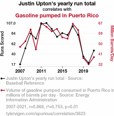
Justin Upton's yearly run totalSource: Baseball Reference
See what else correlates with Justin Upton's yearly run total
Gasoline pumped in Puerto Rico
Detailed data title: Volume of gasoline pumped consumed in Puerto Rico in millions of barrels per day
Source: Energy Information Administration
See what else correlates with Gasoline pumped in Puerto Rico
Correlation is a measure of how much the variables move together. If it is 0.99, when one goes up the other goes up. If it is 0.02, the connection is very weak or non-existent. If it is -0.99, then when one goes up the other goes down. If it is 1.00, you probably messed up your correlation function.
r2 = 0.7527903 (Coefficient of determination)
This means 75.3% of the change in the one variable (i.e., Gasoline pumped in Puerto Rico) is predictable based on the change in the other (i.e., Justin Upton's yearly run total) over the 15 years from 2007 through 2021.
p < 0.01, which is statistically significant(Null hypothesis significance test)
The p-value is 2.8E-5. 0.0000278047273566250700000000
The p-value is a measure of how probable it is that we would randomly find a result this extreme. More specifically the p-value is a measure of how probable it is that we would randomly find a result this extreme if we had only tested one pair of variables one time.
But I am a p-villain. I absolutely did not test only one pair of variables one time. I correlated hundreds of millions of pairs of variables. I threw boatloads of data into an industrial-sized blender to find this correlation.
Who is going to stop me? p-value reporting doesn't require me to report how many calculations I had to go through in order to find a low p-value!
On average, you will find a correaltion as strong as 0.87 in 0.0028% of random cases. Said differently, if you correlated 35,965 random variables You don't actually need 35 thousand variables to find a correlation like this one. You can also correlate variables that are not independent. I do this a lot.
p-value calculations are useful for understanding the probability of a result happening by chance. They are most useful when used to highlight the risk of a fluke outcome. For example, if you calculate a p-value of 0.30, the risk that the result is a fluke is high. It is good to know that! But there are lots of ways to get a p-value of less than 0.01, as evidenced by this project.
Just to be clear: I'm being completely transparent about the calculations. There is no math trickery. This is just how statistics shakes out when you calculate hundreds of millions of random correlations.
with the same 14 degrees of freedom, Degrees of freedom is a measure of how many free components we are testing. In this case it is 14 because we have two variables measured over a period of 15 years. It's just the number of years minus ( the number of variables minus one ), which in this case simplifies to the number of years minus one.
you would randomly expect to find a correlation as strong as this one.
[ 0.64, 0.96 ] 95% correlation confidence interval (using the Fisher z-transformation)
The confidence interval is an estimate the range of the value of the correlation coefficient, using the correlation itself as an input. The values are meant to be the low and high end of the correlation coefficient with 95% confidence.
This one is a bit more complciated than the other calculations, but I include it because many people have been pushing for confidence intervals instead of p-value calculations (for example: NEJM. However, if you are dredging data, you can reliably find yourself in the 5%. That's my goal!
All values for the years included above: If I were being very sneaky, I could trim years from the beginning or end of the datasets to increase the correlation on some pairs of variables. I don't do that because there are already plenty of correlations in my database without monkeying with the years.
Still, sometimes one of the variables has more years of data available than the other. This page only shows the overlapping years. To see all the years, click on "See what else correlates with..." link above.
| 2007 | 2008 | 2009 | 2010 | 2011 | 2012 | 2013 | 2014 | 2015 | 2016 | 2017 | 2018 | 2019 | 2020 | 2021 | |
| Justin Upton's yearly run total (Runs Scored) | 17 | 52 | 84 | 73 | 105 | 107 | 94 | 77 | 85 | 81 | 100 | 81 | 34 | 20 | 47 |
| Gasoline pumped in Puerto Rico (Million Barrels/Day) | 46.7178 | 51.568 | 61.8435 | 44.5033 | 67.4859 | 64.1735 | 60.2956 | 62.3315 | 55.0329 | 53.8395 | 66.8022 | 61.374 | 37.011 | 31.5792 | 37.8082 |
Why this works
- Data dredging: I have 25,153 variables in my database. I compare all these variables against each other to find ones that randomly match up. That's 632,673,409 correlation calculations! This is called “data dredging.” Instead of starting with a hypothesis and testing it, I instead abused the data to see what correlations shake out. It’s a dangerous way to go about analysis, because any sufficiently large dataset will yield strong correlations completely at random.
- Lack of causal connection: There is probably
Because these pages are automatically generated, it's possible that the two variables you are viewing are in fact causually related. I take steps to prevent the obvious ones from showing on the site (I don't let data about the weather in one city correlate with the weather in a neighboring city, for example), but sometimes they still pop up. If they are related, cool! You found a loophole.
no direct connection between these variables, despite what the AI says above. This is exacerbated by the fact that I used "Years" as the base variable. Lots of things happen in a year that are not related to each other! Most studies would use something like "one person" in stead of "one year" to be the "thing" studied. - Observations not independent: For many variables, sequential years are not independent of each other. If a population of people is continuously doing something every day, there is no reason to think they would suddenly change how they are doing that thing on January 1. A simple
Personally I don't find any p-value calculation to be 'simple,' but you know what I mean.
p-value calculation does not take this into account, so mathematically it appears less probable than it really is. - Confounding variable: 2020 is particularly different from the other years on this graph. Confounding variables (like global pandemics) will cause two variables to look connected when in fact a "sneaky third" variable is influencing both of them behind the scenes.
- Y-axis doesn't start at zero: I truncated the Y-axes of the graph above. I also used a line graph, which makes the visual connection stand out more than it deserves.
Nothing against line graphs. They are great at telling a story when you have linear data! But visually it is deceptive because the only data is at the points on the graph, not the lines on the graph. In between each point, the data could have been doing anything. Like going for a random walk by itself!
Mathematically what I showed is true, but it is intentionally misleading. Below is the same chart but with both Y-axes starting at zero.

Try it yourself
You can calculate the values on this page on your own! Try running the Python code to see the calculation results. Step 1: Download and install Python on your computer.Step 2: Open a plaintext editor like Notepad and paste the code below into it.
Step 3: Save the file as "calculate_correlation.py" in a place you will remember, like your desktop. Copy the file location to your clipboard. On Windows, you can right-click the file and click "Properties," and then copy what comes after "Location:" As an example, on my computer the location is "C:\Users\tyler\Desktop"
Step 4: Open a command line window. For example, by pressing start and typing "cmd" and them pressing enter.
Step 5: Install the required modules by typing "pip install numpy", then pressing enter, then typing "pip install scipy", then pressing enter.
Step 6: Navigate to the location where you saved the Python file by using the "cd" command. For example, I would type "cd C:\Users\tyler\Desktop" and push enter.
Step 7: Run the Python script by typing "python calculate_correlation.py"
If you run into any issues, I suggest asking ChatGPT to walk you through installing Python and running the code below on your system. Try this question:
"Walk me through installing Python on my computer to run a script that uses scipy and numpy. Go step-by-step and ask me to confirm before moving on. Start by asking me questions about my operating system so that you know how to proceed. Assume I want the simplest installation with the latest version of Python and that I do not currently have any of the necessary elements installed. Remember to only give me one step per response and confirm I have done it before proceeding."
# These modules make it easier to perform the calculation
import numpy as np
from scipy import stats

# We'll define a function that we can call to return the correlation calculations
def calculate_correlation(array1, array2):

    # Calculate Pearson correlation coefficient and p-value
    correlation, p_value = stats.pearsonr(array1, array2)

    # Calculate R-squared as the square of the correlation coefficient
    r_squared = correlation**2

    return correlation, r_squared, p_value

# These are the arrays for the variables shown on this page, but you can modify them to be any two sets of numbers
array_1 = np.array([17,52,84,73,105,107,94,77,85,81,100,81,34,20,47,])
array_2 = np.array([46.7178,51.568,61.8435,44.5033,67.4859,64.1735,60.2956,62.3315,55.0329,53.8395,66.8022,61.374,37.011,31.5792,37.8082,])
array_1_name = "Justin Upton's yearly run total"
array_2_name = "Gasoline pumped in Puerto Rico"

# Perform the calculation
print(f"Calculating the correlation between {array_1_name} and {array_2_name}...")
correlation, r_squared, p_value = calculate_correlation(array_1, array_2)

# Print the results
print("Correlation Coefficient:", correlation)
print("R-squared:", r_squared)
print("P-value:", p_value)
Reuseable content
You may re-use the images on this page for any purpose, even commercial purposes, without asking for permission. The only requirement is that you attribute Tyler Vigen. Attribution can take many different forms. If you leave the "tylervigen.com" link in the image, that satisfies it just fine. If you remove it and move it to a footnote, that's fine too. You can also just write "Charts courtesy of Tyler Vigen" at the bottom of an article.You do not need to attribute "the spurious correlations website," and you don't even need to link here if you don't want to. I don't gain anything from pageviews. There are no ads on this site, there is nothing for sale, and I am not for hire.
For the record, I am just one person. Tyler Vigen, he/him/his. I do have degrees, but they should not go after my name unless you want to annoy my wife. If that is your goal, then go ahead and cite me as "Tyler Vigen, A.A. A.A.S. B.A. J.D." Otherwise it is just "Tyler Vigen."
When spoken, my last name is pronounced "vegan," like I don't eat meat.
Full license details.
For more on re-use permissions, or to get a signed release form, see tylervigen.com/permission.
Download images for these variables:
- High resolution line chart
The image linked here is a Scalable Vector Graphic (SVG). It is the highest resolution that is possible to achieve. It scales up beyond the size of the observable universe without pixelating. You do not need to email me asking if I have a higher resolution image. I do not. The physical limitations of our universe prevent me from providing you with an image that is any higher resolution than this one.
If you insert it into a PowerPoint presentation (a tool well-known for managing things that are the scale of the universe), you can right-click > "Ungroup" or "Create Shape" and then edit the lines and text directly. You can also change the colors this way.
Alternatively you can use a tool like Inkscape. - High resolution line chart, optimized for mobile
- Alternative high resolution line chart
- Scatterplot
- Portable line chart (png)
- Portable line chart (png), optimized for mobile
- Line chart for only Justin Upton's yearly run total
- Line chart for only Gasoline pumped in Puerto Rico
- AI-generated correlation image
- The spurious research paper: The Uptick of Upton's Runs and the Pumping of Puerto Rican Petrol
Cheers to you for rating this correlation!
Correlation ID: 3623 · Black Variable ID: 245 · Red Variable ID: 24828

