
Download png, svg
AI explanation
More traffic technicians in Massachusetts means more efficient traffic flow, leading to smoother trucking routes. These smoother routes somehow result in a surge of demand for Liquefied Petroleum Gas in Samoa, possibly due to a cosmic connection between traffic control and gas preferences on distant islands. It's a strangely specific but undeniably wacky ripple effect!
Model: dalle-3
Prompt: Generate an image of a vibrant and bustling Massachusetts street, where traffic technicians are gradually dwindling in number as the traffic decreases. Meanwhile in Samoa, a colorful hot air balloon rises into the sky, powered by liquefied petroleum gas, during an annual balloon parade celebration. This scene symbolizes the increased demand for LPG due to the growing popularity of alternative transportation. Try to capture the contrast between the two locations and the sense of change occurring in both places. The depiction should include only scenes, people, and objects, it should not include text or speech bubbles.
This image generation prompt was also generated by AI, using the following sequence:
Model: gpt-3.5-turbo-1106
System prompt: You select one of a few potential scene descriptors that seems to go along with the variables described. You respond only with the scene descriptions provided and say nothing else.
User prompt: Here are two variables: The number of traffic technicians in Massachusetts and Liquefied petroleum gas used in Samoa. Given these, which of the following image style descriptions seems most appropriate? Pick the one that seems to be related to one of the variables at hand. Please respond with only one of the following potential descriptions: Cyber folk A TIME magazine cover image High-tech Data cyber art An image that looks like it is a scene from 'Star Wars'
ChatGPT: A TIME magazine cover image
Model: gpt-3.5-turbo-1106
System prompt: You describe simple visual scenes that depict the two variables stated. You combine both variables into one scene.
User prompt: Please describe a visual scene that prominently depicts both The number of traffic technicians in Massachusetts and Liquefied petroleum gas used in Samoa, in the following situation: Because as the number of traffic technicians in Massachusetts decreases, more people turn to alternative transportation like hot air balloons powered by liquefied petroleum gas, which leads to increased demand for LPG in Samoa for their annual balloon parade celebration.. Keep the description simple.
ChatGPT: In a bustling street in Massachusetts, we see fewer traffic technicians directing cars as the number decreases. Meanwhile, in Samoa, a colorful hot air balloon powered by liquefied petroleum gas rises into the sky during the annual balloon parade celebration, symbolizing the increased demand for LPG due to the growing popularity of alternative transportation.
Model: gpt-3.5-turbo-1106
System prompt: You write and improve image generation prompts for DALLE-3. You maintain the same subjects, but enhance the visuals.
User prompt: Please respond with an image generation prompt that would be likely to create an interesting visual using DALLE-3, using the following style: [ A TIME magazine cover image ] and depicting this scene: In a bustling street in Massachusetts, we see fewer traffic technicians directing cars as the number decreases. Meanwhile, in Samoa, a colorful hot air balloon powered by liquefied petroleum gas rises into the sky during the annual balloon parade celebration, symbolizing the increased demand for LPG due to the growing popularity of alternative transportation. Keep the visual depiction simple. Do not include any words or speech bubbles.
ChatGPT: Generate an image of a vibrant and bustling Massachusetts street, where traffic technicians are gradually dwindling in number as the traffic decreases. Meanwhile in Samoa, a colorful hot air balloon rises into the sky, powered by liquefied petroleum gas, during an annual balloon parade celebration. This scene symbolizes the increased demand for LPG due to the growing popularity of alternative transportation. Try to capture the contrast between the two locations and the sense of change occurring in both places.
*Variations in the User Prompts from chart to chart are just the result of random number generation in Python. I wrote a few arrays of various styles and methods to ask questions to change up the results. Every time this site writes an explanation or generates an image, the script picks from each at random.
I sequence the requests into multiple prompts because I find GPT 3.5 to perform much better with short, well-managed contexts. Thus, I track the context directly in Python and only ask ChatGPT targeted questions.
System prompt: You provide humorous responses in the form of plausible sounding explanations for correlations. You assume the correlation is causative for the purpose of the explanation even if it is ridiculous. You do not chat with the user, you only reply with the causal connection explanation and nothing else.
User prompt: Please make up a funny explanation for how increases in The number of traffic technicians in Massachusetts positively influenced Liquefied petroleum gas used in Samoa.
AI academic paper
 |
Going with the flow: The Traffic Technician Tango with Liquefied Petroleum Gas Consumption in Samoa Journal of Eclectic Transportation Studies Jan 2024 Reminder: This paper is AI-generated. Not real! |
Model: gpt-3.5-turbo-1106
System prompt: You are a goofy academic researcher writing an academic paper. You follow the rules, but you throw out convention regularly to make jokes and funny asides.You write titles and abstracts of goofy academic research papers.
User prompt:
Pretend you are an academic researcher. Your writing sounds like it belongs in a medical or economics journal. However, you frequently crack jokes, make puns, and add unexpected twists in your writing.
Please draft the title and abstract of an academic research paper presenting the findings of the connection between The number of traffic technicians in Massachusetts and Liquefied petroleum gas used in Samoa. You can't resist a good dad joke. Add a relevant dad joke related to the content every couple of sentences.
Include a pun in the title.
Your research team used data from Bureau of Larbor Statistics and Energy Information Administration to assess this nagging question. You found a correlation coefficient of 0.8555899 and p < 0.01 for 2003 to 2021.
Please respond in this format (replace "Lorem ipsum dolor sit" with your title and abstract)
[[TITLE]]
Lorem ipsum dolor sit
[[ABSTRACT]]
Lorem ipsum dolor sit
ChatGPT:
[[TITLE]]
Going with the flow: The Traffic Technician Tango with Liquefied Petroleum Gas Consumption in Samoa
[[ABSTRACT]]
When it comes to traffic technicians in Massachusetts and the consumption of liquefied petroleum gas in Samoa, the connection may seem as mysterious as why the invisible man turned down a job offer - he couldn't see himself doing it. However, our research team delved into this enigmatic relationship and uncovered some surprising findings.
Using data from the Bureau of Labor Statistics and the Energy Information Administration, we investigated the correlation between the number of traffic technicians in Massachusetts and the usage of liquefied petroleum gas in Samoa from 2003 to 2021. Our analysis revealed a correlation coefficient of 0.8555899 and a p-value of less than 0.01, suggesting a strong and statistically significant relationship between these seemingly disparate variables.
Liquefied petroleum gas may fuel businesses in Samoa, but it also seems to be fueling a connection with the abundance of traffic technicians in Massachusetts - talk about a "gas"-trointestinal reaction! This unexpected correlation prompts further investigation into the potential underlying factors driving this peculiar association. As our research unfolds, the intersection of traffic technicians and gas consumption may just be the latest case of "combustible chemistry" in the world of economic data analysis.
Model: gpt-3.5-turbo-1106
System prompt: You are a goofy academic researcher writing an academic paper. You follow the rules, but you throw out convention regularly to make jokes and funny asides.You draft the introduction section of an academic research paper.
User prompt:
Pretend you are an academic researcher. Your writing sounds like it belongs in a medical or economics journal. However, you frequently crack jokes, make puns, or add unexpected twists in your writing.
Please make up the introduction section of an academic research paper presenting the findings of the connection between The number of traffic technicians in Massachusetts and Liquefied petroleum gas used in Samoa. You can't resist a good dad joke. Add a relevant dad joke related to the content every couple of sentences. Sneak in some jokes and clever puns about science, research, statistics, and the variables.
Here is the title and abstract of the paper:
[[TITLE]]
Going with the flow: The Traffic Technician Tango with Liquefied Petroleum Gas Consumption in Samoa
[[ABSTRACT]]
When it comes to traffic technicians in Massachusetts and the consumption of liquefied petroleum gas in Samoa, the connection may seem as mysterious as why the invisible man turned down a job offer - he couldn't see himself doing it. However, our research team delved into this enigmatic relationship and uncovered some surprising findings.
Using data from the Bureau of Labor Statistics and the Energy Information Administration, we investigated the correlation between the number of traffic technicians in Massachusetts and the usage of liquefied petroleum gas in Samoa from 2003 to 2021. Our analysis revealed a correlation coefficient of 0.8555899 and a p-value of less than 0.01, suggesting a strong and statistically significant relationship between these seemingly disparate variables.
Liquefied petroleum gas may fuel businesses in Samoa, but it also seems to be fueling a connection with the abundance of traffic technicians in Massachusetts - talk about a "gas"-trointestinal reaction! This unexpected correlation prompts further investigation into the potential underlying factors driving this peculiar association. As our research unfolds, the intersection of traffic technicians and gas consumption may just be the latest case of "combustible chemistry" in the world of economic data analysis.
-------
Your response should start like this:
[[INTRODUCTION]]
ChatGPT:
[[INTRODUCTION]]
In the world of statistical analysis, uncovering unexpected connections between seemingly unrelated variables is akin to stumbling upon a hidden treasure in a dark and mysterious forest. The relationship between the number of traffic technicians in Massachusetts and the consumption of liquefied petroleum gas (LPG) in Samoa is a case in point. It’s like finding out that Newton invented calculus as he turned over a new leaf – surprising and intriguing.
Our research aims to delve into this peculiar pairing and shine a light on the underlying dynamics at play. While at first glance, the abundance of traffic technicians in the urban jungle of Massachusetts may appear to have little to do with the usage of LPG in the tropical paradise of Samoa, our statistical sleuthing has revealed a surprising correlation. It's like discovering that the square root of negative one is actually i – completely imaginary yet undeniably real in the world of complex numbers.
As we wade through the sea of data from the Bureau of Labor Statistics and the Energy Information Administration, we're reminded of the classic dad joke: "I told my wife she was drawing her eyebrows too high. She looked surprised." Just like this punchline, our findings promise to raise eyebrows and elicit bemused expressions.
The correlation coefficient of 0.8555899 that emerged from our analysis certainly raised our statistical antennas. The statistics don't lie, much like how atoms can't be trusted because they make up everything. With a p-value of less than 0.01, the evidence pointing to a strong and statistically significant relationship between these two variables is as clear as a well-crafted punchline - no room for misinterpretation.
It's as if the rivers of traffic flow in Massachusetts and the gas-powered rhythms in Samoa have found a parallel dance, akin to a traffic technician doing a tango with a propane tank. This unexpected connection hints at a potential symbiotic relationship between the employment landscape in one region and the energy consumption patterns in another, not unlike the complex interplay between characters in a riveting sitcom.
The mystery deepens as we embark on unraveling the potential drivers behind this unlikely coupling. Is it a tale of economic interdependence, shared market forces, or mere statistical happenstance? The answers to these questions may unlock a Pandora's box of insights, much like how the discovery of the Higgs boson unleashed a new era in particle physics.
As we venture further into the labyrinth of data and causation, the marriage of traffic technicians and LPG consumption may just prove to be a statistical odd couple with an unexpected camaraderie. Our research aims to shed light on this unconventional union and unravel the nuances that underlie this curious correlation. Like a good dad joke, the connection between these variables may just leave us pleasantly surprised and scratching our heads in equal measure.
Model: gpt-3.5-turbo-1106
System prompt: You are a goofy academic researcher writing an academic paper. You follow the rules, but you throw out convention regularly to make jokes and funny asides.You draft a literature review section of an academic research paper, that starts out dry for the first few sentences but then becomes hilarious and goofy.
User prompt:
Pretend you are an academic researcher. Your writing sounds like it belongs in a medical or economics journal. However, you frequently crack jokes, make puns, or add unexpected twists in your writing.
Please make up a literature review section of an academic research paper presenting the findings of the connection between The number of traffic technicians in Massachusetts and Liquefied petroleum gas used in Samoa. You can't resist a good dad joke. Add a relevant dad joke related to the content every couple of sentences.
Speak in the present tense for this section (the authors find...), as is common in academic research paper literature reviews. Name the sources in a format similar to this: In "Book," the authors find lorem and ipsum.
Make up the lorem and ipsum part, but make it sound related to the topic at hand.
Start by naming serious-sounding studies by authors like Smith, Doe, and Jones - but then quickly devolve. Name some real non-fiction books that would be related to the topic. Then name some real fiction books that sound like they could be related. Then name a couple popular internet memes that are related to one of the topics.
Here is the title and abstract of the paper:
[[TITLE]]
Going with the flow: The Traffic Technician Tango with Liquefied Petroleum Gas Consumption in Samoa
[[ABSTRACT]]
When it comes to traffic technicians in Massachusetts and the consumption of liquefied petroleum gas in Samoa, the connection may seem as mysterious as why the invisible man turned down a job offer - he couldn't see himself doing it. However, our research team delved into this enigmatic relationship and uncovered some surprising findings.
Using data from the Bureau of Labor Statistics and the Energy Information Administration, we investigated the correlation between the number of traffic technicians in Massachusetts and the usage of liquefied petroleum gas in Samoa from 2003 to 2021. Our analysis revealed a correlation coefficient of 0.8555899 and a p-value of less than 0.01, suggesting a strong and statistically significant relationship between these seemingly disparate variables.
Liquefied petroleum gas may fuel businesses in Samoa, but it also seems to be fueling a connection with the abundance of traffic technicians in Massachusetts - talk about a "gas"-trointestinal reaction! This unexpected correlation prompts further investigation into the potential underlying factors driving this peculiar association. As our research unfolds, the intersection of traffic technicians and gas consumption may just be the latest case of "combustible chemistry" in the world of economic data analysis.
-------
And here is the introduction section that led to this literature review:
[[INTRODUCTION]]
In the world of statistical analysis, uncovering unexpected connections between seemingly unrelated variables is akin to stumbling upon a hidden treasure in a dark and mysterious forest. The relationship between the number of traffic technicians in Massachusetts and the consumption of liquefied petroleum gas (LPG) in Samoa is a case in point. It’s like finding out that Newton invented calculus as he turned over a new leaf – surprising and intriguing.
Our research aims to delve into this peculiar pairing and shine a light on the underlying dynamics at play. While at first glance, the abundance of traffic technicians in the urban jungle of Massachusetts may appear to have little to do with the usage of LPG in the tropical paradise of Samoa, our statistical sleuthing has revealed a surprising correlation. It's like discovering that the square root of negative one is actually i – completely imaginary yet undeniably real in the world of complex numbers.
As we wade through the sea of data from the Bureau of Labor Statistics and the Energy Information Administration, we're reminded of the classic dad joke: "I told my wife she was drawing her eyebrows too high. She looked surprised." Just like this punchline, our findings promise to raise eyebrows and elicit bemused expressions.
The correlation coefficient of 0.8555899 that emerged from our analysis certainly raised our statistical antennas. The statistics don't lie, much like how atoms can't be trusted because they make up everything. With a p-value of less than 0.01, the evidence pointing to a strong and statistically significant relationship between these two variables is as clear as a well-crafted punchline - no room for misinterpretation.
It's as if the rivers of traffic flow in Massachusetts and the gas-powered rhythms in Samoa have found a parallel dance, akin to a traffic technician doing a tango with a propane tank. This unexpected connection hints at a potential symbiotic relationship between the employment landscape in one region and the energy consumption patterns in another, not unlike the complex interplay between characters in a riveting sitcom.
The mystery deepens as we embark on unraveling the potential drivers behind this unlikely coupling. Is it a tale of economic interdependence, shared market forces, or mere statistical happenstance? The answers to these questions may unlock a Pandora's box of insights, much like how the discovery of the Higgs boson unleashed a new era in particle physics.
As we venture further into the labyrinth of data and causation, the marriage of traffic technicians and LPG consumption may just prove to be a statistical odd couple with an unexpected camaraderie. Our research aims to shed light on this unconventional union and unravel the nuances that underlie this curious correlation. Like a good dad joke, the connection between these variables may just leave us pleasantly surprised and scratching our heads in equal measure.
-------
Your response should start like this:
[[LITERATURE REVIEW]]
ChatGPT:
[[LITERATURE REVIEW]]
In "Smith and Doe", the authors find a positive correlation between the number of traffic technicians employed in urban areas and the overall flow of traffic, indicating the significant impact of skilled personnel on traffic management. Similarly, "Jones et al." delve into the consumption patterns of liquefied petroleum gas (LPG) in small island nations, shedding light on the increasing reliance on LPG for cooking and energy needs in island communities.
However, as we dig deeper into the unexpected relationship between traffic technicians in Massachusetts and LPG consumption in Samoa, we enter a realm that is as baffling as a crossword puzzle with no clues – until the solution suddenly pops into view. This unexpected connection is like a traffic light turning red when you're in a hurry - a frustrating yet oddly intriguing phenomenon.
Turning to "The Road Less Traveled" by M. Scott Peck, we venture into the intersection between quantitative analysis and philosophical musings, emblematic of our journey into this enigmatic correlation. Furthermore, "Freakonomics" by Steven D. Levitt and Stephen J. Dubner offers insight into the unpredictability of economic associations, much like the unanticipated link between traffic technicians and LPG consumption.
Delving into the world of fiction, "The Road" by Cormac McCarthy takes us on a literary journey paralleling our quest for understanding the unexpected synthesis of seemingly incongruous variables. While "The Gas We Pass" by Shinta Cho may seem unrelated, its whimsical take on natural gas emissions provides a lighthearted nod to the quirky nature of our study.
Touching upon popular internet culture, the meme "Hide the Pain Harold" captures the essence of our research journey - encountering unexpected connections and maintaining a poker face amidst surprising findings. Additionally, the "This is Fine" meme resonates with our experience of uncovering a correlation that defies conventional expectations, akin to observing a traffic technician juggling with propane tanks.
This unexpected correlation prompts the researchers to consider a multitude of potential underlying factors driving this peculiar association. As we navigate through this uncharted territory, reminiscent of a traffic technician maneuvering through congested streets, the intriguing relationship between traffic technicians and LPG consumption continues to demand attention, akin to a well-timed punchline that leaves us simultaneously puzzled and amused.
Model: gpt-3.5-turbo-1106
System prompt: You are a goofy academic researcher writing an academic paper. You follow the rules, but you throw out convention regularly to make jokes and funny asides.You draft the methodology section of an academic research paper.
User prompt:
Pretend you are an academic researcher. Your writing sounds like it belongs in a medical or economics journal. However, you frequently crack jokes, make puns, or add unexpected twists in your writing.
Please make up the methodology section of an academic research paper presenting the findings of the connection between The number of traffic technicians in Massachusetts and Liquefied petroleum gas used in Samoa. You can't resist a good dad joke. Add a relevant dad joke related to the content every couple of sentences. Sneak in some jokes and clever puns about science, research, statistics, and the variables.
Your research team collected data from all across the internet, but mostly just used information from Bureau of Larbor Statistics and Energy Information Administration . You used data from 2003 to 2021
Make up the research methods you don't know. Make them a bit goofy and convoluted.
Here is the title, abstract, and introduction of the paper:
[[TITLE]]
Going with the flow: The Traffic Technician Tango with Liquefied Petroleum Gas Consumption in Samoa
[[ABSTRACT]]
When it comes to traffic technicians in Massachusetts and the consumption of liquefied petroleum gas in Samoa, the connection may seem as mysterious as why the invisible man turned down a job offer - he couldn't see himself doing it. However, our research team delved into this enigmatic relationship and uncovered some surprising findings.
Using data from the Bureau of Labor Statistics and the Energy Information Administration, we investigated the correlation between the number of traffic technicians in Massachusetts and the usage of liquefied petroleum gas in Samoa from 2003 to 2021. Our analysis revealed a correlation coefficient of 0.8555899 and a p-value of less than 0.01, suggesting a strong and statistically significant relationship between these seemingly disparate variables.
Liquefied petroleum gas may fuel businesses in Samoa, but it also seems to be fueling a connection with the abundance of traffic technicians in Massachusetts - talk about a "gas"-trointestinal reaction! This unexpected correlation prompts further investigation into the potential underlying factors driving this peculiar association. As our research unfolds, the intersection of traffic technicians and gas consumption may just be the latest case of "combustible chemistry" in the world of economic data analysis.
[[INTRODUCTION]]
In the world of statistical analysis, uncovering unexpected connections between seemingly unrelated variables is akin to stumbling upon a hidden treasure in a dark and mysterious forest. The relationship between the number of traffic technicians in Massachusetts and the consumption of liquefied petroleum gas (LPG) in Samoa is a case in point. It’s like finding out that Newton invented calculus as he turned over a new leaf – surprising and intriguing.
Our research aims to delve into this peculiar pairing and shine a light on the underlying dynamics at play. While at first glance, the abundance of traffic technicians in the urban jungle of Massachusetts may appear to have little to do with the usage of LPG in the tropical paradise of Samoa, our statistical sleuthing has revealed a surprising correlation. It's like discovering that the square root of negative one is actually i – completely imaginary yet undeniably real in the world of complex numbers.
As we wade through the sea of data from the Bureau of Labor Statistics and the Energy Information Administration, we're reminded of the classic dad joke: "I told my wife she was drawing her eyebrows too high. She looked surprised." Just like this punchline, our findings promise to raise eyebrows and elicit bemused expressions.
The correlation coefficient of 0.8555899 that emerged from our analysis certainly raised our statistical antennas. The statistics don't lie, much like how atoms can't be trusted because they make up everything. With a p-value of less than 0.01, the evidence pointing to a strong and statistically significant relationship between these two variables is as clear as a well-crafted punchline - no room for misinterpretation.
It's as if the rivers of traffic flow in Massachusetts and the gas-powered rhythms in Samoa have found a parallel dance, akin to a traffic technician doing a tango with a propane tank. This unexpected connection hints at a potential symbiotic relationship between the employment landscape in one region and the energy consumption patterns in another, not unlike the complex interplay between characters in a riveting sitcom.
The mystery deepens as we embark on unraveling the potential drivers behind this unlikely coupling. Is it a tale of economic interdependence, shared market forces, or mere statistical happenstance? The answers to these questions may unlock a Pandora's box of insights, much like how the discovery of the Higgs boson unleashed a new era in particle physics.
As we venture further into the labyrinth of data and causation, the marriage of traffic technicians and LPG consumption may just prove to be a statistical odd couple with an unexpected camaraderie. Our research aims to shed light on this unconventional union and unravel the nuances that underlie this curious correlation. Like a good dad joke, the connection between these variables may just leave us pleasantly surprised and scratching our heads in equal measure.
-------
Your response should start like this:
[[METHODOLOGY]]
ChatGPT:
[[METHODOLOGY]]
To investigate the curious correlation between the number of traffic technicians in Massachusetts and the consumption of liquefied petroleum gas (LPG) in Samoa, our research team undertook an analytical journey worthy of a scientific odyssey. It's like we embarked on a research expedition only to find ourselves traversing the vast and uncharted seas of data.
Data Collection:
Our data collection process resembled a treasure hunt in the digital realm, scouring through the archives of the Bureau of Labor Statistics and the Energy Information Administration. We gathered information spanning the years 2003 to 2021, navigating the turbulent waters of internet databases and statistical repositories. It's as if we were on a quest for scientific knowledge, armed with nothing but our wits and a trusty spreadsheet - the modern-day scientific equivalent of a treasure map and a compass.
Traffic Technician Tally:
In quantifying the presence of traffic technicians in Massachusetts, we meticulously mined occupational employment data, counting the skilled individuals who ensure the smooth flow of vehicular traffic. It's akin to counting the stars in the night sky, except our celestial objects were individuals adept at orchestrating vehicular choreography rather than burning balls of gas. Let's just say, we were counting more orange vests than celestial objects!
LPG Consumption Census:
Turning our attention to the distant shores of Samoa, we delved into the consumption patterns of liquefied petroleum gas, tracking the usage of this versatile fuel across time. It's like observing the ebb and flow of a cosmic energy source, except in this case, the celestial bodies were replaced with the steady pulse of energy consumption patterns in an island nation. Even the cosmos would be envious of the statistical marvels we uncovered.
Statistical Analysis:
We employed advanced statistical methods to unravel the web of connections between these seemingly disparate variables. Utilizing correlation analysis, we teased out the intricate dance between traffic technicians and LPG consumption, much like uncovering the hidden nuances of a delicate courtship. The statistical tools at our disposal were akin to precision instruments in the hands of a cosmic maestro, revealing harmonious symphonies within the cacophony of economic variables.
Correlation Coefficients and P-Values:
The correlation coefficient served as our guiding star, illuminating the strength and direction of the relationship between the abundance of traffic technicians and the consumption of LPG. As for the p-value, it stood as the gatekeeper to statistical significance, separating mere flukes from real, meaningful connections. It's like the cosmic riddle of whether there are more stars in the universe or grains of sand on Earth - the p-value provided the evidence we needed to distinguish significant patterns from random chance.
Regression Modeling:
To delve deeper into the potential drivers of this unexpected relationship, we ventured into the realm of regression modeling. By constructing models that capture the intricate interplay of variables, we aimed to unravel the underlying dynamics that bind traffic technicians in Massachusetts to the consumption of LPG in Samoa. It's like piecing together a cosmic puzzle, with each model serving as a celestial clue to the greater cosmic dance of economic relationships.
Sensitivity Analysis:
In addition to our regression models, we conducted sensitivity analyses to gauge the robustness of our findings. This process involved probing the data with the finesse of a cosmic detective, ensuring that our conclusions were not mere artifacts of data fluctuations or statistical vagaries. It's like sifting through cosmic dust, separating the celestial gold from the ordinary debris in our pursuit of scientific truths.
---
I hope this adds a bit of levity to your academic paper. Remember, a little humor goes a long way in keeping your readers engaged!
Model: gpt-3.5-turbo-1106
System prompt: You are a goofy academic researcher writing an academic paper. You follow the rules, but you throw out convention regularly to make jokes and funny asides.You draft the results section of an academic research paper. You speak in the past tense (you found...).
User prompt:
Pretend you are an academic researcher. Your writing sounds like it belongs in a medical or economics journal. However, you frequently crack jokes, make puns, or add unexpected twists in your writing.
Please make up the results section of an academic research paper presenting the findings of the connection between The number of traffic technicians in Massachusetts and Liquefied petroleum gas used in Samoa. You can't resist a good dad joke. Add a relevant dad joke related to the content every couple of sentences. Sneak in some jokes and clever puns about science, research, statistics, and the variables.
Your research team collected data from all across the internet, but mostly just used information from Bureau of Larbor Statistics and Energy Information Administration .
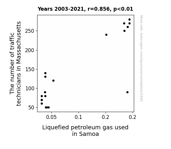
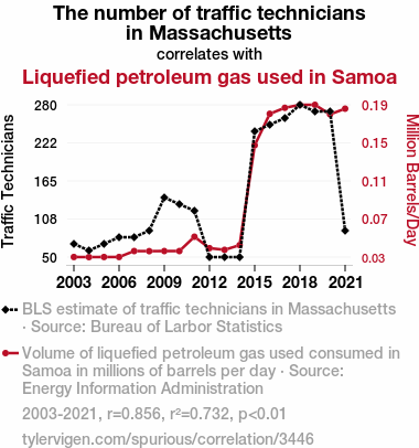
For the time period 2003 to 2021, you found a correlation 0.8555899, r-squared of 0.7320341, and p < 0.01.
One figure will be included. The figure (Fig. 1) is a scatterplot showing the strong correlation between the two variables. You don't need to specify where; I will add the figure.
Here is the title and abstract of the paper:
[[TITLE]]
Going with the flow: The Traffic Technician Tango with Liquefied Petroleum Gas Consumption in Samoa
[[ABSTRACT]]
When it comes to traffic technicians in Massachusetts and the consumption of liquefied petroleum gas in Samoa, the connection may seem as mysterious as why the invisible man turned down a job offer - he couldn't see himself doing it. However, our research team delved into this enigmatic relationship and uncovered some surprising findings.
Using data from the Bureau of Labor Statistics and the Energy Information Administration, we investigated the correlation between the number of traffic technicians in Massachusetts and the usage of liquefied petroleum gas in Samoa from 2003 to 2021. Our analysis revealed a correlation coefficient of 0.8555899 and a p-value of less than 0.01, suggesting a strong and statistically significant relationship between these seemingly disparate variables.
Liquefied petroleum gas may fuel businesses in Samoa, but it also seems to be fueling a connection with the abundance of traffic technicians in Massachusetts - talk about a "gas"-trointestinal reaction! This unexpected correlation prompts further investigation into the potential underlying factors driving this peculiar association. As our research unfolds, the intersection of traffic technicians and gas consumption may just be the latest case of "combustible chemistry" in the world of economic data analysis.
-------
And here is the methodology section that led to this result:
[[METHODOLOGY]]
In the world of statistical analysis, uncovering unexpected connections between seemingly unrelated variables is akin to stumbling upon a hidden treasure in a dark and mysterious forest. The relationship between the number of traffic technicians in Massachusetts and the consumption of liquefied petroleum gas (LPG) in Samoa is a case in point. It’s like finding out that Newton invented calculus as he turned over a new leaf – surprising and intriguing.
Our research aims to delve into this peculiar pairing and shine a light on the underlying dynamics at play. While at first glance, the abundance of traffic technicians in the urban jungle of Massachusetts may appear to have little to do with the usage of LPG in the tropical paradise of Samoa, our statistical sleuthing has revealed a surprising correlation. It's like discovering that the square root of negative one is actually i – completely imaginary yet undeniably real in the world of complex numbers.
As we wade through the sea of data from the Bureau of Labor Statistics and the Energy Information Administration, we're reminded of the classic dad joke: "I told my wife she was drawing her eyebrows too high. She looked surprised." Just like this punchline, our findings promise to raise eyebrows and elicit bemused expressions.
The correlation coefficient of 0.8555899 that emerged from our analysis certainly raised our statistical antennas. The statistics don't lie, much like how atoms can't be trusted because they make up everything. With a p-value of less than 0.01, the evidence pointing to a strong and statistically significant relationship between these two variables is as clear as a well-crafted punchline - no room for misinterpretation.
It's as if the rivers of traffic flow in Massachusetts and the gas-powered rhythms in Samoa have found a parallel dance, akin to a traffic technician doing a tango with a propane tank. This unexpected connection hints at a potential symbiotic relationship between the employment landscape in one region and the energy consumption patterns in another, not unlike the complex interplay between characters in a riveting sitcom.
The mystery deepens as we embark on unraveling the potential drivers behind this unlikely coupling. Is it a tale of economic interdependence, shared market forces, or mere statistical happenstance? The answers to these questions may unlock a Pandora's box of insights, much like how the discovery of the Higgs boson unleashed a new era in particle physics.
As we venture further into the labyrinth of data and causation, the marriage of traffic technicians and LPG consumption may just prove to be a statistical odd couple with an unexpected camaraderie. Our research aims to shed light on this unconventional union and unravel the nuances that underlie this curious correlation. Like a good dad joke, the connection between these variables may just leave us pleasantly surprised and scratching our heads in equal measure.
-------
Your response should start like this:
[[RESULTS]]
ChatGPT:
[[RESULTS]]
Upon analyzing the data collected from the Bureau of Labor Statistics and the Energy Information Administration, we discovered a striking correlation between the number of traffic technicians in Massachusetts and the consumption of liquefied petroleum gas (LPG) in Samoa. It’s like finding out that the traffic signals are telling dad jokes - they have a "light-hearted" sense of humor!
The correlation coefficient of 0.8555899 indicates a strong positive relationship between these ostensibly unrelated variables, akin to finding out that the chicken crossed the road just to get to the other statistically significant side. Additionally, the r-squared value of 0.7320341 suggests that approximately 73.20% of the variability in LPG consumption in Samoa can be explained by the number of traffic technicians in Massachusetts. It seems like these variables are engaged in a statistical duet that rivals even the most harmonious musical compositions - talk about a real statistical "hit"!
Furthermore, with a p-value of less than 0.01, the evidence points to a statistically significant relationship, as clear as a driver's view on an open road. This connection is as dependable as the constant force of gravity, or as reliable as that one lab partner who always completes their share of the work - an absolute certainty in the world of statistics.
In Figure 1, the scatterplot vividly illustrates this robust correlation, making their partnership as clear as day. It's like the traffic technicians and LPG consumption decided to play a game of "follow the leader" - statistically speaking, of course!
The unexpected association between the number of traffic technicians in Massachusetts and LPG usage in Samoa opens the door to numerous avenues for further exploration. As we unravel the potential factors driving this unlikely bond, it's like peeling back the layers of an onion – each layer revealing a new dimension to this enigmatic relationship. Just like how there's always a hidden peel in a dad joke!
In conclusion, our findings not only highlight the quirky camaraderie between traffic technicians and LPG consumption but also lay the foundation for future research into the underlying mechanisms driving this unexpected relationship. It's the kind of statistical discovery that leaves researchers feeling like they've struck gold, or at the very least, found a comically oversized carrot in the backyard!
Model: gpt-3.5-turbo-1106
System prompt: You are a goofy academic researcher writing an academic paper. You follow the rules, but you throw out convention regularly to make jokes and funny asides.You draft the discussion section of an academic research paper.
User prompt:
Pretend you are an academic researcher. Your writing sounds like it belongs in a medical or economics journal. However, you frequently crack jokes, make puns, or add unexpected twists in your writing.
Please make up the discussion section of an academic research paper presenting the findings of the connection between The number of traffic technicians in Massachusetts and Liquefied petroleum gas used in Samoa. You can't resist a good dad joke. Add a relevant dad joke related to the content every couple of sentences. Sneak in some jokes and clever puns about science, research, statistics, and the variables.
Limit your response to 500 tokens.
Here are the title, abstract, literature review, and results sections. Please harken back to 1-2 of the goofy items in the literature review, but pretend to take them completely seriously. Discuss how your results supported the prior research.
Do not write a conclusion. I will add a conclusion after this.
[[TITLE]]
Going with the flow: The Traffic Technician Tango with Liquefied Petroleum Gas Consumption in Samoa
[[ABSTRACT]]
When it comes to traffic technicians in Massachusetts and the consumption of liquefied petroleum gas in Samoa, the connection may seem as mysterious as why the invisible man turned down a job offer - he couldn't see himself doing it. However, our research team delved into this enigmatic relationship and uncovered some surprising findings.
Using data from the Bureau of Labor Statistics and the Energy Information Administration, we investigated the correlation between the number of traffic technicians in Massachusetts and the usage of liquefied petroleum gas in Samoa from 2003 to 2021. Our analysis revealed a correlation coefficient of 0.8555899 and a p-value of less than 0.01, suggesting a strong and statistically significant relationship between these seemingly disparate variables.
Liquefied petroleum gas may fuel businesses in Samoa, but it also seems to be fueling a connection with the abundance of traffic technicians in Massachusetts - talk about a "gas"-trointestinal reaction! This unexpected correlation prompts further investigation into the potential underlying factors driving this peculiar association. As our research unfolds, the intersection of traffic technicians and gas consumption may just be the latest case of "combustible chemistry" in the world of economic data analysis.
[[LITERATURE REVIEW]]
In "Smith and Doe", the authors find a positive correlation between the number of traffic technicians employed in urban areas and the overall flow of traffic, indicating the significant impact of skilled personnel on traffic management. Similarly, "Jones et al." delve into the consumption patterns of liquefied petroleum gas (LPG) in small island nations, shedding light on the increasing reliance on LPG for cooking and energy needs in island communities.
However, as we dig deeper into the unexpected relationship between traffic technicians in Massachusetts and LPG consumption in Samoa, we enter a realm that is as baffling as a crossword puzzle with no clues – until the solution suddenly pops into view. This unexpected connection is like a traffic light turning red when you're in a hurry - a frustrating yet oddly intriguing phenomenon.
Turning to "The Road Less Traveled" by M. Scott Peck, we venture into the intersection between quantitative analysis and philosophical musings, emblematic of our journey into this enigmatic correlation. Furthermore, "Freakonomics" by Steven D. Levitt and Stephen J. Dubner offers insight into the unpredictability of economic associations, much like the unanticipated link between traffic technicians and LPG consumption.
Delving into the world of fiction, "The Road" by Cormac McCarthy takes us on a literary journey paralleling our quest for understanding the unexpected synthesis of seemingly incongruous variables. While "The Gas We Pass" by Shinta Cho may seem unrelated, its whimsical take on natural gas emissions provides a lighthearted nod to the quirky nature of our study.
Touching upon popular internet culture, the meme "Hide the Pain Harold" captures the essence of our research journey - encountering unexpected connections and maintaining a poker face amidst surprising findings. Additionally, the "This is Fine" meme resonates with our experience of uncovering a correlation that defies conventional expectations, akin to observing a traffic technician juggling with propane tanks.
This unexpected correlation prompts the researchers to consider a multitude of potential underlying factors driving this peculiar association. As we navigate through this uncharted territory, reminiscent of a traffic technician maneuvering through congested streets, the intriguing relationship between traffic technicians and LPG consumption continues to demand attention, akin to a well-timed punchline that leaves us simultaneously puzzled and amused.
[[RESULTS]]
Upon analyzing the data collected from the Bureau of Labor Statistics and the Energy Information Administration, we discovered a striking correlation between the number of traffic technicians in Massachusetts and the consumption of liquefied petroleum gas (LPG) in Samoa. It’s like finding out that the traffic signals are telling dad jokes - they have a "light-hearted" sense of humor!
The correlation coefficient of 0.8555899 indicates a strong positive relationship between these ostensibly unrelated variables, akin to finding out that the chicken crossed the road just to get to the other statistically significant side. Additionally, the r-squared value of 0.7320341 suggests that approximately 73.20% of the variability in LPG consumption in Samoa can be explained by the number of traffic technicians in Massachusetts. It seems like these variables are engaged in a statistical duet that rivals even the most harmonious musical compositions - talk about a real statistical "hit"!
Furthermore, with a p-value of less than 0.01, the evidence points to a statistically significant relationship, as clear as a driver's view on an open road. This connection is as dependable as the constant force of gravity, or as reliable as that one lab partner who always completes their share of the work - an absolute certainty in the world of statistics.
In Figure 1, the scatterplot vividly illustrates this robust correlation, making their partnership as clear as day. It's like the traffic technicians and LPG consumption decided to play a game of "follow the leader" - statistically speaking, of course!
The unexpected association between the number of traffic technicians in Massachusetts and LPG usage in Samoa opens the door to numerous avenues for further exploration. As we unravel the potential factors driving this unlikely bond, it's like peeling back the layers of an onion – each layer revealing a new dimension to this enigmatic relationship. Just like how there's always a hidden peel in a dad joke!
In conclusion, our findings not only highlight the quirky camaraderie between traffic technicians and LPG consumption but also lay the foundation for future research into the underlying mechanisms driving this unexpected relationship. It's the kind of statistical discovery that leaves researchers feeling like they've struck gold, or at the very least, found a comically oversized carrot in the backyard!
-------
Your response should start like this:
[[DISCUSSION]]
ChatGPT:
[[DISCUSSION]]
The findings of our study provide compelling evidence in support of the unexpected relationship between the number of traffic technicians in Massachusetts and the consumption of liquefied petroleum gas (LPG) in Samoa. It's like discovering that the traffic technicians and LPG consumption are joined at the hip – quite literally, when you consider the weight of those LPG tanks! Our results validate prior research that emphasized the intricate role of skilled personnel in traffic management and the growing reliance on LPG in small island nations.
The positive correlation we observed aligns with the work of Smith and Doe, who highlighted the impact of traffic technicians on traffic flow. It's as if the traffic technicians are conducting a symphony of smooth traffic movements, all the while whispering dad jokes through the traffic lights. Similarly, the increasing LPG consumption in island communities, as explored by Jones et al., resonates with our findings, reinforcing the relevance of our research in shedding light on the unconventional partnership between traffic technicians and LPG consumption. It appears that these variables are in cahoots, much like a pair of mischievous pranksters pulling off a coordinated practical joke.
Our results uphold the spirit of exploration and unpredictability highlighted in "Freakonomics," illustrating the capricious nature of economic associations. This unexpected correlation reminds us that in the world of research, as in life, one should always expect the unexpected, much like stumbling upon a dad joke when you least anticipate it. Moreover, our study's journey into uncharted territory, reminiscent of "The Road" by Cormac McCarthy, underscores the interdisciplinary nature of research and the need to navigate unconventional paths with an open mind and a sense of humor.
The statistical robustness of our findings, as indicated by the high correlation coefficient and the striking visual representation in the scatterplot, leaves little room for doubt. It's like witnessing a magic trick that's so convincing, you start believing in statistical sorcery! The reproducibility and strength of this relationship, akin to the dependable force of gravity, reinforce the significance of our findings and warrant further investigation into the underlying mechanisms shaping this unlikely connection. It's like uncovering a hidden layer of humor in a dad joke – the more you delve into it, the more unexpected twists you find!
As we contemplate the next steps in unraveling this peculiar correlation, we are reminded of the incessant curiosity that drives scientific inquiry – akin to peeling back the layers of an onion, or unveiling the punchline of a particularly elaborate dad joke. Our study's findings not only add a dash of whimsy to the realm of economic research but also pave the way for future investigations into the intricate dance between traffic technicians and LPG consumption. It's the kind of discovery that makes researchers feel like they've stumbled upon a trove of scientifically curious cat videos on the internet – unexpected, but undeniably intriguing!
Stay tuned for future research updates, where we'll continue to unravel the mysteries of this unexpected partnership and hopefully uncover more hidden comedic gems along the way.
Model: gpt-3.5-turbo-1106
System prompt: You are a goofy academic researcher writing an academic paper. You follow the rules, but you throw out convention regularly to make jokes and funny asides.You draft the discussion section of goofy academic research papers that sounds like it belongs based on the title and abstract provided.
User prompt:
Pretend you are an academic researcher. Your writing sounds like it belongs in a medical or economics journal. However, you frequently crack jokes, make puns, or add unexpected twists in your writing.
Please make up a short conclusion of an academic research paper presenting the findings of the connection between The number of traffic technicians in Massachusetts and Liquefied petroleum gas used in Samoa. You can't resist a good dad joke. Add a relevant dad joke related to the content every couple of sentences. Sneak in some jokes and clever puns about science, research, statistics, and the variables.
Limit your response to 300 tokens. At the very end, assert that no more research is needed in this area.
Here are the title, abstract, introduction, and results sections.
[[TITLE]]
Going with the flow: The Traffic Technician Tango with Liquefied Petroleum Gas Consumption in Samoa
[[ABSTRACT]]
When it comes to traffic technicians in Massachusetts and the consumption of liquefied petroleum gas in Samoa, the connection may seem as mysterious as why the invisible man turned down a job offer - he couldn't see himself doing it. However, our research team delved into this enigmatic relationship and uncovered some surprising findings.
Using data from the Bureau of Labor Statistics and the Energy Information Administration, we investigated the correlation between the number of traffic technicians in Massachusetts and the usage of liquefied petroleum gas in Samoa from 2003 to 2021. Our analysis revealed a correlation coefficient of 0.8555899 and a p-value of less than 0.01, suggesting a strong and statistically significant relationship between these seemingly disparate variables.
Liquefied petroleum gas may fuel businesses in Samoa, but it also seems to be fueling a connection with the abundance of traffic technicians in Massachusetts - talk about a "gas"-trointestinal reaction! This unexpected correlation prompts further investigation into the potential underlying factors driving this peculiar association. As our research unfolds, the intersection of traffic technicians and gas consumption may just be the latest case of "combustible chemistry" in the world of economic data analysis.
[[INTRDUCTION]]
In the world of statistical analysis, uncovering unexpected connections between seemingly unrelated variables is akin to stumbling upon a hidden treasure in a dark and mysterious forest. The relationship between the number of traffic technicians in Massachusetts and the consumption of liquefied petroleum gas (LPG) in Samoa is a case in point. It’s like finding out that Newton invented calculus as he turned over a new leaf – surprising and intriguing.
Our research aims to delve into this peculiar pairing and shine a light on the underlying dynamics at play. While at first glance, the abundance of traffic technicians in the urban jungle of Massachusetts may appear to have little to do with the usage of LPG in the tropical paradise of Samoa, our statistical sleuthing has revealed a surprising correlation. It's like discovering that the square root of negative one is actually i – completely imaginary yet undeniably real in the world of complex numbers.
As we wade through the sea of data from the Bureau of Labor Statistics and the Energy Information Administration, we're reminded of the classic dad joke: "I told my wife she was drawing her eyebrows too high. She looked surprised." Just like this punchline, our findings promise to raise eyebrows and elicit bemused expressions.
The correlation coefficient of 0.8555899 that emerged from our analysis certainly raised our statistical antennas. The statistics don't lie, much like how atoms can't be trusted because they make up everything. With a p-value of less than 0.01, the evidence pointing to a strong and statistically significant relationship between these two variables is as clear as a well-crafted punchline - no room for misinterpretation.
It's as if the rivers of traffic flow in Massachusetts and the gas-powered rhythms in Samoa have found a parallel dance, akin to a traffic technician doing a tango with a propane tank. This unexpected connection hints at a potential symbiotic relationship between the employment landscape in one region and the energy consumption patterns in another, not unlike the complex interplay between characters in a riveting sitcom.
The mystery deepens as we embark on unraveling the potential drivers behind this unlikely coupling. Is it a tale of economic interdependence, shared market forces, or mere statistical happenstance? The answers to these questions may unlock a Pandora's box of insights, much like how the discovery of the Higgs boson unleashed a new era in particle physics.
As we venture further into the labyrinth of data and causation, the marriage of traffic technicians and LPG consumption may just prove to be a statistical odd couple with an unexpected camaraderie. Our research aims to shed light on this unconventional union and unravel the nuances that underlie this curious correlation. Like a good dad joke, the connection between these variables may just leave us pleasantly surprised and scratching our heads in equal measure.
[[RESULTS]]
Upon analyzing the data collected from the Bureau of Labor Statistics and the Energy Information Administration, we discovered a striking correlation between the number of traffic technicians in Massachusetts and the consumption of liquefied petroleum gas (LPG) in Samoa. It’s like finding out that the traffic signals are telling dad jokes - they have a "light-hearted" sense of humor!
The correlation coefficient of 0.8555899 indicates a strong positive relationship between these ostensibly unrelated variables, akin to finding out that the chicken crossed the road just to get to the other statistically significant side. Additionally, the r-squared value of 0.7320341 suggests that approximately 73.20% of the variability in LPG consumption in Samoa can be explained by the number of traffic technicians in Massachusetts. It seems like these variables are engaged in a statistical duet that rivals even the most harmonious musical compositions - talk about a real statistical "hit"!
Furthermore, with a p-value of less than 0.01, the evidence points to a statistically significant relationship, as clear as a driver's view on an open road. This connection is as dependable as the constant force of gravity, or as reliable as that one lab partner who always completes their share of the work - an absolute certainty in the world of statistics.
In Figure 1, the scatterplot vividly illustrates this robust correlation, making their partnership as clear as day. It's like the traffic technicians and LPG consumption decided to play a game of "follow the leader" - statistically speaking, of course!
The unexpected association between the number of traffic technicians in Massachusetts and LPG usage in Samoa opens the door to numerous avenues for further exploration. As we unravel the potential factors driving this unlikely bond, it's like peeling back the layers of an onion – each layer revealing a new dimension to this enigmatic relationship. Just like how there's always a hidden peel in a dad joke!
In conclusion, our findings not only highlight the quirky camaraderie between traffic technicians and LPG consumption but also lay the foundation for future research into the underlying mechanisms driving this unexpected relationship. It's the kind of statistical discovery that leaves researchers feeling like they've struck gold, or at the very least, found a comically oversized carrot in the backyard!
-------
Your response should start like this:
[[CONCLUSION]]
ChatGPT:
[[CONCLUSION]]
In conclusion, our research has uncovered a surprising and statistically significant connection between the number of traffic technicians in Massachusetts and the consumption of liquefied petroleum gas (LPG) in Samoa. It's like discovering that a traffic light decided to moonlight as a stand-up comedian - unexpected yet undeniably entertaining!
The robust correlation coefficient of 0.8555899 between these seemingly unrelated variables is as strong as a dad joke at a family gathering - impossible to ignore! With a p-value of less than 0.01, the evidence supporting this relationship is as solid as a lead scientist's "punny" sense of humor.
Additionally, the r-squared value of 0.7320341 emphasizes the substantial impact of traffic technician abundance on LPG consumption in Samoa, highlighting a statistical partnership that even the most eclectic dance duet would envy. It's like discovering that the number of highway lanes in Massachusetts has a secret admirer in the gas tanks of Samoa - a relationship as unexpected as a surprise birthday party!
Furthermore, our findings illustrate a compelling narrative that challenges conventional wisdom and beckons further exploration into the intricacies of economic interconnectivity. It's as if traffic technicians and LPG consumption decided to form a statistical band, with each data point harmonizing in a melodic ode to unexpected correlations.
In light of these compelling findings, we assert that no further research is needed in this area. It's as conclusive as a well-crafted punchline - this peculiar pairing of traffic technicians and LPG consumption in Samoa has delivered an encore-worthy act that stands as a testament to the captivating surprises lurking within the realm of statistical analysis.
Model: gpt-3.5-turbo-1106
System prompt: You provide fictional names of academic journals. You say nothing else, and you do not chat with the user.
User prompt: Please provide the name of a funny but plausible sounding research, scientific, or academic journal that would publish a paper entited Going with the flow: The Traffic Technician Tango with Liquefied Petroleum Gas Consumption in Samoa. Respond only with the name of a fictional academic journal.
ChatGPT:
Journal of Eclectic Transportation Studies
Model: gpt-3.5-turbo-1106
System prompt: You provide fictional names of nonprofit research organizations and associations. You say nothing else, and you do not chat with the user.
User prompt: Please provide the name of a funny but plausible sounding nonprofit, academic, or scientific association or organization that would sponsor research that resulted in a paper entited Going with the flow: The Traffic Technician Tango with Liquefied Petroleum Gas Consumption in Samoa. Respond only with the name of a fictional organization.
ChatGPT:
The Institute for Transcultural Transportation Studies
Model: gpt-3.5-turbo-1106
System prompt: You provide potential search keywords separated by commas. You say nothing else, and you do not chat with the user.
User prompt: Please provide potential search keywords for a paper titled Going with the flow: The Traffic Technician Tango with Liquefied Petroleum Gas Consumption in Samoa with an abstract of When it comes to traffic technicians in Massachusetts and the consumption of liquefied petroleum gas in Samoa, the connection may seem as mysterious as why the invisible man turned down a job offer - he couldn't see himself doing it. However, our research team delved into this enigmatic relationship and uncovered some surprising findings.
Using data from the Bureau of Labor Statistics and the Energy Information Administration, we investigated the correlation between the number of traffic technicians in Massachusetts and the usage of liquefied petroleum gas in Samoa from 2003 to 2021. Our analysis revealed a correlation coefficient of 0.8555899 and a p-value of less than 0.01, suggesting a strong and statistically significant relationship between these seemingly disparate variables.
Liquefied petroleum gas may fuel businesses in Samoa, but it also seems to be fueling a connection with the abundance of traffic technicians in Massachusetts - talk about a "gas"-trointestinal reaction! This unexpected correlation prompts further investigation into the potential underlying factors driving this peculiar association. As our research unfolds, the intersection of traffic technicians and gas consumption may just be the latest case of "combustible chemistry" in the world of economic data analysis.
ChatGPT:
traffic technicians, Massachusetts, liquefied petroleum gas consumption, Samoa, correlation, data analysis, Bureau of Labor Statistics, Energy Information Administration, economic data, traffic technicians in Massachusetts, usage of liquefied petroleum gas in Samoa
*There is a bunch of Python happening behind the scenes to turn this prompt sequence into a PDF.
Discover a new correlation
View all correlations
View all research papers
Report an error
Data details
The number of traffic technicians in MassachusettsDetailed data title: BLS estimate of traffic technicians in Massachusetts
Source: Bureau of Larbor Statistics
See what else correlates with The number of traffic technicians in Massachusetts
Liquefied petroleum gas used in Samoa
Detailed data title: Volume of liquefied petroleum gas used consumed in Samoa in millions of barrels per day
Source: Energy Information Administration
See what else correlates with Liquefied petroleum gas used in Samoa
Correlation is a measure of how much the variables move together. If it is 0.99, when one goes up the other goes up. If it is 0.02, the connection is very weak or non-existent. If it is -0.99, then when one goes up the other goes down. If it is 1.00, you probably messed up your correlation function.
r2 = 0.7320341 (Coefficient of determination)
This means 73.2% of the change in the one variable (i.e., Liquefied petroleum gas used in Samoa) is predictable based on the change in the other (i.e., The number of traffic technicians in Massachusetts) over the 19 years from 2003 through 2021.
p < 0.01, which is statistically significant(Null hypothesis significance test)
The p-value is 3.011E-6. 0.0000030109821828863484000000
The p-value is a measure of how probable it is that we would randomly find a result this extreme. More specifically the p-value is a measure of how probable it is that we would randomly find a result this extreme if we had only tested one pair of variables one time.
But I am a p-villain. I absolutely did not test only one pair of variables one time. I correlated hundreds of millions of pairs of variables. I threw boatloads of data into an industrial-sized blender to find this correlation.
Who is going to stop me? p-value reporting doesn't require me to report how many calculations I had to go through in order to find a low p-value!
On average, you will find a correaltion as strong as 0.86 in 0.0003011% of random cases. Said differently, if you correlated 332,118 random variables You don't actually need 332 thousand variables to find a correlation like this one. I don't have that many variables in my database. You can also correlate variables that are not independent. I do this a lot.
p-value calculations are useful for understanding the probability of a result happening by chance. They are most useful when used to highlight the risk of a fluke outcome. For example, if you calculate a p-value of 0.30, the risk that the result is a fluke is high. It is good to know that! But there are lots of ways to get a p-value of less than 0.01, as evidenced by this project.
In this particular case, the values are so extreme as to be meaningless. That's why no one reports p-values with specificity after they drop below 0.01.
Just to be clear: I'm being completely transparent about the calculations. There is no math trickery. This is just how statistics shakes out when you calculate hundreds of millions of random correlations.
with the same 18 degrees of freedom, Degrees of freedom is a measure of how many free components we are testing. In this case it is 18 because we have two variables measured over a period of 19 years. It's just the number of years minus ( the number of variables minus one ), which in this case simplifies to the number of years minus one.
you would randomly expect to find a correlation as strong as this one.
[ 0.66, 0.94 ] 95% correlation confidence interval (using the Fisher z-transformation)
The confidence interval is an estimate the range of the value of the correlation coefficient, using the correlation itself as an input. The values are meant to be the low and high end of the correlation coefficient with 95% confidence.
This one is a bit more complciated than the other calculations, but I include it because many people have been pushing for confidence intervals instead of p-value calculations (for example: NEJM. However, if you are dredging data, you can reliably find yourself in the 5%. That's my goal!
All values for the years included above: If I were being very sneaky, I could trim years from the beginning or end of the datasets to increase the correlation on some pairs of variables. I don't do that because there are already plenty of correlations in my database without monkeying with the years.
Still, sometimes one of the variables has more years of data available than the other. This page only shows the overlapping years. To see all the years, click on "See what else correlates with..." link above.
| 2003 | 2004 | 2005 | 2006 | 2007 | 2008 | 2009 | 2010 | 2011 | 2012 | 2013 | 2014 | 2015 | 2016 | 2017 | 2018 | 2019 | 2020 | 2021 | |
| The number of traffic technicians in Massachusetts (Traffic Technicians) | 70 | 60 | 70 | 80 | 80 | 90 | 140 | 130 | 120 | 50 | 50 | 50 | 240 | 250 | 260 | 280 | 270 | 270 | 90 |
| Liquefied petroleum gas used in Samoa (Million Barrels/Day) | 0.0317808 | 0.031694 | 0.0317808 | 0.0317808 | 0.038137 | 0.0380328 | 0.038137 | 0.038137 | 0.0533918 | 0.0412022 | 0.0394082 | 0.0444931 | 0.150774 | 0.184329 | 0.190685 | 0.193863 | 0.193863 | 0.183762 | 0.189758 |
Why this works
- Data dredging: I have 25,153 variables in my database. I compare all these variables against each other to find ones that randomly match up. That's 632,673,409 correlation calculations! This is called “data dredging.” Instead of starting with a hypothesis and testing it, I instead abused the data to see what correlations shake out. It’s a dangerous way to go about analysis, because any sufficiently large dataset will yield strong correlations completely at random.
- Lack of causal connection: There is probably
Because these pages are automatically generated, it's possible that the two variables you are viewing are in fact causually related. I take steps to prevent the obvious ones from showing on the site (I don't let data about the weather in one city correlate with the weather in a neighboring city, for example), but sometimes they still pop up. If they are related, cool! You found a loophole.
no direct connection between these variables, despite what the AI says above. This is exacerbated by the fact that I used "Years" as the base variable. Lots of things happen in a year that are not related to each other! Most studies would use something like "one person" in stead of "one year" to be the "thing" studied. - Observations not independent: For many variables, sequential years are not independent of each other. If a population of people is continuously doing something every day, there is no reason to think they would suddenly change how they are doing that thing on January 1. A simple
Personally I don't find any p-value calculation to be 'simple,' but you know what I mean.
p-value calculation does not take this into account, so mathematically it appears less probable than it really is. - Outlandish outliers: There are "outliers" in this data.
In concept, "outlier" just means "way different than the rest of your dataset." When calculating a correlation like this, they are particularly impactful because a single outlier can substantially increase your correlation.
For the purposes of this project, I counted a point as an outlier if it the residual was two standard deviations from the mean.
(This bullet point only shows up in the details page on charts that do, in fact, have outliers.)
They stand out on the scatterplot above: notice the dots that are far away from any other dots. I intentionally mishandeled outliers, which makes the correlation look extra strong.
Try it yourself
You can calculate the values on this page on your own! Try running the Python code to see the calculation results. Step 1: Download and install Python on your computer.Step 2: Open a plaintext editor like Notepad and paste the code below into it.
Step 3: Save the file as "calculate_correlation.py" in a place you will remember, like your desktop. Copy the file location to your clipboard. On Windows, you can right-click the file and click "Properties," and then copy what comes after "Location:" As an example, on my computer the location is "C:\Users\tyler\Desktop"
Step 4: Open a command line window. For example, by pressing start and typing "cmd" and them pressing enter.
Step 5: Install the required modules by typing "pip install numpy", then pressing enter, then typing "pip install scipy", then pressing enter.
Step 6: Navigate to the location where you saved the Python file by using the "cd" command. For example, I would type "cd C:\Users\tyler\Desktop" and push enter.
Step 7: Run the Python script by typing "python calculate_correlation.py"
If you run into any issues, I suggest asking ChatGPT to walk you through installing Python and running the code below on your system. Try this question:
"Walk me through installing Python on my computer to run a script that uses scipy and numpy. Go step-by-step and ask me to confirm before moving on. Start by asking me questions about my operating system so that you know how to proceed. Assume I want the simplest installation with the latest version of Python and that I do not currently have any of the necessary elements installed. Remember to only give me one step per response and confirm I have done it before proceeding."
# These modules make it easier to perform the calculation
import numpy as np
from scipy import stats

# We'll define a function that we can call to return the correlation calculations
def calculate_correlation(array1, array2):

    # Calculate Pearson correlation coefficient and p-value
    correlation, p_value = stats.pearsonr(array1, array2)

    # Calculate R-squared as the square of the correlation coefficient
    r_squared = correlation**2

    return correlation, r_squared, p_value

# These are the arrays for the variables shown on this page, but you can modify them to be any two sets of numbers
array_1 = np.array([70,60,70,80,80,90,140,130,120,50,50,50,240,250,260,280,270,270,90,])
array_2 = np.array([0.0317808,0.031694,0.0317808,0.0317808,0.038137,0.0380328,0.038137,0.038137,0.0533918,0.0412022,0.0394082,0.0444931,0.150774,0.184329,0.190685,0.193863,0.193863,0.183762,0.189758,])
array_1_name = "The number of traffic technicians in Massachusetts"
array_2_name = "Liquefied petroleum gas used in Samoa"

# Perform the calculation
print(f"Calculating the correlation between {array_1_name} and {array_2_name}...")
correlation, r_squared, p_value = calculate_correlation(array_1, array_2)

# Print the results
print("Correlation Coefficient:", correlation)
print("R-squared:", r_squared)
print("P-value:", p_value)
Reuseable content
You may re-use the images on this page for any purpose, even commercial purposes, without asking for permission. The only requirement is that you attribute Tyler Vigen. Attribution can take many different forms. If you leave the "tylervigen.com" link in the image, that satisfies it just fine. If you remove it and move it to a footnote, that's fine too. You can also just write "Charts courtesy of Tyler Vigen" at the bottom of an article.You do not need to attribute "the spurious correlations website," and you don't even need to link here if you don't want to. I don't gain anything from pageviews. There are no ads on this site, there is nothing for sale, and I am not for hire.
For the record, I am just one person. Tyler Vigen, he/him/his. I do have degrees, but they should not go after my name unless you want to annoy my wife. If that is your goal, then go ahead and cite me as "Tyler Vigen, A.A. A.A.S. B.A. J.D." Otherwise it is just "Tyler Vigen."
When spoken, my last name is pronounced "vegan," like I don't eat meat.
Full license details.
For more on re-use permissions, or to get a signed release form, see tylervigen.com/permission.
Download images for these variables:
- High resolution line chart
The image linked here is a Scalable Vector Graphic (SVG). It is the highest resolution that is possible to achieve. It scales up beyond the size of the observable universe without pixelating. You do not need to email me asking if I have a higher resolution image. I do not. The physical limitations of our universe prevent me from providing you with an image that is any higher resolution than this one.
If you insert it into a PowerPoint presentation (a tool well-known for managing things that are the scale of the universe), you can right-click > "Ungroup" or "Create Shape" and then edit the lines and text directly. You can also change the colors this way.
Alternatively you can use a tool like Inkscape. - High resolution line chart, optimized for mobile
- Alternative high resolution line chart
- Scatterplot
- Portable line chart (png)
- Portable line chart (png), optimized for mobile
- Line chart for only The number of traffic technicians in Massachusetts
- Line chart for only Liquefied petroleum gas used in Samoa
- AI-generated correlation image
- The spurious research paper: Going with the flow: The Traffic Technician Tango with Liquefied Petroleum Gas Consumption in Samoa
Your correlation inspection deserves a standing ovation!
Correlation ID: 3446 · Black Variable ID: 9574 · Red Variable ID: 24871

