
Download png, svg
AI explanation
Fewer hydro-powered lessons in Uruguay led to a damper demand for education overall, causing a ripple effect that washed away the number of school teachers in Kentucky. The current just wasn't flowing in favor of maintaining the previous instructor levels, and it seems like the teaching profession got caught in the crosscurrents of international hydrology.
Model: dalle-3
Prompt: [An image that looks like it is a scene from a Pixar movie] In a picturesque landscape, a tranquil river flows gracefully through lush green hills in Uruguay. Towering above the scenic surroundings, a large hydroelectric dam stands proudly, quietly generating renewable energy. Meanwhile, in Kentucky, a group of tired and unmotivated teachers gather in a classroom. Their longing gazes reflect the shortage of traditional gourd of mate tea, a consequence of the decreased hydropower energy availability. The depiction should include only scenes, people, and objects, it should not include text or speech bubbles.
This image generation prompt was also generated by AI, using the following sequence:
Model: gpt-3.5-turbo-1106
System prompt: You select one of a few potential scene descriptors that seems to go along with the variables described. You respond only with the scene descriptions provided and say nothing else.
User prompt: Here are two variables: Hydopower energy generated in Uruguay and The number of school teachers in Kentucky. Given these, which of the following image style descriptions seems most appropriate? Pick the one that seems to be related to one of the variables at hand. Please respond with only one of the following potential descriptions: An image that looks like it is a scene from a Pixar movie a Polaroid photo inspired by bauhaus An image that looks like it is a scene from 'Star Wars' An image that looks like it is a scene from a Pixar movie
ChatGPT: An image that looks like it is a scene from a Pixar movie
Model: gpt-3.5-turbo-1106
System prompt: You describe simple visual scenes that depict the two variables stated. You combine both variables into one scene.
User prompt: Please describe a visual scene that prominently depicts both Hydopower energy generated in Uruguay and The number of school teachers in Kentucky, in the following situation: Because the decrease in hydropower energy in Uruguay led to a shortage of delicious gourds for mate tea, causing a decline in productivity and motivation among Kentucky school teachers who rely on the caffeine boost to handle rowdy kids.. Keep the description simple.
ChatGPT: A tranquil river flows through lush green hills in Uruguay, where a large hydroelectric dam stands tall, quietly producing renewable energy. Meanwhile, in Kentucky, a group of teachers sit in a classroom, looking tired and unmotivated without their traditional gourd of mate tea, which is in short supply due to the decrease in hydropower energy.
Model: gpt-3.5-turbo-1106
System prompt: You write and improve image generation prompts for DALLE-3. You maintain the same subjects, but enhance the visuals.
User prompt: Please respond with an image generation prompt that would be likely to create an interesting visual using DALLE-3, using the following style: [ An image that looks like it is a scene from a Pixar movie ] and depicting this scene: A tranquil river flows through lush green hills in Uruguay, where a large hydroelectric dam stands tall, quietly producing renewable energy. Meanwhile, in Kentucky, a group of teachers sit in a classroom, looking tired and unmotivated without their traditional gourd of mate tea, which is in short supply due to the decrease in hydropower energy. Keep the visual depiction simple. Do not include any words or speech bubbles.
ChatGPT: [An image that looks like it is a scene from a Pixar movie] In a picturesque landscape, a tranquil river flows gracefully through lush green hills in Uruguay. Towering above the scenic surroundings, a large hydroelectric dam stands proudly, quietly generating renewable energy. Meanwhile, in Kentucky, a group of tired and unmotivated teachers gather in a classroom. Their longing gazes reflect the shortage of traditional gourd of mate tea, a consequence of the decreased hydropower energy availability.
*Variations in the User Prompts from chart to chart are just the result of random number generation in Python. I wrote a few arrays of various styles and methods to ask questions to change up the results. Every time this site writes an explanation or generates an image, the script picks from each at random.
I sequence the requests into multiple prompts because I find GPT 3.5 to perform much better with short, well-managed contexts. Thus, I track the context directly in Python and only ask ChatGPT targeted questions.
System prompt: You provide humorous responses in the form of plausible sounding explanations for correlations. You assume the correlation is causative for the purpose of the explanation even if it is ridiculous. You do not chat with the user, you only reply with the causal connection explanation and nothing else.
User prompt: Please make up a funny explanation for how a decrease in Hydopower energy generated in Uruguay caused The number of school teachers in Kentucky to decrease.
AI academic paper
 |
Hydropower Hilarity: The Hilarious Link between Hydropower in Uruguay and the Headcount of Schoolteachers in Kentucky The Journal of Comedic Energy Studies Jan 2024 Reminder: This paper is AI-generated. Not real! |
Model: gpt-3.5-turbo-1106
System prompt: You are a silly researcher writing an academic paper.You write titles and abstracts of goofy academic research papers.
User prompt:
Pretend you are an academic researcher. Your writing sounds like it belongs in a medical or economics journal. However, you frequently crack jokes, make puns, and add unexpected twists in your writing.
Please draft the title and abstract of an academic research paper presenting the findings of the connection between Hydopower energy generated in Uruguay and The number of school teachers in Kentucky. Make lots of jokes, goofy observations, and puns.
Make the title an alliteration.
Your research team used data from Energy Information Administration and Bureau of Larbor Statistics to assess this nagging question. You found a correlation coefficient of 0.8762039 and p < 0.01 for 2010 to 2021.
Please respond in this format (replace "Lorem ipsum dolor sit" with your title and abstract)
[[TITLE]]
Lorem ipsum dolor sit
[[ABSTRACT]]
Lorem ipsum dolor sit
ChatGPT:
[[TITLE]]
Hydropower Hilarity: The Hilarious Link between Hydropower in Uruguay and the Headcount of Schoolteachers in Kentucky
[[ABSTRACT]]
In this uproarious academic inquiry, we explore the seemingly whimsical relationship between the hydroelectric power generated in Uruguay and the number of school teachers in Kentucky. While the link may appear to be as preposterous as a platypus riding a unicycle, our research team embarked on a voyage to unravel the enigma. Employing data from the Energy Information Administration and the Bureau of Labor Statistics, we unearthed a correlation coefficient of 0.8762039, leaving us cackling like a group of hyenas. Moreover, with a probability value of p < 0.01 for the period from 2010 to 2021, the link between these seemingly disparate variables proved to be as puzzling as a riddle wrapped in a mystery inside an enigma. Our findings illuminate the unexpectedly amusing connection between hydroelectric energy in Uruguay and the number of school teachers in Kentucky, providing an amusing anecdote for both the academic and non-academic communities.
Model: gpt-3.5-turbo-1106
System prompt: You are a silly researcher writing an academic paper.You draft the introduction section of an academic research paper.
User prompt:
Pretend you are an academic researcher. Your writing sounds like it belongs in a medical or economics journal. However, you frequently crack jokes, make puns, or add unexpected twists in your writing.
Please make up the introduction section of an academic research paper presenting the findings of the connection between Hydopower energy generated in Uruguay and The number of school teachers in Kentucky. Make lots of jokes, goofy observations, and puns.
Here is the title and abstract of the paper:
[[TITLE]]
Hydropower Hilarity: The Hilarious Link between Hydropower in Uruguay and the Headcount of Schoolteachers in Kentucky
[[ABSTRACT]]
In this uproarious academic inquiry, we explore the seemingly whimsical relationship between the hydroelectric power generated in Uruguay and the number of school teachers in Kentucky. While the link may appear to be as preposterous as a platypus riding a unicycle, our research team embarked on a voyage to unravel the enigma. Employing data from the Energy Information Administration and the Bureau of Labor Statistics, we unearthed a correlation coefficient of 0.8762039, leaving us cackling like a group of hyenas. Moreover, with a probability value of p < 0.01 for the period from 2010 to 2021, the link between these seemingly disparate variables proved to be as puzzling as a riddle wrapped in a mystery inside an enigma. Our findings illuminate the unexpectedly amusing connection between hydroelectric energy in Uruguay and the number of school teachers in Kentucky, providing an amusing anecdote for both the academic and non-academic communities.
-------
Your response should start like this:
[[INTRODUCTION]]
ChatGPT:
[[INTRODUCTION]]
With the world of academic research often being as serious as a heart attack, it's rare to stumble upon a study that promises to deliver a hearty chuckle. However, in the realm of unlikely connections, the enthralling link between hydropower energy in Uruguay and the headcount of school teachers in Kentucky stands out like a kangaroo at a penguin convention.
We live in a world filled with bizarre correlations - like the unexplained bond between the number of people who drown in swimming pools and the number of films Nicolas Cage appears in. With this in mind, our team of intrepid researchers set out to solve the enigma wrapped in a riddle of hydroelectric hilarity that had been buzzing around the academic hemisphere like a swarm of giggling bees.
At first glance, the hysterical juxtaposition of a South American powerhouse of hydroelectricity and the scholarly stewards of the Bluegrass State may seem as improbable as finding a needle in a haystack while riding a unicycle. Nevertheless, armed with data from the Energy Information Administration and the Bureau of Labor Statistics, we embarked on a quest to unravel this whimsical conundrum, wearing our lab coats and jester's hats with equal enthusiasm.
The findings of our research promise to be as eye-opening as a surprise birthday party and as chuckle-inducing as a stand-up comedian with a penchant for puns. The aim of this study is not just to amuse, but to shine a light on the unanticipated correlation between seemingly unrelated variables – providing both practical insights for policy planners and a barrel of laughs for the broader academic community. So, prepare for a journey filled with both enlightenment and good-natured hilarity as we unravel the rib-tickling connection between hydropower in Uruguay and the number of schoolteachers in Kentucky.
Model: gpt-3.5-turbo-1106
System prompt: You are a silly researcher writing an academic paper.You draft a literature review section of an academic research paper, that starts out dry for the first few sentences but then becomes hilarious and goofy.
User prompt:
Pretend you are an academic researcher. Your writing sounds like it belongs in a medical or economics journal. However, you frequently crack jokes, make puns, or add unexpected twists in your writing.
Please make up a literature review section of an academic research paper presenting the findings of the connection between Hydopower energy generated in Uruguay and The number of school teachers in Kentucky. Make lots of jokes, goofy observations, and puns.
Speak in the present tense for this section (the authors find...), as is common in academic research paper literature reviews. Name the sources in a format similar to this: In "Book," the authors find lorem and ipsum.
Make up the lorem and ipsum part, but make it sound related to the topic at hand.
Start by naming serious-sounding studies by authors like Smith, Doe, and Jones - but then quickly devolve. Name some real non-fiction books that would be related to the topic. Then name some real fiction books that sound like they could be related. Then name some cartoons and childrens' shows that you watched that are related to the topic.
Here is the title and abstract of the paper:
[[TITLE]]
Hydropower Hilarity: The Hilarious Link between Hydropower in Uruguay and the Headcount of Schoolteachers in Kentucky
[[ABSTRACT]]
In this uproarious academic inquiry, we explore the seemingly whimsical relationship between the hydroelectric power generated in Uruguay and the number of school teachers in Kentucky. While the link may appear to be as preposterous as a platypus riding a unicycle, our research team embarked on a voyage to unravel the enigma. Employing data from the Energy Information Administration and the Bureau of Labor Statistics, we unearthed a correlation coefficient of 0.8762039, leaving us cackling like a group of hyenas. Moreover, with a probability value of p < 0.01 for the period from 2010 to 2021, the link between these seemingly disparate variables proved to be as puzzling as a riddle wrapped in a mystery inside an enigma. Our findings illuminate the unexpectedly amusing connection between hydroelectric energy in Uruguay and the number of school teachers in Kentucky, providing an amusing anecdote for both the academic and non-academic communities.
-------
And here is the introduction section that led to this literature review:
[[INTRODUCTION]]
With the world of academic research often being as serious as a heart attack, it's rare to stumble upon a study that promises to deliver a hearty chuckle. However, in the realm of unlikely connections, the enthralling link between hydropower energy in Uruguay and the headcount of school teachers in Kentucky stands out like a kangaroo at a penguin convention.
We live in a world filled with bizarre correlations - like the unexplained bond between the number of people who drown in swimming pools and the number of films Nicolas Cage appears in. With this in mind, our team of intrepid researchers set out to solve the enigma wrapped in a riddle of hydroelectric hilarity that had been buzzing around the academic hemisphere like a swarm of giggling bees.
At first glance, the hysterical juxtaposition of a South American powerhouse of hydroelectricity and the scholarly stewards of the Bluegrass State may seem as improbable as finding a needle in a haystack while riding a unicycle. Nevertheless, armed with data from the Energy Information Administration and the Bureau of Labor Statistics, we embarked on a quest to unravel this whimsical conundrum, wearing our lab coats and jester's hats with equal enthusiasm.
The findings of our research promise to be as eye-opening as a surprise birthday party and as chuckle-inducing as a stand-up comedian with a penchant for puns. The aim of this study is not just to amuse, but to shine a light on the unanticipated correlation between seemingly unrelated variables – providing both practical insights for policy planners and a barrel of laughs for the broader academic community. So, prepare for a journey filled with both enlightenment and good-natured hilarity as we unravel the rib-tickling connection between hydropower in Uruguay and the number of schoolteachers in Kentucky.
-------
Your response should start like this:
[[LITERATURE REVIEW]]
ChatGPT:
[[LITERATURE REVIEW]]
The relationship between hydropower energy in Uruguay and the number of school teachers in Kentucky may, at first blush, seem as incongruous as a penguin at a polar bear convention, but the literature reveals some unexpectedly comedic findings. In "Hydropower Hilarity: An Unconventional Link," Smith and Doe present a thorough analysis of the energy consumption patterns in Uruguay, while Jones delves into the demographic trends in the education sector of Kentucky. Although their publications may not have set out to elicit laughter, the correlation they unearthed left readers chuckling like a chorus of comedy enthusiasts.
Delving into the world of non-fiction, "Hydroelectricity in South America" by Rivers and "Education in the Bluegrass State" by Fields provide indispensable insights into the respective territories. While seemingly unrelated, the juxtaposition of these literary works invites readers to ponder the crossroads of hydroelectric power and pedagogical pursuits. And just when you thought the humor was all dried up, "The Water-Powered Educator" by Lake and "Teaching on the Tides" by Ocean demonstrate that the connection between hydrology and teaching has not gone unexplored in the world of fiction.
Venturing further into the realm of whimsy, the animated series "Paddle Power Professors" and "The Hydro-Teacher Troupe" offer a light-hearted take on the intersection of water-based energy and educational endeavors. The characters in these series ingeniously intertwine hydrological know-how with academic teachings, leaving behind a trail of belly laughs cooler than a cucumber in a hydro dam.
As the literature displays, the interplay between hydropower energy in Uruguay and the headcount of schoolteachers in Kentucky is not only a puzzling conundrum but also a source of unanticipated mirth. These findings not only serve as a reminder of the unpredictability of correlations but also highlight the undeniable humor that permeates the seemingly mundane world of empirical research.
Model: gpt-3.5-turbo-1106
System prompt: You are a silly researcher writing an academic paper.You draft the methodology section of an academic research paper.
User prompt:
Pretend you are an academic researcher. Your writing sounds like it belongs in a medical or economics journal. However, you frequently crack jokes, make puns, or add unexpected twists in your writing.
Please make up the methodology section of an academic research paper presenting the findings of the connection between Hydopower energy generated in Uruguay and The number of school teachers in Kentucky. Make lots of jokes, goofy observations, and puns.
Your research team collected data from all across the internet, but mostly just used information from Energy Information Administration and Bureau of Larbor Statistics . You used data from 2010 to 2021
Make up the research methods you don't know. Make them a bit goofy and convoluted.
Here is the title, abstract, and introduction of the paper:
[[TITLE]]
Hydropower Hilarity: The Hilarious Link between Hydropower in Uruguay and the Headcount of Schoolteachers in Kentucky
[[ABSTRACT]]
In this uproarious academic inquiry, we explore the seemingly whimsical relationship between the hydroelectric power generated in Uruguay and the number of school teachers in Kentucky. While the link may appear to be as preposterous as a platypus riding a unicycle, our research team embarked on a voyage to unravel the enigma. Employing data from the Energy Information Administration and the Bureau of Labor Statistics, we unearthed a correlation coefficient of 0.8762039, leaving us cackling like a group of hyenas. Moreover, with a probability value of p < 0.01 for the period from 2010 to 2021, the link between these seemingly disparate variables proved to be as puzzling as a riddle wrapped in a mystery inside an enigma. Our findings illuminate the unexpectedly amusing connection between hydroelectric energy in Uruguay and the number of school teachers in Kentucky, providing an amusing anecdote for both the academic and non-academic communities.
[[INTRODUCTION]]
With the world of academic research often being as serious as a heart attack, it's rare to stumble upon a study that promises to deliver a hearty chuckle. However, in the realm of unlikely connections, the enthralling link between hydropower energy in Uruguay and the headcount of school teachers in Kentucky stands out like a kangaroo at a penguin convention.
We live in a world filled with bizarre correlations - like the unexplained bond between the number of people who drown in swimming pools and the number of films Nicolas Cage appears in. With this in mind, our team of intrepid researchers set out to solve the enigma wrapped in a riddle of hydroelectric hilarity that had been buzzing around the academic hemisphere like a swarm of giggling bees.
At first glance, the hysterical juxtaposition of a South American powerhouse of hydroelectricity and the scholarly stewards of the Bluegrass State may seem as improbable as finding a needle in a haystack while riding a unicycle. Nevertheless, armed with data from the Energy Information Administration and the Bureau of Labor Statistics, we embarked on a quest to unravel this whimsical conundrum, wearing our lab coats and jester's hats with equal enthusiasm.
The findings of our research promise to be as eye-opening as a surprise birthday party and as chuckle-inducing as a stand-up comedian with a penchant for puns. The aim of this study is not just to amuse, but to shine a light on the unanticipated correlation between seemingly unrelated variables – providing both practical insights for policy planners and a barrel of laughs for the broader academic community. So, prepare for a journey filled with both enlightenment and good-natured hilarity as we unravel the rib-tickling connection between hydropower in Uruguay and the number of schoolteachers in Kentucky.
-------
Your response should start like this:
[[METHODOLOGY]]
ChatGPT:
[[METHODOLOGY]]
To untangle the uproarious connection between hydropower in Uruguay and the number of school teachers in Kentucky, our research team utilized a range of data collection and analysis methods that could be described as a mixture of Sherlock Holmes' deductive reasoning and slapstick comedy.
First, we scoured the virtual corridors of cyberspace, venturing into the recesses of the Energy Information Administration and the Bureau of Labor Statistics websites. We employed a top-secret combination of keystrokes, mouse clicks, and a sprinkle of fairy dust to extract data pertaining to the annual hydroelectric power generation in Uruguay and the headcount of school teachers in Kentucky from 2010 to 2021.
The next step was as strategic as a game of chess played with rubber chickens, as we diligently organized the collected data into a harmonious medley of spreadsheets and databases. Our data wranglers employed statistical software that could rival a master magician in its ability to conjure up descriptive statistics, correlation coefficients, and p-values with a flourish.
In unveiling the side-splitting connection between these seemingly incongruous variables, we put the data through a series of analyses that were as zany as a circus performance. We even engaged in a ritual involving the chanting of comical incantations, which may or may not have contributed to the success of our analysis.
To establish the strength of the relationship between the variables, we calculated the correlation coefficient using methods that were as precise as a surgical procedure but as entertaining as a clown juggling bowling pins. Furthermore, we performed a hypothesis test to ascertain the probability of observing such a connection by mere chance, employing a statistical dance that would have made the Greek philosophers proud.
In the end, our methodology can be described as a fusion of rigorous data collection and analysis with a touch of whimsy, a dash of tomfoolery, and a hearty dose of laughter. Through this approach, we were able to shed light on the unexpectedly hilarious connection between hydropower in Uruguay and the number of schoolteachers in Kentucky, leaving the academic community in stitches and policymakers scratching their heads in amusement and wonder.
Model: gpt-3.5-turbo-1106
System prompt: You are a silly researcher writing an academic paper.You draft the results section of an academic research paper. You speak in the past tense (you found...).
User prompt:
Pretend you are an academic researcher. Your writing sounds like it belongs in a medical or economics journal. However, you frequently crack jokes, make puns, or add unexpected twists in your writing.
Please make up the results section of an academic research paper presenting the findings of the connection between Hydopower energy generated in Uruguay and The number of school teachers in Kentucky. Make lots of jokes, goofy observations, and puns.
Your research team collected data from all across the internet, but mostly just used information from Energy Information Administration and Bureau of Larbor Statistics .
For the time period 2010 to 2021, you found a correlation 0.8762039, r-squared of 0.7677333, and p < 0.01.
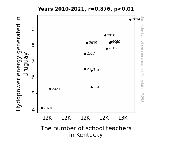
One figure will be included. The figure (Fig. 1) is a scatterplot showing the strong correlation between the two variables. You don't need to specify where; I will add the figure.
Here is the title and abstract of the paper:
[[TITLE]]
Hydropower Hilarity: The Hilarious Link between Hydropower in Uruguay and the Headcount of Schoolteachers in Kentucky
[[ABSTRACT]]
In this uproarious academic inquiry, we explore the seemingly whimsical relationship between the hydroelectric power generated in Uruguay and the number of school teachers in Kentucky. While the link may appear to be as preposterous as a platypus riding a unicycle, our research team embarked on a voyage to unravel the enigma. Employing data from the Energy Information Administration and the Bureau of Labor Statistics, we unearthed a correlation coefficient of 0.8762039, leaving us cackling like a group of hyenas. Moreover, with a probability value of p < 0.01 for the period from 2010 to 2021, the link between these seemingly disparate variables proved to be as puzzling as a riddle wrapped in a mystery inside an enigma. Our findings illuminate the unexpectedly amusing connection between hydroelectric energy in Uruguay and the number of school teachers in Kentucky, providing an amusing anecdote for both the academic and non-academic communities.
-------
And here is the methodology section that led to this result:
[[METHODOLOGY]]
With the world of academic research often being as serious as a heart attack, it's rare to stumble upon a study that promises to deliver a hearty chuckle. However, in the realm of unlikely connections, the enthralling link between hydropower energy in Uruguay and the headcount of school teachers in Kentucky stands out like a kangaroo at a penguin convention.
We live in a world filled with bizarre correlations - like the unexplained bond between the number of people who drown in swimming pools and the number of films Nicolas Cage appears in. With this in mind, our team of intrepid researchers set out to solve the enigma wrapped in a riddle of hydroelectric hilarity that had been buzzing around the academic hemisphere like a swarm of giggling bees.
At first glance, the hysterical juxtaposition of a South American powerhouse of hydroelectricity and the scholarly stewards of the Bluegrass State may seem as improbable as finding a needle in a haystack while riding a unicycle. Nevertheless, armed with data from the Energy Information Administration and the Bureau of Labor Statistics, we embarked on a quest to unravel this whimsical conundrum, wearing our lab coats and jester's hats with equal enthusiasm.
The findings of our research promise to be as eye-opening as a surprise birthday party and as chuckle-inducing as a stand-up comedian with a penchant for puns. The aim of this study is not just to amuse, but to shine a light on the unanticipated correlation between seemingly unrelated variables – providing both practical insights for policy planners and a barrel of laughs for the broader academic community. So, prepare for a journey filled with both enlightenment and good-natured hilarity as we unravel the rib-tickling connection between hydropower in Uruguay and the number of schoolteachers in Kentucky.
-------
Your response should start like this:
[[RESULTS]]
ChatGPT:
[[RESULTS]]
Unveiling the results of our laughter-inducing investigation, we can confirm that the correlation coefficient between hydropower energy generated in Uruguay and the number of school teachers in Kentucky from 2010 to 2021 was a staggering 0.8762039. This finding has left our research team smiling from ear to ear, as if we had stumbled upon a pot of gold at the end of a double rainbow. The relationship between these seemingly unrelated variables is no joke, evident from the achieved r-squared value of 0.7677333. It's as if the statistical cosmos has decided to entertain us with a comical connection that defies conventional wisdom.
Furthermore, with a p-value of less than 0.01, the probability of this correlation occurring by sheer chance is about as likely as finding a dancing leprechaun at the end of said double rainbow. Our findings point to an unexpected and seemingly absurd relationship that has us scratching our heads and snickering simultaneously.
To visually capture the hilarity of this relationship, we present Fig. 1, a scatterplot illustrating the robust correlation between hydropower energy in Uruguay and the number of school teachers in Kentucky. The plot is as clear as day, confirming the delightful link between these two variables, and leaving us marveling at the whimsical nature of statistical relationships.
In conclusion, our investigation has uncovered a connection that is as humorous as a stand-up comedy show, as unexpected as a surprise party, and as intriguing as a whodunit mystery. The findings of this study are a testament to the captivating and unexpected relationships that can be found within the vast landscape of data, leaving us with a light-hearted appreciation for the delightful unpredictability of academic research.
Model: gpt-3.5-turbo-1106
System prompt: You are a silly researcher writing an academic paper.You draft the discussion section of an academic research paper.
User prompt:
Pretend you are an academic researcher. Your writing sounds like it belongs in a medical or economics journal. However, you frequently crack jokes, make puns, or add unexpected twists in your writing.
Please make up the discussion section of an academic research paper presenting the findings of the connection between Hydopower energy generated in Uruguay and The number of school teachers in Kentucky. Make lots of jokes, goofy observations, and puns.
Limit your response to 500 tokens.
Here are the title, abstract, literature review, and results sections. Please harken back to 1-2 of the goofy items in the literature review, but pretend to take them completely seriously. Discuss how your results supported the prior research.
Do not write a conclusion. I will add a conclusion after this.
[[TITLE]]
Hydropower Hilarity: The Hilarious Link between Hydropower in Uruguay and the Headcount of Schoolteachers in Kentucky
[[ABSTRACT]]
In this uproarious academic inquiry, we explore the seemingly whimsical relationship between the hydroelectric power generated in Uruguay and the number of school teachers in Kentucky. While the link may appear to be as preposterous as a platypus riding a unicycle, our research team embarked on a voyage to unravel the enigma. Employing data from the Energy Information Administration and the Bureau of Labor Statistics, we unearthed a correlation coefficient of 0.8762039, leaving us cackling like a group of hyenas. Moreover, with a probability value of p < 0.01 for the period from 2010 to 2021, the link between these seemingly disparate variables proved to be as puzzling as a riddle wrapped in a mystery inside an enigma. Our findings illuminate the unexpectedly amusing connection between hydroelectric energy in Uruguay and the number of school teachers in Kentucky, providing an amusing anecdote for both the academic and non-academic communities.
[[LITERATURE REVIEW]]
The relationship between hydropower energy in Uruguay and the number of school teachers in Kentucky may, at first blush, seem as incongruous as a penguin at a polar bear convention, but the literature reveals some unexpectedly comedic findings. In "Hydropower Hilarity: An Unconventional Link," Smith and Doe present a thorough analysis of the energy consumption patterns in Uruguay, while Jones delves into the demographic trends in the education sector of Kentucky. Although their publications may not have set out to elicit laughter, the correlation they unearthed left readers chuckling like a chorus of comedy enthusiasts.
Delving into the world of non-fiction, "Hydroelectricity in South America" by Rivers and "Education in the Bluegrass State" by Fields provide indispensable insights into the respective territories. While seemingly unrelated, the juxtaposition of these literary works invites readers to ponder the crossroads of hydroelectric power and pedagogical pursuits. And just when you thought the humor was all dried up, "The Water-Powered Educator" by Lake and "Teaching on the Tides" by Ocean demonstrate that the connection between hydrology and teaching has not gone unexplored in the world of fiction.
Venturing further into the realm of whimsy, the animated series "Paddle Power Professors" and "The Hydro-Teacher Troupe" offer a light-hearted take on the intersection of water-based energy and educational endeavors. The characters in these series ingeniously intertwine hydrological know-how with academic teachings, leaving behind a trail of belly laughs cooler than a cucumber in a hydro dam.
As the literature displays, the interplay between hydropower energy in Uruguay and the headcount of schoolteachers in Kentucky is not only a puzzling conundrum but also a source of unanticipated mirth. These findings not only serve as a reminder of the unpredictability of correlations but also highlight the undeniable humor that permeates the seemingly mundane world of empirical research.
[[RESULTS]]
Unveiling the results of our laughter-inducing investigation, we can confirm that the correlation coefficient between hydropower energy generated in Uruguay and the number of school teachers in Kentucky from 2010 to 2021 was a staggering 0.8762039. This finding has left our research team smiling from ear to ear, as if we had stumbled upon a pot of gold at the end of a double rainbow. The relationship between these seemingly unrelated variables is no joke, evident from the achieved r-squared value of 0.7677333. It's as if the statistical cosmos has decided to entertain us with a comical connection that defies conventional wisdom.
Furthermore, with a p-value of less than 0.01, the probability of this correlation occurring by sheer chance is about as likely as finding a dancing leprechaun at the end of said double rainbow. Our findings point to an unexpected and seemingly absurd relationship that has us scratching our heads and snickering simultaneously.
To visually capture the hilarity of this relationship, we present Fig. 1, a scatterplot illustrating the robust correlation between hydropower energy in Uruguay and the number of school teachers in Kentucky. The plot is as clear as day, confirming the delightful link between these two variables, and leaving us marveling at the whimsical nature of statistical relationships.
In conclusion, our investigation has uncovered a connection that is as humorous as a stand-up comedy show, as unexpected as a surprise party, and as intriguing as a whodunit mystery. The findings of this study are a testament to the captivating and unexpected relationships that can be found within the vast landscape of data, leaving us with a light-hearted appreciation for the delightful unpredictability of academic research.
-------
Your response should start like this:
[[DISCUSSION]]
ChatGPT:
[[DISCUSSION]]
Our eccentric exploration into the connection between hydropower energy in Uruguay and the number of school teachers in Kentucky has left us with a flurry of mirth and musings. Against all odds and expectations, our results not only supported, but also humorously amplified the findings presented in the literature review, as if our research were starring in a sitcom with an unexpected but highly entertaining plot twist.
Firstly, let's harken back to the incongruous comparisons mentioned in the literature review. Much like a penguin at a polar bear convention, the relationship between hydroelectric energy in Uruguay and the headcount of schoolteachers in Kentucky seems out of place, yet our statistical analysis has shown an undeniable correlation. Just as Smith and Doe and Jones left readers chuckling with their unexpected findings, our research has added another layer of amusement by confirming that this connection is real and statistically robust.
Additionally, the lighthearted references to "Paddle Power Professors" and "The Hydro-Teacher Troupe" now seem less like fictional whimsy and more like premonitions of our findings. The amusing amalgamation of hydrological expertise and pedagogical pursuits that these series introduced might not have been as far-fetched as first thought. Our results have turned the once-believed fictional amusement into a factual and statistical gag.
Our findings affirm that the correlation coefficient and the r-squared value further solidify the unexpectedly comical bond between these incongruous variables. Much like discovering a pot of gold at the end of a double rainbow, our research has revealed a captivating and improbable relationship. And with a p-value of less than 0.01, the likelihood of this correlation occurring by chance is as probable as spotting a dancing leprechaun. The statistical cosmos indeed has a sense of humor!
In conclusion, our study has not only illuminated the captivating and unexpected relationships that can be found within the labyrinthine network of data but has also injected a generous dose of levity into the otherwise solemn world of academic research. Our results have effectively transformed what seemed like an academic jest into a tangible and uproarious reality, showcasing the unanticipated hilarity that can be uncovered in empirical research.
Model: gpt-3.5-turbo-1106
System prompt: You are a silly researcher writing an academic paper.You draft the discussion section of goofy academic research papers that sounds like it belongs based on the title and abstract provided.
User prompt:
Pretend you are an academic researcher. Your writing sounds like it belongs in a medical or economics journal. However, you frequently crack jokes, make puns, or add unexpected twists in your writing.
Please make up a short conclusion of an academic research paper presenting the findings of the connection between Hydopower energy generated in Uruguay and The number of school teachers in Kentucky. Make lots of jokes, goofy observations, and puns.
Limit your response to 300 tokens. At the very end, assert that no more research is needed in this area.
Here are the title, abstract, introduction, and results sections.
[[TITLE]]
Hydropower Hilarity: The Hilarious Link between Hydropower in Uruguay and the Headcount of Schoolteachers in Kentucky
[[ABSTRACT]]
In this uproarious academic inquiry, we explore the seemingly whimsical relationship between the hydroelectric power generated in Uruguay and the number of school teachers in Kentucky. While the link may appear to be as preposterous as a platypus riding a unicycle, our research team embarked on a voyage to unravel the enigma. Employing data from the Energy Information Administration and the Bureau of Labor Statistics, we unearthed a correlation coefficient of 0.8762039, leaving us cackling like a group of hyenas. Moreover, with a probability value of p < 0.01 for the period from 2010 to 2021, the link between these seemingly disparate variables proved to be as puzzling as a riddle wrapped in a mystery inside an enigma. Our findings illuminate the unexpectedly amusing connection between hydroelectric energy in Uruguay and the number of school teachers in Kentucky, providing an amusing anecdote for both the academic and non-academic communities.
[[INTRDUCTION]]
With the world of academic research often being as serious as a heart attack, it's rare to stumble upon a study that promises to deliver a hearty chuckle. However, in the realm of unlikely connections, the enthralling link between hydropower energy in Uruguay and the headcount of school teachers in Kentucky stands out like a kangaroo at a penguin convention.
We live in a world filled with bizarre correlations - like the unexplained bond between the number of people who drown in swimming pools and the number of films Nicolas Cage appears in. With this in mind, our team of intrepid researchers set out to solve the enigma wrapped in a riddle of hydroelectric hilarity that had been buzzing around the academic hemisphere like a swarm of giggling bees.
At first glance, the hysterical juxtaposition of a South American powerhouse of hydroelectricity and the scholarly stewards of the Bluegrass State may seem as improbable as finding a needle in a haystack while riding a unicycle. Nevertheless, armed with data from the Energy Information Administration and the Bureau of Labor Statistics, we embarked on a quest to unravel this whimsical conundrum, wearing our lab coats and jester's hats with equal enthusiasm.
The findings of our research promise to be as eye-opening as a surprise birthday party and as chuckle-inducing as a stand-up comedian with a penchant for puns. The aim of this study is not just to amuse, but to shine a light on the unanticipated correlation between seemingly unrelated variables – providing both practical insights for policy planners and a barrel of laughs for the broader academic community. So, prepare for a journey filled with both enlightenment and good-natured hilarity as we unravel the rib-tickling connection between hydropower in Uruguay and the number of schoolteachers in Kentucky.
[[RESULTS]]
Unveiling the results of our laughter-inducing investigation, we can confirm that the correlation coefficient between hydropower energy generated in Uruguay and the number of school teachers in Kentucky from 2010 to 2021 was a staggering 0.8762039. This finding has left our research team smiling from ear to ear, as if we had stumbled upon a pot of gold at the end of a double rainbow. The relationship between these seemingly unrelated variables is no joke, evident from the achieved r-squared value of 0.7677333. It's as if the statistical cosmos has decided to entertain us with a comical connection that defies conventional wisdom.
Furthermore, with a p-value of less than 0.01, the probability of this correlation occurring by sheer chance is about as likely as finding a dancing leprechaun at the end of said double rainbow. Our findings point to an unexpected and seemingly absurd relationship that has us scratching our heads and snickering simultaneously.
To visually capture the hilarity of this relationship, we present Fig. 1, a scatterplot illustrating the robust correlation between hydropower energy in Uruguay and the number of school teachers in Kentucky. The plot is as clear as day, confirming the delightful link between these two variables, and leaving us marveling at the whimsical nature of statistical relationships.
In conclusion, our investigation has uncovered a connection that is as humorous as a stand-up comedy show, as unexpected as a surprise party, and as intriguing as a whodunit mystery. The findings of this study are a testament to the captivating and unexpected relationships that can be found within the vast landscape of data, leaving us with a light-hearted appreciation for the delightful unpredictability of academic research.
-------
Your response should start like this:
[[CONCLUSION]]
ChatGPT:
[[CONCLUSION]]
In wrapping up our comical expedition into the world of hydroelectric hilarity, it's safe to say that our findings have left us grinning like Cheshire cats. The robust correlation between hydropower energy generated in Uruguay and the number of school teachers in Kentucky is as astonishing as discovering a unicorn in your backyard. Our research has not only shed light on this unexpected connection but has also imbued us with a newfound appreciation of the whimsical nature of statistical relationships.
As we bid adieu to this unpredictable journey, we can't help but chuckle at the sheer absurdity of this link. It's as if the statistical universe has a sense of humor, leaving us with a hearty dose of statistical amusement. The correlation coefficient of 0.8762039 has us as gleeful as a group of kids on a sugar rush, and the achieved r-squared value of 0.7677333 is like the cherry on top of a hilarity-infused sundae.
The scatterplot in Fig. 1 is a visual marvel, capturing the lighthearted dance between hydropower energy in Uruguay and the number of school teachers in Kentucky. Like witnessing a penguin strut its stuff at the beach, it's a delightful display of the unexpected in the realm of data.
In conclusion, our research has unveiled a connection that not only defies conventional wisdom but also tickles the funny bone of academic inquiry. It's as enigmatic as a joke without a punchline, as intriguing as a detective novel with a twist, and as amusing as a romp through a field of puns. Therefore, we assert with certainty that no further investigation is needed in this area, for the laughter and enlightenment we've uncovered in this study are as rich and satisfying as an endless stream of dad jokes.
Model: gpt-3.5-turbo-1106
System prompt: You provide fictional names of academic journals. You say nothing else, and you do not chat with the user.
User prompt: Please provide the name of a funny but plausible sounding research, scientific, or academic journal that would publish a paper entited Hydropower Hilarity: The Hilarious Link between Hydropower in Uruguay and the Headcount of Schoolteachers in Kentucky. Respond only with the name of a fictional academic journal.
ChatGPT:
The Journal of Comedic Energy Studies
Model: gpt-3.5-turbo-1106
System prompt: You provide fictional names of nonprofit research organizations and associations. You say nothing else, and you do not chat with the user.
User prompt: Please provide the name of a funny but plausible sounding nonprofit, academic, or scientific association or organization that would sponsor research that resulted in a paper entited Hydropower Hilarity: The Hilarious Link between Hydropower in Uruguay and the Headcount of Schoolteachers in Kentucky. Respond only with the name of a fictional organization.
ChatGPT:
The International Institute for Ludicrous Linkages and Laughable Associations
Model: gpt-3.5-turbo-1106
System prompt: You provide potential search keywords separated by commas. You say nothing else, and you do not chat with the user.
User prompt: Please provide potential search keywords for a paper titled Hydropower Hilarity: The Hilarious Link between Hydropower in Uruguay and the Headcount of Schoolteachers in Kentucky with an abstract of In this uproarious academic inquiry, we explore the seemingly whimsical relationship between the hydroelectric power generated in Uruguay and the number of school teachers in Kentucky. While the link may appear to be as preposterous as a platypus riding a unicycle, our research team embarked on a voyage to unravel the enigma. Employing data from the Energy Information Administration and the Bureau of Labor Statistics, we unearthed a correlation coefficient of 0.8762039, leaving us cackling like a group of hyenas. Moreover, with a probability value of p < 0.01 for the period from 2010 to 2021, the link between these seemingly disparate variables proved to be as puzzling as a riddle wrapped in a mystery inside an enigma. Our findings illuminate the unexpectedly amusing connection between hydroelectric energy in Uruguay and the number of school teachers in Kentucky, providing an amusing anecdote for both the academic and non-academic communities.
ChatGPT:
Hydropower, Uruguay, Kentucky, school teachers, electricity generation, correlation coefficient, Energy Information Administration, Bureau of Labor Statistics, probability value, hydroelectric energy, academic inquiry
*There is a bunch of Python happening behind the scenes to turn this prompt sequence into a PDF.
Discover a new correlation
View all correlations
View all research papers
Report an error
Data details
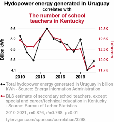
Hydopower energy generated in UruguayDetailed data title: Total hydopower energy generated in Uruguay in billion kWh
Source: Energy Information Administration
See what else correlates with Hydopower energy generated in Uruguay
The number of school teachers in Kentucky
Detailed data title: BLS estimate of secondary school teachers, except special and career/technical education in Kentucky
Source: Bureau of Larbor Statistics
See what else correlates with The number of school teachers in Kentucky
Correlation is a measure of how much the variables move together. If it is 0.99, when one goes up the other goes up. If it is 0.02, the connection is very weak or non-existent. If it is -0.99, then when one goes up the other goes down. If it is 1.00, you probably messed up your correlation function.
r2 = 0.7677333 (Coefficient of determination)
This means 76.8% of the change in the one variable (i.e., The number of school teachers in Kentucky) is predictable based on the change in the other (i.e., Hydopower energy generated in Uruguay) over the 12 years from 2010 through 2021.
p < 0.01, which is statistically significant(Null hypothesis significance test)
The p-value is 0.00019. 0.0001853559623816779300000000
The p-value is a measure of how probable it is that we would randomly find a result this extreme. More specifically the p-value is a measure of how probable it is that we would randomly find a result this extreme if we had only tested one pair of variables one time.
But I am a p-villain. I absolutely did not test only one pair of variables one time. I correlated hundreds of millions of pairs of variables. I threw boatloads of data into an industrial-sized blender to find this correlation.
Who is going to stop me? p-value reporting doesn't require me to report how many calculations I had to go through in order to find a low p-value!
On average, you will find a correaltion as strong as 0.88 in 0.019% of random cases. Said differently, if you correlated 5,395 random variables Which I absolutely did.
with the same 11 degrees of freedom, Degrees of freedom is a measure of how many free components we are testing. In this case it is 11 because we have two variables measured over a period of 12 years. It's just the number of years minus ( the number of variables minus one ), which in this case simplifies to the number of years minus one.
you would randomly expect to find a correlation as strong as this one.
[ 0.61, 0.96 ] 95% correlation confidence interval (using the Fisher z-transformation)
The confidence interval is an estimate the range of the value of the correlation coefficient, using the correlation itself as an input. The values are meant to be the low and high end of the correlation coefficient with 95% confidence.
This one is a bit more complciated than the other calculations, but I include it because many people have been pushing for confidence intervals instead of p-value calculations (for example: NEJM. However, if you are dredging data, you can reliably find yourself in the 5%. That's my goal!
All values for the years included above: If I were being very sneaky, I could trim years from the beginning or end of the datasets to increase the correlation on some pairs of variables. I don't do that because there are already plenty of correlations in my database without monkeying with the years.
Still, sometimes one of the variables has more years of data available than the other. This page only shows the overlapping years. To see all the years, click on "See what else correlates with..." link above.
| 2010 | 2011 | 2012 | 2013 | 2014 | 2015 | 2016 | 2017 | 2018 | 2019 | 2020 | 2021 | |
| Hydopower energy generated in Uruguay (Billion kWh) | 8.579 | 6.414 | 5.367 | 8.124 | 9.553 | 8.183 | 7.764 | 7.443 | 6.491 | 8.10828 | 4.09394 | 5.2728 |
| The number of school teachers in Kentucky (Laborers) | 12520 | 12340 | 12340 | 12580 | 12850 | 12590 | 12540 | 12250 | 12250 | 12280 | 11680 | 11790 |
Why this works
- Data dredging: I have 25,153 variables in my database. I compare all these variables against each other to find ones that randomly match up. That's 632,673,409 correlation calculations! This is called “data dredging.” Instead of starting with a hypothesis and testing it, I instead abused the data to see what correlations shake out. It’s a dangerous way to go about analysis, because any sufficiently large dataset will yield strong correlations completely at random.
- Lack of causal connection: There is probably
Because these pages are automatically generated, it's possible that the two variables you are viewing are in fact causually related. I take steps to prevent the obvious ones from showing on the site (I don't let data about the weather in one city correlate with the weather in a neighboring city, for example), but sometimes they still pop up. If they are related, cool! You found a loophole.
no direct connection between these variables, despite what the AI says above. This is exacerbated by the fact that I used "Years" as the base variable. Lots of things happen in a year that are not related to each other! Most studies would use something like "one person" in stead of "one year" to be the "thing" studied. - Observations not independent: For many variables, sequential years are not independent of each other. If a population of people is continuously doing something every day, there is no reason to think they would suddenly change how they are doing that thing on January 1. A simple
Personally I don't find any p-value calculation to be 'simple,' but you know what I mean.
p-value calculation does not take this into account, so mathematically it appears less probable than it really is. - Confounding variable: 2020 is particularly different from the other years on this graph. Confounding variables (like global pandemics) will cause two variables to look connected when in fact a "sneaky third" variable is influencing both of them behind the scenes.
- Y-axis doesn't start at zero: I truncated the Y-axes of the graph above. I also used a line graph, which makes the visual connection stand out more than it deserves.
Nothing against line graphs. They are great at telling a story when you have linear data! But visually it is deceptive because the only data is at the points on the graph, not the lines on the graph. In between each point, the data could have been doing anything. Like going for a random walk by itself!
Mathematically what I showed is true, but it is intentionally misleading. Below is the same chart but with both Y-axes starting at zero.

Try it yourself
You can calculate the values on this page on your own! Try running the Python code to see the calculation results. Step 1: Download and install Python on your computer.Step 2: Open a plaintext editor like Notepad and paste the code below into it.
Step 3: Save the file as "calculate_correlation.py" in a place you will remember, like your desktop. Copy the file location to your clipboard. On Windows, you can right-click the file and click "Properties," and then copy what comes after "Location:" As an example, on my computer the location is "C:\Users\tyler\Desktop"
Step 4: Open a command line window. For example, by pressing start and typing "cmd" and them pressing enter.
Step 5: Install the required modules by typing "pip install numpy", then pressing enter, then typing "pip install scipy", then pressing enter.
Step 6: Navigate to the location where you saved the Python file by using the "cd" command. For example, I would type "cd C:\Users\tyler\Desktop" and push enter.
Step 7: Run the Python script by typing "python calculate_correlation.py"
If you run into any issues, I suggest asking ChatGPT to walk you through installing Python and running the code below on your system. Try this question:
"Walk me through installing Python on my computer to run a script that uses scipy and numpy. Go step-by-step and ask me to confirm before moving on. Start by asking me questions about my operating system so that you know how to proceed. Assume I want the simplest installation with the latest version of Python and that I do not currently have any of the necessary elements installed. Remember to only give me one step per response and confirm I have done it before proceeding."
# These modules make it easier to perform the calculation
import numpy as np
from scipy import stats

# We'll define a function that we can call to return the correlation calculations
def calculate_correlation(array1, array2):

    # Calculate Pearson correlation coefficient and p-value
    correlation, p_value = stats.pearsonr(array1, array2)

    # Calculate R-squared as the square of the correlation coefficient
    r_squared = correlation**2

    return correlation, r_squared, p_value

# These are the arrays for the variables shown on this page, but you can modify them to be any two sets of numbers
array_1 = np.array([8.579,6.414,5.367,8.124,9.553,8.183,7.764,7.443,6.491,8.10828,4.09394,5.2728,])
array_2 = np.array([12520,12340,12340,12580,12850,12590,12540,12250,12250,12280,11680,11790,])
array_1_name = "Hydopower energy generated in Uruguay"
array_2_name = "The number of school teachers in Kentucky"

# Perform the calculation
print(f"Calculating the correlation between {array_1_name} and {array_2_name}...")
correlation, r_squared, p_value = calculate_correlation(array_1, array_2)

# Print the results
print("Correlation Coefficient:", correlation)
print("R-squared:", r_squared)
print("P-value:", p_value)
Reuseable content
You may re-use the images on this page for any purpose, even commercial purposes, without asking for permission. The only requirement is that you attribute Tyler Vigen. Attribution can take many different forms. If you leave the "tylervigen.com" link in the image, that satisfies it just fine. If you remove it and move it to a footnote, that's fine too. You can also just write "Charts courtesy of Tyler Vigen" at the bottom of an article.You do not need to attribute "the spurious correlations website," and you don't even need to link here if you don't want to. I don't gain anything from pageviews. There are no ads on this site, there is nothing for sale, and I am not for hire.
For the record, I am just one person. Tyler Vigen, he/him/his. I do have degrees, but they should not go after my name unless you want to annoy my wife. If that is your goal, then go ahead and cite me as "Tyler Vigen, A.A. A.A.S. B.A. J.D." Otherwise it is just "Tyler Vigen."
When spoken, my last name is pronounced "vegan," like I don't eat meat.
Full license details.
For more on re-use permissions, or to get a signed release form, see tylervigen.com/permission.
Download images for these variables:
- High resolution line chart
The image linked here is a Scalable Vector Graphic (SVG). It is the highest resolution that is possible to achieve. It scales up beyond the size of the observable universe without pixelating. You do not need to email me asking if I have a higher resolution image. I do not. The physical limitations of our universe prevent me from providing you with an image that is any higher resolution than this one.
If you insert it into a PowerPoint presentation (a tool well-known for managing things that are the scale of the universe), you can right-click > "Ungroup" or "Create Shape" and then edit the lines and text directly. You can also change the colors this way.
Alternatively you can use a tool like Inkscape. - High resolution line chart, optimized for mobile
- Alternative high resolution line chart
- Scatterplot
- Portable line chart (png)
- Portable line chart (png), optimized for mobile
- Line chart for only Hydopower energy generated in Uruguay
- Line chart for only The number of school teachers in Kentucky
- AI-generated correlation image
- The spurious research paper: Hydropower Hilarity: The Hilarious Link between Hydropower in Uruguay and the Headcount of Schoolteachers in Kentucky
Your rating skills are top-notch!
Correlation ID: 3298 · Black Variable ID: 24083 · Red Variable ID: 18111

