NOTICE: This correlation is inactive
The correlation is not active in any lists.
This page remains only to prevent link rot.

Download png, svg
AI explanation
As the Best Actor winners age, they develop a certain gravitas and wisdom that subtly influences the Marvel movies, attracting a more mature audience who appreciate the nuanced performances and sophisticated storytelling. This, in turn, leads to higher box office earnings as older viewers flock to the theaters, armed with their decades of movie-going experience and a penchant for overpriced popcorn. It's like fine wine pairing with blockbuster popcorn flicks, creating a box office recipe for success that even Thanos couldn't snap away.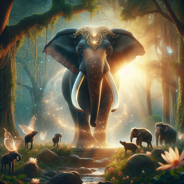
Model: dalle-3
Prompt: Please respond with an image generation prompt that would be likely to create an interesting visual using DALL-E 3, using the following style: [ Magic realism ] and depicting this scene: An imposing and regal elephant stands in a lush green forest, its majestic tusks gleaming in the sunlight. As it gracefully moves through the foliage, a radiant aura surrounds it, scattering glittering dust in its wake. Animals of all kinds are drawn to the elephant, following in a harmonious parade as flowers bloom in its path. The atmosphere is filled with a sense of wonder and enchantment, as nature itself pays homage to this magnificent creature. Keep the visual depiction simple. Do not include any words or speech bubbles. The depiction should include only scenes, people, and objects, it should not include text or speech bubbles.
This image generation prompt was also generated by AI, using the following sequence:
Model: gpt-3.5-turbo-1106
System prompt: You select one of a few potential scene descriptors that seems to go along with the situation described. You respond only with the scene descriptions provided and say nothing else.
User prompt: Here is a situation: Because as Best Actor winners age, they develop a magnetic field that attracts superhero film fans, drawing more people to theaters and boosting box office revenue. It's like a silver fox superhero effect - the older the actor, the bigger the box office draw!. Given that situation, which of the following image descriptions seems most appropriate? Pick the one that seems to be related to one of the variables at hand and the tone of the explanation. Please respond with only one of the following potential descriptions: Macabre Magic realism Hyper-realistic Symbolism Cutsy art illustration
ChatGPT: Magic realism
Model: gpt-3.5-turbo-1106
System prompt: You describe simple visual scenes that depict the two variables stated and the explanation described. Do not reference graphs or charts; describe physical objects.
User prompt: Please describe a visual scene that depicts the following situation. Keep the description simple. Because as Best Actor winners age, they develop a magnetic field that attracts superhero film fans, drawing more people to theaters and boosting box office revenue. It's like a silver fox superhero effect - the older the actor, the bigger the box office draw!
ChatGPT: Picture an older actor standing on a stage, holding an award and flashing a confident smile. As he moves through the crowd, people around him are pulled in as if by a magnet, eagerly following him to see what he does next. Each step he takes seems to draw in more and more people, creating a buzz of excitement and energy around him. In the background, movie theater ticket sales soar as fans rush to see the acclaimed actor in his latest superhero film.
Model: gpt-3.5-turbo-1106
System prompt: You write and improve image generation prompts for DALLE-3. You maintain the same subjects, but enhance the visuals.
User prompt: Please respond with an image generation prompt that would be likely to create an interesting visual using DALLE-3, using the following style: [ Magic realism ] and depicting this scene: Picture an older actor standing on a stage, holding an award and flashing a confident smile. As he moves through the crowd, people around him are pulled in as if by a magnet, eagerly following him to see what he does next. Each step he takes seems to draw in more and more people, creating a buzz of excitement and energy around him. In the background, movie theater ticket sales soar as fans rush to see the acclaimed actor in his latest superhero film. Keep the visual depiction simple. Do not include any words or speech bubbles.
ChatGPT: Please respond with an image generation prompt that would be likely to create an interesting visual using DALL-E 3, using the following style: [ Magic realism ] and depicting this scene: An imposing and regal elephant stands in a lush green forest, its majestic tusks gleaming in the sunlight. As it gracefully moves through the foliage, a radiant aura surrounds it, scattering glittering dust in its wake. Animals of all kinds are drawn to the elephant, following in a harmonious parade as flowers bloom in its path. The atmosphere is filled with a sense of wonder and enchantment, as nature itself pays homage to this magnificent creature. Keep the visual depiction simple. Do not include any words or speech bubbles.
*Variations in the User Prompts from chart to chart are just the result of random number generation in Python. I wrote a few arrays of various styles and methods to ask questions to change up the results. Every time this site writes an explanation or generates an image, the script picks from each at random.
I sequence the requests into multiple prompts because I find GPT 3.5 to perform much better with short, well-managed contexts. Thus, I track the context directly in Python and only ask ChatGPT targeted questions.
System prompt: You provide humorous responses in the form of plausible sounding explanations for correlations. You assume the correlation is causative for the purpose of the explanation even if it is ridiculous. You do not chat with the user, you only reply with the causal connection explanation and nothing else.
User prompt: Please make up a funny explanation for how an increase in Academy Award Best Actor Winner's Age caused Highest grossing Marvel comic movies' worldwide box office revenue to increase. Make it feel plausible.
Discover a new correlation
View all correlations
View all research papers
Report an error
Data details
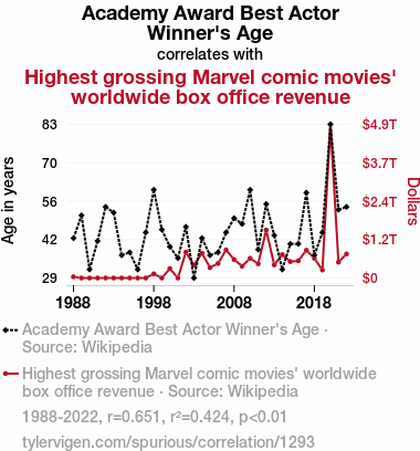
Academy Award Best Actor Winner's AgeSource: Wikipedia
See what else correlates with Academy Award Best Actor Winner's Age
Highest grossing Marvel comic movies' worldwide box office revenue
Source: Wikipedia
See what else correlates with Highest grossing Marvel comic movies' worldwide box office revenue
Correlation is a measure of how much the variables move together. If it is 0.99, when one goes up the other goes up. If it is 0.02, the connection is very weak or non-existent. If it is -0.99, then when one goes up the other goes down. If it is 1.00, you probably messed up your correlation function.
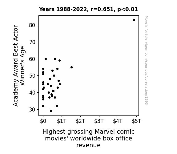
r2 = 0.4240547 (Coefficient of determination)
This means 42.4% of the change in the one variable (i.e., Highest grossing Marvel comic movies' worldwide box office revenue) is predictable based on the change in the other (i.e., Academy Award Best Actor Winner's Age) over the 35 years from 1988 through 2022.
p < 0.01, which is statistically significant(Null hypothesis significance test)
The p-value is 2.3E-5. 0.0000227214776155862700000000
The p-value is a measure of how probable it is that we would randomly find a result this extreme. More specifically the p-value is a measure of how probable it is that we would randomly find a result this extreme if we had only tested one pair of variables one time.
But I am a p-villain. I absolutely did not test only one pair of variables one time. I correlated hundreds of millions of pairs of variables. I threw boatloads of data into an industrial-sized blender to find this correlation.
Who is going to stop me? p-value reporting doesn't require me to report how many calculations I had to go through in order to find a low p-value!
On average, you will find a correaltion as strong as 0.65 in 0.0023% of random cases. Said differently, if you correlated 44,011 random variables You don't actually need 44 thousand variables to find a correlation like this one. You can also correlate variables that are not independent. I do this a lot.
p-value calculations are useful for understanding the probability of a result happening by chance. They are most useful when used to highlight the risk of a fluke outcome. For example, if you calculate a p-value of 0.30, the risk that the result is a fluke is high. It is good to know that! But there are lots of ways to get a p-value of less than 0.01, as evidenced by this project.
Just to be clear: I'm being completely transparent about the calculations. There is no math trickery. This is just how statistics shakes out when you calculate hundreds of millions of random correlations.
with the same 34 degrees of freedom, Degrees of freedom is a measure of how many free components we are testing. In this case it is 34 because we have two variables measured over a period of 35 years. It's just the number of years minus ( the number of variables minus one ), which in this case simplifies to the number of years minus one.
you would randomly expect to find a correlation as strong as this one.
[ 0.41, 0.81 ] 95% correlation confidence interval (using the Fisher z-transformation)
The confidence interval is an estimate the range of the value of the correlation coefficient, using the correlation itself as an input. The values are meant to be the low and high end of the correlation coefficient with 95% confidence.
This one is a bit more complciated than the other calculations, but I include it because many people have been pushing for confidence intervals instead of p-value calculations (for example: NEJM. However, if you are dredging data, you can reliably find yourself in the 5%. That's my goal!
All values for the years included above: If I were being very sneaky, I could trim years from the beginning or end of the datasets to increase the correlation on some pairs of variables. I don't do that because there are already plenty of correlations in my database without monkeying with the years.
Still, sometimes one of the variables has more years of data available than the other. This page only shows the overlapping years. To see all the years, click on "See what else correlates with..." link above.
| 1988 | 1989 | 1990 | 1991 | 1992 | 1993 | 1994 | 1995 | 1996 | 1997 | 1998 | 1999 | 2000 | 2001 | 2002 | 2003 | 2004 | 2005 | 2006 | 2007 | 2008 | 2009 | 2010 | 2011 | 2012 | 2013 | 2014 | 2015 | 2016 | 2017 | 2018 | 2019 | 2020 | 2021 | 2022 | |
| Academy Award Best Actor Winner's Age (Age in years) | 43 | 51 | 32 | 42 | 54 | 52 | 37 | 38 | 32 | 45 | 60 | 46 | 40 | 36 | 47 | 29 | 43 | 37 | 38 | 45 | 50 | 48 | 60 | 39 | 55 | 44 | 32 | 41 | 41 | 59 | 37 | 45 | 83 | 53 | 54 |
| Highest grossing Marvel comic movies' worldwide box office revenue (Dollars) | 37962800000 | 0 | 0 | 0 | 0 | 0 | 0 | 0 | 0 | 0 | 131184000000 | 0 | 296340000000 | 0 | 821709000000 | 407712000000 | 783766000000 | 330580000000 | 459360000000 | 890872000000 | 585174000000 | 373063000000 | 623933000000 | 449440000000 | 1518590000000 | 414828000000 | 741452000000 | 519312000000 | 543934000000 | 880167000000 | 622674000000 | 252443000000 | 4867510000000 | 502050000000 | 760928000000 |
Why this works
- Data dredging: I have 25,237 variables in my database. I compare all these variables against each other to find ones that randomly match up. That's 636,906,169 correlation calculations! This is called “data dredging.” Instead of starting with a hypothesis and testing it, I instead abused the data to see what correlations shake out. It’s a dangerous way to go about analysis, because any sufficiently large dataset will yield strong correlations completely at random.
- Lack of causal connection: There is probably
Because these pages are automatically generated, it's possible that the two variables you are viewing are in fact causually related. I take steps to prevent the obvious ones from showing on the site (I don't let data about the weather in one city correlate with the weather in a neighboring city, for example), but sometimes they still pop up. If they are related, cool! You found a loophole.
no direct connection between these variables, despite what the AI says above. This is exacerbated by the fact that I used "Years" as the base variable. Lots of things happen in a year that are not related to each other! Most studies would use something like "one person" in stead of "one year" to be the "thing" studied. - Observations not independent: For many variables, sequential years are not independent of each other. If a population of people is continuously doing something every day, there is no reason to think they would suddenly change how they are doing that thing on January 1. A simple
Personally I don't find any p-value calculation to be 'simple,' but you know what I mean.
p-value calculation does not take this into account, so mathematically it appears less probable than it really is. - Confounding variable: 2020 is particularly different from the other years on this graph. Confounding variables (like global pandemics) will cause two variables to look connected when in fact a "sneaky third" variable is influencing both of them behind the scenes.
- Y-axis doesn't start at zero: I truncated the Y-axes of the graph above. I also used a line graph, which makes the visual connection stand out more than it deserves.
Nothing against line graphs. They are great at telling a story when you have linear data! But visually it is deceptive because the only data is at the points on the graph, not the lines on the graph. In between each point, the data could have been doing anything. Like going for a random walk by itself!
Mathematically what I showed is true, but it is intentionally misleading. Below is the same chart but with both Y-axes starting at zero. - Outlandish outliers: There are "outliers" in this data.
In concept, "outlier" just means "way different than the rest of your dataset." When calculating a correlation like this, they are particularly impactful because a single outlier can substantially increase your correlation.
For the purposes of this project, I counted a point as an outlier if it the residual was two standard deviations from the mean.
(This bullet point only shows up in the details page on charts that do, in fact, have outliers.)
They stand out on the scatterplot above: notice the dots that are far away from any other dots. I intentionally mishandeled outliers, which makes the correlation look extra strong.

Try it yourself
You can calculate the values on this page on your own! Try running the Python code to see the calculation results. Step 1: Download and install Python on your computer.Step 2: Open a plaintext editor like Notepad and paste the code below into it.
Step 3: Save the file as "calculate_correlation.py" in a place you will remember, like your desktop. Copy the file location to your clipboard. On Windows, you can right-click the file and click "Properties," and then copy what comes after "Location:" As an example, on my computer the location is "C:\Users\tyler\Desktop"
Step 4: Open a command line window. For example, by pressing start and typing "cmd" and them pressing enter.
Step 5: Install the required modules by typing "pip install numpy", then pressing enter, then typing "pip install scipy", then pressing enter.
Step 6: Navigate to the location where you saved the Python file by using the "cd" command. For example, I would type "cd C:\Users\tyler\Desktop" and push enter.
Step 7: Run the Python script by typing "python calculate_correlation.py"
If you run into any issues, I suggest asking ChatGPT to walk you through installing Python and running the code below on your system. Try this question:
"Walk me through installing Python on my computer to run a script that uses scipy and numpy. Go step-by-step and ask me to confirm before moving on. Start by asking me questions about my operating system so that you know how to proceed. Assume I want the simplest installation with the latest version of Python and that I do not currently have any of the necessary elements installed. Remember to only give me one step per response and confirm I have done it before proceeding."
# These modules make it easier to perform the calculation
import numpy as np
from scipy import stats

# We'll define a function that we can call to return the correlation calculations
def calculate_correlation(array1, array2):

    # Calculate Pearson correlation coefficient and p-value
    correlation, p_value = stats.pearsonr(array1, array2)

    # Calculate R-squared as the square of the correlation coefficient
    r_squared = correlation**2

    return correlation, r_squared, p_value

# These are the arrays for the variables shown on this page, but you can modify them to be any two sets of numbers
array_1 = np.array([43,51,32,42,54,52,37,38,32,45,60,46,40,36,47,29,43,37,38,45,50,48,60,39,55,44,32,41,41,59,37,45,83,53,54,])
array_2 = np.array([37962800000,0,0,0,0,0,0,0,0,0,131184000000,0,296340000000,0,821709000000,407712000000,783766000000,330580000000,459360000000,890872000000,585174000000,373063000000,623933000000,449440000000,1518590000000,414828000000,741452000000,519312000000,543934000000,880167000000,622674000000,252443000000,4867510000000,502050000000,760928000000,])
array_1_name = "Academy Award Best Actor Winner's Age"
array_2_name = "Highest grossing Marvel comic movies' worldwide box office revenue"

# Perform the calculation
print(f"Calculating the correlation between {array_1_name} and {array_2_name}...")
correlation, r_squared, p_value = calculate_correlation(array_1, array_2)

# Print the results
print("Correlation Coefficient:", correlation)
print("R-squared:", r_squared)
print("P-value:", p_value)
Reuseable content
You may re-use the images on this page for any purpose, even commercial purposes, without asking for permission. The only requirement is that you attribute Tyler Vigen. Attribution can take many different forms. If you leave the "tylervigen.com" link in the image, that satisfies it just fine. If you remove it and move it to a footnote, that's fine too. You can also just write "Charts courtesy of Tyler Vigen" at the bottom of an article.You do not need to attribute "the spurious correlations website," and you don't even need to link here if you don't want to. I don't gain anything from pageviews. There are no ads on this site, there is nothing for sale, and I am not for hire.
For the record, I am just one person. Tyler Vigen, he/him/his. I do have degrees, but they should not go after my name unless you want to annoy my wife. If that is your goal, then go ahead and cite me as "Tyler Vigen, A.A. A.A.S. B.A. J.D." Otherwise it is just "Tyler Vigen."
When spoken, my last name is pronounced "vegan," like I don't eat meat.
Full license details.
For more on re-use permissions, or to get a signed release form, see tylervigen.com/permission.
Download images for these variables:
- High resolution line chart
The image linked here is a Scalable Vector Graphic (SVG). It is the highest resolution that is possible to achieve. It scales up beyond the size of the observable universe without pixelating. You do not need to email me asking if I have a higher resolution image. I do not. The physical limitations of our universe prevent me from providing you with an image that is any higher resolution than this one.
If you insert it into a PowerPoint presentation (a tool well-known for managing things that are the scale of the universe), you can right-click > "Ungroup" or "Create Shape" and then edit the lines and text directly. You can also change the colors this way.
Alternatively you can use a tool like Inkscape. - High resolution line chart, optimized for mobile
- Alternative high resolution line chart
- Scatterplot
- Portable line chart (png)
- Portable line chart (png), optimized for mobile
- Line chart for only Academy Award Best Actor Winner's Age
- Line chart for only Highest grossing Marvel comic movies' worldwide box office revenue
Your rating skills are legendary!
Correlation ID: 1293 · Black Variable ID: 526 · Red Variable ID: 180

