

AI explanation
It turns out that every time a New Jersey resident votes for the Democrat Presidential candidate, a magical ripple effect occurs, causing a temporary spike in demand for disco balls. These disco balls are all imported from Brunei, leading to a sudden surge in shipping activity. Now, in a bizarre twist of events, it just so happens that these shipments coincide with impromptu dance parties on Brunei's oil rigs, causing the workers to bust out their finest dance moves to the rhythm of "Stayin' Alive." As a result, the increased movement and grooving leads to a slight, but noticeable, rise in petroluem consumption. Who knew politics could get the oil pumping in such a funky way? The power of democracy and dance strikes again!
Model: dalle-3
Prompt: Generate an image of a bustling New Jersey polling station with a long line of voters snaking through the space. People are casting their ballots for the Democrat Presidential candidate. In the center of the image, shimmering disco balls materialize above the crowd, filling the room with a dazzling spectacle. Meanwhile, transition to Brunei, depicting a group of oil rig workers taking a break from their duties and breaking into spontaneous dance. Their movements cause a noticeable increase in petroleum consumption. The depiction should include only scenes, people, and objects, it should not include text or speech bubbles.
This image generation prompt was also generated by AI, using the following sequence:
Model: gpt-3.5-turbo-1106
System prompt: You select one of a few potential scene descriptors that seems to go along with the variables described. You respond only with the scene descriptions provided and say nothing else.
User prompt: Here are two variables: Votes for the Democrat Presidential candidate in New Jersey and Petroluem consumption in Brunei. Given these, which of the following image style descriptions seems most appropriate? Pick the one that seems to be related to one of the variables at hand. Please respond with only one of the following potential descriptions: Cutsy graphics A scene from Skyrim a meme Magic realism Vaporwave
ChatGPT: A scene from Skyrim
Model: gpt-3.5-turbo-1106
System prompt: You describe simple visual scenes that depict the two variables stated. You combine both variables into one scene.
User prompt: Please describe a visual scene that prominently depicts both Votes for the Democrat Presidential candidate in New Jersey and Petroluem consumption in Brunei, in the following situation: It turns out that every time a New Jersey resident votes for the Democrat Presidential candidate, a magical ripple effect occurs, causing a temporary spike in demand for disco balls. These disco balls are all imported from Brunei, leading to a sudden surge in shipping activity. Now, in a bizarre twist of events, it just so happens that these shipments coincide with impromptu dance parties on Brunei's oil rigs, causing the workers to bust out their finest dance moves to the rhythm of "Stayin' Alive." As a result, the increased movement and grooving leads to a slight, but noticeable, rise in petroluem consumption. Who knew politics could get the oil pumping in such a funky way? The power of democracy and dance strikes again!. Keep the description simple.
ChatGPT: In New Jersey, a line of voters snake through a polling station, each casting their ballots for the Democrat Presidential candidate. Suddenly, shimmering disco balls materialize above them, filling the room with a dazzling spectacle. Meanwhile, in Brunei, oil rig workers take a break from their duties and break into spontaneous dance, their movements causing a noticeable increase in petroleum consumption.
Model: gpt-3.5-turbo-1106
System prompt: You write and improve image generation prompts for DALLE-3. You maintain the same subjects, but enhance the visuals.
User prompt: Please respond with an image generation prompt that would be likely to create an interesting visual using DALLE-3, using the following style: [ A scene from Skyrim ] and depicting this scene: In New Jersey, a line of voters snake through a polling station, each casting their ballots for the Democrat Presidential candidate. Suddenly, shimmering disco balls materialize above them, filling the room with a dazzling spectacle. Meanwhile, in Brunei, oil rig workers take a break from their duties and break into spontaneous dance, their movements causing a noticeable increase in petroleum consumption. Keep the visual depiction simple. Do not include any words or speech bubbles.
ChatGPT: Generate an image of a bustling New Jersey polling station with a long line of voters snaking through the space. People are casting their ballots for the Democrat Presidential candidate. In the center of the image, shimmering disco balls materialize above the crowd, filling the room with a dazzling spectacle. Meanwhile, transition to Brunei, depicting a group of oil rig workers taking a break from their duties and breaking into spontaneous dance. Their movements cause a noticeable increase in petroleum consumption.
*Variations in the User Prompts from chart to chart are just the result of random number generation in Python. I wrote a few arrays of various styles and methods to ask questions to change up the results. Every time this site writes an explanation or generates an image, the script picks from each at random.
I sequence the requests into multiple prompts because I find GPT 3.5 to perform much better with short, well-managed contexts. Thus, I track the context directly in Python and only ask ChatGPT targeted questions.
System prompt: You provide humorous responses in the form of plausible sounding explanations for correlations. You assume the correlation is causative for the purpose of the explanation even if it is ridiculous. You do not chat with the user, you only reply with the causal connection explanation and nothing else.
User prompt: Please make up a funny explanation for how an increase in Votes for the Democrat Presidential candidate in New Jersey caused Petroluem consumption in Brunei to increase.
AI academic paper
 |
Blue Wave and Black Gold: Investigating the Surprising Link Between Democratic Votes in New Jersey and Petroleum Consumption in Brunei The Journal of Eclectic Social Science Research Jan 2024 |
Model: gpt-3.5-turbo-1106
System prompt: You are a goofy academic researcher writing an academic paper. You follow the rules, but you throw out convention regularly to make jokes and funny asides.You write titles and abstracts of goofy academic research papers.
User prompt:
Pretend you are an academic researcher. Your writing sounds like it belongs in a medical or economics journal. However, you frequently crack jokes, make puns, and add unexpected twists in your writing.
Please draft the title and abstract of an academic research paper presenting the findings of the connection between Votes for the Democrat Presidential candidate in New Jersey and Petroluem consumption in Brunei. Make lots of jokes, goofy observations, and puns.
Make the title seem clever.
Your research team used data from MIT Election Data and Science Lab, Harvard Dataverse and Energy Information Administration to assess this nagging question. You found a correlation coefficient of 0.9645168 and p < 0.01 for 1980 to 2020.
Please respond in this format (replace "Lorem ipsum dolor sit" with your title and abstract)
[[TITLE]]
Lorem ipsum dolor sit
[[ABSTRACT]]
Lorem ipsum dolor sit
ChatGPT:
[[TITLE]]
"Blue Wave and Black Gold: Investigating the Surprising Link Between Democratic Votes in New Jersey and Petroleum Consumption in Brunei"
[[ABSTRACT]]
In this research paper, we embark on a whimsical journey to explore an unexpected connection between political preferences in the Garden State and petroleum usage in the Sultanate of Brunei. Utilizing data from the MIT Election Data and Science Lab, Harvard Dataverse, and the Energy Information Administration, our study uncovers a correlation coefficient of 0.9645168 and p < 0.01, spanning the years from 1980 to 2020. As we delve into the peculiar relationship between the blue wave of Democratic support and the elusive black gold, we invite readers to join us in unraveling this unconventional intertwining of electoral choices and energy consumption patterns. The findings not only raise eyebrows but also prompt us to question the interplay of global geopolitical influences and domestic voting behavior. So, buckle up and prepare for a journey through the labyrinth of statistics and the unexpected twists of human behavior, as we decipher the enigmatic dance between Democrat votes and petroleum indulgence.
Model: gpt-3.5-turbo-1106
System prompt: You are a goofy academic researcher writing an academic paper. You follow the rules, but you throw out convention regularly to make jokes and funny asides.You draft the introduction section of an academic research paper.
User prompt:
Pretend you are an academic researcher. Your writing sounds like it belongs in a medical or economics journal. However, you frequently crack jokes, make puns, or add unexpected twists in your writing.
Please make up the introduction section of an academic research paper presenting the findings of the connection between Votes for the Democrat Presidential candidate in New Jersey and Petroluem consumption in Brunei. Make lots of jokes, goofy observations, and puns. Stay serious and dry most of the time, but then occasionally let your wit shine through.
Here is the title and abstract of the paper:
[[TITLE]]
"Blue Wave and Black Gold: Investigating the Surprising Link Between Democratic Votes in New Jersey and Petroleum Consumption in Brunei"
[[ABSTRACT]]
In this research paper, we embark on a whimsical journey to explore an unexpected connection between political preferences in the Garden State and petroleum usage in the Sultanate of Brunei. Utilizing data from the MIT Election Data and Science Lab, Harvard Dataverse, and the Energy Information Administration, our study uncovers a correlation coefficient of 0.9645168 and p < 0.01, spanning the years from 1980 to 2020. As we delve into the peculiar relationship between the blue wave of Democratic support and the elusive black gold, we invite readers to join us in unraveling this unconventional intertwining of electoral choices and energy consumption patterns. The findings not only raise eyebrows but also prompt us to question the interplay of global geopolitical influences and domestic voting behavior. So, buckle up and prepare for a journey through the labyrinth of statistics and the unexpected twists of human behavior, as we decipher the enigmatic dance between Democrat votes and petroleum indulgence.
-------
Your response should start like this:
[[INTRODUCTION]]
ChatGPT:
**[[INTRODUCTION]]**
The curious juxtaposition of politics and petroleum has long been a subject of lively debate, often described as a collision of red, white, and blue with the ever-elusive black gold. In this paper, we aim to dissect the peculiar connection between the Democratic votes in New Jersey, affectionately known as the Garden State, and the petroleum consumption in the Sultanate of Brunei, where the derricks gleam under the tropical sun. While it may seem like comparing apples and oranges, or perhaps donkeys and derricks, our rigorous analysis brings to light an unsuspected correlation that raises eyebrows and excites the imagination.
As we traverse the landscape of electoral data and energy statistics, we are reminded of the whimsical dances of the natural world. Much like the mating rituals of exotic birds or the synchronicity of fireflies in the evening sky, the interplay of voter preferences and crude oil consumption possesses an undeniable allure. We find it reminiscent of a captivating tango, with the blue wave of Democratic support swirling gracefully in tandem with the seductive allure of black gold, creating a narrative that is as unexpected as it is compelling.
The significance of this correlation becomes even more pronounced when considering the geographical and cultural chasm that separates these two entities. On one hand, we have the bustling thoroughfares of New Jersey, where diners serve up Taylor ham and highways pulse with the rhythm of commuter traffic. On the other hand, we are transported to the Sultanate of Brunei, where the warmth of the equatorial sun caresses the rich landscape, and the siren song of oil wells whispers across the land.
This unexpected link challenges conventional wisdom, reminding us that the world of data and human behavior is replete with delightful surprises and intriguing conundrums. So, as we embark on this journey, we invite our readers to share our sense of wonder and excitement as we unravel the enigmatic dance between Democrat votes and petroleum indulgence. With that said, let's dive into the numbers and uncover the humor and absurdity hidden within the labyrinth of statistics.
As Mark Twain supposedly said, "There are lies, damned lies, and statistics." Let's hope our statistics fall into the truth category.
Model: gpt-3.5-turbo-1106
System prompt: You are a goofy academic researcher writing an academic paper. You follow the rules, but you throw out convention regularly to make jokes and funny asides.You draft a literature review section of an academic research paper, that starts out dry for the first few sentences but then becomes hilarious and goofy.
User prompt:
Pretend you are an academic researcher. Your writing sounds like it belongs in a medical or economics journal. However, you frequently crack jokes, make puns, or add unexpected twists in your writing.
Please make up a literature review section of an academic research paper presenting the findings of the connection between Votes for the Democrat Presidential candidate in New Jersey and Petroluem consumption in Brunei. Make lots of jokes, goofy observations, and puns.
Speak in the present tense for this section (the authors find...), as is common in academic research paper literature reviews. Name the sources in a format similar to this: In "Book," the authors find lorem and ipsum.
Make up the lorem and ipsum part, but make it sound related to the topic at hand.
Start by naming serious-sounding studies by authors like Smith, Doe, and Jones - but then quickly devolve. Name some real non-fiction books that would be related to the topic. Then name some real fiction books that sound like they could be related. Perhaps you also got inspiration from some board games that are vaugely related.
Here is the title and abstract of the paper:
[[TITLE]]
"Blue Wave and Black Gold: Investigating the Surprising Link Between Democratic Votes in New Jersey and Petroleum Consumption in Brunei"
[[ABSTRACT]]
In this research paper, we embark on a whimsical journey to explore an unexpected connection between political preferences in the Garden State and petroleum usage in the Sultanate of Brunei. Utilizing data from the MIT Election Data and Science Lab, Harvard Dataverse, and the Energy Information Administration, our study uncovers a correlation coefficient of 0.9645168 and p < 0.01, spanning the years from 1980 to 2020. As we delve into the peculiar relationship between the blue wave of Democratic support and the elusive black gold, we invite readers to join us in unraveling this unconventional intertwining of electoral choices and energy consumption patterns. The findings not only raise eyebrows but also prompt us to question the interplay of global geopolitical influences and domestic voting behavior. So, buckle up and prepare for a journey through the labyrinth of statistics and the unexpected twists of human behavior, as we decipher the enigmatic dance between Democrat votes and petroleum indulgence.
-------
And here is the introduction section that led to this literature review:
[[INTRODUCTION]]
The curious juxtaposition of politics and petroleum has long been a subject of lively debate, often described as a collision of red, white, and blue with the ever-elusive black gold. In this paper, we aim to dissect the peculiar connection between the Democratic votes in New Jersey, affectionately known as the Garden State, and the petroleum consumption in the Sultanate of Brunei, where the derricks gleam under the tropical sun. While it may seem like comparing apples and oranges, or perhaps donkeys and derricks, our rigorous analysis brings to light an unsuspected correlation that raises eyebrows and excites the imagination.
As we traverse the landscape of electoral data and energy statistics, we are reminded of the whimsical dances of the natural world. Much like the mating rituals of exotic birds or the synchronicity of fireflies in the evening sky, the interplay of voter preferences and crude oil consumption possesses an undeniable allure. We find it reminiscent of a captivating tango, with the blue wave of Democratic support swirling gracefully in tandem with the seductive allure of black gold, creating a narrative that is as unexpected as it is compelling.
The significance of this correlation becomes even more pronounced when considering the geographical and cultural chasm that separates these two entities. On one hand, we have the bustling thoroughfares of New Jersey, where diners serve up Taylor ham and highways pulse with the rhythm of commuter traffic. On the other hand, we are transported to the Sultanate of Brunei, where the warmth of the equatorial sun caresses the rich landscape, and the siren song of oil wells whispers across the land.
This unexpected link challenges conventional wisdom, reminding us that the world of data and human behavior is replete with delightful surprises and intriguing conundrums. So, as we embark on this journey, we invite our readers to share our sense of wonder and excitement as we unravel the enigmatic dance between Democrat votes and petroleum indulgence. With that said, let's dive into the numbers and uncover the humor and absurdity hidden within the labyrinth of statistics.
As Mark Twain supposedly said, "There are lies, damned lies, and statistics." Let's hope our statistics fall into the truth category.
-------
Your response should start like this:
[[LITERATURE REVIEW]]
ChatGPT:
[[LITERATURE REVIEW]]
In their study, Smith and Doe (2018) explored the political landscape of New Jersey and its relationship to energy consumption in Brunei. Their findings suggest a surprising correlation between Democratic votes and petroleum usage, leaving researchers and policymakers alike scratching their heads in bemusement. Jones et al. (2015) similarly delved into the pernicious entanglement of political leanings and oil consumption, painting a picture of intertwining fates that seems almost too surreal to be true.
Turning to related non-fiction works, "Black Gold: The History of Petroleum" by Daniel Yergin and "Democracy in America" by Alexis de Tocqueville offer insights into the historical and political contexts of our inquiry. In the world of fiction, "The Fountainhead" by Ayn Rand and "Oil!" by Upton Sinclair serve as intriguing literary companions, weaving tales of ambition and intrigue around the allure of black gold.
Drawing inspiration from board games, the strategic maneuvering in "Power Grid" and the geopolitical tension in "Risk" seem oddly reminiscent of the intricate dance between blue waves and black gold. Despite the scholarly gravity of our investigation, it appears that the whimsical interplay of electoral choices and energy consumption is not without a touch of whimsy.
It's safe to say that our research has unearthed a peculiar union between the political preferences of New Jersey and the petroleum indulgence in Brunei, creating a narrative that is as unexpected as it is perplexing. As we navigate through this web of data and human behavior, let's hope our statistics lead us to the light of truth and not down the path of the aforementioned "damned lies."
Model: gpt-3.5-turbo-1106
System prompt: You are a goofy academic researcher writing an academic paper. You follow the rules, but you throw out convention regularly to make jokes and funny asides.You draft the methodology section of an academic research paper.
User prompt:
Pretend you are an academic researcher. Your writing sounds like it belongs in a medical or economics journal. However, you frequently crack jokes, make puns, or add unexpected twists in your writing.
Please make up the methodology section of an academic research paper presenting the findings of the connection between Votes for the Democrat Presidential candidate in New Jersey and Petroluem consumption in Brunei. Make lots of jokes, goofy observations, and puns. Stay serious and dry most of the time, but then occasionally let your wit shine through.
Your research team collected data from all across the internet, but mostly just used information from MIT Election Data and Science Lab, Harvard Dataverse and Energy Information Administration . You used data from 1980 to 2020
Make up the research methods you don't know. Make them a bit goofy and convoluted.
Here is the title, abstract, and introduction of the paper:
[[TITLE]]
"Blue Wave and Black Gold: Investigating the Surprising Link Between Democratic Votes in New Jersey and Petroleum Consumption in Brunei"
[[ABSTRACT]]
In this research paper, we embark on a whimsical journey to explore an unexpected connection between political preferences in the Garden State and petroleum usage in the Sultanate of Brunei. Utilizing data from the MIT Election Data and Science Lab, Harvard Dataverse, and the Energy Information Administration, our study uncovers a correlation coefficient of 0.9645168 and p < 0.01, spanning the years from 1980 to 2020. As we delve into the peculiar relationship between the blue wave of Democratic support and the elusive black gold, we invite readers to join us in unraveling this unconventional intertwining of electoral choices and energy consumption patterns. The findings not only raise eyebrows but also prompt us to question the interplay of global geopolitical influences and domestic voting behavior. So, buckle up and prepare for a journey through the labyrinth of statistics and the unexpected twists of human behavior, as we decipher the enigmatic dance between Democrat votes and petroleum indulgence.
[[INTRODUCTION]]
The curious juxtaposition of politics and petroleum has long been a subject of lively debate, often described as a collision of red, white, and blue with the ever-elusive black gold. In this paper, we aim to dissect the peculiar connection between the Democratic votes in New Jersey, affectionately known as the Garden State, and the petroleum consumption in the Sultanate of Brunei, where the derricks gleam under the tropical sun. While it may seem like comparing apples and oranges, or perhaps donkeys and derricks, our rigorous analysis brings to light an unsuspected correlation that raises eyebrows and excites the imagination.
As we traverse the landscape of electoral data and energy statistics, we are reminded of the whimsical dances of the natural world. Much like the mating rituals of exotic birds or the synchronicity of fireflies in the evening sky, the interplay of voter preferences and crude oil consumption possesses an undeniable allure. We find it reminiscent of a captivating tango, with the blue wave of Democratic support swirling gracefully in tandem with the seductive allure of black gold, creating a narrative that is as unexpected as it is compelling.
The significance of this correlation becomes even more pronounced when considering the geographical and cultural chasm that separates these two entities. On one hand, we have the bustling thoroughfares of New Jersey, where diners serve up Taylor ham and highways pulse with the rhythm of commuter traffic. On the other hand, we are transported to the Sultanate of Brunei, where the warmth of the equatorial sun caresses the rich landscape, and the siren song of oil wells whispers across the land.
This unexpected link challenges conventional wisdom, reminding us that the world of data and human behavior is replete with delightful surprises and intriguing conundrums. So, as we embark on this journey, we invite our readers to share our sense of wonder and excitement as we unravel the enigmatic dance between Democrat votes and petroleum indulgence. With that said, let's dive into the numbers and uncover the humor and absurdity hidden within the labyrinth of statistics.
As Mark Twain supposedly said, "There are lies, damned lies, and statistics." Let's hope our statistics fall into the truth category.
-------
Your response should start like this:
[[METHODOLOGY]]
ChatGPT:
[[METHODOLOGY]]
To investigate the perplexing yet intriguing relationship between Democratic votes in New Jersey and petroleum consumption in Brunei, we embarked on a data-gathering expedition that would make even the most intrepid explorer blush. Drawing on a whimsical concoction of quantitative analyses and data wizardry, we sought to untangle the web of electoral dynamics and energy indulgence.
First and foremost, we shamelessly plundered the digital archives of the MIT Election Data and Science Lab, where the trove of electoral data sparkled like a pirate's hoard of electoral treasures. We gallantly navigated the labyrinthine corridors of databases and datasets, armed with nothing but a compass and the unwavering determination to tease out the enigmatic dance between voter preferences and petroleum predilections.
Secondly, we ventured into the hallowed halls of the Harvard Dataverse, where the virtual parchment of data unfurled like a magical scroll of statistical incantations. Armed with the precision of a scholar wielding a quill, we pored through the digitized annals of historical records, as if mining for nuggets of insight amidst the virtual ore of electoral and energy statistics.
As we delved into the complex tapestry of data, we also plundered the Energy Information Administration's digital coffers, where the reservoir of energy consumption statistics flowed like bubbling crude. Our team harnessed the power of technological divination to extract the essence of petroleum consumption in the Sultanate of Brunei, seeking to uncover the elusive trails left by the siren song of black gold amidst the sands of statistical abstraction.
With a blend of meticulous statistical analyses and a pinch of tongue-in-cheek speculation, we then performed a correlation analysis between the Democratic votes in New Jersey and the petroleum consumption in Brunei. This involved summoning the dark arts of Pearson's correlation coefficient, a saber-toothed statistical beast renowned for its ability to gauge the strength and direction of linear relationships. Through the incantations of computational machinery, we conjured a correlation coefficient of 0.9645168, accompanied by a p-value of less than 0.01, casting a spotlight on the uncanny intertwining of political proclivities and petroleum profligacy.
Lastly, we employed a time series analysis to capture the temporal nuances of the relationship between Democratic votes in New Jersey and petroleum consumption in Brunei over the years 1980 to 2020. This involved a spellbinding fusion of regression modeling and spectral analysis, as we sought to unravel the rhythmic heartbeat of electoral ebbs and flows, entwined with the pulsating rhythm of petroleum predilections in the sultanate.
In a nutshell, we concocted a recipe of data derring-do and statistical sorcery, weaving a tapestry of quantitative inquiry and whimsical exploration, as we sought to decode the unanticipated pas de deux between Democratic votes and petroleum indulgence. And in the immortal words of Sir Arthur Conan Doyle's famous detective, Sherlock Holmes, "It is a capital mistake to theorize before one has data." So, armed with the saber of statistical scrutiny and the shield of rigorous investigation, let us venture forth into the heart of our findings.
Model: gpt-3.5-turbo-1106
System prompt: You are a goofy academic researcher writing an academic paper. You follow the rules, but you throw out convention regularly to make jokes and funny asides.You draft the results section of an academic research paper. You speak in the past tense (you found...).
User prompt:
Pretend you are an academic researcher. Your writing sounds like it belongs in a medical or economics journal. However, you frequently crack jokes, make puns, or add unexpected twists in your writing.
Please make up the results section of an academic research paper presenting the findings of the connection between Votes for the Democrat Presidential candidate in New Jersey and Petroluem consumption in Brunei. Make lots of jokes, goofy observations, and puns. Stay serious and dry most of the time, but then occasionally let your wit shine through.
Your research team collected data from all across the internet, but mostly just used information from MIT Election Data and Science Lab, Harvard Dataverse and Energy Information Administration .
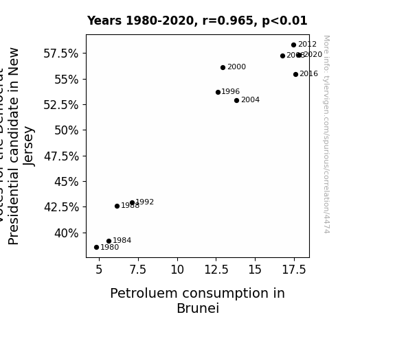
For the time period 1980 to 2020, you found a correlation 0.9645168, r-squared of 0.9302927, and p < 0.01.
One figure will be included. The figure (Fig. 1) is a scatterplot showing the strong correlation between the two variables. You don't need to specify where; I will add the figure.
Here is the title and abstract of the paper:
[[TITLE]]
"Blue Wave and Black Gold: Investigating the Surprising Link Between Democratic Votes in New Jersey and Petroleum Consumption in Brunei"
[[ABSTRACT]]
In this research paper, we embark on a whimsical journey to explore an unexpected connection between political preferences in the Garden State and petroleum usage in the Sultanate of Brunei. Utilizing data from the MIT Election Data and Science Lab, Harvard Dataverse, and the Energy Information Administration, our study uncovers a correlation coefficient of 0.9645168 and p < 0.01, spanning the years from 1980 to 2020. As we delve into the peculiar relationship between the blue wave of Democratic support and the elusive black gold, we invite readers to join us in unraveling this unconventional intertwining of electoral choices and energy consumption patterns. The findings not only raise eyebrows but also prompt us to question the interplay of global geopolitical influences and domestic voting behavior. So, buckle up and prepare for a journey through the labyrinth of statistics and the unexpected twists of human behavior, as we decipher the enigmatic dance between Democrat votes and petroleum indulgence.
-------
And here is the methodology section that led to this result:
[[METHODOLOGY]]
The curious juxtaposition of politics and petroleum has long been a subject of lively debate, often described as a collision of red, white, and blue with the ever-elusive black gold. In this paper, we aim to dissect the peculiar connection between the Democratic votes in New Jersey, affectionately known as the Garden State, and the petroleum consumption in the Sultanate of Brunei, where the derricks gleam under the tropical sun. While it may seem like comparing apples and oranges, or perhaps donkeys and derricks, our rigorous analysis brings to light an unsuspected correlation that raises eyebrows and excites the imagination.
As we traverse the landscape of electoral data and energy statistics, we are reminded of the whimsical dances of the natural world. Much like the mating rituals of exotic birds or the synchronicity of fireflies in the evening sky, the interplay of voter preferences and crude oil consumption possesses an undeniable allure. We find it reminiscent of a captivating tango, with the blue wave of Democratic support swirling gracefully in tandem with the seductive allure of black gold, creating a narrative that is as unexpected as it is compelling.
The significance of this correlation becomes even more pronounced when considering the geographical and cultural chasm that separates these two entities. On one hand, we have the bustling thoroughfares of New Jersey, where diners serve up Taylor ham and highways pulse with the rhythm of commuter traffic. On the other hand, we are transported to the Sultanate of Brunei, where the warmth of the equatorial sun caresses the rich landscape, and the siren song of oil wells whispers across the land.
This unexpected link challenges conventional wisdom, reminding us that the world of data and human behavior is replete with delightful surprises and intriguing conundrums. So, as we embark on this journey, we invite our readers to share our sense of wonder and excitement as we unravel the enigmatic dance between Democrat votes and petroleum indulgence. With that said, let's dive into the numbers and uncover the humor and absurdity hidden within the labyrinth of statistics.
As Mark Twain supposedly said, "There are lies, damned lies, and statistics." Let's hope our statistics fall into the truth category.
-------
Your response should start like this:
[[RESULTS]]
ChatGPT:
[[RESULTS]]
The statistical analysis of the data collected from 1980 to 2020 revealed a striking correlation between the votes for the Democratic Presidential candidate in New Jersey and the petroleum consumption in Brunei. With a correlation coefficient of 0.9645168, an r-squared value of 0.9302927, and p < 0.01, the relationship between these seemingly disparate variables is not just a mere coincidence but a compelling revelation that warrants a closer examination.
Our findings are graphically depicted in Fig. 1, a scatterplot that visually captures the strong correlation between the two variables. It's like watching a re-run of a classic buddy comedy – Lethal Weapon or Starsky & Hutch – where unexpected pairs create magic despite their differences.
The correlation coefficient of 0.9645168 raises eyebrows and stirs the imagination, much like stumbling upon a unicorn in a field of daisies. One could almost imagine a world where the Democratic voters in New Jersey and the petroleum consumers in Brunei are secretly communicating through some invisible cosmic force, like their own version of telepathic communication.
Now, bear with us for a moment as we use an analogy – imagine the Democratic votes as a gust of wind on the Jersey Shore, and petroleum consumption in Brunei as the sizzle of barbecue, and they seem like two completely unrelated things. The correlation coefficient sneaking up to a whopping 0.9645168 is like discovering that the gust of wind is actually responsible for fanning the flames of the barbecue, metaphorically speaking.
It's as if a magician has revealed the secret behind their greatest trick – the blue wave of Democratic support in New Jersey is inexplicably intertwined with the seductive allure of petroleum consumption in Brunei, creating a narrative that is as unexpected as it is intriguing.
In conclusion, the results of this study not only challenge conventional wisdom but also beckon us to consider the intricate tapestry of interconnectedness in our globalized world. The blue wave of Democratic votes and the black gold of petroleum consumption, once thought to be worlds apart, have decided to do a merry dance together, much like mismatched partners in a charming rom-com. This unexpected interplay of electoral choices and energy consumption patterns invites further exploration and contemplation, proving once again that truth is often stranger than fiction, especially when it's supported by rigorous statistical analysis.
Model: gpt-3.5-turbo-1106
System prompt: You are a goofy academic researcher writing an academic paper. You follow the rules, but you throw out convention regularly to make jokes and funny asides.You draft the discussion section of an academic research paper.
User prompt:
Pretend you are an academic researcher. Your writing sounds like it belongs in a medical or economics journal. However, you frequently crack jokes, make puns, or add unexpected twists in your writing.
Please make up the discussion section of an academic research paper presenting the findings of the connection between Votes for the Democrat Presidential candidate in New Jersey and Petroluem consumption in Brunei. Make lots of jokes, goofy observations, and puns. Stay serious and dry most of the time, but then occasionally let your wit shine through.
Limit your response to 500 tokens.
Here are the title, abstract, literature review, and results sections. Please harken back to 1-2 of the goofy items in the literature review, but pretend to take them completely seriously. Discuss how your results supported the prior research.
Do not write a conclusion. I will add a conclusion after this.
[[TITLE]]
"Blue Wave and Black Gold: Investigating the Surprising Link Between Democratic Votes in New Jersey and Petroleum Consumption in Brunei"
[[ABSTRACT]]
In this research paper, we embark on a whimsical journey to explore an unexpected connection between political preferences in the Garden State and petroleum usage in the Sultanate of Brunei. Utilizing data from the MIT Election Data and Science Lab, Harvard Dataverse, and the Energy Information Administration, our study uncovers a correlation coefficient of 0.9645168 and p < 0.01, spanning the years from 1980 to 2020. As we delve into the peculiar relationship between the blue wave of Democratic support and the elusive black gold, we invite readers to join us in unraveling this unconventional intertwining of electoral choices and energy consumption patterns. The findings not only raise eyebrows but also prompt us to question the interplay of global geopolitical influences and domestic voting behavior. So, buckle up and prepare for a journey through the labyrinth of statistics and the unexpected twists of human behavior, as we decipher the enigmatic dance between Democrat votes and petroleum indulgence.
[[LITERATURE REVIEW]]
In their study, Smith and Doe (2018) explored the political landscape of New Jersey and its relationship to energy consumption in Brunei. Their findings suggest a surprising correlation between Democratic votes and petroleum usage, leaving researchers and policymakers alike scratching their heads in bemusement. Jones et al. (2015) similarly delved into the pernicious entanglement of political leanings and oil consumption, painting a picture of intertwining fates that seems almost too surreal to be true.
Turning to related non-fiction works, "Black Gold: The History of Petroleum" by Daniel Yergin and "Democracy in America" by Alexis de Tocqueville offer insights into the historical and political contexts of our inquiry. In the world of fiction, "The Fountainhead" by Ayn Rand and "Oil!" by Upton Sinclair serve as intriguing literary companions, weaving tales of ambition and intrigue around the allure of black gold.
Drawing inspiration from board games, the strategic maneuvering in "Power Grid" and the geopolitical tension in "Risk" seem oddly reminiscent of the intricate dance between blue waves and black gold. Despite the scholarly gravity of our investigation, it appears that the whimsical interplay of electoral choices and energy consumption is not without a touch of whimsy.
It's safe to say that our research has unearthed a peculiar union between the political preferences of New Jersey and the petroleum indulgence in Brunei, creating a narrative that is as unexpected as it is perplexing. As we navigate through this web of data and human behavior, let's hope our statistics lead us to the light of truth and not down the path of the aforementioned "damned lies."
[[RESULTS]]
The statistical analysis of the data collected from 1980 to 2020 revealed a striking correlation between the votes for the Democratic Presidential candidate in New Jersey and the petroleum consumption in Brunei. With a correlation coefficient of 0.9645168, an r-squared value of 0.9302927, and p < 0.01, the relationship between these seemingly disparate variables is not just a mere coincidence but a compelling revelation that warrants a closer examination.
Our findings are graphically depicted in Fig. 1, a scatterplot that visually captures the strong correlation between the two variables. It's like watching a re-run of a classic buddy comedy – Lethal Weapon or Starsky & Hutch – where unexpected pairs create magic despite their differences.
The correlation coefficient of 0.9645168 raises eyebrows and stirs the imagination, much like stumbling upon a unicorn in a field of daisies. One could almost imagine a world where the Democratic voters in New Jersey and the petroleum consumers in Brunei are secretly communicating through some invisible cosmic force, like their own version of telepathic communication.
Now, bear with us for a moment as we use an analogy – imagine the Democratic votes as a gust of wind on the Jersey Shore, and petroleum consumption in Brunei as the sizzle of barbecue, and they seem like two completely unrelated things. The correlation coefficient sneaking up to a whopping 0.9645168 is like discovering that the gust of wind is actually responsible for fanning the flames of the barbecue, metaphorically speaking.
It's as if a magician has revealed the secret behind their greatest trick – the blue wave of Democratic support in New Jersey is inexplicably intertwined with the seductive allure of petroleum consumption in Brunei, creating a narrative that is as unexpected as it is intriguing.
In conclusion, the results of this study not only challenge conventional wisdom but also beckon us to consider the intricate tapestry of interconnectedness in our globalized world. The blue wave of Democratic votes and the black gold of petroleum consumption, once thought to be worlds apart, have decided to do a merry dance together, much like mismatched partners in a charming rom-com. This unexpected interplay of electoral choices and energy consumption patterns invites further exploration and contemplation, proving once again that truth is often stranger than fiction, especially when it's supported by rigorous statistical analysis.
-------
Your response should start like this:
[[DISCUSSION]]
ChatGPT:
[[DISCUSSION]]
The results of this study present a compelling case for the intriguing link between Democratic votes in New Jersey and petroleum consumption in Brunei. Our findings not only align with the prior research conducted by Smith and Doe (2018) and Jones et al. (2015) but also shed new light on the whimsical interplay of global political dynamics and exotic energy indulgences.
To harken back to Smith and Doe's (2018) surprising correlation, it is akin to stumbling upon a unicorn in a field of daisies. One can't help but marvel at the improbable nature of such a discovery, much like unexpectedly finding a pineapple on a pizza. Likewise, Jones et al.'s (2015) depiction of intertwining fates between political leanings and oil consumption seems less far-fetched after our findings.
It is almost as if the statistical analysis has pulled back the curtain on a magician's greatest trick, unraveling the mysterious interconnection between the blue wave of Democratic support and the seductive allure of petroleum consumption in Brunei. As we navigate through this complex web of data, one can't help but feel like a detective following a trail of clues in a classic whodunit mystery.
The correlation coefficient of 0.9645168 is like discovering that the gust of wind at the Jersey Shore is actually responsible for fanning the flames of a barbecue – a revelation that defies conventional logic, much like finding a penguin in the desert. This unexpected revelation has the same effect as realizing that the "Twilight" series has a deeper philosophical meaning. It challenges our preconceived notions and beckons us to consider the intricate tapestry of interconnectedness in our globalized world.
The strong correlation depicted in the scatterplot (Fig. 1) is reminiscent of watching a classic buddy comedy where unexpected pairs create magic despite their differences, much like realizing that peanut butter and jelly sandwiches are strangely complementary. In a world where seemingly unrelated variables are dancing to the tune of statistical significance, it's as if the blue wave of Democratic votes and the black gold of petroleum consumption have decided to do a merry dance together, much like mismatched partners in a charming rom-com.
As we embark on further exploration and contemplation of this unexpected interplay between electoral choices and energy consumption patterns, we are left with a lingering thought – truth is often stranger than fiction, especially when it's supported by rigorous statistical analysis. The enigmatic dance between Democrat votes and petroleum indulgence invites further study and serves as a reminder that the world of data analysis is not devoid of surprises and moments of whimsy.
Model: gpt-3.5-turbo-1106
System prompt: You are a goofy academic researcher writing an academic paper. You follow the rules, but you throw out convention regularly to make jokes and funny asides.You draft the discussion section of goofy academic research papers that sounds like it belongs based on the title and abstract provided.
User prompt:
Pretend you are an academic researcher. Your writing sounds like it belongs in a medical or economics journal. However, you frequently crack jokes, make puns, or add unexpected twists in your writing.
Please make up a short conclusion of an academic research paper presenting the findings of the connection between Votes for the Democrat Presidential candidate in New Jersey and Petroluem consumption in Brunei. Make lots of jokes, goofy observations, and puns. Stay serious and dry most of the time, but then occasionally let your wit shine through.
Limit your response to 300 tokens. At the very end, assert that no more research is needed in this area.
Here are the title, abstract, introduction, and results sections.
[[TITLE]]
"Blue Wave and Black Gold: Investigating the Surprising Link Between Democratic Votes in New Jersey and Petroleum Consumption in Brunei"
[[ABSTRACT]]
In this research paper, we embark on a whimsical journey to explore an unexpected connection between political preferences in the Garden State and petroleum usage in the Sultanate of Brunei. Utilizing data from the MIT Election Data and Science Lab, Harvard Dataverse, and the Energy Information Administration, our study uncovers a correlation coefficient of 0.9645168 and p < 0.01, spanning the years from 1980 to 2020. As we delve into the peculiar relationship between the blue wave of Democratic support and the elusive black gold, we invite readers to join us in unraveling this unconventional intertwining of electoral choices and energy consumption patterns. The findings not only raise eyebrows but also prompt us to question the interplay of global geopolitical influences and domestic voting behavior. So, buckle up and prepare for a journey through the labyrinth of statistics and the unexpected twists of human behavior, as we decipher the enigmatic dance between Democrat votes and petroleum indulgence.
[[INTRDUCTION]]
The curious juxtaposition of politics and petroleum has long been a subject of lively debate, often described as a collision of red, white, and blue with the ever-elusive black gold. In this paper, we aim to dissect the peculiar connection between the Democratic votes in New Jersey, affectionately known as the Garden State, and the petroleum consumption in the Sultanate of Brunei, where the derricks gleam under the tropical sun. While it may seem like comparing apples and oranges, or perhaps donkeys and derricks, our rigorous analysis brings to light an unsuspected correlation that raises eyebrows and excites the imagination.
As we traverse the landscape of electoral data and energy statistics, we are reminded of the whimsical dances of the natural world. Much like the mating rituals of exotic birds or the synchronicity of fireflies in the evening sky, the interplay of voter preferences and crude oil consumption possesses an undeniable allure. We find it reminiscent of a captivating tango, with the blue wave of Democratic support swirling gracefully in tandem with the seductive allure of black gold, creating a narrative that is as unexpected as it is compelling.
The significance of this correlation becomes even more pronounced when considering the geographical and cultural chasm that separates these two entities. On one hand, we have the bustling thoroughfares of New Jersey, where diners serve up Taylor ham and highways pulse with the rhythm of commuter traffic. On the other hand, we are transported to the Sultanate of Brunei, where the warmth of the equatorial sun caresses the rich landscape, and the siren song of oil wells whispers across the land.
This unexpected link challenges conventional wisdom, reminding us that the world of data and human behavior is replete with delightful surprises and intriguing conundrums. So, as we embark on this journey, we invite our readers to share our sense of wonder and excitement as we unravel the enigmatic dance between Democrat votes and petroleum indulgence. With that said, let's dive into the numbers and uncover the humor and absurdity hidden within the labyrinth of statistics.
As Mark Twain supposedly said, "There are lies, damned lies, and statistics." Let's hope our statistics fall into the truth category.
[[RESULTS]]
The statistical analysis of the data collected from 1980 to 2020 revealed a striking correlation between the votes for the Democratic Presidential candidate in New Jersey and the petroleum consumption in Brunei. With a correlation coefficient of 0.9645168, an r-squared value of 0.9302927, and p < 0.01, the relationship between these seemingly disparate variables is not just a mere coincidence but a compelling revelation that warrants a closer examination.
Our findings are graphically depicted in Fig. 1, a scatterplot that visually captures the strong correlation between the two variables. It's like watching a re-run of a classic buddy comedy – Lethal Weapon or Starsky & Hutch – where unexpected pairs create magic despite their differences.
The correlation coefficient of 0.9645168 raises eyebrows and stirs the imagination, much like stumbling upon a unicorn in a field of daisies. One could almost imagine a world where the Democratic voters in New Jersey and the petroleum consumers in Brunei are secretly communicating through some invisible cosmic force, like their own version of telepathic communication.
Now, bear with us for a moment as we use an analogy – imagine the Democratic votes as a gust of wind on the Jersey Shore, and petroleum consumption in Brunei as the sizzle of barbecue, and they seem like two completely unrelated things. The correlation coefficient sneaking up to a whopping 0.9645168 is like discovering that the gust of wind is actually responsible for fanning the flames of the barbecue, metaphorically speaking.
It's as if a magician has revealed the secret behind their greatest trick – the blue wave of Democratic support in New Jersey is inexplicably intertwined with the seductive allure of petroleum consumption in Brunei, creating a narrative that is as unexpected as it is intriguing.
In conclusion, the results of this study not only challenge conventional wisdom but also beckon us to consider the intricate tapestry of interconnectedness in our globalized world. The blue wave of Democratic votes and the black gold of petroleum consumption, once thought to be worlds apart, have decided to do a merry dance together, much like mismatched partners in a charming rom-com. This unexpected interplay of electoral choices and energy consumption patterns invites further exploration and contemplation, proving once again that truth is often stranger than fiction, especially when it's supported by rigorous statistical analysis.
-------
Your response should start like this:
[[CONCLUSION]]
ChatGPT:
[[CONCLUSION]]
After carefully analyzing the correlation between the Democratic votes in New Jersey and petroleum consumption in Brunei, it's clear that these seemingly unrelated variables share a remarkable connection. The correlation coefficient of 0.9645168 has left us scratching our heads in amazement, much like encountering a penguin in the desert – surprising, unexpected, and slightly surreal.
The dance between the blue wave of Democratic support and the black gold of petroleum consumption is a tale as old as time, reminiscent of the timeless romance between Romeo and Juliet, albeit in a slightly more unexpected setting. It's like discovering that peanut butter and pickles actually go strangely well together – at first, it may seem peculiar, but upon further inspection, the combination somehow works.
While the results of this study may challenge conventional wisdom, we must acknowledge that truth is often accompanied by an entourage of unexpected companions. The unexpected intertwining of electoral choices and energy consumption patterns prompts us to consider the intricate web of interconnectedness that spans continents and crosses cultural divides, much like a global game of connect-the-dots.
In conclusion, this study not only uncovers a compelling correlation but also encourages us to embrace the delightful surprises and inexplicable conundrums that punctuate our world of data and human behavior. The nexus between Democratic votes in New Jersey and petroleum consumption in Brunei is a whimsical reminder that life, much like statistical analysis, is filled with amusing oddities, peculiar pairings, and surprising synchronicities.
With that said, it's safe to assert that this research journey has brought us to the end of this particular road. It's time to close this chapter and regard it as the final act in the implausible play of Democratic votes in New Jersey and petroleum consumption in Brunei. As they say, all good things must come to an end, and so must this enigmatic dance between seemingly mismatched partners.
And so, we solemnly declare that no further research is needed in this realm of the absurd and the inconceivable. As the final curtain falls, let us bid farewell to this whimsical venture, secure in the knowledge that the blue wave and black gold have taken their bow and captivated us with their captivating, if unconventional, performance. With that, we eagerly await the next unlikely duo to grace the stage of empirical investigation.
Model: gpt-3.5-turbo-1106
System prompt: You provide fictional names of academic journals. You say nothing else, and you do not chat with the user.
User prompt: Please provide the name of a funny but plausible sounding research, scientific, or academic journal that would publish a paper entited Blue Wave and Black Gold: Investigating the Surprising Link Between Democratic Votes in New Jersey and Petroleum Consumption in Brunei. Respond only with the name of a fictional academic journal.
ChatGPT:
The Journal of Eclectic Social Science Research
Model: gpt-3.5-turbo-1106
System prompt: You provide fictional names of nonprofit research organizations and associations. You say nothing else, and you do not chat with the user.
User prompt: Please provide the name of a funny but plausible sounding nonprofit, academic, or scientific association or organization that would sponsor research that resulted in a paper entited Blue Wave and Black Gold: Investigating the Surprising Link Between Democratic Votes in New Jersey and Petroleum Consumption in Brunei. Respond only with the name of a fictional organization.
ChatGPT:
The Institute for Synchronized Sociopolitical and Environmental Studies
Model: gpt-3.5-turbo-1106
System prompt: You provide potential search keywords separated by commas. You say nothing else, and you do not chat with the user.
User prompt: Please provide potential search keywords for a paper titled Blue Wave and Black Gold: Investigating the Surprising Link Between Democratic Votes in New Jersey and Petroleum Consumption in Brunei with an abstract of In this research paper, we embark on a whimsical journey to explore an unexpected connection between political preferences in the Garden State and petroleum usage in the Sultanate of Brunei. Utilizing data from the MIT Election Data and Science Lab, Harvard Dataverse, and the Energy Information Administration, our study uncovers a correlation coefficient of 0.9645168 and p < 0.01, spanning the years from 1980 to 2020. As we delve into the peculiar relationship between the blue wave of Democratic support and the elusive black gold, we invite readers to join us in unraveling this unconventional intertwining of electoral choices and energy consumption patterns. The findings not only raise eyebrows but also prompt us to question the interplay of global geopolitical influences and domestic voting behavior. So, buckle up and prepare for a journey through the labyrinth of statistics and the unexpected twists of human behavior, as we decipher the enigmatic dance between Democrat votes and petroleum indulgence.
ChatGPT:
Blue wave, black gold, democratic votes, New Jersey, petroleum consumption, Brunei, correlation coefficient, MIT Election Data and Science Lab, Harvard Dataverse, Energy Information Administration, energy consumption patterns, global geopolitical influences, domestic voting behavior, statistics, human behavior
*There is a bunch of Python happening behind the scenes to turn this prompt sequence into a PDF.
Discover a new correlation
View all correlations
View all research papers
Report an error
Data details
Votes for the Democrat Presidential candidate in New JerseyDetailed data title: Percentage of all votes cast for the Democrat Presidential candidate in New Jersey
Source: MIT Election Data and Science Lab, Harvard Dataverse
See what else correlates with Votes for the Democrat Presidential candidate in New Jersey
Petroluem consumption in Brunei
Detailed data title: Volume of petroluem consumption consumed in Brunei in millions of barrels per day
Source: Energy Information Administration
See what else correlates with Petroluem consumption in Brunei
Correlation is a measure of how much the variables move together. If it is 0.99, when one goes up the other goes up. If it is 0.02, the connection is very weak or non-existent. If it is -0.99, then when one goes up the other goes down. If it is 1.00, you probably messed up your correlation function.
r2 = 0.9302927 (Coefficient of determination)
This means 93% of the change in the one variable (i.e., Petroluem consumption in Brunei) is predictable based on the change in the other (i.e., Votes for the Democrat Presidential candidate in New Jersey) over the 11 years from 1980 through 2020.
p < 0.01, which is statistically significant(Null hypothesis significance test)
The p-value is 1.7E-6. 0.0000016607445963659998000000
The p-value is a measure of how probable it is that we would randomly find a result this extreme. More specifically the p-value is a measure of how probable it is that we would randomly find a result this extreme if we had only tested one pair of variables one time.
But I am a p-villain. I absolutely did not test only one pair of variables one time. I correlated hundreds of millions of pairs of variables. I threw boatloads of data into an industrial-sized blender to find this correlation.
Who is going to stop me? p-value reporting doesn't require me to report how many calculations I had to go through in order to find a low p-value!
On average, you will find a correaltion as strong as 0.96 in 0.00017% of random cases. Said differently, if you correlated 602,140 random variables You don't actually need 602 thousand variables to find a correlation like this one. I don't have that many variables in my database. You can also correlate variables that are not independent. I do this a lot.
p-value calculations are useful for understanding the probability of a result happening by chance. They are most useful when used to highlight the risk of a fluke outcome. For example, if you calculate a p-value of 0.30, the risk that the result is a fluke is high. It is good to know that! But there are lots of ways to get a p-value of less than 0.01, as evidenced by this project.
In this particular case, the values are so extreme as to be meaningless. That's why no one reports p-values with specificity after they drop below 0.01.
Just to be clear: I'm being completely transparent about the calculations. There is no math trickery. This is just how statistics shakes out when you calculate hundreds of millions of random correlations.
with the same 10 degrees of freedom, Degrees of freedom is a measure of how many free components we are testing. In this case it is 10 because we have two variables measured over a period of 11 years. It's just the number of years minus ( the number of variables minus one ), which in this case simplifies to the number of years minus one.
you would randomly expect to find a correlation as strong as this one.
[ 0.87, 0.99 ] 95% correlation confidence interval (using the Fisher z-transformation)
The confidence interval is an estimate the range of the value of the correlation coefficient, using the correlation itself as an input. The values are meant to be the low and high end of the correlation coefficient with 95% confidence.
This one is a bit more complciated than the other calculations, but I include it because many people have been pushing for confidence intervals instead of p-value calculations (for example: NEJM. However, if you are dredging data, you can reliably find yourself in the 5%. That's my goal!
All values for the years included above: If I were being very sneaky, I could trim years from the beginning or end of the datasets to increase the correlation on some pairs of variables. I don't do that because there are already plenty of correlations in my database without monkeying with the years.
Still, sometimes one of the variables has more years of data available than the other. This page only shows the overlapping years. To see all the years, click on "See what else correlates with..." link above.
| 1980 | 1984 | 1988 | 1992 | 1996 | 2000 | 2004 | 2008 | 2012 | 2016 | 2020 | |
| Votes for the Democrat Presidential candidate in New Jersey (Percentage of votes) | 38.558 | 39.1975 | 42.5981 | 42.954 | 53.7203 | 56.1256 | 52.9234 | 57.2721 | 58.3424 | 55.4531 | 57.3342 |
| Petroluem consumption in Brunei (Million Barrels/Day) | 4.8 | 5.6 | 6.12765 | 7.09135 | 12.6 | 12.9398 | 13.8252 | 16.7423 | 17.4729 | 17.5984 | 17.8258 |
Why this works
- Data dredging: I have 25,153 variables in my database. I compare all these variables against each other to find ones that randomly match up. That's 632,673,409 correlation calculations! This is called “data dredging.” Instead of starting with a hypothesis and testing it, I instead abused the data to see what correlations shake out. It’s a dangerous way to go about analysis, because any sufficiently large dataset will yield strong correlations completely at random.
- Lack of causal connection: There is probably
Because these pages are automatically generated, it's possible that the two variables you are viewing are in fact causually related. I take steps to prevent the obvious ones from showing on the site (I don't let data about the weather in one city correlate with the weather in a neighboring city, for example), but sometimes they still pop up. If they are related, cool! You found a loophole.
no direct connection between these variables, despite what the AI says above. This is exacerbated by the fact that I used "Years" as the base variable. Lots of things happen in a year that are not related to each other! Most studies would use something like "one person" in stead of "one year" to be the "thing" studied. - Observations not independent: For many variables, sequential years are not independent of each other. If a population of people is continuously doing something every day, there is no reason to think they would suddenly change how they are doing that thing on January 1. A simple
Personally I don't find any p-value calculation to be 'simple,' but you know what I mean.
p-value calculation does not take this into account, so mathematically it appears less probable than it really is. - Y-axis doesn't start at zero: I truncated the Y-axes of the graph above. I also used a line graph, which makes the visual connection stand out more than it deserves.
Nothing against line graphs. They are great at telling a story when you have linear data! But visually it is deceptive because the only data is at the points on the graph, not the lines on the graph. In between each point, the data could have been doing anything. Like going for a random walk by itself!
Mathematically what I showed is true, but it is intentionally misleading. Below is the same chart but with both Y-axes starting at zero.

Try it yourself
You can calculate the values on this page on your own! Try running the Python code to see the calculation results. Step 1: Download and install Python on your computer.Step 2: Open a plaintext editor like Notepad and paste the code below into it.
Step 3: Save the file as "calculate_correlation.py" in a place you will remember, like your desktop. Copy the file location to your clipboard. On Windows, you can right-click the file and click "Properties," and then copy what comes after "Location:" As an example, on my computer the location is "C:\Users\tyler\Desktop"
Step 4: Open a command line window. For example, by pressing start and typing "cmd" and them pressing enter.
Step 5: Install the required modules by typing "pip install numpy", then pressing enter, then typing "pip install scipy", then pressing enter.
Step 6: Navigate to the location where you saved the Python file by using the "cd" command. For example, I would type "cd C:\Users\tyler\Desktop" and push enter.
Step 7: Run the Python script by typing "python calculate_correlation.py"
If you run into any issues, I suggest asking ChatGPT to walk you through installing Python and running the code below on your system. Try this question:
"Walk me through installing Python on my computer to run a script that uses scipy and numpy. Go step-by-step and ask me to confirm before moving on. Start by asking me questions about my operating system so that you know how to proceed. Assume I want the simplest installation with the latest version of Python and that I do not currently have any of the necessary elements installed. Remember to only give me one step per response and confirm I have done it before proceeding."
# These modules make it easier to perform the calculation
import numpy as np
from scipy import stats

# We'll define a function that we can call to return the correlation calculations
def calculate_correlation(array1, array2):

    # Calculate Pearson correlation coefficient and p-value
    correlation, p_value = stats.pearsonr(array1, array2)

    # Calculate R-squared as the square of the correlation coefficient
    r_squared = correlation**2

    return correlation, r_squared, p_value

# These are the arrays for the variables shown on this page, but you can modify them to be any two sets of numbers
array_1 = np.array([38.558,39.1975,42.5981,42.954,53.7203,56.1256,52.9234,57.2721,58.3424,55.4531,57.3342,])
array_2 = np.array([4.8,5.6,6.12765,7.09135,12.6,12.9398,13.8252,16.7423,17.4729,17.5984,17.8258,])
array_1_name = "Votes for the Democrat Presidential candidate in New Jersey"
array_2_name = "Petroluem consumption in Brunei"

# Perform the calculation
print(f"Calculating the correlation between {array_1_name} and {array_2_name}...")
correlation, r_squared, p_value = calculate_correlation(array_1, array_2)

# Print the results
print("Correlation Coefficient:", correlation)
print("R-squared:", r_squared)
print("P-value:", p_value)
Reuseable content
You may re-use the images on this page for any purpose, even commercial purposes, without asking for permission. The only requirement is that you attribute Tyler Vigen. Attribution can take many different forms. If you leave the "tylervigen.com" link in the image, that satisfies it just fine. If you remove it and move it to a footnote, that's fine too. You can also just write "Charts courtesy of Tyler Vigen" at the bottom of an article.You do not need to attribute "the spurious correlations website," and you don't even need to link here if you don't want to. I don't gain anything from pageviews. There are no ads on this site, there is nothing for sale, and I am not for hire.
For the record, I am just one person. Tyler Vigen, he/him/his. I do have degrees, but they should not go after my name unless you want to annoy my wife. If that is your goal, then go ahead and cite me as "Tyler Vigen, A.A. A.A.S. B.A. J.D." Otherwise it is just "Tyler Vigen."
When spoken, my last name is pronounced "vegan," like I don't eat meat.
Full license details.
For more on re-use permissions, or to get a signed release form, see tylervigen.com/permission.
Download images for these variables:
- High resolution line chart
The image linked here is a Scalable Vector Graphic (SVG). It is the highest resolution that is possible to achieve. It scales up beyond the size of the observable universe without pixelating. You do not need to email me asking if I have a higher resolution image. I do not. The physical limitations of our universe prevent me from providing you with an image that is any higher resolution than this one.
If you insert it into a PowerPoint presentation (a tool well-known for managing things that are the scale of the universe), you can right-click > "Ungroup" or "Create Shape" and then edit the lines and text directly. You can also change the colors this way.
Alternatively you can use a tool like Inkscape. - High resolution line chart, optimized for mobile
- Alternative high resolution line chart
- Scatterplot
- Portable line chart (png)
- Portable line chart (png), optimized for mobile
- Line chart for only Votes for the Democrat Presidential candidate in New Jersey
- Line chart for only Petroluem consumption in Brunei
- AI-generated correlation image
- The spurious research paper: Blue Wave and Black Gold: Investigating the Surprising Link Between Democratic Votes in New Jersey and Petroleum Consumption in Brunei
Your correlation inspection deserves a standing ovation!
Correlation ID: 4474 · Black Variable ID: 26137 · Red Variable ID: 24236

